Descriptive Statistics Tabular and Graphical Presentations n n

Descriptive Statistics: Tabular and Graphical Presentations n n Summarizing Qualitative Data Summarizing Quantitative Data
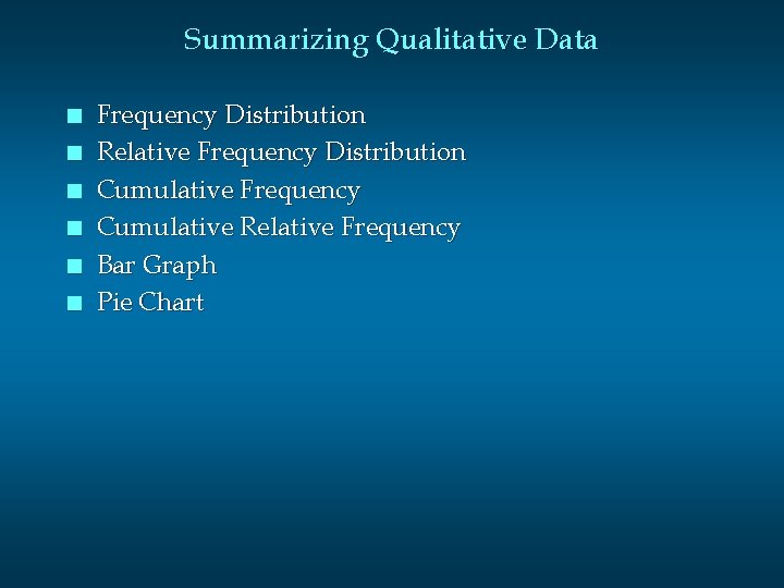
Summarizing Qualitative Data n n n Frequency Distribution Relative Frequency Distribution Cumulative Frequency Cumulative Relative Frequency Bar Graph Pie Chart
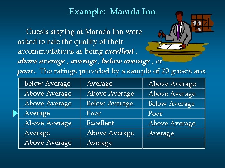
Example: Marada Inn Guests staying at Marada Inn were asked to rate the quality of their accommodations as being excellent , above average , below average , or poor. The ratings provided by a sample of 20 guests are: Below Average Above Average Above Average Below Average Poor Excellent Above Average Below Average Poor Above Average
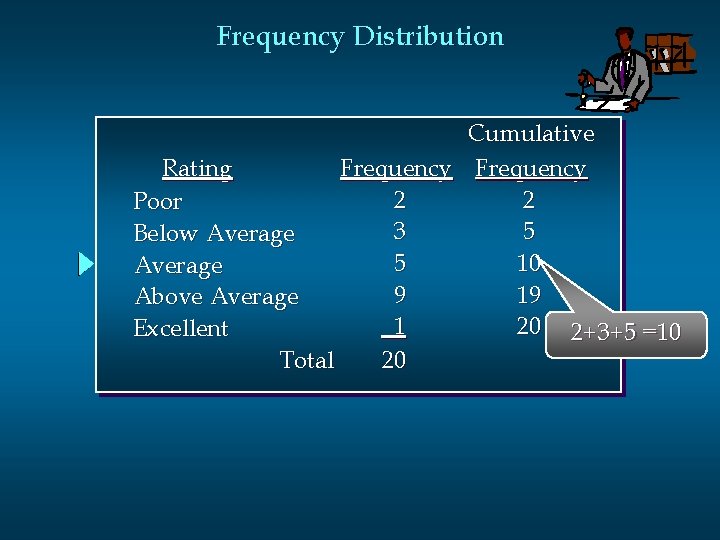
Frequency Distribution Cumulative Rating Frequency 2 2 Poor 3 5 Below Average 5 10 Average 9 19 Above Average 1 20 2+3+5 =10 Excellent Total 20
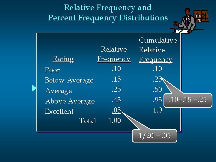
Relative Frequency and Percent Frequency Distributions Relative Rating Frequency. 10 Poor. 15 Below Average. 25 Average. 45 Above Average. 05 Excellent Total 1. 00 Cumulative Relative Frequency. 10. 25. 50. 95. 10+. 15 =. 25 1. 0 1/20 =. 05
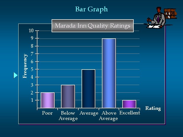
Bar Graph Marada Inn Quality Ratings 10 9 Frequency 8 7 6 5 4 3 2 1 Poor Below Average Above Excellent Average Rating
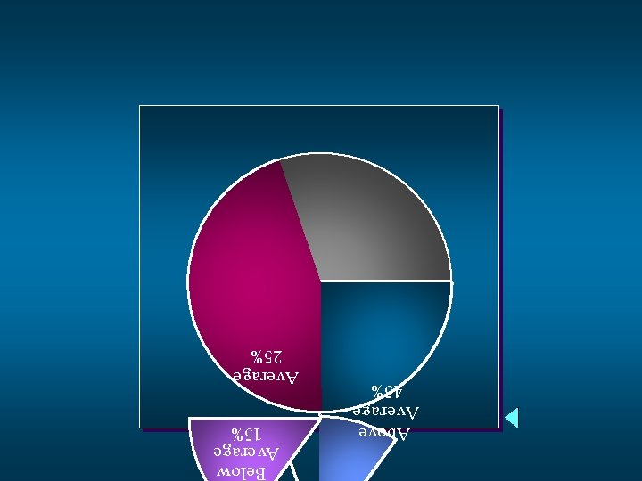
Above Average 45% Below Average 15% Average 25%
Summarizing Quantitative Data n n Frequency Distribution Relative Frequency Distributions Histogram Cumulative Distributions
Example: Hudson Auto Repair The manager of Hudson Auto would like to have a better understanding of the cost of parts used in the engine tune-ups performed in the shop. She examines 50 customer invoices for tune-ups. The costs of parts, rounded to the nearest dollar, are listed on the next slide.
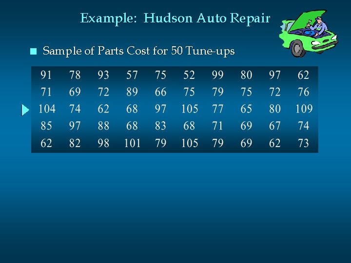
Example: Hudson Auto Repair n Sample of Parts Cost for 50 Tune-ups
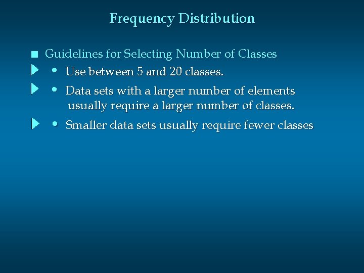
Frequency Distribution n Guidelines for Selecting Number of Classes • Use between 5 and 20 classes. • Data sets with a larger number of elements usually require a larger number of classes. • Smaller data sets usually require fewer classes
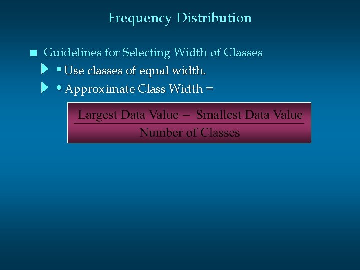
Frequency Distribution n Guidelines for Selecting Width of Classes • Use classes of equal width. • Approximate Class Width =
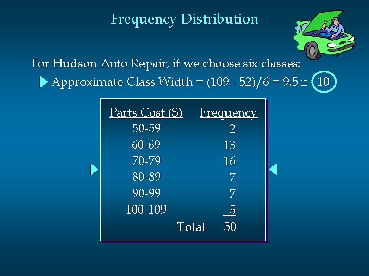
Frequency Distribution For Hudson Auto Repair, if we choose six classes: Approximate Class Width = (109 - 52)/6 = 9. 5 10 Parts Cost ($) Frequency 50 -59 2 60 -69 13 70 -79 16 80 -89 7 90 -99 7 100 -109 5 Total 50
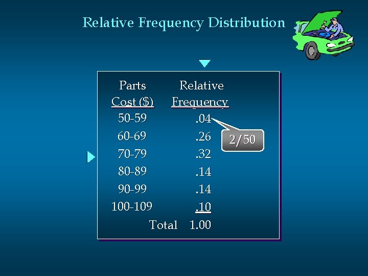
Relative Frequency Distribution Parts Relative Cost ($) Frequency 50 -59. 04 60 -69. 26 2/50 70 -79. 32 80 -89. 14 90 -99. 14 100 -109. 10 Total 1. 00
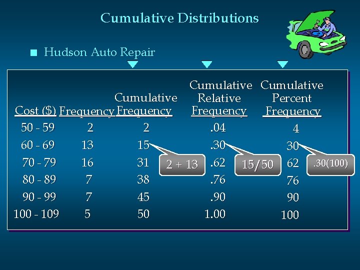
Cumulative Distributions n Hudson Auto Repair Cumulative Relative Percent Cost ($) Frequency 2 2. 04 50 - 59 4 13 15. 30 60 - 69 30 16 31 2 + 13. 62 15/50 62. 30(100) 70 - 79 7 38. 76 80 - 89 76 7 45. 90 90 - 99 90 5 50 1. 00 100 - 109 100
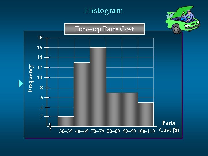
Histogram Tune-up Parts Cost 18 16 Frequency 14 12 10 8 6 4 2 Parts 50 -59 60 -69 70 -79 80 -89 90 -99 100 -110 Cost ($)
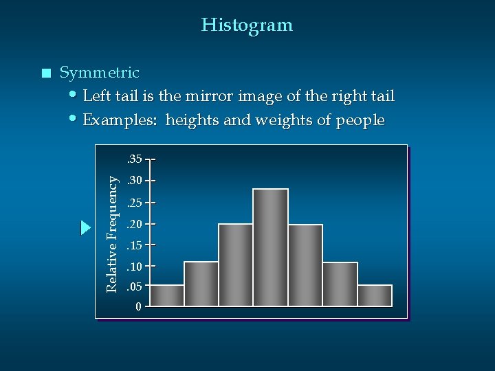
Histogram Symmetric • Left tail is the mirror image of the right tail • Examples: heights and weights of people. 35 Relative Frequency n . 30. 25. 20. 15. 10. 05 0
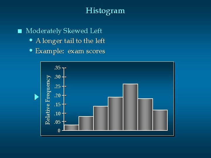
Histogram Moderately Skewed Left • A longer tail to the left • Example: exam scores. 35 Relative Frequency n . 30. 25. 20. 15. 10. 05 0
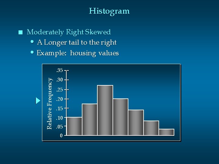
Histogram Moderately Right Skewed • A Longer tail to the right • Example: housing values. 35 Relative Frequency n . 30. 25. 20. 15. 10. 05 0
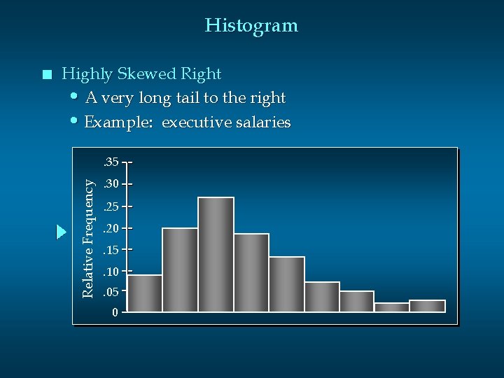
Histogram Highly Skewed Right • A very long tail to the right • Example: executive salaries. 35 Relative Frequency n . 30. 25. 20. 15. 10. 05 0
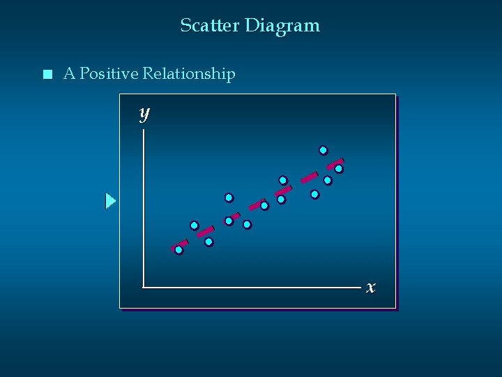
Scatter Diagram n A Positive Relationship y x
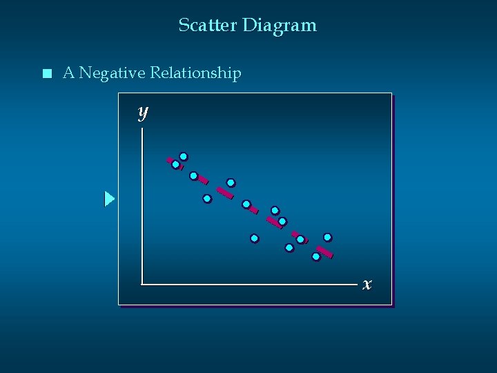
Scatter Diagram n A Negative Relationship y x
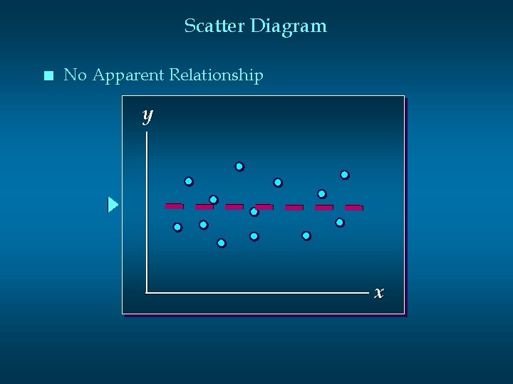
Scatter Diagram n No Apparent Relationship y x
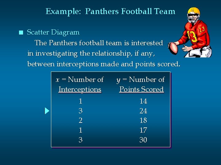
Example: Panthers Football Team n Scatter Diagram The Panthers football team is interested in investigating the relationship, if any, between interceptions made and points scored. x = Number of Interceptions 1 3 2 1 3 y = Number of Points Scored 14 24 18 17 30
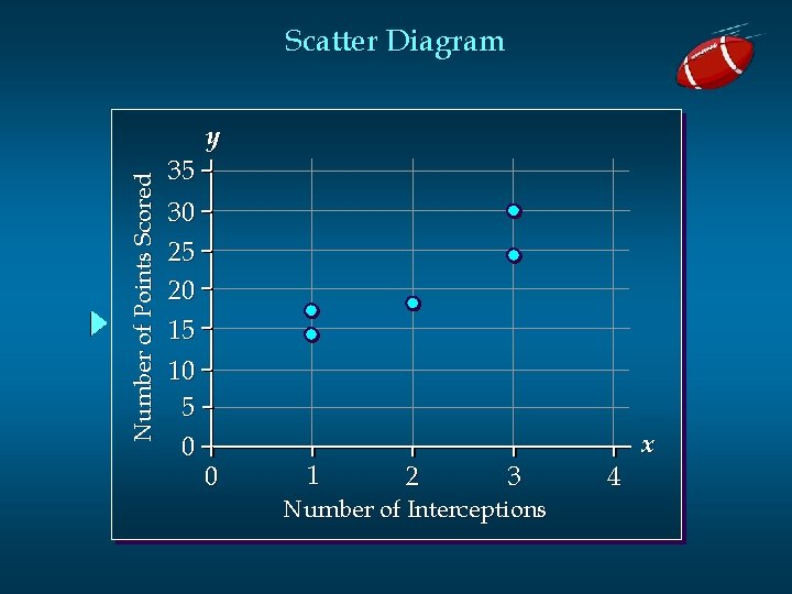
Scatter Diagram Number of Points Scored y 35 30 25 20 15 10 5 0 0 1 2 3 Number of Interceptions 4 x
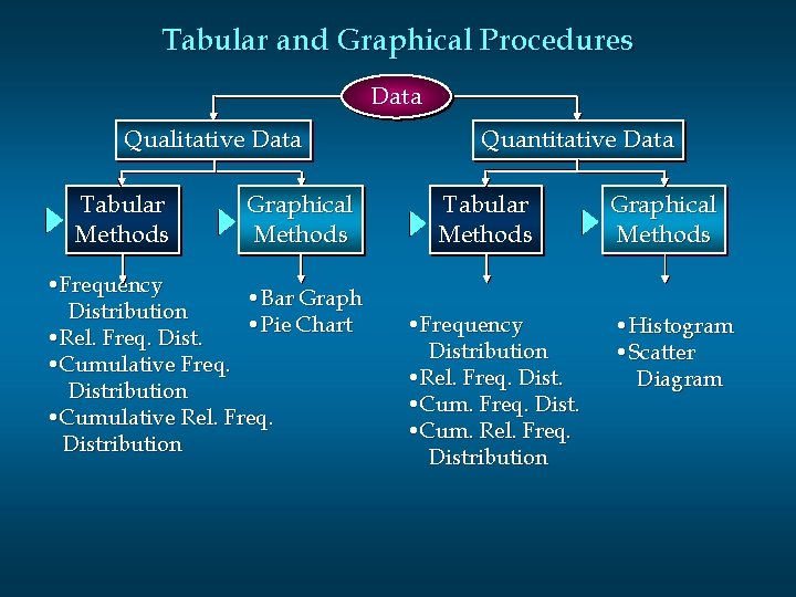
Tabular and Graphical Procedures Data Qualitative Data Tabular Methods Graphical Methods • Frequency • Bar Graph Distribution • Pie Chart • Rel. Freq. Dist. • Cumulative Freq. Distribution • Cumulative Rel. Freq. Distribution Quantitative Data Tabular Methods • Frequency Distribution • Rel. Freq. Dist. • Cum. Rel. Freq. Distribution Graphical Methods • Histogram • Scatter Diagram
- Slides: 26