December 2 2020 The Art and Science of

December 2, 2020 The Art and Science of Describing Images (Part II) daisy. org/webinar. CC Accessible Publishing and Reading Webinars daisy. org/webinars

Your panel Valerie Morrison Host: Richard Orme Center for Inclusive Design & Innovation, Georgia Institute of Technology Huw Alexander text. BOX
Overview Information + Complex Images p Describing Complex Images p Complex Images, Simplified p Questions p
The World is a Complex Place
The Visual Turn Educational materials have shifted to a much more visual form of conveying information. And society has followed suit in its preferred methods of consuming content.
Describing Complex Images
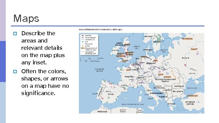
Maps p p Describe the areas and relevant details on the map plus any inset. Often the colors, shapes, or arrows on a map have no significance.
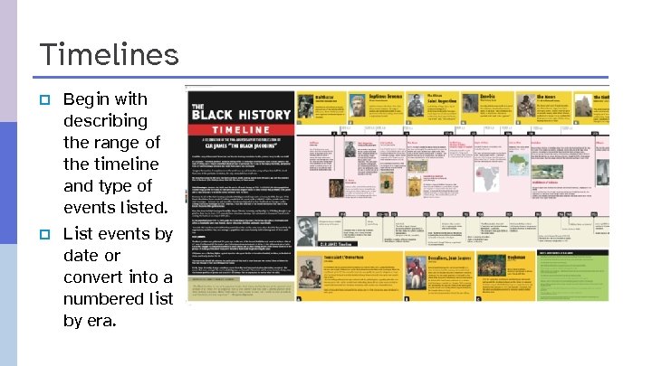
Timelines p p Begin with describing the range of the timeline and type of events listed. List events by date or convert into a numbered list by era.
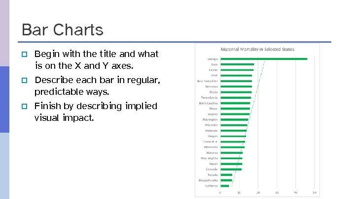
Bar Charts p p p Begin with the title and what is on the X and Y axes. Describe each bar in regular, predictable ways. Finish by describing implied visual impact.
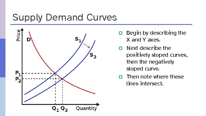
Supply Demand Curves p p p Begin by describing the X and Y axes. Next describe the positively sloped curves, then the negatively sloped curve. Then note where these lines intersect.
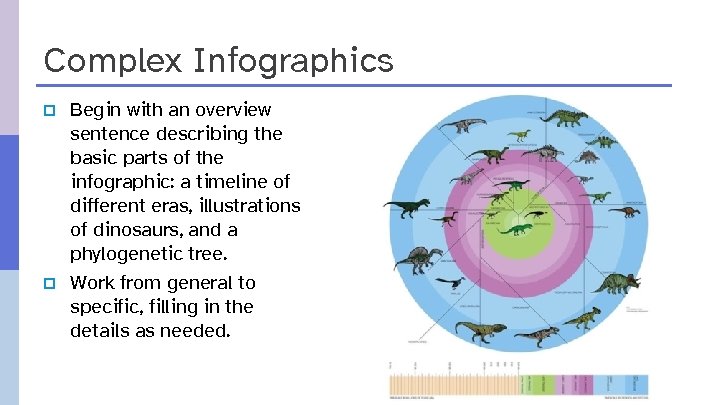
Complex Infographics p p Begin with an overview sentence describing the basic parts of the infographic: a timeline of different eras, illustrations of dinosaurs, and a phylogenetic tree. Work from general to specific, filling in the details as needed.
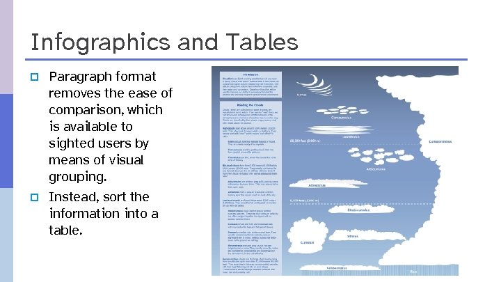
Infographics and Tables p p Paragraph format removes the ease of comparison, which is available to sighted users by means of visual grouping. Instead, sort the information into a table.
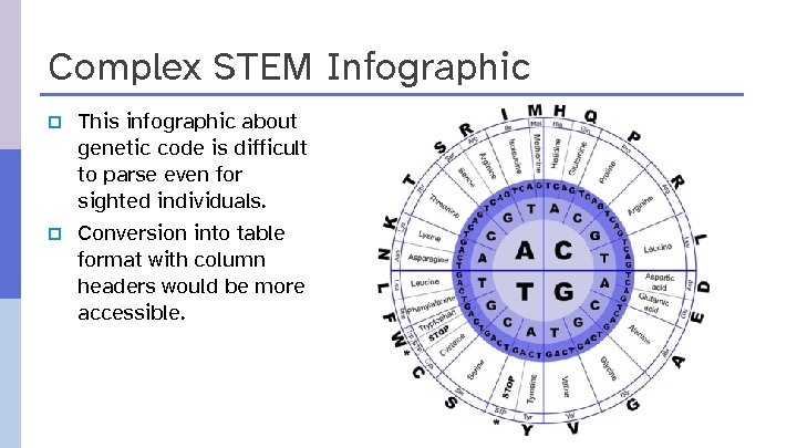
Complex STEM Infographic p p This infographic about genetic code is difficult to parse even for sighted individuals. Conversion into table format with column headers would be more accessible.
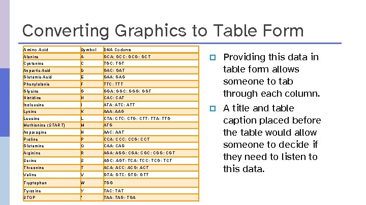
Converting Graphics to Table Form Amino Acid Symbol DNA Codons Alanine A GCA; GCC; GCG; GCT Cystenine C TGC; TGT Aspartic Acid D GAC; GAT Glutamic Acid E GAA; GAG Phenylalanie F TTC; TTT Glycine G GGA; GGC; GGG; GGT Histidine H CAC; CAT Isoleucine I ATA; ATC; ATT Lysine K AAA; AAG Leucine L CTA; CTC; CTG; CTT; TTA; TTG Methionine (START) M ATG Asparagine N AAC; AAT Proline P CCA; CCC; CCG; CCT Glutamine O CAA; CAG Arginine R AGA; AGG; CGA; CGC; CGG; CGT Serine S AGC; AGT; TCA; TCC; TCG; TCT Threonine T ACA; ACC; ACG; ACT Valine V GTA; GTC; GTG; GTT Tryptophan W TGG Tyrosine Y TAC; TAT STOP * TAA; TAG; TGA p p Providing this data in table form allows someone to tab through each column. A title and table caption placed before the table would allow someone to decide if they need to listen to this data.
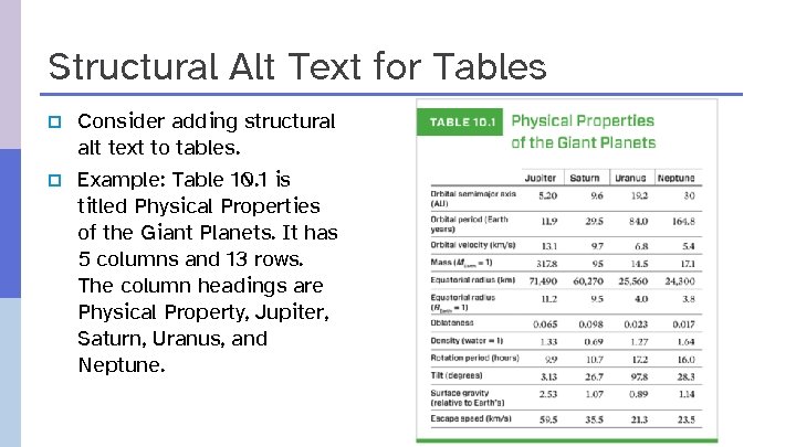
Structural Alt Text for Tables p p Consider adding structural alt text to tables. Example: Table 10. 1 is titled Physical Properties of the Giant Planets. It has 5 columns and 13 rows. The column headings are Physical Property, Jupiter, Saturn, Uranus, and Neptune.
Describing Infographics The description of an infographic needs to reference the following elements: p The title of the infographic. p The structure of the infographic: o Number of Sections. o The images and diagrams incorporated into the design. p The information provided in each section. Repeat the text contained within the image. p Only describe relevant images that improve understanding. Decorative images can be ignored. p Number each list element within a section to help the user keep track of their position.
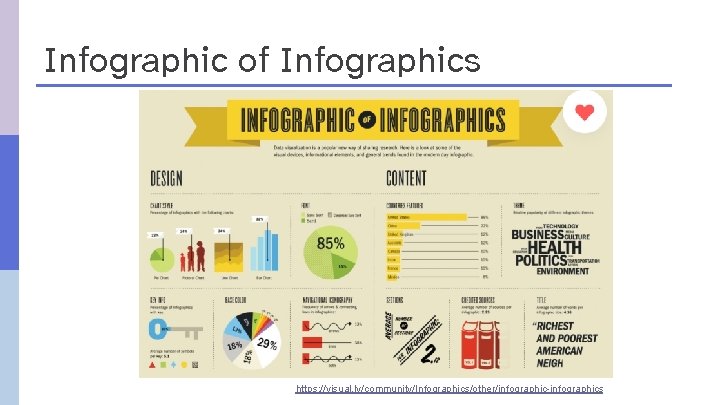
Infographic of Infographics https: //visual. ly/community/Infographics/other/infographic-infographics
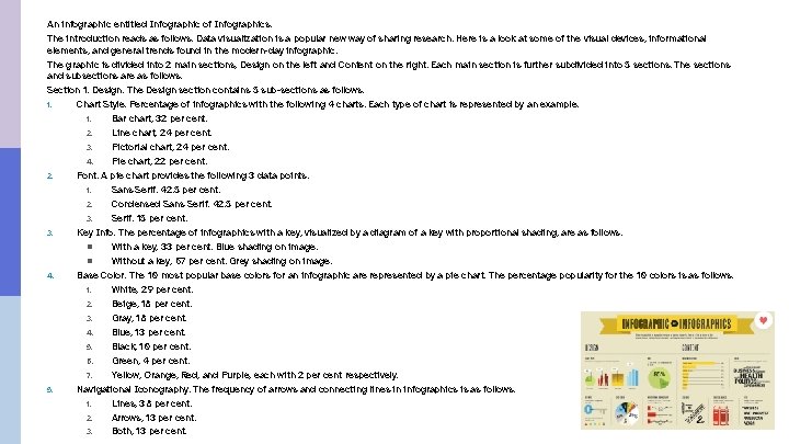
An infographic entitled Infographic of Infographics. The introduction reads as follows. Data visualization is a popular new way of sharing research. Here is a look at some of the visual devices, informational elements, and general trends found in the modern-day infographic. The graphic is divided into 2 main sections, Design on the left and Content on the right. Each main section is further subdivided into 5 sections. The sections and subsections are as follows. Section 1. Design. The Design section contains 5 sub-sections as follows. 1. Chart Style. Percentage of infographics with the following 4 charts. Each type of chart is represented by an example. 1. Bar chart, 32 per cent. 2. Line chart, 24 per cent. 3. Pictorial chart, 24 per cent. 4. Pie chart, 22 per cent. 2. Font. A pie chart provides the following 3 data points. 1. Sans Serif. 42. 5 per cent. 2. Condensed Sans Serif. 42. 5 per cent. 3. Serif. 15 per cent. 3. Key Info. The percentage of infographics with a key, visualized by a diagram of a key with proportional shading, are as follows. n With a key, 33 per cent. Blue shading on image. n Without a key, 67 per cent. Grey shading on image. 4. Base Color. The 10 most popular base colors for an infographic are represented by a pie chart. The percentage popularity for the 10 colors is as follows. 1. White, 29 per cent. 2. Beige, 18 per cent. 3. Gray, 18 per cent. 4. Blue, 13 per cent. 5. Black, 10 per cent. 6. Green, 4 per cent. 7. Yellow, Orange, Red, and Purple, each with 2 per cent respectively. 5. Navigational Iconography. The frequency of arrows and connecting lines in infographics is as follows. 1. Lines, 38 per cent. 2. Arrows, 13 per cent. 3. Both, 13 per cent.
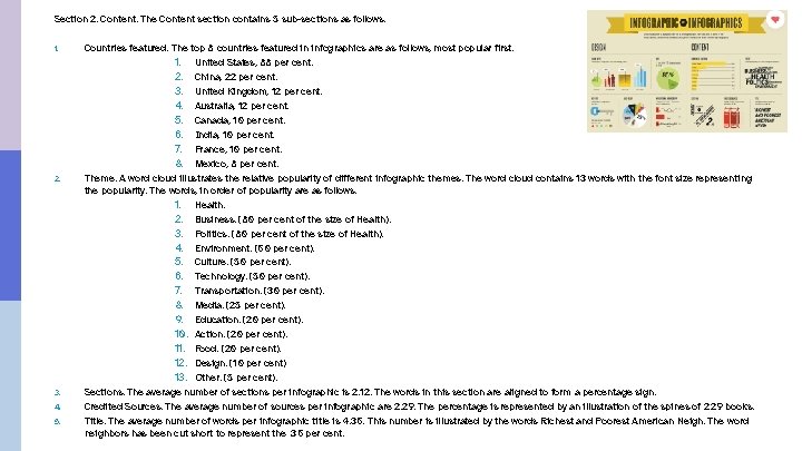
Section 2. Content. The Content section contains 5 sub-sections as follows. 1. 2. 3. 4. 5. Countries featured. The top 8 countries featured in infographics are as follows, most popular first. 1. United States, 88 per cent. 2. China, 22 per cent. 3. United Kingdom, 12 per cent. 4. Australia, 12 per cent. 5. Canada, 10 per cent. 6. India, 10 per cent. 7. France, 10 per cent. 8. Mexico, 8 per cent. Theme. A word cloud illustrates the relative popularity of different infographic themes. The word cloud contains 13 words with the font size representing the popularity. The words, in order of popularity are as follows. 1. Health. 2. Business. (80 per cent of the size of Health). 3. Politics. (80 per cent of the size of Health). 4. Environment. (60 per cent). 5. Culture. (50 per cent). 6. Technology. (50 per cent). 7. Transportation. (30 per cent). 8. Media. (25 per cent). 9. Education. (20 per cent). 10. Action. (20 per cent). 11. Food. (20 per cent). 12. Design. (10 per cent) 13. Other. (5 per cent). Sections. The average number of sections per infographic is 2. 12. The words in this section are aligned to form a percentage sign. Credited Sources. The average number of sources per infographic are 2. 29. The percentage is represented by an illustration of the spines of 2. 29 books. Title. The average number of words per infographic title is 4. 36. This number is illustrated by the words Richest and Poorest American Neigh. The word neighbors has been cut short to represent the. 36 per cent.
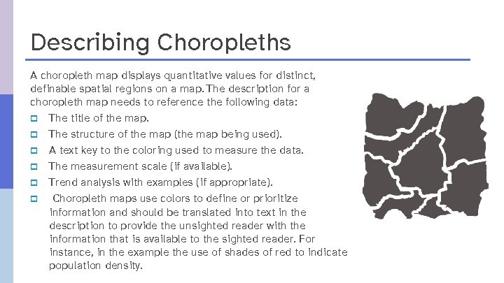
Describing Choropleths A choropleth map displays quantitative values for distinct, definable spatial regions on a map. The description for a choropleth map needs to reference the following data: p The title of the map. p The structure of the map (the map being used). p A text key to the coloring used to measure the data. p The measurement scale (if available). p Trend analysis with examples (if appropriate). p Choropleth maps use colors to define or prioritize information and should be translated into text in the description to provide the unsighted reader with the information that is available to the sighted reader. For instance, in the example the use of shades of red to indicate population density.
State of a Nation

Description Biden Won.
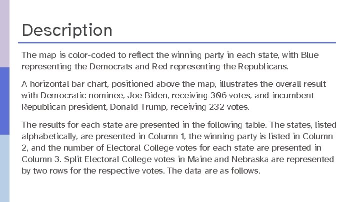
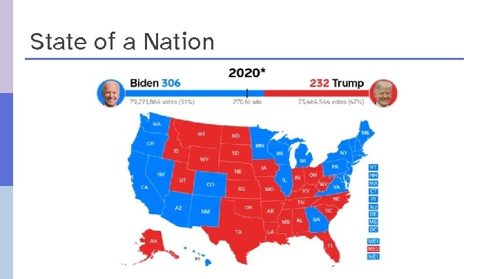
Description The map is color-coded to reflect the winning party in each state, with Blue representing the Democrats and Red representing the Republicans. A horizontal bar chart, positioned above the map, illustrates the overall result with Democratic nominee, Joe Biden, receiving 306 votes, and incumbent Republican president, Donald Trump, receiving 232 votes. The results for each state are presented in the following table. The states, listed alphabetically, are presented in Column 1, the winning party is listed in Column 2, and the number of Electoral College votes for each state are presented in Column 3. Split Electoral College votes in Maine and Nebraska are represented by two rows for the respective votes. The data are as follows.
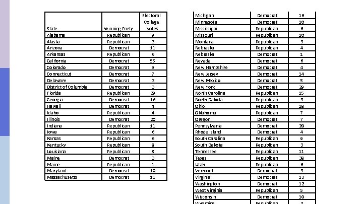
State Alabama Alaska Arizona Arkansas California Colorado Connecticut Delaware District of Columbia Florida Georgia Hawaii Idaho Illinois Indiana Iowa Kansas Kentucky Louisiana Maine Maryland Massachusetts Winning Party Republican Democrat Democrat Republican Democrat Republican Republican Democrat Electoral College Votes 9 3 11 6 55 9 7 3 3 29 16 4 4 20 11 6 6 8 8 3 1 10 11 Michigan Minnesota Mississippi Missouri Montana Nebraska Nevada New Hampshire New Jersey New Mexico New York North Carolina North Dakota Ohio Oklahoma Oregon Pennsylvania Rhode Island South Carolina South Dakota Tennessee Texas Utah Vermont Virginia Washington West Virginia Wisconsin Democrat Republican Democrat Democrat Republican Republican Democrat Democrat Republican Democrat 16 10 3 4 1 6 4 14 5 29 15 3 18 7 7 20 4 9 3 11 38 6 3 13 12 5 10
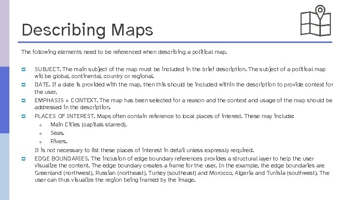
Describing Maps The following elements need to be referenced when describing a political map. p p p SUBJECT. The main subject of the map must be included in the brief description. The subject of a political map will be global, continental, country or regional. DATE. If a date is provided with the map, then this should be included within the description to provide context for the user. EMPHASIS + CONTEXT. The map has been selected for a reason and the context and usage of the map should be addressed in the description. PLACES OF INTEREST. Maps often contain reference to local places of interest. These may include: o Main Cities (capitals starred). o Seas. o Rivers. It is not necessary to list these places of interest in detail unless expressly required. EDGE BOUNDARIES. The inclusion of edge boundary references provides a structural layer to help the user visualize the content. The edge boundary creates a frame for the user. In the example, the edge boundaries are Greenland (northwest), Russian (northeast), Turkey (southeast) and Morocco, Algeria and Tunisia (southwest). The user can thus visualize the region being framed by the image.
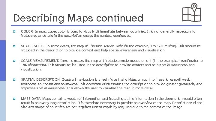
Describing Maps continued p COLOR. In most cases color is used to visually differentiate between countries. It is not generally necessary to include color details in the description unless the context requires so. p SCALE RATIO. In some cases, the map will include a scale ratio (in the example, 1 to 19. 3 million). This should be included in the description to provide context and help spatial awareness and visualization. p SCALE MEASUREMENT. In some cases, the map will include a scale measurement (in the example, 1 centimeter to 100 kilometers). This should be included in the description to provide context and help spatial awareness and visualization. p SPATIAL DESCRIPTION. Quadrant navigation is a technique that divides a map into 4 sections: northwest, northeast, southeast and southwest. This deconstruction enables the description to provide greater granularity and improves spatial awareness. This allows the user to visualize the map in more detail. p MASS DATA. Maps contain a wealth of information and including all the information in the description would often result in an overly long description. It is therefore necessary to provide an overview of the map. Descriptions of the size and shape of countries are not required unless explicitly required due to the context of the image
Geographically Speaking
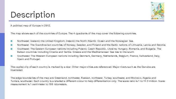
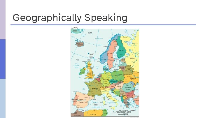
Description A political map of Europe in 2012. The map shows each of the countries of Europe. The 4 quadrants of the map cover the following countries. p p Northwest: Iceland, the United Kingdom, Ireland, the North Atlantic Ocean and the Norwegian Sea. Northeast: The Scandinavian countries of Norway, Sweden, and Finland the Baltic nations of Lithuania, Latvia and Estonia. Southeast: The Eastern European nations including Poland, Czech Republic, Ukraine, Hungary, Romania, and Bulgaria. The Balkan countries including Croatia and Serbia. Greece and the Mediterranean Sea lies to the south. Southwest: The Western European nations including Denmark, Germany, Netherlands, Belgium, France, Switzerland, Italy, Spain and Portugal. The capital city of each country is marked by a star. Other major cities are referenced. Major rivers such as the Danube are illustrated. The edge boundaries of the map are Greenland, northwest, Russian, northeast, Turkey, southeast, and Morocco, Algeria and Tunisia, southwest. Each country is a shaded a different colour to help differentiation only. The scale ratio is 1 to 19. 3 million. Scale measurement is 1 centimeter to 100 kilometers.

Sector Description: Creating Structure

Sector Description Options
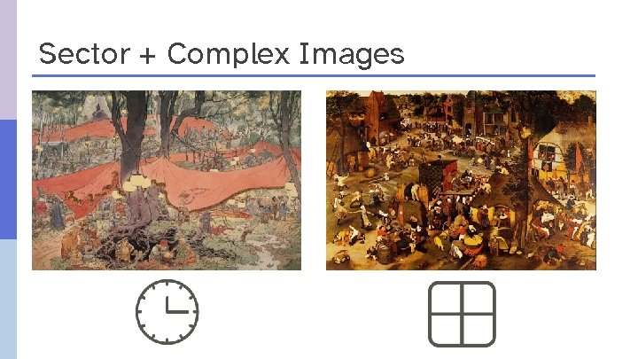
Sector + Complex Images
A UK Divided
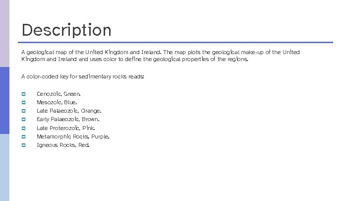
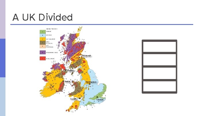
Description A geological map of the United Kingdom and Ireland. The map plots the geological make-up of the United Kingdom and Ireland uses color to define the geological properties of the regions. A color-coded key for sedimentary rocks reads: p p p p Cenozoic, Green. Mesozoic, Blue. Late Palaeozoic, Orange. Early Palaeozoic, Brown. Late Proterozoic, Pink. Metamorphic Rocks, Purple. Igneous Rocks, Red.
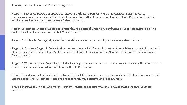
The map can be divided into 6 distinct regions. Region 1: Scotland. Geological properties: above the Highland Boundary Fault the geology is dominated by metamorphic and igneous rock. The Central Lowlands is a rift valley comprised mainly of late Palaeozoic rock. The southern reaches are composed of early Palaeozoic rock. Region 2: Northern England. Geological properties: the north of England is dominated by Late Palaeozoic rock. The east coast of Yorkshire is comprised of Mesozoic rock. Region 3: Midlands. Geological properties: the Midlands are composed of predominantly Mesozoic rock. Region 4: Southern England. Geological properties: the south of England is predominantly Mesozoic rock. A swathe of Cenozoic rock sweeps from East Anglia across the Greater London area. The New Forest and south coast are also Cenozoic rock. Region 5: Wales and South-West England. Geological properties: northern Wales is composed of early Palaeozoic rock. Southern Wales and Cornwall are predominantly late Palaeozoic. Region 6: Northern Ireland the Republic of Ireland. Geological properties: the majority of Ireland is constituted of late Palaeozoic rock. Northern Ireland is predominantly metamorphic and igneous rock. The rock formations in Scotland match Northern Ireland. The rock formations in Wales match those in southern Ireland.

Recap
Recap: Structure Organize as Lists Present as Tables Sub-divide as Sections Pathway: Overview to Detail
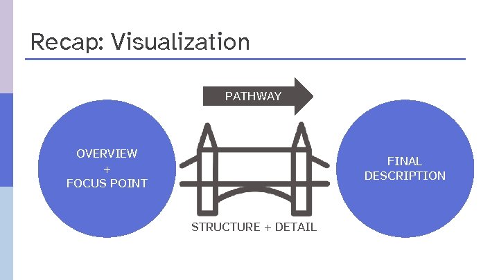
Recap: Visualization PATHWAY OVERVIEW + FOCUS POINT FINAL DESCRIPTION STRUCTURE + DETAIL
Quality Control Step into the user’s shoes Try to recreate the image from the description
Unravel Complexity Create a level playing field for all users.

Contact information Valerie Morrison from CIDI: valerie. morrison@design. gatech. edu p Huw Alexander from text. BOX: huw@textboxdigital. com p
Feedback: Poll now active What types of images would you like to be covered in a future webinar? p p p Artwork Graphic novels and cartoons Anatomy and physiology Tests, describing scenarios without giving the answer Other (respond in Q&A)

Discussion and Q&A

Wrap up Webinar video, slide deck and links to resources will be posted at: daisy. org/webinars Next week: “Do More With Word. To. EPUB”

daisy. org inclusivepublishing. org
- Slides: 44