Data Visualization with TDA Mapper Data Overlapping bins

Data Visualization with TDA Mapper Data Overlapping bins Graph http: //www. nature. com/srep/2013/130207/srep 01236/full/srep 01236. html

https: //commons. wikimedia. org/wiki/File%3 AData_visualization_process_v 1. pn

Data Visualization with TDA Mapper Data Overlapping bins Graph http: //www. nature. com/srep/2013/130207/srep 01236/full/srep 01236. html

Data Visualization with TDA Mapper Course outline: Most Tuesdays: Lecture in 105 MLH Most Thursdays: Lab in B 5 MLH (basement computer lab) • Bring a laptop on Thursdays and/or use the computers in B 5. • No computer background required. Mr. Bungula and I will be available to assist you. • A few advanced labs will be available for those interested. First 8 weeks: Basic introduction to data analysis focused on understanding the TDA Mapper algorithm: Last 8 weeks: We will compare data visualization with TDA mapper to other data visualization techniques. See course website for more info: http: //homepage. divms. uiowa. edu/~idarcy/COURSES/TDA/SPRING 18/3900. html

Some journals require an author’s contributions section. For example: each student will be graded individually Authors' contributions CM and JN contributed to the mathematical analysis for applying the coloring invariant. JN also drafted significant portions of the sections The coloring invariants, Tangle generation, Checking the coloring invariants. AP, JS, and TT developed the software implementing the coloring invariant calculations. RM contributed to the Non-drawable section and is responsible for the subroutine which determines if a matrix corresponds to a drawable tangle. He was assisted by ND and JS. JC, ND, SM, and JS developed equivalence moves which were implemented by ND, RM, and JS. ID conceived of and oversaw this project, drafted much of the manuscript, and contributed to the mathematical and software development. All authors read and approved the final manuscript. https: //link. springer. com/article/10. 1186/1471 -2105 -7 -435

Consider publishing your work in either a research journal or a journal aimed at students. • This is NOT required. • You will be assigned a writing fellow to help improve your writing.

https: //dl-acm-org. proxy. lib. uiowa. edu/citation. cfm? id=2634549. 2627814&coll=portal&dl=ACM

Mapper http: //cs 233. stanford. edu/Referenced. Papers/mapper. PBG. pdf

https: //en. wikipedia. org/wiki/Reeb_graph

Can you create a similar graph if you have data points that lie on a torus? How? ? ?

http: //www. ayasdi. com/
 covering persistent homology including barcodes")
We are not (currently) covering persistent homology including barcodes

http: //www. nature. com/srep/2013/130207/srep 01236/full/srep 01236. html
 Data Set Example: Point cloud data representing a hand. B) Function f :")
A) Data Set Example: Point cloud data representing a hand. B) Function f : Data Set R Example: x-coordinate f : (x, y, z) x C) Put data into overlapping bins. Example: f-1(ai, bi) D) Cluster each bin & create network. Vertex = a cluster of a bin. Edge = nonempty intersection between clusters http: //www. nature. com/srep/2013/130207/srep 01236/full/srep 01236. html
 Data Set Example: Point cloud data representing a hand. http: //www. nature. com/srep/2013/130207/srep")
A) Data Set Example: Point cloud data representing a hand. http: //www. nature. com/srep/2013/130207/srep 01236/full/srep 01236. html
")
Function f : Data Set R Ex 1: x-coordinate f : (x, y, z) x http: //www. nature. com/srep/2013/130207/srep 01236/full/srep 01236. html
")
Function f : Data Set R Ex 1: x-coordinate f : (x, y, z) x http: //www. nature. com/srep/2013/130207/srep 01236/full/srep 01236. html
 ( () () () ) Function")
Put data into overlapping bins. Example: f-1(ai, bi) ( () () () ) Function f : Data Set R Ex 1: x-coordinate f : (x, y, z) x http: //www. nature. com/srep/2013/130207/srep 01236/full/srep 01236. html
 ( () () () ) Function")
Put data into overlapping bins. Example: f-1(ai, bi) ( () () () ) Function f : Data Set R Ex 1: x-coordinate f : (x, y, z) x http: //www. nature. com/srep/2013/130207/srep 01236/full/srep 01236. html
 Cluster each bin http: //www. nature. com/srep/2013/130207/srep 01236/full/srep 01236. html")
D) Cluster each bin http: //www. nature. com/srep/2013/130207/srep 01236/full/srep 01236. html
 Cluster each bin Vertex = a cluster of a bin. http: //www. nature.")
D) Cluster each bin Vertex = a cluster of a bin. http: //www. nature. com/srep/2013/130207/srep 01236/full/srep 01236. html
 Cluster each bin & create network. Vertex = a cluster of a bin.")
D) Cluster each bin & create network. Vertex = a cluster of a bin. Edge = nonempty intersection between clusters http: //www. nature. com/srep/2013/130207/srep 01236/full/srep 01236. html
 Cluster each bin & create network. Vertex = a cluster of a bin.")
D) Cluster each bin & create network. Vertex = a cluster of a bin. Edge = nonempty intersection between clusters http: //www. nature. com/srep/2013/130207/srep 01236/full/srep 01236. html
 Data Set Example: Point cloud data representing a hand. B) Function f :")
A) Data Set Example: Point cloud data representing a hand. B) Function f : Data Set R Example: x-coordinate f : (x, y, z) x C) Put data into overlapping bins. Example: f-1(ai, bi) D) Cluster each bin & create network. Vertex = a cluster of a bin. Edge = nonempty intersection between clusters http: //www. nature. com/srep/2013/130207/srep 01236/full/srep 01236. html

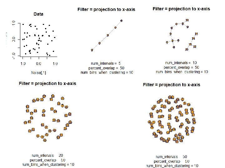
In the next few examples, please note 1. The different types of data to which we can apply TDA mapper. 2. Several choices need to be made when applying TDA mapper. For example: • How is the data modeled including how is the distance between data points calculated? • How are the data put into overlapping bins? Data Overlapping bins Graph http: //www. nature. com/srep/2013/130207/srep 01236/full/srep 01236. html

https: //dl-acm-org/citation. cfm? id=2634549. 2627814&coll=portal&dl=ACM XRDS • SUMMER 2014 • VOL. 20 • NO. 4

https: //dl-acm-org. proxy. lib. uiowa. edu/citation. cfm? id=2634549. 2627814&coll=portal&dl=ACM

1, 797 data points data point: 8 x 8 matrix 5 intervals with 50 percent overlap. Distance metric: Euclidean Filter function: principal SVD values Node colors: filter values, red = high and blue = low Nodes labels: most frequently occurring digit in the associated clusters 15 intervals with 50 percent overlap.

We currently maintain 412 data sets as a service to the machine learning community. http: //archive. ics. uci. edu/ml/index. php

http: //archive. ics. uci. edu/ml/datasets. html

http: //archive. ics. uci. edu/ml/datasets/Optical+Recognition+of+Handwritten+Digits http: //archive. ics. uci. edu/ml/machine-learning-databases/optdigits/optdigits. names http: //archive. ics. uci. edu/ml/machine-learning-databases/optdigits. tes 5. Number of Instances optdigits. tra optdigits. tes Training 3823 Testing 1797

Source: E. Alpaydin, C. Kaynak, Department of Computer Engineering, Bogazici University, 80815 Istanbul Turkey, alpaydin '@' boun. edu. tr Data Set Information: We used preprocessing programs made available by NIST to extract normalized bitmaps of handwritten digits from a preprinted form. From a total of 43 people, 30 contributed to the training set and different 13 to the test set. 32 x 32 bitmaps are divided into nonoverlapping blocks of 4 x 4 and the number of on pixels are counted in each block. This generates an input matrix of 8 x 8 where each element is an integer in the range 0. . 16. This reduces dimensionality and gives invariance to small distortions. For info on NIST preprocessing routines, see M. D. Garris, J. L. Blue, G. T. Candela, D. L. Dimmick, J. Geist, P. J. Grother, S. A. Janet, and C. L. Wilson, NIST Form-Based Handprint Recognition System, NISTIR 5469, 1994. Attribute Information: All input attributes are integers in the range 0. . 16. The last attribute is the class code 0. . 9

http: //scientificpapers. org/wp- content/files/1345_Proposing_a_New_Framework_ for_Biometric_Optical_Recognition_for_Handwritten_Digits_Data_Set. pdf

http: //scientificpapers. org/wp- content/files/1345_Proposing_a_New_Framework_ for_Biometric_Optical_Recognition_for_Handwritten_Digits_Data_Set. pdf

(0, 1, 6, 15, 12, 1, 0, 0, … http: //scientificpapers. org/wp- content/files/1345_Proposing_a_New_Framework_ for_Biometric_Optical_Recognition_for_Handwritten_Digits_Data_Set. pdf

http: //archive. ics. uci. edu/ml/datasets/Optical+Recognition+of+Handwritten+Digits http: //archive. ics. uci. edu/ml/machine-learning-databases/optdigits/optdigits. names http: //archive. ics. uci. edu/ml/machine-learning-databases/optdigits. tes 5. Number of Instances optdigits. tra optdigits. tes Training 3823 Testing 1797

1, 797 data points 5 intervals with 50 percent overlap. data point: 8 x 8 matrix Distance metric: Euclidean Filter function: principal SVD values Node colors: filter values, red = high and blue = low Nodes labels: most frequently occurring digit in the associated clusters 15 intervals with 50 percent overlap.
: 1. ) Learn basics")
Goals for Thursday’s lab (meet in basement B 5 MLH): 1. ) Learn basics of R/Rstudio. lap 1. pptx: Instructions on installing and working with R/Rstudio. Matrices_and_Data_Frames. R: commands from the Swirl course by this name. upload. Datato. Retc. R: commands for reading data into R. also includes commands taken from the Swirl course Manipulating data with dplyr - Getting and Cleaning Data. create. Artifical. Data. Sets. r: various ways to create artificial data. 2. ) Play with the TDA mapper R package (focus on artificial data). TDAmapper. r: Modify this script by changing parameters and applying TDA mapper to a variety of data sets Create slides for some of these data sets. Follow the format in sample slide, sample. pptx 3. ) Start draft of a poster on TDA mapper (Template Examples. pptx).

To understand software, it helps to apply it to a variety of examples. HW: If data points lived on the above objects, what graph do you get when you apply mapper to these date sets if filter = projection to x-axis?

https: //cran. r-project. org/web/packages/TDAmapper/ http: //danifold. net/mapper/

3 minute break to meet classmates, discuss projects, questions, etc. https: //online. stopwatchpro. com/3 -minute-timer/

http: //www. nature. com/srep/2013/130207/srep 01236/full/srep 01236. html
: Basketball Data: rates (per minute played) of rebounds, assists, turnovers,")
Application 3 (in paper): Basketball Data: rates (per minute played) of rebounds, assists, turnovers, steals, blocked shots, personal fouls, and points scored for 452 players. Input: 452 points in R 7 For each player, we have a vector ( ) rebounds assists turnovers steals blocked shots personal fouls points scored min , min , min = (r, a, t, s, b, f, p) in R 7 Distance: variance normalized Euclidean distance. Clustering: Single linkage. http: //www. nature. com/srep/2013/130207/srep 01236/full/srep 01236. html

Filters: principle and secondary SVD values. http: //commons. wikimedia. org/wiki/File: SVD_Graphic_Example. png Data http: //www. nature. com/srep/2013/130207/srep 01236/full/srep 01236. html
 Low resolution map at 20 intervals for each filter B) High resolution map")
A) Low resolution map at 20 intervals for each filter B) High resolution map at 30 intervals for each filter. The overlap is such at that each interval overlaps with half of the adjacent intervals, the graphs are colored by points per game, and a variance normalized Euclidean distance metric is applied. Metric: Variance Normalized Euclidean; Lens: Principal SVD Value (Resolution 20, Gain 2. 0 x, Equalized) and Secondary SVD Value (Resolution 20, Gain 2. 0 x, Equalized). Color: red: high values, blue: low values. http: //www. nature. com/srep/2013/130207/srep 01236/full/srep 01236. html
 Low resolution map at 20")
Le. Bron James , Kobe Bryant, Brook Lopez A) Low resolution map at 20 intervals for each filter B) High resolution map at 30 intervals for each filter. The overlap is such at that each interval overlaps with half of the adjacent intervals, the graphs are colored by points per game, and a variance normalized Euclidean distance metric is applied. Metric: Variance Normalized Euclidean; Lens: Principal SVD Value (Resolution 20, Gain 2. 0 x, Equalized) and Secondary SVD Value (Resolution 20, Gain 2. 0 x, Equalized). Color: red: high values, blue: low values. http: //www. nature. com/srep/2013/130207/srep 01236/full/srep 01236. html

Application 2: US House of Representatives Voting records Data: (aye, abstain, nay, …. = ( +1 , 0 , -1 , … ) ) Distance: Pearson correlation Filters: principal and secondary metric SVD Clustering: Single linkage. http: //www. nature. com/srep/2013/130207/srep 01236/full/srep 01236. html

number of sub-networks formed each year per political party. X-axis: 1990– 2011. Y-axis: Fragmentation index. Color bars denote, from top to bottom, party of the President, party for the House, party for the Senate (red: republican; blue: democrat; purple: split). The bottom 3 panels are the actual topological networks for the members. Networks are constructed from voting behavior of the member of the house, with an “aye” vote coded as a 1, “abstain” as zero, and “nay” as a -1. Each node contains sets of members. Each panel labeled with the year contains networks constructed from all the members for all the votes of that year. Note high fragmentation in 2010 in both middle panel and in the Fragmentation Index plot (black bar). The distance metric and filters used in the analysis were Pearson correlation and principal and secondary metric SVD. Metric: Correlation; Lens: Principal SVD Value (Resolution 120, Gain 4. 5 x, Equalized) and Secondary SVD Value (Resolution 120, Gain 4. 5 x, Equalized). Color: Red: Republican; Blue: Democrats. http: //www. nature. com/srep/2013/130207/srep 01236/full/srep 01236. html

Application 1: breast cancer gene expression Data: microarray gene expression data from 2 data sets, NKI and GSE 2034 Distance: correlation distance Filters: (1) L-infinity centrality: f(x) = max{d(x, p) : p in data set} captures the structure of the points far removed from the center or norm. (2) NKI: survival vs. death GSE 2034: no relapse vs. relapse Clustering: Single linkage.

www. nature. com/scitable/topicpage/microarray-based-comparative-genomic-hybridization-acgh-45432

Gene expression profiling predicts clinical outcome of breast cancer van 't Veer LJ, Dai H, van de Vijver MJ, He YD, Hart AA, Mao M, Peterse HL, van der Kooy K, Marton MJ, Witteveen AT, Schreiber GJ, Kerkhoven RM, Roberts C, Linsley PS, Bernards R, Friend SH Nature. 2002 Jan 31; 415(6871): 530 -6.
 NKI (2002): gene expression levels of 24,")
2 breast cancer data sets: 1. ) NKI (2002): gene expression levels of 24, 000 from 272 tumors. Includes node-negative and node-positive patients, who had or had not received adjuvant systemic therapy. Also includes survival information. 2. ) GSE 203414 (2005) expression of 22, 000 transcripts from total RNA of frozen tumour samples from 286 lymph-nodenegative patients who had not received adjuvant systemic treatment. Also includes time to relapse information.

http: //bioinformatics. nki. nl/data. php

Fig. S 1. Shape of the data becomes more distinct as the analysis columns are restricted to the top varying genes. 24 K: all the genes on the microarray were used in the analysis; 11 K: 10, 731 top most varying genes were used in the analysis; 7 K: 6. 688 top most varying genes were used in the analysis; 3 K: 3212 top most varying genes were used in the analysis; 1. 5 K: 1553 top most varying genes were used in the analysis. Graphs colored by the L-infinity centrality values. Red: high; Blue: low http: //www. nature. com/srep/2013/130207/srep 01236/full/srep 01236. html

Two filter functions, L-Infinity centrality and survival or relapse were used to generate the networks. The top half of panels A and B are the networks of patients who didn't survive, the bottom half are the patients who survived. Panels C and D are similar to panels A and B except that one of the filters is relapse instead of survival. Panels A and C are colored by the average expression of the ESR 1 gene. Panels B and D are colored by the average expression of the genes in the KEGG chemokine pathway. Metric: Correlation; Lens: L-Infinity Centrality (Resolution 70, Gain 3. 0 x, Equalized) and Event Death (Resolution 30, Gain 3. 0 x). Color bar: red: high values, blue: low values. http: //www. nature. com/srep/2013/130207/srep 01236/full/srep 01236. html

Comparison of our results with those of Van de Vijver and colleagues is difficult because of differences in patients, techniques, and materials used. Their study included node-negative and node-positive patients, who had or had not received adjuvant systemic therapy, and only women younger than 53 years. microarray platforms used in the studies differ—Affymetrix and Agilent. Of the 70 genes in the study by van't Veer and co-workers, 48 are present on the Affymetrix U 133 a array, whereas only 38 of our 76 genes are present on the Agilent array. There is a three-gene overlap between the two signatures (cyclin E 2, origin recognition complex, and TNF superfamily protein). Despite the apparent difference, both signatures included genes that identified several common pathways that might be involved in tumour recurrence. This finding supports the idea that although there might be redundancy in gene members, effective signatures could be required to include representation of specific pathways. From: Gene-expression profiles to predict distant metastasis of lymph-node-negative primary breast cancer, Yixin Wang et al, The Lancet, Volume 365, Issue 9460, 19– 25 February 2005, Pages 671– 679

From: http: //www. nature. com/srep/2013/130207/srep 01236/full/srep 01236. html The numbers in the first row are the average levels of expressions of genes belonging to the chemokine pathway within the relevant groups. The second row gives these same levels reported as percentiles belonging to the collection of the chemokine expression levels across all the patients in the study to which the group belongs. Note that the low. ERHS groups display very high chemokine expression levels, 92 nd percentile in the case of NKI and 84 th percentile in the case of GSE 2304. The low. ERNS groups are also consistently higher than the general population in the study, although to different degrees in the studies. The difference can perhaps be accounted for by the difference between the survival vs. non-relapse criteria in the two data sets.

Two filter functions, L-Infinity centrality and survival or relapse were used to generate the networks. The top half of panels A and B are the networks of patients who didn't survive, the bottom half are the patients who survived. Panels C and D are similar to panels A and B except that one of the filters is relapse instead of survival. Panels A and C are colored by the average expression of the ESR 1 gene. Panels B and D are colored by the average expression of the genes in the KEGG chemokine pathway. Metric: Correlation; Lens: L-Infinity Centrality (Resolution 70, Gain 3. 0 x, Equalized) and Event Death (Resolution 30, Gain 3. 0 x). Color bar: red: high values, blue: low values. http: //www. nature. com/srep/2013/130207/srep 01236/full/srep 01236. html
 and the low. ERHS (bottom")
Highlighted in red are the low. ERNS (top panel) and the low. ERHS (bottom panel) patient subgroups. http: //www. nature. com/srep/2013/130207/srep 01236/full/srep 01236. html

Identifying subtypes of cancer in a consistent manner is a challenge in the field since sub-populations can be small and their relationships complex High expression level of the estrogen receptor gene (ESR 1) is positively correlated with improved prognosis, given that this set of patients is likely to respond to standard therapies. • But , there are still sub-groups of high ESR 1 that do not respond well to therapy. Low ESR 1 levels are strongly correlated with poor prognosis • But there are patients with low ESR 1 levels but high survival rates Many molecular sub-groups have been identified, • But often difficult to identify the same sub-group in a broader setting, where data sets are generated on different platforms, on different sets of patients and at a different times, because of the noise and complexity in the data. From: http: //www. nature. com/srep/2013/130207/srep 01236/full/srep 01236. html

Three key ideas of topology that make extracting of patterns via shape possible. 1. ) coordinate free. • No dependence on the coordinate system chosen. • Can compare data derived from different platforms 2. ) invariant under “small” deformations. • less sensitive to noise 3. ) compressed representations of shapes. • Input: dataset with thousands of points • Output: network with 13 vertices and 12 edges. http: //www. nature. com/srep/2013/130207/srep 01236/full/srep 01236. html

Two filter functions, L-Infinity centrality and survival or relapse were used to generate the networks. The top half of panels A and B are the networks of patients who didn't survive, the bottom half are the patients who survived. Panels C and D are similar to panels A and B except that one of the filters is relapse instead of survival. Panels A and C are colored by the average expression of the ESR 1 gene. Panels B and D are colored by the average expression of the genes in the KEGG chemokine pathway. Metric: Correlation; Lens: L-Infinity Centrality (Resolution 70, Gain 3. 0 x, Equalized) and Event Death (Resolution 30, Gain 3. 0 x). Color bar: red: high values, blue: low values. http: //www. nature. com/srep/2013/130207/srep 01236/full/srep 01236. html

http: //www. pnas. org/content/early/2011/04/07/1102826108

DSGA decomposition of the original tumor vector into the Normal component its linear models fit onto the Healthy State Model and the Disease component vector of residuals. Nicolau M et al. PNAS 2011; 108: 7265 -7270 © 2011 by National Academy of Sciences

PAD analysis of the NKI data. The output has three progression arms, PAD analysis of the NKI data. because tumors (data points) are ordered by the magnitude of deviation from normal (the HSM). Each bin is colored by the mean of the filter map on the points. Blue bins contain tumors whose total deviation from HSM is small (normal and Normal-like tumors). Red bins contain tumors whose deviation from HSM is large. The image of f was subdivided into 15 intervals with 80% overlap. All bins are seen (outliers included). Regions of sparse data show branching. Several bins are disconnected from the main graph. The ER− arm consists mostly of Basal tumors. The c-MYB+ group was chosen within the ER arm as the tightest subset, between the two sparse regions. © 2011 by National Academy of Sciences Nicolau M et al. PNAS 2011; 108: 7265 -7270
- Slides: 67