Data Visualization Session 1 Visual perception crash course
- Slides: 48

Data Visualization: Session 1 Visual perception crash course Empirically-derived dos and don’ts 21 March 2018 Laurel Brehm MPI / IMPRS 1

Overview • A brief intro to visual perception – How does it work? – And how can it go wrong? • Themes of good & bad visualizations – Priming intuitions via experience & example 2

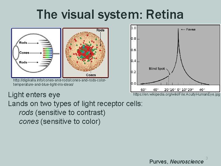
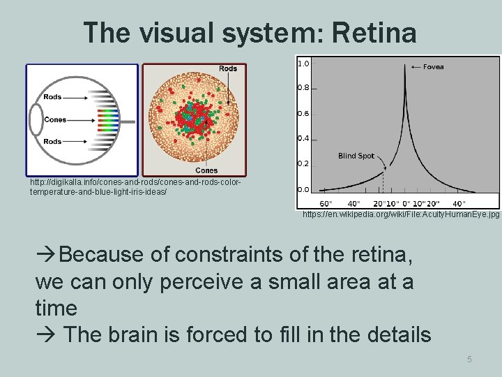
The visual system: Retina http: //digikalla. info/cones-and-rods-colortemperature-and-blue-light-iris-ideas/ https: //en. wikipedia. org/wiki/File: Acuity. Human. Eye. jpg Light enters eye Lands on two types of light receptor cells: rods (sensitive to contrast) cones (sensitive to color) Purves, Neuroscience 3

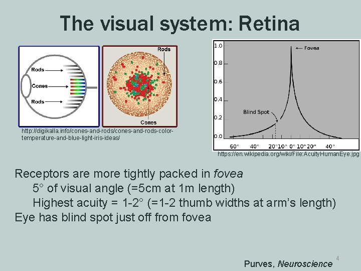
The visual system: Retina http: //digikalla. info/cones-and-rods-colortemperature-and-blue-light-iris-ideas/ https: //en. wikipedia. org/wiki/File: Acuity. Human. Eye. jpg Receptors are more tightly packed in fovea 5° of visual angle (=5 cm at 1 m length) Highest acuity = 1 -2° (=1 -2 thumb widths at arm’s length) Eye has blind spot just off from fovea Purves, Neuroscience 4

The visual system: Retina http: //digikalla. info/cones-and-rods-colortemperature-and-blue-light-iris-ideas/ https: //en. wikipedia. org/wiki/File: Acuity. Human. Eye. jpg Because of constraints of the retina, we can only perceive a small area at a time The brain is forced to fill in the details 5

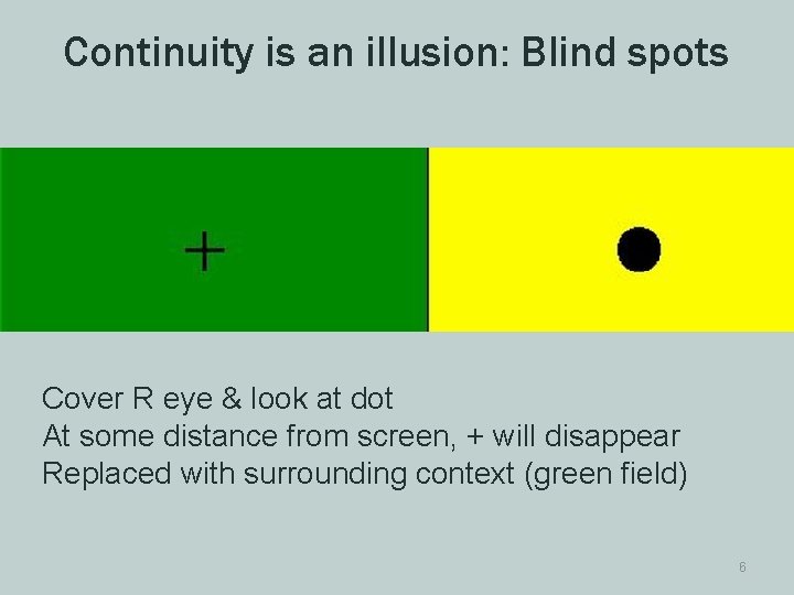
Continuity is an illusion: Blind spots Cover R eye & look at dot At some distance from screen, + will disappear Replaced with surrounding context (green field) 6

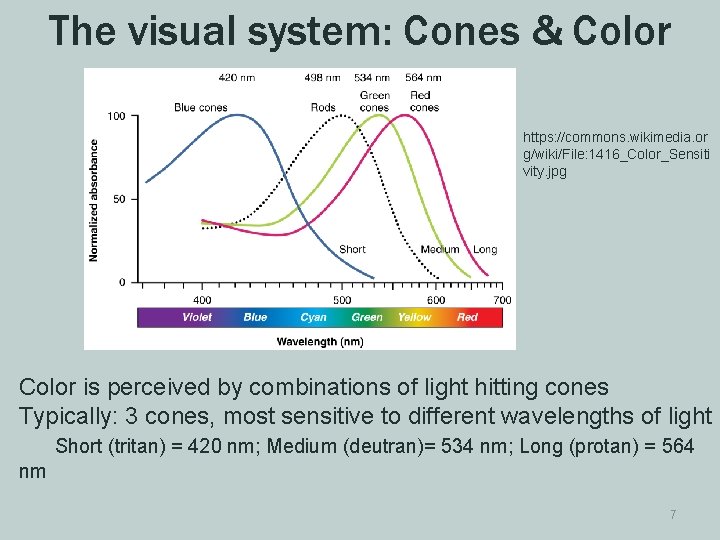
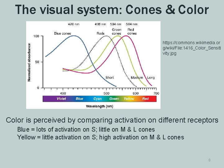
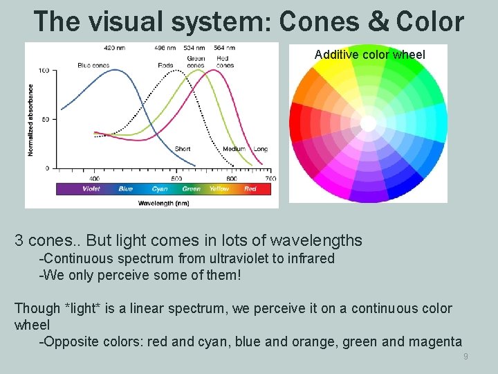
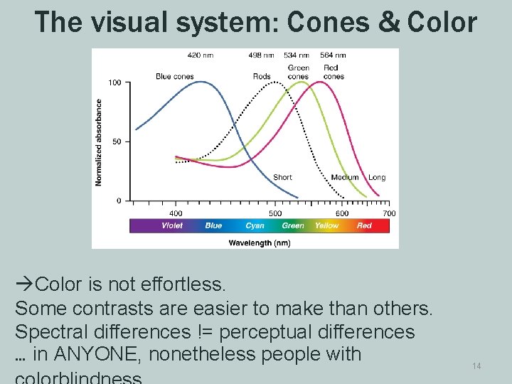
The visual system: Cones & Color https: //commons. wikimedia. or g/wiki/File: 1416_Color_Sensiti vity. jpg Color is perceived by combinations of light hitting cones Typically: 3 cones, most sensitive to different wavelengths of light Short (tritan) = 420 nm; Medium (deutran)= 534 nm; Long (protan) = 564 nm 7

The visual system: Cones & Color https: //commons. wikimedia. or g/wiki/File: 1416_Color_Sensiti vity. jpg Color is perceived by comparing activation on different receptors Blue = lots of activation on S; little on M & L cones Yellow = little activation on S; high activation on M & L cones 8

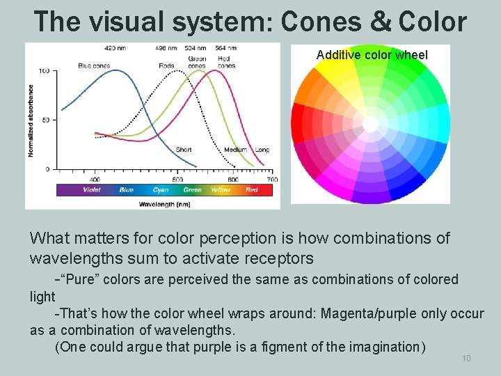
The visual system: Cones & Color Additive color wheel 3 cones. . But light comes in lots of wavelengths -Continuous spectrum from ultraviolet to infrared -We only perceive some of them! Though *light* is a linear spectrum, we perceive it on a continuous color wheel -Opposite colors: red and cyan, blue and orange, green and magenta 9

The visual system: Cones & Color Additive color wheel What matters for color perception is how combinations of wavelengths sum to activate receptors -“Pure” colors are perceived the same as combinations of colored light -That’s how the color wheel wraps around: Magenta/purple only occur as a combination of wavelengths. (One could argue that purple is a figment of the imagination) 10

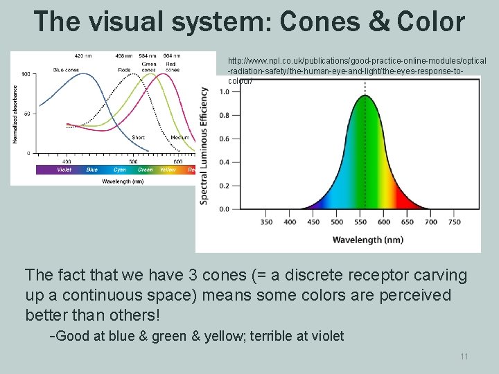
The visual system: Cones & Color http: //www. npl. co. uk/publications/good-practice-online-modules/optical -radiation-safety/the-human-eye-and-light/the-eyes-response-tocolour/ The fact that we have 3 cones (= a discrete receptor carving up a continuous space) means some colors are perceived better than others! -Good at blue & green & yellow; terrible at violet 11

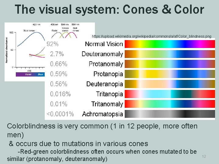
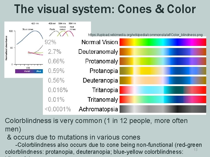
The visual system: Cones & Color https: //upload. wikimedia. org/wikipedia/commons/a/af/Color_blindness. png Colorblindness is very common (1 in 12 people, more often men) & occurs due to mutations in various cones -Red-green colorblindness often occurs when cones mutated to be similar (protanomaly, deuteranomaly) 12

The visual system: Cones & Color https: //upload. wikimedia. org/wikipedia/commons/a/af/Color_blindness. png Colorblindness is very common (1 in 12 people, more often men) & occurs due to mutations in various cones -Colorblindness also occurs due to cone being non-functional (red-green 13 colorblindness: protanopia, deuteranopia; blue-yellow colorblindness:

The visual system: Cones & Color is not effortless. Some contrasts are easier to make than others. Spectral differences != perceptual differences … in ANYONE, nonetheless people with 14

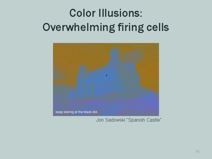
Color Illusions: Overwhelming firing cells Jon Sadowski “Spanish Castle” 15

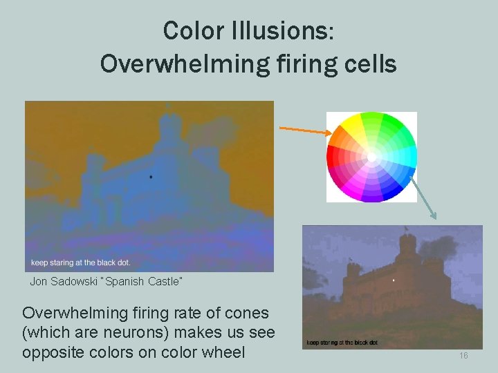
Color Illusions: Overwhelming firing cells Jon Sadowski “Spanish Castle” Overwhelming firing rate of cones (which are neurons) makes us see opposite colors on color wheel 16

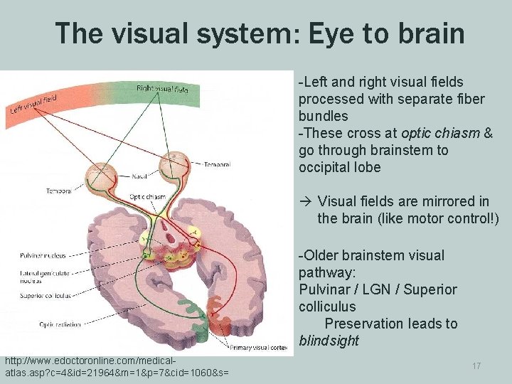
The visual system: Eye to brain -Left and right visual fields processed with separate fiber bundles -These cross at optic chiasm & go through brainstem to occipital lobe Visual fields are mirrored in the brain (like motor control!) -Older brainstem visual pathway: Pulvinar / LGN / Superior colliculus Preservation leads to blindsight http: //www. edoctoronline. com/medicalatlas. asp? c=4&id=21964&m=1&p=7&cid=1060&s= 17

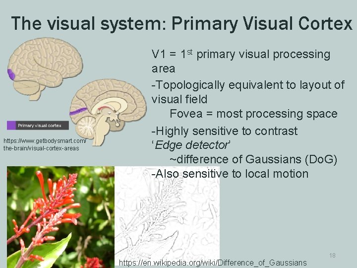
The visual system: Primary Visual Cortex https: //www. getbodysmart. com/ the-brain/visual-cortex-areas V 1 = 1 st primary visual processing area -Topologically equivalent to layout of visual field Fovea = most processing space -Highly sensitive to contrast ‘Edge detector’ ~difference of Gaussians (Do. G) -Also sensitive to local motion https: //en. wikipedia. org/wiki/Difference_of_Gaussians 18

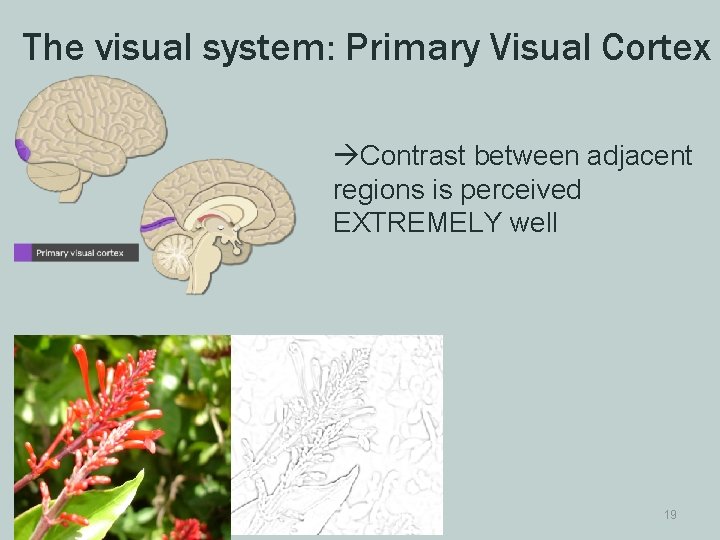
The visual system: Primary Visual Cortex Contrast between adjacent regions is perceived EXTREMELY well 19

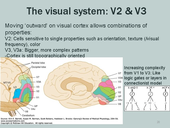
The visual system: V 2 & V 3 Moving ‘outward’ on visual cortex allows combinations of properties: V 2: Cells sensitive to single properties such as orientation, texture (/visual frequency), color V 3, V 3 a: Bigger, more complex patterns -Cortex is still topographically oriented Increasing complexity from V 1 to V 3: Like logic gates or layers in connectionist model 20

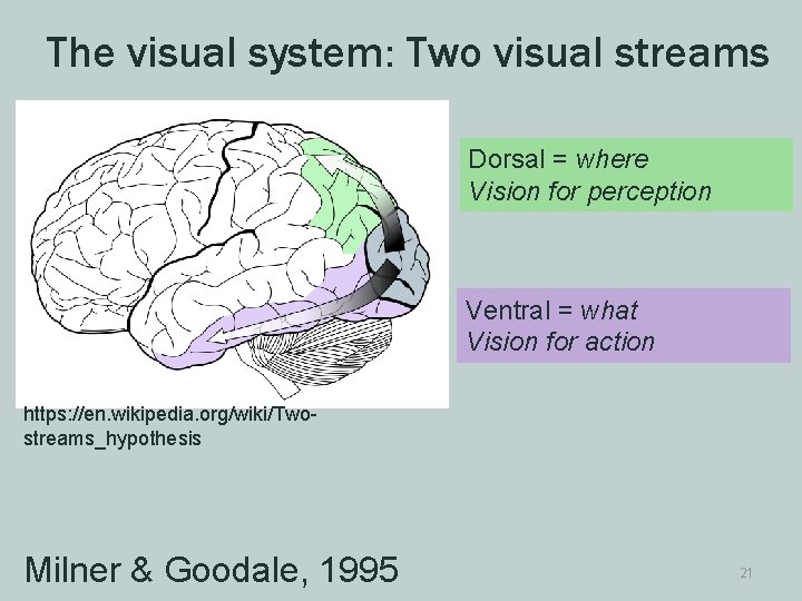
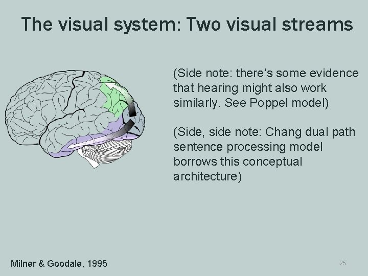
The visual system: Two visual streams Dorsal = where Vision for perception Ventral = what Vision for action https: //en. wikipedia. org/wiki/Twostreams_hypothesis Milner & Goodale, 1995 21

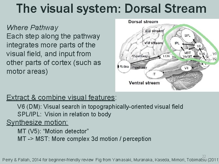
The visual system: Dorsal Stream Where Pathway Each step along the pathway integrates more parts of the visual field, and input from other parts of cortex (such as motor areas) Extract & combine visual features: V 6 (DM): Visual search in topographically-oriented visual field SPL/IPL: Vision in relation to body Synthesize motion: MT (V 5): “Motion detector” MT -> MST: More complex 3 d motion / perception 22 Perry & Fallah, 2014 for beginner-friendly review Fig from Yamasaki, Muranaka, Kaseda, Mimori, Tobimatsu (2011)

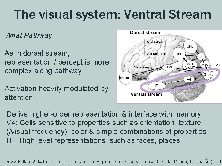
The visual system: Ventral Stream What Pathway As in dorsal stream, representation / percept is more complex along pathway Activation heavily modulated by attention Derive higher-order representation & interface with memory V 4: Cells sensitive to properties such as orientation, texture (/visual frequency), color & simple combinations of properties IT: High-level representations, such as faces, places. 23 Perry & Fallah, 2014 for beginner-friendly review Fig from Yamasaki, Muranaka, Kaseda, Mimori, Tobimatsu (2011)

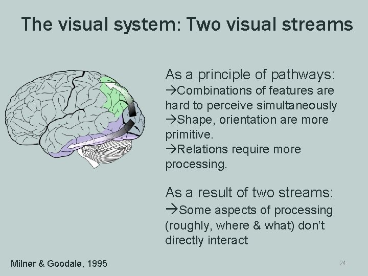
The visual system: Two visual streams As a principle of pathways: Combinations of features are hard to perceive simultaneously Shape, orientation are more primitive. Relations require more processing. As a result of two streams: Some aspects of processing (roughly, where & what) don’t directly interact Milner & Goodale, 1995 24

The visual system: Two visual streams (Side note: there’s some evidence that hearing might also work similarly. See Poppel model) (Side, side note: Chang dual path sentence processing model borrows this conceptual architecture) Milner & Goodale, 1995 25

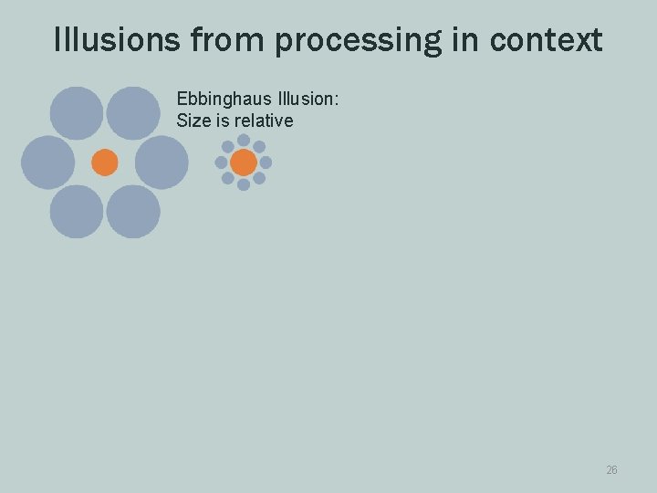
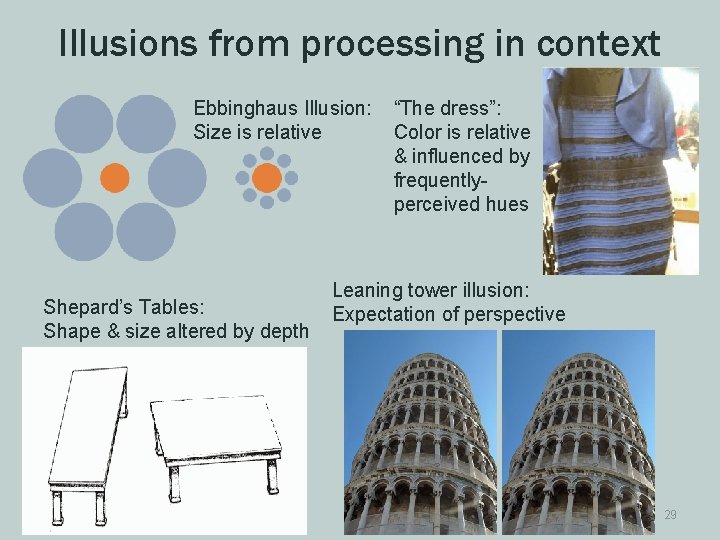
Illusions from processing in context Ebbinghaus Illusion: Size is relative 26

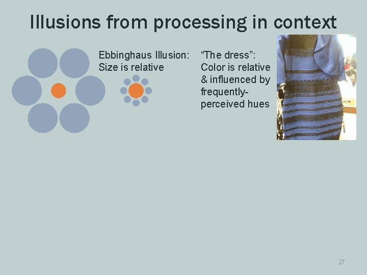
Illusions from processing in context Ebbinghaus Illusion: Size is relative “The dress”: Color is relative & influenced by frequentlyperceived hues 27

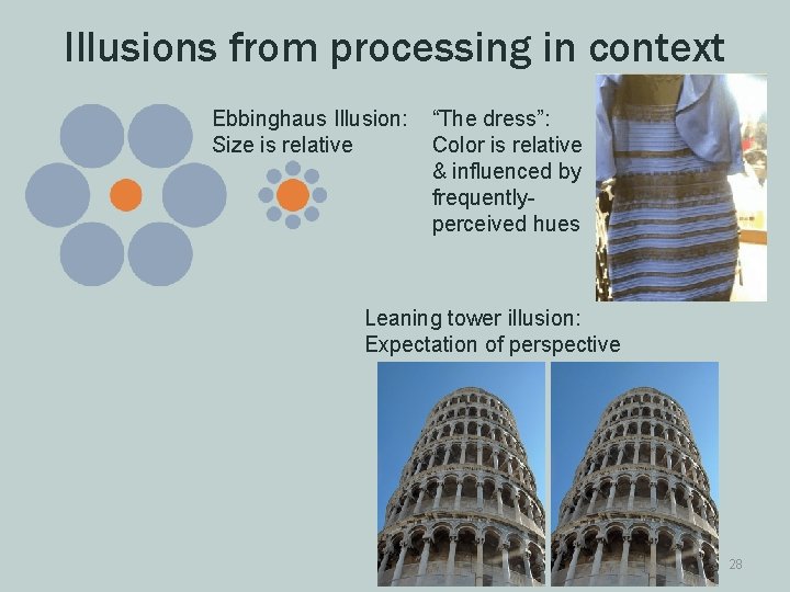
Illusions from processing in context Ebbinghaus Illusion: Size is relative “The dress”: Color is relative & influenced by frequentlyperceived hues Leaning tower illusion: Expectation of perspective 28

Illusions from processing in context Ebbinghaus Illusion: Size is relative Shepard’s Tables: Shape & size altered by depth “The dress”: Color is relative & influenced by frequentlyperceived hues Leaning tower illusion: Expectation of perspective 29

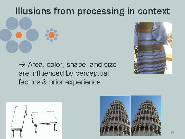
Illusions from processing in context Area, color, shape, and size are influenced by perceptual factors & prior experience 30

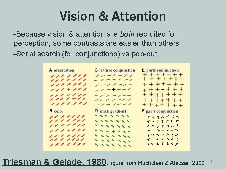
Vision & Attention -Because vision & attention are both recruited for perception, some contrasts are easier than others -Serial search (for conjunctions) vs pop-out Triesman & Gelade, 1980; figure from Hochstein & Ahissar, 2002 31

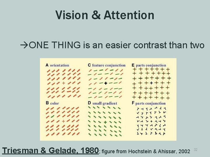
Vision & Attention ONE THING is an easier contrast than two Triesman & Gelade, 1980; figure from Hochstein & Ahissar, 2002 32

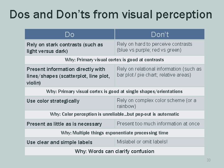
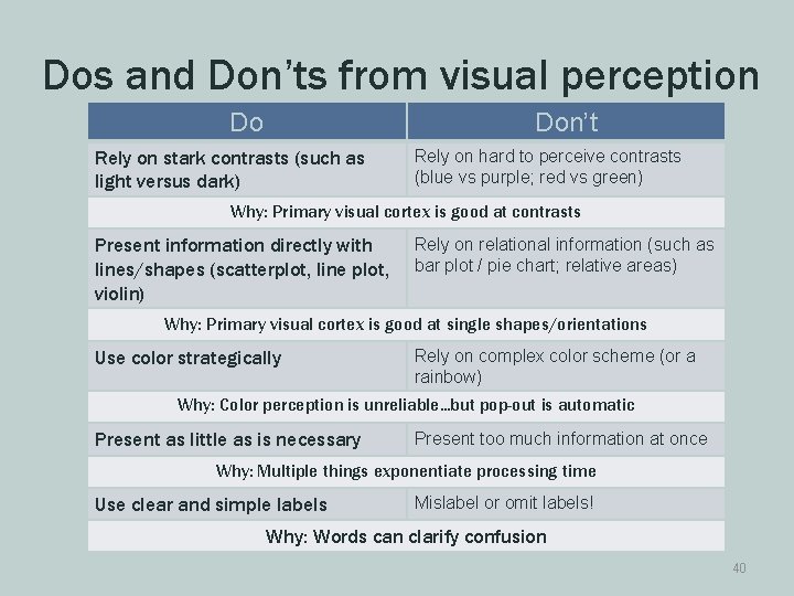
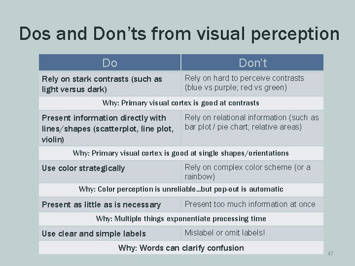
Dos and Don’ts from visual perception Do Don’t Rely on stark contrasts (such as light versus dark) Rely on hard to perceive contrasts (blue vs purple; red vs green) Why: Primary visual cortex is good at contrasts Present information directly with lines/shapes (scatterplot, line plot, violin) Rely on relational information (such as bar plot / pie chart; relative areas) Why: Primary visual cortex is good at single shapes/orientations Use color strategically Rely on complex color scheme (or a rainbow) Why: Color perception is unreliable…but pop-out is automatic Present as little as is necessary Present too much information at once Why: Multiple things exponentiate processing time Use clear and simple labels Mislabel or omit labels! Why: Words can clarify confusion 33

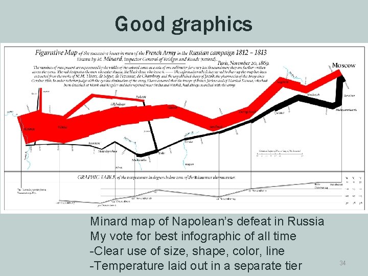
Good graphics Minard map of Napolean’s defeat in Russia My vote for best infographic of all time -Clear use of size, shape, color, line -Temperature laid out in a separate tier 34

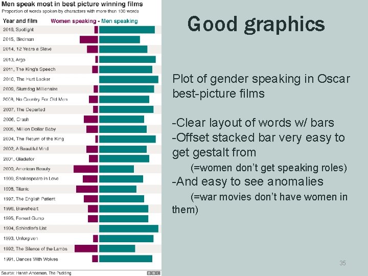
Good graphics Plot of gender speaking in Oscar best-picture films -Clear layout of words w/ bars -Offset stacked bar very easy to get gestalt from (=women don’t get speaking roles) -And easy to see anomalies (=war movies don’t have women in them) 35

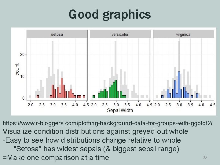
Good graphics https: //www. r-bloggers. com/plotting-background-data-for-groups-with-ggplot 2/ Visualize condition distributions against greyed-out whole -Easy to see how distributions change relative to whole “Setosa” has widest sepals (& biggest sepal range) =Make one comparison at a time 36

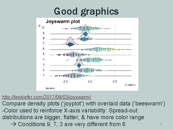
Good graphics http: //lenkiefer. com/2017/08/03/joyswarm/ Compare density plots (‘joyplot’) with overlaid data (‘beeswarm’) -Color used to reinforce X-axis variability: Spread-out distributions are bigger, flatter, & have more color range 37 Conditions 9, 7, 3 are very different from 6

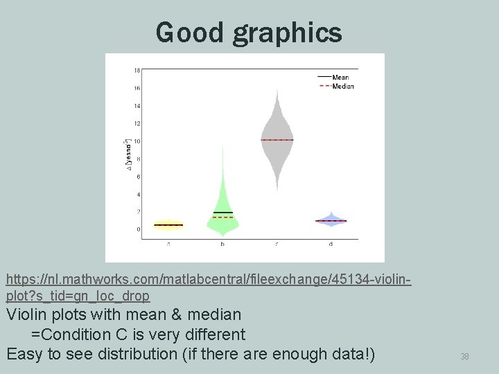
Good graphics https: //nl. mathworks. com/matlabcentral/fileexchange/45134 -violinplot? s_tid=gn_loc_drop Violin plots with mean & median =Condition C is very different Easy to see distribution (if there are enough data!) 38

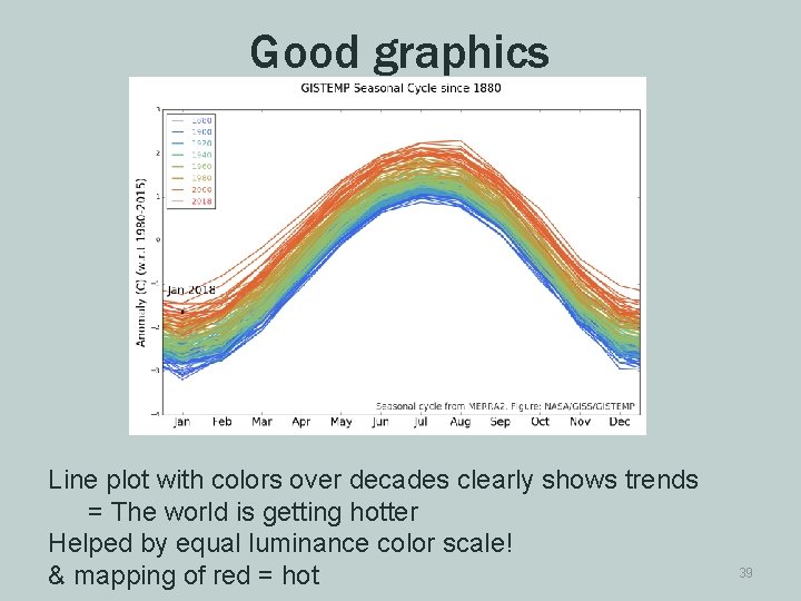
Good graphics Line plot with colors over decades clearly shows trends = The world is getting hotter Helped by equal luminance color scale! & mapping of red = hot 39

Dos and Don’ts from visual perception Do Don’t Rely on stark contrasts (such as light versus dark) Rely on hard to perceive contrasts (blue vs purple; red vs green) Why: Primary visual cortex is good at contrasts Present information directly with lines/shapes (scatterplot, line plot, violin) Rely on relational information (such as bar plot / pie chart; relative areas) Why: Primary visual cortex is good at single shapes/orientations Use color strategically Rely on complex color scheme (or a rainbow) Why: Color perception is unreliable…but pop-out is automatic Present as little as is necessary Present too much information at once Why: Multiple things exponentiate processing time Use clear and simple labels Mislabel or omit labels! Why: Words can clarify confusion 40

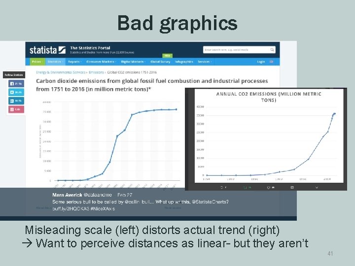
Bad graphics Misleading scale (left) distorts actual trend (right) Want to perceive distances as linear– but they aren’t 41

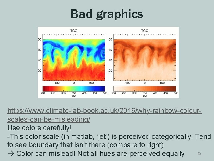
Bad graphics https: //www. climate-lab-book. ac. uk/2016/why-rainbow-colourscales-can-be-misleading/ Use colors carefully! -This color scale (in matlab, ‘jet’) is perceived categorically. Tend to see boundary that isn’t there (compare to right) 42 Color can mislead! Not all hues are perceived equally

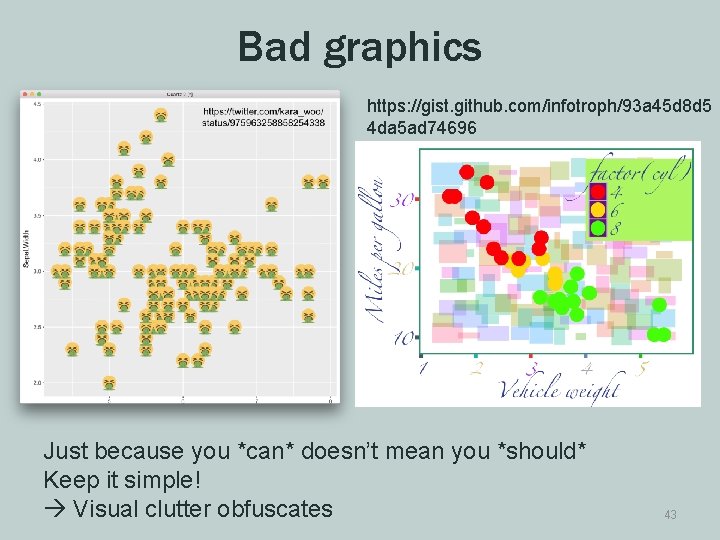
Bad graphics https: //gist. github. com/infotroph/93 a 45 d 8 d 5 4 da 5 ad 74696 Just because you *can* doesn’t mean you *should* Keep it simple! Visual clutter obfuscates 43

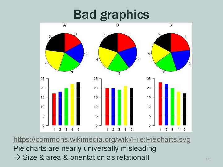
Bad graphics https: //commons. wikimedia. org/wiki/File: Piecharts. svg Pie charts are nearly universally misleading Size & area & orientation as relational! 44

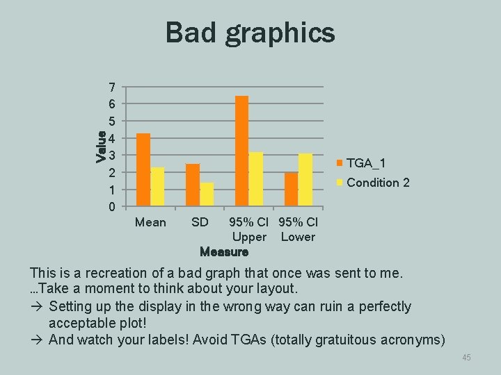
Value Bad graphics 7 6 5 4 3 2 1 0 TGA_1 Condition 2 Mean SD 95% CI Upper Lower Measure This is a recreation of a bad graph that once was sent to me. …Take a moment to think about your layout. Setting up the display in the wrong way can ruin a perfectly acceptable plot! And watch your labels! Avoid TGAs (totally gratuitous acronyms) 45

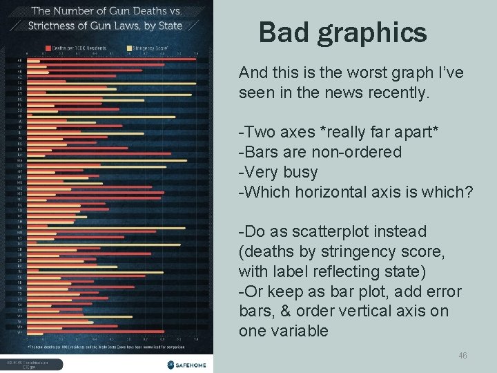
Bad graphics And this is the worst graph I’ve seen in the news recently. -Two axes *really far apart* -Bars are non-ordered -Very busy -Which horizontal axis is which? -Do as scatterplot instead (deaths by stringency score, with label reflecting state) -Or keep as bar plot, add error bars, & order vertical axis on one variable 46

Dos and Don’ts from visual perception Do Don’t Rely on stark contrasts (such as light versus dark) Rely on hard to perceive contrasts (blue vs purple; red vs green) Why: Primary visual cortex is good at contrasts Present information directly with lines/shapes (scatterplot, line plot, violin) Rely on relational information (such as bar plot / pie chart; relative areas) Why: Primary visual cortex is good at single shapes/orientations Use color strategically Rely on complex color scheme (or a rainbow) Why: Color perception is unreliable…but pop-out is automatic Present as little as is necessary Present too much information at once Why: Multiple things exponentiate processing time Use clear and simple labels Mislabel or omit labels! Why: Words can clarify confusion 47

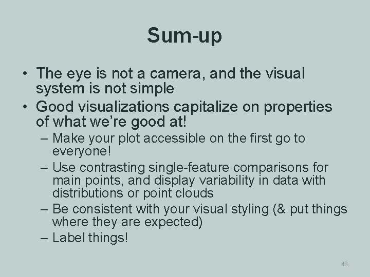
Sum-up • The eye is not a camera, and the visual system is not simple • Good visualizations capitalize on properties of what we’re good at! – Make your plot accessible on the first go to everyone! – Use contrasting single-feature comparisons for main points, and display variability in data with distributions or point clouds – Be consistent with your visual styling (& put things where they are expected) – Label things! 48