Data visualization creating impact with your data project


- Slides: 26
Data visualization: creating impact with your data project Paul Leys
title
Information visualization “The use of computer-supported, interactive, visual representation of abstract data to amplify cognition” Card et al. 1999
How many circles? Slide source: Joris Klerkx
How many circles? • Our brain is extremely good in recognizing visual patterns Slide source: Joris Klerkx
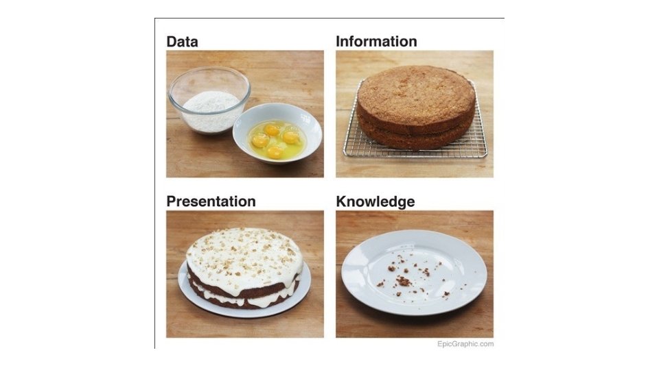
Why visualize data? • Generalization of data usage • Support with interpretation • Making it as easy as possible for the target audience Creating impact with your data project
How - Tufte principles • Tell the truth • Graphical integrity • Do it effectively with clarity, precision • Design aesthetics
Graphical integrity 50 40 % Outgoing 30 % Incoming % Total 20 10 UGent LW RE WE GE EA EB DI PP BW FW PS
Graphical integrity 100 90 80 70 60 % Outgoing 50 % Incoming 40 % Total 30 20 10 0 UGent LW RE WE GE EA EB DI PP BW FW PS
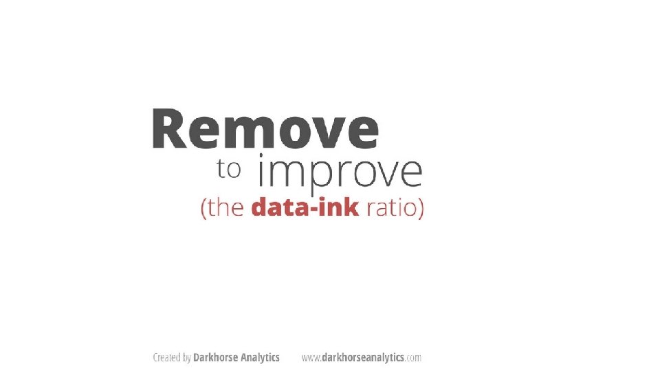
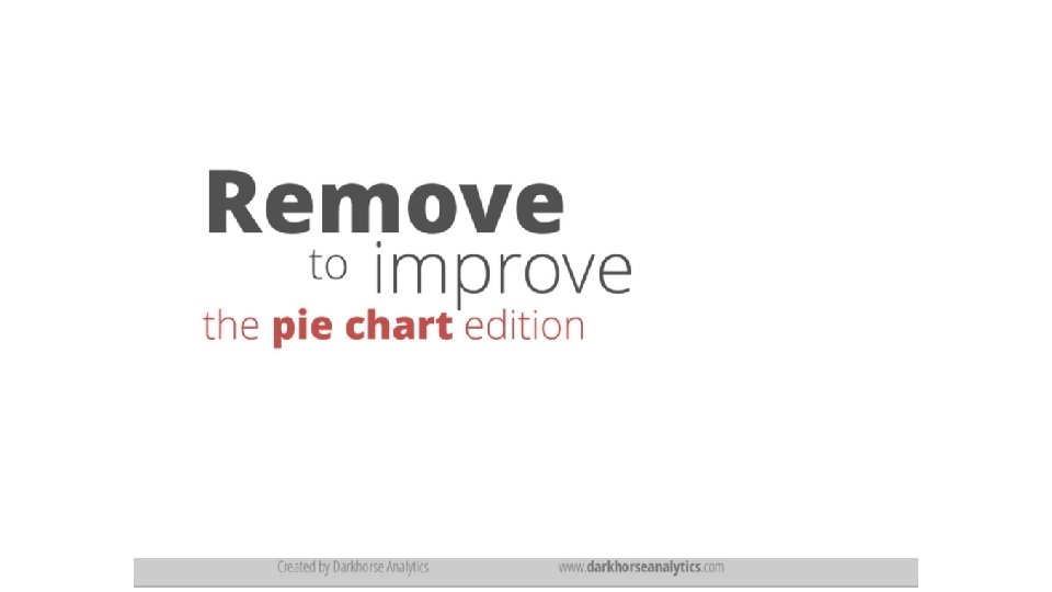
Design aesthetics: 5 principles 1. 2. 3. 4. 5. Above all show the data Maximize the data-ink ratio, within reason Erease non-data ink, within reason Erease redundant data-ink Revise and edit
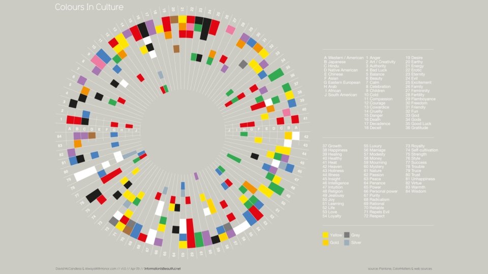
Use of colors All colors are equal … but they are not perceived as the same! Red, green, blue and yellow are hard-wired into the brain use them if you want user to remember color coding
Tools
Slide source: David Mc. Candless
“Perfection is achieved, not when there is nothing more to add, but when there is nothing left to take away. ” Antoine de Saint-Exupery