Data Visualization Best Practices for Power BI Dan


Data Visualization Best Practices for Power BI Dan Edwards, CPA Senior Manager – Crowe LLP Power. BIWorld. Tour. com #PBIWorld. Tour
Meet your presenter • Dan Edwards, CPA – Senior Manager @ Crowe • Over 25 years implementing and supporting technology solutions • Specializes in financial and operational reporting solutions • Experienced with many ERP, Reporting and BI tools Power. BIWorld. Tour. com #PBIWorld. Tour
What is your role? 1. 2. 3. 4. 5. Business Analyst Developer Executive Business User Other Power. BIWorld. Tour. com #PBIWorld. Tour
Familiarity with Business Intelligence 1. 2. 3. 4. Frequently use dashboards and visuals Frequently use reports and Excel Considering using Business Intelligence What is Business Intelligence? Power. BIWorld. Tour. com #PBIWorld. Tour
Familiarity with Power BI 1. 2. 3. 4. Use it all the time Others in my company use it Have played with it Have heard about it, but haven’t worked with it Power. BIWorld. Tour. com #PBIWorld. Tour
Objectives for today • Understand why is data visualization important • Better understand how the human brain & eye interpret data • Understand importance of choosing the right visualization type • Learn to tell a story with the data Power. BIWorld. Tour. com #PBIWorld. Tour
Session Agenda • Why are data visualizations so important? • Creating visualizations people will really use • Keys to well designed visualizations • Data Visualization Best Practices • Samples & demos in Power BI • Where to learn more Power. BIWorld. Tour. com #PBIWorld. Tour
Power. BIWorld. Tour. com #PBIWorld. Tour
Power. BIWorld. Tour. com #PBIWorld. Tour

Why is Data Visualization so IMPORTANT? ? ? Power. BIWorld. Tour. com #PBIWorld. Tour
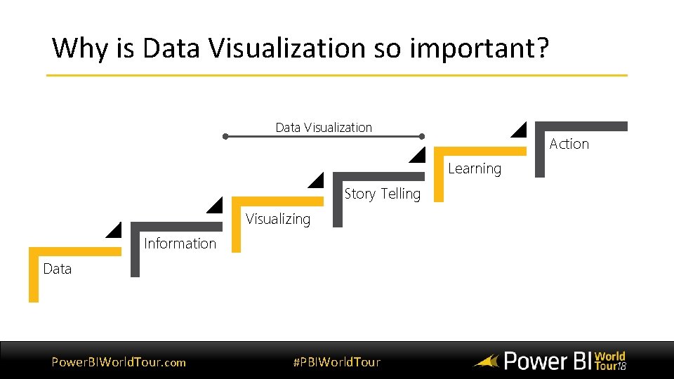
Why is Data Visualization so important? Data Visualization Action Learning Story Telling Visualizing Information Data Power. BIWorld. Tour. com #PBIWorld. Tour
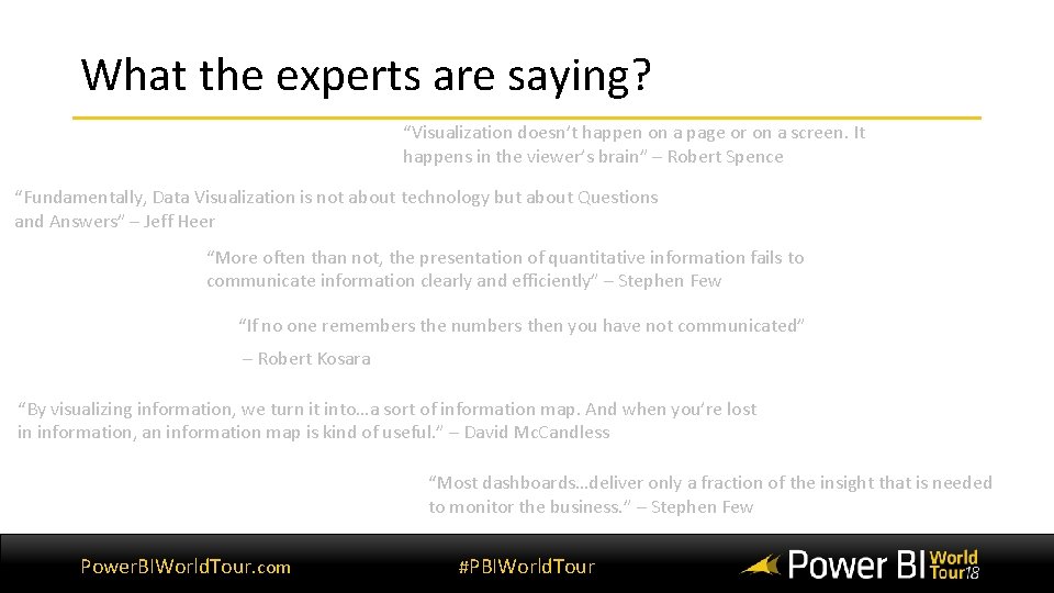
What the experts are saying? “Visualization doesn’t happen on a page or on a screen. It happens in the viewer’s brain” – Robert Spence “Fundamentally, Data Visualization is not about technology but about Questions and Answers” – Jeff Heer “More often than not, the presentation of quantitative information fails to communicate information clearly and efficiently” – Stephen Few “If no one remembers the numbers then you have not communicated” – Robert Kosara “By visualizing information, we turn it into…a sort of information map. And when you’re lost in information, an information map is kind of useful. ” – David Mc. Candless “Most dashboards…deliver only a fraction of the insight that is needed to monitor the business. ” – Stephen Few Power. BIWorld. Tour. com #PBIWorld. Tour

If you can’t explain it simply, you don’t understand it well enough. Albert Einstein Power. BIWorld. Tour. com #PBIWorld. Tour
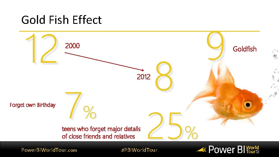
Gold Fish Effect 12 Forget own Birthday 2000 7% 2012 teens who forget major details of close friends and relatives Power. BIWorld. Tour. com 8 25% #PBIWorld. Tour 9 Goldfish
Gold Fish Effect Why? Power. BIWorld. Tour. com #PBIWorld. Tour
Gold Fish Effect What do the scientist say? "More than ever, research is highlighting a trend in reduced attention and concentration spans…the younger generation appear to be the worst afflicted, " - sociologist David Moxon “…individuals who multitask emails, phone calls and social-networking sites have more trouble paying attention and focusing on important information” – The New York Times “…lack of attention has a serious impact on task performance and increases the risk of accidents. ” – sociologist David Moxon Power. BIWorld. Tour. com #PBIWorld. Tour
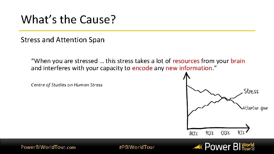
What’s the Cause? Stress and Attention Span “When you are stressed … this stress takes a lot of resources from your brain and interferes with your capacity to encode any new information. ” Centre of Studies on Human Stress Power. BIWorld. Tour. com #PBIWorld. Tour
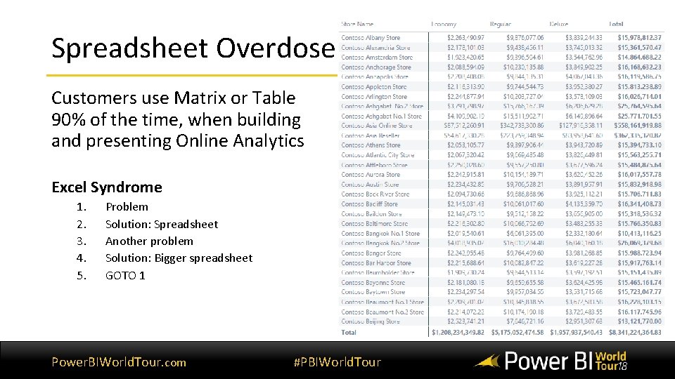
Spreadsheet Overdose Customers use Matrix or Table 90% of the time, when building and presenting Online Analytics Excel Syndrome 1. 2. 3. 4. 5. Problem Solution: Spreadsheet Another problem Solution: Bigger spreadsheet GOTO 1 Power. BIWorld. Tour. com #PBIWorld. Tour

Quiz time! Power. BIWorld. Tour. com #PBIWorld. Tour
Question 1 1. Which product category has the largest revenue? 2. Which country has the largest revenue? Power. BIWorld. Tour. com #PBIWorld. Tour

Time! Power. BIWorld. Tour. com #PBIWorld. Tour
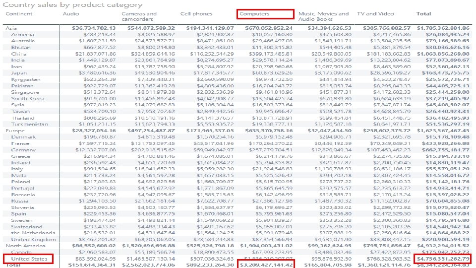
Power. BIWorld. Tour. com #PBIWorld. Tour
Question 2 1. Which product category has the largest revenue? 2. Which channel has the largest revenue? 3. Which promotion has the largest revenue? Power. BIWorld. Tour. com #PBIWorld. Tour

Time! Power. BIWorld. Tour. com #PBIWorld. Tour
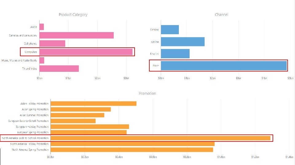
Power. BIWorld. Tour. com #PBIWorld. Tour
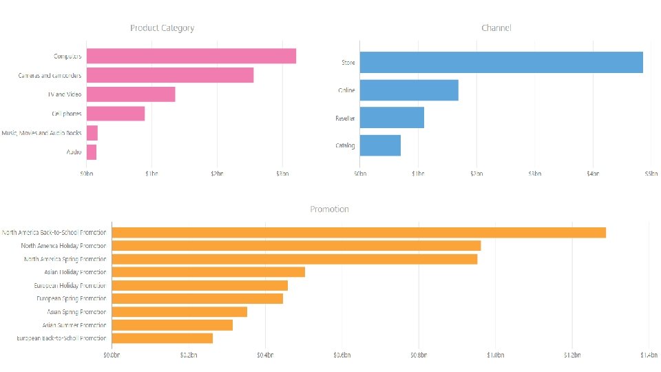
Power. BIWorld. Tour. com #PBIWorld. Tour
How the human eye works Power. BIWorld. Tour. com #PBIWorld. Tour
When a chart hits your eyes • We don’t go in order • We see first what stands out • We see only a few things at once • We seek meaning and make connections • We rely on conventions and metaphors Good Charts, Berinato, Page 34 Power. BIWorld. Tour. com #PBIWorld. Tour
So how do I create visualizations that people will really use? ? Power. BIWorld. Tour. com #PBIWorld. Tour
Keys to well designed visualizations • Exceptionally well organized • Condensed, primarily in the form of summaries • Specific to the task at hand customized to communicate clearly to those who will use it • Displayed using concise and often small media that communicate the information in the clearest and most direct way possible Power. BIWorld. Tour. com #PBIWorld. Tour

Data Visualization Best Practices • Use the right visualization • Keep it organized • Colors, themes, & backgrounds • Tell a story • Highlight key points • Use buttons, drill through, tooltips and bookmarks • Always be consistent Power. BIWorld. Tour. com #PBIWorld. Tour

Using the right visualization Power. BIWorld. Tour. com #PBIWorld. Tour
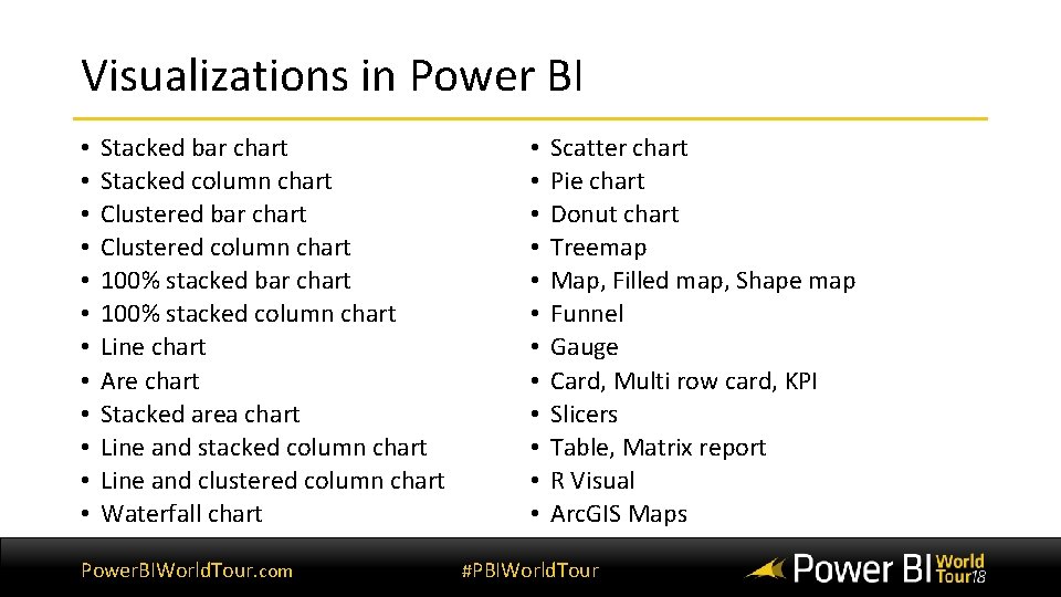
Visualizations in Power BI • • • Stacked bar chart Stacked column chart Clustered bar chart Clustered column chart 100% stacked bar chart 100% stacked column chart Line chart Are chart Stacked area chart Line and stacked column chart Line and clustered column chart Waterfall chart Power. BIWorld. Tour. com • • • Scatter chart Pie chart Donut chart Treemap Map, Filled map, Shape map Funnel Gauge Card, Multi row card, KPI Slicers Table, Matrix report R Visual Arc. GIS Maps #PBIWorld. Tour
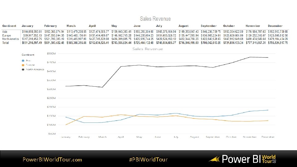
Power. BIWorld. Tour. com #PBIWorld. Tour
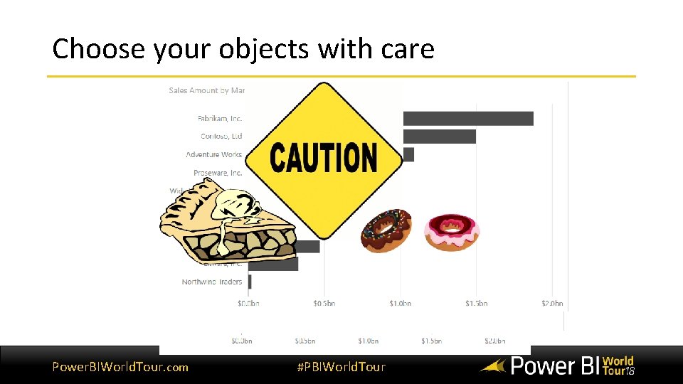
Choose your objects with care Power. BIWorld. Tour. com #PBIWorld. Tour
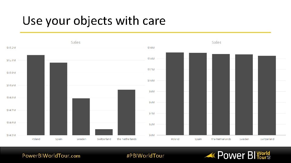
Use your objects with care Power. BIWorld. Tour. com #PBIWorld. Tour
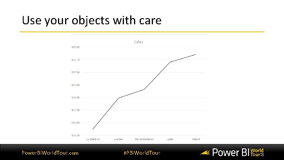
Use your objects with care Power. BIWorld. Tour. com #PBIWorld. Tour
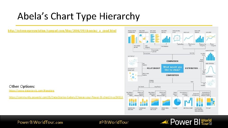
Abela’s Chart Type Hierarchy http: //extremepresentation. typepad. com/blog/2006/09/choosing_a_good. html Other Options: https: //www. data-to-viz. com/#explore https: //community. powerbi. com/t 5/Data-Stories-Gallery/Choose-your-Power-BI-chart/m-p/34319 Power. BIWorld. Tour. com #PBIWorld. Tour

Keep it organized Power. BIWorld. Tour. com #PBIWorld. Tour
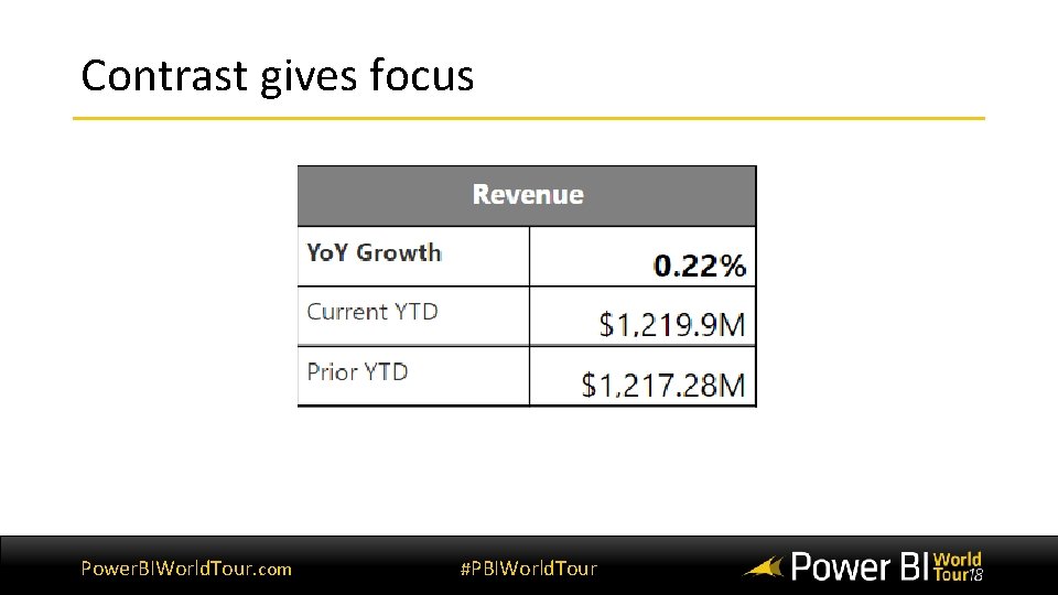
Contrast gives focus Power. BIWorld. Tour. com #PBIWorld. Tour

Color is hard to master Black text on a white background works well. White text on a black background works well. Yellow text on a white background works poorly. Blue text on a black background works poorly. Power. BIWorld. Tour. com #PBIWorld. Tour
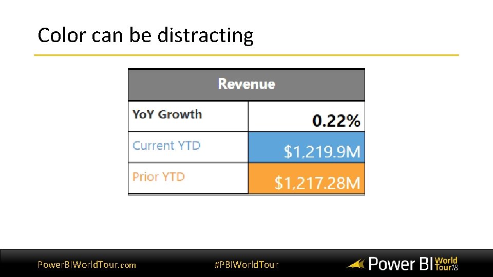
Color can be distracting Power. BIWorld. Tour. com #PBIWorld. Tour
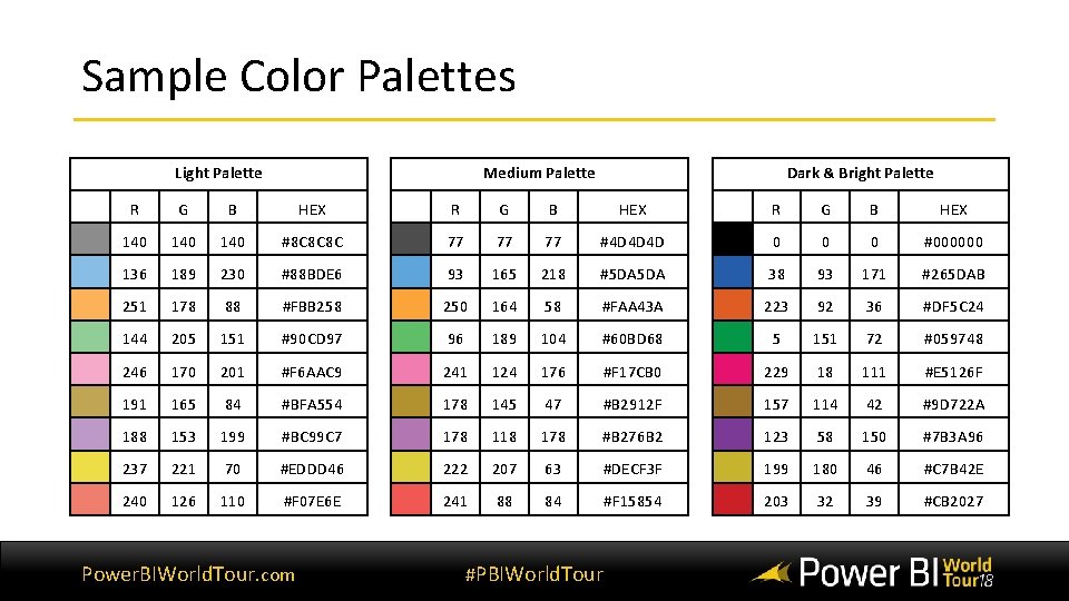
Sample Color Palettes Light Palette Medium Palette Dark & Bright Palette R G B HEX 140 140 #8 C 8 C 8 C 77 77 77 #4 D 4 D 4 D 0 0 0 #000000 136 189 230 #88 BDE 6 93 165 218 #5 DA 38 93 171 #265 DAB 251 178 88 #FBB 258 250 164 58 #FAA 43 A 223 92 36 #DF 5 C 24 144 205 151 #90 CD 97 96 189 104 #60 BD 68 5 151 72 #059748 246 170 201 #F 6 AAC 9 241 124 176 #F 17 CB 0 229 18 111 #E 5126 F 191 165 84 #BFA 554 178 145 47 #B 2912 F 157 114 42 #9 D 722 A 188 153 199 #BC 99 C 7 178 118 178 #B 276 B 2 123 58 150 #7 B 3 A 96 237 221 70 #EDDD 46 222 207 63 #DECF 3 F 199 180 46 #C 7 B 42 E 240 126 110 #F 07 E 6 E 241 88 84 #F 15854 203 32 39 #CB 2027 Power. BIWorld. Tour. com #PBIWorld. Tour
Power. BIWorld. Tour. com #PBIWorld. Tour
Power. BIWorld. Tour. com #PBIWorld. Tour

Demonstration colors and themes Power. BIWorld. Tour. com #PBIWorld. Tour

Using Backgrounds Power. BIWorld. Tour. com #PBIWorld. Tour
Using Power. Point to create a background • Create the layout in Power. Point using shapes & lines • Group and save the shapes as a picture • Use the picture as page background in Power BI Power. BIWorld. Tour. com #PBIWorld. Tour
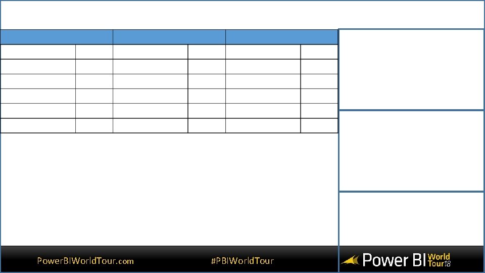
Power. BIWorld. Tour. com #PBIWorld. Tour

Demonstration Creating backgrounds Power. BIWorld. Tour. com #PBIWorld. Tour

Tell a story Power. BIWorld. Tour. com #PBIWorld. Tour
Build easy navigation • Button – create a menu • Drill through – provide details • Tooltips – give a quick glace • Bookmarks – make sure users see the page you want Power. BIWorld. Tour. com #PBIWorld. Tour

Demonstration using buttons, drill through, tooltips and bookmarks Power. BIWorld. Tour. com #PBIWorld. Tour
Always be consistent Power. BIWorld. Tour. com #PBIWorld. Tour
Always be consistent • Have a plan • Identify your visualizations • Draw a sketch • Layout your screen • Have someone look it over • Ask for user input Power. BIWorld. Tour. com #PBIWorld. Tour
Conclusion • Understand your audience • Design is important • Good visuals tell story • But as the author you need to design the story Power. BIWorld. Tour. com #PBIWorld. Tour

Questions Power. BIWorld. Tour. com #PBIWorld. Tour
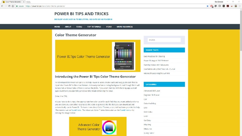
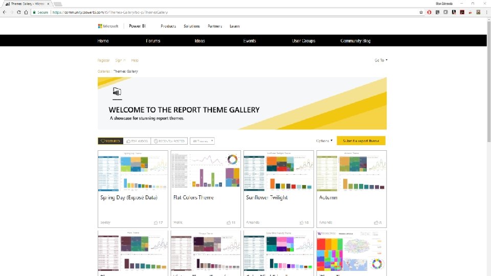
Resources • https: //danscorner 4 businessintel. blogspot. com/ • How to create small multiples • Conditional formatting tips • An easy way to create backgrounds for Power BI • Other links • Power BI theme creator – https: //powerbi. tips/tools/color-theme-generator/ • Theme gallery – https: //community. powerbi. com/t 5/Themes-Gallery/bd-p/Themes. Gallery Power. BIWorld. Tour. com #PBIWorld. Tour
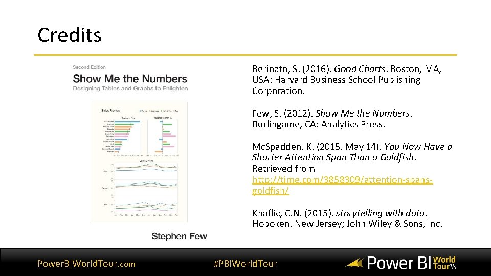
Credits Berinato, S. (2016). Good Charts. Boston, MA, USA: Harvard Business School Publishing Corporation. Few, S. (2012). Show Me the Numbers. Burlingame, CA: Analytics Press. Mc. Spadden, K. (2015, May 14). You Now Have a Shorter Attention Span Than a Goldfish. Retrieved from http: //time. com/3858309/attention-spansgoldfish/ Knaflic, C. N. (2015). storytelling with data. Hoboken, New Jersey; John Wiley & Sons, Inc. Power. BIWorld. Tour. com #PBIWorld. Tour
THANK YOU Dan Edwards, CPA Crowe LLP Direct: 714 -668 -5348 Cell: 714 -231 -2202 dan. edwards@crowe. com @dsecpa https: //www. linkedin. com/in/dsedwards/ Power. BIWorld. Tour. com #PBIWorld. Tour

Don’t forget to join your local PUG to enjoy year-round networking and learning.
- Slides: 62