Data Visualization An Introduction OVERVIEW What is Data


![Proportional Symbol Map • [symbology] A symbol whose size differs in relation to the Proportional Symbol Map • [symbology] A symbol whose size differs in relation to the](https://slidetodoc.com/presentation_image_h2/65c2fe268fec38d3a2aaf5c044883735/image-13.jpg)

- Slides: 58

Data Visualization: An Introduction

OVERVIEW

What is Data Visualization? • “Data visualization” refers to summarizing and representing data through charts, plots, maps, and other graphics • The goal is communicate information clearly and effectively without the unnecessary burden of information overload • The key is balancing form and function to graphically present key ideas in an aesthetically appealing yet powerful way • Related topics/categories: – “scientific visualization (real-world objects with spatial properties)” – “information visualizations (i. e. charts, graphs, non-spatial components)” – “infographics (i. e. visualizations with a narrative)” Quoted definitions from: Duke University Libraries Research Guide on Introduction to Data Visualization: http: //guides. library. duke. edu/content. php? pid=355157

Outline I. Map types and spatial visualizations – Sample map types – Sample map-related applications – Other visualizations and additional resources II. Statistical Graphics – Definitions and usage – Examples for one-, two-, and higher-dimensional data, including both continuous and categorical data – Some useful tips

MAP TYPES AND SPATIAL VISUALIZATIONS

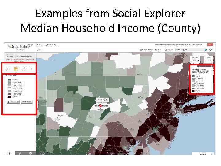
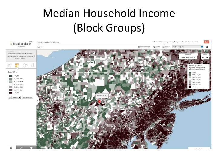
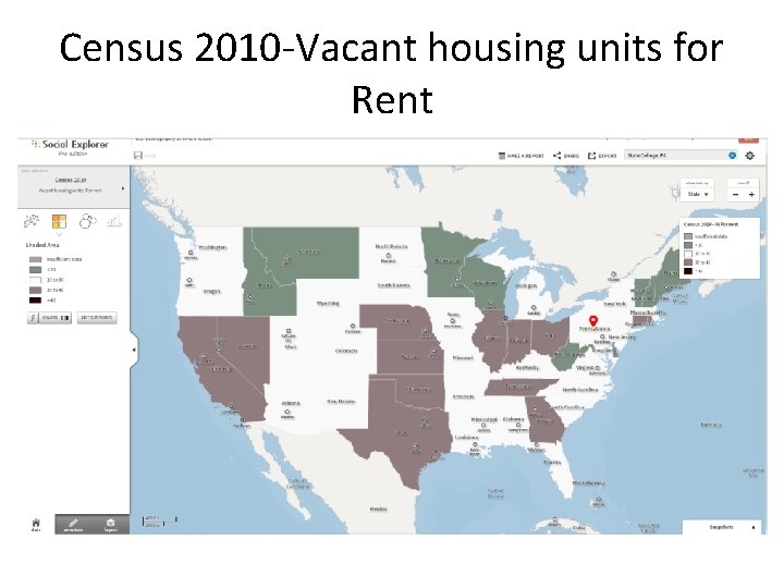
Map Types: Definitions and Samples • Choropleth maps • Dot maps • Proportional maps Sample visualizations from Social Explorer is subscribed to by Penn State Libraries.

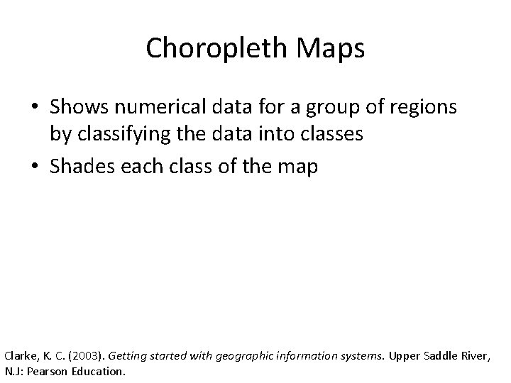
Choropleth Maps • Shows numerical data for a group of regions by classifying the data into classes • Shades each class of the map Clarke, K. C. (2003). Getting started with geographic information systems. Upper Saddle River, N. J: Pearson Education.

Examples from Social Explorer Median Household Income (County)

Median Household Income (Block Groups)

Census 2010 -Vacant housing units for Rent

Dot Maps • “Uses a dot symbol to show the presence of a feature, relying on a visual scatter to show spatial pattern. • Most often used where point features are the GIS data, but dots can be scattered at random throughout areas. ” Clarke, K. C. (2003). Getting started with geographic information systems. Upper Saddle River, N. J: Pearson Education.

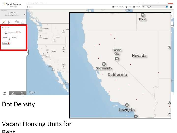
Dot Density Vacant Housing Units for
![Proportional Symbol Map symbology A symbol whose size differs in relation to the Proportional Symbol Map • [symbology] A symbol whose size differs in relation to the](https://slidetodoc.com/presentation_image_h2/65c2fe268fec38d3a2aaf5c044883735/image-13.jpg)
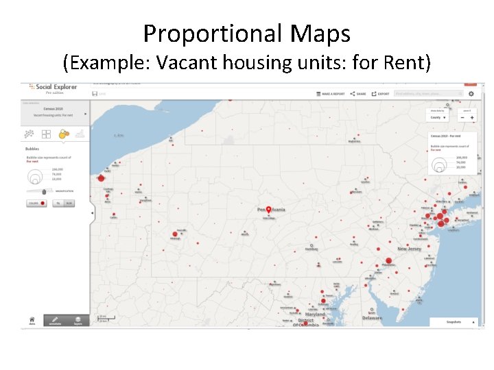
Proportional Symbol Map • [symbology] A symbol whose size differs in relation to the phenomenon being mapped. Definition Source: http: //support. esri. com/en/knowledgebase/GISDictionary/term/proportional%20 symbol

Proportional Maps (Example: Vacant housing units: for Rent)

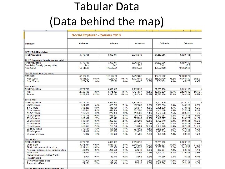
Tabular Data (Data behind the map)

Color Balance and Base Maps • Base layer or map: A GIS data layer of reference information, such as topography, road network, or streams, to which all other layers are referenced geometrically. • Color balance: The achievement of visual harmony between colors on a map, primarily by avoiding colors that show simultaneous contrast when adjacent to each other. Clarke, K. C. (2003). Getting started with geographic information systems. Upper Saddle River, N. J: Pearson Education.

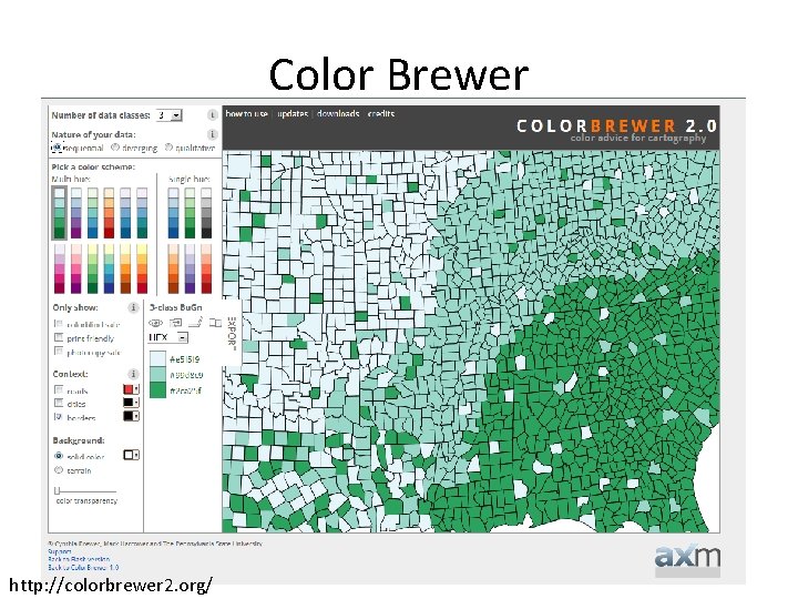
Color Brewer http: //colorbrewer 2. org/

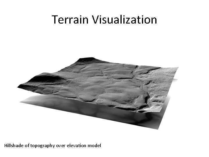
Terrain Visualization Hillshade of topography over elevation model

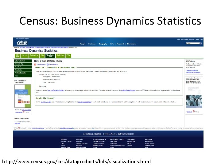
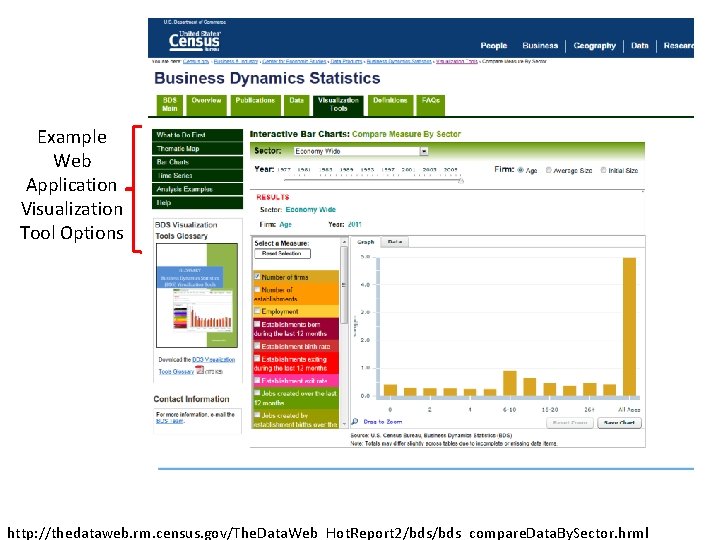
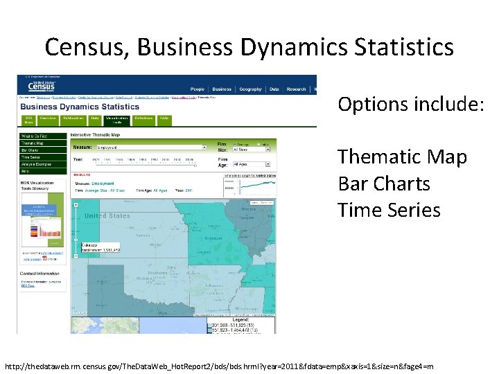
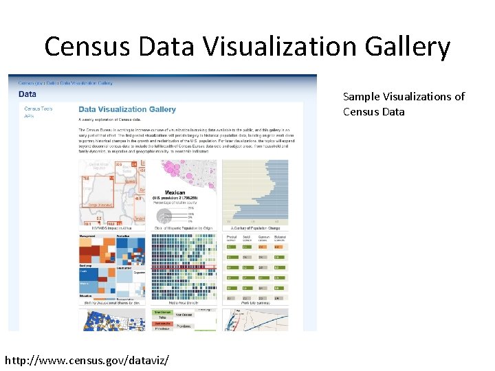
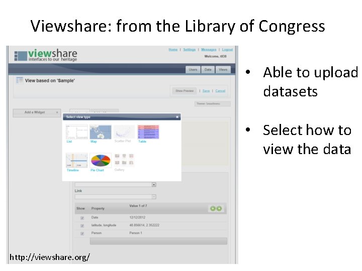
Select Web Applications with Visualizations • U. S. Census: Business Dynamic Statistics – Includes options for tables, charts, maps – U. S. Census Visualization Gallery • Viewshare, from the Library of Congress – Uploading a tabular dataset enables multiple chart, table, and map options • World Bank • Others: Geocommons, Many Eyes, Wordle, D 3, and more.

Census: Business Dynamics Statistics http: //www. census. gov/ces/dataproducts/bds/visualizations. html

Example Web Application Visualization Tool Options http: //thedataweb. rm. census. gov/The. Data. Web_Hot. Report 2/bds_compare. Data. By. Sector. hrml

Census, Business Dynamics Statistics Options include: Thematic Map Bar Charts Time Series http: //thedataweb. rm. census. gov/The. Data. Web_Hot. Report 2/bds. hrml? year=2011&fdata=emp&xaxis=1&size=n&fage 4=m

Census Data Visualization Gallery Sample Visualizations of Census Data http: //www. census. gov/dataviz/

Viewshare: from the Library of Congress • Able to upload datasets • Select how to view the data http: //viewshare. org/

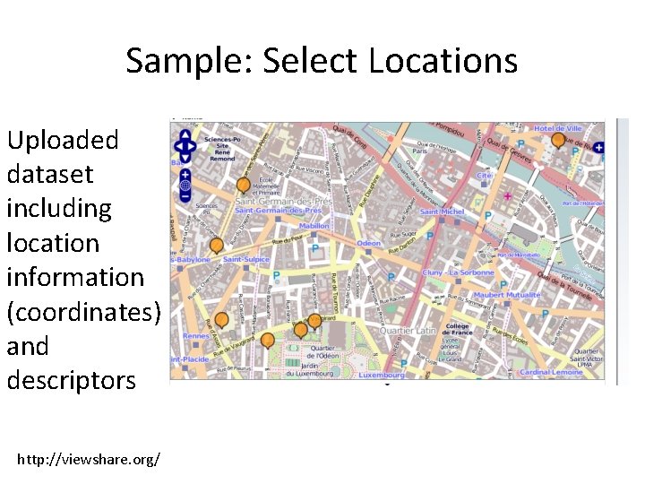
Sample: Select Locations Uploaded dataset including location information (coordinates) and descriptors http: //viewshare. org/

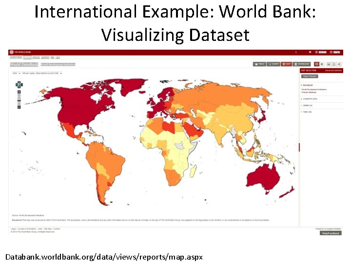
International Example: World Bank: Visualizing Dataset Databank. worldbank. org/data/views/reports/map. aspx

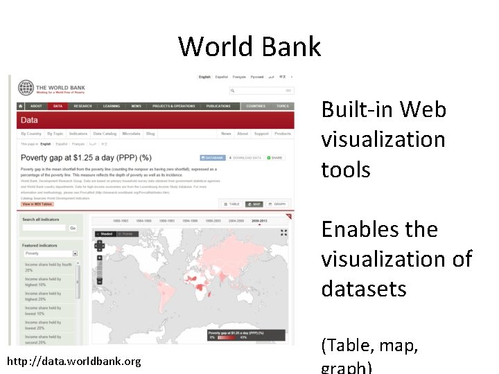
World Bank Built-in Web visualization tools Enables the visualization of datasets http: //data. worldbank. org (Table, map,

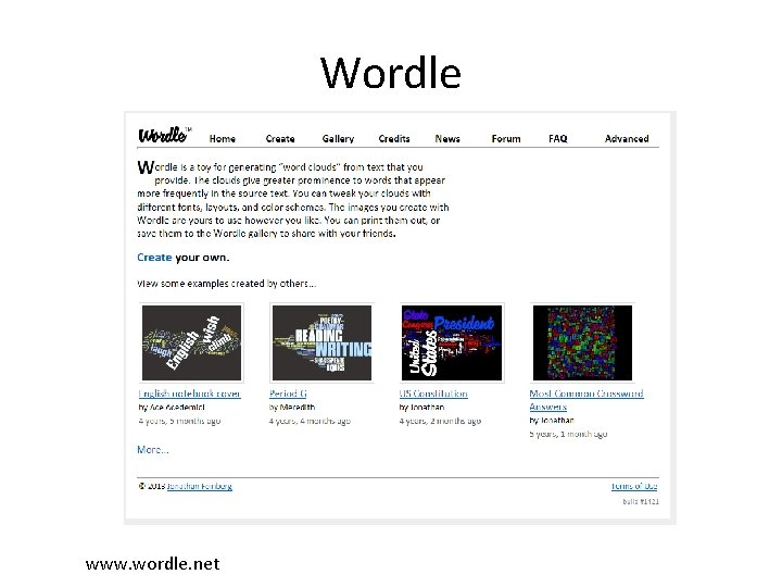
Wordle www. wordle. net

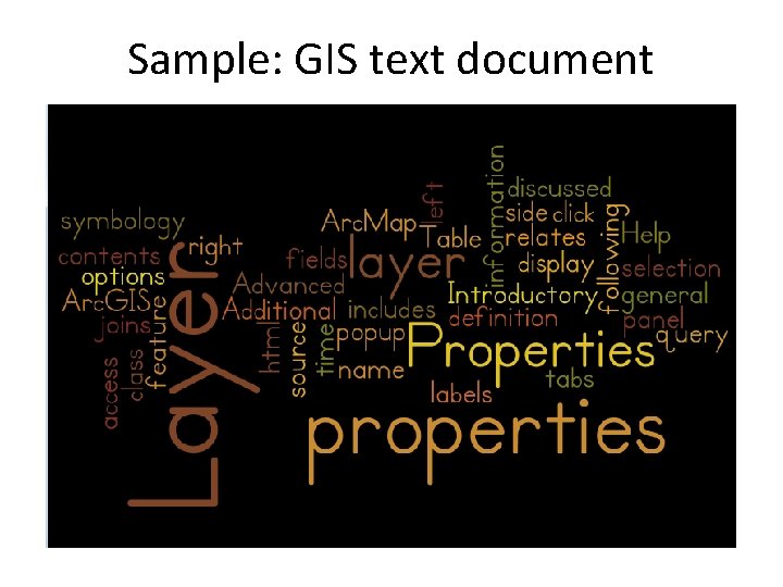
Sample: GIS text document

Summary • Different map types and combinations are possible to represent data • Web applications with built-in visualization tools enable exploration of data • Capability to modify settings and input own data enables visualization options

Additional Resources • Introduction to Data Visualization, Guide, Duke University Libraries, http: //guides. library. duke. edu/content. php? pid =355157

STATISTICAL GRAPHICS

Outline I. Use II. Definitions III. Data for examples IV. One continuous variable V. One categorical variable VI. Two variables VII. Other charts VIII. Useful tips

Use • Explore data structure, content, or relationships • Illustrate patterns, differences, or properties • Verify assumptions of statistical models • Communicate results simply but effectively • Summarize basic relationships • Emphasize or support a claim

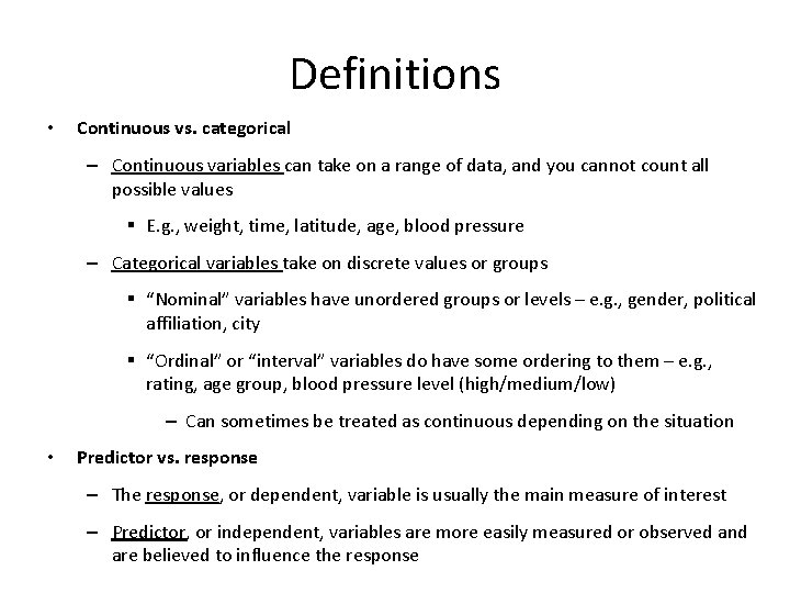
Definitions • Continuous vs. categorical – Continuous variables can take on a range of data, and you cannot count all possible values § E. g. , weight, time, latitude, age, blood pressure – Categorical variables take on discrete values or groups § “Nominal” variables have unordered groups or levels – e. g. , gender, political affiliation, city § “Ordinal” or “interval” variables do have some ordering to them – e. g. , rating, age group, blood pressure level (high/medium/low) – Can sometimes be treated as continuous depending on the situation • Predictor vs. response – The response, or dependent, variable is usually the main measure of interest – Predictor, or independent, variables are more easily measured or observed and are believed to influence the response

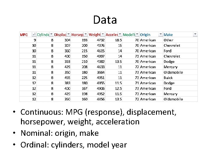
Data for examples • Automobile data collected on 398 cars made from 1970 to 1982 • MPG, displacement (cub. inch. ), horsepower, weight (lbs. ), acceleration (seconds to accelerate from 0 to 60 mph), model year, origin, and make • “Cars” data retrieved from Stat. Lib library of Carnegie Mellon University (http: //lib. stat. cmu. edu/datasets/) • Used as the 1983 American Statistical Association data exposition dataset

Data • Continuous: MPG (response), displacement, horsepower, weight, acceleration • Nominal: origin, make • Ordinal: cylinders, model year

One continuous variable • Histogram • Boxplot • Stem & leaf

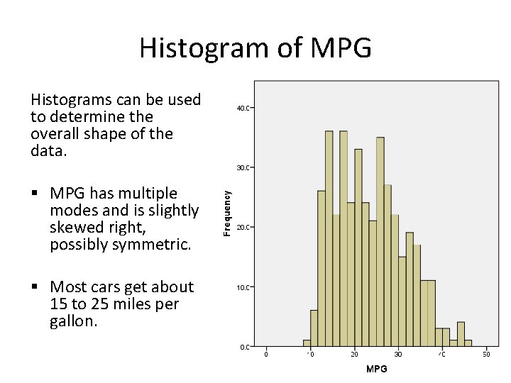
Histogram of MPG Histograms can be used to determine the overall shape of the data. § MPG has multiple modes and is slightly skewed right, possibly symmetric. § Most cars get about 15 to 25 miles per gallon.

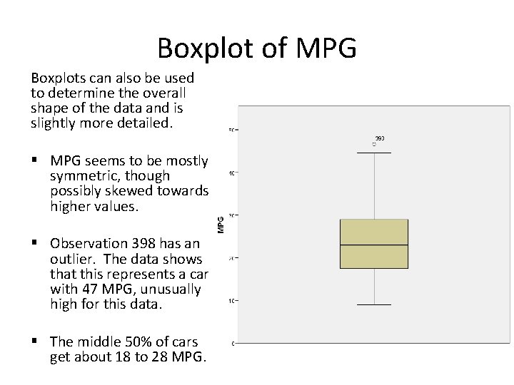
Boxplot of MPG Boxplots can also be used to determine the overall shape of the data and is slightly more detailed. § MPG seems to be mostly symmetric, though possibly skewed towards higher values. § Observation 398 has an outlier. The data shows that this represents a car with 47 MPG, unusually high for this data. § The middle 50% of cars get about 18 to 28 MPG.

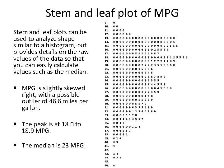
Stem and leaf plot of MPG Stem and leaf plots can be used to analyze shape similar to a histogram, but provides details on the raw values of the data so that you can easily calculate values such as the median. § MPG is slightly skewed right, with a possible outlier of 46. 6 miles per gallon. § The peak is at 18. 0 to 18. 9 MPG. § The median is 23 MPG.

One categorical variable • Bar chart • Pie chart/Vertical pie chart • Frequency/relative freq. /cumulative freq. table

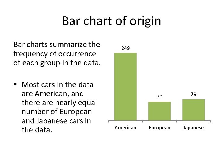
Bar chart of origin Bar charts summarize the frequency of occurrence of each group in the data. § Most cars in the data are American, and there are nearly equal number of European and Japanese cars in the data. 249 American 70 79 European Japanese

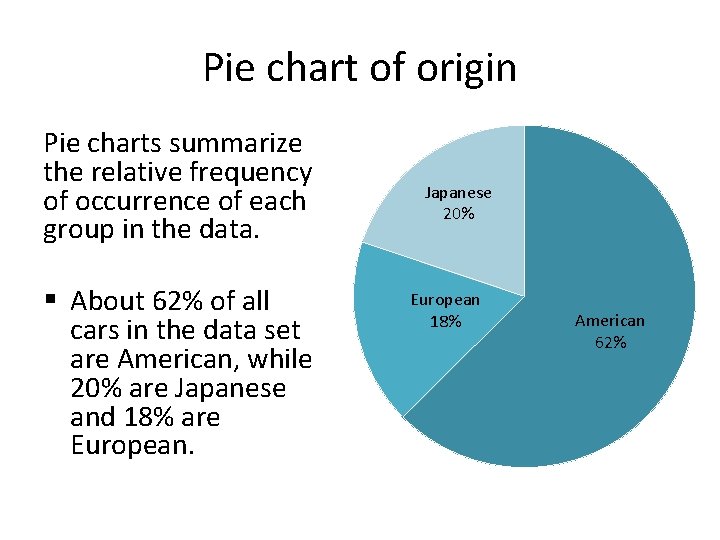
Pie chart of origin Pie charts summarize the relative frequency of occurrence of each group in the data. § About 62% of all cars in the data set are American, while 20% are Japanese and 18% are European. Japanese 20% European 18% American 62%

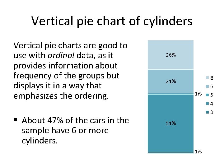
Vertical pie chart of cylinders Vertical pie charts are good to use with ordinal data, as it provides information about frequency of the groups but displays it in a way that emphasizes the ordering. § About 47% of the cars in the sample have 6 or more cylinders. 26% 8 21% 6 1% 5 4 3 51% 1%

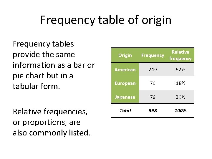
Frequency table of origin Frequency tables provide the same information as a bar or pie chart but in a tabular form. Relative frequencies, or proportions, are also commonly listed. Origin Frequency Relative frequency American 249 62% European 70 18% Japanese 79 20% Total 398 100%

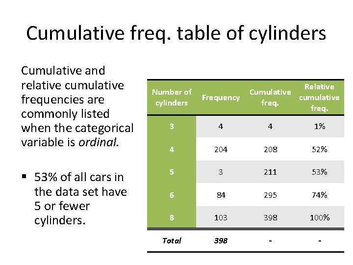
Cumulative freq. table of cylinders Cumulative and relative cumulative frequencies are commonly listed when the categorical variable is ordinal. § 53% of all cars in the data set have 5 or fewer cylinders. Relative Cumulative cumulative freq. Number of cylinders Frequency 3 4 4 1% 4 208 52% 5 3 211 53% 6 84 295 74% 8 103 398 100% Total 398 - -

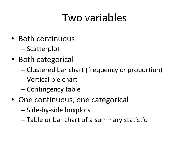
Two variables • Both continuous – Scatterplot • Both categorical – Clustered bar chart (frequency or proportion) – Vertical pie chart – Contingency table • One continuous, one categorical – Side-by-side boxplots – Table or bar chart of a summary statistic

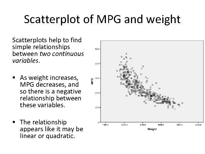
Scatterplot of MPG and weight Scatterplots help to find simple relationships between two continuous variables. § As weight increases, MPG decreases, and so there is a negative relationship between these variables. § The relationship appears like it may be linear or quadratic.

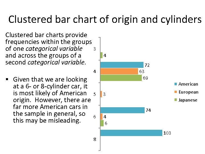
Clustered bar chart of origin and cylinders Clustered bar charts provide frequencies within the groups 3 of one categorical variable and across the groups of a second categorical variable. 4 72 4 § Given that we are looking at a 6 - or 8 -cylinder car, it is most likely of American origin. However, there are far more American cars in the sample in general, so this may be misleading. 5 63 69 American European 3 Japanese 74 6 103 8

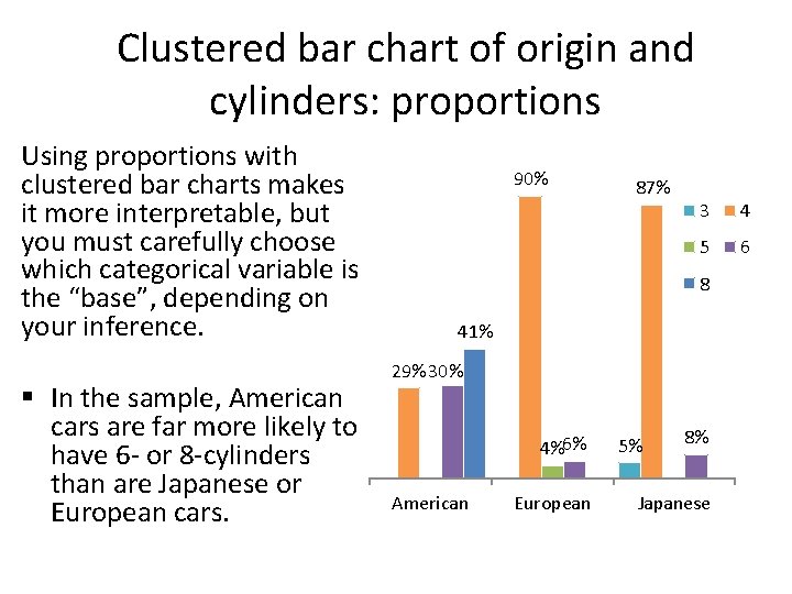
Clustered bar chart of origin and cylinders: proportions Using proportions with clustered bar charts makes it more interpretable, but you must carefully choose which categorical variable is the “base”, depending on your inference. § In the sample, American cars are far more likely to have 6 - or 8 -cylinders than are Japanese or European cars. 90% 87% 3 4 5 6 8 41% 29% 30% 4%6% American European 5% 8% Japanese

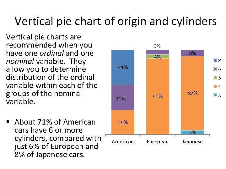
Vertical pie chart of origin and cylinders Vertical pie charts are recommended when you have one ordinal and one nominal variable. They allow you to determine distribution of the ordinal variable within each of the groups of the nominal variable. § About 71% of American cars have 6 or more cylinders, compared with just 6% of European and 8% of Japanese cars. 6% 4% 8% 8 41% 6 5 4 30% 90% 87% 29% 5% American European Japanese 3

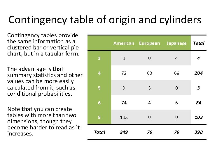
Contingency table of origin and cylinders Contingency tables provide the same information as a clustered bar or vertical pie chart, but in a tabular form. The advantage is that summary statistics and other values can be more easily calculated from it, such as conditional probabilities. Note that you can create tables with more than two dimensions, though they become harder to read as it increases. American European Japanese Total 3 0 0 4 4 4 72 63 69 204 5 0 3 6 74 4 6 84 8 103 0 0 103 Total 249 70 79 398

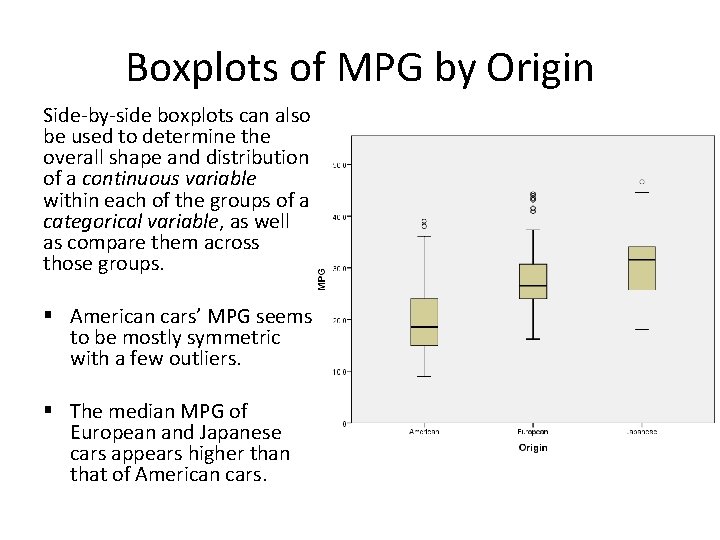
Boxplots of MPG by Origin Side-by-side boxplots can also be used to determine the overall shape and distribution of a continuous variable within each of the groups of a categorical variable, as well as compare them across those groups. § American cars’ MPG seems to be mostly symmetric with a few outliers. § The median MPG of European and Japanese cars appears higher than that of American cars.

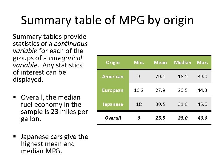
Summary table of MPG by origin Summary tables provide statistics of a continuous variable for each of the groups of a categorical variable. Any statistics of interest can be displayed. § Overall, the median fuel economy in the sample is 23 miles per gallon. § Japanese cars give the highest mean and median MPG. Origin Min. Mean Median Max. American 9 20. 1 18. 5 39. 0 European 16. 2 27. 9 26. 5 44. 3 Japanese 18 30. 5 31. 6 46. 6 Overall 9 23. 5 23. 0 46. 6

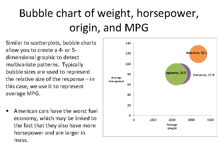
Other charts • Time series/line/run chart (not shown): one continuous and one time variable (and one optional categorical variable) – Displays behavior over time so you can detect patterns, abnormalities, or other quality issues – Plot some continuous variable of interest (usually the response) on the y-axis versus time on the x-axis – Similar to a scatterplot, but connects dots with lines • Bubble chart: 3 continuous variables and one categorical variable (and one additional optional categorical variable)

Bubble chart of weight, horsepower, origin, and MPG Similar to scatterplots, bubble charts allow you to create a 4 - or 5 dimensional graphic to detect multivariate patterns. Typically bubble sizes are used to represent the relative size of the response – in this case, we use it to represent average MPG. § American cars have the worst fuel economy, which may be linked to the fact that they also have more horsepower and are larger in mass.

Useful tips • Can often use color, size, shape, etc. to distinguish groups • To reduce the number of dimensions, if the number of groups are small, you can combine two categorical variables into one – E. g. : Gender and Smoker can create a single variable with four groups: F smoker, M smoker, F nonsmoker, M nonsmoker • For illustration purposes, you can transform a continuous variable into a categorical variable – E. g. , Age can become age groups: 18 to 24, 35 to 44, etc. • Ordinal variables can sometimes be treated as continuous • Though usually recording counts, tables can also report summary statistics of a continuous variable, such as mean or median • In many cases, proportions and observed counts can be used interchangeable, though proportions are usually more interpretable.