Data Visualisation Designing visual representations of numeric data









- Slides: 47

Data Visualisation Designing visual representations of numeric data the Stephen Few way Presenter Darren Burnett

• What is Data Visualisation anyway? • Why is it important? • How human beings interpret what they see. • Effectively conveying numeric and chronological data.

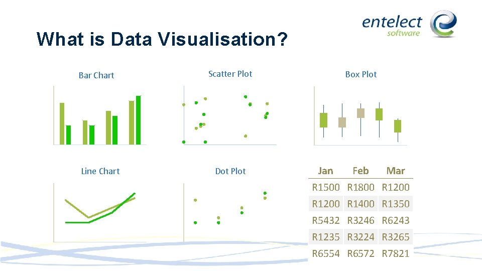
What is Data Visualisation? Bar Chart Line Chart Scatter Plot Dot Plot Box Plot Jan Feb Mar R 1500 R 1800 R 1200 R 1400 R 1350 R 5432 R 3246 R 6243 R 1235 R 3224 R 3265 R 6554 R 6572 R 7821

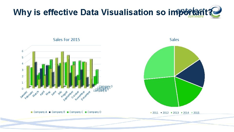
Why is effective Data Visualisation so important? Sales For 2015 6 5 4 3 2 1 Ja nu Fe ary br ua r M y ar ch Ap ril M ay Ju ne Ju Au ly Se gu pt st em b Oc er t No obe ve r m De be ce r m be r 0 Company A Company B Company C Company D Company C Company B Company A Company D 2011 2012 2013 2014 2015

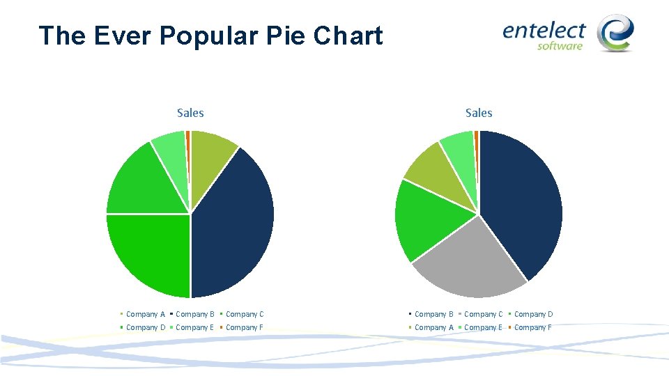
The Ever Popular Pie Chart Sales Company A Company B Company C Company D Company E Company F Company A Company E Company F

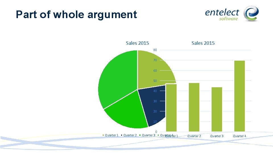
Part of whole argument Sales 2015 80 70 60 50 40 30 20 10 Quarter 1 Quarter 2 Quarter 3 0 Quarter 4 1 Quarter 2 Quarter 3 Quarter 4

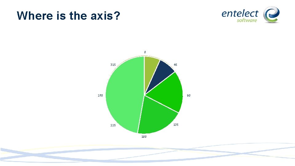
Where is the axis? 0 315 45 270 90 135 225 180

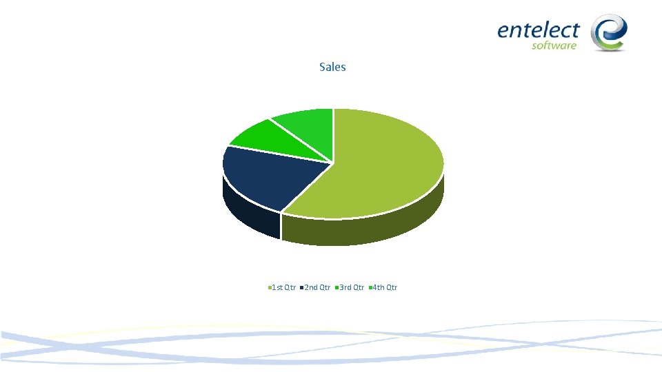
Sales 1 st Qtr 2 nd Qtr 3 rd Qtr 4 th Qtr

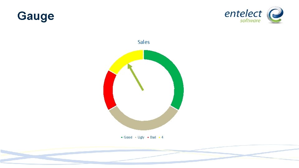
Gauge Sales Good Ugly Bad 4

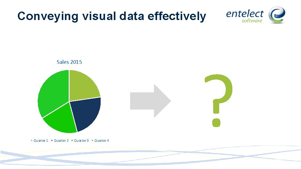
Conveying visual data effectively Sales 2015 Quarter 1 Quarter 2 Quarter 3 Quarter 4 ?

985321478921350841354907432135496 521097438570870324657009668240972 353089879394231596385712653440987 421549098321487900657089702198673 How many did you get?

985321478921350841354907432135496 521097438570870324657009668240972 353089879394231596385712653440987 421549098321487900657089702198673


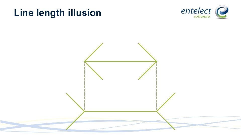
Line length illusion

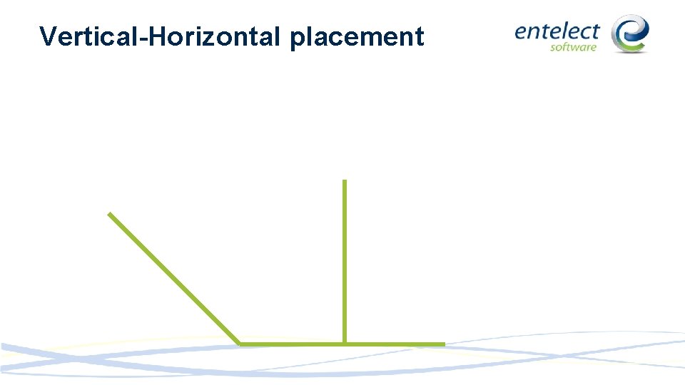
Vertical-Horizontal placement

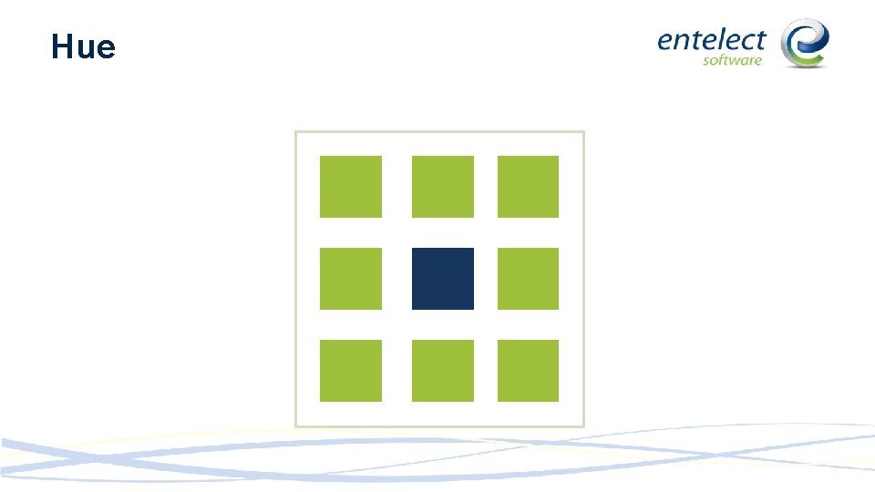
Hue

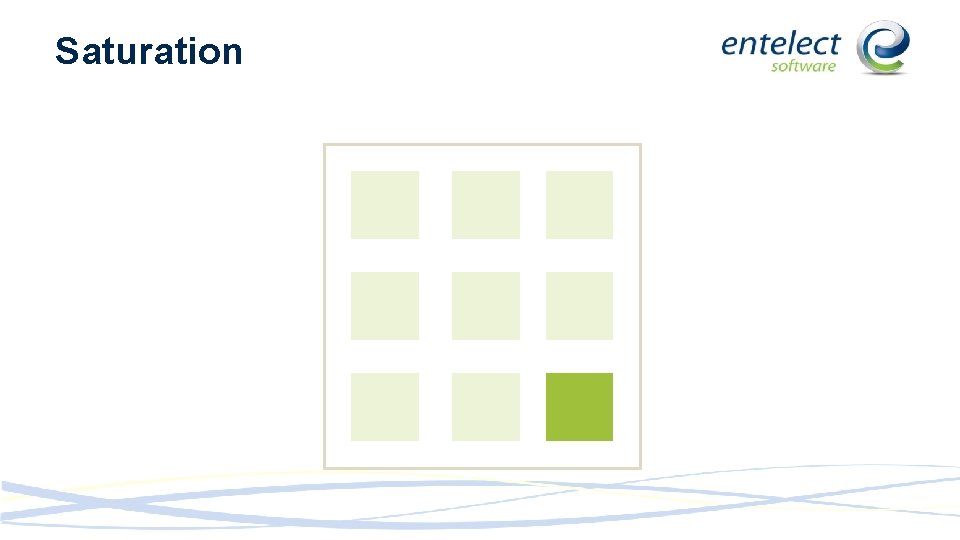
Saturation

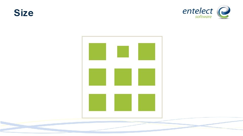
Size

Outline

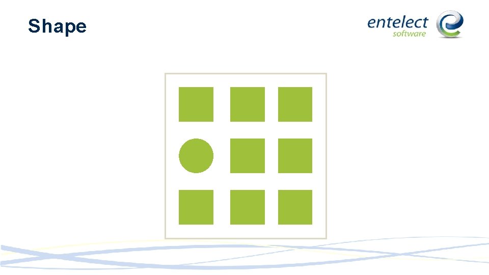
Shape

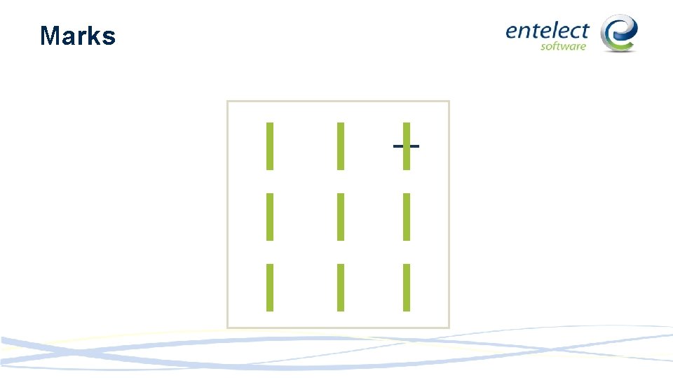
Marks

Position

Animation

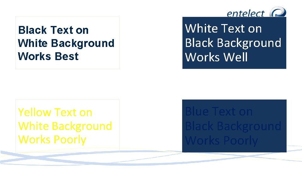
Black Text on White Background Works Best White Text on Black Background Works Well Yellow Text on White Background Works Poorly Blue Text on Black Background Works Poorly

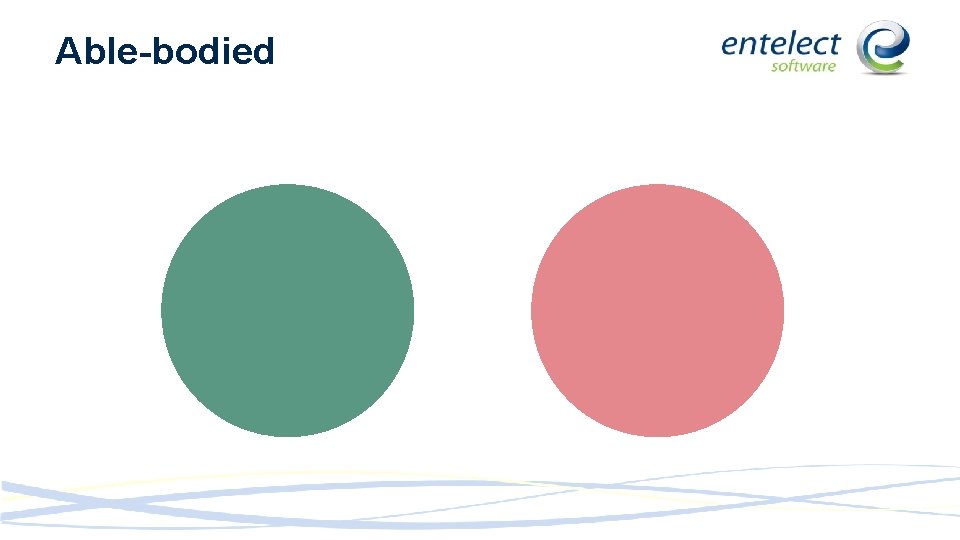
Able-bodied

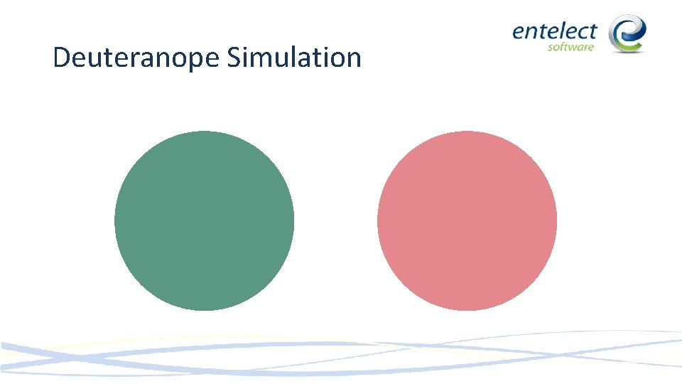
Deuteranope Simulation

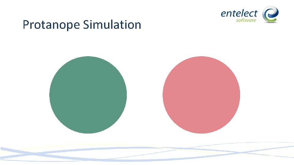
Protanope Simulation

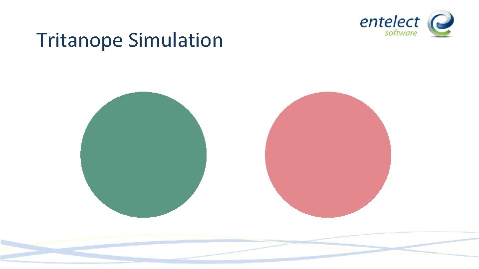
Tritanope Simulation

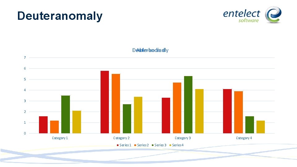
Deuteranomaly Able-bodied 7 6 5 4 3 2 1 0 Category 1 Category 2 Series 1 Category 3 Series 2 Series 3 Series 4 Category 4

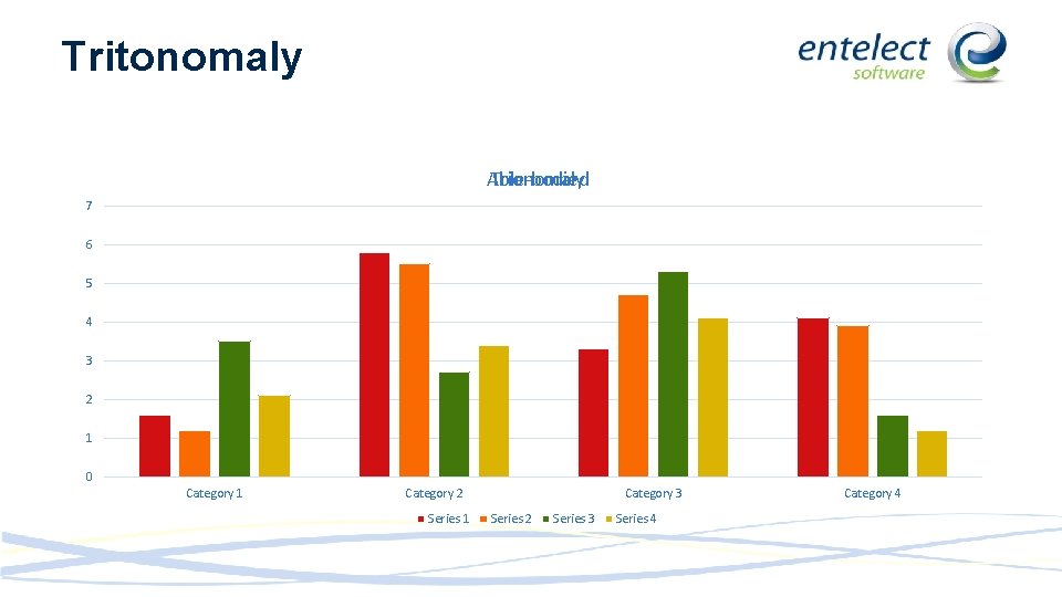
Tritonomaly Able-bodied Trionomaly 7 6 5 4 3 2 1 0 Category 1 Category 2 Series 1 Category 3 Series 2 Series 3 Series 4 Category 4

More focus is placed here in cultures that read from left to right More focus is placed here in cultures that read from right to left The Real Estate Place less important information in the bottom corners

Data Representation • • Time Series Ranking Part-to-whole Deviation Distribution Correlation Nominal Comparison

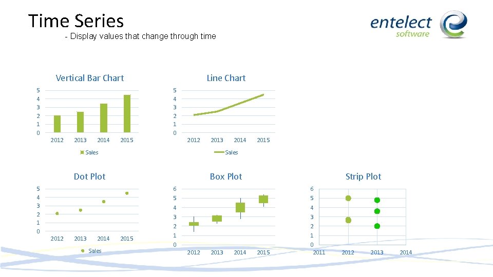
Time Series - Display values that change through time Vertical Bar Chart 5 4 3 2 1 0 Line Chart 5 4 3 2 1 0 2012 2013 2014 2015 2012 2013 Sales Box Plot 5 4 3 2 1 0 2013 2014 Sales 2015 Sales Dot Plot 2012 2014 2015 Strip Plot 6 6 5 5 4 4 3 3 2 2 1 1 0 2012 2013 2014 2015 0 2011 2012 2013 2014

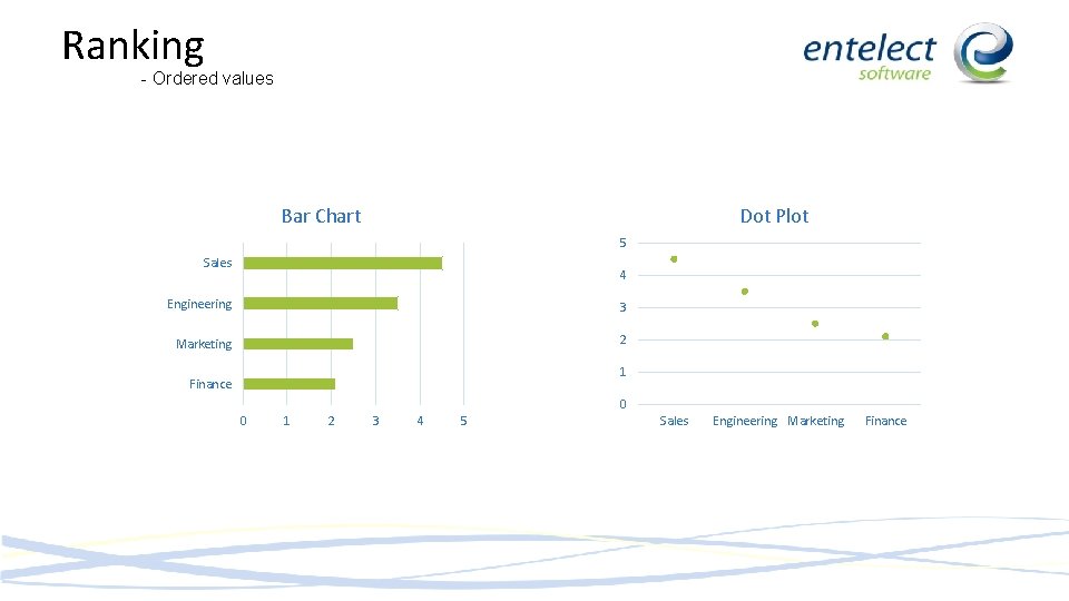
Ranking - Ordered values Bar Chart Dot Plot 5 Sales 4 Engineering 3 Marketing 2 1 Finance 0 0 1 2 3 4 5 Sales Engineering Marketing Finance

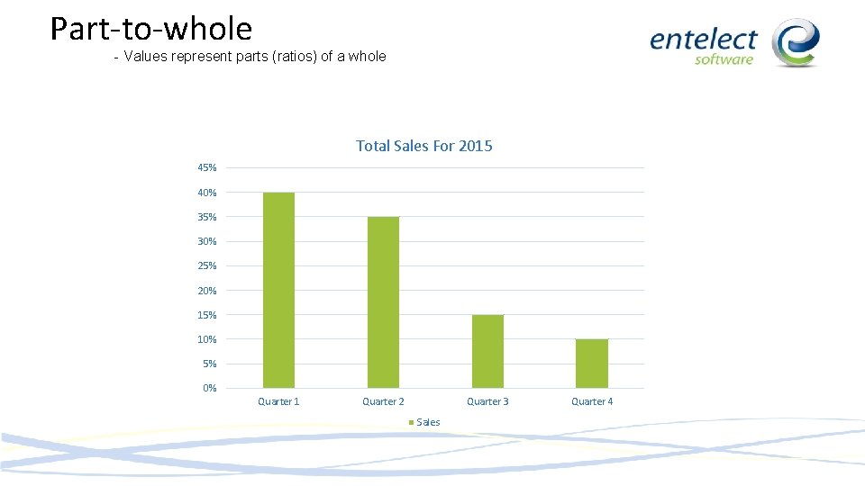
Part-to-whole - Values represent parts (ratios) of a whole Total Sales For 2015 45% 40% 35% 30% 25% 20% 15% 10% 5% 0% Quarter 1 Quarter 2 Quarter 3 Sales Quarter 4

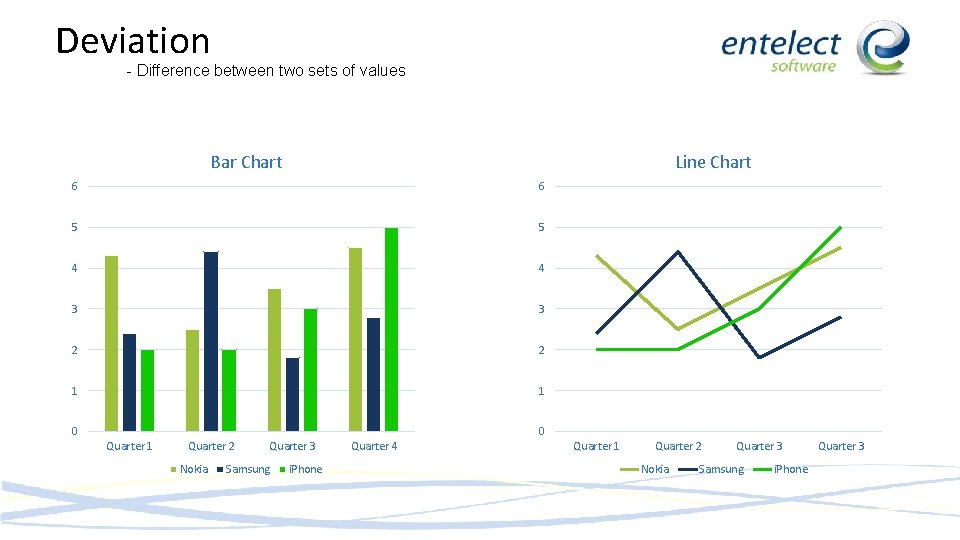
Deviation - Difference between two sets of values Bar Chart Line Chart 6 6 5 5 4 4 3 3 2 2 1 1 0 0 Quarter 1 Quarter 2 Nokia Quarter 3 Samsung i. Phone Quarter 4 Quarter 1 Quarter 2 Nokia Quarter 3 Samsung i. Phone Quarter 3

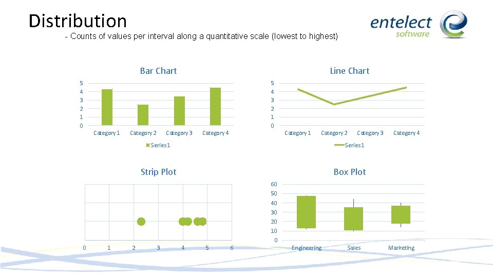
Distribution - Counts of values per interval along a quantitative scale (lowest to highest) Bar Chart Line Chart 5 4 3 2 1 0 Category 1 Category 2 Category 3 Category 4 Category 1 Category 2 Series 1 Category 3 Category 4 Series 1 Strip Plot Box Plot 60 50 40 30 20 10 0 0 1 2 3 4 5 6 Engineering Sales Marketing

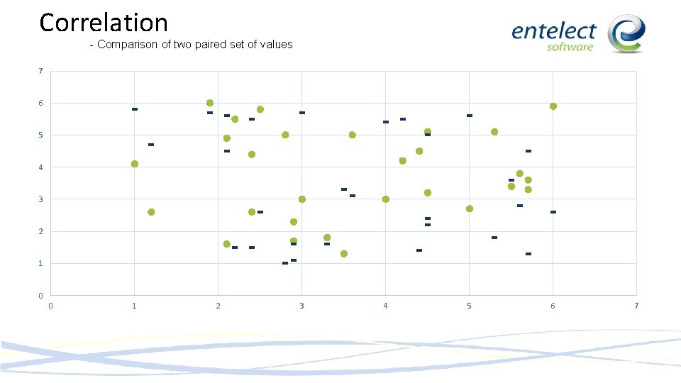
Correlation - Comparison of two paired set of values 7 6 5 4 3 2 1 0 0 1 2 3 4 5 6 7

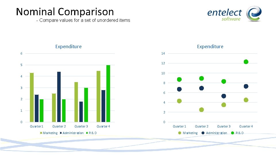
Nominal Comparison - Compare values for a set of unordered items Expenditure 6 14 5 12 10 4 8 3 6 2 4 1 2 0 0 Quarter 1 Quarter 2 Marketing Quarter 3 Administration Quarter 4 R&D

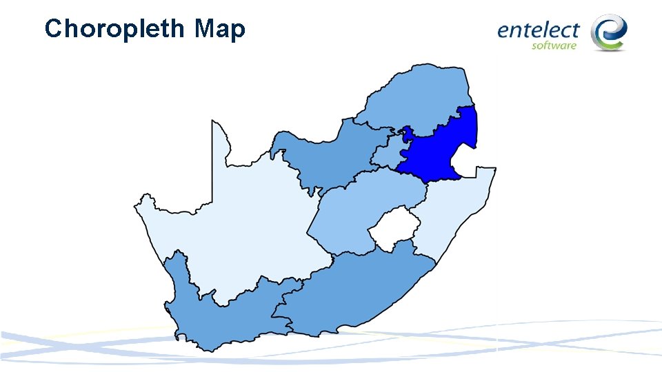
Choropleth Map

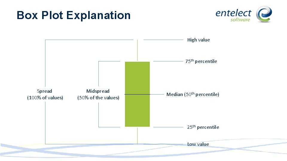
Box Plot Explanation High value 75 th percentile Spread (100% of values) Midspread (50% of the values) Median (50 th percentile) 25 th percentile Low value

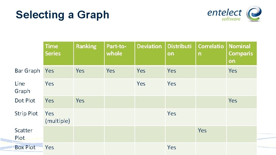
Selecting a Graph Time Series Bar Graph Yes Line Graph Yes Dot Plot Yes Strip Plot Yes (multiple) Ranking Part-towhole Deviation Distributi on Yes Yes Yes Scatter Plot Box Plot Correlatio Nominal n Comparis on Yes Yes

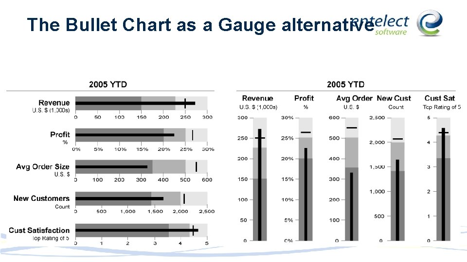
The Bullet Chart as a Gauge alternative

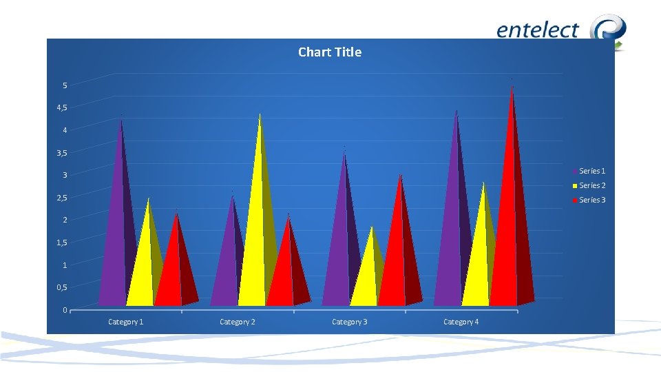
Chart Title 5 4, 5 4 3, 5 Series 1 3 Series 2 2, 5 Series 3 2 1, 5 1 0, 5 0 Category 1 Category 2 Category 3 Category 4

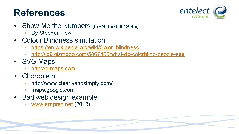
References • Show Me the Numbers (ISBN 0 -9706019 -9 -9) • By Stephen Few • Colour Blindness simulation • https: //en. wikipedia. org/wiki/Color_blindness • http: //io 9. gizmodo. com/5867406/what-do-colorblind-people-see • SVG Maps • http: //d-maps. com • Choropleth • http: //www. clearlyandsimply. com/ • maps. google. com • Bad web design example • www. arngren. net (2013)

Questions ?