Data representation and interpretation Collecting displaying and interpreting



- Slides: 23

Data representation and interpretation — Collecting, displaying and interpreting data (Parry, 2015). (Velaction Continuous Improvement. , 2014).

WALT Today we are learning about collecting, displaying and interpreting data WILF I’m looking for you to: • Collect data from observed events. • Display collected data as a picture graph or column graph. • Interpret and describe key features of the collected data. TIB We collect, use and interpret data throughout our working lives to provide important information.

So what is data? Data is a term used to describe the (Priestly, n. d. ). number information collected from different sources. We are going to watch a short video to look at different ways data can be collected. In this video you will revise and learn about four common sources of data — sorting and counting, observing events, asking questions and experimenting. (Fallmann, n. d. ). Common Sources of Data

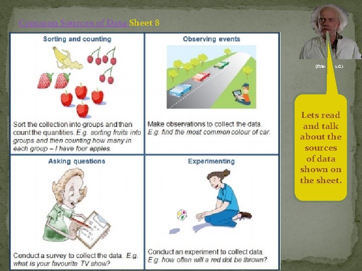
Common Sources of Data Sheet 8 (Priestly, n. d. ). Lets read and talk about the sources of data shown on the sheet.

Have you collected data from any of these sources? (Priestly, n. d. ). View the Learning object — Ways to display data to see how you can present gathered information in picture graphs and column graphs. (Fallmann, n. d. ).

Lets discuss the information shown on each screen and your previous experience with collecting data to display in graphs (e. g. making picture graphs to show information). (Priestly, n. d. ). Q. What question did the students ask in ‘Ways to display data’? A. What is your favourite playtime activity? Q. Why do people need to collect information (data)? A. to answer a question or solve a problem Q. When have you collected information (data) about something? Q. How was the information displayed in ‘Ways to display data’? A. picture, bar and column graph

Q. Which display was easiest to read? Why do you think that is? (Priestly, n. d. ). Q. How could you tell, from looking at each graph, how many people voted for each activity? A. when counting objects Q. When might you need to make a list and use tally marks?

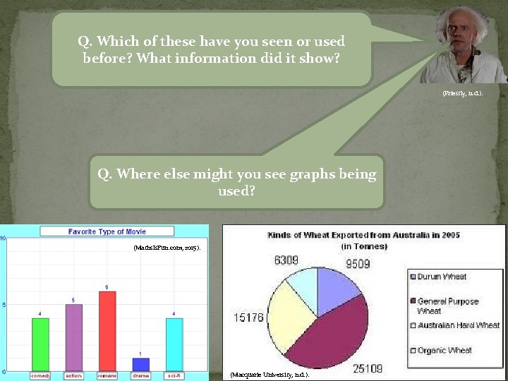
Q. Which of these have you seen or used before? What information did it show? (Priestly, n. d. ). Q. Where else might you see graphs being used? (Maths. Is. Fun. com, 2015). (Macquarie University, n. d. ).

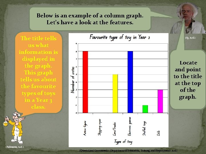
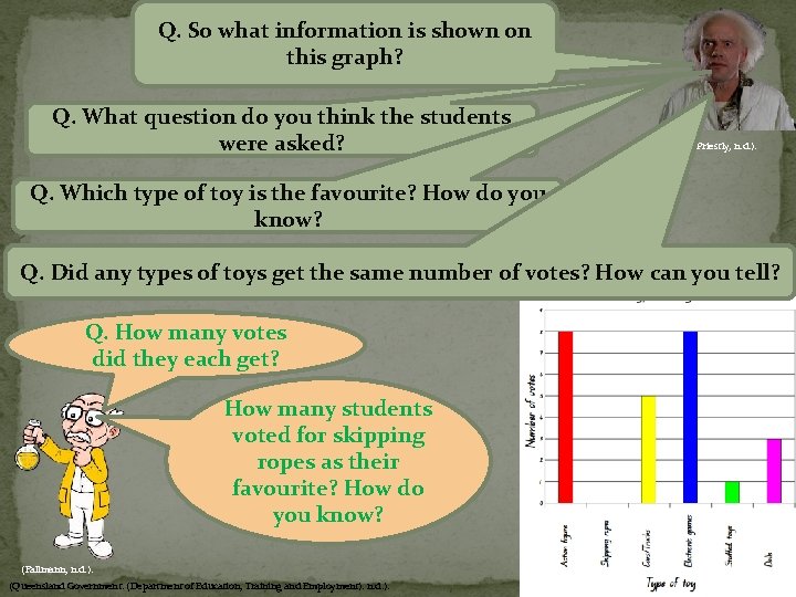
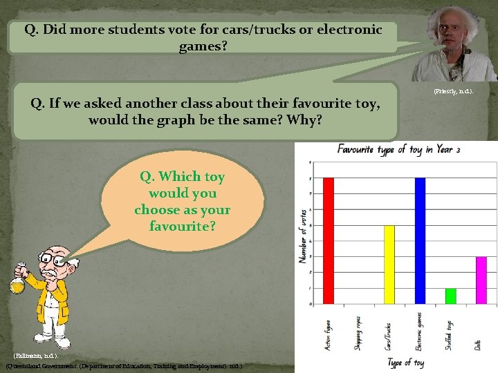
Below is an example of a column graph. Let’s have a look at the features. The title tells us what information is displayed in the graph. This graph tells us about the favourite types of toys in a Year 3 class. (Priestly, n. d. ). Locate and point to the title at the top of the graph. (Fallmann, n. d. ). (Queensland Government. (Department of Education, Training and Employment). n. d. ).

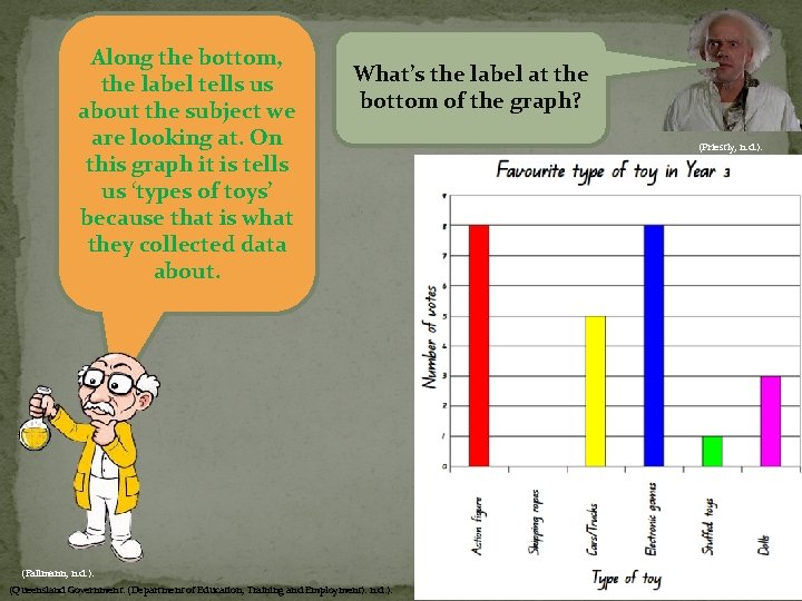
Along the bottom, the label tells us about the subject we are looking at. On this graph it is tells us ‘types of toys’ because that is what they collected data about. What’s the label at the bottom of the graph? (Fallmann, n. d. ). (Queensland Government. (Department of Education, Training and Employment). n. d. ). (Priestly, n. d. ).

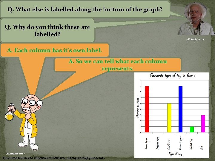
Q. What else is labelled along the bottom of the graph? Q. Why do you think these are labelled? (Priestly, n. d. ). A. Each column has it’s own label. A. So we can tell what each column represents. (Fallmann, n. d. ). (Queensland Government. (Department of Education, Training and Employment). n. d. ).

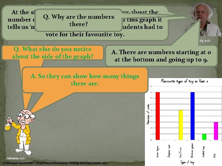
At the side of the graph the label tells us about the Q. Why arewere the numbers number of things that counted. On this graph it there? tells us ‘number of votes’ because the students had to vote for their favourite toy. (Priestly, n. d. ). Q. What else do you notice about the side of the graph? A. There are numbers starting at 0 at the bottom and going up to 9. A. So they can show many things there are. (Fallmann, n. d. ). (Queensland Government. (Department of Education, Training and Employment). n. d. ).

Q. So what information is shown on this graph? Q. What question do you think the students were asked? (Priestly, n. d. ). Q. Which type of toy is the favourite? How do you know? Q. Did any types of toys get the same number of votes? How can you tell? Q. How many votes did they each get? How many students voted for skipping ropes as their favourite? How do you know? (Fallmann, n. d. ). (Queensland Government. (Department of Education, Training and Employment). n. d. ).

Q. Did more students vote for cars/trucks or electronic games? Q. If we asked another class about their favourite toy, would the graph be the same? Why? Q. Which toy would you choose as your favourite? (Fallmann, n. d. ). (Queensland Government. (Department of Education, Training and Employment). n. d. ). (Priestly, n. d. ).

Collect data from observing events Soon you will construct your own graph similar to the Favourite type of toy in Year 3 graph. Let’s think about vehicles travelling past (our school). I wonder which type of vehicle we would see most frequently. Can you predict which of these would go by more often. (Fallmann, n. d. ). (Priestly, n. d. ). Can you suggest different types of vehicles that may travel past the school?

Q. How might we collect data to find out which type of vehicle passes by most frequently? (Priestly, n. d. ). You will watch a video to collect your data (observe events). This data will be used to answer the question: What type of vehicle passes (the school) most frequently. The steps used in collecting and recording data are: • collect data in a list or table (use tally marks) • count the totals for each type of vehicle • make a (column) graph to show your results. (Fallmann, n. d. ).

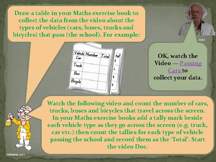
Draw a table in your Maths exercise book to collect the data from the video about the types of vehicles (cars, buses, trucks and bicycles) that pass (the school). For example: (Priestly, n. d. ). OK, watch the Video — Passing Cars to collect your data. Watch the following video and count the number of cars, trucks, buses and bicycles that travel across the screen. In your Maths exercise books add a tally mark beside each vehicle type as they go across the screen (e. g. truck, car etc. ) then count the tallies for each type of vehicle passing the school and record them as the ‘Total’. Start the video Doc. (Fallmann, n. d. ).

Display data Watch the Video — How to construct a column graph (Priestly, n. d. ). In the following video you will learn how to transfer and display your collected data (from Passing cars) into a column graph using Graph maker. (Fallmann, n. d. ).

You are now going to make a column graph using the Learning object — Graph maker to represent your collected data from your Maths exercise books. Of course they can, you just watch. Wow , can they really do that? (Priestly, n. d. ). Don’t forget to: ◦ give the graph a title (e. g. ‘Vehicles passing the school’) ◦ label the axes (e. g. the horizontal axis ‘Type of vehicle’ and the vertical axis ‘Number of vehicles’) ◦ list the vehicles along the horizontal axis (or baseline) ◦ number the vertical axis ◦ compare the completed graph with the collected data to make sure it is accurate (e. g. 10 tally marks and 10 shown on the graph for cars) ◦ print out the graph and glue it into your Maths exercise book next to your table with tally marks. (Fallmann, n. d. ). Learning object — Graph maker

Interpret data Q. Which vehicle passed the school most frequently? How do you know? Q. How might this data change on the weekend (or at a different time of day? ) Why do you think this is? Q. Did any two types of vehicles get the same result? Q. Why do you think (cars) were the more common? Q. How many times did they each pass the school? Q. How could you use this data? (Fallmann, n. d. ). (Priestly, n. d. ).

Q. What have you found out about ways to display data? (Priestly, n. d. ). Q. Who might use column graphs? Q. What types of graph have you found out about today? What did you enjoy about today’s lesson? What didn’t you enjoy? (Fallmann, n. d. ).

References Fallmann, I. (n. d. ). Mindbreeze illuminating information: What makes data scientists sexy? , Retrieved May 12, 2015, from https: //www. mindbreeze. com/blog/what-makes-data-scientists-sexy. html Macquarie University. (n. d. ). Planning your task 1 report. Retrieved May 15, 2015, from http: //www. ieltsonline. com. au/IELTSexpress/writing/task 1/practice/02_plan_wt 1_report. asp Maths. Is. Fun. com. (2015). Maths. Is. Fun. com [Image]. Retrieved May 14, 2015, from http: //www. mathsisfun. com/data/bar-graphs. html Parry, K. A. (2015). My Ph. D Journey – Doctor of Philosophy (UOW) [Image]. Retrieved May 17, 2015, from http: //kellyannparry. com/2015/02/02/acollecting-we-will-go-data-collection/ Priestly, T. (n. d. ) Successful workplace: New ideas in a fast changing world [Image]. Retrieved May 12, 2015, from http: //www. successfulworkplace. org/2013/02/13/what-the-hll-is-a-data-scientist-anyway/ Queensland Government. (Department of Education, Training and Employment). (n. d. ). Curriculum into the classroom: Mathematics, Year 3, Unit 2, Lesson 7, Data representation and interpretation — Collecting, displaying and interpreting data 1. Retrieved May 10, 2015, from https: //oneportal. deta. qld. gov. au/Education. Delivery/Stateschooling/schoolcurriculum/Curriculumintotheclassroom/Pages/C 2 Cmathematics. aspx (QLD Education login required). Queensland Government. (Department of Education, Training and Employment). (n. d. ). Favourite type of toy in Year 3: Column graph. Retrieved May 10, 2015, from https: //learningplace. eq. edu. au/cx/resources/file/bf 9 bc 036 -8324 -35 b 1 -93 ec 1 ed 63631 caa 9/1/Mth_Y 03_U 2_ILM_LP 07_Sh 09_Col. pdf Velaction Continuous Improvement. (2014). Data Collection [Image]. Retrieved May 17, 2015, from http: //www. velaction. com/data-collection/
