Data Graphing in Science 1212022 What is Data

- Slides: 8

Data Graphing in Science 1/21/2022

What is Data Graphing? ? ? �Data graphing is a way to outline specific information in the form of visual graphs or tables �It often exhibits a relationship between two specific items/pieces of data �Provides a visual reference of the data for easier organizing and analysis 1/21/2022

Bar Graphs �Bar graphs are a visual display used to compare the amounts or frequency of occurrence of different characteristics of data �It is used to compare groups of data and to make generalizations quickly �In order to make a proper analysis you must keep in mind the titles of the table and axes along with the value of the scale 1/21/2022

Circle Graph �Circle graphs display categories of information to provide a quick and easy way to display parts of a whole �Data must be converted over to percentages by dividing the specific part value to the whole value 1/21/2022 �GRAPH

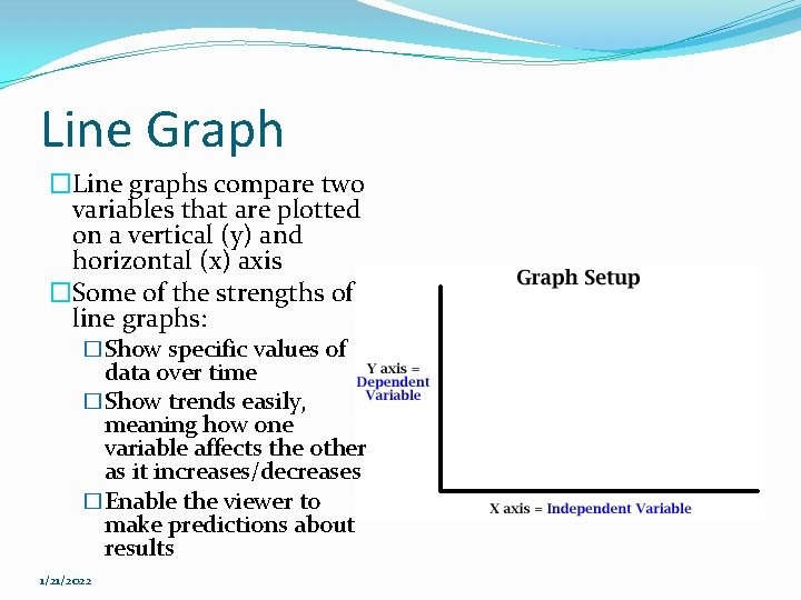
Line Graph �Line graphs compare two variables that are plotted on a vertical (y) and horizontal (x) axis �Some of the strengths of line graphs: �Show specific values of data over time �Show trends easily, meaning how one variable affects the other as it increases/decreases �Enable the viewer to make predictions about results 1/21/2022

Stem & Leaf Plot/”Stemplots” �Stem & leaf plots are a device used to show a graphical format of the distribution of data; basically meaning the order of the data �A stemplot contains two columns separated by a vertical line; stems on the left and leaves on the right �The stem represents the 10’s place and higher while the leaf represents the 1’s place only �CLIP 1/21/2022

Box & Whisker Plot/”Boxplot” � Box and whisker plots are used to display a set of data so that you can easily see where most of the numbers are � The numerical data is quartered into 25% sections through 5 number summaries: � � � Minimum Lower Quartile Median Upper Quartile Maximum � This type of graph allows for the reader to figure out the spread of the data and identify outliers 1/21/2022 CLIP

The End 1/21/2022