Data and Information Data Raw unorganised facts figures
- Slides: 14

Data and Information

Data • Raw, unorganised facts, figures and symbols fed to a computer during the input process. • Can also mean ideas or concepts before they have been refined.

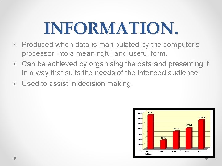
INFORMATION. • Produced when data is manipulated by the computer’s processor into a meaningful and useful form. • Can be achieved by organising the data and presenting it in a way that suits the needs of the intended audience. • Used to assist in decision making.

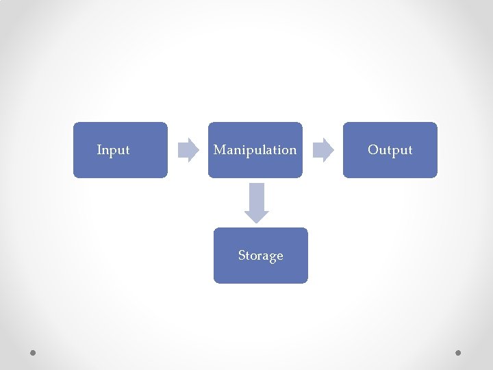
Input Manipulation Storage Output

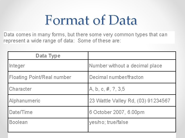
Format of Data comes in many forms, but there some very common types that can represent a wide range of data: Some of these are: Data Type Integer Number without a decimal place Floating Point/Real number Decimal number/fracton Character A, b, c, #, ? , 3, 5 Alphanumeric 23 Wattle Valley Rd, (03) 91234567 Date/Time 6 October 2007, 6. 00 pm Boolean yes/no; true/false

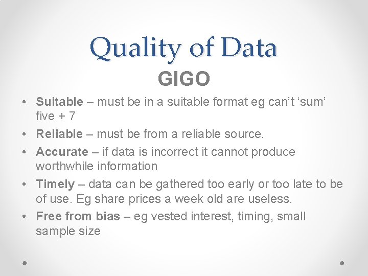
Quality of Data GIGO • Suitable – must be in a suitable format eg can’t ‘sum’ five + 7 • Reliable – must be from a reliable source. • Accurate – if data is incorrect it cannot produce worthwhile information • Timely – data can be gathered too early or too late to be of use. Eg share prices a week old are useless. • Free from bias – eg vested interest, timing, small sample size

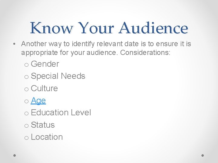
Know Your Audience • Another way to identify relevant date is to ensure it is appropriate for your audience. Considerations: o Gender o Special Needs o Culture o Age o Education Level o Status o Location

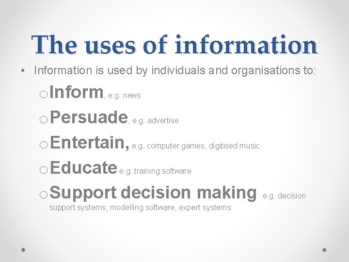
The uses of information • Information is used by individuals and organisations to: o. Inform, e. g. news o. Persuade, e. g. advertise o. Entertain, e. g. computer games, digitised music o. Educate e. g. training software o. Support decision making e. g. decision support systems, modelling software, expert systems

Types and Purposes of Graphic Representations • Graphic representations are particularly useful for summarising a series of numbers and their interrelationships, and they can assist in identifying trends and patterns.

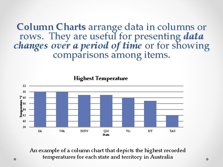
Column Charts arrange data in columns or rows. They are useful for presenting data changes over a period of time or for showing comparisons among items. Highest Temperature 52 Temperature °C 50 48 46 44 42 40 38 SA WA NSW Qld State Vic NT TAS An example of a column chart that depicts the highest recorded temperatures for each state and territory in Australia

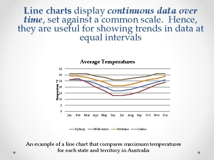
Line charts display continuous data over time, set against a common scale. Hence, they are useful for showing trends in data at equal intervals Average Temperatures 35 30 Temperature °C 25 20 15 10 5 0 Jan Feb Mar Sydney Apr May Melbourne Jun Jul Aug Brisbane Sep Oct Nov Dec Cairns An example of a line chart that compares maximum temperatures for each state and territory in Australia

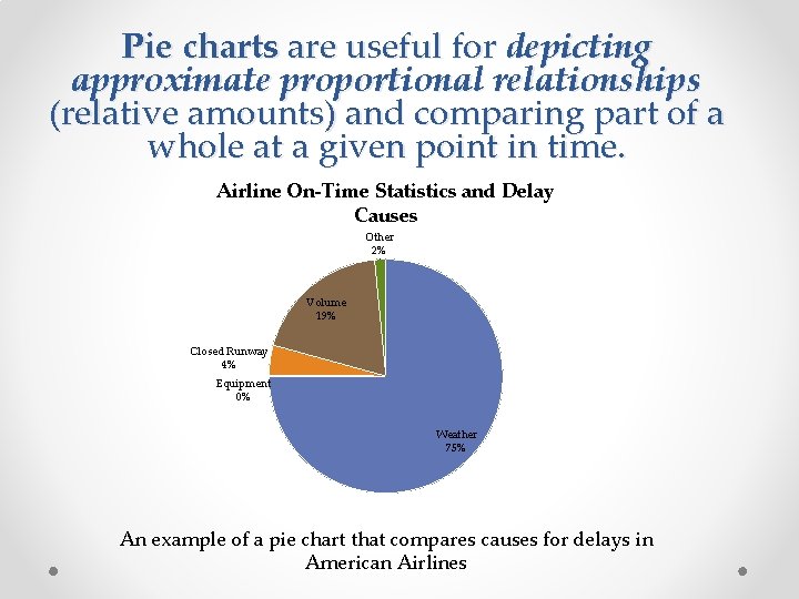
Pie charts are useful for depicting approximate proportional relationships (relative amounts) and comparing part of a whole at a given point in time. Airline On-Time Statistics and Delay Causes Other 2% Volume 19% Closed Runway 4% Equipment 0% Weather 75% An example of a pie chart that compares causes for delays in American Airlines

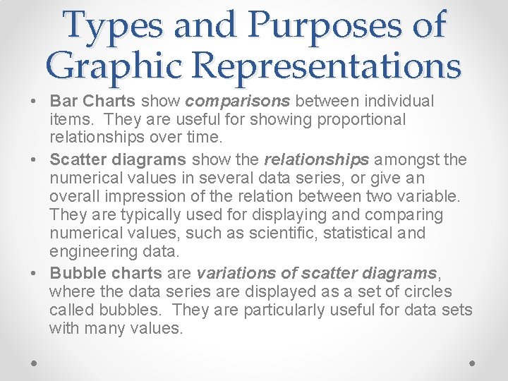
Types and Purposes of Graphic Representations • Bar Charts show comparisons between individual items. They are useful for showing proportional relationships over time. • Scatter diagrams show the relationships amongst the numerical values in several data series, or give an overall impression of the relation between two variable. They are typically used for displaying and comparing numerical values, such as scientific, statistical and engineering data. • Bubble charts are variations of scatter diagrams, where the data series are displayed as a set of circles called bubbles. They are particularly useful for data sets with many values.

Spreadsheet Software • Producing graphs from numerical data o Mathematical functions o Financial functions o Statistical functions o Lookup and reference functions