Data Analysis Unit Double bar graphs are used

Data Analysis Unit
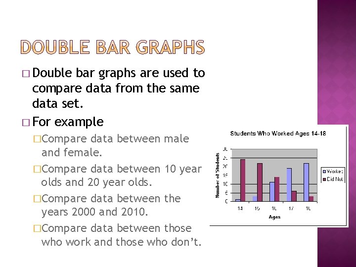
� Double bar graphs are used to compare data from the same data set. � For example �Compare data between male and female. �Compare data between 10 year olds and 20 year olds. �Compare data between the years 2000 and 2010. �Compare data between those who work and those who don’t.
1. 2. 3. 4. 5. 6. 7. Divide your data into the two categories that will be compared. Determine your x-axis label Determine your y-axis label and appropriate intervals. Title your graph Draw each bar to the appropriate height. Color one set of data on a bar one color and the other set of data on a bar another color. Create a legend so the reader of the graph will know what each bar represents.
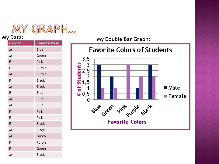
My Data: Purple F Black M Black F Blue M Blue F Pink F Black M Green F Purple F Green M Black Male Female ck M Bl a Purple le F 3, 5 3 2, 5 2 1, 5 1 0, 5 0 k Pink Pu rp F Favorite Colors of Students Pi n Green n M Gr ee Blue ue M My Double Bar Graph: Bl Favorite Color # of Students Gender Favorite Colors
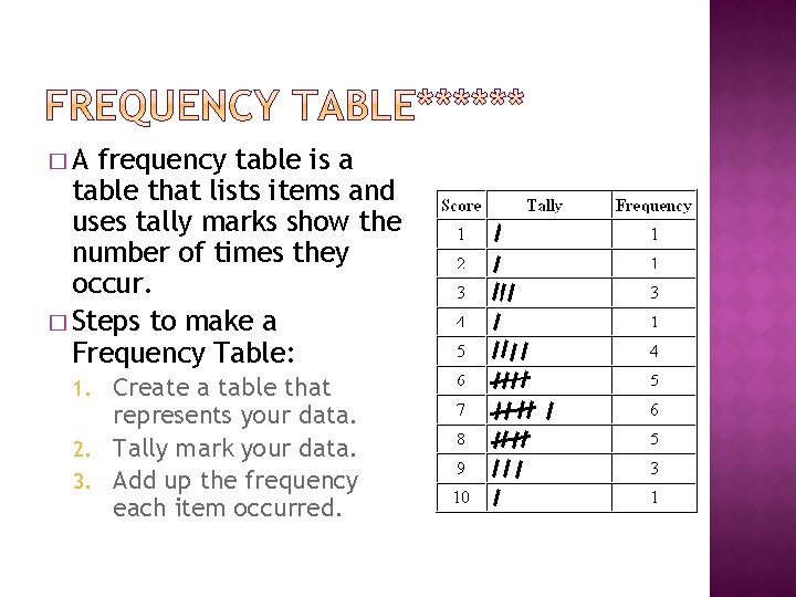
�A frequency table is a table that lists items and uses tally marks show the number of times they occur. � Steps to make a Frequency Table: Create a table that represents your data. 2. Tally mark your data. 3. Add up the frequency each item occurred. 1.
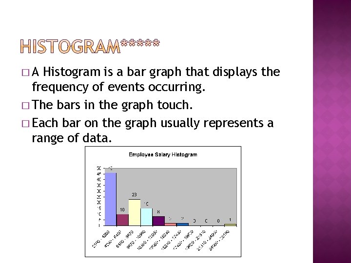
�A Histogram is a bar graph that displays the frequency of events occurring. � The bars in the graph touch. � Each bar on the graph usually represents a range of data.
1. 2. 3. 4. 5. 6. Organize your data into equal intervals. Create a standard bar graph with x- and yaxis labels and a title. On the x-axis label each interval. On the y-axis label the frequency in equal intervals. Draw each bar. Make sure bars are touching. Color the bars.
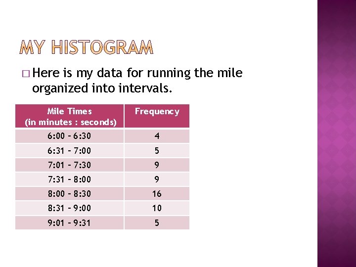
� Here is my data for running the mile organized into intervals. Mile Times (in minutes : seconds) Frequency 6: 00 – 6: 30 4 6: 31 – 7: 00 5 7: 01 – 7: 30 9 7: 31 – 8: 00 9 8: 00 – 8: 30 16 8: 31 – 9: 00 10 9: 01 – 9: 31 5
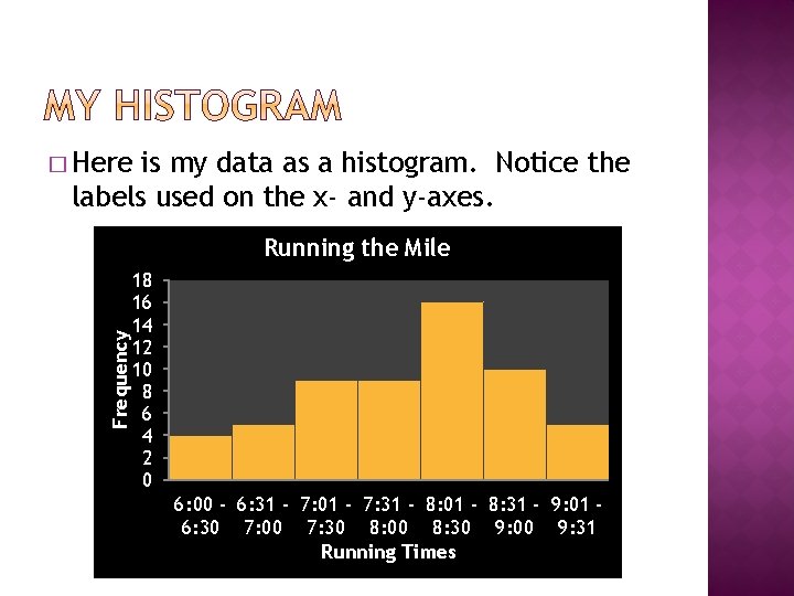
� Here is my data as a histogram. Notice the labels used on the x- and y-axes. Frequency Running the Mile 18 16 14 12 10 8 6 4 2 0 6: 00 - 6: 31 - 7: 01 - 7: 31 - 8: 01 - 8: 31 - 9: 01 6: 30 7: 00 7: 30 8: 00 8: 30 9: 00 9: 31 Running Times
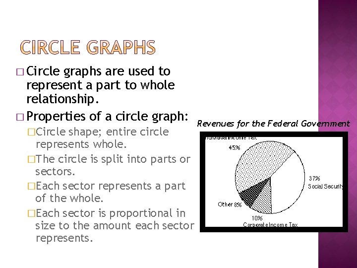
� Circle graphs are used to represent a part to whole relationship. � Properties of a circle graph: �Circle shape; entire circle represents whole. �The circle is split into parts or sectors. �Each sector represents a part of the whole. �Each sector is proportional in size to the amount each sector represents. Revenues for the Federal Government
1. 2. 3. 4. 5. Make a list of items you wish to illustrate on the graph and list the percentage of that item. (# for that item divided by total # of items) All percents should add up to 100%. Convert each percentage into degrees by multiplying each percent by 3. 6. All degrees should add up to 360 degrees. Use a protractor to draw a circle and mark the center. Use a protractor to draw each sector of the circle. Color and label each section.
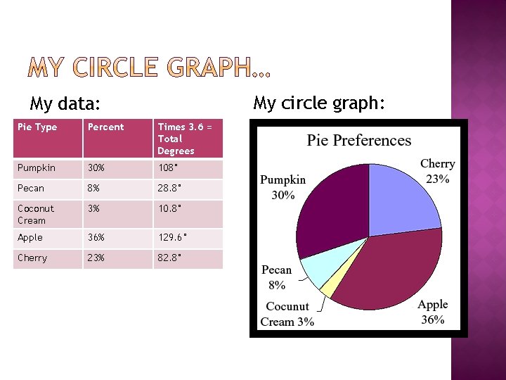
My circle graph: My data: Pie Type Percent Times 3. 6 = Total Degrees Pumpkin 30% 108° Pecan 8% 28. 8° Coconut Cream 3% 10. 8° Apple 36% 129. 6° Cherry 23% 82. 8°
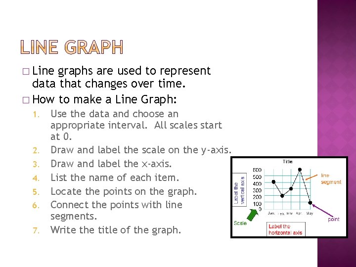
� Line graphs are used to represent data that changes over time. � How to make a Line Graph: 1. 2. 3. 4. 5. 6. 7. Use the data and choose an appropriate interval. All scales start at 0. Draw and label the scale on the y-axis. Draw and label the x-axis. List the name of each item. Locate the points on the graph. Connect the points with line segments. Write the title of the graph.
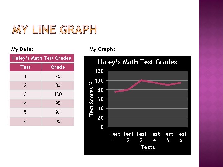
My Data: My Graph: Haley’s Math Test Grades Grade 1 75 2 80 3 100 4 95 5 90 6 95 Haley’s Math Test Grades 120 Test Scores % Test 100 80 60 40 20 0 Test Test 1 2 3 4 5 6 Tests
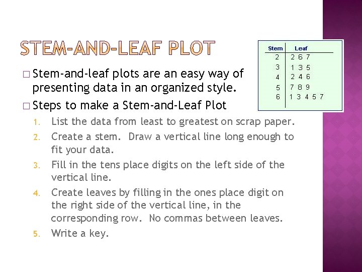
� Stem-and-leaf plots are an easy way of presenting data in an organized style. � Steps to make a Stem-and-Leaf Plot 1. 2. 3. 4. 5. List the data from least to greatest on scrap paper. Create a stem. Draw a vertical line long enough to fit your data. Fill in the tens place digits on the left side of the vertical line. Create leaves by filling in the ones place digit on the right side of the vertical line, in the corresponding row. No commas between leaves. Write a key.
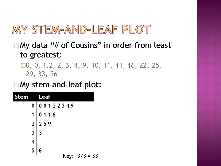
� My data “# of Cousins” in order from least to greatest: � 0, 1, 2, 2, 3, 4, 9, 10, 11, 16, 22, 25, 29, 33, 56 � My stem-and-leaf plot: Stem Leaf 0 00122349 1 0116 2 259 3 3 4 5 6 Key: 3/3 = 33
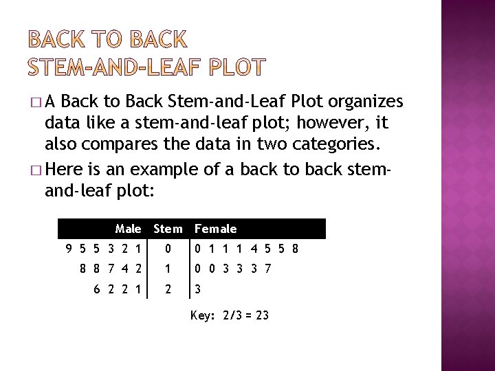
�A Back to Back Stem-and-Leaf Plot organizes data like a stem-and-leaf plot; however, it also compares the data in two categories. � Here is an example of a back to back stemand-leaf plot: Male Stem Female 9 5 5 3 2 1 0 0 1 1 1 4 5 5 8 8 8 7 4 2 1 0 0 3 3 3 7 6 2 2 1 2 3 Key: 2/3 = 23
1. 2. 3. 4. 5. 6. 7. Organize your data from least to greatest in each category. Create the stem. This is the middle column of the graph. Fill in the tens place digits in that column. Create the leaves on the left side of the stem. The leaves will go from largest to smallest so the smallest number is next to the stem. Create the leaves on the right side of the stem. The leaves will go from smallest to largest. No commas between leaves. Write a key.
� The required data displays to make are frequency table & histogram. Plus, you have to make one other data display from those depicted in these notes. � Determine which data representation will work best for the data you collected. � Determine what supplies you will need in order to make your data display: � Ruler, protractor, white paper, colored pencils, etc.
- Slides: 19