Data Analysis and Visualisation Training Manual Data Appreciation


- Slides: 75

Data Analysis and Visualisation Training Manual

Data Appreciation and Analysis Data as a Value of Communication Primary data points Data Engagement model Data Analysis Tools Understanding Data (Trend and Predictive Analysis) Data Sourcing

What is Data? In class context, we adopt the definition of: “ (Hidden) factual information (as measurements or statistics) that can be used as basis for reasoning, discussion, or calculation” or “a collection of facts from which conclusions may be drawn” • Data is not only in numbers, it is a signal to presented in a form that can assessed to make lead a discussion or provide guide decision towards a specific action. • Data is the value for communication and informed decisions. It is the raw material where information can be obtained. • The data could be in the form of numbers, words, pictures, maps, and even newspaper articles.

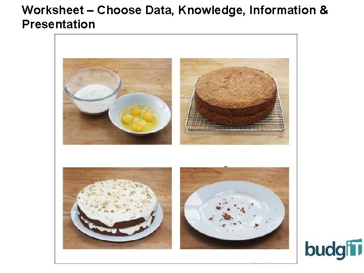
Worksheet – Choose Data, Knowledge, Information & Presentation

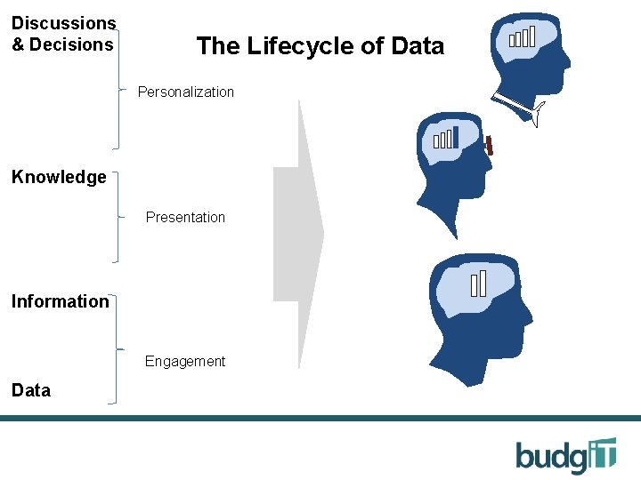
Discussions & Decisions The Lifecycle of Data Personalization The Knowledge Presentation Information Engagement Data

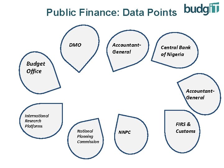
Public Finance: Data Points DMO Accountant. General Central Bank of Nigeria Budget Office Accountant. General International Research Platforms National Planning Commission NNPC FIRS & Customs

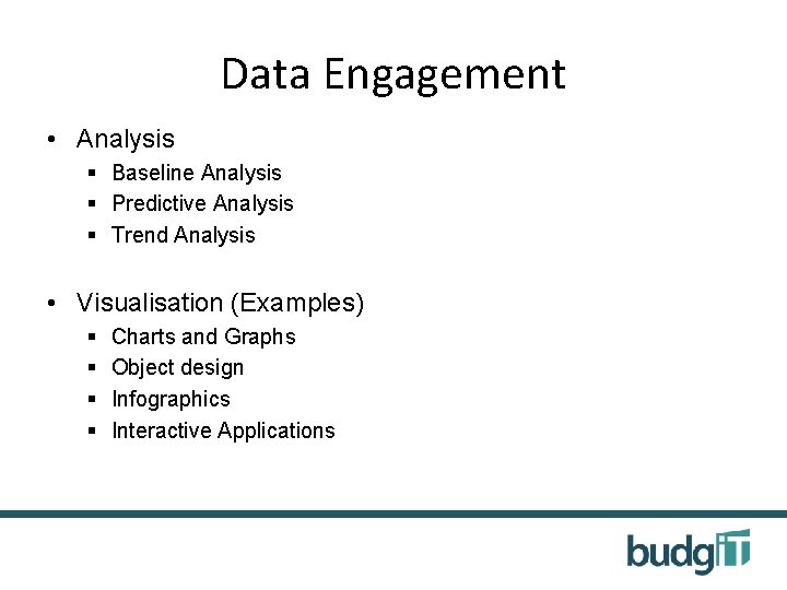
Data Engagement • Analysis § Baseline Analysis § Predictive Analysis § Trend Analysis • Visualisation (Examples) § § Charts and Graphs Object design Infographics Interactive Applications

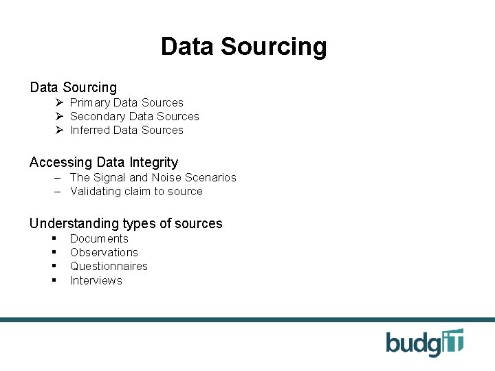
Data Sourcing Ø Primary Data Sources Ø Secondary Data Sources Ø Inferred Data Sources Accessing Data Integrity – The Signal and Noise Scenarios – Validating claim to source Understanding types of sources § § Documents Observations Questionnaires Interviews

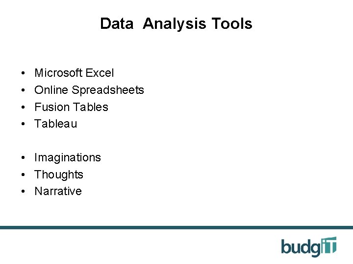
Data Analysis Tools • • Microsoft Excel Online Spreadsheets Fusion Tables Tableau • Imaginations • Thoughts • Narrative

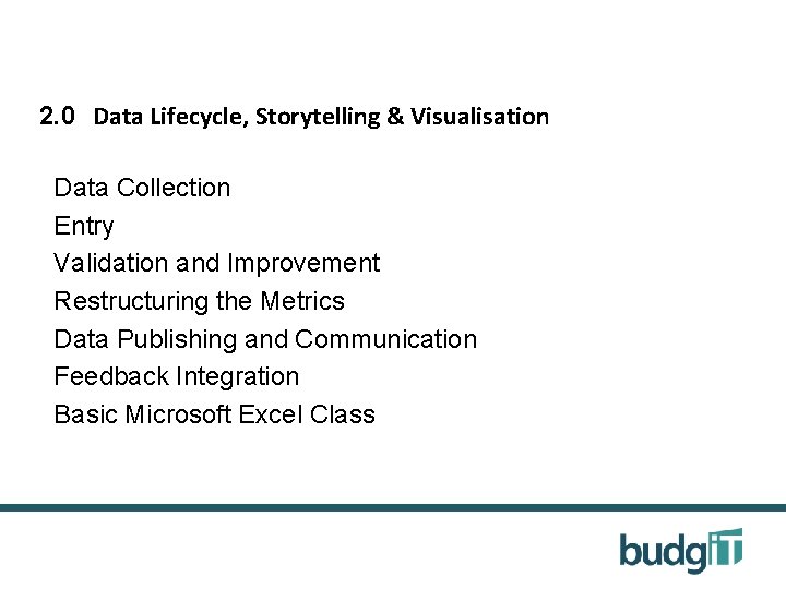
2. 0 Data Lifecycle, Storytelling & Visualisation Data Collection Entry Validation and Improvement Restructuring the Metrics Data Publishing and Communication Feedback Integration Basic Microsoft Excel Class

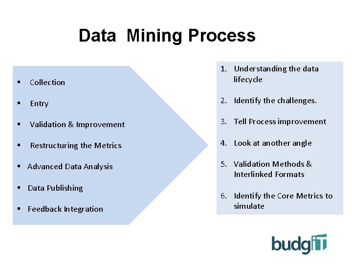
Data Mining Process § Collection 1. Understanding the data lifecycle § Entry 2. Identify the challenges. § Validation & Improvement 3. Tell Process improvement § Restructuring the Metrics 4. Look at another angle § Advanced Data Analysis § Data Publishing § Feedback Integration Entry 5. Validation Methods & Interlinked Formats 6. Identify the Core Metrics to simulate

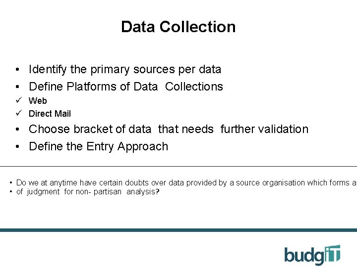
Data Collection • Identify the primary sources per data • Define Platforms of Data Collections ü Web ü Direct Mail • Choose bracket of data that needs further validation • Define the Entry Approach • Do we at anytime have certain doubts over data provided by a source organisation which forms a • of judgment for non- partisan analysis?

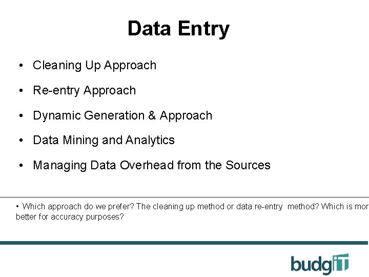
Data Entry • Cleaning Up Approach • Re-entry Approach • Dynamic Generation & Approach • Data Mining and Analytics • Managing Data Overhead from the Sources • Which approach do we prefer? The cleaning up method or data re-entry method? Which is more better for accuracy purposes?

Data Validation • Access Levels for Validation • Peer review mechanism

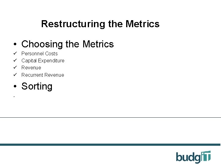
Restructuring the Metrics • Choosing the Metrics ü ü Personnel Costs Capital Expenditure Revenue Recurrent Revenue • Sorting -

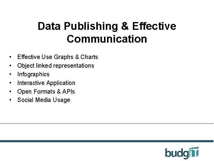
Data Publishing & Effective Communication • • • Effective Use Graphs & Charts Object linked representations Infographics Interactive Application Open Formats & APIs Social Media Usage

3. 0 Data Publishing & Effective Communication • • • Rules of Visualisation Understanding the Output and Process The Art of Questioning Simple online visualisation types Introduction to Charts, Graphs & Number Use

Conversation & Attention Span 'The true length of a work is its ability to generate an infinite variety of interpretation‘ Ben Okri The true beauty of a visualisation is in the depth of discussions and varied perspective to the data.

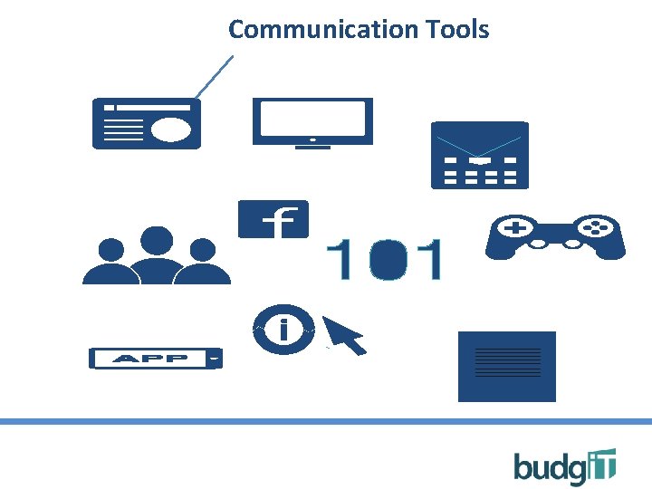
Communication Tools

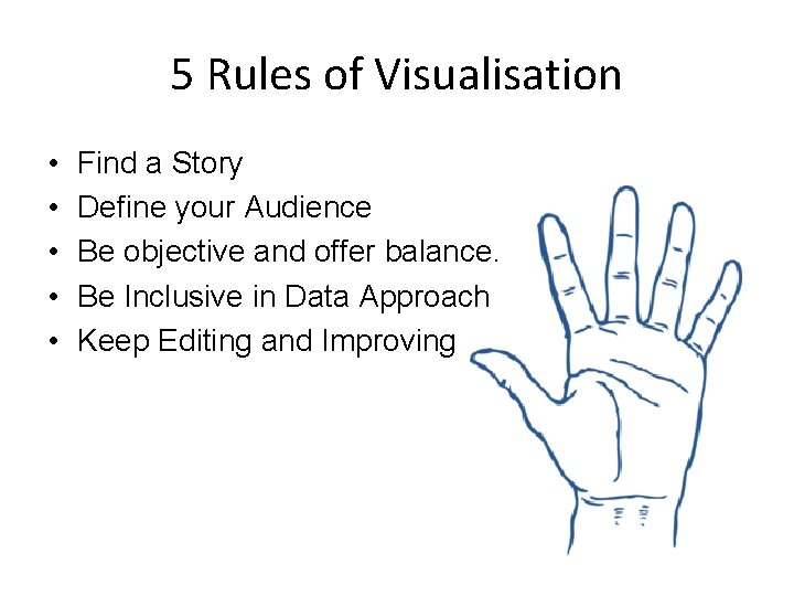
5 Rules of Visualisation • • • Find a Story Define your Audience Be objective and offer balance. Be Inclusive in Data Approach Keep Editing and Improving

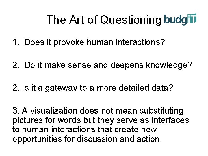
The Art of Questioning 1. Does it provoke human interactions? 2. Do it make sense and deepens knowledge? 2. Is it a gateway to a more detailed data? 3. A visualization does not mean substituting pictures for words but they serve as interfaces to human interactions that create new opportunities for discussion and action.

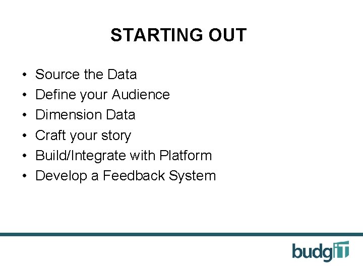
STARTING OUT • • • Source the Data Define your Audience Dimension Data Craft your story Build/Integrate with Platform Develop a Feedback System

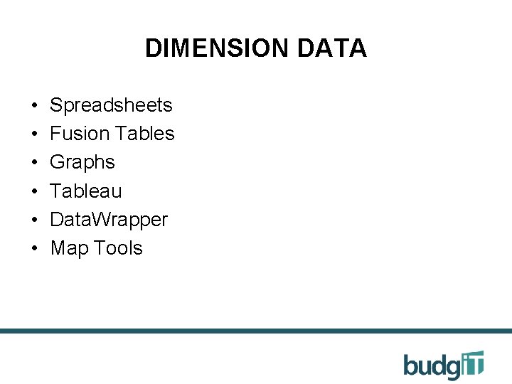
DIMENSION DATA • • • Spreadsheets Fusion Tables Graphs Tableau Data. Wrapper Map Tools

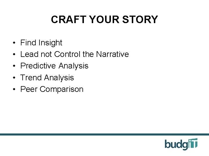
CRAFT YOUR STORY • • • Find Insight Lead not Control the Narrative Predictive Analysis Trend Analysis Peer Comparison

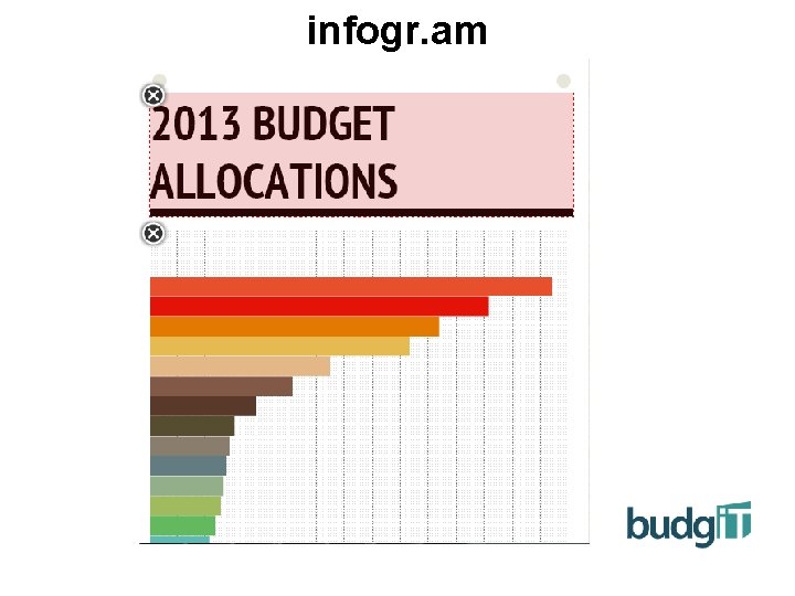
infogr. am

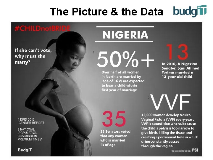
The Picture & the Data

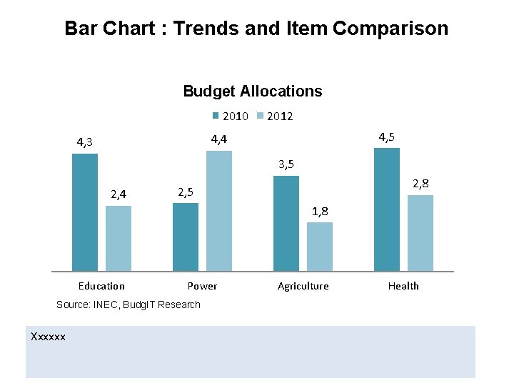
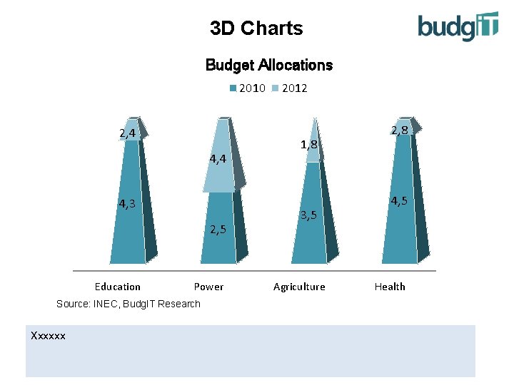
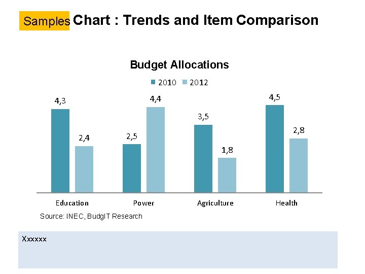
Bar Chart : Trends and Item Comparison Budget Allocations 2010 2012 4, 5 4, 4 4, 3 3, 5 2, 4 2, 8 2, 5 1, 8 Education Power Source: INEC, Budg. IT Research Xxxxxx Agriculture Health

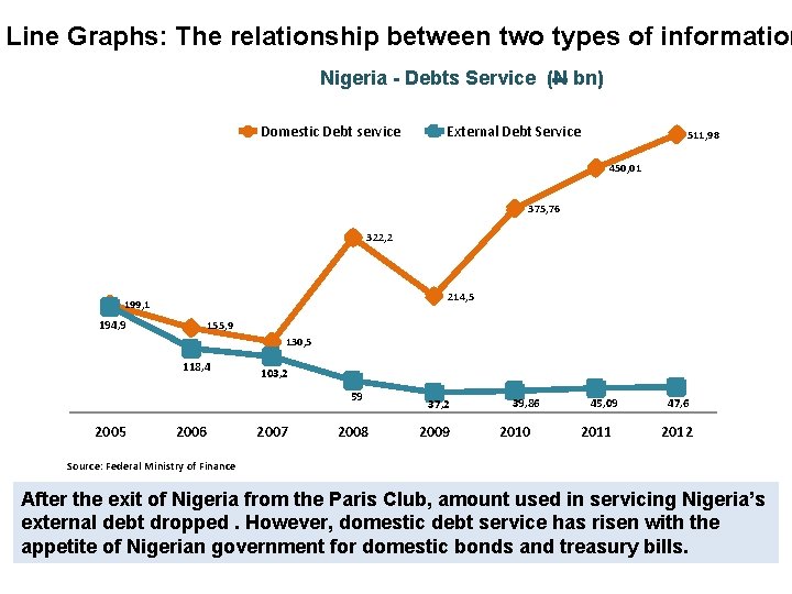
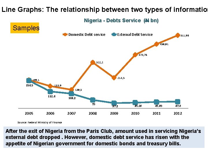
Line Graphs: The relationship between two types of information Nigeria - Debts Service (N bn) Domestic Debt service External Debt Service 511, 98 450, 01 375, 76 322, 2 214, 5 199, 1 194, 9 155, 9 130, 5 118, 4 103, 2 59 2005 2006 2007 2008 37, 2 2009 39, 86 2010 45, 09 2011 47, 6 2012 Source: Federal Ministry of Finance After the exit of Nigeria from the Paris Club, amount used in servicing Nigeria’s external debt dropped. However, domestic debt service has risen with the appetite of Nigerian government for domestic bonds and treasury bills.

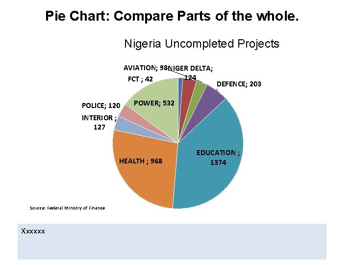
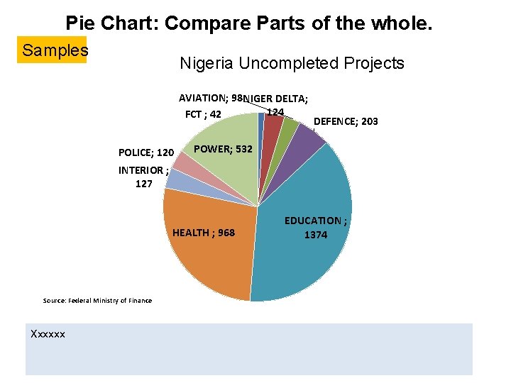
Pie Chart: Compare Parts of the whole. Nigeria Uncompleted Projects AVIATION; 98 NIGER DELTA; 124 FCT ; 42 POLICE; 120 DEFENCE; 203 POWER; 532 INTERIOR ; 127 HEALTH ; 968 Source: Federal Ministry of Finance Xxxxxx EDUCATION ; 1374

4. 0 Data Publishing and Communication Effective Use Graphs & Charts Object linked representations Simple Infographics Samples using Microsoft Power. Point Course Evaluation

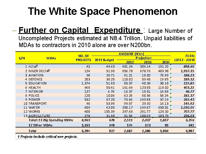
The White Space Phenomenon – Further on Capital Expenditure : Large Number of Uncompleted Projects estimated at N 8. 4 Trillion. Unpaid liabilities of MDAs to contractors in 2010 alone are over N 200 bn. NO. OF PROJECTS 2011 Budget FCTA† NIGER DELTA† AVIATION DEFENCE EDUCATION HEALTH INTERIOR POLICE POWER TRANSPORT WATER WORKS AGRICULTURE Total: 13 Big Spending MDAs 17 Other MDAs 42 124 98 203 1, 374 968 127 120 532 46 659 400 270 4, 963 1, 331 44. 63 51. 98 28. 71 38. 25 51. 83 55. 41 6. 78 10. 06 87. 25 53. 98 62. 05 155. 39 31. 40 678 249 Total 6, 294 927 S/N 1 2 3 4 5 6 7 8 9 10 11 12 13 MDAs † Projects include critical new projects. AMOUNT (N'bn) Projection 2012 2013 401. 24 306. 14 856. 70 670. 76 91. 21 18. 02 110. 02 59. 45 55. 37 40. 38 161. 64 123. 55 16. 37 15. 51 62. 28 60. 86 78. 66 149. 58 99. 87 29. 92 250. 17 149. 87 297. 68 281. 77 31. 54 100. 69 2, 513 2, 007 174 373 2, 687 2, 380 2014 191. 22 409. 90 78. 99 19. 85 30. 10 118. 02 14. 88 58. 24 37. 19 16. 13 630. 01 128. 32 103. 79 1, 837 93 1, 930 TOTAL (2012 - 2014) 898. 60 1, 937. 35 188. 23 189. 32 125. 85 403. 21 46. 77 181. 37 265. 43 145. 92 1, 030. 05 707. 77 236. 03 6, 356 641 6, 997

3 D Charts Budget Allocations 2010 2, 4 4, 3 2, 5 Education Power Source: INEC, Budg. IT Research Xxxxxx 2012 1, 8 3, 5 Agriculture 2, 8 4, 5 Health

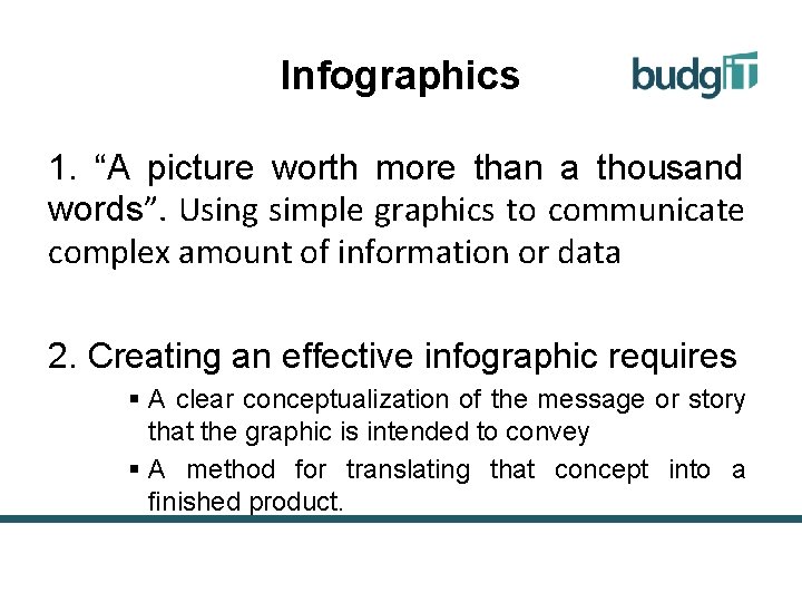
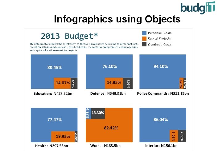
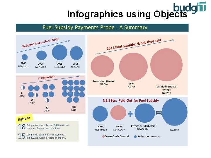
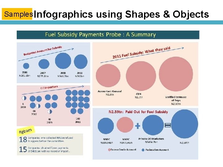
Infographics 1. “A picture worth more than a thousand words”. Using simple graphics to communicate complex amount of information or data 2. Creating an effective infographic requires § A clear conceptualization of the message or story that the graphic is intended to convey § A method for translating that concept into a finished product.

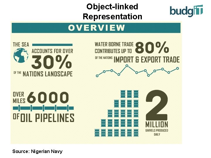
Object-linked Representation Source: Nigerian Navy

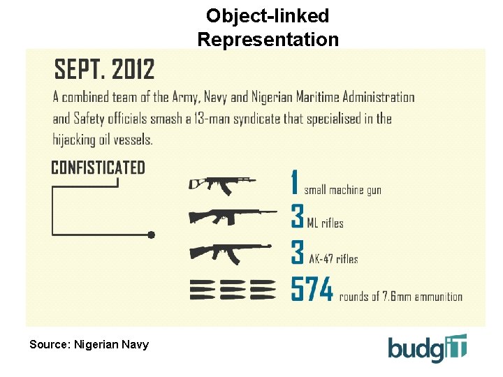
Object-linked Representation Source: Nigerian Navy

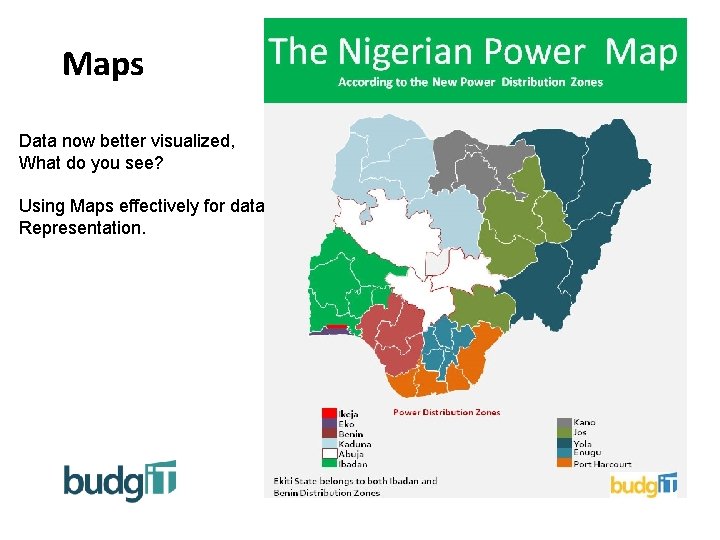
Maps Data now better visualized, What do you see? Using Maps effectively for data Representation.

Infographics using Objects

Infographics using Objects

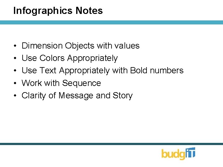
Notes • • • Dimension Objects with values Use Colors Appropriately Use Text Appropriately with Bold numbers Work with Sequence Clarity of Message and Story

Microsoft Power. Point Developing Simple Charts and Visualisations

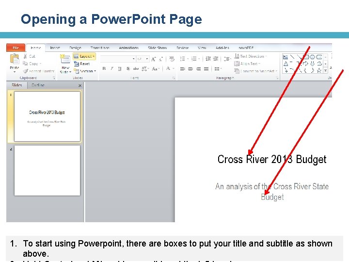
Opening a Power. Point Page 1. To start using Powerpoint, there are boxes to put your title and subtitle as shown above.

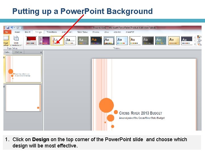
Putting up a Power. Point Background 1. Click on Design on the top corner of the Power. Point slide and choose which design will be most effective.

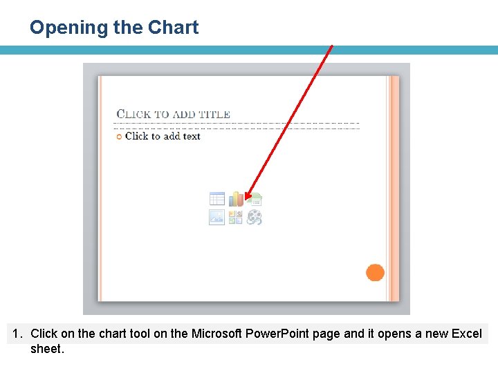
Opening the Chart 1. Click on the chart tool on the Microsoft Power. Point page and it opens a new Excel sheet.

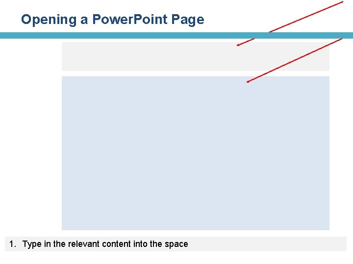
Opening a Power. Point Page 1. Type in the relevant content into the space

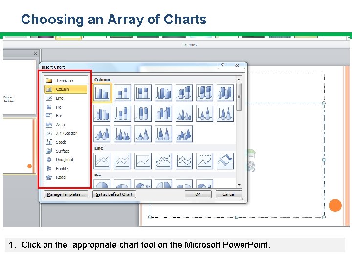
Choosing an Array of Charts 1. Click on the appropriate chart tool on the Microsoft Power. Point.

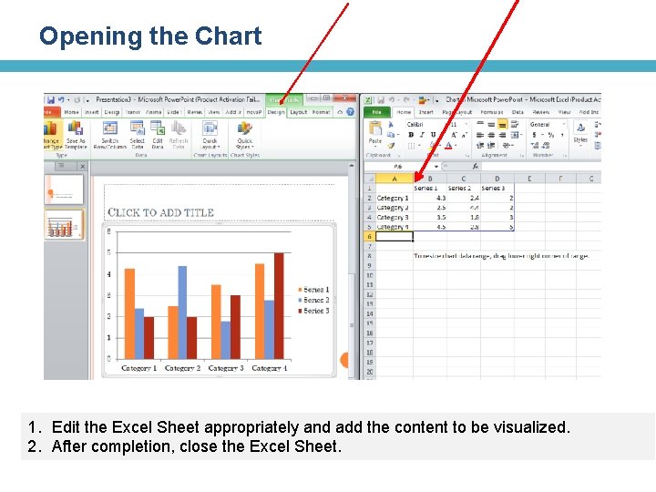
Opening the Chart 1. Edit the Excel Sheet appropriately and add the content to be visualized. 2. After completion, close the Excel Sheet.

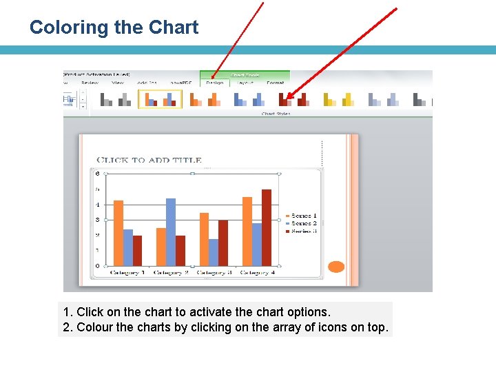
Coloring the Chart 1. Click on the chart to activate the chart options. 2. Colour the charts by clicking on the array of icons on top.

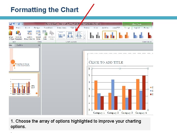
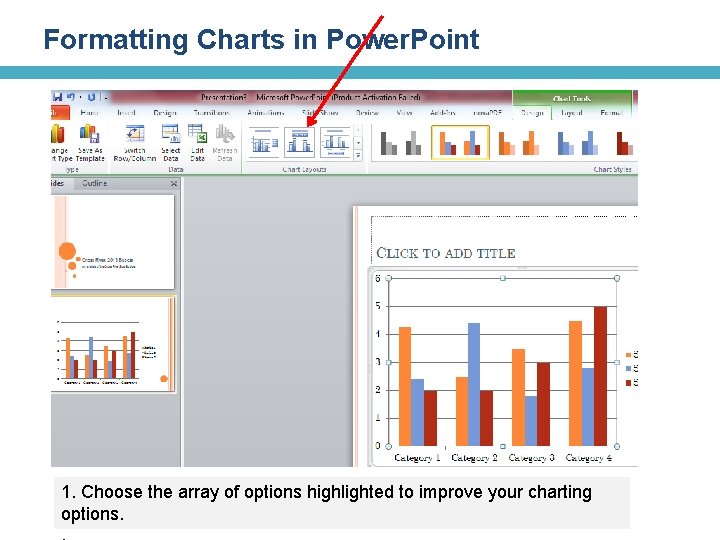
Formatting the Chart 1. Choose the array of options highlighted to improve your charting options.

Formatting Charts in Power. Point 1. Choose the array of options highlighted to improve your charting options.

Bar Chart : Trends and Item Comparison Samples Budget Allocations 2010 2012 4, 5 4, 4 4, 3 3, 5 2, 4 2, 8 2, 5 1, 8 Education Power Source: INEC, Budg. IT Research Xxxxxx Agriculture Health

Line Graphs: The relationship between two types of information Nigeria - Debts Service (N bn) Samples Domestic Debt service External Debt Service 511, 98 450, 01 375, 76 322, 2 214, 5 199, 1 194, 9 155, 9 130, 5 118, 4 103, 2 59 2005 2006 2007 2008 37, 2 2009 39, 86 2010 45, 09 2011 47, 6 2012 Source: Federal Ministry of Finance After the exit of Nigeria from the Paris Club, amount used in servicing Nigeria’s external debt dropped. However, domestic debt service has risen with the appetite of Nigerian government for domestic bonds and treasury bills.

Pie Chart: Compare Parts of the whole. Samples Nigeria Uncompleted Projects AVIATION; 98 NIGER DELTA; 124 FCT ; 42 POLICE; 120 DEFENCE; 203 POWER; 532 INTERIOR ; 127 HEALTH ; 968 Source: Federal Ministry of Finance Xxxxxx EDUCATION ; 1374

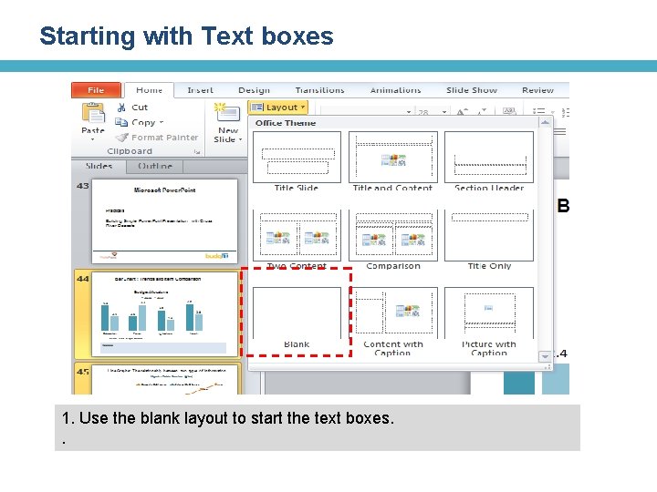
Starting with Text boxes 1. Use the blank layout to start the text boxes. .

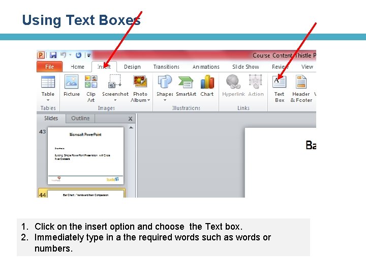
Using Text Boxes 1. Click on the insert option and choose the Text box. 2. Immediately type in a the required words such as words or numbers.

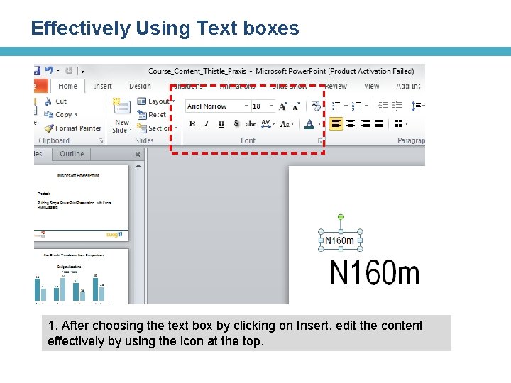
Effectively Using Text boxes 1. After choosing the text box by clicking on Insert, edit the content effectively by using the icon at the top.

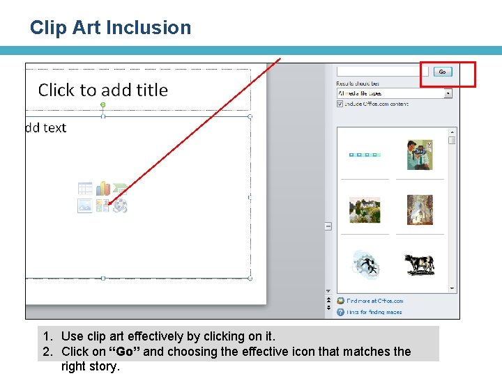
Clip Art Inclusion 1. Use clip art effectively by clicking on it. 2. Click on “Go” and choosing the effective icon that matches the right story.

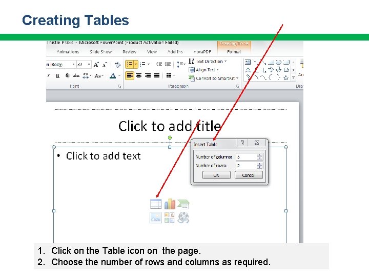
Creating Tables 1. Click on the Table icon on the page. 2. Choose the number of rows and columns as required.

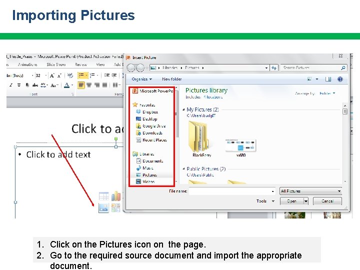
Importing Pictures 1. Click on the Pictures icon on the page. 2. Go to the required source document and import the appropriate document.

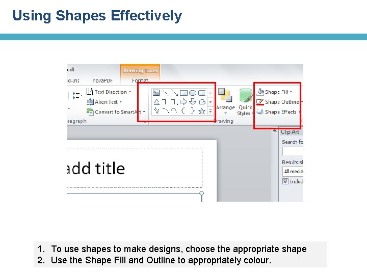
Using Shapes Effectively 1. To use shapes to make designs, choose the appropriate shape 2. Use the Shape Fill and Outline to appropriately colour.

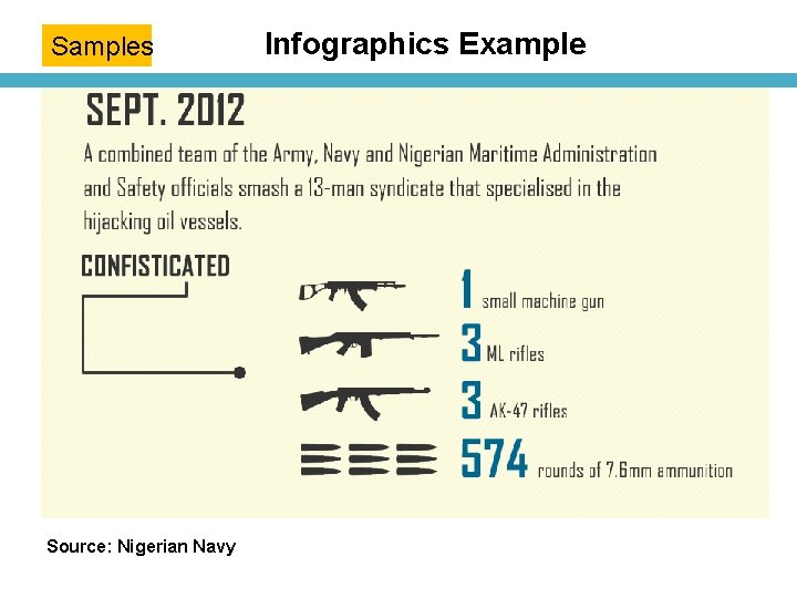
Samples Source: Nigerian Navy Infographics Example

Samples Infographics using Shapes & Objects

Infographics Notes • • • Dimension Objects with values Use Colors Appropriately Use Text Appropriately with Bold numbers Work with Sequence Clarity of Message and Story

Infogr. am & Data. Wrapper Developing Simple Charts and Visualisations

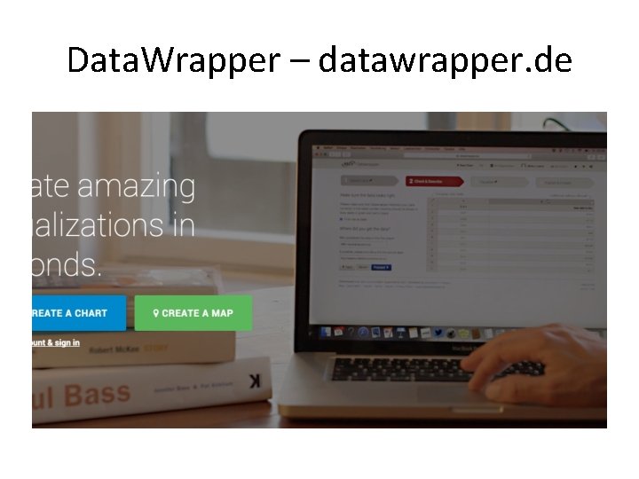
Data. Wrapper – datawrapper. de

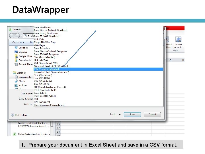
Data. Wrapper 1. Prepare your document in Excel Sheet and save in a CSV format.

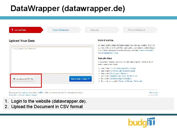
Data. Wrapper (datawrapper. de) 1. Login to the website (datawrapper. de). 2. Upload the Document in CSV format

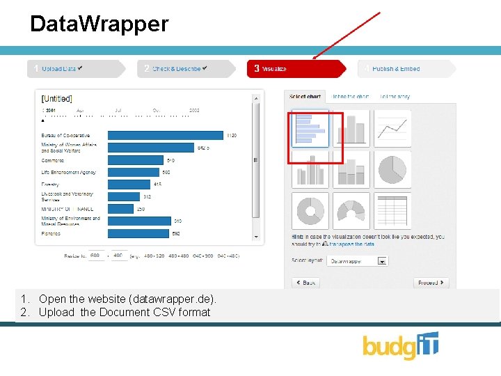
Data. Wrapper 1. Open the website (datawrapper. de). 2. Upload the Document CSV format

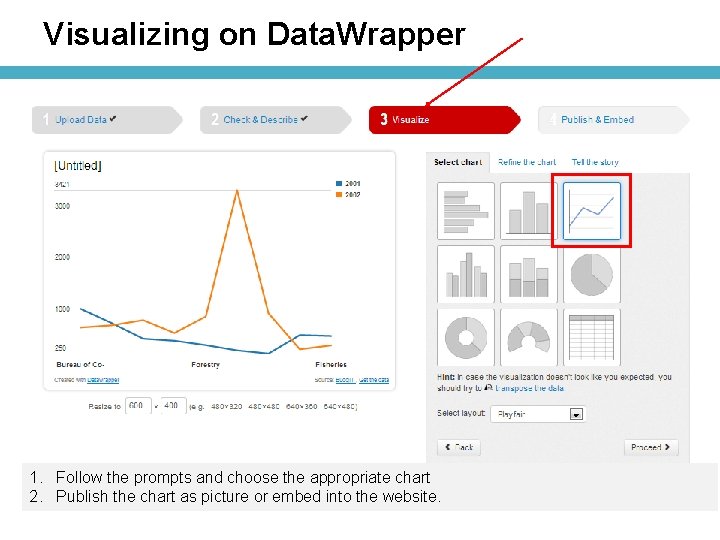
Visualizing on Data. Wrapper 1. Follow the prompts and choose the appropriate chart 2. Publish the chart as picture or embed into the website.

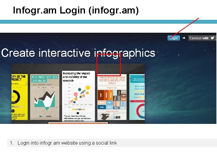
Infogr. am Login (infogr. am) 1. Login into infogr. am website using a social link

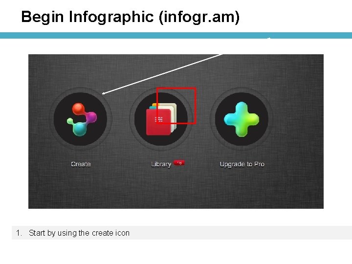
Begin Infographic (infogr. am) 1. Start by using the create icon

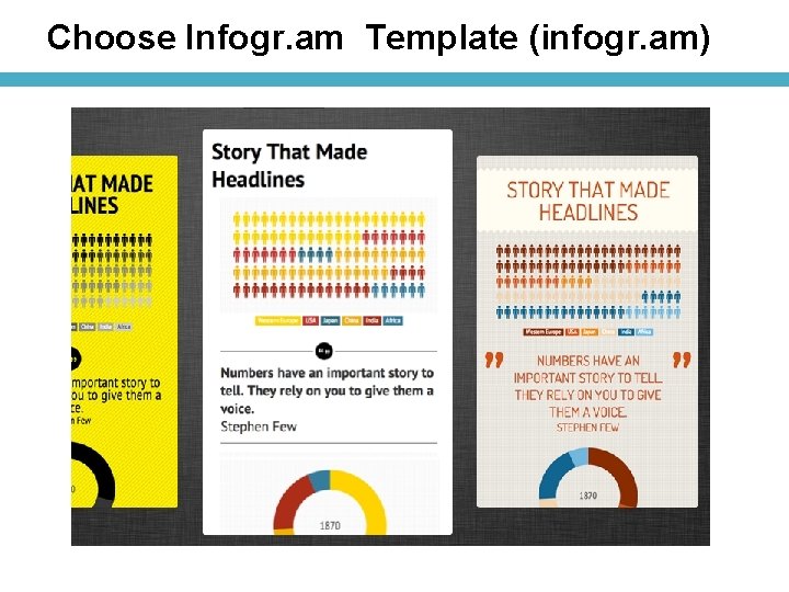
Choose Infogr. am Template (infogr. am)

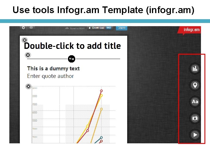
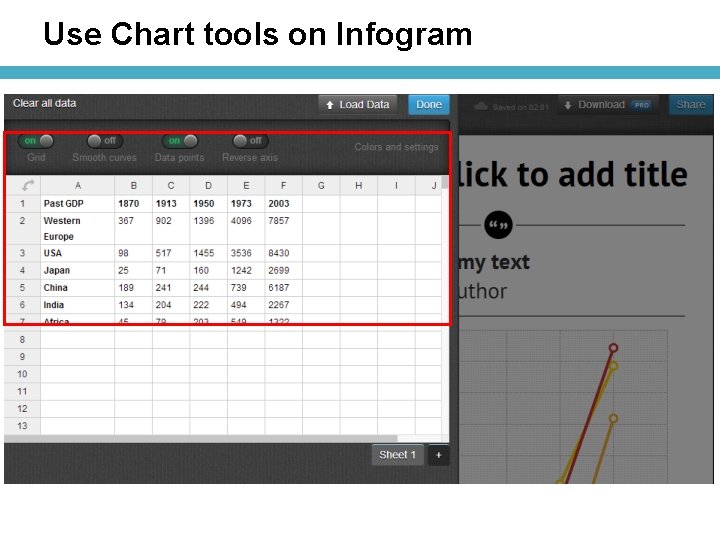
Use tools Infogr. am Template (infogr. am)

Use tools Infogr. am Template (infogr. am)

Use Chart tools on Infogram

yourbudgit. com @budgitng facebook. com/budgitng info@yourbudgit. com