Daniel S Yates The Practice of Statistics Third


 can be displayed")


 IQR (section 1.")


: Metabolic Rates 1792 1666")


- Slides: 53
Daniel S. Yates The Practice of Statistics Third Edition Chapter 1: Exploring Distributions Copyright © 2008 by W. H. Freeman & Company
Chapter Objectives • Use a variety of graphical techniques to display a distribution • Interpret graphical displays • Use a variety of numerical techniques to describe a distribution • Interpret numerical measures in the context of the situation in which they occur.
1. 1 Displaying Distributions with Graphs • Read the Nielsen Rating study on pg. 37 • What do you observe? Does one network appear to “win” the ratings race? • How can we get a better sense of which network has the best rating? • How can statistics help us understand this data?
Exploratory Data Analysis: Statistical practice of analyzing distributions of data through graphical displays and numerical summaries. Distribution: Description of the values a variable takes on and how often the variable takes on those values. An EDA allows us to identify patterns and departures from patterns in distributions
Categorical Data Categorical Variable: – Values are labels or categories. – Distributions list the categories and either the count or percent of individuals in each. Displays: Bar. Graphs and Pie. Charts
Beware of Bad Graphs What is wrong with this graph? Let us count the ways……. .
Quantitative Data Quantitative Variable: • Values are numeric - arithmetic computation makes sense (average, etc. ) • Distributions list the values and number of times the variable takes on that value. Displays: • • Stemplots Dotplots Histograms Boxplots Only organized Data can Illuminate! Your goal is to make neat, organized, labeled graphs that display the distribution of data effectively and provide an insight O into patterns and departures from patterns. n l y o
Dotplots • Small datasets with a small range (max – min) can be displayed using dotplot. Draw & label a number line from min to max Place one dot per observation above its value Stack multiple observations evenly. Refer to M&M counts activity for example
Stemplots • Gives a quick picture of the distribution while including actual numerical values in the graph. • Works best for small number of observations that are all greater than 0. Stem – consists of all but the right-most digit. May have as many digits as needed. Leaf – the final digit. Only a single digit. Write stems in a vertical column, in increasing order, and draw a vertical line to the right of the column Write each leaf in the row to the right of its stem.
Literacy rates in Islamic nations Female Percent Male Percent Algeria 60 78 Morocco 38 68 Bangladesh 31 50 Saudi Arabia 70 84 Egypt 46 68 Syria 63 89 Iran 71 85 Tajikistan 99 100 Jordan 86 96 Tunisia 63 83 Kazakhstan 99 100 Turkey 78 94 Lebanon 82 95 Uzbekistan 99 100 Libya 71 92 Yemen 29 70 Malaysia 85 92 Country Note: They omitted data for countries with population less than 3 million. Data for Iraq and Afghanistan are not available.
Stemplot Of women Stemplot of Men 2 3 4 5 6 7 8 9 10 9 18 6 033 0118 256 999 0 88 08 3459 22456 000
Back-to-Back stemplot • Good for comparing two related distributions • Leaves are ordered out from common stem
Stemplots continued… • Do not work well for large data sets where each stem must hold a large number of leaves • Modifications – Splitting stems: leaves 0 -4 and 5 -9 (can split stems into 5: 0 -1, 2 -3, 4 -5, 6 -7, 8 -9) – Trimming: removes last digit or digits You must use your judgment Purpose is to display the shape of distribution HW: pg. 46 #1. 1 a, b, 1. 2 -1. 6
Histograms • Histograms break the range of data values into classes and displays the count/% of observations that fall into that class. Divide the range of data into equal-width classes. Count the observations in each class - “frequency” Draw bars to represent classes - height = frequency Bars should touch (unlike bar graphs).
IQ Scores for 60 randomly chosen fifth-grade students 145 139 126 122 125 130 96 110 118 101 142 134 124 112 109 134 113 81 113 123 94 100 136 109 131 117 110 127 124 106 124 115 133 116 102 127 117 109 137 117 90 103 114 139 101 122 105 97 89 102 108 110 128 114 112 114 102 82 101 Class Count 75 to 84 2 115 to 124 13 85 to 94 3 125 to 134 10 95 to 104 10 135 to 144 5 105 to 114 16 145 to 154 1
Describe what you see in the context of the data.
Examining Distributions Look for overall pattern and departures from pattern Shape (mound, bimodal, skewed, uniform) Outlier (points clearly away from body of data) Center (What number “typifies” the data? ) Spread (How “variable” are the data values? )
Shape Skewed left Skewed right ~Use the tail as your guide~ Some things are naturally skewed
Outliers • Matter of judgment • Points clearly apart for the body of the data • Not just the most extreme • Section 1. 2 – rule of thumb • Affect mean and standard deviation • Further investigation may be needed
Center Median: middle number Mean: average of the numbers If data is skewed use median for center If data is symmetrical use mean
Spread How much variability there is Standard deviation (section 1. 2) IQR (section 1. 2) Use st. dev. for symmetrical data Use IQR for data that is skewed HW: pg. 55 #1. 7 -1. 11
Ogives Relative Cumulative Frequencey Plot • Histograms tell us little about the relative standings of an individual observation • Ogives give us relative standings
Steps for making an ogive: step 1 Add three more columns to your frequency table 1) Relative Frequency divide the count in each class by the total 2) Cumulative Frequency Add the counts in the frequency column that fall in or below the current class interval 3) Relative Cumulative frequency Divide the cumulative Frequencies by the total
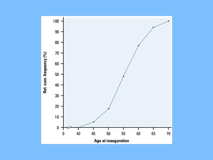
Using data from 1. 11 exercise on presidents Cumulative Freq. Relative Cumulative Freq. Class Freq. Relative Freq. 40 -44 2 2/43 = 4. 7% 45 -49 6 6/43 = 14. 0% 8 8/43 = 18. 6% 50 -54 13 13/43 = 30. 2% 21 21/43 = 48. 8% 55 -59 12 12/43 = 27. 9% 33 33/43 = 76. 7% 60 -64 7 7/43 = 16. 3% 40 40/43 = 93. 0% 65 -69 3 3/43 = 7. 0% 43 43/43 = 100% Total 43
Ogive: Step 2 • Label and scale your axes and title your graph. • Label the horizontal axis “Age at inauguration” and the vertical axis “Relative cumulative frequency. ” • Scale the horizontal axis according to your choice of class intervals and the vertical axis from 0% to 100%
Ogive: Step 3 • Plot a point corresponding to the relative cumulative frequency in each class interval at the left endpoint of the next class interval. • For example: for the 40 to 44 interval, plot 4. 7% above the age value of 45. • This means that 4. 7% of presidents were inaugurated before the age of 45. • Begin at height 0% and connect all points with line segments. • Your last point will be at a height of 100%.
Reading an ogive • What is Bill Clinton’s relative standing? (He was 46 when he took office) • To answer this, locate 46 on the horizontal axis and draw a vertical line up until it meets the ogive. • Then draw a horizontal line from this point of intersection to the vertical axis.
This places him at the 10% relative cumulative frequency mark. This means that about 10% of all presidents were the same age or younger than him when they were inaugurated.
• What is the center of the distribution? – Should be at the 50% – Draw horizontal line from 50% until it meets ogive. – Then draw a vertical line to the horizontal axis.
About 50% of all presidents were 55 years old or younger when they took office and 50% were older. The center of the distribution is 55.
Time Plots • Displays that ignore time can often be misleading
Time plot of the average monthly price of regular gasoline from 1996 to 2006. Describe what you see. HW: pg. 64 #1. 13 -1. 16, 18
1. 2 – Describing Distributions with Numbers • Center: – Mean: average – “x-bar” – Very sensitive to outliers – Median: middle number – Location found by (n+1)/2 If symmetric: mean & median close If exactly symmetric: mean = median If skewed: Mean is further out on tail
Measuring Spread Compare these two distributions 1 2 3 Both have a mean of 2 and a median of 2 They differ in spread! Variability is the key to statistics.
Spread • Range: max – min – Shows full range of data • Pth percentile – Describes the percent at or below • Quartiles: – Q 1: 25 th percentile • Median of lower half – Q 3: 75 th percentile • Median of upper half
Quartiles To find them, order data from min to max. Determine the median - average if necessary. The first quartile is the middle of the ‘bottom half’. The third quartile is the middle of the ‘top half’. 19 22 23 23 23 26 26 27 28 29 30 31 32 med Q 1=23 45 68 74 Q 1 75 76 82 med=79 Q 3=29. 5 82 91 Q 3 93 98
Give 5 -number summary for the highway mileages of 13 minicompact cars: 19 29 27 28 23 26 23 23 32 31 29 26 22
Boxplots of the highway and city gas mileages for the cars classified as two-seaters and as minicompacts by the EPA
Using IQR for Outliers The IQR is the width of the “box” in the boxplot
Determining Outliers “ 1. 5 x IQR Rule” Inter. Quartile Range “IQR”: Distance between Q 1 and Q 3. Resistant measure of spread. . . only measures middle 50% of data. 1. 5 IQR Rule: If an observation falls more than 1. 5 IQRs above Q 3 or below Q 1, it is an outlier. Why 1. 5? According to John Tukey, 1 IQR seemed like too little and 2 IQRs seemed like too much. . .
1. 5 • IQR Rule To determine outliers: Find 5 Number Summary Determine IQR Multiply 1. 5 x. IQR Set up “fences” Q 1 -(1. 5 IQR) and Q 3+(1. 5 IQR) Observations “outside” the fences are outliers.
Outlier Example All data on p. 48. IQR=45. 72 -19. 06 IQR=26. 66 1. 5 IQR=1. 5(26. 66) 1. 5 IQR=39. 99 fence: 19. 0639. 99 = -20. 93 fence: 45. 72+39. 99 = 85. 71 outliers } { 0 10 20 30 40 50 60 70 Spending ($) 80 90 100
Modified Boxplot Shows the outliers in the data as separate points. HW: pg. 82 #1. 33 -1. 38
Standard Deviation Another common measure of spread is the Standard Deviation: a measure of the “average” deviation of all observations from the mean. To calculate Standard Deviation: Calculate the mean. Determine each observation’s deviation (x - xbar). “Average” the squared-deviations by dividing the total squared deviation by (n-1). This quantity is the Variance. Square root the result to determine the Standard Deviation.
Standard Deviation Variance: Standard Deviation: Example 1. 16 (p. 85): Metabolic Rates 1792 1666 1362 1614 1460 1867 1439
Standard Deviation 1792 1666 1362 1614 1460 1867 1439 Metabolic Rates: mean=1600 x (x - x)2 1792 192 36864 1666 66 4356 1362 -238 56644 1614 14 196 1460 -140 19600 1867 267 71289 1439 -161 25921 Totals: 0 214870 Total Squared Deviation 214870 Variance var=214870/6 var=35811. 66 Standard Deviation s=√ 35811. 66 s=189. 24 cal What does this value, s, mean?
Standard Deviation continued • s and s 2 will be large if the observations are widely spread about their mean • They will be small if close to the mean • N – 1: degrees of freedom – We use n – 1 because we are not averaging n unrelated numbers – Only n – 1 of the squared deviations can vary freely
Standard Deviation continued • If data is skewed or outliers: – Use 5 -number summary and IQR to describe spread • If data is reasonably symmetric: – Use and s HW: pg. 89 #1. 39 -1. 44
Linear Transformations Variables can be measured in different units (feet vs meters, pounds vs kilograms, etc) When converting units, the measures of center and spread will change. Linear Transformations (xnew=a+bx) do not change the shape of a distribution. Multiplying each observation by b multiplies both the measure of center and spread by b. Adding a to each observation adds a to the measure of center, but does not affect spread.
Linear Transformations cont… • Example 1. 18 on pg. 91 to see affects of a linear transformation HW: pg. 97 #1. 45 -1. 47, 1. 50
Data Analysis Toolbox To answer a statistical question of interest: Data: Organize and Examine Who are the individuals described? What are the variables? Why were the data gathered? When, Where, How, By Whom were data gathered? • Graph: Construct an appropriate graphical display Describe SOCS Numerical Summary: Calculate appropriate center and spread (mean and s or 5 number summary) Interpretation: Answer question in context!
Chapter 1 Summary Data Analysis is the art of describing data in context using graphs and numerical summaries. The purpose is to describe the most important features of a dataset.