Cumulative Frequency Graphs Box Plots Worksheet A Printing

Cumulative Frequency Graphs & Box Plots – Worksheet A

Printing To print handouts from slides Select the slide from the left. Then click: File > Print > ‘Print Current Slide’ To print multiple slides Click on a section title to highlight all those slides, or press ‘Ctrl’ at the same time as selecting slides to highlight more than one. Then click: File > Print > ‘Print Selection’ To print double-sided handouts Highlight both slides before using ‘Print Selection’. Choose ‘Print on Both Sides’ and ‘Flip on Short Edge’.
 The cumulative frequency graph below")
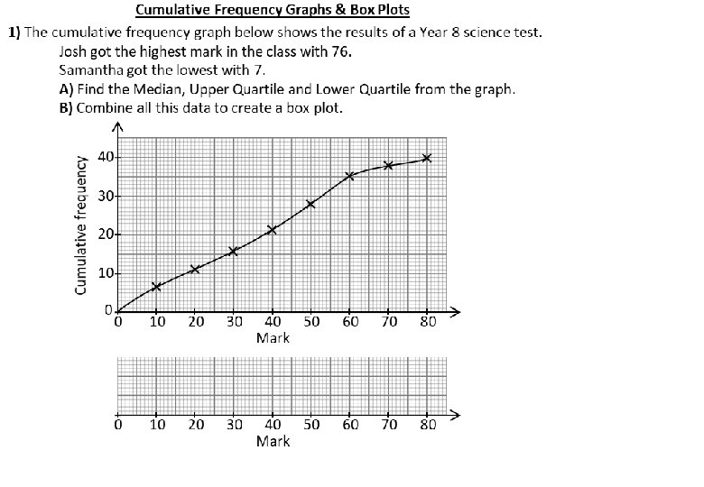
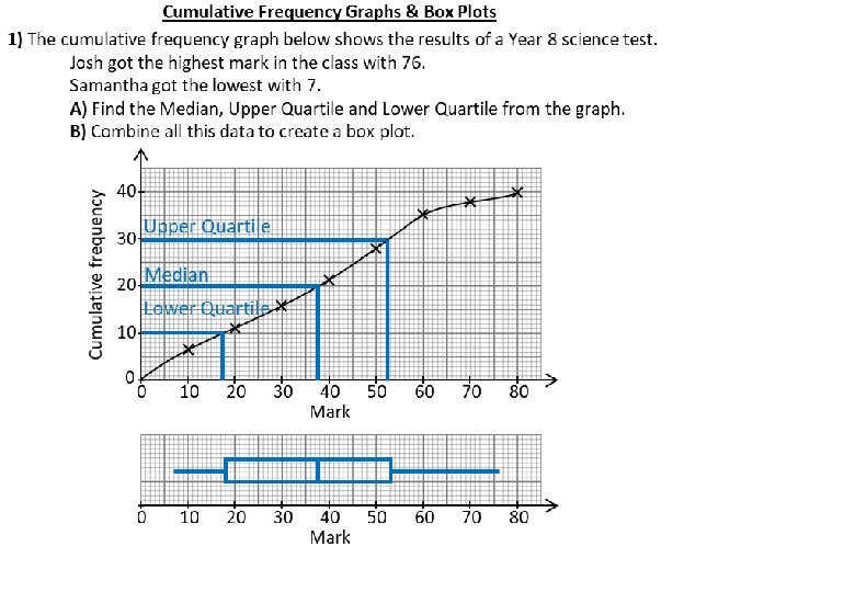
Cumulative frequency Cumulative Frequency Graphs & Box Plots 1) The cumulative frequency graph below shows the results of a Year 8 science test. Josh got the highest mark in the class with 76. Samantha got the lowest with 7. A) Find the Median, Upper Quartile and Lower Quartile from the graph. B) Combine all this data to create a box plot. 3) These two tables show the results for Year 7 and Year 10 end-of-year English tests. Year 7 Min = 8 Max = 99 40 30 Upper Quartile Lower Quartile 0 0 10 20 F. C. F. 0�m� 20 21�m� 40 41�m� 60 61�m� 80 81�m� 100 15 22 18 11 4 15 37 55 66 70 A) Year Plot both sets. Better of data on the single grid. 10: Median B) Use the graphs to plot two box plots Lower on IQR = More consistent the same grid. Lowest C) Compare the data. Score. Which class did best? 20 Median 10 Mark (m) 30 40 50 Mark 60 70 80 20 30 40 50 Mark 60 70 80 Cumulative frequency 2) This cumulative frequency graph shows the results of a Year 10 science test. A) Use the data to complete the box plot. 30 20 0 10 10 20 20 30 30 40 50 Mark 60 0�m� 10 11�m� 20 21�m� 30 31�m� 40 41�m� 50 51�m� 60 61�m� 70 71�m� 80 81�m� 90 91�m� 100 1 1 7 12 16 13 15 2 2 1 1 2 9 21 37 50 65 67 69 70 Upper Quartile 50 40 Median 30 Lower Quartile 20 0 0 10 20 30 40 50 60 Mark 70 Year 8: Better Median Higher IQR = Less consistent Highest Score. 60 Higher 70 Lowest Score. C. F. 10 B) What comparisons can you make between the Year 8 s and the Year 10 s? 10 F. 70 Cumulative frequency 10 Mark (m) Lower Highest Score. 60 0 Year 10 Min = 0 Max = 92 70 80 90 100 80 90 Mark Year 7 Year 10 0 10 20 30 40 50 Mark 60 70 100
 The cumulative frequency graph below")
Cumulative frequency Cumulative Frequency Graphs & Box Plots 1) The cumulative frequency graph below shows the results of a Year 8 science test. Josh got the highest mark in the class with 76. Samantha got the lowest with 7. A) Find the Median, Upper Quartile and Lower Quartile from the graph. B) Combine all this data to create a box plot. 3) These two tables show the results for Year 7 and Year 10 end-of-year English tests. Year 7 Min = 8 Max = 99 40 30 Mark (m) F. 0�m� 20 21�m� 40 41�m� 60 61�m� 80 81�m� 100 15 22 18 11 4 Year 10 Min = 0 Max = 92 C. F. A) Plot both sets of data on the single grid. B) Use the graphs to plot two box plots on the same grid. C) Compare the data. Which class did best? 20 10 0 0 10 20 30 40 50 Mark 60 70 80 Mark (m) F. 0�m� 10 11�m� 20 21�m� 30 31�m� 40 41�m� 50 51�m� 60 61�m� 70 71�m� 80 81�m� 90 91�m� 100 1 1 7 12 16 13 15 2 2 1 C. F. 70 0 10 20 30 40 50 Mark 60 70 80 Cumulative frequency 2) This cumulative frequency graph shows the results of a Year 10 science test. A) Use the data to complete the box plot. 30 20 10 20 30 40 50 Mark 60 50 40 30 20 10 B) What comparisons can you make between the Year 8 s and the Year 10 s? 10 0 0 Cumulative frequency 60 0 0 10 20 30 40 50 60 Mark 70 70 80 90 100 80 90 Mark Year 7 Year 10 Mark 0 10 20 30 40 50 Mark 60 70 100

Questions? Comments? Suggestions? …or have you found a mistake!? Any feedback would be appreciated . Please feel free to email: tom@goteachmaths. co. uk
- Slides: 7