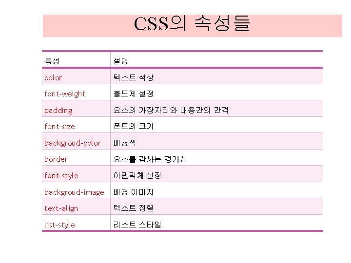
CSS CSSCascading Style Sheets CSS 3 selectors Box
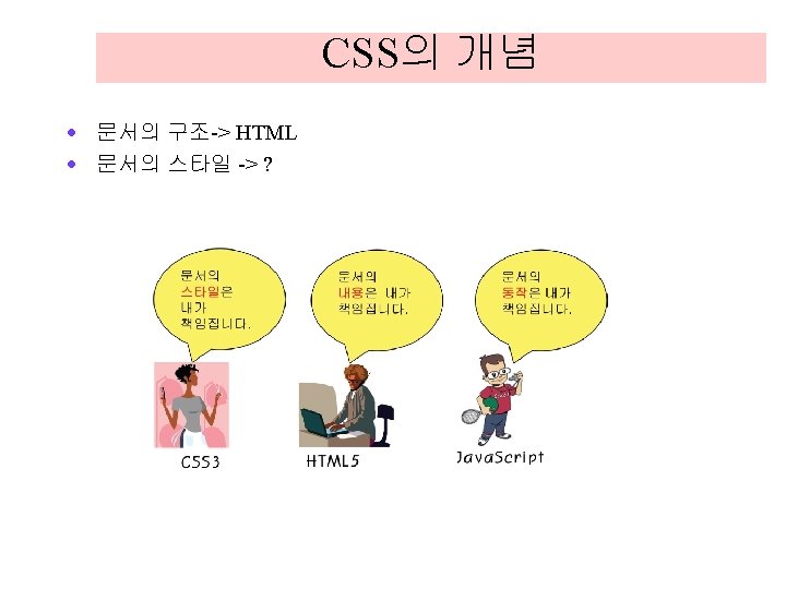
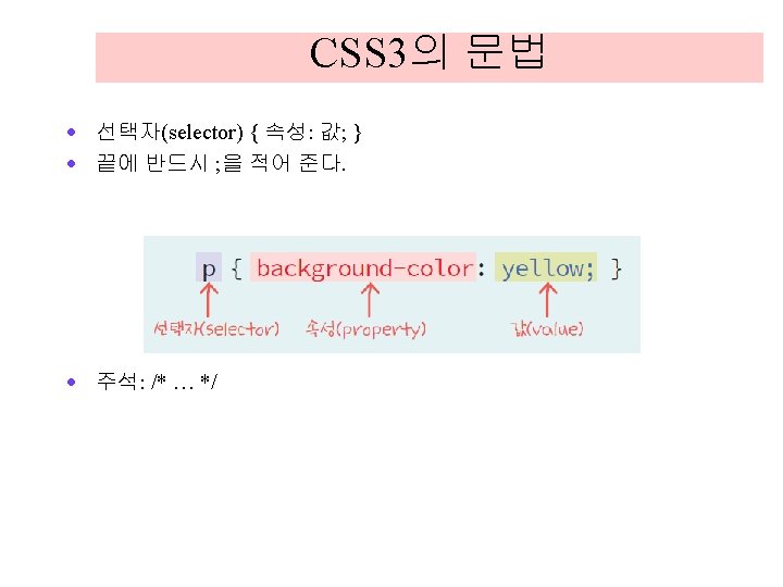
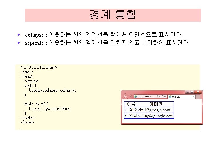
: 문서의 스타일을 지정한다.")
CSS · CSS(Cascading Style Sheets): 문서의 스타일을 지정한다.
 박스 모델(Box Model) 배경 및 경계선(Backgrounds")
CSS 3의 기능 · · · · 선택자(selectors) 박스 모델(Box Model) 배경 및 경계선(Backgrounds and Borders) 텍스트 효과(Text Effects) 2차원 및 3차원 변환(2 D/3 D Transformations) 애니메이션(Animations) 다중 컬럼 레이아웃(Multiple Column Layout) 사용자 인터페이스(User Interface)

CSS의 위치 <!doctype html> <head> <title>My Web Page</title> <style> p { background-color: yellow; </style> </head> <body> <p>This is a paragraph. </p> </body> </html> }

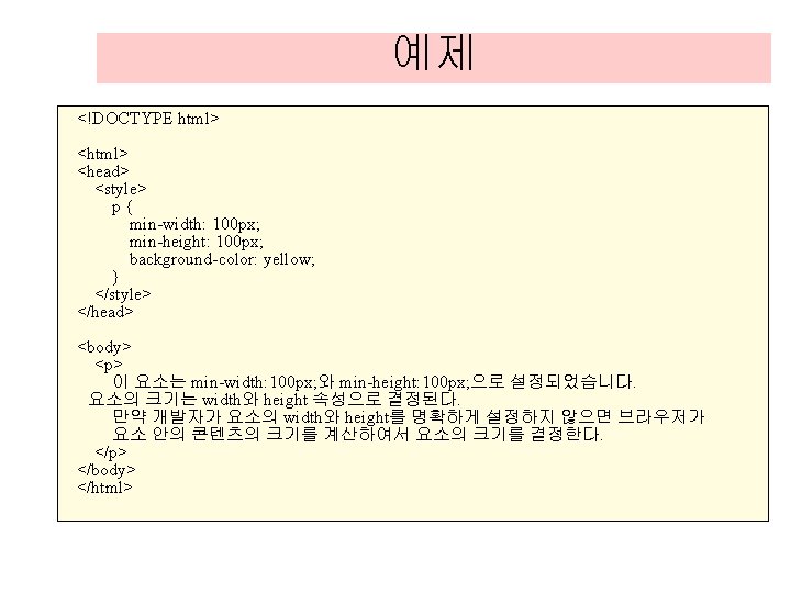
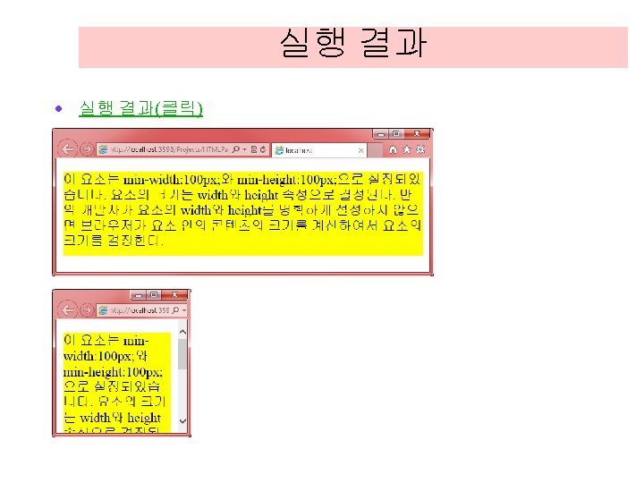
예제 <!DOCTYPE html> <head> <title>My Web Page</title> <style> h 1 { background-color: yellow; border: 2 px solid red; } </style> </head> <body> <h 1>This is a heading. </h 1> </body> </html>
 전체 선택자(universal selector) 클래스 선택자(class selector)")
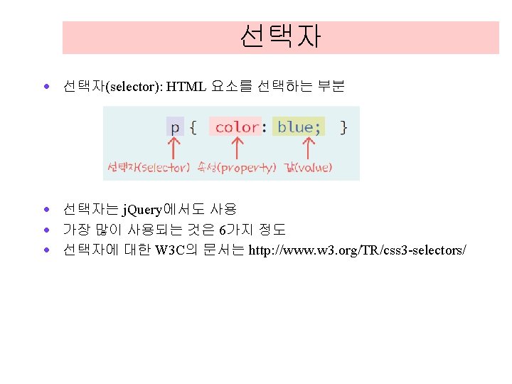
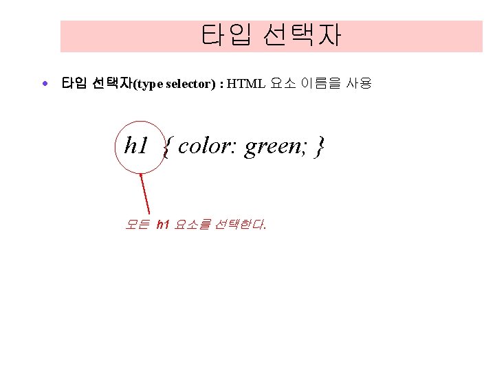
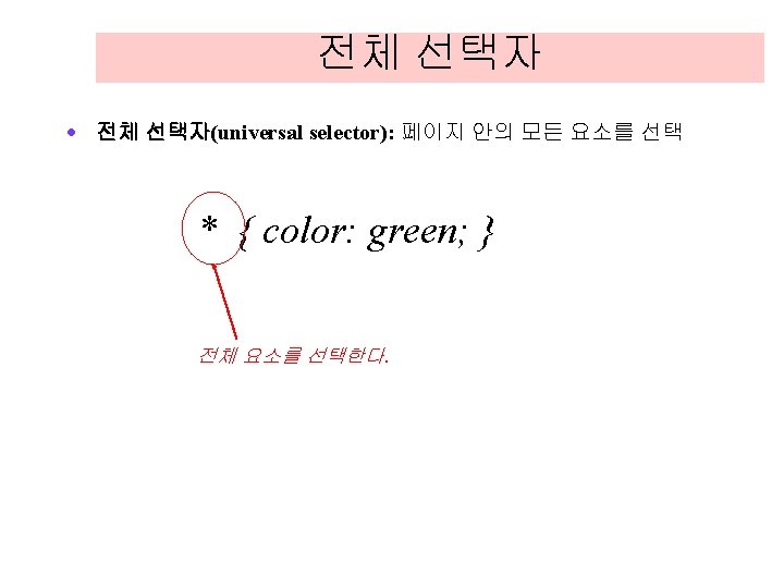
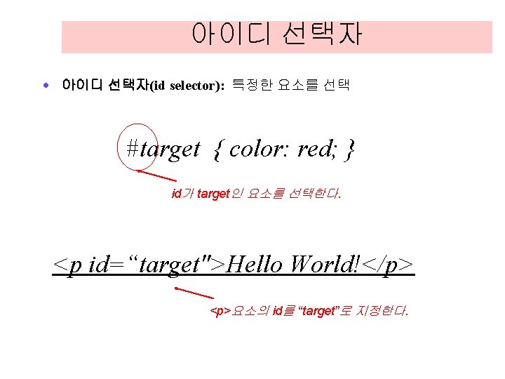
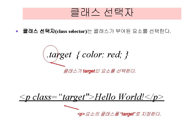
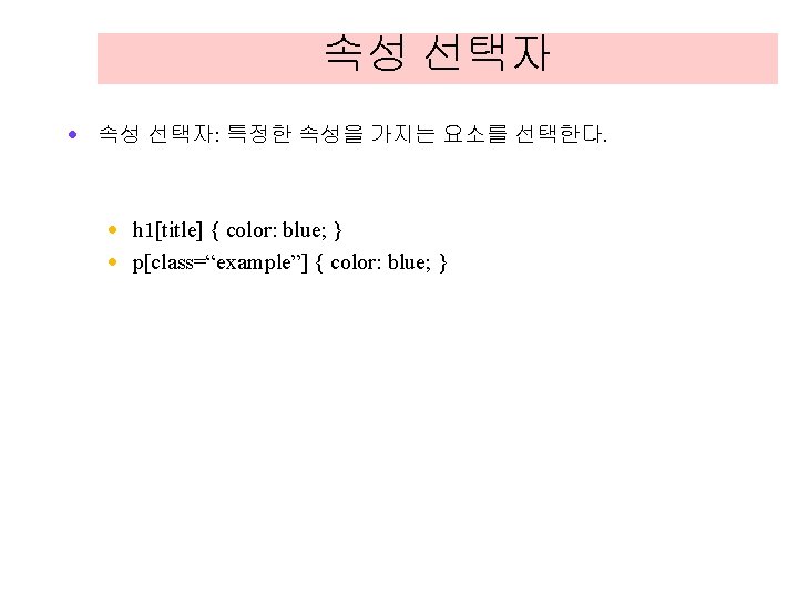
선택자의 종류 · · · 타입 선택자(type selector) 전체 선택자(universal selector) 클래스 선택자(class selector) 아이디 선택자(ID selector) 속성 선택자(attribute selector) 의사 선택자(pseudo-class)

예제 <!DOCTYPE html> <head> <title>CSS id Example</title> <style> #special { background-color: yellow; color: red; } </style> </head> <body> <p id="special">id가 special인 단락입니다. </p> <p>정상적인 단락입니다. </p> </body> </html>

예제 <!DOCTYPE html> <head> <title>CSS class Example</title> <style>. type 1 { text-align: center; } </style> </head> <body> <h 1 class="type 1">class가 type 1인 헤딩입니다. </h 1> <p class="type 1">class가 type 1인 단락입니다</p> </body> </html>
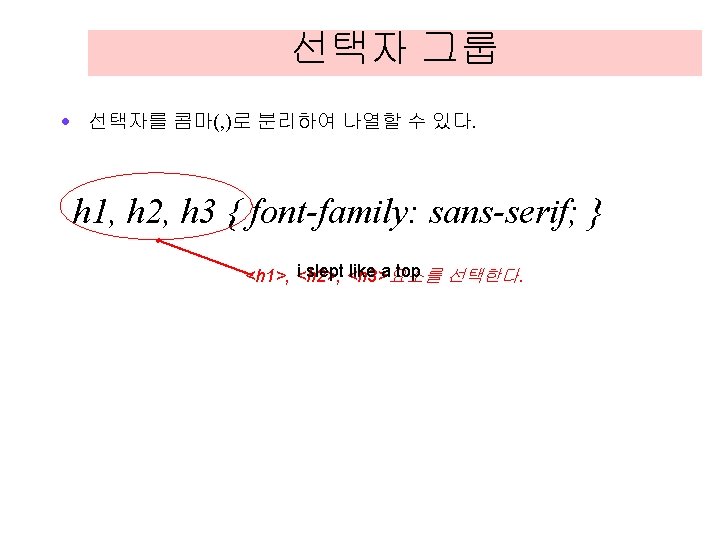

예제 <!DOCTYPE html> <head> <title>CSS selector Example</title> <style> h 1, p { font-family: sans-serif; color: red; } </style> </head> <body> <h 1>This is a heading 1. </h 1> <p>This is a paragraph. </p> </body> </html>
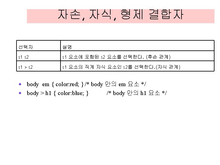

예제 <!DOCTYPE html> <head> <style> body em { color: red; } /* body 안의 em 요소 */ body > h 1 { color: blue; } /* body 안의 h 1 요소 */ </style> </head> <body> <h 1>This headline is <em>very</em> important</h 1> </body> </html>
: 클래스가 정의된 것처럼 간주 · a: link { color:")
의사 클래스 · 의사 클래스(pseudo-class): 클래스가 정의된 것처럼 간주 · a: link { color: blue; } · a: visited { color: green; } · a: hover { color: red; }

예제 a: link { text-decoration: none; color: blue; background-color: white; } a: visited { text-decoration: none; color: green; background-color: silver; } a: hover { text-decoration: none; color: white; background-color: blue; } …
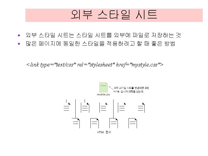

예제 mystyle. css h 1 { color: red; } p { color: #0026 ff; } <!DOCTYPE html> <head> <link type="text/css" rel="stylesheet" href="mystyle. css"> </head> <body> <h 1>This is a headline. </h 1> <p>This is a paragraph. </p> </body> </html>

내부 스타일 시트 · 내부 스타일 시트는 HTML 안에 CSS를 정의하는 것이다. <!DOCTYPE html> <head> <style> h 1 { color: red; } p{ color: #0026 ff; } </style> </head> <body> <h 1>This is a headline. </h 1> <p>This is a paragraph. </p> </body> </html>

인라인 스타일 시트 · 각각의 HTML 요소마다 스타일을 지정하는 것 · 2개 이상의 선언이 있다면 반드시 끝에 ; 을 적어 준다. <!DOCTYPE html> <head> </head> <body> <h 1 style="color: red">This is a headline. </h 1> <p style="color: #0026 ff">This is a paragraph. </p> </body> </html>

인라인 스타일 시트 · 각각의 HTML 요소마다 스타일을 지정하는 것 · 2개 이상의 선언이 있다면 반드시 끝에 ; 을 적어 준다. <!DOCTYPE html> <head> </head> <body> <h 1 style="color: red">This is a headline. </h 1> <p style="color: #0026 ff">This is a paragraph. </p> </body> </html>

예제 coffee. css h 1, p { font-family: serif; color: black; } h 1 { border-bottom: 1 px solid gray; color: red; } body { background-color: yellow; }

<!DOCTYPE html> <head> <title>Web Programming</title> <link type="text/css" rel="stylesheet" href="coffee. css"> </head> <body> <h 1>Welcome to Web Coffee!</h 1> <img src="coffee. gif" width="100" height="100"> <p> 하우스 로스팅 원두의 신선한 커피를 맛보세요! <em>공인 1급 Barista</em>가 최고급 원두만을 직접 엄선하여 사용합니다. </p> <h 2>메뉴</h 2> <p> 아메리카노, 카페라떼, 카푸치노, 카페모카, . . . </p> </body> </html>
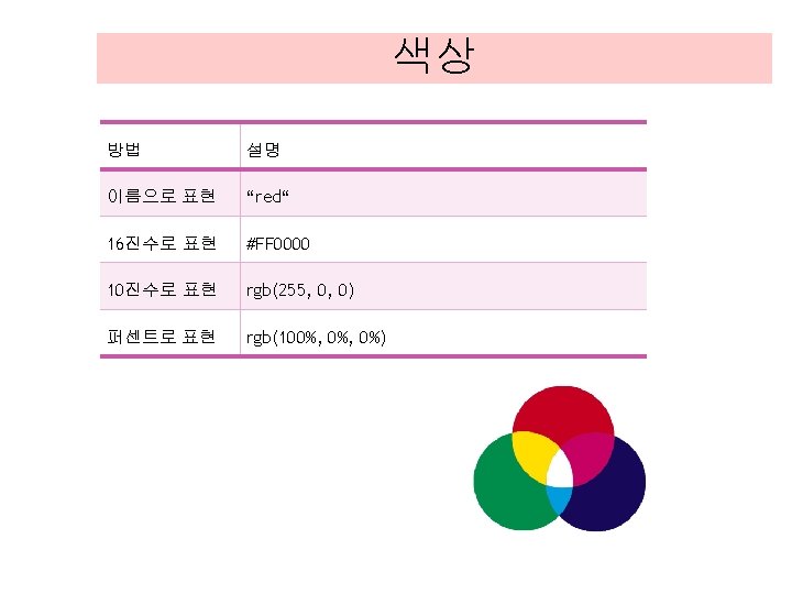
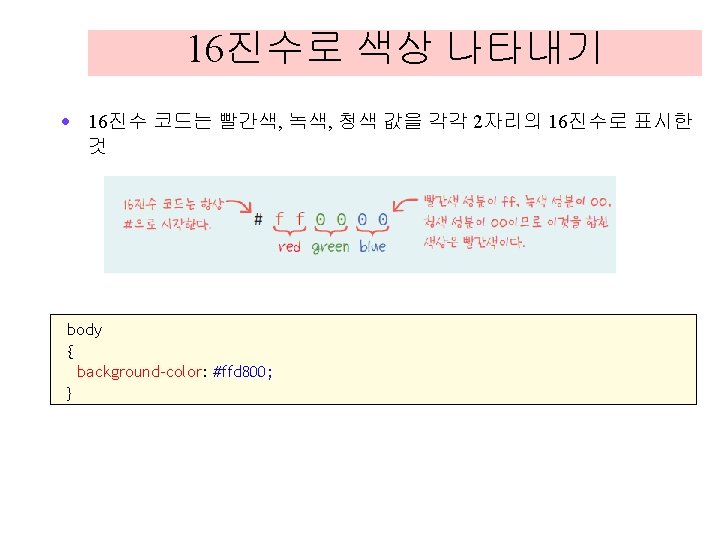

색상의 이름으로 나타내기 body { background-color: aqua; }
; } body { background-color: rgb(153,")
RGB 값으로 표시하기 body { background-color: rgb(60%, 40%, 10%); } body { background-color: rgb(153, 102, 25); }

예제 <!DOCTYPE html> <head> <style> h 1 { background-color: #6495 ed; p. a { background-color: #ff 0000; p. b { background-color: #00 ff 00; p. c { background-color: #0000 ff; p. d { background-color: #888888; </style> </head> <body> <h 1>CSS Color Chart</h 1> <p class="a">Color #1</p> <p class="b">Color #2</p> <p class="c">Color #3</p> <p class="d">Color #4</p> </body> </html> } } }
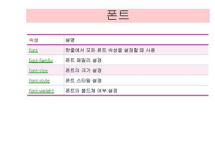

웹폰트 <html> <head> <title>Web Font Test</title> <style> @font-face { font-family: "Vera Serif Bold"; src: url("http: //developer. mozilla. org/@api/deki/files/2934/=Vera. Se. Bd. ttf"); } body { font-family: "Vera Serif Bold", serif } </style> </head> <body> 이것이 모질라에서 제공하는 Vera Serif Bold입니다. </body> </html>

폰트 크기 예제 <!DOCTYPE html> <head> <style> body { font-size: medium; } p#t 1 { font-size: 1. 0 em; p#t 2 { font-size: 1. 5 em; p#t 3 { font-size: 2. 0 em; </style> </head> <body> <p id="t 1">paragraph. </p> <p id="t 2">paragraph. </p> <p id="t 3">paragraph. </p> </body> </html> } } }
 · font-style – 이탤릭체 여부(normal, italic,")
폰트 속성 · font-weight – 볼드체 여부(normal, bold) · font-style – 이탤릭체 여부(normal, italic, oblique)

폰트 축약 기법 <!DOCTYPE html> <head> <style> p. style 1 { font: italic 30 px arial, sans-serif; } p. style 2 { font: bold 40 px Georgia, serif; } </style> </head> <body> <p class="style 1">font: italic 30 px arial, sans-serif</p> <p class="style 2">font: bold 40 px Georgia, serif</p> </body> </html>

텍스트 정렬 <!DOCTYPE html> <head> <style> h 1 { text-align: center; color: red; p. date { text-align: right; color: indigo; p. poet { text-align: justify; color: blue; </style> </head> <body> <h 1>CSS 텍스트 정렬 예제</h 1> <p class="date">2013년 9월 1일</p> <p class="poet"> 삶이 그대를 속일지라도 슬퍼하거나 노여워하지 말라. . . </p> <p><em>참고 푸시킨의 시</em> </p> </body> </html> } // 중앙정렬 } // 오른쪽정렬 } // 양쪽정렬

텍스트 장식 <!DOCTYPE html> <head> <style> h 1 { text-decoration: overline; } h 2 { text-decoration: line-through; } h 3 { text-decoration: underline; } </style> </head> <body> <h 1>텍스트 장식의 예입니다. </h 1> <h 2>텍스트 장식의 예입니다. </h 2> <h 3>텍스트 장식의 예입니다. </h 3> </body> </html>

텍스트 변환 <!DOCTYPE html> <head> <style> p. upper { text-transform: uppercase; } p. lower { text-transform: lowercase; } p. capit { text-transform: capitalize; } </style> </head> <body> <p class="upper">text_transform is uppercase. </p> <p class="lower">text_transform is lowercase. </p> <p class="capit">text_transform is capitalize. </p> </body> </html>

텍스트 그림자 <!DOCTYPE html> <head> <style> h 1 { text-shadow: 5 px 5 px #FF 0000; } </style> </head> <body> <h 1>Text-shadow 처리!</h 1> </body> </html>

Word Wrapping <!DOCTYPE html> <head> <style> p. test { width: 11 em; border: 1 px solid #000000; word-wrap: break-word; } </style> </head> <body> <p class="test"> 매우 긴 단어가 있는 경우에 자동으로 잘라준다. aaaaaaaaaaaaaaaaaaaaa </p> </body> </html>


경계선 스타일 <!DOCTYPE html> <body> <p style="border-style: none">none. </p> <p style="border-style: dotted">dotted</p> <p style="border-style: dashed">dashed</p> <p style="border-style: solid">solid</p> <p style="border-style: double">double</p> <p style="border-style: groove">groove</p> <p style="border-style: ridge">ridge</p> <p style="border-style: inset">inset</p> <p style="border-style: outset">outset</p> </body> </html>

경계선의 폭. . . <head> <style> p. thick { border-style: solid; border-width: thick; } p. medium { border-style: solid; border-width: medium; } p. thin { border-style: solid; border-width: 1 px; } </style> </head> <body> <p class="thick">경계선이 thick으로 설정되었음</p> <p class="medium">경계선이 medium으로 설정되었음</p> <p class="thin">경계선이 1 px으로 설정되었음</p> </body> </html>

경계선의 색상 <!DOCTYPE html> <head> <style> p. green { border-style: solid; border-color: green; } </style> </head> <body> <p class="green">경계선의 색상: green</p> </body> </html>

동근 경계선 <!DOCTYPE html> <head> <style> div { border: 2 px solid red; border-radius: 25 px; } </style> </head> <body> <div>border-radius 속성을 사용하면 둥근 경계선을 만들 수 있습니다. </div> </body> </html>

경계선 그림자 <!DOCTYPE html> <head> <style> div { width: 300 px; height: 50 px; background-color: green; box-shadow: 20 px 10 px 5 px #666666; } </style> </head> <body> <div></div> </body> </html>
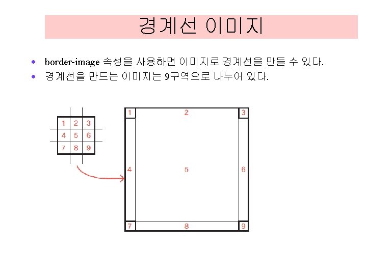

경계선 이미지 <!DOCTYPE html> <head> <style> div { border: 30 px solid transparent; width: 300 px; height: 50 px; -webkit-border-image: url(border. png) 30 30 round; /* Safari 5+ */ -o-border-image: url(border. png) 30 30 round; /* Opera */ border-image: url(border. png) 30 30 round; /* Chrome */ } </style> </head> <body> <div>경계 이미지가 반복되면서 그려진다. </div> </body> </html>

요소 크기 설정 <!DOCTYPE html> <head> <style> #target 1 { width: 100 px; height: 50 px; background-color: yellow; } #target 2 { width: 100 px; height: 50 px; background-color: lightgreen; } </style> </head> <body> <p id="target 1">이것은 p요소입니다. </p> <div id="target 2">이것은 div요소입니다. </div> </body> </html>

마진과 패딩 예제. . . <style> body { margin: 0 px; padding: 0 px; } p{ margin: 0 px; padding: 0 px; background-color: yellow; border: 1 px solid red; } #target { margin: 10 px; padding: 20 px; background-color: lightgreen; border: 1 px solid red; } </style> </head> <body> <p>margin: 0 px, padding: 0 px인 단락입니다. </p> <p id="target">margin: 10 px, padding: 20 px인 단락입니다. </p> </body> </html>
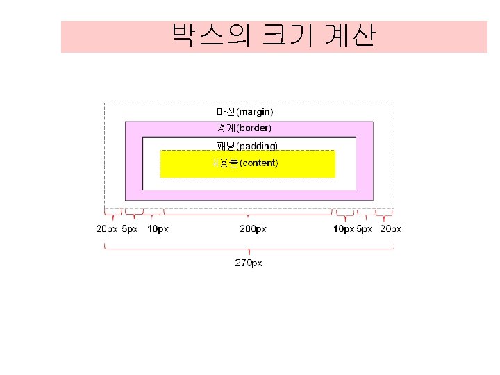

예제 <!DOCTYPE html> <head> <style> div. test { background-color: yellow; width: 200 px; padding: 10 px; border: 5 px solid red; margin: 20 px; } </style> </head> <body> <div class="test">이것은 div 요소로서 전체 폭은 270픽셀이다. </div> </body> </html>
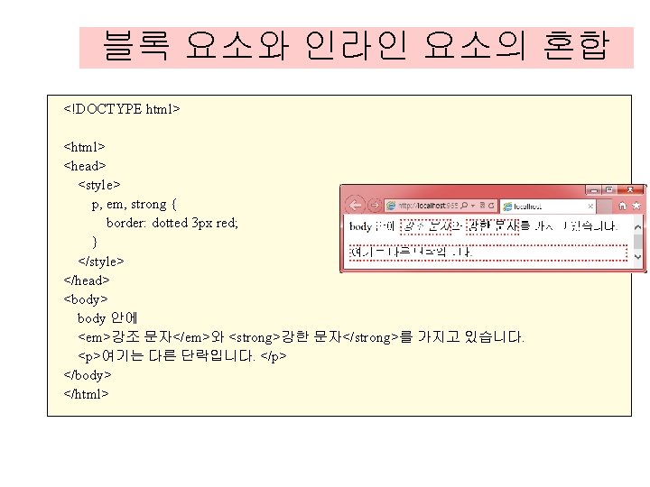
 <!DOCTYPE html> <head> <style> p, em, strong, div { border: dotted 3")
수평정렬(인라인 요소) <!DOCTYPE html> <head> <style> p, em, strong, div { border: dotted 3 px red; } </style> </head> <body> <p style="text-align: center"> <em>My Text </em> </p> </body> </html>
 <!DOCTYPE html> <head> <style> p, h 1 { border: dotted 3 px")
수평정렬(블록 요소) <!DOCTYPE html> <head> <style> p, h 1 { border: dotted 3 px red; } </style> </head> <body> <p style="margin-left: auto; margin-right: auto; width: 50%"> My Text </p> </body> </html>
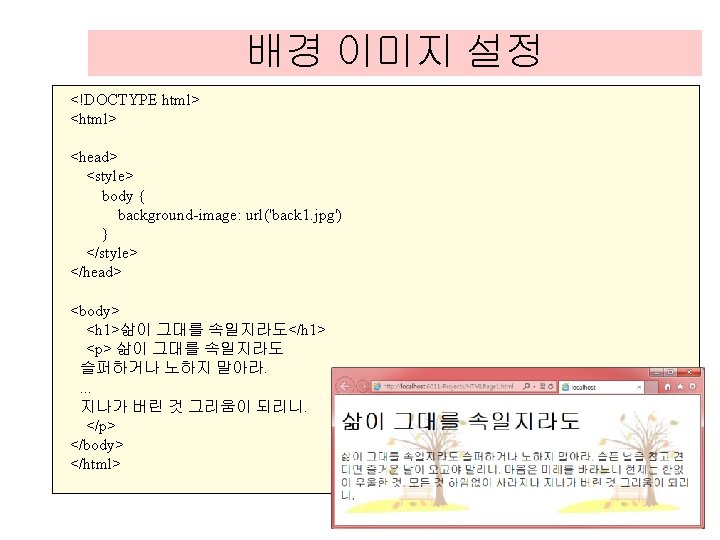
; background-repeat:")
고정된 배경 이미지 <!DOCTYPE html> <head> <style> body { background-image: url('back 1. jpg'); background-repeat: no-repeat; background-attachment: fixed; } </style> </head> <body> <p>이미지는 한번만 표시되고 위치가 고정되어 있다. </p> </body> </html>

배경 이미지 크기 <!DOCTYPE html> <head> <style> div { width: 500 px; height: 100 px; background: url(back. jpg); background-repeat: no-repeat; background-size: 100 px; } </style> </head> <body> <div> 지금 그 사람의 이름은 잊었지만 그의 눈동자 입술은 내 가슴에 있네. . . 내 가슴에 있네 </div> </body> </html>

링크 예제 <!DOCTYPE html> <head> <style> a: link { color: red; } a: visited { color: green; } a: hover { color: blue; } a: active { color: yellow; } </style> </head> <body> <p><a href="" target="_blank">여기가 링크입니다. </a> </p> </body> </html>

링크 예제 <!DOCTYPE html> <head> <style> a. style 1: link { a. style 1: visited { a. style 1: hover { a. style 2: link { a. style 2: visited { a. style 2: hover { </style> </head> color: #ff 0000; } color: #0000 ff; } font-size: 150%; } color: #ff 0000; } color: #0000 ff; } background: #66 ff 66; } <body> <p>마우스를 올려놓으면 스타일이 변경됩니다. </p> <p><a class="style 1" href="index. html" target="_blank"> 폰트크기를 변경하는 링크</a></p> <p><a class="style 2" href="index. html" target="_blank"> 배경색을 변경하는 링크</a></p> </body> </html>

링크 예제 <!DOCTYPE html> <head> <style> ul. a { list-style-type: circle; ul. b { list-style-type: disc; ul. c { list-style-type: square; </style> </head> <body> <ul class="a"> <li>HTML 5</li> <li>CSS 3</li> <li>JAVASCRIPT</li> </ul> <ul class="b"> <li>HTML 5</li> <li>CSS 3</li> <li>JAVASCRIPT</li> </ul> <ul class="c"> <li>HTML 5</li> <li>CSS 3</li> <li>JAVASCRIPT</li> </ul> </body> </html> } } }

수평 리스트 예제 <!DOCTYPE html> <head> <style> ul { list-style: none; text-align: center; border-top: 1 px solid red; border-bottom: 1 px solid red; padding: 10 px 0; } ul li { display: inline; text-transform: uppercase; padding: 0 10 px; letter-spacing: 10 px; } ul li a { text-decoration: none; color: black; } ul li a: hover { text-decoration: underline; } </style> </head>

수평 리스트 예제 <body> <ul> <li><a href="#">Home</a></li> <li><a href="#">Blog</a></li> <li><a href="#">About</a></li> <li><a href="#">Contact</a></li> </ul> </body> </html>

테이블의 경계 <!DOCTYPE html> <head> <style> table, td, th { border: 1 px solid blue; } </style> </head> <body> <table> <tr> <th>이름</th> <th>이메일</th> </tr> <td>김철수</td> <td>chul@google. com</td> </tr> <td>김영희</td> <td>young@google. com</td> </tr> </table> </body> </html>

테이블 배경색 <!DOCTYPE html> <head> <style> td, th { color: white; background-color: green; } </style> </head> <body> <table> <tr> <th>이름</th> <th>이메일</th> </tr> <td>김철수</td> <td>chul@google. com</td> </tr> <td>김영희</td> <td>young@google. com</td> </tr> </table> </body> </html>

헤더와 데이터의 분리 <!DOCTYPE html> <head> <style> table, td, th { border: 1 px solid green; } th { background-color: green; color: white; } </style> </head>. . .

테이블 텍스트 정렬 <!DOCTYPE html> <head> <style> table, td, th { border: 1 px solid blue; table { width: 100%; } td { text-align: center; } </style> </head> <body> <table> <tr> <th>이름</th> <th>이메일</th> </tr> <td>김철수</td> <td>chul@google. com</td> </tr> <td>김영희</td> <td>young@google. com</td> </tr> </table> </body> </html> }

테이블 캡션 <!DOCTYPE html> <head> <style> caption { caption-side: bottom; } </style> </head> <body> <table border="1"> <caption>VIP 고객 리스트</caption> <tr> <th>이름</th> <th>이메일</th> </tr> <td>김철수</td> <td>chul@google. com</td> </tr> <td>김영희</td> <td>young@google. com</td> </tr> </table> </body> </html>

짝수행과 홀수행 다르게 하기 <!DOCTYPE html> <head> <style> #list { font-family: "Trebuchet MS", sans-serif; width: 100%; } #list td, #list th { border: 1 px dotted gray; text-align: center; } #list th { color: white; background-color: blue; } #list tr. alt td { background-color: yellow; } </style> </head>

짝수행과 홀수행 다르게 하기 <body> <table id="list"> <tr> <th>이름</th> <th>이메일</th> </tr> <td>김철수</td> <td>chul@google. com</td> </tr> <tr class="alt"> <td>김영희</td> <td>young@google. com</td> </tr> <td>홍길동</td> <td>hong@google. com</td> </tr> <tr class="alt"> <td>김수진</td> <td>sujin@google. com</td> </tr> </table> </body> </html>

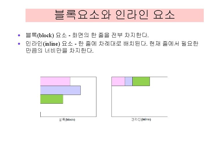

블록요소 · 한 줄을 전부 차지 · <h 1>, <p>, <ul>, <li>, <table>, <blockquote>, <pre>, <div> <form> , <header>, <nav> 요소 · 예제 실행과 소스보기 <body> <h 1 style="background-color: red">h 1으로 정의된 부분입니다. </h 1> <div style="background-color: aqua">div로 정의된 부분입니다. </div> <p style="background-color: yellow">p로 정의된 부분입니다. </p> <pre style="background-color: green">pre로 정의된 부분입니다. </pre> </body>

인라인요소 · 인라인 요소들은 한 줄 안에 차례대로 배치 · <a>, <img>, <strong>, <em>, , <input>, <span> 요소 <body> <em style="background-color: red">em 요소</em> <span style="background-color: aqua">span 요소</span> <img src="pome. png" width="60" height="60" /> <a href="http: //www. w 3 c. org">a 요소</a> </body>

예제 <!DOCTYPE html> <head> <title>display 속성</title> <style>. menubar li { display: inline; background-color: yellow; border: 1 px solid; border-color: red; margin: 0; padding: . 5 em; } </style> </head> <body> <ul class="menubar"> <li><a href="”#”">홈으로</a></li> <li><a href="”#”">회사 소개</a></li> <li><a href="”#”">제품 소개</a></li> <li><a href="”#”">질문과 대답</a></li> <li><a href="”#”">연락처</a></li> </ul> </body> </html>
 · 블록 요소들은 박스처럼 상하로 쌓이게")
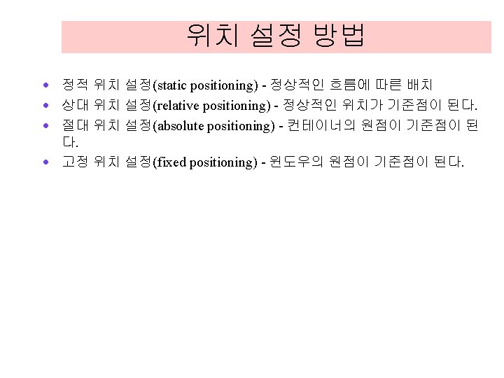
정적 위치 설정 · 정적 위치 설정(static positioning) · 블록 요소들은 박스처럼 상하로 쌓이게 되고 인라인 요소들은 한 줄에 차례대로 배치 <!DOCTYPE html> <head> <style> #one { background-color: cyan; width: 200 px; height: 50 px; } #two { position: static; background-color: yellow; width: 200 px; height: 50 px; } #three { background-color: lightgreen; width: 200 px; height: 50 px; } </style>

예제 <body> <p id="one">block #1</p> <div id="two"> block #2 position: static; </div> <p id="three">block #3</p> </body> </html>
 · 정상적인 위치에서 상대적으로 요소가 배치")
상대 위치 설정 · 상대 위치 설정(relative positioning) · 정상적인 위치에서 상대적으로 요소가 배치 <style> #one { background-color: cyan; width: 200 px; height: 50 px; } #two { } position: relative; left: 30 px; background-color: yellow; width: 200 px; height: 50 px; #three { background-color: lightgreen; width: 200 px; height: 50 px; } </style>
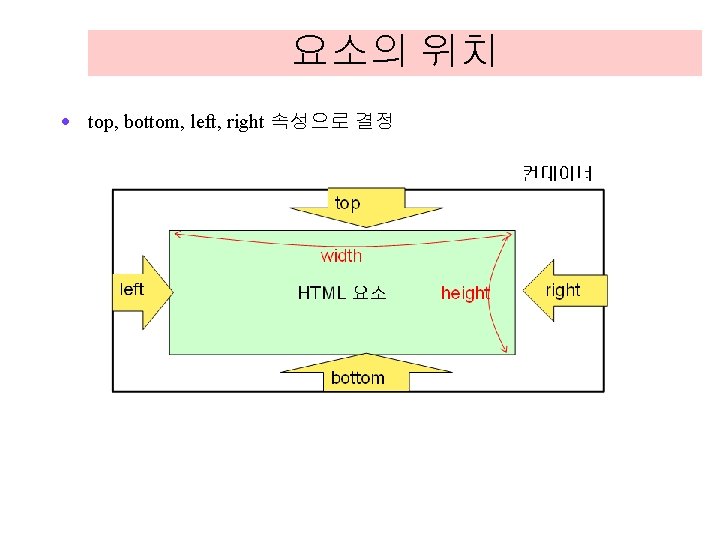
 · 전체 페이지를 기준으로 시작 위치에서 top,")
절대 위치 설정 · 절대 위치(absolute positioning) · 전체 페이지를 기준으로 시작 위치에서 top, left, bottom, right 만큼 떨어진 위치에 배치. . . #two { position: absolute; top: 30 px; left: 30 px; . . . } background-color: yellow; width: 200 px; height: 50 px;
 · 브라우저 윈도우에 상대적으로 요소의 위치를")
고정 위치 설정 · 고정 위치 설정(fixed positioning) · 브라우저 윈도우에 상대적으로 요소의 위치를 잡는 것 <!DOCTYPE html> <head> <style> p{ background-color: lightgreen; width: 200 px; height: 50 px; } #two { background-color: yellow; position: fixed; top: 0 px; right: 0 px; } </style> </head>

고정 위치 설정 <body> <p>block #1</p> <p id="two"> block #2 position: fixed; top: 0 px; right: 10 px; </p> <p>block #3</p> <p>block #4</p> <p>block #5</p> <p>block #6</p> <p>block #7</p> <p>block #8</p> <p>block #9</p> <p>block #10</p> <p>block #11</p> </body> </html>
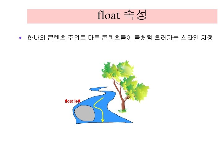

예제 <!DOCTYPE html> <head> <style> img. a { float: left </style> </head> } <body> <img class="a" src="sunshine. jpg" width="160" height="120" /> <p> 생활이 그대를 속일지라도 슬퍼하거나 노여워 말라. . </p> </body> </html>

예제 <!DOCTYPE html> <head> <style> img { float: left; width: 110 px; height: 90 px; margin: 5 px; } </style> </head> <body> <h 3>이미지 갤러리</h 3> <img src="sunshine. jpg" width="100" height="90"> <img src="lion. png" width="100" height="90"> <img src="storm. jpg" width="100" height="90"> </body> </html>
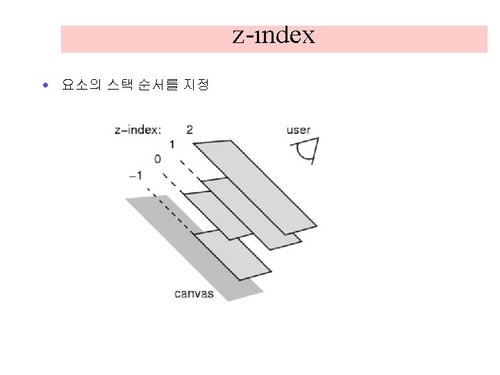

예제. . . <style> #box 1 { position: absolute; top: 0 px; left: 0 px; width: 100 px; height: 100 px; background: blue; z-index: 200; } #box 2 { position: absolute; top: 30 px; left: 30 px; width: 100 px; height: 100 px; background: yellow; z-index: 100; } #box 3 { position: absolute; top: 60 px; left: 60 px; width: 100 px; height: 100 px; background: green; z-index: 0; } </style>

예제 </head> <body> <div id="box 1">box #1 </div> <div id="box 2">box #2 </div> <div id="box 3">box #3 </div> </body> </html>

예제 <!DOCTYPE html> <head> <style> img { position: absolute; left: 0 px; top: 0 px; z-index: -1; } </style> </head> <body> <img src="pome. png" width="200" height="200" /> <p>img 요소의 z-index가 -1이므로 다른 요소의 뒤에 위치한다. </p> </body> </html>

예제 <!DOCTYPE html> <head> <style> p{ background-color: lightgreen; width: 200 px; height: 50 px; } #target { border: 1 px solid black; width: 300 px; height: 100 px; overflow: scroll; } </style> </head> <body> <div id=target> <p>block #1</p> <p>block #2</p> <p>block #3</p> <p>block #4</p> <p>block #5</p> </div> </body> </html>
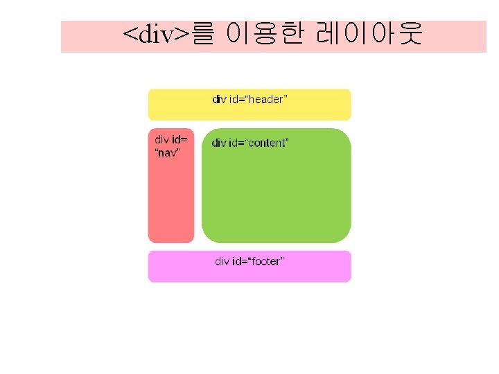

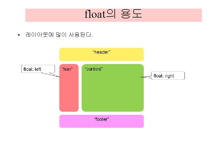
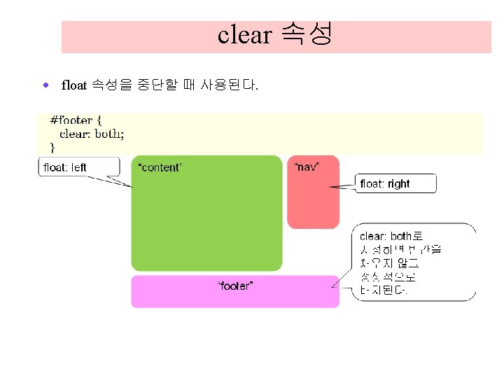
예제 <!DOCTYPE html> <head> <title>My Blog Page</title> <style> #header { background-color: yellow; width: 100%; height: 50 px; } #nav { width: 30%; background-color: red; height: 100 px; float: left; }

예제 #content { width: 70%; background-color: blue; float: right; height: 100 px; } #footer { background-color: aqua; width: 100%; height: 50 px; clear: both; } </style> </head> <body> <div id="wrapper"> <div id="header"> header </div> <div id="nav"> nav </div> <div id="content"> content </div> <div id="footer"> footer </div> </body> </html>
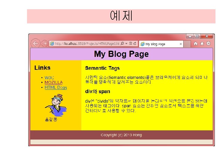

예제 <!DOCTYPE html> <head> <title>My Blog Page</title> <style> body { background-color: #efe 5 d 0; font-family: Arial, "Trebuchet MS", sans-serif; margin: 0 px; } header { background-color: #e 3 afed; color: #000000; margin: 0 px; text-align: center; padding: 5 px; }

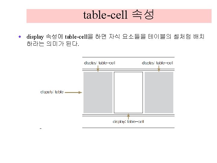
예제 h 1 { margin: 0 px; } section#main { display: table-cell; background-color: yellow; padding: 15 px; } nav { display: table-cell; background-color: #ffd 800; padding: 15 px; } footer { background-color: #954 b 4 b; color: #efe 5 d 0; text-align: center; padding: 10 px; margin: 0 px 0 px; font-size: 90%; } </style>

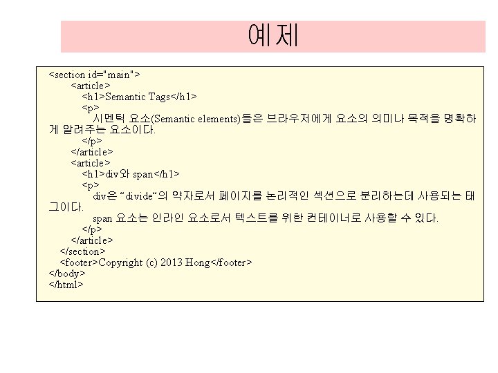
예제 <body> <header> <h 1>My Blog Page</h 1> </header> <nav> <h 1>Links</h 1> <ul> <li><a href="http: //www. w 3 c. org/">W 3 C</a></li> <li><a href="http: //developer. mozilla. org/">MOZILLA</a></li> <li><a href="http: //htmldog. com/guides/">HTML Dogs</a></li> </ul> <figure> <img width="85" height="85" src="hong. png" alt="홍길동" /> <figcaption>홍길동</figcaption> </figure> </nav>

CSS 3 효과: 투명도 <!DOCTYPE html> <head> <style> img { opacity: 0. 4; } img: hover { opacity: 1. 0; } </style> </head> <body> <h 1>Opacity 속성</h 1> <img src="lion. png" width="150" height="120" alt="lion"> <img src="audio. png" width="150" height="120" alt="audio"> </body> </html>

CSS 3 효과: 가시성 <!DOCTYPE html> <head> <style> #a { visibility: hidden; border: 1 px dotted red; } #b { visibility: visible; border: 1 px dotted red; } </style> </head> <body> <h 1>Visibility 속성</h 1> <img id="a" src="lion. png" width="150" height="120" alt="lion"> <img id="b" src="audio. png" width="150" height="120" alt="audio"> </body> </html>

CSS 3: 전환 <!DOCTYPE html> <head> <style> div { width: 100 px; height: 50 px; border: 1 px solid black; background: yellow; transition: width 5 s; } div: hover { width: 200 px; } </style> </head> <body> <div>마우스를 올려보세요. </div> </body> </html>

CSS 3: 전환 <!DOCTYPE html> <head> <style> p{ width: 100 px; height: 50 px; border: 1 px solid black; background: yellow; transition: width 5 s height 5 s border 5 s, transform 5 s; -webkit-transition: width 5 s, height 5 s, border 5 s, -webkit-transform 5 s; } p: hover { width: 200 px; height: 100 px; border: 10 px solid red; transform: rotate(180 deg); -webkit-transform: rotate(180 deg); } </style> </head> <body> <p>마우스를 올려보세요. </p> </body> </html>
 - 평행이동 transform: rotate(45")
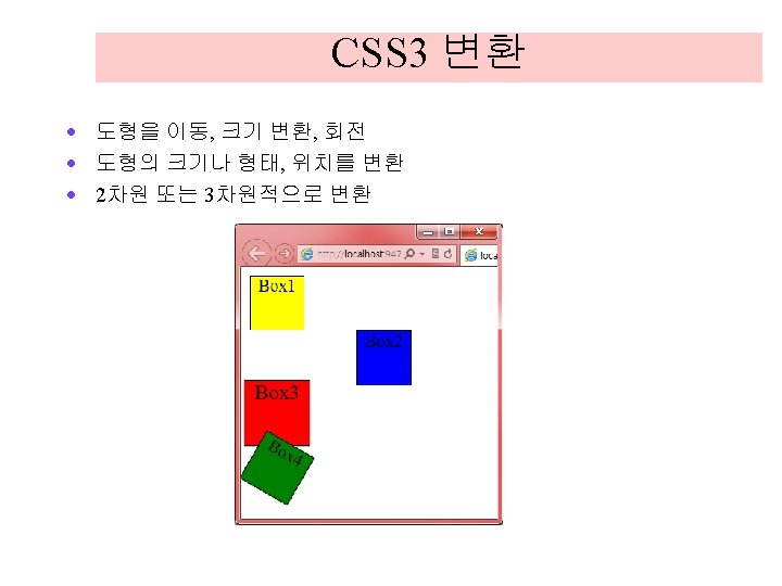
transform 속성 · · · transform: translate(10 px, 10 px) - 평행이동 transform: rotate(45 deg) - 회전 transform: scale(2, 1. 2) - 크기변환 transform: skew(20 deg, 10 deg) - 비틀기 변환 transform: matrix() - 일반적인 변환

CSS 3: 전환 <!DOCTYPE html> <head> <style> div { width: 50 px; height: 50 px; background-color: yellow; border: 1 px solid black; text-align: center; } div#box 2 { transform: translate(100 px, 0 px); background-color: blue; } div#box 3 { transform: scale(1. 2, 1. 2); background-color: red; } div#box 4 { transform: rotate(30 deg); background-color: green; } </style> </head>

CSS 3: 전환 <body> <div id="box 1">Box 1</div> <div id="box 2">Box 2</div> <div id="box 3">Box 3</div> <div id="box 4">Box 4</div> </body> </html>

예제 <!DOCTYPE html> <head> <style> div { background-color: green; height: 150 px; width: 150 px; }. container { background-color: yellow; border: 1 px solid black; }. transformed { backface-visibility: visible; transform-origin: 50% 42%; transform: perspective(500 px) rotate. Y(59 deg) rotate. X(0 deg); } </style> </head> <body> <div class="container"> <div class="transformed"></div> </body> </html>
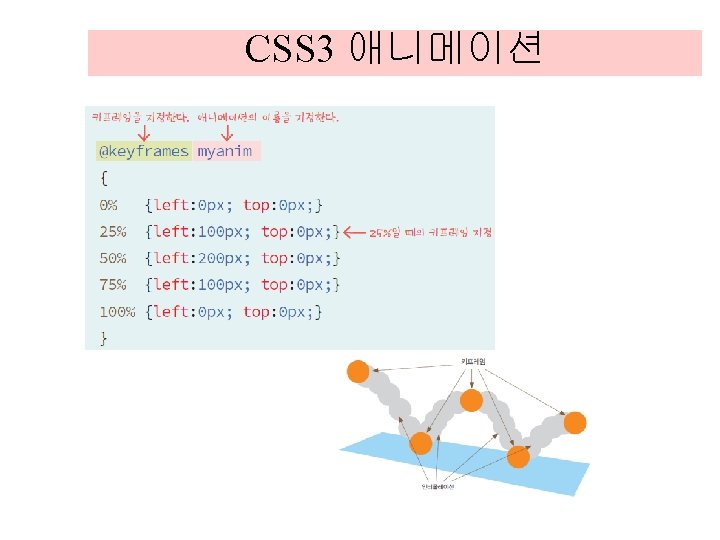

예제 <!DOCTYPE html> <head> <style> div { width: 100 px; height: 100 px; background: red; position: relative; animation: 2 s myanim; animation-iteration-count: 10; } @keyframes myanim { 0% {left: 0 px; top: 0 px; } 25% {left: 100 px; top: 0 px; } 50% {left: 200 px; top: 0 px; } 75% {left: 100 px; top: 0 px; } 100% {left: 0 px; top: 0 px; } } </style> </head> <body> <div></div> </body> </html>
- Slides: 145