CSS Box Model What is the Box Model

CSS Box Model
What is the Box Model? The box model is a tool we use to understand how our content will be displayed on a web page. n Each XHTML element appearing on our page takes up a "box" or "container" of space. n Each box size is affected not only by content but also by padding, borders, and margins. n By knowing how to calculate the dimensions of each box, we can accurately predict how elements will lay out on the screen. n As we build a new page, we can arrange these boxes on the screen, creating a balanced layout with white space around the content. The importance of the box model concept cannot be overemphasized. It would be difficult and frustrating to create a website without understanding this concept.
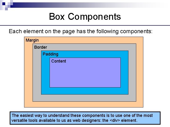
Box Components Each element on the page has the following components: Margin Border Padding Content The easiest way to understand these components is to use one of the most versatile tools available to us as web designers: the <div> element.
Introducing the <div> Element The <div> ("division") element groups other elements on the screen. n By setting the width and height attributes via CSS, we can reserve a precise amount of space on our page for specific content. n The actual content is nested and contained within the opening <div> and closing </div> tags. n When we apply CSS styling directly to the <div> element, all the elements contained within that <div> will inherit that style. n By using multiple <div> elements as building blocks, we can design an entire web page layout.
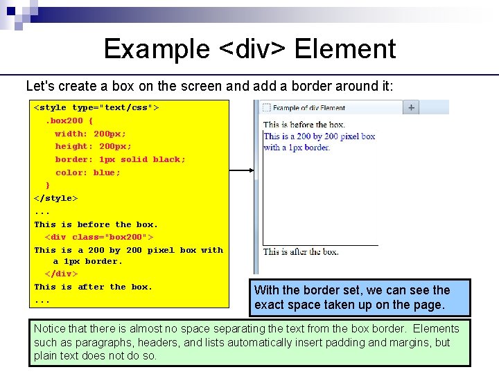
Example <div> Element Let's create a box on the screen and add a border around it: <style type="text/css">. box 200 { width: 200 px; height: 200 px; border: 1 px solid black; color: blue; } </style>. . . This is before the box. <div class="box 200"> This is a 200 by 200 pixel box with a 1 px border. </div> This is after the box. . With the border set, we can see the exact space taken up on the page. Notice that there is almost no space separating the text from the box border. Elements such as paragraphs, headers, and lists automatically insert padding and margins, but plain text does not do so.

Adding Padding and Margin Let's create some space between elements by adding both padding and margin: <style type="text/css">. box 200 { width: 200 px; height: 200 px; border: 1 px solid black; color: blue; padding: 10 px; margin: 10 px; } </style>. . . The 10 pixel padding adds buffer space, on all four sides, between the content and border. The 10 pixel margin adds buffer space, on all four sides, between the border and surrounding elements. Let's examine this a bit closer up to see exactly what is happening.
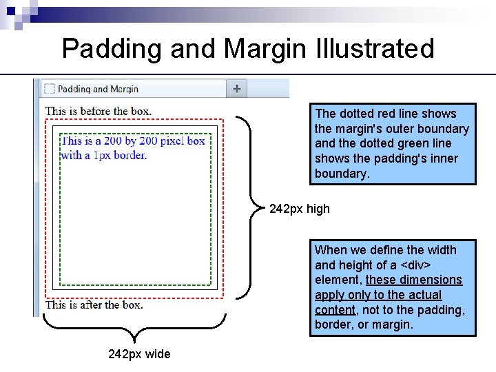
Padding and Margin Illustrated The dotted red line shows the margin's outer boundary and the dotted green line shows the padding's inner boundary. 242 px high When we define the width and height of a <div> element, these dimensions apply only to the actual content, not to the padding, border, or margin. 242 px wide
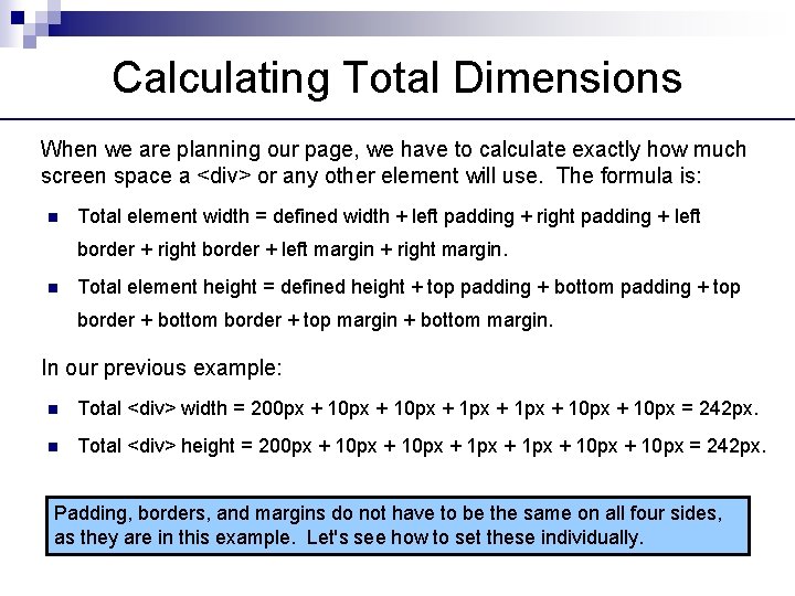
Calculating Total Dimensions When we are planning our page, we have to calculate exactly how much screen space a <div> or any other element will use. The formula is: n Total element width = defined width + left padding + right padding + left border + right border + left margin + right margin. n Total element height = defined height + top padding + bottom padding + top border + bottom border + top margin + bottom margin. In our previous example: n Total <div> width = 200 px + 10 px + 1 px + 10 px = 242 px. n Total <div> height = 200 px + 10 px + 1 px + 10 px = 242 px. Padding, borders, and margins do not have to be the same on all four sides, as they are in this example. Let's see how to set these individually.
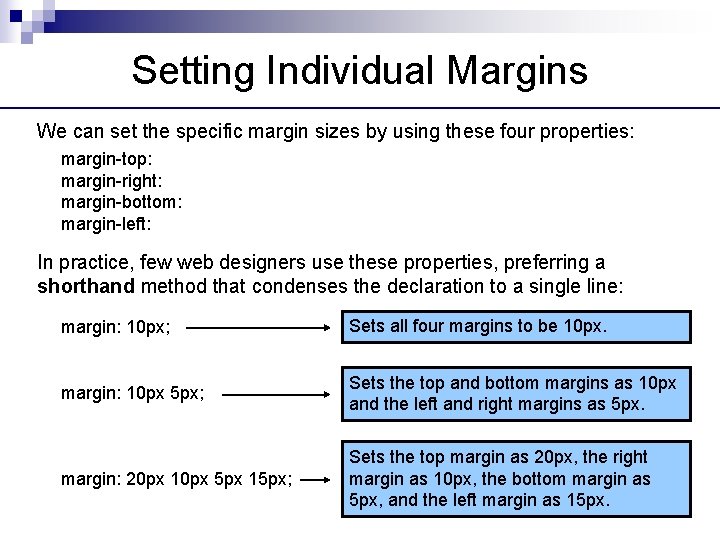
Setting Individual Margins We can set the specific margin sizes by using these four properties: margin-top: margin-right: margin-bottom: margin-left: In practice, few web designers use these properties, preferring a shorthand method that condenses the declaration to a single line: margin: 10 px; Sets all four margins to be 10 px. margin: 10 px 5 px; Sets the top and bottom margins as 10 px and the left and right margins as 5 px. margin: 20 px 10 px 5 px 15 px; Sets the top margin as 20 px, the right margin as 10 px, the bottom margin as 5 px, and the left margin as 15 px.
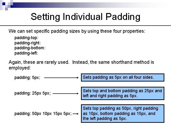
Setting Individual Padding We can set specific padding sizes by using these four properties: padding-top: padding-right: padding-bottom: padding-left: Again, these are rarely used. Instead, the same shorthand method is employed: padding: 5 px; Sets padding as 5 px on all four sides. padding: 25 px 5 px; Sets top and bottom padding as 25 px and left and right padding as 5 px. padding: 50 px 15 px 5 px; Sets top padding as 50 px, right padding as 10 px, bottom padding as 15 px, and the left padding as 5 px.
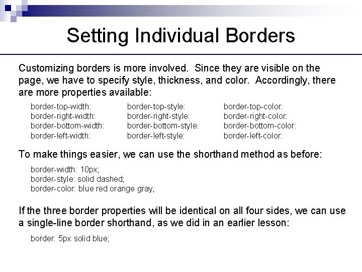
Setting Individual Borders Customizing borders is more involved. Since they are visible on the page, we have to specify style, thickness, and color. Accordingly, there are more properties available: border-top-width: border-right-width: border-bottom-width: border-left-width: border-top-style: border-right-style: border-bottom-style: border-left-style: border-top-color: border-right-color: border-bottom-color: border-left-color: To make things easier, we can use the shorthand method as before: border-width: 10 px; border-style: solid dashed; border-color: blue red orange gray; If the three border properties will be identical on all four sides, we can use a single-line border shorthand, as we did in an earlier lesson: border: 5 px solid blue;
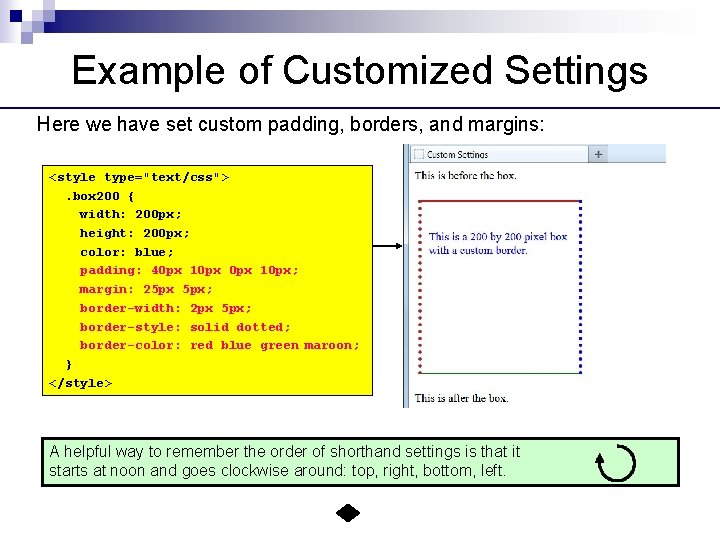
Example of Customized Settings Here we have set custom padding, borders, and margins: <style type="text/css">. box 200 { width: 200 px; height: 200 px; color: blue; padding: 40 px 10 px; margin: 25 px 5 px; border-width: 2 px 5 px; border-style: solid dotted; border-color: red blue green maroon; } </style> A helpful way to remember the order of shorthand settings is that it starts at noon and goes clockwise around: top, right, bottom, left.
- Slides: 12