CSS box model and layout This lecture will
CSS box model and layout
This lecture will cover… • The cascade • Background to CSS layout • CSS fundamentals essential to layout design – The CSS box model – Styling the box – Divisions (divs) – floating and clearing – CSS units of measurement – pixels, %, ems • This week’s lab tutorial • This week’s reading
Background to CSS layout • Core problem of web design is that the developer has no control over how the user will view the page – Device – mobile, tablet, laptop, desktop? – What type (and version) of browser? Old browsers still in use - IE 6 – do not support CSS 2. 1 standards – The display resolution of pixels per inch (ppi) width x height – http: //en. wikipedia. org/wiki/Display_resolution#Computer_monitors – Browser window size – the viewport – User preferences - custom browser settings e. g. text size • Completely unlike designing for printed media, which has a fixed size 'canvas'
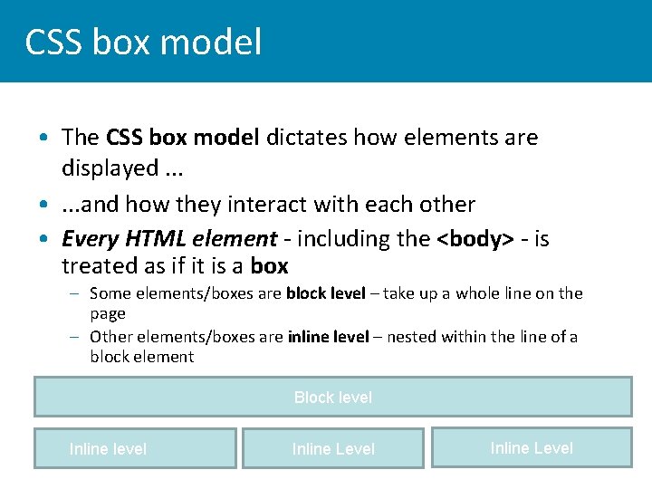
CSS box model • The CSS box model dictates how elements are displayed. . . • . . . and how they interact with each other • Every HTML element - including the <body> - is treated as if it is a box – Some elements/boxes are block level – take up a whole line on the page – Other elements/boxes are inline level – nested within the line of a block element Block level Inline Level
Block and Inline level elements • List some Block level elements • List some Inline level elements
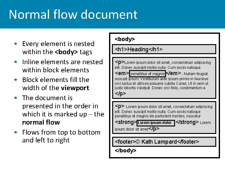
Normal flow document • Every element is nested within the <body> tags • Inline elements are nested within block elements • Block elements fill the width of the viewport • The document is presented in the order in which it is marked up – the normal flow • Flows from top to bottom and left to right <body> <h 1>Heading</h 1> <p>Lorem ipsum dolor sit amet, consectetuer adipiscing elit. Donec suscipit mollis nulla. Cum sociis natoque <em> penatibus et magnis </em>. Nullam feugiat suscipit ipsum. Vestibulum ante ipsum primis in faucibus orci luctus et ultrices posuere cubilia Curae; Ut in sem ut justo lobortis volutpat. Donec orci felis, condimentum a </p> <p> Lorem ipsum dolor sit amet, consectetuer adipiscing elit. Donec suscipit mollis nulla. Cum sociis natoque penatibus et magnis dis parturient montes, nascetur <strong> Lorem ipsum dolor </strong> Lorem ipsum dolor sit amet</p> <footer>© Kath Lampard</footer> </body>
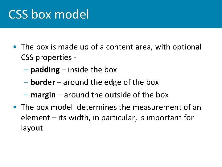
CSS box model • The box is made up of a content area, with optional CSS properties – padding – inside the box – border – around the edge of the box – margin – around the outside of the box • The box model determines the measurement of an element – its width, in particular, is important for layout
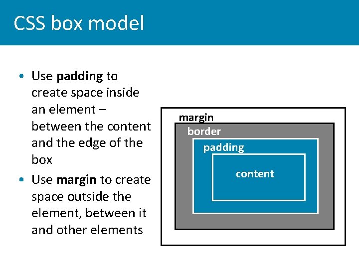
CSS box model • Use padding to create space inside an element – between the content and the edge of the box • Use margin to create space outside the element, between it and other elements margin border padding content
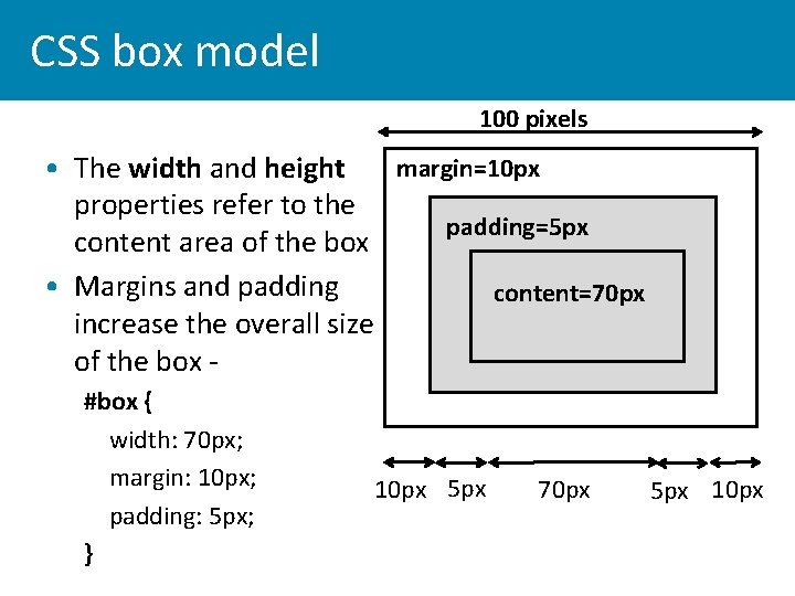
CSS box model 100 pixels margin=10 px • The width and height properties refer to the padding=5 px content area of the box • Margins and padding content=70 px increase the overall size of the box #box { width: 70 px; margin: 10 px; padding: 5 px; } 10 px 5 px 70 px 5 px 10 px
Layout - the CSS 2. 1 box model • In the 'Getting started' stylesheet the margin and padding properties applied by the browser stylesheet have been over-ridden by the reset CSS and set to 0 • If you are not using this stylesheet you should write this rule first in your stylesheet – * { margin: 0; padding: 0; } • Sets margin and padding to 0 on all elements
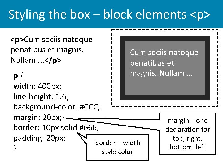
Styling the box – block elements <p>Cum sociis natoque penatibus et magnis. Nullam. . . </p> Cum sociis natoque penatibus et magnis. Nullam. . . p{ width: 400 px; line-height: 1. 6; background-color: #CCC; margin: 20 px; border: 10 px solid #666; padding: 20 px; border – width } style color margin – one declaration for top, right, bottom, left
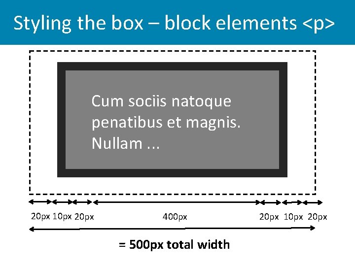
Styling the box – block elements <p> Cum sociis natoque penatibus et magnis. Nullam. . . 20 px 10 px 20 px 400 px = 500 px total width 20 px 10 px 20 px
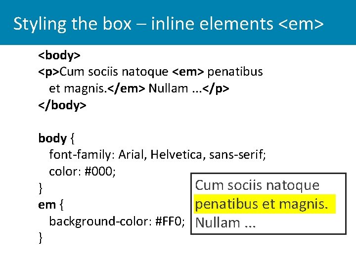
Styling the box – inline elements <em> <body> <p>Cum sociis natoque <em> penatibus et magnis. </em> Nullam. . . </p> </body> body { font-family: Arial, Helvetica, sans-serif; color: #000; Cum sociis natoque } penatibus et magnis. em { background-color: #FF 0; Nullam. . . }
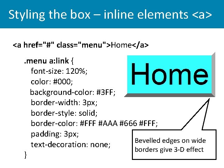
Styling the box – inline elements <a> <a href="#" class="menu">Home</a>. menu a: link { font-size: 120%; color: #000; background-color: #3 FF; border-width: 3 px; border-style: solid; border-color: #FFF #AAA #666 #FFF; padding: 3 px; Bevelled edges on wide text-decoration: none; borders give 3 -D effect }
Styling the box - background • Background properties can be styled for all regions of the box, apart from the margins (this can be done in CSS 3) • Default value is transparent – the colour or background image of a parent box in which a box is nested shows through • Small images can be used as box backgrounds: these tile - i. e. repeat - to fill the browser window background-repeat: repeat; • Large images - if used – should be set to background-repeat: no-repeat; http: //www. csszengarden. com/? cssfile=/197. css&page=2 http: //www. csszengarden. com/? cssfile=/204. css&page=1
styling the box • Take some time to style both block and inline box elements on your page, make sure that you experiment with each part of the box model to get different effects.
Layout - normal flow document • By default the HTML document will be displayed by the browser in normal flow layout • Elements are displayed in the order they occur in the HTML file – – Block elements display vertically from top to bottom, nested within the body – Inline elements display horizontally from left to right, nested within block elements
CSS layout • Most layouts require changing the normal flow of the document – – by laying out content in 2 or more columns – by floating elements to the left or right of the page • Block level elements that are used for layout – – semantic page section elements (HTML 5) – nav, section, article, aside, footer – divs with meaningful class or id attributes – e. g. <div id="wrapper">, <div id="maincontent"> • The div is a generic element, very useful for layout, but should only be used where necessary – avoid 'divititis'
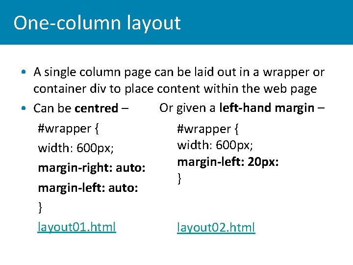
One-column layout • A single column page can be laid out in a wrapper or container div to place content within the web page Or given a left-hand margin – • Can be centred – #wrapper { width: 600 px; margin-left: 20 px: margin-right: auto: } margin-left: auto: } layout 01. html layout 02. html
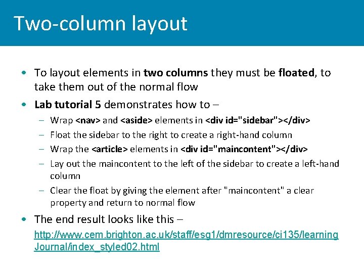
Two-column layout • To layout elements in two columns they must be floated, to take them out of the normal flow • Lab tutorial 5 demonstrates how to – – – Wrap <nav> and <aside> elements in <div id="sidebar"></div> Float the sidebar to the right to create a right-hand column Wrap the <article> elements in <div id="maincontent"></div> Lay out the maincontent to the left of the sidebar to create a left-hand column – Clear the float by giving the element after "maincontent" a clear property and return to normal flow • The end result looks like this – • http: //www. cem. brighton. ac. uk/staff/esg 1/dmresource/ci 135/learning Journal/index_styled 02. html
Layout and box measurements • When laying out elements it's important to calculate the total width of the box, including padding, borders and margins • For example, floating two boxes 200 px wide inside a div 400 px wide will work – but only if neither box has padding etc. • Even the addition of a single 1 px border on one element will prevent the elements fitting side by side • Calculate the total measurement of an element in order to work out the size of divs for layout
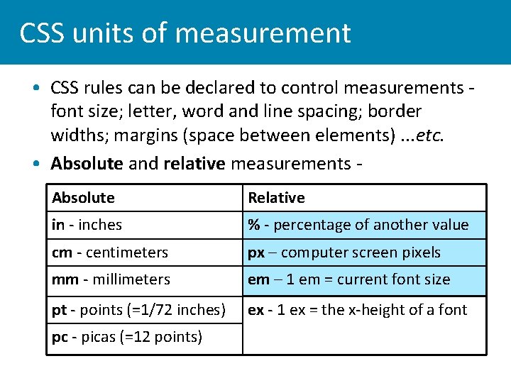
CSS units of measurement • CSS rules can be declared to control measurements font size; letter, word and line spacing; border widths; margins (space between elements). . . etc. • Absolute and relative measurements Absolute Relative in - inches % - percentage of another value cm - centimeters px – computer screen pixels mm - millimeters em – 1 em = current font size pt - points (=1/72 inches) ex - 1 ex = the x-height of a font pc - picas (=12 points)
Absolute and relative units • Absolute values are fixed units of measurement • A web page is not like a printed page or a fixed size canvas. . . • Fixed measurements would only work if the browser knew precisely the display resolution of the screen and size of the device viewport • Relative measurements have no fixed value: their size is relative to a default value specified elsewhere • Pixels, % and ems are the measurements most commonly used in web dev
Relative measurements: pixels • Pixels give designers an illusion of control – i. e. that elements measurements are fixed • In fact, pixel size is relative to screen resolution – e. g. the same type size will look big on a low resolution display, small on a high res display – 72 pixels per inch (ppi) has been used as a working norm, but now a huge variation in pixel density of screen displays – Any box property can be measured in pixels – font-size, width and height, margin, padding, border etc. – Problematic for layout – pages measured in pixels are not liquid and will not adapt to different devices
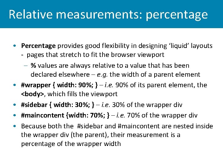
Relative measurements: percentage • Percentage provides good flexibility in designing ‘liquid’ layouts - pages that stretch to fit the browser viewport – % values are always relative to a value that has been declared elsewhere – e. g. the width of a parent element • #wrapper { width: 90%; } – i. e. 90% of its parent element, the <body>, which fills the viewport • #sidebar { width: 30%; } – i. e. 30% of the wrapper div • #maincontent {width: 70%; } – i. e. 70% of the wrapper div • Because both the #sidebar and #maincontent are nested inside the wrapper div (the parent), their measurement is a percentage of the wrapper width
Relative measurements: ems • Em - the most scaleable unit of relative measurement • The unit can be used to specify the width or height of any CSS box property • When a user resizes text in their browser (not zoomed) both font and layout box will resize to scale • The em unit is a measurement relative to the font size of the parent element – if the font size in an element is 11 px then 1 em=11 px – if the font size is 30 px then 1 em=30 px • The concept of ems is quite difficult to grasp - until you start using the measurement
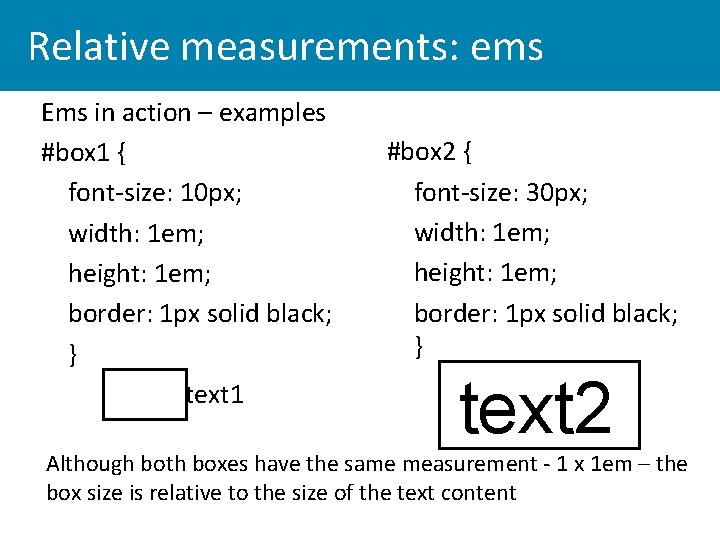
Relative measurements: ems Ems in action – examples #box 1 { font-size: 10 px; width: 1 em; height: 1 em; border: 1 px solid black; } text 1 #box 2 { font-size: 30 px; width: 1 em; height: 1 em; border: 1 px solid black; } text 2 Although both boxes have the same measurement - 1 x 1 em – the box size is relative to the size of the text content
Relative measurements: ems • Default font size defined by the browser settings is 16 px – quite big • Define the default page font size in the rule for the <body> element body { font-size: 100%; (i. e. 16 px) } 100% of browser default makes 1 em = 16 pixels • Define font size of all other elements in ems - e. g. h 1 – 2. 5 em; h 2 -2 em; p – 0. 875 em • This means that all the elements will have a font size relative to the body font size and will scale in proportion
Relative measurements: ems • Ems in action – see what happens when the user resizes the text in the browser • http: //www. rnib. org. uk/Pages/Home. aspx • How important is it to support text re-sizing? – modern browsers have a zoom function to re-size the entire page
This week’s reading • Jon Duckett, HTML & CSS: Design and build websites. Chapter 12 (Text); Chapter 13 (Boxes); Chapter 15 (Layout). • W 3 C CSS 2. 1 Specification – Chapter 8, The box model http: //www. w 3. org/TR/CSS 2/box. html • Richard Rutter, 2007. How to size text in CSS. A List Apart. http: //www. alistapart. com/articles/howtosizetextincss/
- Slides: 30