CSIS 3600 Systems Analysis and Design InputOutput Forms


- Slides: 43

CSIS 3600 Systems Analysis and Design Input/Output Forms and User Interface Design and Usability

Input/Output Design • Forms and report design as well as the user interface are key ingredients to a successful system • Users often equate the quality of a system to the quality of its inputs and outputs. • Besides end users, system models (Sequence Diagrams, Class Diagrams, etc. ) provide resources for identifying specific form and report needs. • It is also common during the design of forms and reports to discover flaws or missing details in a system model. As these discoveries are made system models are updated. • Systems development is an iterative process!

I/O and Prototyping • Input/Output and the user interface are often developed through the use of prototyping. • Prototyping is an iterative process involving analysts and end users. • A rudimentary system is built and rebuilt according to user feedback. • Preliminary screens, forms and reports are designed and revised during prototyping. • Eventually they become the screens, forms and reports, used in the final system.

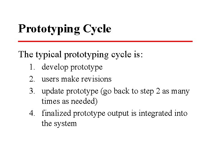
Prototyping Cycle The typical prototyping cycle is: 1. develop prototype 2. users make revisions 3. update prototype (go back to step 2 as many times as needed) 4. finalized prototype output is integrated into the system

INPUT • Input refers to the collection of data to be input into the system. • This can be done through data entry or automatic data collection (bar code readers, etc. ). • Also remember that many systems receive input via integration with other systems and using interfaces (i. e. lab systems, data already stored in another database, web services, etc. )

METHODS OF INPUT • There are two primary methods of input: – Real-time - capture of data at the point of origin as soon as possible after the data originates – Batch - Data is collected and then periodically forwarded to be inputted into the system

Methods of Input • • Display Screen Audio Input Optical readers (bar codes, scantrons, etc. ) OCR Smart Card Touch Input from other systems Others…

OUTPUT • Output is often thought of as reports but it also includes screen displays and output to other systems. • The purpose of the output should be the deciding factor in the output technology chosen for use.

Factors to Consider in Choosing an Output Technology 1. 2. 3. 4. 5. 6. 7. 8. Who will use (see) the output {requisite quality}? How many people need the output? Where is the output needed (distribution/logistics)? What is the purpose of the output? What is the speed with which output is needed? How frequently will the output be accessed? How long will (or must) the output be stored? Under what special regulations is the output produced, stored and distributed? 9. What are the initial and ongoing costs of maintenance and supplies? 10. What are the environmental requirements (noise absorption, controlled temperature, space for equipment and cabling) for output technologies?

Output • • Printer Specialty printer (label makers, high speed, etc. ) Screen Display Audio Output Microfilm, Microform Electronic Output (email, faxes, Web page) Output to other systems Others…

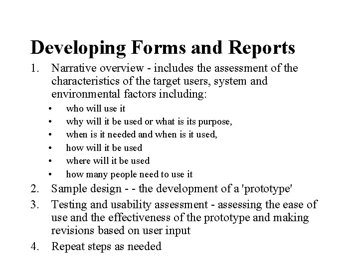
Developing Forms and Reports 1. Narrative overview - includes the assessment of the characteristics of the target users, system and environmental factors including: • • • who will use it why will it be used or what is its purpose, when is it needed and when is it used, how will it be used where will it be used how many people need to use it 2. Sample design - - the development of a 'prototype' 3. Testing and usability assessment - assessing the ease of use and the effectiveness of the prototype and making revisions based on user input 4. Repeat steps as needed

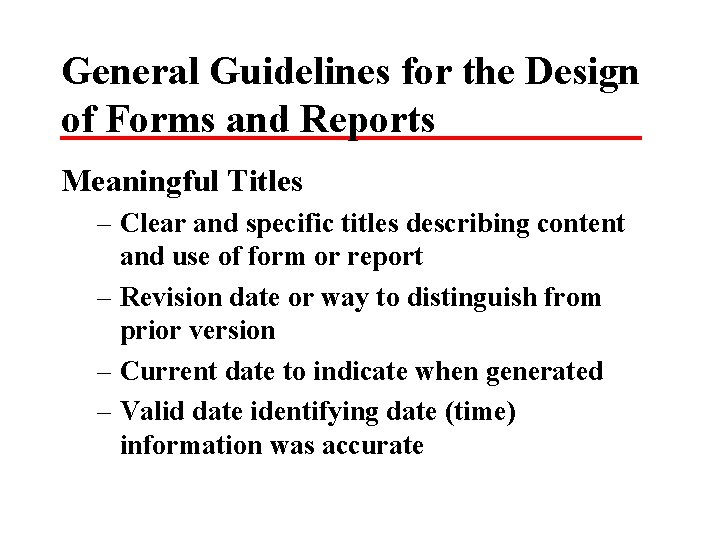
General Guidelines for the Design of Forms and Reports Meaningful Titles – Clear and specific titles describing content and use of form or report – Revision date or way to distinguish from prior version – Current date to indicate when generated – Valid date identifying date (time) information was accurate

Guidelines continued Meaningful Information – Only needed information should be displayed – Information should be provided in a manner that is usable without modification

Guidelines continued Balanced Layout – Information should be balanced on the screen or page – Adequate spacing and margins should be used – All data and entry fields should be clearly labeled

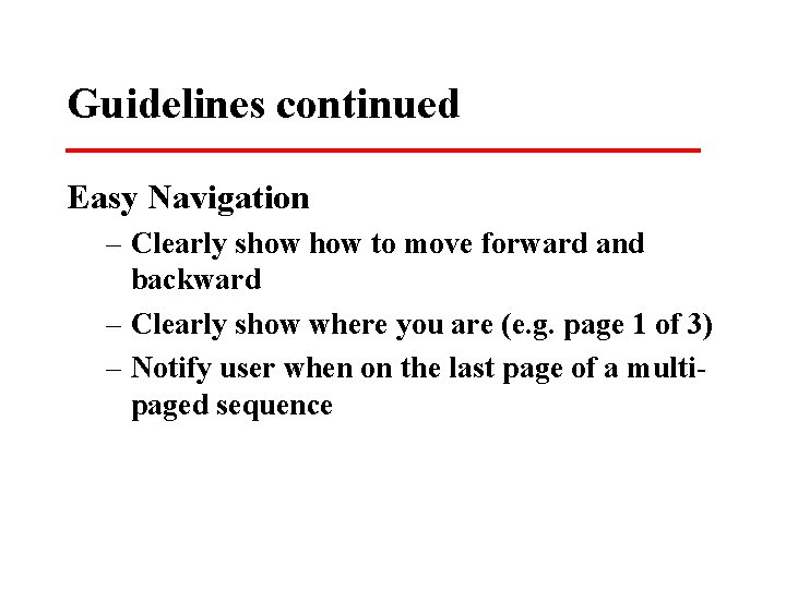
Guidelines continued Easy Navigation – Clearly show to move forward and backward – Clearly show where you are (e. g. page 1 of 3) – Notify user when on the last page of a multipaged sequence

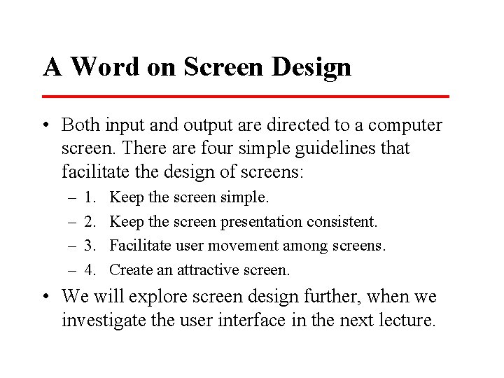
A Word on Screen Design • Both input and output are directed to a computer screen. There are four simple guidelines that facilitate the design of screens: – – 1. 2. 3. 4. Keep the screen simple. Keep the screen presentation consistent. Facilitate user movement among screens. Create an attractive screen. • We will explore screen design further, when we investigate the user interface in the next lecture.

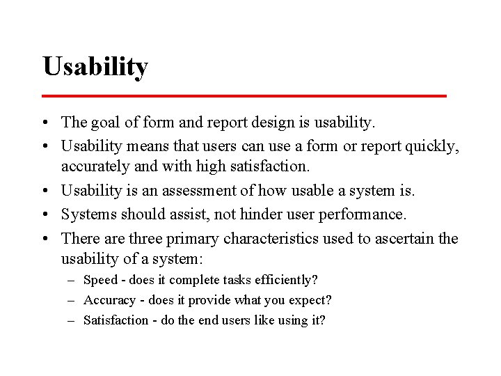
Usability • The goal of form and report design is usability. • Usability means that users can use a form or report quickly, accurately and with high satisfaction. • Usability is an assessment of how usable a system is. • Systems should assist, not hinder user performance. • There are three primary characteristics used to ascertain the usability of a system: – Speed - does it complete tasks efficiently? – Accuracy - does it provide what you expect? – Satisfaction - do the end users like using it?

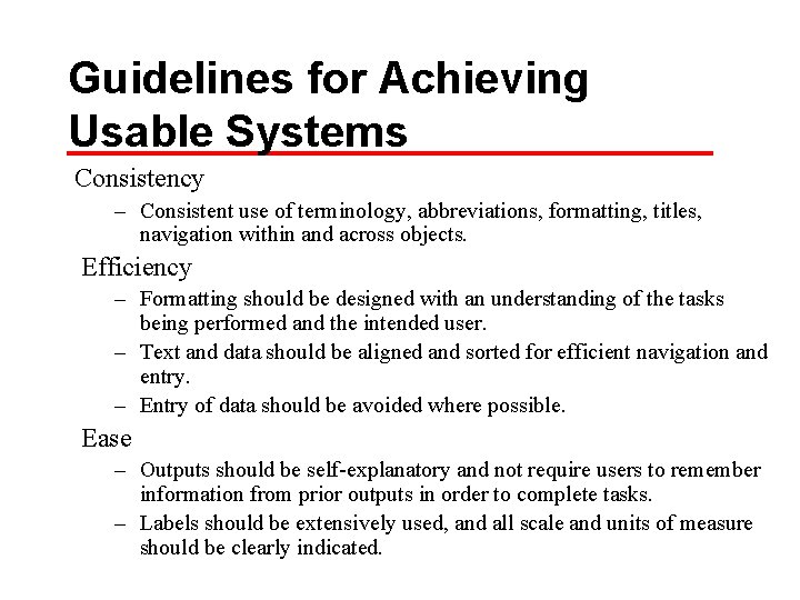
Guidelines for Achieving Usable Systems Consistency – Consistent use of terminology, abbreviations, formatting, titles, navigation within and across objects. Efficiency – Formatting should be designed with an understanding of the tasks being performed and the intended user. – Text and data should be aligned and sorted for efficient navigation and entry. – Entry of data should be avoided where possible. Ease – Outputs should be self-explanatory and not require users to remember information from prior outputs in order to complete tasks. – Labels should be extensively used, and all scale and units of measure should be clearly indicated.

More on Usable Systems Format – Information format should be consistent between entry and display. – Format should distinguish each piece of data and highlight, not bury, important data. – Special symbols, such as decimal places dollar signs, and +/- signs should be used as appropriate. Flexibility – Information should be viewed and retrieved in a manner most convenient to the user. • For example, users should be given options for the sequence in which to enter or view data and for use of shortcut keystrokes, and the system should remember where the user stopped during the last use of the system.

HCI Resources For more information on Human Computer Interaction: • http: //degraaff. org/hci/ - collection of links to HCI resources • http: //www. ergonomics. org. uk/- the Ergonomics Society • http: //www. upassoc. org/- Usability Professionals Association • http: //www. cs. cmu. edu/afs/cs. cmu. edu/user/hcii/www/i ndex. html- Carnegie Mellon Human Computer Institute • http: //www. cs. umd. edu/hcil/ University of Maryland Human Computer Interaction Lab

User Interface • A user interface supports usability. • It can be considered a "meeting of the minds. " • The user interface must be easy to understand to use. • Today there are 3 primary user interfaces: • Character (text based – example is the command line interface) • The other 2 are GUI based: – Windows – Browser

User Scenario and Dialogues • Two good ways exist to approach UI development. – User scenario are drawn from Use Cases – Another way to approach interactive user interface design is to simulate a conversation between the system and the end user. • This can also be supported with the use of story boards.

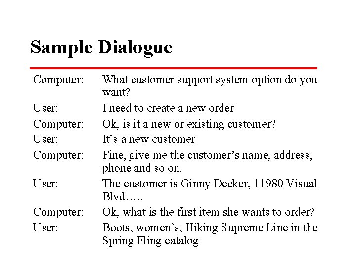
Sample Dialogue Computer: User: What customer support system option do you want? I need to create a new order Ok, is it a new or existing customer? It’s a new customer Fine, give me the customer’s name, address, phone and so on. The customer is Ginny Decker, 11980 Visual Blvd…. . Ok, what is the first item she wants to order? Boots, women’s, Hiking Supreme Line in the Spring Fling catalog

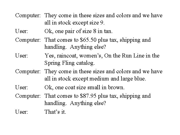
Computer: They come in these sizes and colors and we have all in stock except size 9. User: Ok, one pair of size 8 in tan. Computer: That comes to $65. 50 plus tax, shipping and handling. Anything else? User: Yes, raincoat, women’s, On the Run Line in the Spring Fling catalog. Computer: They come in these sizes and colors and we have all in stock except medium and large blue. User: Ok, one coat size small in brown. Computer: That comes to $87. 95 plus tax, shipping and handling. Anything else? User: That’s it.

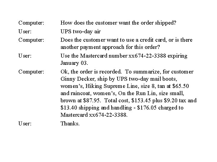
Computer: User: Computer: User: How does the customer want the order shipped? UPS two-day air Does the customer want to use a credit card, or is there another payment approach for this order? Use the Mastercard number xx 674 -22 -3388 expiring January 03. Ok, the order is recorded. To summarize, for customer Ginny Decker, ship by UPS two-day mail boots, women’s, Hiking Supreme Line, size 8, tan at $65. 50 and raincoat, women’s, On the Run Lin, size small, brown at $87. 95. Total cost, $153. 45 plus $9. 20 tax and $13. 40 shipping and handling - $176. 05 charged to Mastercard xx 674 -22 -3388. Thanks.

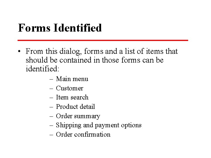
Forms Identified • From this dialog, forms and a list of items that should be contained in those forms can be identified: – – – – Main menu Customer Item search Product detail Order summary Shipping and payment options Order confirmation

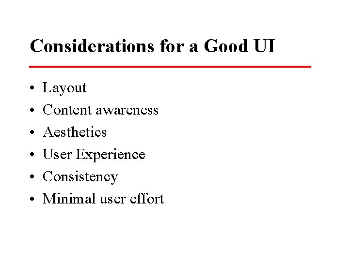
Considerations for a Good UI • • • Layout Content awareness Aesthetics User Experience Consistency Minimal user effort

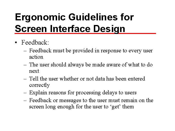
Ergonomic Guidelines for Screen Interface Design • Feedback: – Feedback must be provided in response to every user action – The user should always be made aware of what to do next – Tell the user whether or not data has been entered correctly – Explain reasons for processing delays to users – Feedback or messages to the user must remain on the screen long enough for the user to ‘get’ them

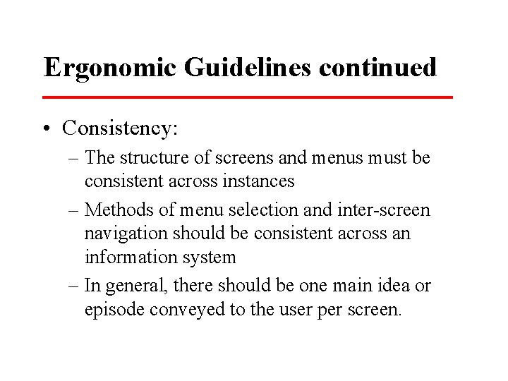
Ergonomic Guidelines continued • Consistency: – The structure of screens and menus must be consistent across instances – Methods of menu selection and inter-screen navigation should be consistent across an information system – In general, there should be one main idea or episode conveyed to the user per screen.

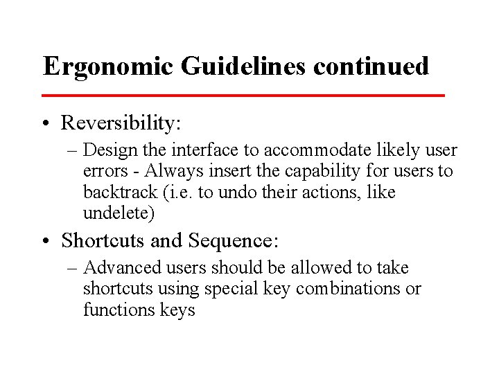
Ergonomic Guidelines continued • Reversibility: – Design the interface to accommodate likely user errors - Always insert the capability for users to backtrack (i. e. to undo their actions, like undelete) • Shortcuts and Sequence: – Advanced users should be allowed to take shortcuts using special key combinations or functions keys

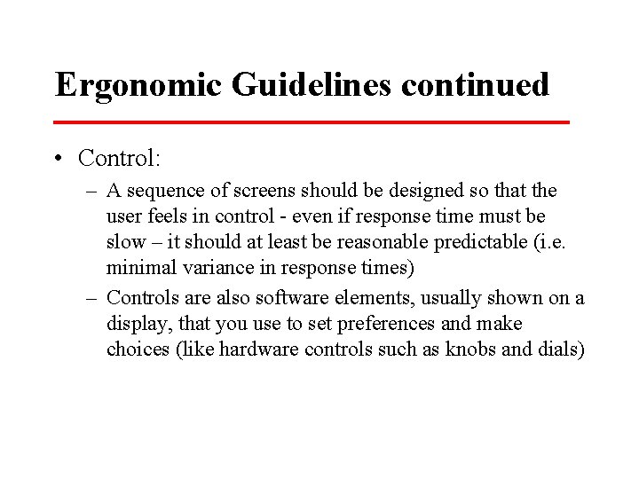
Ergonomic Guidelines continued • Control: – A sequence of screens should be designed so that the user feels in control - even if response time must be slow – it should at least be reasonable predictable (i. e. minimal variance in response times) – Controls are also software elements, usually shown on a display, that you use to set preferences and make choices (like hardware controls such as knobs and dials)

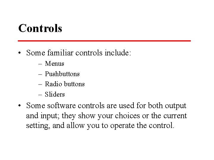
Controls • Some familiar controls include: – – Menus Pushbuttons Radio buttons Sliders • Some software controls are used for both output and input; they show your choices or the current setting, and allow you to operate the control.

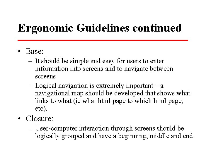
Ergonomic Guidelines continued • Ease: – It should be simple and easy for users to enter information into screens and to navigate between screens – Logical navigation is extremely important – a navigational map should be developed that shows what links to what (ie what html page to which html page, etc). • Closure: – User-computer interaction through screens should be logically grouped and have a beginning, middle and end

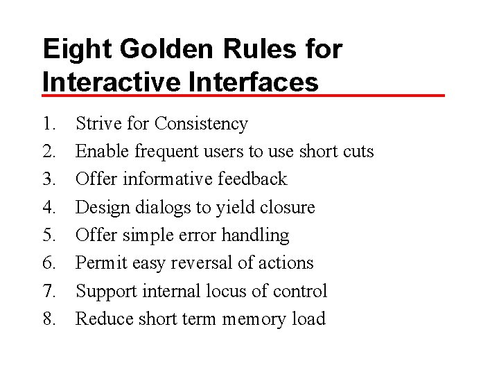
Eight Golden Rules for Interactive Interfaces 1. 2. 3. 4. 5. 6. 7. 8. Strive for Consistency Enable frequent users to use short cuts Offer informative feedback Design dialogs to yield closure Offer simple error handling Permit easy reversal of actions Support internal locus of control Reduce short term memory load

A Look at Interface Design Issues • http: //www. iarchitect. com/shame. htm

Web Design Considerations • http: //science. kennesaw. edu/~mcmurray/ht ml-horror. html • Current issues in Web Usability: • http: //www. useit. com/

Some Top Mistakes of Web Design 1. Gratuitous Use of Bleeding-Edge Technology 2. Scrolling Text, Marquees, and Constantly Running Animations 3. Complex URLs 4. Orphan Pages 5. Long Scrolling Pages 6. Lack of Navigation Support 7. Non-Standard Link Colors 8. Outdated Information 9. Overly Long Download Times (dated 1999 http: //www. useit. com/alertbox/990530. html)

Sample Resource Colors Test: • http: //www. akamaidesign. com/tests/colo rs. html

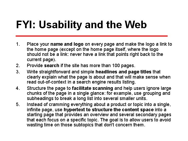
FYI: Usability and the Web 1. 2. 3. 4. 5. Place your name and logo on every page and make the logo a link to the home page (except on the home page itself, where the logo should not be a link: never have a link that points right back to the current page). Provide search if the site has more than 100 pages. Write straightforward and simple headlines and page titles that clearly explain what the page is about and that will make sense when read out-of-context in a search engine results listing. Structure the page to facilitate scanning and help users ignore large chunks of the page in a single glance: for example, use grouping and subheadings to break a long list into several smaller units. Instead of cramming everything about a product or topic into a single, infinite page, use hypertext to structure the content space into a starting page that provides an overview and several secondary pages that each focus on a specific topic. The goal is to allow users to avoid wasting time on those subtopics that don't concern them.

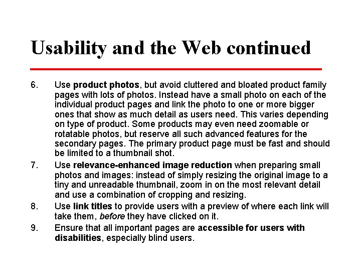
Usability and the Web continued 6. 7. 8. 9. Use product photos, but avoid cluttered and bloated product family pages with lots of photos. Instead have a small photo on each of the individual product pages and link the photo to one or more bigger ones that show as much detail as users need. This varies depending on type of product. Some products may even need zoomable or rotatable photos, but reserve all such advanced features for the secondary pages. The primary product page must be fast and should be limited to a thumbnail shot. Use relevance-enhanced image reduction when preparing small photos and images: instead of simply resizing the original image to a tiny and unreadable thumbnail, zoom in on the most relevant detail and use a combination of cropping and resizing. Use link titles to provide users with a preview of where each link will take them, before they have clicked on it. Ensure that all important pages are accessible for users with disabilities, especially blind users.

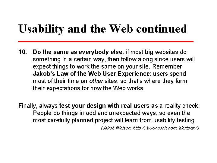
Usability and the Web continued 10. Do the same as everybody else: if most big websites do something in a certain way, then follow along since users will expect things to work the same on your site. Remember Jakob's Law of the Web User Experience: users spend most of their time on other sites, so that's where they form their expectations for how the Web works. Finally, always test your design with real users as a reality check. People do things in odd and unexpected ways, so even the most carefully planned project will learn from usability testing. (Jakob Nielsen, http: //www. useit. com/alertbox/)

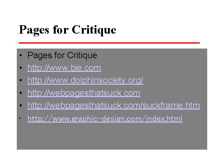
Pages for Critique • • • Pages for Critique http: //www. bie. com http: //www. dolphinsociety. org/ http: //webpagesthatsuck. com/suckframe. htm http: //www. graphic-design. com/index. html

QUIZ • http: //trfn. clpgh. org/About/badquiz. h tml