CSC 323 Quarter Spring 0203 Daniela Stan Raicu
- Slides: 17

CSC 323 Quarter: Spring 02/03 Daniela Stan Raicu School of CTI, De. Paul University 1/17/2022 Daniela Stan - CSC 323 1

Outline Chapter 2: Looking at Data – Relationships between two or more variables Ø Scatterplots Ø Correlation 1/17/2022 Daniela Stan - CSC 323 2

Association Between Variables Ø Two variables measured on the same individuals are associated if some values of one variable tend to occur more often with some values of the second variable than with other values of that variable. Ø A response variable measures an outcome of a study. An explanatory variable explains or causes changes in the response variable. Ø Explanatory variable ~ independent variable Ø Response variable ~ dependent variable 1/17/2022 Daniela Stan - CSC 323 3

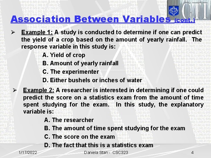
Association Between Variables (cont. ) Ø Example 1: A study is conducted to determine if one can predict the yield of a crop based on the amount of yearly rainfall. The response variable in this study is: A. Yield of crop B. Amount of yearly rainfall C. The experimenter D. Either bushels or inches of water Ø Example 2: A researcher is interested in determining if one could predict the score on a statistics exam from the amount of time spent studying for the exam. In this study, the explanatory variable is: A. The researcher B. The amount of time spent studying for the exam C. The score on the exam D. The fact that this is a statistics exam 1/17/2022 Daniela Stan - CSC 323 4

Scatterplots Ø A scatterplot displays the relationship between two quantitative variables. Ø The values of one variable appear on the horizontal axis and the values of the other variable appear on the vertical axis. Always plot the explanatory variable, if there is one, on the horizontal axis (the x axis) of a scatterplot. Ø Each individual in the data appears as the point in the plot fixed by the values of both variables for that individual. 1/17/2022 Daniela Stan - CSC 323 5

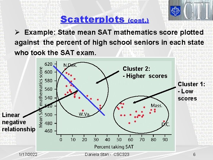
Scatterplots (cont. ) Ø Example: State mean SAT mathematics score plotted against the percent of high school seniors in each state who took the SAT exam. Cluster 2: - Higher scores Cluster 1: - Low scores Linear negative relationship 1/17/2022 Daniela Stan - CSC 323 6

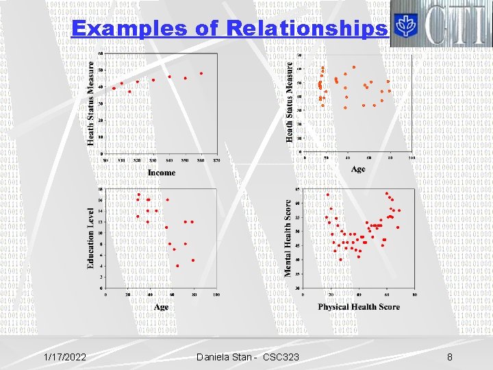
Interpreting Scatterplots Ø The overall pattern of a scatterplot can be described by the: - form - direction - strength of the relationship. Ø Form: - linear or non-linear (curved relationships or clusters) Ø Direction: - positive or negative association Ø Strength: how closely the points follow a clear form: - strong or weak 1/17/2022 Daniela Stan - CSC 323 7

Examples of Relationships 1/17/2022 Daniela Stan - CSC 323 8

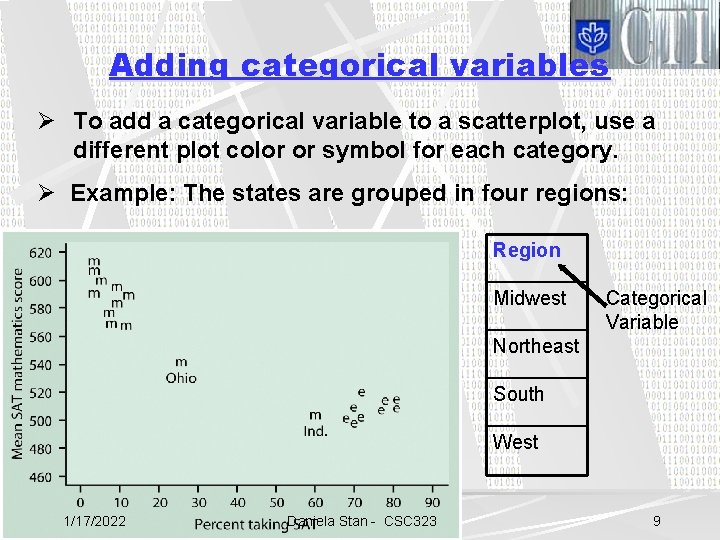
Adding categorical variables Ø To add a categorical variable to a scatterplot, use a different plot color or symbol for each category. Ø Example: The states are grouped in four regions: Region Midwest Categorical Variable Northeast South West 1/17/2022 Daniela Stan - CSC 323 9

Examples on Scatterplots Ø Problem 2. 10 1/17/2022 Daniela Stan - CSC 323 10

Measuring Strength & Direction of a Linear Relationship How closely does a non-horizontal straight line fit the points of a scatterplot? The correlation coefficient (often referred to as just correlation): r l measure of the strength of the relationship: the stronger the relationship, the larger the magnitude of r. l measure of the direction of the relationship: positive r indicates a positive relationship, negative r indicates a negative relationship. 1/17/2022 Daniela Stan - CSC 323 11

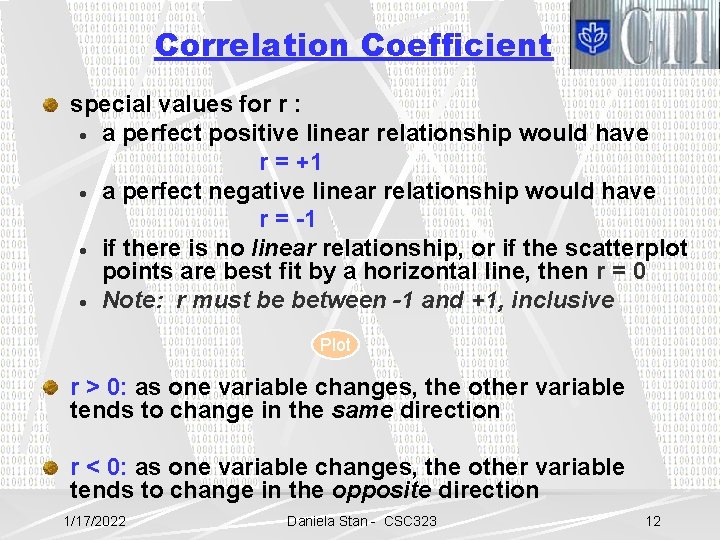
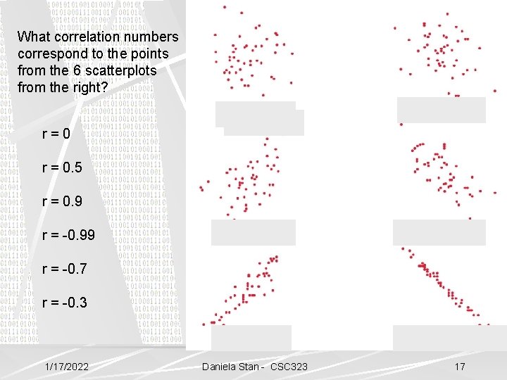
Correlation Coefficient special values for r : · a perfect positive linear relationship would have r = +1 · a perfect negative linear relationship would have r = -1 · if there is no linear relationship, or if the scatterplot points are best fit by a horizontal line, then r = 0 · Note: r must be between -1 and +1, inclusive Plot r > 0: as one variable changes, the other variable tends to change in the same direction r < 0: as one variable changes, the other variable tends to change in the opposite direction 1/17/2022 Daniela Stan - CSC 323 12

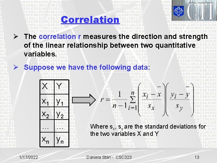
Correlation Ø The correlation r measures the direction and strength of the linear relationship between two quantitative variables. Ø Suppose we have the following data: X Y x 1 y 1 x 2 y 2 … … xn yn 1/17/2022 Where sx, sy are the standard deviations for the two variables X and Y Daniela Stan - CSC 323 13

More on Correlation Ø Correlation ignores distinction between explanatory and response variables Ø Correlation requires that both variables be quantitative Ø Correlation is not affected by changes in the unit of measurement of either variable Ø Correlation measures the strength of only linear relationships Ø Correlation is not resistant measure, so outliers can greatly change the value of r. 1/17/2022 Daniela Stan - CSC 323 14

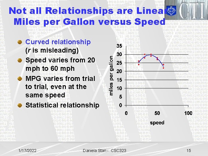
Not all Relationships are Linear Miles per Gallon versus Speed Curved relationship (r is misleading) Speed varies from 20 mph to 60 mph MPG varies from trial to trial, even at the same speed Statistical relationship 1/17/2022 Daniela Stan - CSC 323 15

Problems with Correlations Outliers can inflate or deflate correlations Groups combined inappropriately mask relationships (a third variable) l groups may have different relationships when separated Plot Reading Assignments Ø Chapter 1 Ø Chapter 2 (Sections 2. 1 and 2. 2) Ø More on correlation: Problem 2. 22/ page 132 1/17/2022 Daniela Stan - CSC 323 16

What correlation numbers correspond to the points from the 6 scatterplots from the right? r=0 r = 0. 5 r = 0. 9 r = -0. 99 r = -0. 7 r = -0. 3 1/17/2022 Daniela Stan - CSC 323 17