CS 110 Introduction to Computer Science Intellectual Property

- Slides: 17

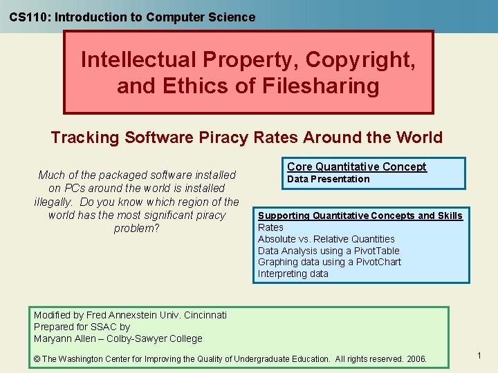
CS 110: Introduction to Computer Science Intellectual Property, Copyright, and Ethics of Filesharing Tracking Software Piracy Rates Around the World Much of the packaged software installed on PCs around the world is installed illegally. Do you know which region of the world has the most significant piracy problem? Core Quantitative Concept Data Presentation Supporting Quantitative Concepts and Skills Rates Absolute vs. Relative Quantities Data Analysis using a Pivot. Table Graphing data using a Pivot. Chart Interpreting data Modified by Fred Annexstein Univ. Cincinnati Prepared for SSAC by Maryann Allen – Colby-Sawyer College © The Washington Center for Improving the Quality of Undergraduate Education. All rights reserved. 2006. 1

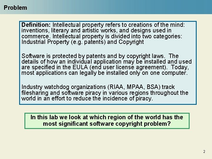
Problem Definition: Intellectual property refers to creations of the mind: inventions, literary and artistic works, and designs used in commerce. Intellectual property is divided into two categories: Industrial Property (e. g. patents) and Copyright Software is protected by patents and by copyright laws. The details of how an individual application may be installed and used are specified in the EULA (end user license agreement). Today, most applications can legally be installed only on one computer. Industry watchdog organizations (RIAA, MPAA, BSA) track filesharing and software piracy in various regions throughout the world in an effort to reduce the incidence of piracy. In this lab we look at which region of the world has the most significant software copyright problem? 2

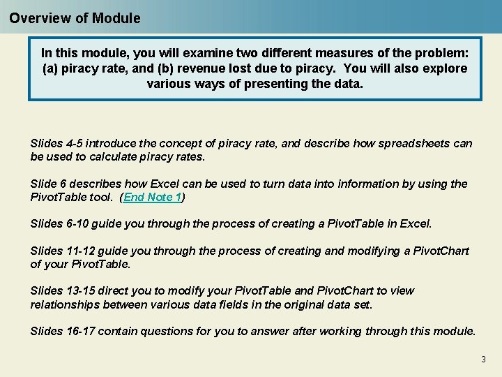
Overview of Module In this module, you will examine two different measures of the problem: (a) piracy rate, and (b) revenue lost due to piracy. You will also explore various ways of presenting the data. Slides 4 -5 introduce the concept of piracy rate, and describe how spreadsheets can be used to calculate piracy rates. Slide 6 describes how Excel can be used to turn data into information by using the Pivot. Table tool. (End Note 1) Slides 6 -10 guide you through the process of creating a Pivot. Table in Excel. Slides 11 -12 guide you through the process of creating and modifying a Pivot. Chart of your Pivot. Table. Slides 13 -15 direct you to modify your Pivot. Table and Pivot. Chart to view relationships between various data fields in the original data set. Slides 16 -17 contain questions for you to answer after working through this module. 3

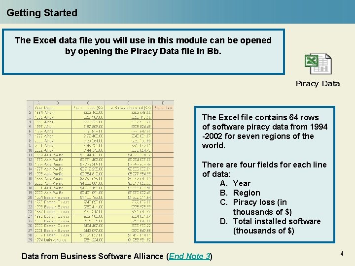
Getting Started The Excel data file you will use in this module can be opened by opening the Piracy Data file in Bb. The Excel file contains 64 rows of software piracy data from 1994 -2002 for seven regions of the world. There are four fields for each line of data: A. Year B. Region C. Piracy loss (in thousands of $) D. Total installed software (thousands of $) Data from Business Software Alliance (End Note 3) 4

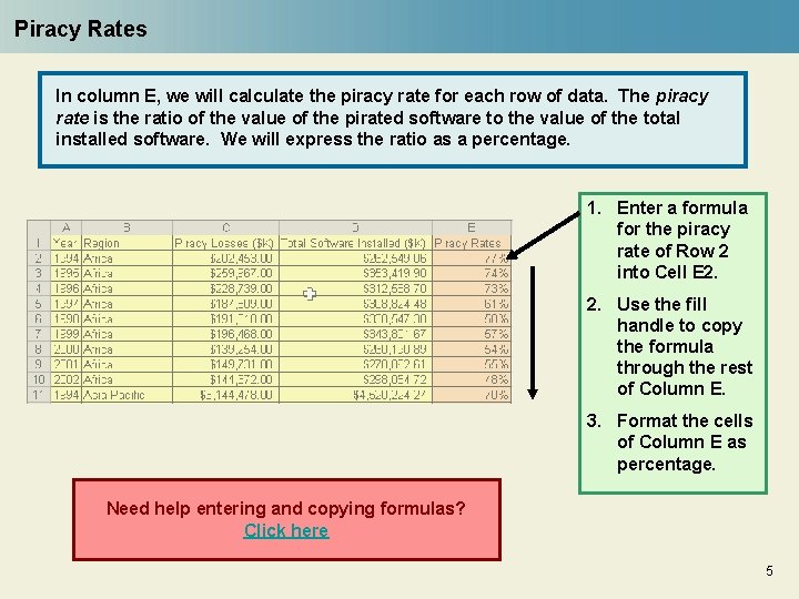
Piracy Rates In column E, we will calculate the piracy rate for each row of data. The piracy rate is the ratio of the value of the pirated software to the value of the total installed software. We will express the ratio as a percentage. 1. Enter a formula for the piracy rate of Row 2 into Cell E 2. 2. Use the fill handle to copy the formula through the rest of Column E. 3. Format the cells of Column E as percentage. Need help entering and copying formulas? Click here 5

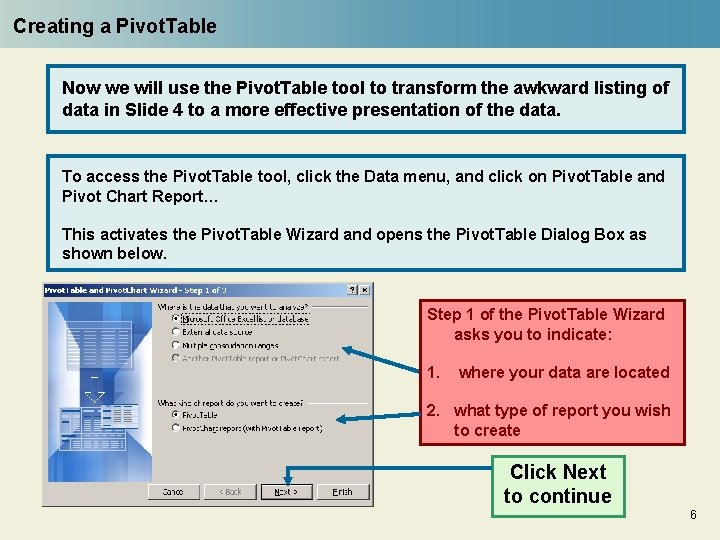
Creating a Pivot. Table Now we will use the Pivot. Table tool to transform the awkward listing of data in Slide 4 to a more effective presentation of the data. To access the Pivot. Table tool, click the Data menu, and click on Pivot. Table and Pivot Chart Report… This activates the Pivot. Table Wizard and opens the Pivot. Table Dialog Box as shown below. Step 1 of the Pivot. Table Wizard asks you to indicate: 1. where your data are located 2. what type of report you wish to create Click Next to continue 6

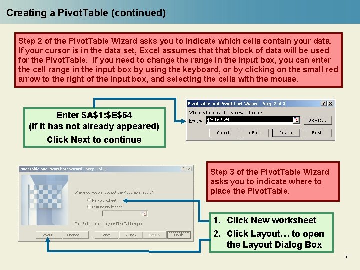
Creating a Pivot. Table (continued) Step 2 of the Pivot. Table Wizard asks you to indicate which cells contain your data. If your cursor is in the data set, Excel assumes that block of data will be used for the Pivot. Table. If you need to change the range in the input box, you can enter the cell range in the input box by using the keyboard, or by clicking on the small red arrow to the right of the input box, and selecting the cells with the mouse. Enter $A$1: $E$64 (if it has not already appeared) Click Next to continue Step 3 of the Pivot. Table Wizard asks you to indicate where to place the Pivot. Table. 1. Click New worksheet 2. Click Layout… to open the Layout Dialog Box 7

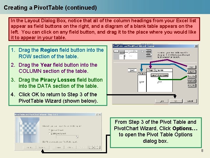
Creating a Pivot. Table (continued) In the Layout Dialog Box, notice that all of the column headings from your Excel list appear as field buttons on the right, and a diagram of a blank table appears on the left. You can click on any field button, and drag it to the place where you would like it to appear in your table. 1. Drag the Region field button into the ROW section of the table. 2. Drag the Year field button into the COLUMN section of the table. 3. Drag the Piracy Losses field button into the DATA section of the table. 4. Click OK to return to Step 3 of the Pivot. Table Wizard (shown below). From Step 3 of the Pivot Table and Pivot. Chart Wizard, Click Options… to open the Pivot Table Options dialog box. 8

Creating a Pivot. Table (continued) For the purposes of this exercise, you don’t need Grand Totals to appear in your Pivot Table. In Step 3 of the Pivot Table and Pivot. Chart Wizard, you can specify whether or not you want the Grand Totals to appear in your Pivot Table In the format options section of the Pivot Table Options dialog box, 1. Remove the check from the Grand totals for columns checkbox. 2. Remove the check from the Grand totals for rows checkbox. 3. Click OK to return to Step 3 of the Pivot. Table Wizard (shown below). Click Finish and your Pivot. Table will be created in a new worksheet. 9

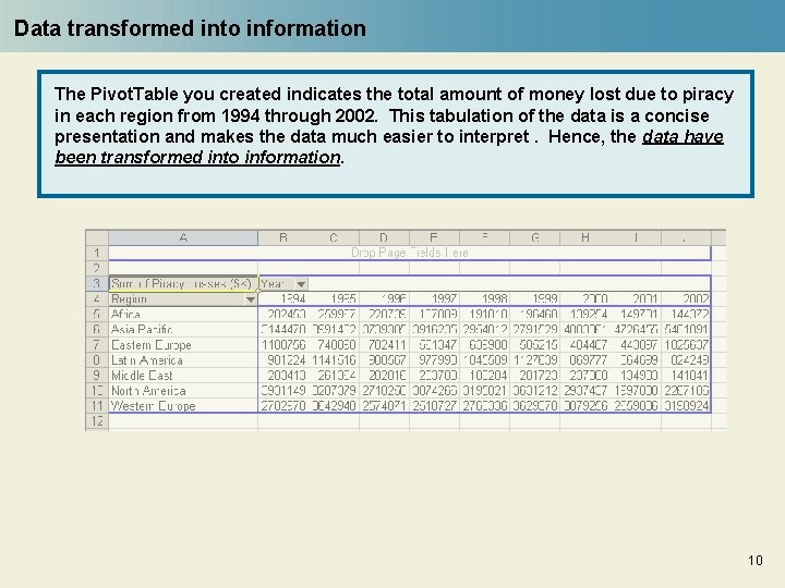
Data transformed into information The Pivot. Table you created indicates the total amount of money lost due to piracy in each region from 1994 through 2002. This tabulation of the data is a concise presentation and makes the data much easier to interpret. Hence, the data have been transformed into information. 10

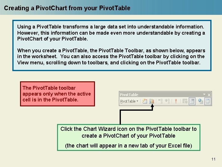
Creating a Pivot. Chart from your Pivot. Table Using a Pivot. Table transforms a large data set into understandable information. However, this information can be made even more understandable by creating a Pivot. Chart of your Pivot. Table. When you create a Pivot. Table, the Pivot. Table Toolbar, as shown below, appears in the worksheet. You can also access the Pivot. Table toolbar by clicking on the View menu, scrolling down to toolbars, and clicking on the Pivot. Table toolbar. The Pivot. Table toolbar appears only when the active cell is in the Pivot. Table. Click the Chart Wizard icon on the Pivot. Table toolbar to create a Pivot. Chart of your Pivot. Table (the chart will appear in a new tab of your Excel file) 11

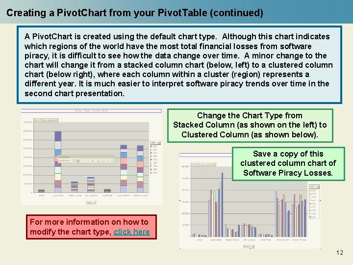
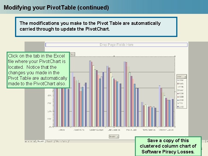
Creating a Pivot. Chart from your Pivot. Table (continued) A Pivot. Chart is created using the default chart type. Although this chart indicates which regions of the world have the most total financial losses from software piracy, it is difficult to see how the data change over time. A minor change to the chart will change it from a stacked column chart (below, left) to a clustered column chart (below right), where each column within a cluster (region) represents a different year. It is much easier to interpret software piracy trends over time in the second chart presentation. Change the Chart Type from Stacked Column (as shown on the left) to Clustered Column (as shown below). Save a copy of this clustered column chart of Software Piracy Losses. For more information on how to modify the chart type, click here 12

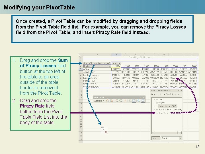
Modifying your Pivot. Table Once created, a Pivot Table can be modified by dragging and dropping fields from the Pivot Table field list. For example, you can remove the Piracy Losses field from the Pivot Table, and insert Piracy Rate field instead. 1. Drag and drop the Sum of Piracy Losses field button at the top left of the table to an area outside of the table border to remove it from the Pivot Table. 2. Drag and drop the Piracy Rate field button from the Pivot Table Field List into the body of the table. 13

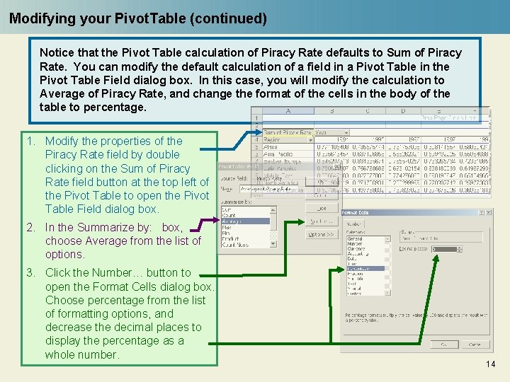
Modifying your Pivot. Table (continued) Notice that the Pivot Table calculation of Piracy Rate defaults to Sum of Piracy Rate. You can modify the default calculation of a field in a Pivot Table in the Pivot Table Field dialog box. In this case, you will modify the calculation to Average of Piracy Rate, and change the format of the cells in the body of the table to percentage. 1. Modify the properties of the Piracy Rate field by double clicking on the Sum of Piracy Rate field button at the top left of the Pivot Table to open the Pivot Table Field dialog box. 2. In the Summarize by: box, choose Average from the list of options. 3. Click the Number… button to open the Format Cells dialog box. Choose percentage from the list of formatting options, and decrease the decimal places to display the percentage as a whole number. 14

Modifying your Pivot. Table (continued) The modifications you make to the Pivot Table are automatically carried through to update the Pivot. Chart. Click on the tab in the Excel file where your Pivot. Chart is located. Notice that the changes you made in the Pivot Table are automatically made to the Pivot. Chart also. Save a copy of this clustered column chart of Software Piracy Losses. 15

End of Module Questions 1. Examine the two graphs you saved and compare the amount of software piracy in each region. Which region has the most piracy when measured by rates? Which region has the most piracy when measured in dollars lost? 2. Which graph is the better indicator of the amount of piracy occurring in various regions? Would your answer change if you were a software executive? Or a computer ethicist? 3. Write a short paragraph to explain how the two graphs of the same data can portray completely different results. 4. Use the Excel file below to create a Pivot Table to calculate the total losses due to software piracy in various regions of the world in 2003. Which region has the highest revenue lost due to software piracy in 2003? (Click on the icon in Normal Mode. ) 5. Above is a link to the latest data from the RIAA on CD and muusic download sales. Write a short paragraph describing an analysis of this data. What conclusions can you draw about the impact of downloading music electronically.

End Notes 1. 2. 3. Constructing a Pivot Table is a key feature of this module. The Pivot Table (a trademark name of Microsoft) is a powerful data-summarization tool. Watch in this module how a data set of region-by-region and year-by-year data is reorganized by the Pivot Table from a linear list of the form 1 a, 1 b, 1 c, … 2 a, 2 b, 2 c, … to a bilateral table of 1, 2, 3, … vs. a, b, c, …. Learn about Pivot. Tables at http: //en. wikipedia. org/wiki/Pivot_table. Return to Slide 3. “Normal View, ” “Slide Sorter View” and “Slide Show” refer to the icons on the Power Point at the lower left corner of the Normal and Slide Sorter Views. The icons do not display in the Slide Show. If you are viewing the module in Slide Show view, click on the icon for the Normal View in order to retrieve the data set. Return to Slide 4. This data was part of the 8 th Annual BSA Global Software Piracy Study, published by the Business Software Alliance. This report, as well as many others is available on their website. To download this specific report in. pdf format, please follow this link. Return to Slide 4.