Creating User Interfaces 1 Motivations A graphical user

![JList Constructors F JList() Creates an empty list. F JList(Object[] string. Items) Creates a JList Constructors F JList() Creates an empty list. F JList(Object[] string. Items) Creates a](https://slidetodoc.com/presentation_image_h2/39adf11f36ff21787ea758100841920e/image-41.jpg)
- Slides: 55

Creating User Interfaces 1

Motivations A graphical user interface (GUI) makes a system user-friendly and easy to use. Creating a GUI requires creativity and knowledge of how GUI components work. Since the GUI components in Java are very flexible and versatile, you can create a wide assortment of useful user interfaces. Previous chapters briefly introduced several GUI components. This chapter introduces the frequently used GUI components in detail. 2

Objectives F F F F To create graphical user interfaces with various user-interface components: JButton, JCheck. Box, JRadio. Button, JLabel, JText. Field, JText. Area, JCombo. Box, JList, JScroll. Bar, and JSlider. To create listeners for various types of events. To explore JButton To explore JCheck. Box To explore JRadio. Button To explore JLabel To explore JText. Field To explore JText. Area To explore JCombo. Box To explore JList To explore JScroll. Bar To explore JSlider To display multiple windows in an application. 3

Components Covered in the Chapter FIntroduces the frequently used GUI components FUses borders and icons 4

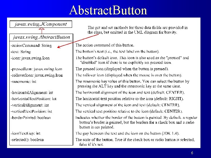
Buttons A button is a component that triggers an action event when clicked. Swing provides regular buttons, toggle buttons, check box buttons, and radio buttons. The common features of these buttons are generalized in javax. swing. Abstract. Button. 5

Abstract. Button 6

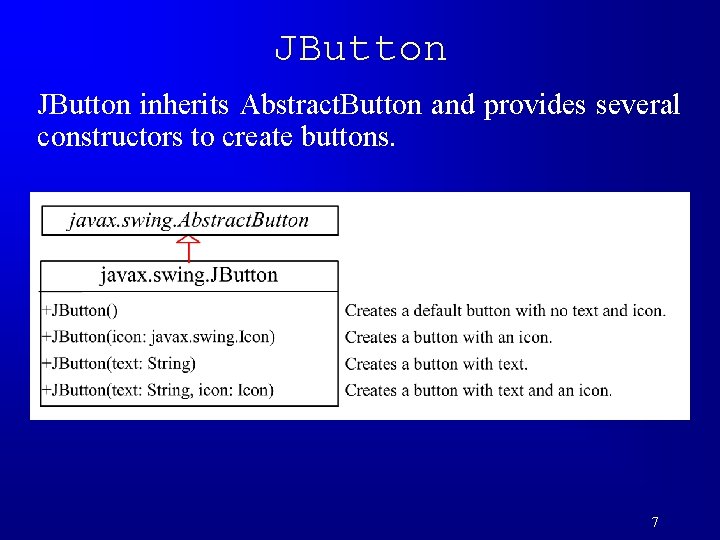
JButton inherits Abstract. Button and provides several constructors to create buttons. 7

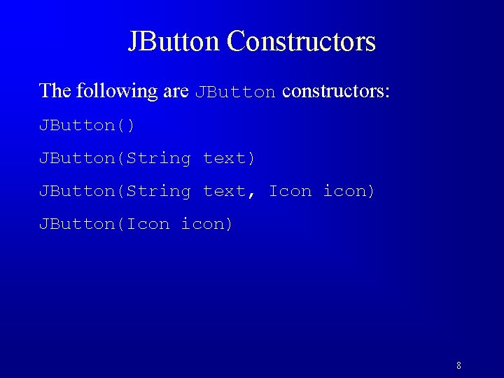
JButton Constructors The following are JButton constructors: JButton() JButton(String text, Icon icon) JButton(Icon icon) 8

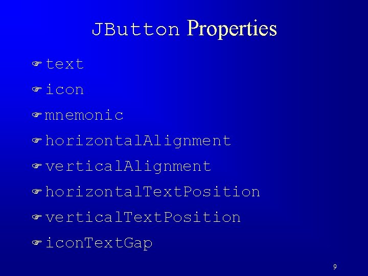
JButton Properties F text F icon F mnemonic F horizontal. Alignment F vertical. Alignment F horizontal. Text. Position F vertical. Text. Position F icon. Text. Gap 9

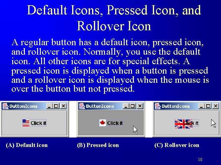
Default Icons, Pressed Icon, and Rollover Icon A regular button has a default icon, pressed icon, and rollover icon. Normally, you use the default icon. All other icons are for special effects. A pressed icon is displayed when a button is pressed and a rollover icon is displayed when the mouse is over the button but not pressed. (A) Default icon (B) Pressed icon (C) Rollover icon 10

Demo Test. Button. Icons Run 11

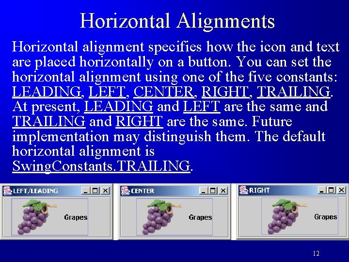
Horizontal Alignments Horizontal alignment specifies how the icon and text are placed horizontally on a button. You can set the horizontal alignment using one of the five constants: LEADING, LEFT, CENTER, RIGHT, TRAILING. At present, LEADING and LEFT are the same and TRAILING and RIGHT are the same. Future implementation may distinguish them. The default horizontal alignment is Swing. Constants. TRAILING. 12

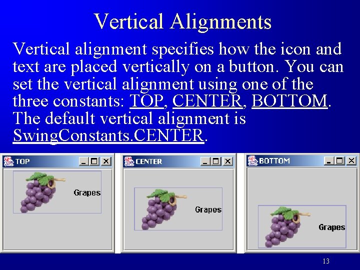
Vertical Alignments Vertical alignment specifies how the icon and text are placed vertically on a button. You can set the vertical alignment using one of the three constants: TOP, CENTER, BOTTOM. The default vertical alignment is Swing. Constants. CENTER. 13

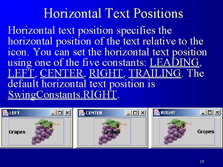
Horizontal Text Positions Horizontal text position specifies the horizontal position of the text relative to the icon. You can set the horizontal text position using one of the five constants: LEADING, LEFT, CENTER, RIGHT, TRAILING. The default horizontal text position is Swing. Constants. RIGHT. 14

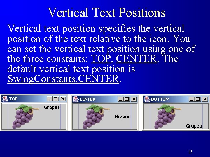
Vertical Text Positions Vertical text position specifies the vertical position of the text relative to the icon. You can set the vertical text position using one of the three constants: TOP, CENTER. The default vertical text position is Swing. Constants. CENTER. 15

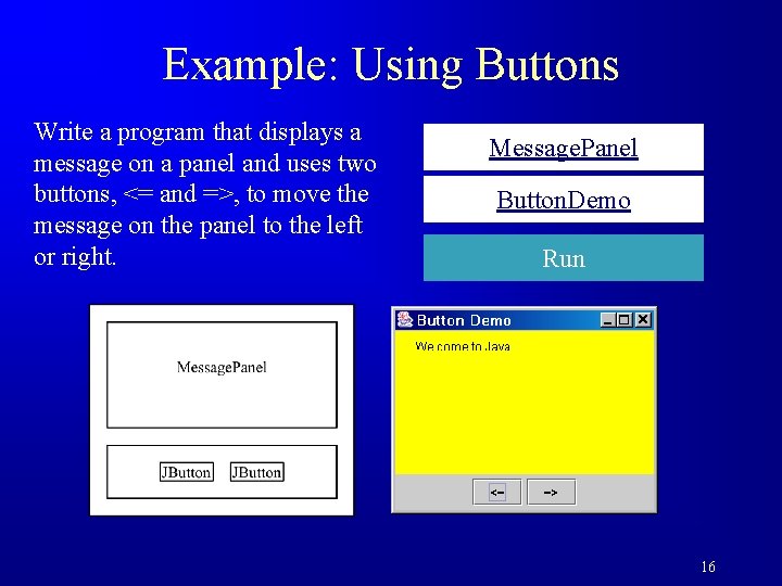
Example: Using Buttons Write a program that displays a message on a panel and uses two buttons, <= and =>, to move the message on the panel to the left or right. Message. Panel Button. Demo Run 16

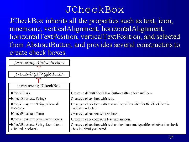
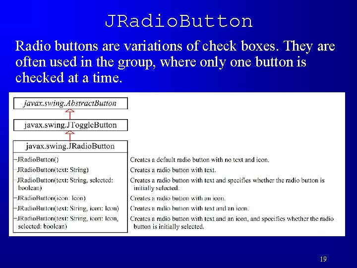
JCheck. Box inherits all the properties such as text, icon, mnemonic, vertical. Alignment, horizontal. Text. Position, vertical. Text. Position, and selected from Abstract. Button, and provides several constructors to create check boxes. 17

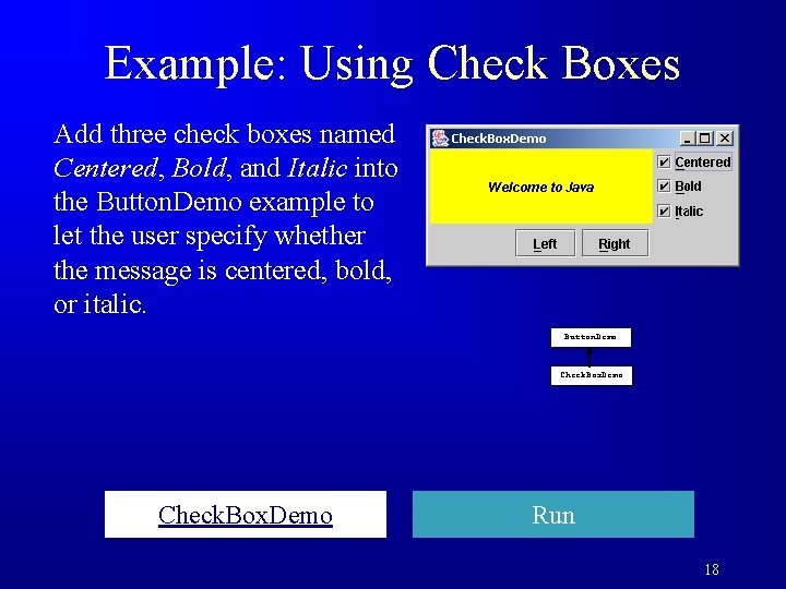
Example: Using Check Boxes Add three check boxes named Centered, Bold, and Italic into the Button. Demo example to let the user specify whether the message is centered, bold, or italic. Button. Demo Check. Box. Demo Run 18

JRadio. Button Radio buttons are variations of check boxes. They are often used in the group, where only one button is checked at a time. 19

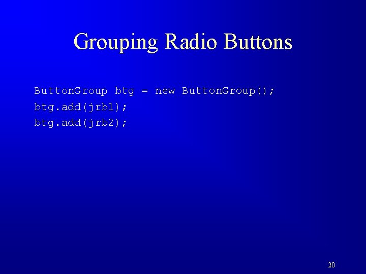
Grouping Radio Buttons Button. Group btg = new Button. Group(); btg. add(jrb 1); btg. add(jrb 2); 20

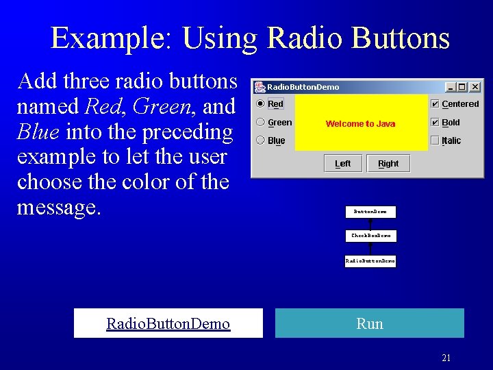
Example: Using Radio Buttons Add three radio buttons named Red, Green, and Blue into the preceding example to let the user choose the color of the message. Button. Demo Check. Box. Demo Radio. Button. Demo Run 21

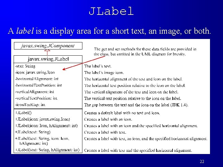
JLabel A label is a display area for a short text, an image, or both. 22

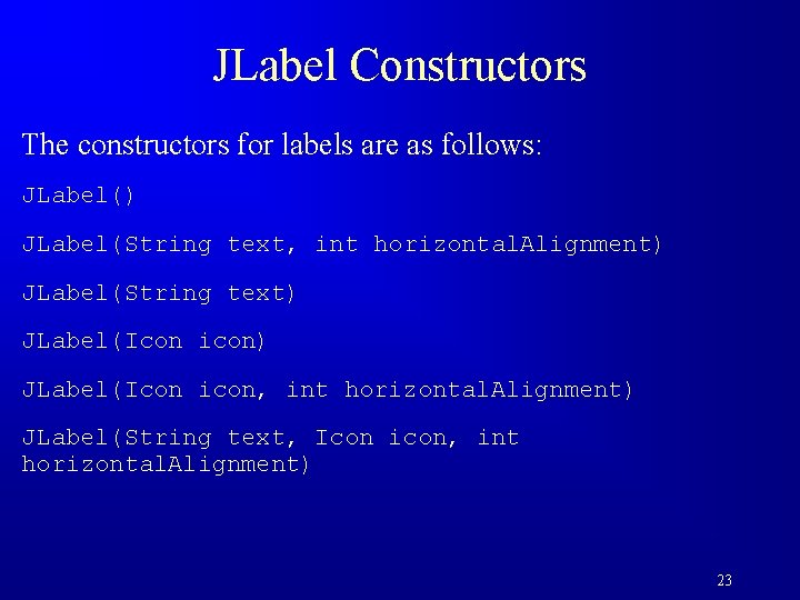
JLabel Constructors The constructors for labels are as follows: JLabel() JLabel(String text, int horizontal. Alignment) JLabel(String text) JLabel(Icon icon, int horizontal. Alignment) JLabel(String text, Icon icon, int horizontal. Alignment) 23

JLabel Properties JLabel inherits all the properties from JComponent and has many properties similar to the ones in JButton, such as text, icon, horizontal. Alignment, vertical. Alignment, horizontal. Text. Position, vertical. Text. Position, and icon. Text. Gap. 24

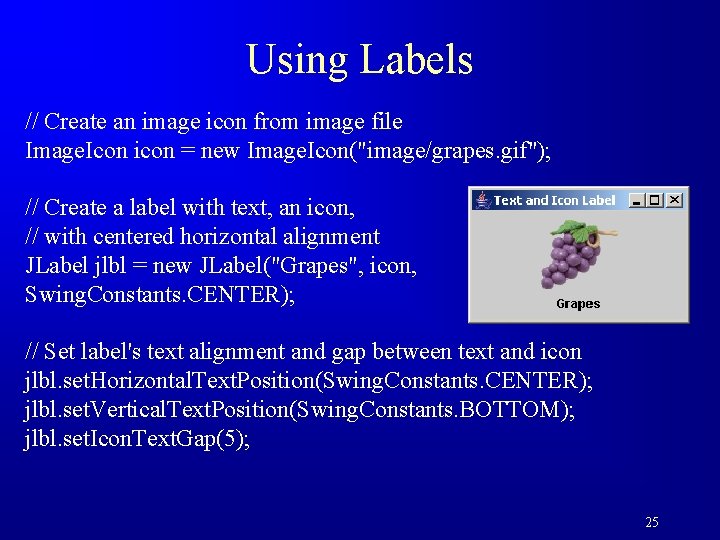
Using Labels // Create an image icon from image file Image. Icon icon = new Image. Icon("image/grapes. gif"); // Create a label with text, an icon, // with centered horizontal alignment JLabel jlbl = new JLabel("Grapes", icon, Swing. Constants. CENTER); // Set label's text alignment and gap between text and icon jlbl. set. Horizontal. Text. Position(Swing. Constants. CENTER); jlbl. set. Vertical. Text. Position(Swing. Constants. BOTTOM); jlbl. set. Icon. Text. Gap(5); 25

JText. Field A text field is an input area where the user can type in characters. Text fields are useful in that they enable the user to enter in variable data (such as a name or a description). 26

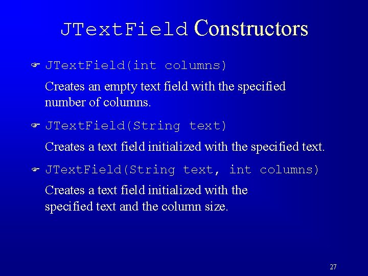
JText. Field Constructors F JText. Field(int columns) Creates an empty text field with the specified number of columns. F JText. Field(String text) Creates a text field initialized with the specified text. F JText. Field(String text, int columns) Creates a text field initialized with the specified text and the column size. 27

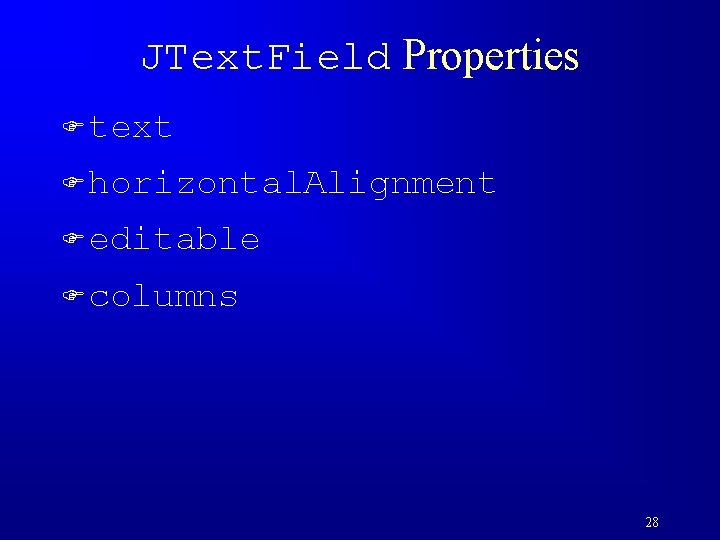
JText. Field Properties F text F horizontal. Alignment F editable F columns 28

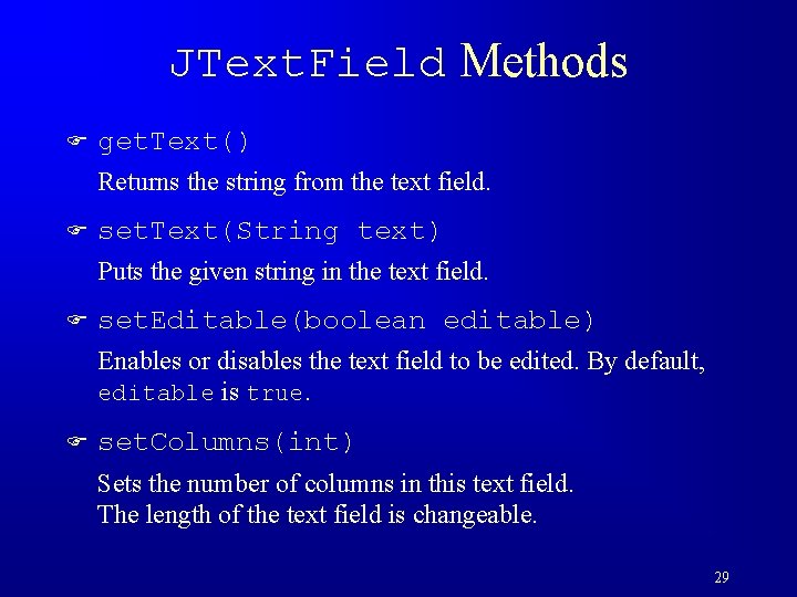
JText. Field Methods F get. Text() Returns the string from the text field. F set. Text(String text) Puts the given string in the text field. F set. Editable(boolean editable) Enables or disables the text field to be edited. By default, editable is true. F set. Columns(int) Sets the number of columns in this text field. The length of the text field is changeable. 29

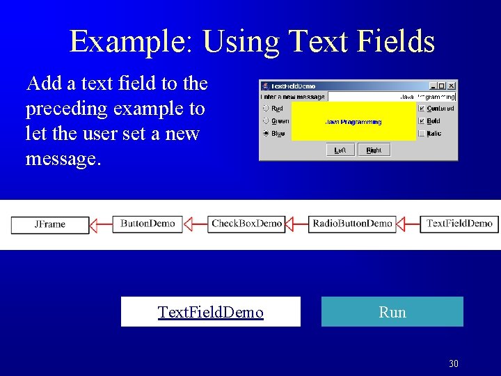
Example: Using Text Fields Add a text field to the preceding example to let the user set a new message. Text. Field. Demo Run 30

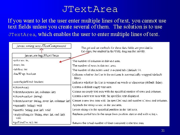
JText. Area If you want to let the user enter multiple lines of text, you cannot use text fields unless you create several of them. The solution is to use JText. Area, which enables the user to enter multiple lines of text. 31

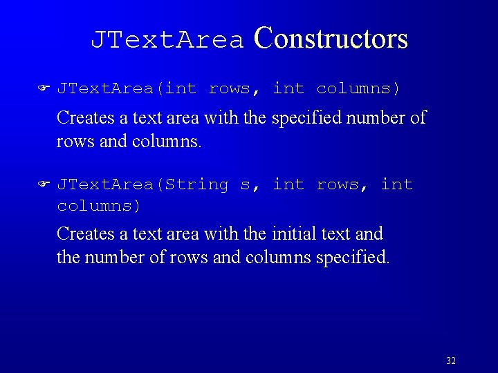
JText. Area Constructors F JText. Area(int rows, int columns) Creates a text area with the specified number of rows and columns. F JText. Area(String s, int rows, int columns) Creates a text area with the initial text and the number of rows and columns specified. 32

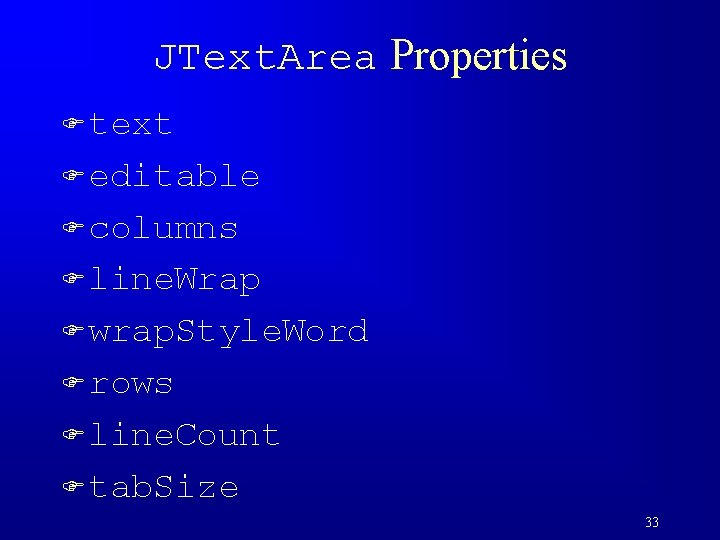
JText. Area Properties F text F editable F columns F line. Wrap F wrap. Style. Word F rows F line. Count F tab. Size 33

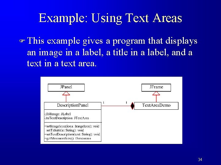
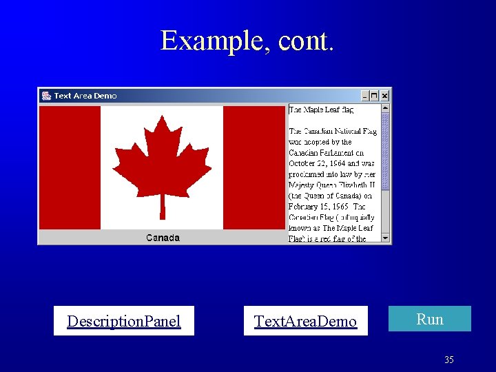
Example: Using Text Areas F This example gives a program that displays an image in a label, a title in a label, and a text in a text area. 34

Example, cont. Description. Panel Text. Area. Demo Run 35

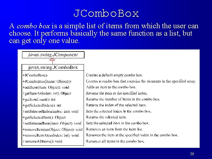
JCombo. Box A combo box is a simple list of items from which the user can choose. It performs basically the same function as a list, but can get only one value. 36

JCombo. Box Methods To add an item to a JCombo. Box jcbo, use jcbo. add. Item(Object item) To get an item from JCombo. Box jcbo, use jcbo. get. Item() 37

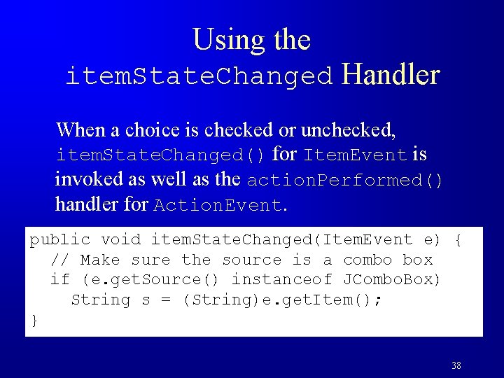
Using the item. State. Changed Handler When a choice is checked or unchecked, item. State. Changed() for Item. Event is invoked as well as the action. Performed() handler for Action. Event. public void item. State. Changed(Item. Event e) { // Make sure the source is a combo box if (e. get. Source() instanceof JCombo. Box) String s = (String)e. get. Item(); } 38

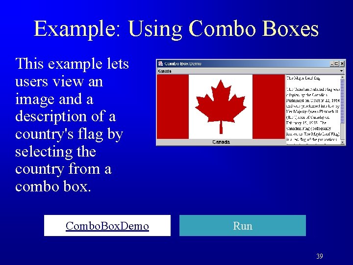
Example: Using Combo Boxes This example lets users view an image and a description of a country's flag by selecting the country from a combo box. Combo. Box. Demo Run 39

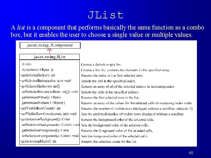
JList A list is a component that performs basically the same function as a combo box, but it enables the user to choose a single value or multiple values. 40
![JList Constructors F JList Creates an empty list F JListObject string Items Creates a JList Constructors F JList() Creates an empty list. F JList(Object[] string. Items) Creates a](https://slidetodoc.com/presentation_image_h2/39adf11f36ff21787ea758100841920e/image-41.jpg)
JList Constructors F JList() Creates an empty list. F JList(Object[] string. Items) Creates a new list initialized with items. 41

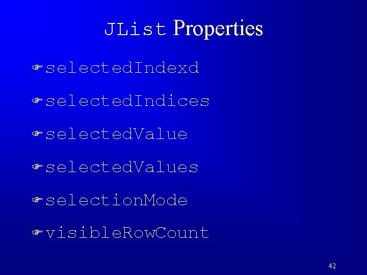
JList Properties F selected. Indexd F selected. Indices F selected. Values F selection. Mode F visible. Row. Count 42

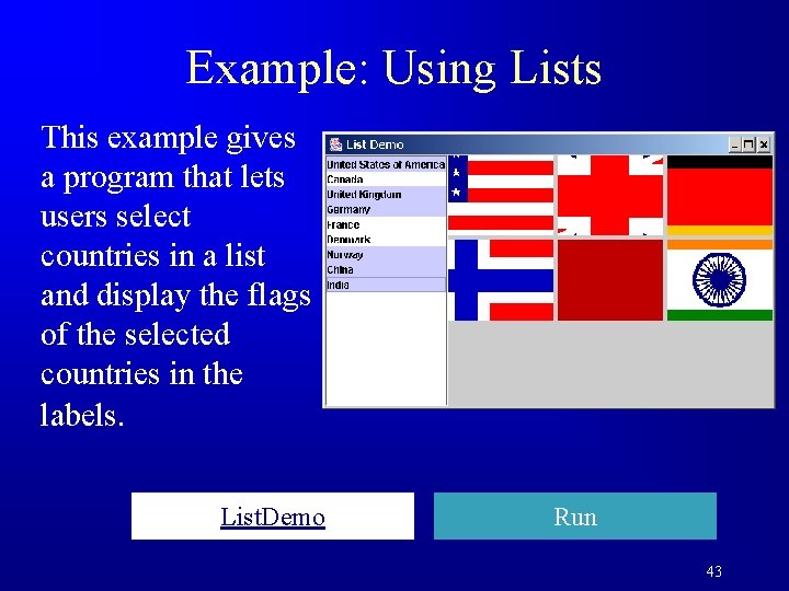
Example: Using Lists This example gives a program that lets users select countries in a list and display the flags of the selected countries in the labels. List. Demo Run 43

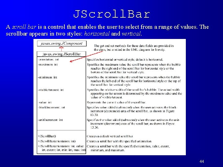
JScroll. Bar A scroll bar is a control that enables the user to select from a range of values. The scrollbar appears in two styles: horizontal and vertical. 44

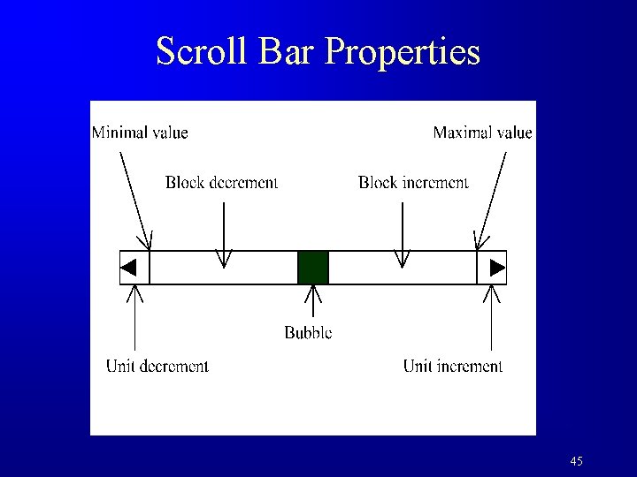
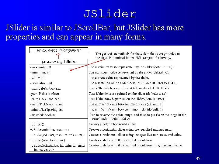
Scroll Bar Properties 45

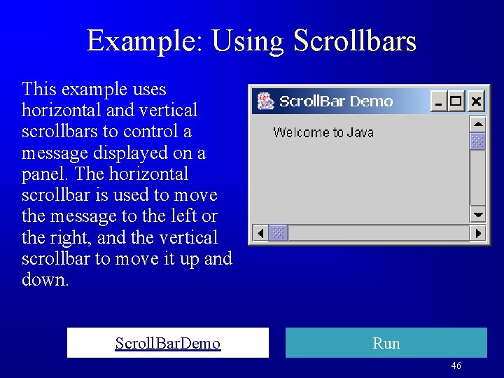
Example: Using Scrollbars This example uses horizontal and vertical scrollbars to control a message displayed on a panel. The horizontal scrollbar is used to move the message to the left or the right, and the vertical scrollbar to move it up and down. Scroll. Bar. Demo Run 46

JSlider is similar to JScroll. Bar, but JSlider has more properties and can appear in many forms. 47

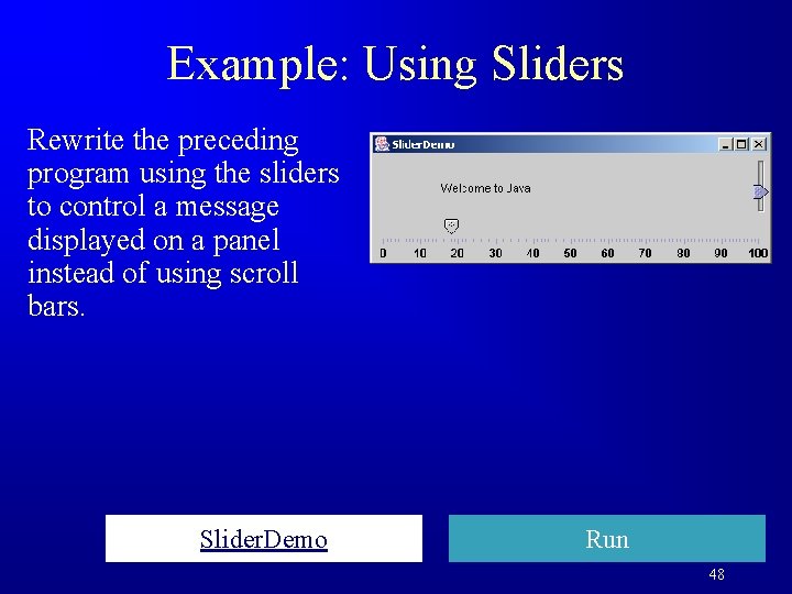
Example: Using Sliders Rewrite the preceding program using the sliders to control a message displayed on a panel instead of using scroll bars. Slider. Demo Run 48

Creating Multiple Windows The following slides show step-by-step how to create an additional window from an application or applet. 49

Creating Additional Windows, Step 1: Create a subclass of JFrame (called a Sub. Frame) that tells the new window what to do. For example, all the GUI application programs extend JFrame and are subclasses of JFrame. 50

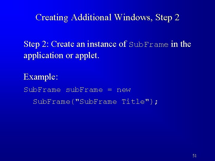
Creating Additional Windows, Step 2: Create an instance of Sub. Frame in the application or applet. Example: Sub. Frame sub. Frame = new Sub. Frame("Sub. Frame Title"); 51

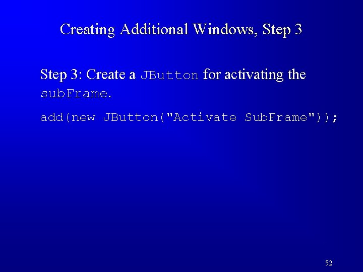
Creating Additional Windows, Step 3: Create a JButton for activating the sub. Frame. add(new JButton("Activate Sub. Frame")); 52

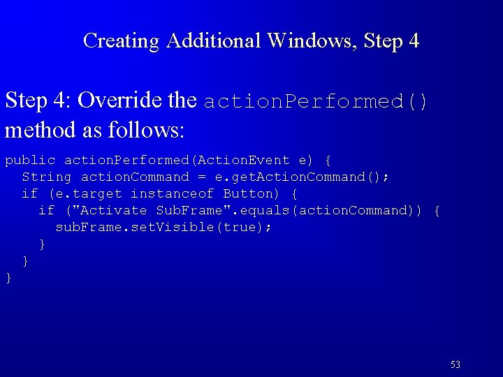
Creating Additional Windows, Step 4: Override the action. Performed() method as follows: public action. Performed(Action. Event e) { String action. Command = e. get. Action. Command(); if (e. target instanceof Button) { if ("Activate Sub. Frame". equals(action. Command)) { sub. Frame. set. Visible(true); } } } 53

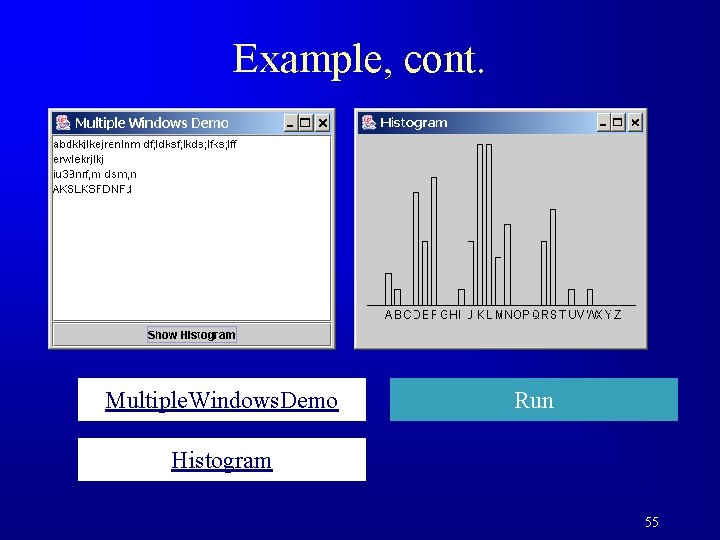
Example: Creating Multiple Windows F This example creates a main window with a text area in the scroll pane, and a button named "Show Histogram. " When the user clicks the button, a new window appears that displays a histogram to show the occurrence of the letters in the text area. 54

Example, cont. Multiple. Windows. Demo Run Histogram 55