Creating Effective Visual Aids This presentation contains excerpts



- Slides: 40

Creating Effective Visual Aids This presentation contains excerpts from the following set of slides: Giving an effective presentation: Using Powerpoint and structuring a scientific talk Susan Mc. Connell Department of Biological Sciences Stanford University

What do you think of the following slide?

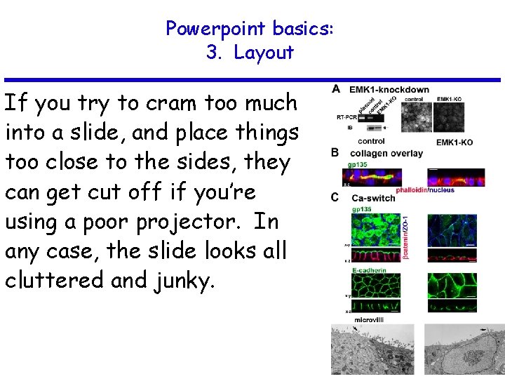
Emk 1 knockdown inhibits lumen formation in MDCK cells: -RT-PCR: EMK 1 is effectively knocked down in MDCK cells 24 hours after transfection with PSUPER (control) or P-SUPER-si. EMK 1 plasmid; knockdown confirmed on the right with antibodies to EMK 1. - Collagen overlay assay: cells cultured 24 h on collagen I before being overlaid with additional collagen on the apical surface, analyzed 24 h later. Note the lack of lumen in EMK 1 -KO cultures. - Ca switch: control or EMK 1 -KO cells were plated in low Ca medium 24 h upon transfection with p. SUPER or p. SUPER-KO. After 12 h, cultures were switched to normal medium for 24 h. Transmission EM of cells sectioned perpendicular to the substratum shows lack of microvilli in EMK 1 -KO cells.

Is this better?

Emk 1 knockdown inhibits lumen formation in MDCK cells

Not much.

Powerpoint basics:

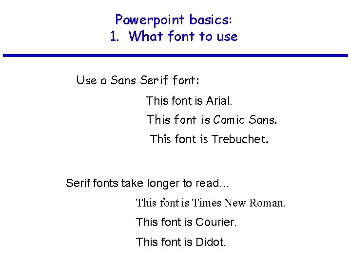
Powerpoint basics: 1. What font to use

Powerpoint basics: 1. What font to use Use a Sans Serif font:

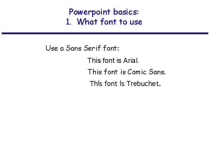
Powerpoint basics: 1. What font to use Use a Sans Serif font: This font is Arial. This font is Comic Sans. This font is Trebuchet.

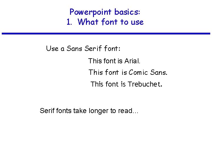
Powerpoint basics: 1. What font to use Use a Sans Serif font: This font is Arial. This font is Comic Sans. This font is Trebuchet. Serif fonts take longer to read…

Powerpoint basics: 1. What font to use Use a Sans Serif font: This font is Arial. This font is Comic Sans. This font is Trebuchet. Serif fonts take longer to read… This font is Times New Roman. This font is Courier. This font is Didot.

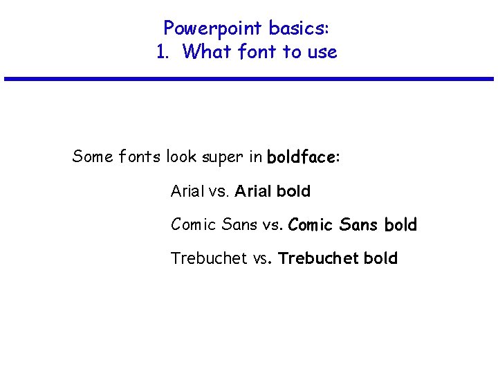
Powerpoint basics: 1. What font to use Some fonts look super in boldface:

Powerpoint basics: 1. What font to use Some fonts look super in boldface: Arial vs. Arial bold Comic Sans vs. Comic Sans bold Trebuchet vs. Trebuchet bold

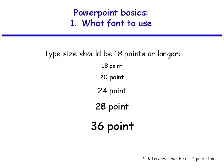
Powerpoint basics: 1. What font to use Type size should be 18 points or larger: 18 point 20 point 24 point 28 point 36 point * References can be in 14 point font

Powerpoint basics: 1. What font to use AVOID USING ALL CAPITAL LETTERS BECAUSE IT’S REALLY HARD TO READ!

Powerpoint basics: 2. Color

Powerpoint basics: 2. Color Dark letters against a light background work.

Powerpoint basics: 2. Color Light letters against a dark background also work.

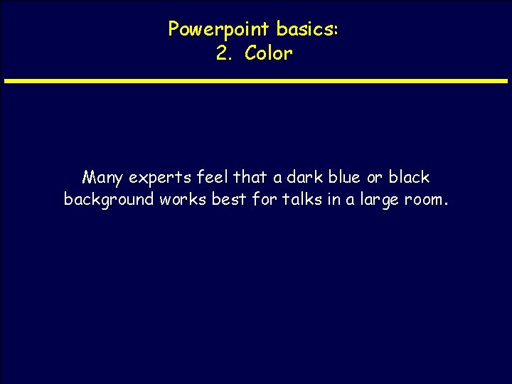
Powerpoint basics: 2. Color Many experts feel that a dark blue or black background works best for talks in a large room.

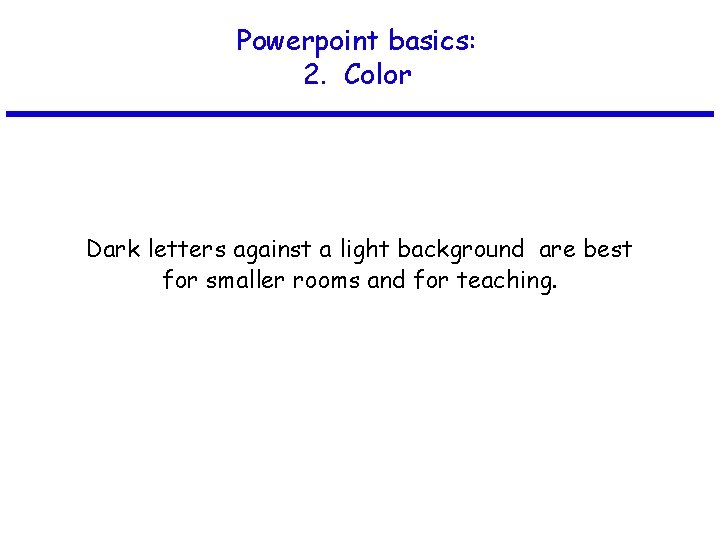
Powerpoint basics: 2. Color Dark letters against a light background are best for smaller rooms and for teaching.

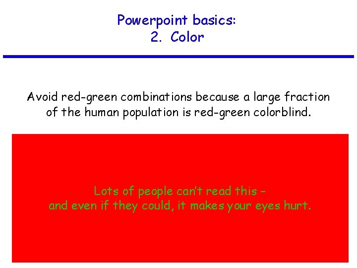
Powerpoint basics: 2. Color Avoid red-green combinations because a large fraction of the human population is red-green colorblind. Lots of people can’t read this – and even if they could, it makes your eyes hurt.

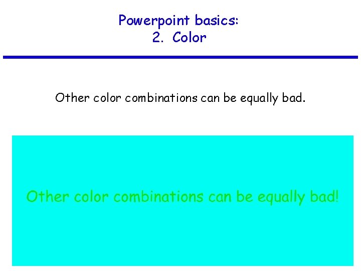
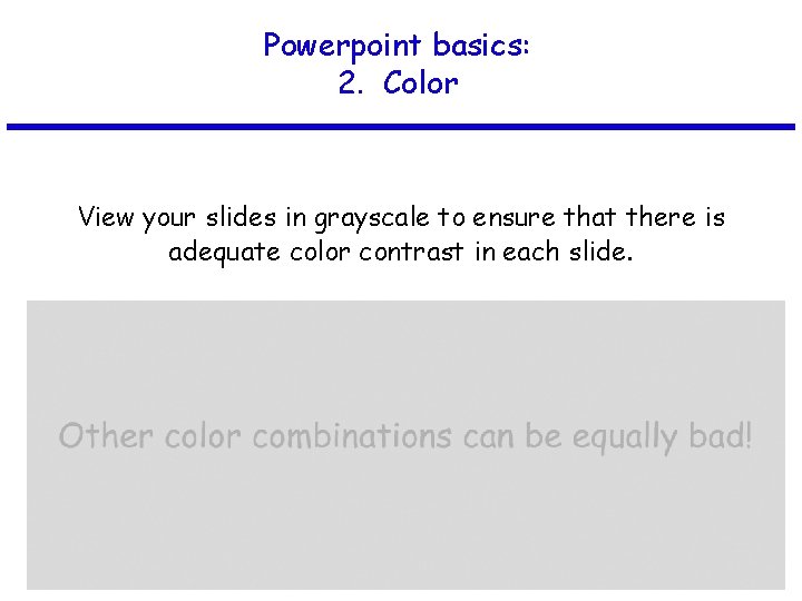
Powerpoint basics: 2. Color Other color combinations can be equally bad.

Powerpoint basics: 2. Color View your slides in grayscale to ensure that there is adequate color contrast in each slide.

Powerpoint basics: 3. Layout

Powerpoint basics: 3. Layout Every slide should have a heading. Sentences are preferred if it’s possible to make a statement.

Powerpoint basics: 3. Layout Limit text blocks to no more than two lines each.

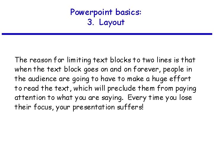
Powerpoint basics: 3. Layout The reason for limiting text blocks to two lines is that when the text block goes on and on forever, people in the audience are going to have to make a huge effort to read the text, which will preclude them from paying attention to what you are saying. Every time you lose their focus, your presentation suffers!

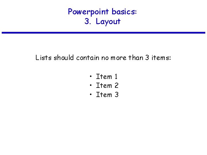
Powerpoint basics: 3. Layout Lists should contain no more than 3 items: • Item 1 • Item 2 • Item 3

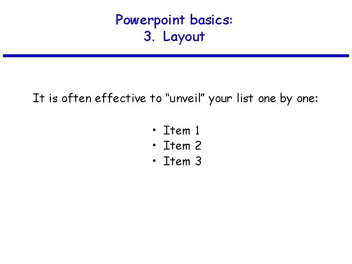
Powerpoint basics: 3. Layout It is often effective to “unveil” your list one by one: • Item 1 • Item 2 • Item 3

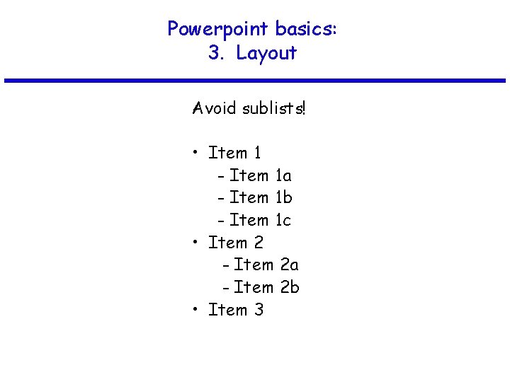
Powerpoint basics: 3. Layout Avoid sublists! • Item 1 - Item 1 a - Item 1 b - Item 1 c • Item 2 - Item 2 a - Item 2 b • Item 3

Powerpoint basics: 3. Layout Be generous with empty space.

Powerpoint basics: 3. Layout If you try to cram too much into a slide, and place things too close to the sides, they can get cut off if you’re using a poor projector. In any case, the slide looks all cluttered and junky.

Powerpoint basics: 4. Style

Powerpoint basics: 4. Style Try your best to include a simple image on every slide.

Powerpoint basics: 4. Style Limit the number of items on each slide. Each slide should make just one or two points!

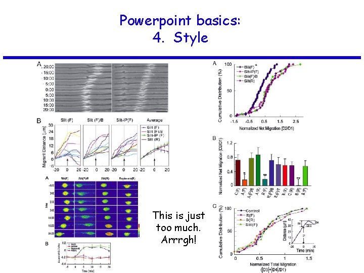
Powerpoint basics: 4. Style This is just too much. Arrrgh!

Powerpoint basics: 4. Style Here is a simple rule for showing figures and images: If you’re not going to take the time to explain it, get rid of it.

Powerpoint basics: 4. Style Avoid fancy transitions between slides unless you have a good reason.

Powerpoint basics: 4. Style Don’t try to show too many slides. Often, less is more.