Creating Charts with Microsoft Excel Next Main Menu







- Slides: 26

Creating Charts with Microsoft Excel Next

Main Menu Table of Contents Learning Activities Quiz Credits Next

What is Microsoft Excel? Uses for Microsoft Excel Parts of a Spreadsheet Creating Graphs in Microsoft Excel Back Next

What is Microsoft Excel? Microsoft Excel is a spreadsheet application developed by Microsoft for Microsoft Windows and Mac OS. It features calculation, graphing tools, pivot tables, and a macro programming language called Visual Basic for Applications. It has been a very widely applied spreadsheet for these platforms, especially since version 5 in 1993, and it has replaced Lotus 1 -2 -3 as the industry standard for spreadsheets. Excel forms part of Microsoft Office (www. wikipedia. org). Back Next

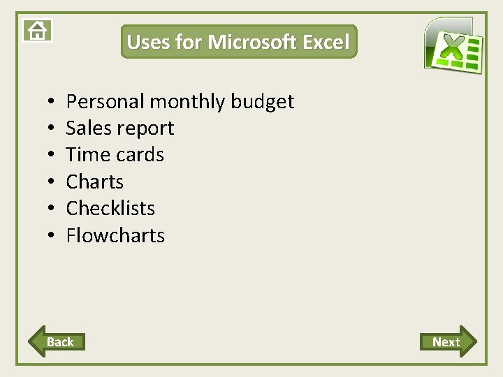
Uses for Microsoft Excel • • • Personal monthly budget Sales report Time cards Charts Checklists Flowcharts Back Next

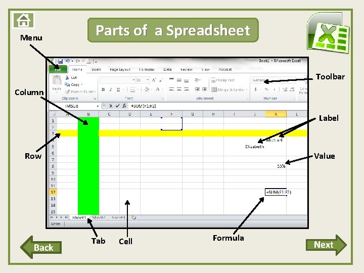
Menu Parts of a Spreadsheet Toolbar Column Label Row Back Value Tab Cell Formula Next

Label a Spreadsheet Practice labeling a spreadsheet. Check your understanding of the parts of an Excel Spreadsheet. Use the link below to correctly label the parts of an Excel spreadsheet. Parts of a Spreadsheet Back

Learning Activities Label a Spreadsheet Create a Graph Next

Label a Spreadsheet Practice labeling a spreadsheet. Check your understanding of the parts of an Excel Spreadsheet. Use the link below to correctly label the parts of an Excel spreadsheet. Parts of a Spreadsheet Back

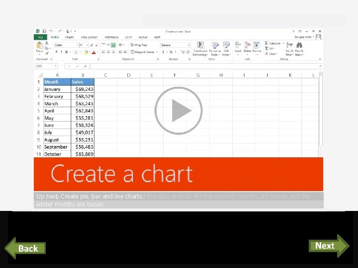
Creating Graphs in Microsoft Excel Click the Next button at the bottom of the page to begin watching a video on how to create a graph using Microsoft Excel. Next

Course summary Help And now IColumn have an catching chart of sales, the data. looks like the summer months Up Charts IFor Excel You Clustered select next, example, can displays provide the hover Create cells Irecommended want over a. Ipie, visual want iseye to each bar great to create representation and use one forline charts for acomparing tochart see charts. thebased what chart, for your data, looks on click the data, to so the good see data IItclick Quick making iffor in there’s it. the your Analysis it cells easier adata. pattern. selected. button, to analyze. and clickare theslower Chartsand tab. the winter months are busier. Press F 5 to start, Esc to stop 1 Back 2 1: 04 Create a crt 3 3: 35 Pie, bar, & line 5 4 5: 36 Customize 1: 51 Combo charts 6 1/5 videos 7 8 Next 3: 17 Summary Feedback Help

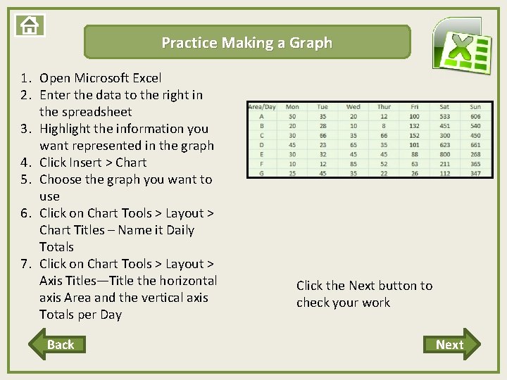
Practice Making a Graph 1. Open Microsoft Excel 2. Enter the data to the right in the spreadsheet 3. Highlight the information you want represented in the graph 4. Click Insert ˃ Chart 5. Choose the graph you want to use 6. Click on Chart Tools ˃ Layout ˃ Chart Titles – Name it Daily Totals 7. Click on Chart Tools ˃ Layout ˃ Axis Titles—Title the horizontal axis Area and the vertical axis Totals per Day Back Click the Next button to check your work Next

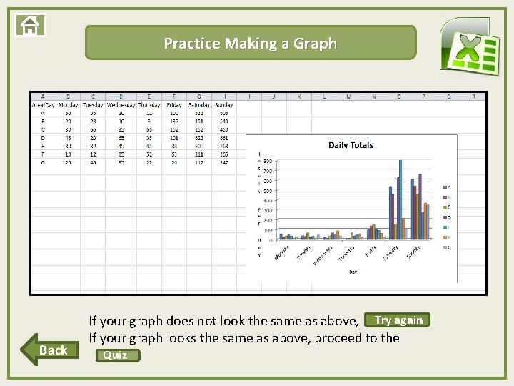
Practice Making a Graph Back If your graph does not look the same as above, Try. again If your graph looks the same as above, proceed to the Quiz

Quiz Question 1 Question 2 Question 3

Question 1 Excel Spreadsheets can be used to: A. Create charts B. Create brochures C. Edit pictures

Way to Go!!!! Next

Question 2 Which of the following is a part of a spreadsheet? A. Videos B. Sound Effects C. Columns

Try Again Back

Try Again Back

Way to Go!!!! Next

Way to Go!!!! Next

Question 3 There is only one type of graph available in Microsoft Excel. True False

Try Again Back

Way to Go!!!!

Way to Go!!!!

Credits Laura Blackburn Rebecca Schiedel Teach ICT. com Creator Guinea Pig (tester)