Course Overview Introduction Understanding UI Users and Their

- Slides: 57

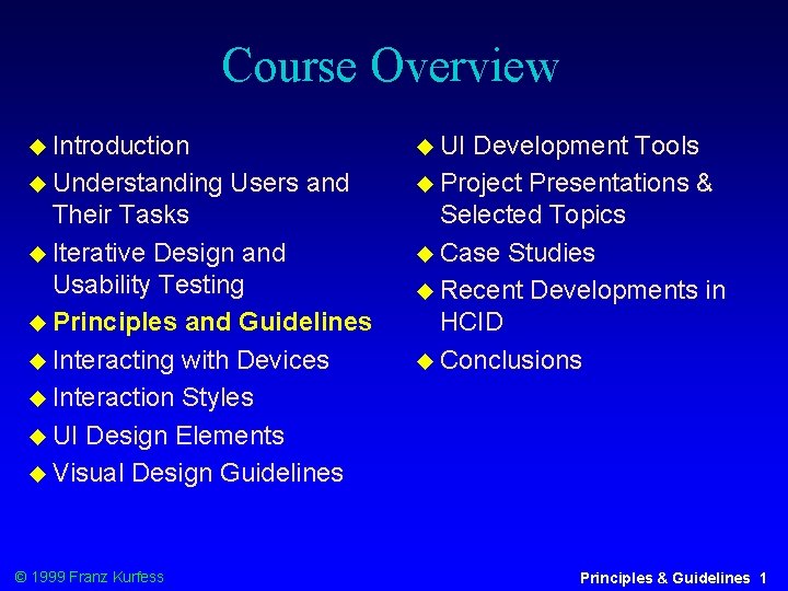
Course Overview Introduction Understanding UI Users and Their Tasks Iterative Design and Usability Testing Principles and Guidelines Interacting with Devices Interaction Styles UI Design Elements Visual Design Guidelines © 1999 Franz Kurfess Development Tools Project Presentations & Selected Topics Case Studies Recent Developments in HCID Conclusions Principles & Guidelines 1

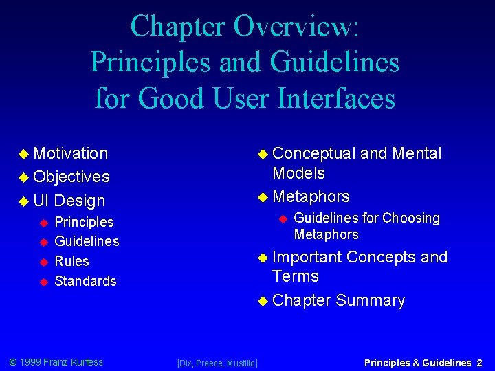
Chapter Overview: Principles and Guidelines for Good User Interfaces Motivation Conceptual Objectives Models Metaphors UI Design Principles Guidelines Rules Standards © 1999 Franz Kurfess and Mental Guidelines for Choosing Metaphors Important Concepts and Terms Chapter Summary [Dix, Preece, Mustillo] Principles & Guidelines 2

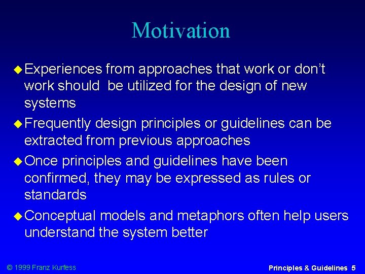
Motivation Experiences from approaches that work or don’t work should be utilized for the design of new systems Frequently design principles or guidelines can be extracted from previous approaches Once principles and guidelines have been confirmed, they may be expressed as rules or standards Conceptual models and metaphors often help users understand the system better © 1999 Franz Kurfess Principles & Guidelines 5

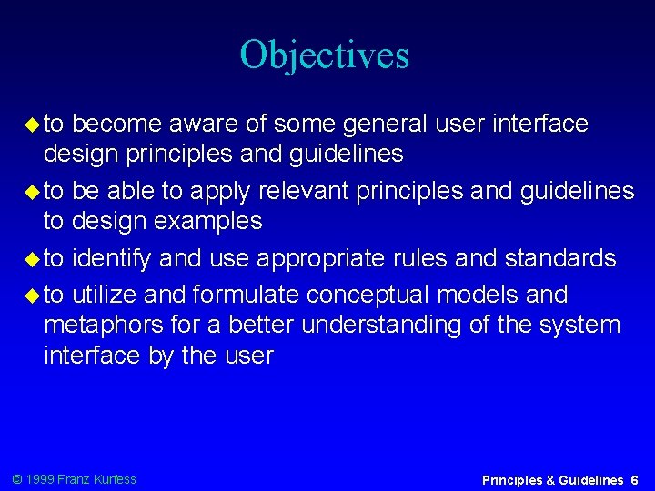
Objectives to become aware of some general user interface design principles and guidelines to be able to apply relevant principles and guidelines to design examples to identify and use appropriate rules and standards to utilize and formulate conceptual models and metaphors for a better understanding of the system interface by the user © 1999 Franz Kurfess Principles & Guidelines 6

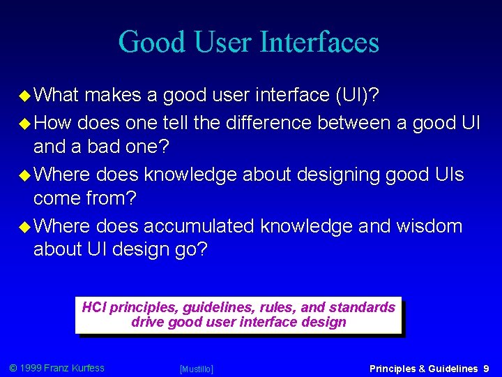
Good User Interfaces What makes a good user interface (UI)? How does one tell the difference between a good UI and a bad one? Where does knowledge about designing good UIs come from? Where does accumulated knowledge and wisdom about UI design go? HCI principles, guidelines, rules, and standards drive good user interface design © 1999 Franz Kurfess [Mustillo] Principles & Guidelines 9

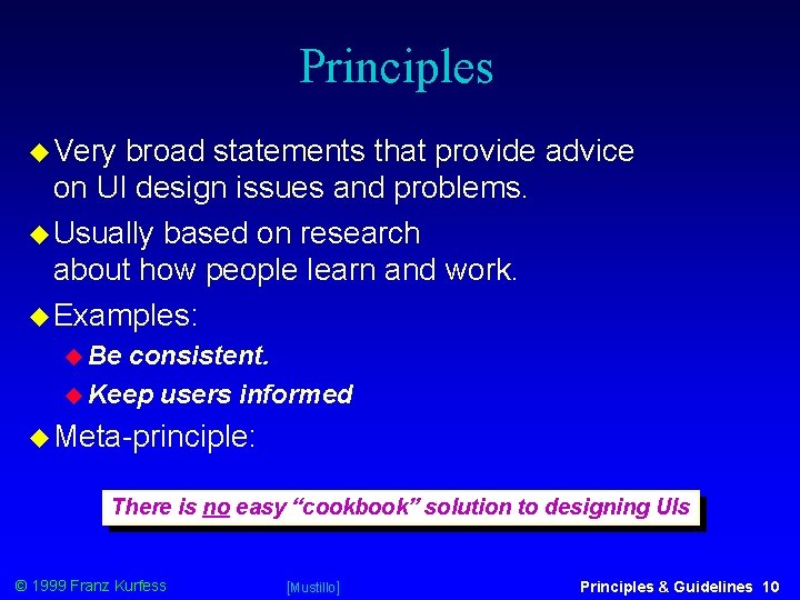
Principles Very broad statements that provide advice on UI design issues and problems. Usually based on research about how people learn and work. Examples: Be consistent. Keep users informed Meta-principle: There is no easy “cookbook” solution to designing UIs © 1999 Franz Kurfess [Mustillo] Principles & Guidelines 10

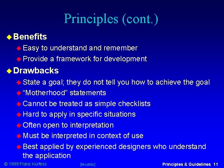
Principles (cont. ) Benefits Easy to understand remember Provide a framework for development Drawbacks State a goal; they do not tell you how to achieve the goal “Motherhood” statements Cannot be treated as simple checklists Hard to apply in specific situations Often open to interpretation Must be interpreted in context of use Best applied by experienced designers who understand the application © 1999 Franz Kurfess [Mustillo] Principles & Guidelines 11

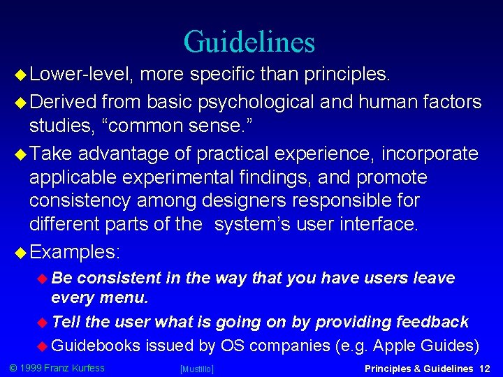
Guidelines Lower-level, more specific than principles. Derived from basic psychological and human factors studies, “common sense. ” Take advantage of practical experience, incorporate applicable experimental findings, and promote consistency among designers responsible for different parts of the system’s user interface. Examples: Be consistent in the way that you have users leave every menu. Tell the user what is going on by providing feedback Guidebooks issued by OS companies (e. g. Apple Guides) © 1999 Franz Kurfess [Mustillo] Principles & Guidelines 12

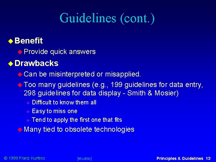
Guidelines (cont. ) Benefit Provide quick answers Drawbacks Can be misinterpreted or misapplied. Too many guidelines (e. g. , 199 guidelines for data entry, 298 guidelines for data display - Smith & Mosier) Difficult to know them all Easy to miss one Tend to apply the first one that fits Many tied to obsolete technologies © 1999 Franz Kurfess [Mustillo] Principles & Guidelines 13

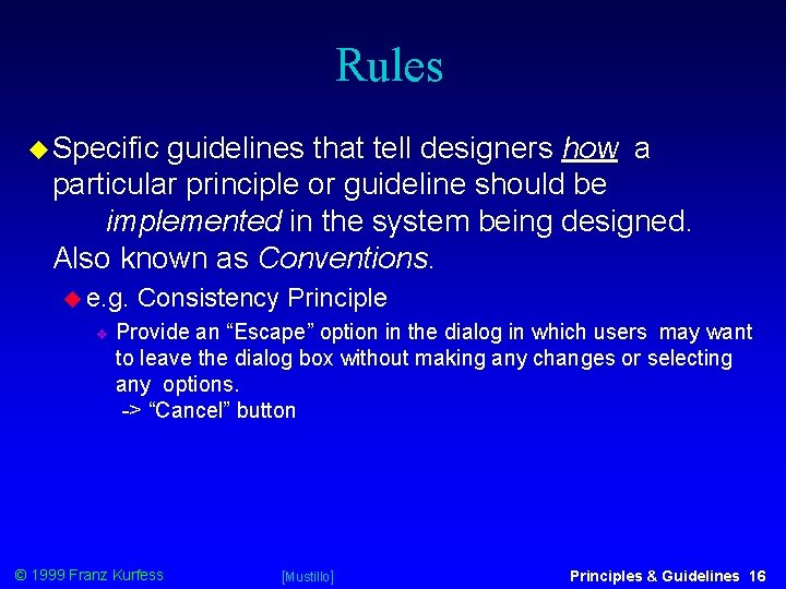
Rules Specific guidelines that tell designers how a particular principle or guideline should be implemented in the system being designed. Also known as Conventions. e. g. Consistency Principle Provide an “Escape” option in the dialog in which users may want to leave the dialog box without making any changes or selecting any options. -> “Cancel” button © 1999 Franz Kurfess [Mustillo] Principles & Guidelines 16

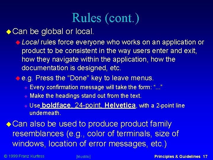
Rules (cont. ) Can be global or local. Local rules force everyone who works on an application or product to be consistent in the way users enter and exit, how they navigate within the application, how the documentation is designed, etc. e. g. Press the “Done” key to leave menus. Every confirmation message will take the form: “. . . ” Make the headings stand out from the text. Use boldface, underneath. 24 -point, Helvetica, with a 2 -point line Can also be used to produce product family resemblances (e. g. , color of terminals, size of windows, location of error messages, etc. ) © 1999 Franz Kurfess [Mustillo] Principles & Guidelines 17

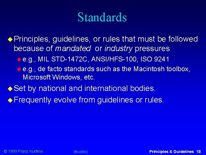
Standards Principles, guidelines, or rules that must be followed because of mandated or industry pressures e. g. , MIL STD-1472 C, ANSI/HFS-100, ISO 9241 e. g. , de facto standards such as the Macintosh toolbox, Microsoft Windows, etc. Set by national and international bodies. Frequently evolve from guidelines or rules. © 1999 Franz Kurfess [Mustillo] Principles & Guidelines 18

UI Standards Specify how the UI should appear to the user. International standards for UI design are slowly emerging. ISO 9241 is an HCI standard. Now up to 17 parts. ISO 9241 - 2 deals with the design of tasks and jobs involving work with visual display units ISO 9241 -10 -17 deal with usability, human-computer dialog, software aspects of display design, keyboard requirements, and user guidance. © 1999 Franz Kurfess [Mustillo] Principles & Guidelines 19

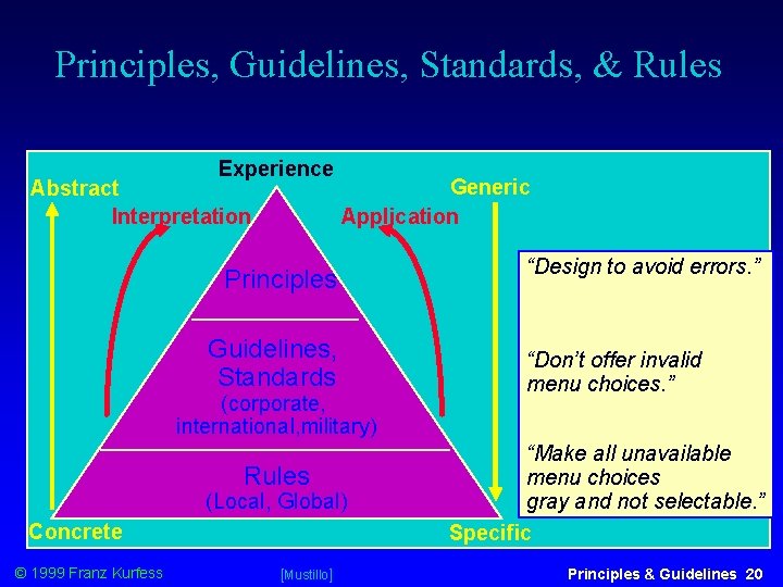
Principles, Guidelines, Standards, & Rules Experience Abstract Interpretation Generic Application Principles Guidelines, Standards (corporate, international, military) Rules (Local, Global) Concrete © 1999 Franz Kurfess [Mustillo] “Design to avoid errors. ” “Don’t offer invalid menu choices. ” “Make all unavailable menu choices gray and not selectable. ” Specific Principles & Guidelines 20

UI Design Principles Many by many people Similar intentions, but different emphasis depending on domains of expertise Principles, guidelines, and rules tend to be used somewhat interchangeably Examples: Ben Shneiderman’s 8 golden rules for dialog design (see handout) IBM’s 11 design principles (see handout) Microsoft’s Tandy Trower (see video) Jacob Nielsen’s 10 UI design principles (next set of slides) © 1999 Franz Kurfess [Mustillo] Principles & Guidelines 21

Nielsen and Norman’s UI Design Principles 1 Use Simple and Natural Dialog Match the user’s task in as natural a way as possible Minimize mappings between computer syntax/semantics and task semantics Present exactly the information the user needs “Less is more” less to learn, get wrong, distract. . . Information should appear in a natural and logical order Related information is close together and graphically clustered Order of accessing information matches (or is controlled) by user’s expectations Remove or hide irrelevant or rarely needed information Competes © 1999 Franz Kurfess with important information [Mustillo] Principles & Guidelines 22

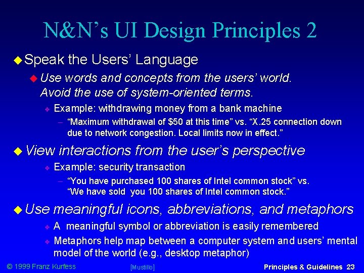
N&N’s UI Design Principles 2 Speak the Users’ Language Use words and concepts from the users’ world. Avoid the use of system-oriented terms. Example: withdrawing money from a bank machine “Maximum withdrawal of $50 at this time” vs. “X. 25 connection down due to network congestion. Local limits now in effect. ” View interactions from the user’s perspective Example: security transaction “You have purchased 100 shares of Intel common stock” vs. “We have sold you 100 shares of Intel common stock. ” Use meaningful icons, abbreviations, and metaphors A meaningful symbol or abbreviation is easily remembered Metaphors help map between a computer system and users’ mental model of the world (e. g. , desktop metaphor) © 1999 Franz Kurfess [Mustillo] Principles & Guidelines 23

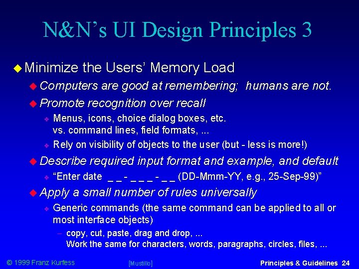
N&N’s UI Design Principles 3 Minimize the Users’ Memory Load Computers are good at remembering; humans are not. Promote recognition over recall Menus, icons, choice dialog boxes, etc. vs. command lines, field formats, . . . Rely on visibility of objects to the user (but - less is more!) Describe “Enter date _ _ - _ _ (DD-Mmm-YY, e. g. , 25 -Sep-99)” Apply required input format and example, and default a small number of rules universally Generic commands (the same command can be applied to all or most interface objects) copy, cut, paste, drag and drop, . . . Work the same for characters, words, paragraphs, circles, files, . . . © 1999 Franz Kurfess [Mustillo] Principles & Guidelines 24

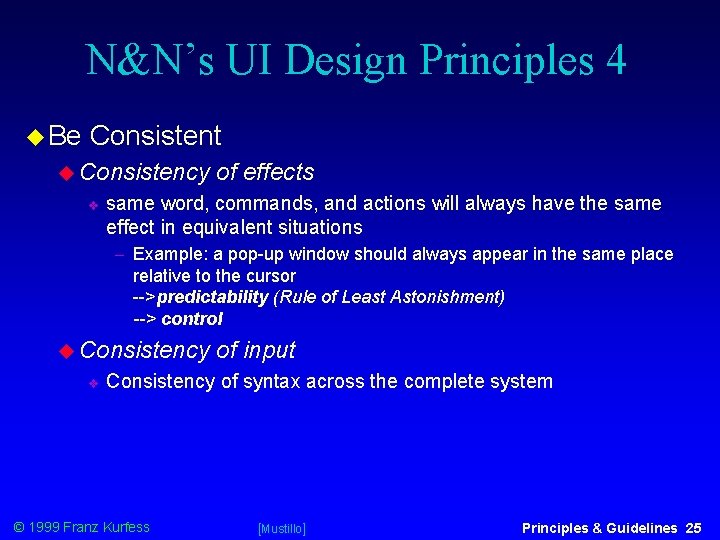
N&N’s UI Design Principles 4 Be Consistent Consistency of effects same word, commands, and actions will always have the same effect in equivalent situations Example: a pop-up window should always appear in the same place relative to the cursor -->predictability (Rule of Least Astonishment) --> control Consistency of input Consistency of syntax across the complete system © 1999 Franz Kurfess [Mustillo] Principles & Guidelines 25

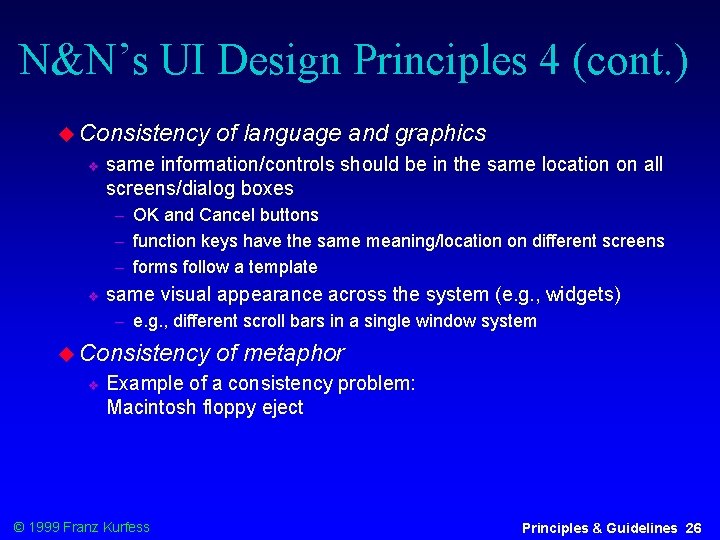
N&N’s UI Design Principles 4 (cont. ) Consistency of language and graphics same information/controls should be in the same location on all screens/dialog boxes OK and Cancel buttons function keys have the same meaning/location on different screens forms follow a template same visual appearance across the system (e. g. , widgets) e. g. , different scroll bars in a single window system Consistency of metaphor Example of a consistency problem: Macintosh floppy eject © 1999 Franz Kurfess Principles & Guidelines 26

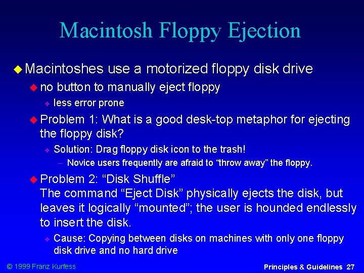
Macintosh Floppy Ejection Macintoshes no use a motorized floppy disk drive button to manually eject floppy less error prone Problem 1: What is a good desk-top metaphor for ejecting the floppy disk? Solution: Drag floppy disk icon to the trash! Novice users frequently are afraid to “throw away” the floppy. Problem 2: “Disk Shuffle” The command “Eject Disk” physically ejects the disk, but leaves it logically “mounted”; the user is hounded endlessly to insert the disk. Cause: Copying between disks on machines with only one floppy disk drive and no hard drive © 1999 Franz Kurfess Principles & Guidelines 27

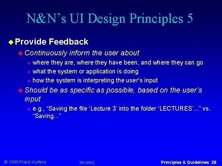
N&N’s UI Design Principles 5 Provide Feedback Continuously inform the user about where they are, where they have been, and where they can go what the system or application is doing how the system is interpreting the user’s input Should be as specific as possible, based on the user’s input e. g. , “Saving the file ‘Lecture 3’ into the folder ‘LECTURES’. . . ” vs. “Saving. . . ” © 1999 Franz Kurfess [Mustillo] Principles & Guidelines 28

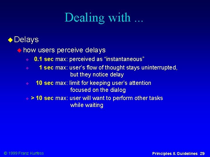
Dealing with. . . Delays how users perceive delays 0. 1 sec max: perceived as “instantaneous” 1 sec max: user’s flow of thought stays uninterrupted, but they notice delay 10 sec max: limit for keeping user’s attention focused on the dialog > 10 sec max: user will want to perform other tasks while waiting © 1999 Franz Kurfess Principles & Guidelines 29

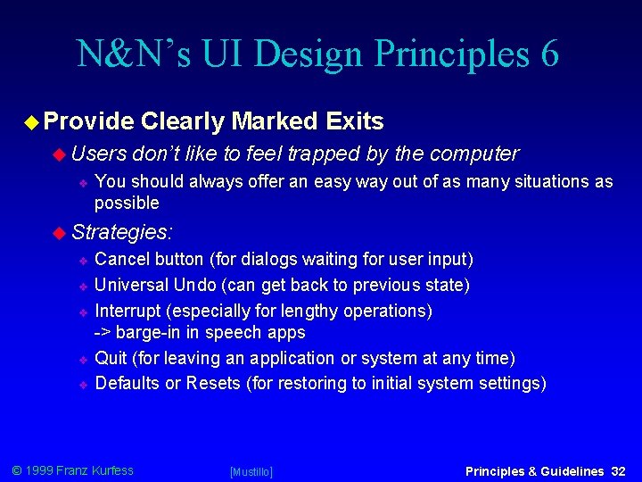
N&N’s UI Design Principles 6 Provide Users Clearly Marked Exits don’t like to feel trapped by the computer You should always offer an easy way out of as many situations as possible Strategies: Cancel button (for dialogs waiting for user input) Universal Undo (can get back to previous state) Interrupt (especially for lengthy operations) -> barge-in in speech apps Quit (for leaving an application or system at any time) Defaults or Resets (for restoring to initial system settings) © 1999 Franz Kurfess [Mustillo] Principles & Guidelines 32

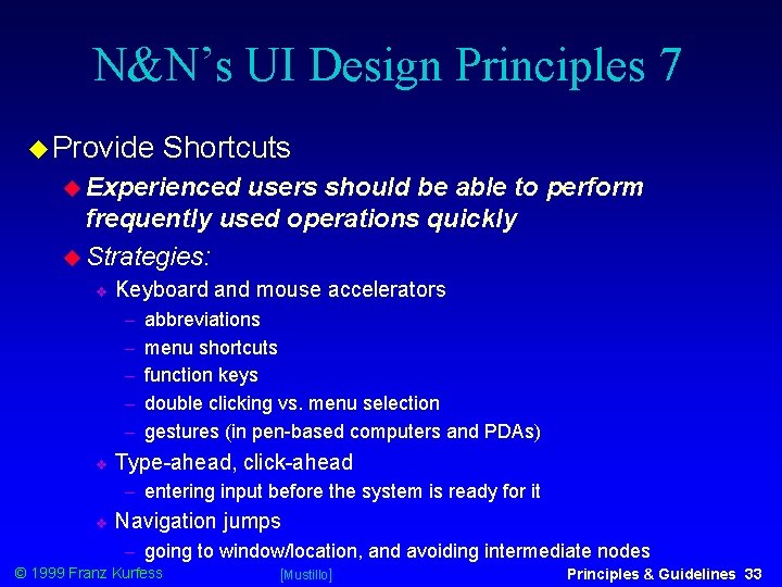
N&N’s UI Design Principles 7 Provide Shortcuts Experienced users should be able to perform frequently used operations quickly Strategies: Keyboard and mouse accelerators abbreviations menu shortcuts function keys double clicking vs. menu selection gestures (in pen-based computers and PDAs) Type-ahead, click-ahead entering input before the system is ready for it Navigation jumps going to window/location, and avoiding intermediate nodes © 1999 Franz Kurfess [Mustillo] Principles & Guidelines 33

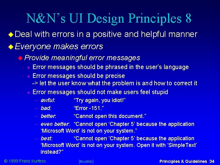
N&N’s UI Design Principles 8 Deal with errors in a positive and helpful manner Everyone makes errors Provide meaningful error messages Error messages should be phrased in the user’s language Error messages should be precise -> let the user know what the problem is and how to correct it Error messages should not make users feel stupid awful: “Try again, you idiot!” bad: “Error -151. ” better: “Cannot open this document. ” even better: “Cannot open ‘Chapter 5’ because the application ‘Microsoft Word’ is not on your system. ” best: “Cannot open ’Chapter 5’ because the application ‘Microsoft Word’ is not on your system. Open it with ‘Simple. Text’ instead? ” © 1999 Franz Kurfess [Mustillo] Principles & Guidelines 34

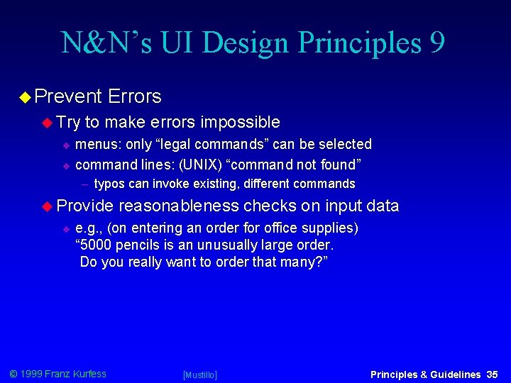
N&N’s UI Design Principles 9 Prevent Try Errors to make errors impossible menus: only “legal commands” can be selected command lines: (UNIX) “command not found” typos can invoke existing, different commands Provide reasonableness checks on input data e. g. , (on entering an order for office supplies) “ 5000 pencils is an unusually large order. Do you really want to order that many? ” © 1999 Franz Kurfess [Mustillo] Principles & Guidelines 35

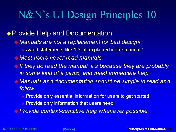
N&N’s UI Design Principles 10 Provide Help and Documentation Manuals are not a replacement for bad design! Avoid statements like “It’s all explained in the manual. ” Most users never read manuals. If they do read the manual, it’s because they are probably in some kind of a panic, and need immediate help. Manuals and documentation should be simple to read and follow. Provide only essential information for users to get started Provide only information that users need Provide © 1999 Franz Kurfess context-sensitive help whenever possible [Mustillo] Principles & Guidelines 36

Conceptual and Mental Models Good user interface design also depends on the selection of appropriate conceptual models. Conceptual models facilitate the development of effective mental models for the user. Models Internal representations of how things work. Can be physical, psychological, philosophical, or spiritual. © 1999 Franz Kurfess [Mustillo] Principles & Guidelines 37

Conceptual Model General conceptual framework through which the functionality of a user interface is presented to users. What is the interface trying to convey? Also referred to as the “design model. ” Designer’s attempt to create a useful and accurate mental model of the system for the user. The user interface is very influential for the construction of a mental model. © 1999 Franz Kurfess Principles & Guidelines 38

Mental model Internal representation of a user’s current conceptualization and understanding of a system. Also sometimes referred to as the “user model. ” A user’s mental model may evolve to become more accurate and complete as new information is acquired (e. g. , novice vs. expert users, children vs. adults). © 1999 Franz Kurfess Principles & Guidelines 39

Users’ Mental Models Previous experience, interactions with a user interface, and its behavior Affordances clues that communicate how an object can be used “natural mapping” The design of objects should suggest (i. e. , afford) their functionality -> how they are to be used. Examples: doors are meant to be opened/closed; chairs are for sitting, tables are for putting things on, knobs are for turning, handles are for pulling, buttons are to be pushed, etc. © 1999 Franz Kurfess [Mustillo] Principles & Guidelines 40

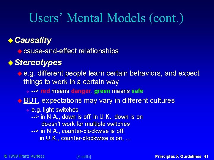
Users’ Mental Models (cont. ) Causality cause-and-effect relationships Stereotypes e. g. different people learn certain behaviors, and expect things to work in a certain way --> red means danger, green means safe BUT, expectations may vary in different cultures e. g. light switches --> in N. A. , down is off; in U. K. , down is on doesn’t work for multiple switches --> in N. A. , counter-clockwise is off; in U. K. , counter-clockwise is on, . . . © 1999 Franz Kurfess [Mustillo] Principles & Guidelines 41

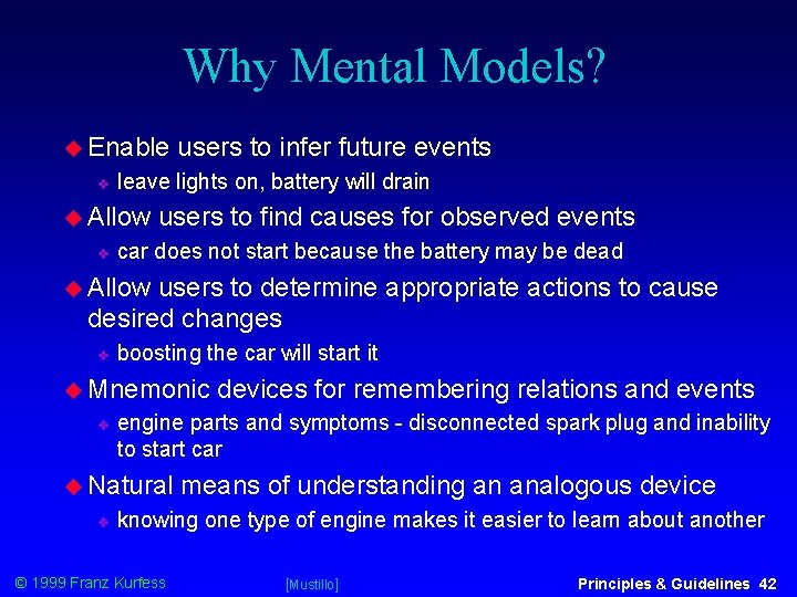
Why Mental Models? Enable leave lights on, battery will drain Allow users to infer future events users to find causes for observed events car does not start because the battery may be dead Allow users to determine appropriate actions to cause desired changes boosting the car will start it Mnemonic engine parts and symptoms - disconnected spark plug and inability to start car Natural devices for remembering relations and events means of understanding an analogous device knowing one type of engine makes it easier to learn about another © 1999 Franz Kurfess [Mustillo] Principles & Guidelines 42

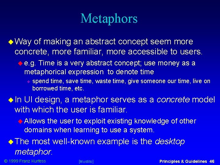
Metaphors Way of making an abstract concept seem more concrete, more familiar, more accessible to users. e. g. Time is a very abstract concept; use money as a metaphorical expression to denote time spend time, save time, waste time, give someone our time, live on borrowed time, etc. In UI design, a metaphor serves as a concrete model with which the user is familiar. Allows the user to exploit existing knowledge of other domains when learning to use a system. The most well-known example is the desktop metaphor. © 1999 Franz Kurfess [Mustillo] Principles & Guidelines 46

Metaphors as Conceptual Models It is important to design a user interface that enables a user to develop an appropriate mental model. One way is to develop an explicit metaphor that is suitable for the system or application. © 1999 Franz Kurfess [Mustillo] Principles & Guidelines 47

Interface Metaphors Ways of presenting user objects so that they mimic real life objects in the user’s everyday world. Make software easier to users can recognize and generalize the attributes and actions of the concrete object that they know in their everyday world. Facilitate the process of learning to use a system exploit a mental model and a set of expectations that the user already has A major challenge is to decide which metaphor will best match a task. © 1999 Franz Kurfess [Mustillo] Principles & Guidelines 48

Selection of Metaphors Task analysis establish Talk an understanding of the users and their domain to users, observe them Find out how they organize their work go about completing their tasks sort and group things If you choose your metaphors carefully, it will be easier for users to learn and use your software. © 1999 Franz Kurfess [Mustillo] Principles & Guidelines 49

Metaphors are More than Icons Picking a metaphor does not mean choosing an icon or picture for an object. an overall metaphor decides on the “look-and-feel” of an entire series of screens (in the case of a GUI) Commonly used metaphors Desktop* - GUI Spreadsheet - ledger Form - accounting Card catalog - library Index cards - hypertext Pile or Stack © 1999 Franz Kurfess [Mustillo] Principles & Guidelines 50

Recent Metaphors CD players (to play audio) film rolls (to denote movies) Notebook* (e. g. , Pen. Point) Places* (General Magic) Lifestreams (U. Maryland) Social User Interfaces* (e. g. , Microsoft) “Bob, ” “Clippit, ” “Genie, ” “Peedy the Parrot” (Microsoft Persona Project) © 1999 Franz Kurfess [Mustillo] Principles & Guidelines 51

Desktop Metaphor First example of a desktop metaphor was the Xerox Star user interface (late 1970 s). Precursor to today’s GUI. Most prevalent computing metaphor for GUIs. Draws on the familiar analogy of office filing systems, and the familiar operations of opening files and moving objects from file to file. © 1999 Franz Kurfess [Mustillo] Principles & Guidelines 52

Desktop Metaphor (cont. ) Screen looks like an office or desktop familiar objects such as folders, documents, an inbox and outbox for mail, a trash can, a clock, an appointment book, . . . The folder is a particularly useful and successful metaphor. Purpose Use immediately apparent. of mouse as a direct manipulation device. sometimes difficult to grasp for novices no immediate counterpart name refers to its shape, not its function © 1999 Franz Kurfess [Mustillo] Principles & Guidelines 53

Notebook Metaphor Popularized in pen-based interfaces in the early 1990 s Go Corp. ’s Pen. Point Apple Newton Provides the user with a simple, on-screen notebook Information organized as a collection of pages and sections Tabs at the right-hand side Table of Contents at the front © 1999 Franz Kurfess [Mustillo] Principles & Guidelines 54

Notebook Metaphor (cont. ) Notations and functions derived from the paper counterpart turn a page with a tap or a flick of the pen tip on or near the page number Bookshelf repository of system-wide objects and resources such as: Inbox and outbox On-line help Tools palette Disk manager Software keyboard, . . . © 1999 Franz Kurfess [Mustillo] Principles & Guidelines 55

Other UI Metaphors “Places” - General Magic Things done on users’ behalf by having software agents “go” to “places” (Downtown, Hallway, Office) and find what users need or request. More on software agents in a later lecture. © 1999 Franz Kurfess [Mustillo] Principles & Guidelines 56

Social UI Metaphors People interact with computers in fundamentally social ways. “People interact with computers in the same way that they interact with other people. ” (Byron Reeves & Clifford Nass, Stanford University) Are polite to computers. Form perceptions and beliefs about the personality of the computer. Social to UIs incorporate anthropomorphic characters interact with users by means of natural spoken dialog. Conversational, engaging, visual presence Animated, provide © 1999 Franz Kurfess “life-like” characters assistance to users. [Mustillo] Principles & Guidelines 57

Microsoft “Bob” Animated personal guide in that communicates with the user through speech balloons. Life-like (or claims to be) Single source of relevant information at any given point in the interaction. Provides tips and suggestions system capabilities more efficient ways of completing a task © 1999 Franz Kurfess [Mustillo] Principles & Guidelines 58

“Clippit” and Friends Office 97 Assistant animated character that is the intelligent center of the user assistance system in Office 97. Serves analogous role to the departmental guru. Provides quick and easy answers to user questions Supposed to be fun. Friends include: The Dot, The Genius, Will, Power Pup, . . . © 1999 Franz Kurfess [Mustillo] Principles & Guidelines 59

Genie and Friends MS Active. X™ Project Interactive personalities provide enhanced capabilities to the existing interactive modalities of the Windows interface. Users can select the personality they want Genie, © 1999 Franz Kurfess Merlin, or Robby the Robot. [Mustillo] Principles & Guidelines 60

Peedy the Parrot MS Persona Project Expressive visual presence. Conversational assistant that accepts user requests for audio CDs, and then plays them. Integrates spoken language input, a conversational dialog manager, reactive 3 D animation, speech output and sound effects. © 1999 Franz Kurfess [Mustillo] Principles & Guidelines 61

Choosing Metaphors Match the most important user objects The objects in your interface that users have to manipulate in order to get their work done. Look at your major user objects and the actions users will need to perform with them. Then, decide what kind of metaphor would work best for those objects and actions. Simple The is better simplest metaphors are often the most powerful. © 1999 Franz Kurfess [Mustillo] Principles & Guidelines 62

Choosing Metaphors Your metaphor does not need to be unique A metaphor works best if it is common. If someone else has already used a notebook idea, then it is OK for you to also use it. Look at the users’ real world for metaphor ideas Be flexible Try out your metaphors and get feedback before you make any final design decisions. If a metaphor works naturally, use it. If it doesn’t, be careful. © 1999 Franz Kurfess [Mustillo] Principles & Guidelines 63

Pitfalls of Metaphors can hinder as well as help e. g. Use of metaphors as icons. Consider the Microsoft Word 6. 0 toolbar. Some icons are readily identifiable; others are not. Contrast this with the Netscape toolbar. Metaphors may not translate across global cultural norms. What does a desktop mean to a person who has never seen as desk? We don’t know enough about the impact of social user interface metaphors. © 1999 Franz Kurfess [Mustillo] Principles & Guidelines 64

“Global” Metaphor desktop intended to encompass entire application concept is a good example. Problem arises when the reality begins to diverge from the metaphor. trash can is a great metaphor for the deletion function, but a bad one for ejecting a disk “trashing” a disk Also, the fact that desktop metaphor has to be explained to first-time users is an indication that it may not be terribly intuitive. © 1999 Franz Kurfess Principles & Guidelines 65

Important Concepts and Terms conceptual model design principles design guidelines design rules design standards desktop metaphor graphical user interface (GUI) interaction styles interface metaphor mental model © 1999 Franz Kurfess metaphor mouse notebook metaphor task analysis user interface design user model WIMP window Principles & Guidelines 68

Chapter Summary User interface design is hard work Adhere There to proven HCI principles and guidelines are no magic formulas - no immutable rules Every application is different Know your users and understand their tasks UI design is an adaptive process Conceptual models change Paradigms shift New metaphors emerge Users’ mental models evolve © 1999 Franz Kurfess [Mustillo] Principles & Guidelines 69

© 1999 Franz Kurfess Principles & Guidelines 70