COURSE 3 LESSON 10 2 Reading Graphs Critically
- Slides: 4

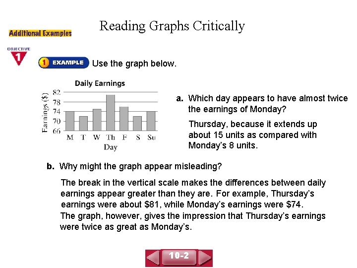
COURSE 3 LESSON 10 -2 Reading Graphs Critically Use the graph below. a. Which day appears to have almost twice the earnings of Monday? Thursday, because it extends up about 15 units as compared with Monday’s 8 units. b. Why might the graph appear misleading? The break in the vertical scale makes the differences between daily earnings appear greater than they are. For example, Thursday’s earnings were about $81, while Monday’s earnings were $74. The graph, however, gives the impression that Thursday’s earnings were twice as great as Monday’s. 10 -2

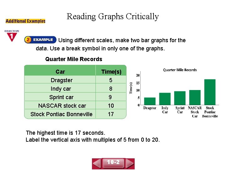
Reading Graphs Critically COURSE 3 LESSON 10 -2 Using different scales, make two bar graphs for the data. Use a break symbol in only one of the graphs. Quarter Mile Records Car Time(s) Dragster Indy car 5 8 Sprint car NASCAR stock car Stock Pontiac Bonneville 9 10 17 The highest time is 17 seconds. Label the vertical axis with multiples of 5 from 0 to 20. 10 -2

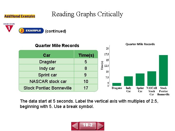
COURSE 3 LESSON 10 -2 Reading Graphs Critically (continued) Quarter Mile Records Car Time(s) Dragster Indy car 5 8 Sprint car NASCAR stock car Stock Pontiac Bonneville 9 10 17 The data start at 5 seconds. Label the vertical axis with multiples of 2. 5, beginning with 5. Use a break symbol. 10 -2

COURSE 3 LESSON 10 -2 Reading Graphs Critically 1. What can be used to give a graph a misleading visual impression? Sample: a break in an axis scale 2. The average daily temperature of a town varies from 55°F to 98°F. Describe an appropriate scale you could use to create a bar graph for the data. Sample: Break between 0 and 50. Show 50º, 55º, 60º, 65º, 70º, 75º, 80º, 85º, 90º, 95º, and 100º on the axis. 10 -2