COS 368 Graphical User Interface Design Introduction Control

- Slides: 17

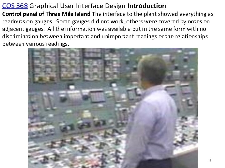
COS 368 Graphical User Interface Design Introduction Control panel of Three Mile Island The interface to the plant showed everything as readouts on gauges. Some gauges did not work, others were covered by notes on adjacent gauges. All the information was available but in the same form with no discrimination between important and unimportant readings or the relationships between various readings. 1

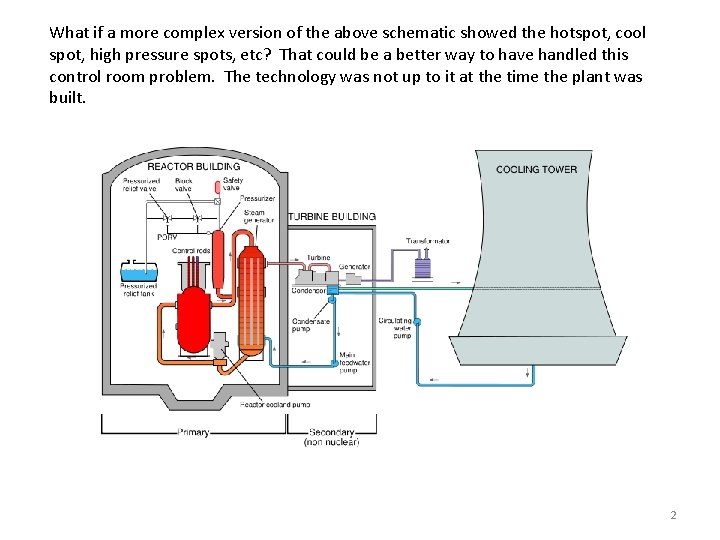
What if a more complex version of the above schematic showed the hotspot, cool spot, high pressure spots, etc? That could be a better way to have handled this control room problem. The technology was not up to it at the time the plant was built. 2

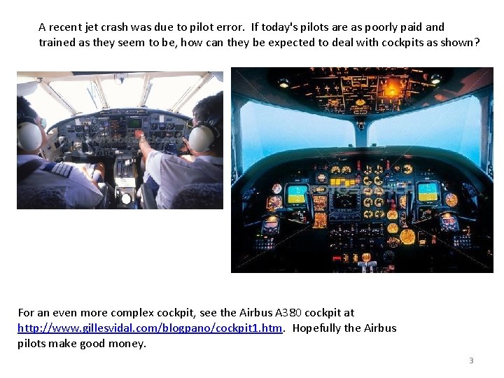
A recent jet crash was due to pilot error. If today's pilots are as poorly paid and trained as they seem to be, how can they be expected to deal with cockpits as shown? For an even more complex cockpit, see the Airbus A 380 cockpit at http: //www. gillesvidal. com/blogpano/cockpit 1. htm. Hopefully the Airbus pilots make good money. 3

Evolutionary changes to interfaces are achieved by a slow process of progressive refinement and understanding of users and their tasks to create applications that are easy to use. We will emphasize this type of change in the course. (COS 368) Revolutionary changes are changes to an entire paradigm. Examples i. Pod (very successful), i. Phone (success), Segway (success? ) (After much insight and experience. ) 4

Some main ideas • To users the interface is the product. • Implementers (us) are probably not the best interface designers. We are very different than the average user. If we design to please ourselves we may please very few others. • Design before implementing. (This seems basic but it is not generally done. ) Some pertinent aphorisms Know thy user. You are not the user. Listen to the user, but do not do what she says. To the user the interface is the product. The purchaser is not necessarily the user. The user must be in control. Design then build. A stitch in time saves 9. An ounce of prevention is worth a pound of cure. True beauty is more than skin deep. 5

General Usability Questions • Is the interface usable by its target population? • What makes an interface usable? • Can we measure usability? • Are there guidelines to follow that make for usable interfaces? • Is there a process to follow that guarantees a usable interface? Most Basic Question Do people need the product or can they be convinced that they need the product? What are the specific attributes of a "good user interface"? What is a "good user interface" What is a "good car" What is "good music" What is "good furniture arrangement". Answer: Each system will have unique users with different needs. What might be good for one group might be useless for another. 6

What is design? (Architecture, the usual example of design) • starts with the requirements of the product being designed • the use(s) to which the users will put the product • the knowledge, skills, background, desires, interests, etc. of the users. • the requirements of the physical climate (hot, cold, temperate, etc. ) • the aesthetic climate (wooded, traditional setting, modern setting, etc. ) • the local building codes, etc. • the needs of the occupants of the house must be known or predicted oincome onumber of people in the household otheir interests oetc. The design of the house takes all of these factors (and others) into account. Again, this information may have to be discovered by the designer in the design process. 7

Good design disappears. • Good design is one that lets the user concentrate on what they want to do, not on how to do it. • Decisions that let the user work easily towards a goal are good design. • Decisions that hinder reaching the goal are bad design. • People notice when something is hard to do • People complain about these bad design aspects. • People do not comment, or even notice, when things go right. Laundry soap example. • The way it was. • The way it changed. Often a poor design becomes standard and is difficult if not impossible to correct. In my opinion the functionality of the "Save As. . . " menu item is incorrect. 8

What makes an interface usable? • Learnability : standard measure o. Casual Users - Learnability is very important o. Expert Users - Learnability is less important than functionality o. Retention over time. • Effectiveness (Productivity) o. Work Done / Unit Time o. Reasonable error rate. • Acceptability (User Satisfaction) o. Does it satisfy the actual user? • Generic Aspect (Compatibility) o. Features that are like the main stream of products. o. Allow users to transfer their already learned knowledge of other programs o. Key combos should be the same o Shortcut icons should be the same or similar 9

How do we measure usability? Difficult to generalize, there are few standard measures. Engineering has Mean Time to Failure, yield, etc. items. Software usability measures are not as well defined. User testing seems to be the best way to measure usability. Sample of users use the system (or a prototype) and measure number of correct actions number of errors time required to complete a task Opinion etc. 10

Measuring Learnability - Measure time to learn how to achieve a specified level of performance. Measuring Effectiveness - Measure error rates or how many tasks can be done in a given amount of time. Measuring Acceptability • Difficult to directly measure this. • It may be done by asking users their opinion of the interface. • This is not a good way to measure. • Users are influenced by many factors. Measuring Compatibility • Usually this is done during the design phase • Not measured, it really consists of using the same widgets as generally used in similar products. • Problem is that compatibility (or familiarity) precludes revolutionary design. Is the i. Pod interface compatible with previous interfaces? Is it popular and accepted by users? 11

Why study user interfaces in a Computer Science course? It has been estimated that 48% of the code and 50% of the implementation time required in new applications are directly related to the user interface (Myers and Rosson, 1992). If you are spending half your time working on something, it would be good to have some background. Some, perhaps counter-intuitive, ideas from user interface design studies Having all words capital letters makes the information HARDER TO READ. The all caps may stand out but it is actually more difficult to read than normal headline-like (e. g. Submit Now) or sentence-like (e. g. Please enter your email address) capitalization. The reason for this is that the lower case letters look more different from each other than the upper case letters do. Upper case all have the same basic size. There is no ascent (height above the letter 'a', as in the letter 'h') or descent (distance below the letter 'a' as in the letter 'p'). People do not read. (This may be obvious to many but not to some designers. ) All people are not the same. Some people are color blind, many people have impaired vision, etc. Therefore, it is not a good idea to have color be the primary way used to differentiate between important parts of the interface. 12

Some additional points. • Just because a system has a GUI, it does not mean that it is intuitive. You can easily build a confusing, inconsistent, difficult GUI. Designing and building a good one is hard. • Interface design should be multidisciplinary. Useful to have people with skills in psychology and graphical design on the team. • Software designers are not necessarily good GUI designers. In fact, computer scientists may be among the worst GUI designers if they are unaided by having other skills or other skilled people on the team. (Note: this does not mean that the software designers and implementers do less interesting work than others do. Others may come up with a new way of looking at the problem and find new ways to solve it. Implementing these innovative solutions often required innovative (and rewarding) programming. ) 13

Business benefits due to usability • People have gotten used to excellent interfaces. If your product does not have one, your users may leave to the competition. • People will be more productive with a highly usable interface. In tough economic times this means that you might not need as many employees. (Is this a social benefit or not? Ethical question. ) • High learnability reduces training time and costs. It also reduces the peer-to-peer help that is often found necessary with some systems. (There will often be a local guru who knows lots about an obscure system. If the system is not obscure, that person can go back to her regular work. ) • User satisfaction can help the climate of the work place. In times of high employment, it is important to make the workplace as enjoyable as possible. • Fewer help line calls save lots of money (e. g. reduced need for technical support staff). Some businesses have been bankrupted by putting out an inferior product and then spending all their time answering the help lines. A poor installation facility can ruin the market for a product. A survey found that the median cost of a support call was $23. 33 in 1993. • The GUI may pay management dividends such as keeping inventory, budget, etc. , up to date. If users avoid the system, these data are no longer as available. • Reduces size and expense of manuals. Also reduces the time to prepare manuals, which was often the deciding factor on when a product ships. 14

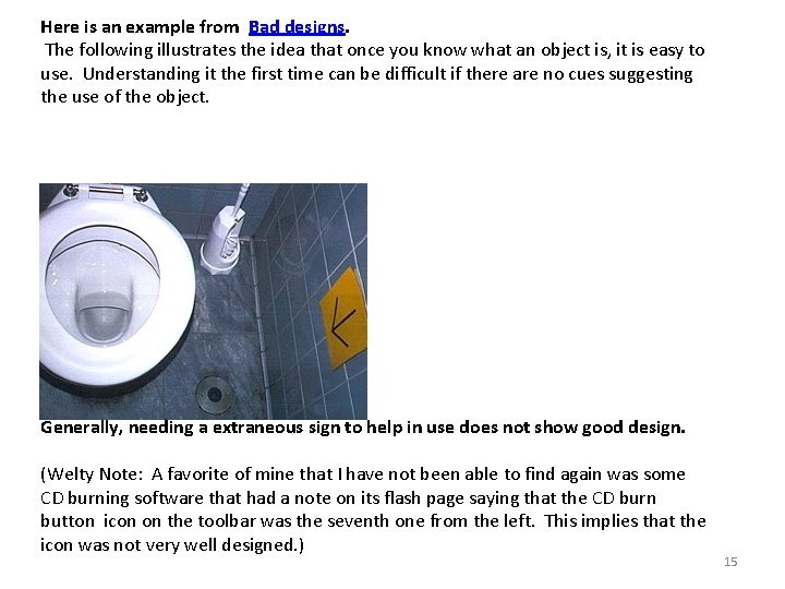
Here is an example from Bad designs. The following illustrates the idea that once you know what an object is, it is easy to use. Understanding it the first time can be difficult if there are no cues suggesting the use of the object. Where's the flusher? Generally, needing a extraneous sign to help in use does not show good design. (Welty Note: A favorite of mine that I have not been able to find again was some CD burning software that had a note on its flash page saying that the CD burn button icon on the toolbar was the seventh one from the left. This implies that the icon was not very well designed. ) 15

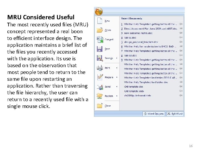
MRU Considered Useful The most recently used files (MRU) concept represented a real boon to efficient interface design. The application maintains a brief list of the files you recently accessed with the application. Its use is based on the observation that most people tend to return to the same file upon restarting an application. Rather than traversing the file hierarchy, the user can return to a recently used file with a single mouse click. 16

MRU Considered Useful (continued) Any document-centric application can benefit from the use of MRU lists. Its benefits are not limited to document editing applications, such as text, sound, and graphics editors, but also any application in which the user deals with conceptual objects, such as employee profiles, reports, and even address books. Rather than being a feature, the MRU list should be regarded as a standard. (Welty note: Another bad example is that some applications always go back to a default directory when you Open or Save a file. This means you must navigate through the directory structure each time. It would be more efficient of user time if the system always opened the dialogs in the directory previously used. ) (Welty note: This does not apply to menu items. It has been found that rearranging menu items to put the most often used one first causes problems. ) Microsoft Paint – Always brings me to a directory that is far from where I want to be. I have tried to finds a way to change its start-up directory but have 17 been unsuccessful.