CORRELATION COEFFICIENT Analyze Scatterplots Linear Associations A scatterplot


 uses the formula: This is the formula used to")


- Slides: 18
CORRELATION COEFFICIENT Analyze Scatterplots
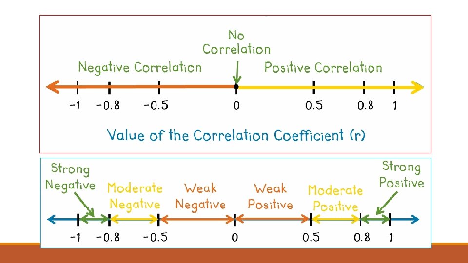
Linear Associations A scatterplot shows a relationship between two sets of data. The line-of-best-fit is drawn to help identify if the data has a positive, negative or no correlation. How close the dots are to the line determine how strong the “Linear Association” is. The strength of this linear association is conveyed through the correlation coefficient.
Linear Associations Line of Best Fit = is the line that best approximates the linear relationship between two data sets Linear Regression = models the relationship between two variables in a data set by producing a line of best fit Linear Regression Equation = the equation that describes the line of best fit Correlation Coefficient= indicates how closely data points are to forming a straight line (conveys the strength of association). Represented by “r”
Correlation Coefficient “r” is the correlation coefficient This can be calculated for any scatter plot that appears to have a linear association. The value of the correlation coefficient is -1 ≤ r ≤ 1 where +1 is perfect positive correlation (an actual line), 0 is no correlation, and -1 is perfect negative correlation (an actual line with negative slope).
Paycheck & Hours Worked If you had a job and made $8. 25 per hour, the graph at the right would show the amount of your paycheck after working x number of hours. In this example, r = 1 because the hours you work and the amount of money you earn, show PERFECT Positive Correlation. The slope is 8. 25 not 1. The r value and the slope are two different things. The correlation coefficient will have the SAME sign as the slope but rarely the same value.
Cost of Property & Number of Spaces from GO on Monopoly Game Board This graph shows another positive correlation. The correlation coefficient, r = 0. 9. This means that there is STRONG positive correlation.
Speed of Car & Fuel Efficiency This graph shows a positive correlation. The correlation coefficient, r = 0. 7. This means that there is MODERATE positive correlation.
Duration of a Rollercoaster Ride & the Height of the First Drop This graph shows a positive correlation. The correlation coefficient, r = 0. 3 This means that there is WEAK positive correlation.
GPA & Weight of Student There is no relationship between grade point average and the weight of a student. The correlation coefficient, r = 0. This means that there is NO correlation.
Negative Correlations Price of a Used Car and Number of Miles on the Odometer Amount of Gas to Heat a House and Average Monthly Outdoor Temperature The correlation coefficient, r = -0. 7 The correlation coefficient, r = -0. 9 This means that there is a MODERATE Negative Correlation. This means that there is a STRONG Negative Correlation.
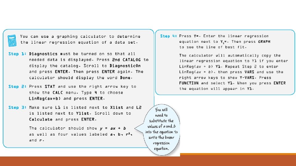
r can be calculated by a formula, using a graphing calculator, or an Excel spreadsheet. Example: How strong of a relationship is there between the length of your forearm and the length of your foot in centimeters? Enter the data into a graphing calculator. Forearm Length (cm) Foot Length (cm) 22 24 20 19 24 24 21 23 25 23 18 18 20 21 23 23 24 25 20 22 19 19 25 25 23 22 22 23 24 24 20 21 18 19 24 23 24 27 21 24 22 22
Formula to Calculate r you won’t have to do this by hand
How do you calculate r with a graphing calculator?
The Calculator (or excel spreadsheet) uses the formula: This is the formula used to calculate the correlation coefficient. The focus of this class is not to use this formula but to understand how we can obtain the correlation coefficient using technology and what the correlation coefficient means.
How do you calculate r in Excel or a Google Sheet? Where your data starts in the first column. Where your data ends in the first column. r can be calculated by a formula, using a graphing calculator, or an Excel spreadsheet. Step 1: Enter data into two columns on the spreadsheet. Where your Step 2: Highlight or click on the box where you want the data starts in the correlation coefficient displayed. second Step 3: In Google Sheets type in the formula column. ◦ =CORREL(A____: A____, B____: B______) ◦ Click enter. ◦ Reformat your correlation coefficient to the number of decimal places you desire. Where your data ends in the second column.
Google Sheet The correlation coefficient is calculated. Type in formula with correct cell ranges. Reduce the number of decimal places. Is this a strong, moderate or weak correlation?