Corrections and Normalization in microarrays data analysis Mauro

- Slides: 42

Corrections and Normalization in microarrays data analysis Mauro Delorenzi

Acknowledgments Uni. Cal. Statistics Berkeley / WEHI Bioinformatics Terry Speed (Berkeley / WEHI) Yee Hwa Yang (Berkeley) Sandrine Dudoit (Stanford) Ingrid Lönnstedt (Uppsala) Yongchao Ge (Berkeley) Natalie Thorne (WEHI) Mauro Delorenzi (WEHI) Collaborations with: Peter Mac CI, Melb. Brown-Botstein lab, Stanford Matt Callow (LBNL) CSIRO Image Analysis Group Most slides were taken from our collection

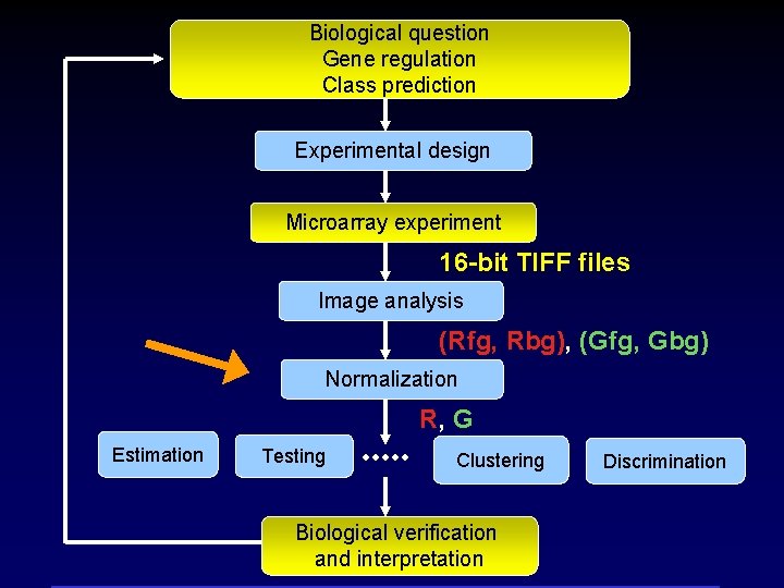
Biological question Gene regulation Class prediction Experimental design Microarray experiment 16 -bit TIFF files Image analysis (Rfg, Rbg), (Gfg, Gbg) Normalization R, G Estimation Testing Clustering Biological verification and interpretation Discrimination

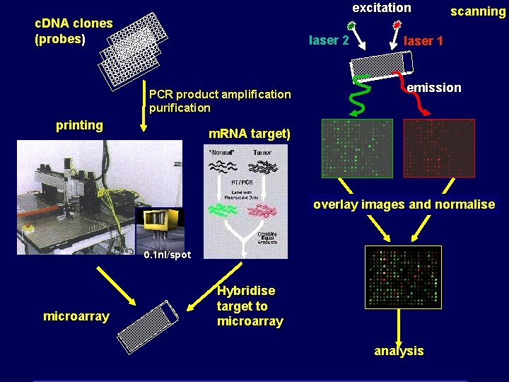
excitation c. DNA clones (probes) laser 2 PCR product amplification purification printing scanning laser 1 emission m. RNA target) overlay images and normalise 0. 1 nl/spot microarray Hybridise target to microarray analysis

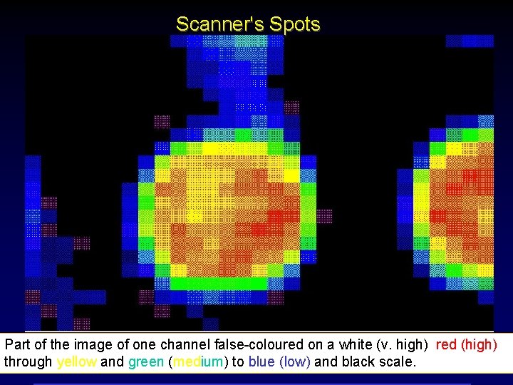
Scanner's Spots Part of the image of one channel false-coloured on a white (v. high) red (high) through yellow and green (medium) to blue (low) and black scale.

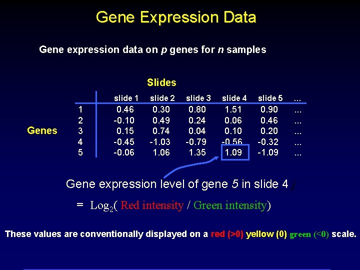
Gene Expression Data Gene expression data on p genes for n samples Slides Genes 1 2 3 4 5 slide 1 slide 2 slide 3 slide 4 slide 5 … 0. 46 -0. 10 0. 15 -0. 45 -0. 06 0. 30 0. 49 0. 74 -1. 03 1. 06 0. 80 0. 24 0. 04 -0. 79 1. 35 1. 51 0. 06 0. 10 -0. 56 1. 09 0. 90 0. 46 0. 20 -0. 32 -1. 09 . . . . Gene expression level of gene 5 in slide 4 j = Log 2( Red intensity / Green intensity) These values are conventionally displayed on a red (>0) yellow (0) green (<0) scale.

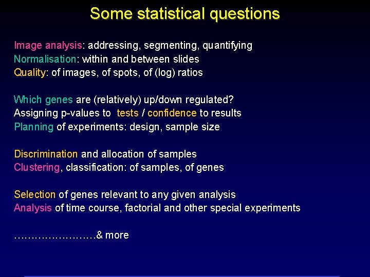
Some statistical questions Image analysis: addressing, segmenting, quantifying Normalisation: within and between slides Quality: of images, of spots, of (log) ratios Which genes are (relatively) up/down regulated? Assigning p-values to tests / confidence to results Planning of experiments: design, sample size Discrimination and allocation of samples Clustering, classification: of samples, of genes Selection of genes relevant to any given analysis Analysis of time course, factorial and other special experiments …………& more

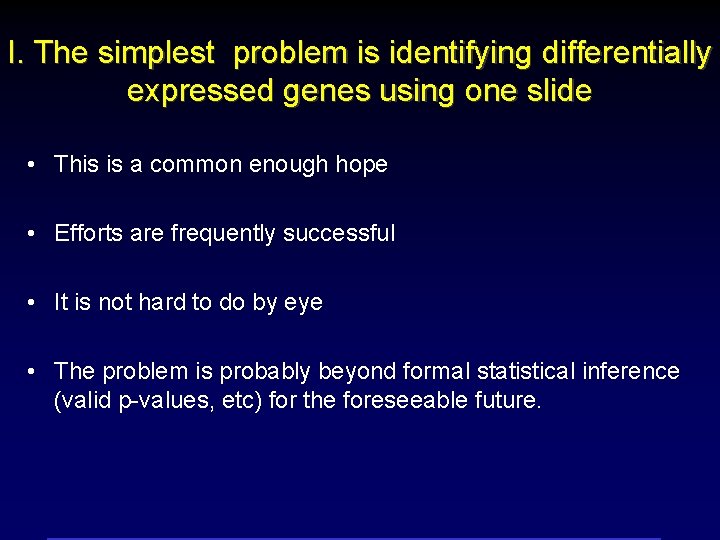
I. The simplest problem is identifying differentially expressed genes using one slide • This is a common enough hope • Efforts are frequently successful • It is not hard to do by eye • The problem is probably beyond formal statistical inference (valid p-values, etc) for the foreseeable future.

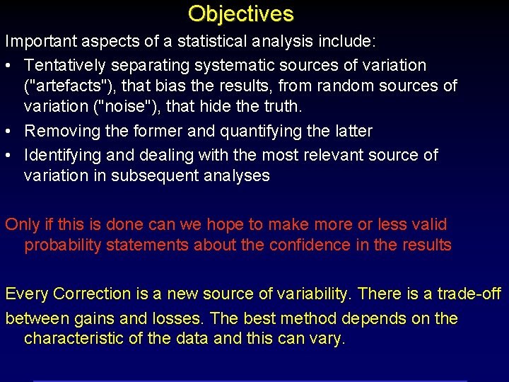
Objectives Important aspects of a statistical analysis include: • Tentatively separating systematic sources of variation ("artefacts"), that bias the results, from random sources of variation ("noise"), that hide the truth. • Removing the former and quantifying the latter • Identifying and dealing with the most relevant source of variation in subsequent analyses Only if this is done can we hope to make more or less valid probability statements about the confidence in the results Every Correction is a new source of variability. There is a trade-off between gains and losses. The best method depends on the characteristic of the data and this can vary.

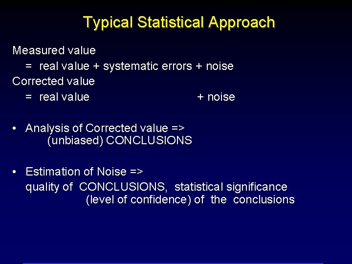
Typical Statistical Approach Measured value = real value + systematic errors + noise Corrected value = real value + noise • Analysis of Corrected value => (unbiased) CONCLUSIONS • Estimation of Noise => quality of CONCLUSIONS, statistical significance (level of confidence) of the conclusions

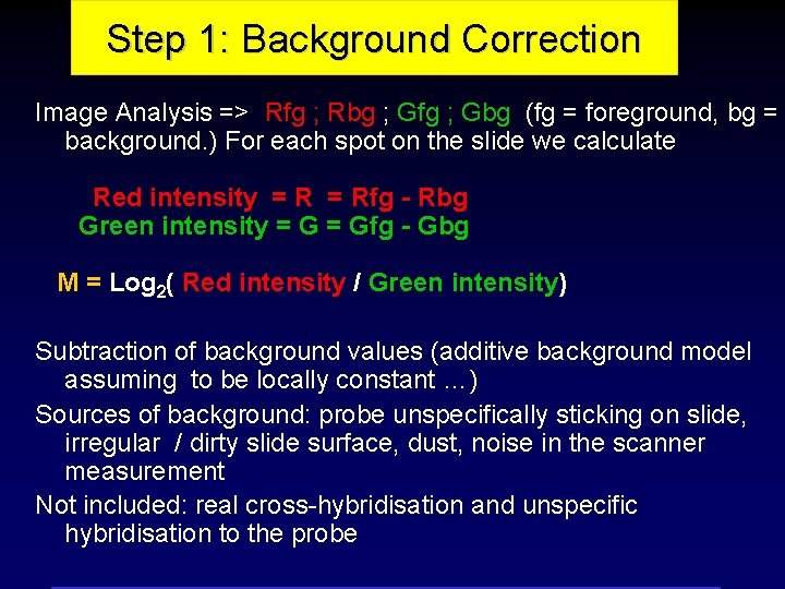
Step 1: Background Correction Image Analysis => Rfg ; Rbg ; Gfg ; Gbg (fg = foreground, bg = background. ) For each spot on the slide we calculate Red intensity = Rfg - Rbg Green intensity = Gfg - Gbg M = Log 2( Red intensity / Green intensity) Subtraction of background values (additive background model assuming to be locally constant …) Sources of background: probe unspecifically sticking on slide, irregular / dirty slide surface, dust, noise in the scanner measurement Not included: real cross-hybridisation and unspecific hybridisation to the probe

The intensity pairs (R, G) are highly processed data and the methods of image processing and background correction of the laser scan images can have a large impact. Before applying normalisation, inference, cluster analysis and the like, it is important to identify and remove systematic sources of variation such as due to different labeling efficiencies and scanning properties of the two dyes or spatial inhomogeneities. With many different users and protocols, the portion of the variation due to systematic effects can vary substantially. There are many sources of systematic variation which affect the measured gene expression levels. Normalisation is the term used to describe the process of re moving such variation. Until the variation is properly accounted for or modelled, there is no question of the system being in statistical control and hence no basis for a statistical model to describe chance variation.

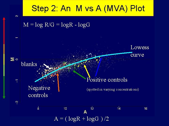
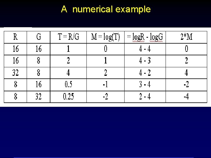
Step 2: An M vs A (MVA) Plot M = log R/G = log. R - log. G Lowess curve blanks Positive controls Negative controls (spotted in varying concentrations) A = ( log. R + log. G ) /2

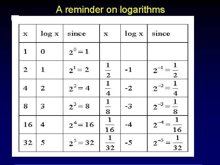
A reminder on logarithms

A numerical example

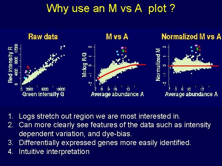
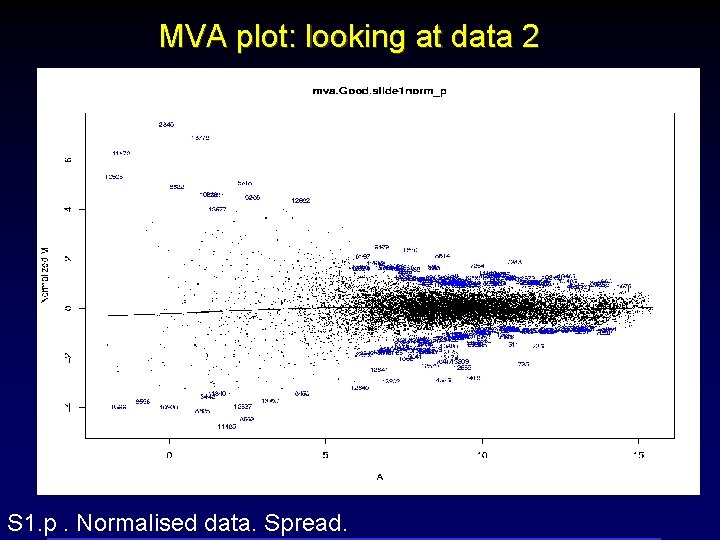
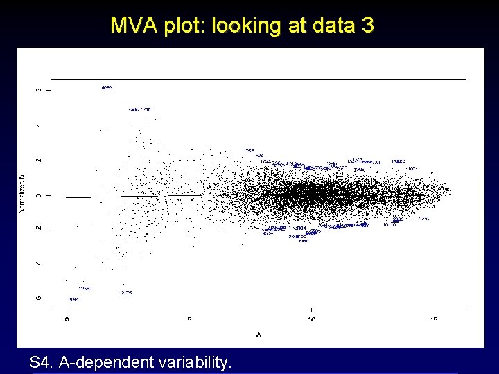
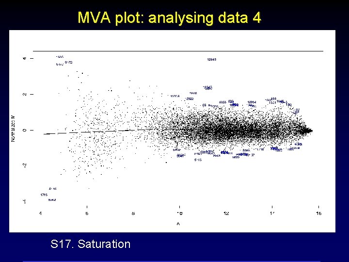
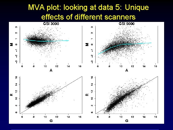
Why use an M vs A plot ? 1. Logs stretch out region we are most interested in. 2. Can more clearly see features of the data such as intensity dependent variation, and dye-bias. 3. Differentially expressed genes more easily identified. 4. Intuitive interpretation

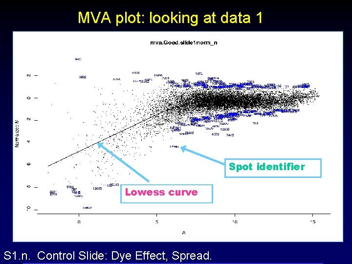
MVA plot: looking at data 1 Spot identifier Lowess curve S 1. n. Control Slide: Dye Effect, Spread.

MVA plot: looking at data 2 S 1. p. Normalised data. Spread.

MVA plot: looking at data 3 S 4. A-dependent variability.

MVA plot: analysing data 4 S 17. Saturation

MVA plot: looking at data 5: Unique effects of different scanners

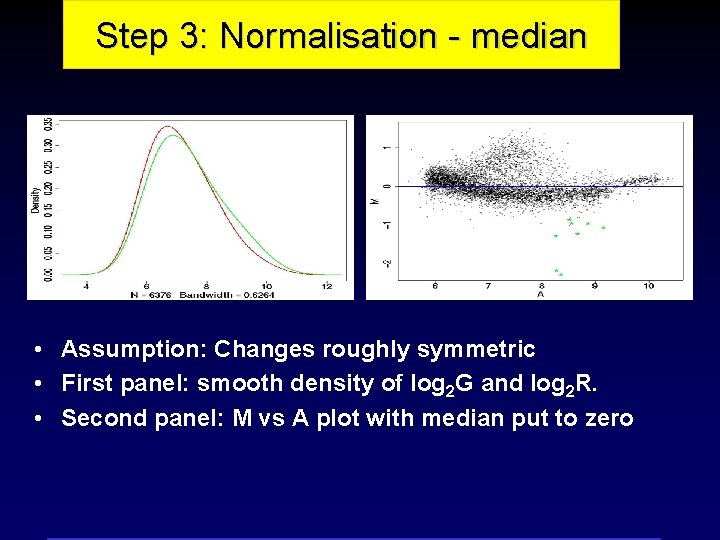
Step 3: Normalisation - median • Assumption: Changes roughly symmetric • First panel: smooth density of log 2 G and log 2 R. • Second panel: M vs A plot with median put to zero

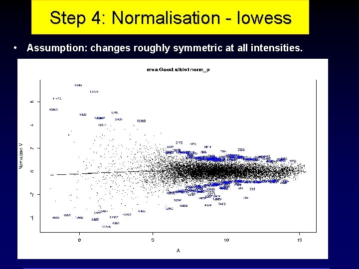
Step 4: Normalisation - lowess • Assumption: changes roughly symmetric at all intensities.

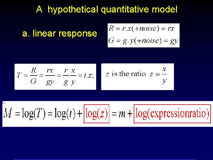
A hypothetical quantitative model a. linear response

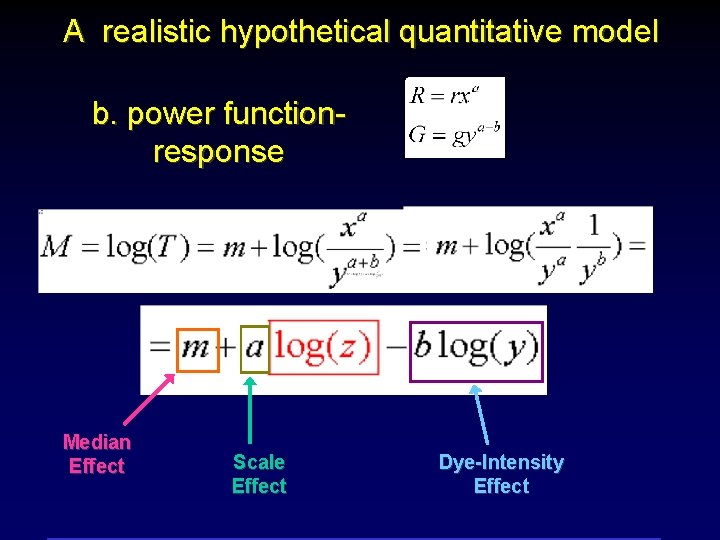
A realistic hypothetical quantitative model b. power functionresponse Median Effect Scale Effect Dye-Intensity Effect

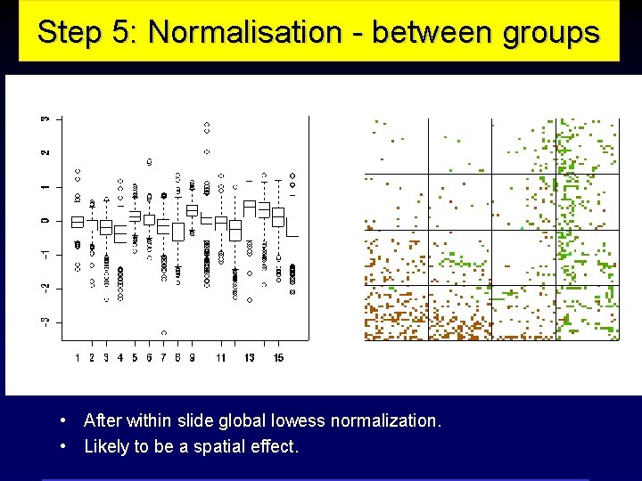
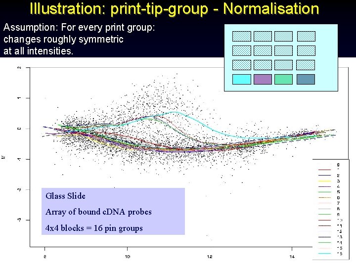
Log-ratios Step 5: Normalisation - between groups Print-tip groups • After within slide global lowess normalization. • Likely to be a spatial effect.

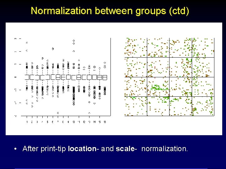
Log-ratios Normalization between groups (ctd) Print-tip groups • After print-tip location- and scale- normalization.

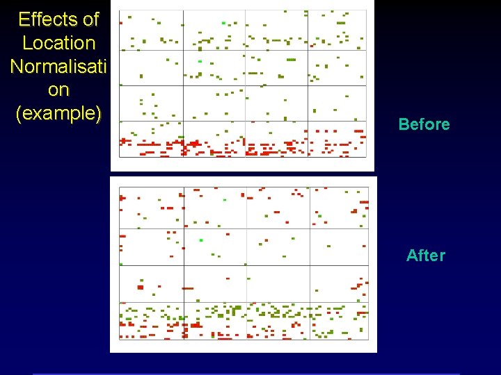
Effects of Location Normalisati on (example) Before After

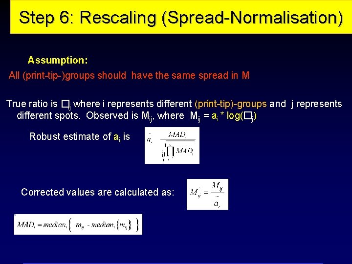
Step 6: Rescaling (Spread-Normalisation) Assumption: All (print-tip-)groups should have the same spread in M True ratio is �ij where i represents different (print-tip)-groups and j represents different spots. Observed is Mij, where Mij = ai * log(�ij) Robust estimate of ai is Corrected values are calculated as:

Illustration: print-tip-group - Normalisation Assumption: For every print group: changes roughly symmetric at all intensities. Glass Slide Array of bound c. DNA probes 4 x 4 blocks = 16 pin groups

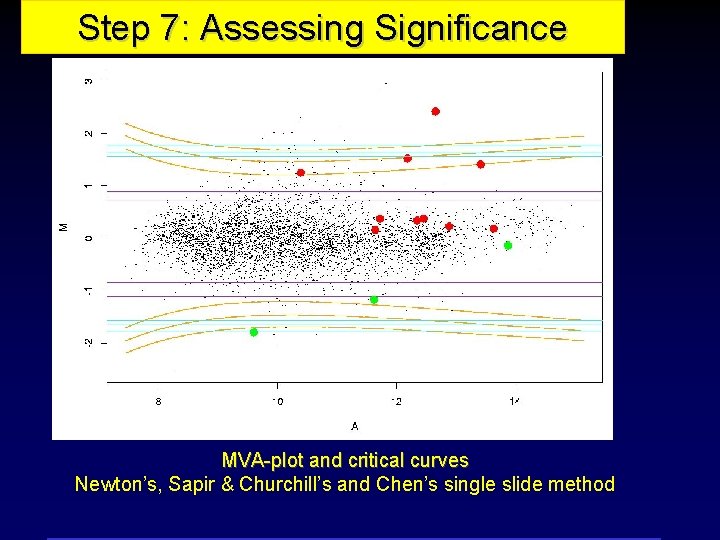
Step 7: Assessing Significance MVA-plot and critical curves Newton’s, Sapir & Churchill’s and Chen’s single slide method

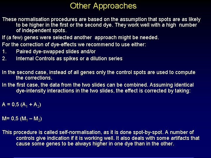
Other Approaches These normalisation procedures are based on the assumption that spots are as likely to be higher in the first or the second dye. They work well with a high number of independent spots. If (a few) genes were selected another approach might be needed. For the correction of dye-effects we recommend to use either: 1. Paired dye-swapped slides and/or 2. Internal Controls as spikes or a dilution series In the second case, instead of all genes only the control spots are used to compute the corrections. In the first case, the data from the two slides can be combined. Assuming identical dye-intensity interactions in the two slides, the effect is corrected by taking: A = 0, 5 (A 1 + A 2) M= 0, 5 (M 1 – M 2) This procedure is called self-normalisation, as it is done spot-by-spot. A number of controls give indication if it is working well. It also deals with some artifacts that cause some genes to be always higher in one dye than in the other.

II. The second simplest problem is identifying differentially expressed genes using replicated slides There a number of different aspects: • First, between-slide normalization; then • What should we look at: averages, SDs t-statistics, other summaries? • How should we look at them? • Can we make valid probability statements?

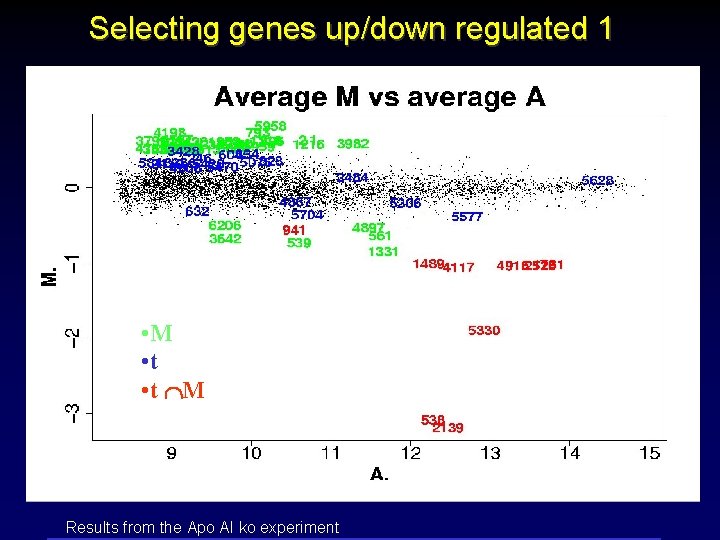
Selecting genes up/down regulated 1 • M • t M Results from the Apo AI ko experiment

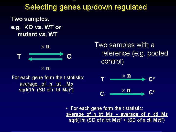
Selecting genes up/down regulated Two samples. e. g. KO vs. WT or mutant vs. WT n T C n For each gene form the t statistic: average of n trt Ms sqrt(1/n (SD of n trt Ms)2) Two samples with a reference (e. g. pooled control) T C n n C* C* • For each gene form the t statistic: average of n trt Ms - average of n ctl Ms sqrt(1/n (SD of n trt Ms)2 + (SD of n ctl Ms)2)

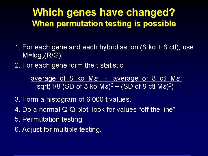
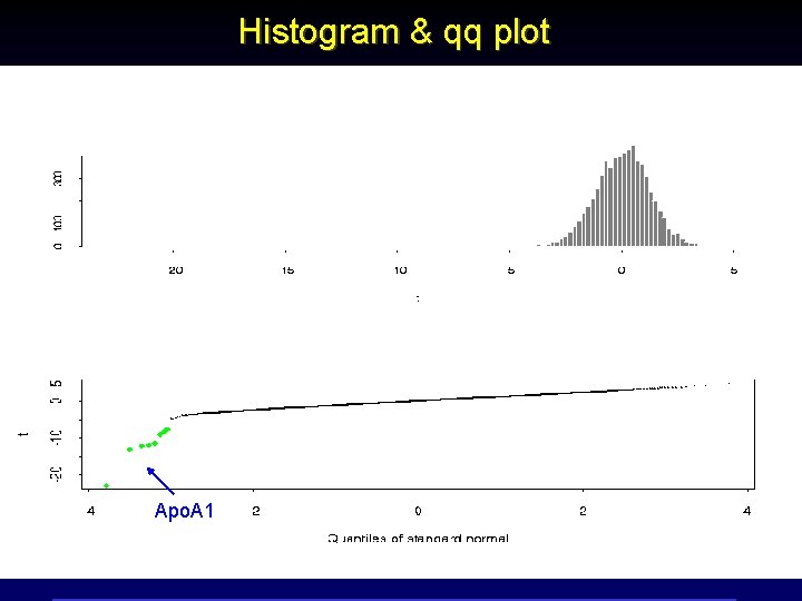
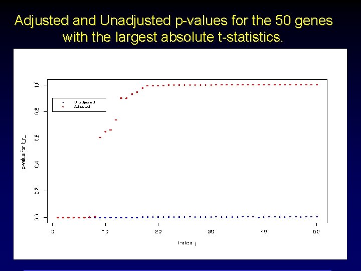
Which genes have changed? When permutation testing is possible 1. For each gene and each hybridisation (8 ko + 8 ctl), use M=log 2(R/G). 2. For each gene form the t statistic: average of 8 ko Ms - average of 8 ctl Ms sqrt(1/8 (SD of 8 ko Ms)2 + (SD of 8 ctl Ms)2) 3. Form a histogram of 6, 000 t values. 4. Do a normal Q-Q plot; look for values “off the line”. 5. Permutation testing. 6. Adjust for multiple testing.

Histogram & qq plot Apo. A 1

Adjusted and Unadjusted p-values for the 50 genes with the largest absolute t-statistics.

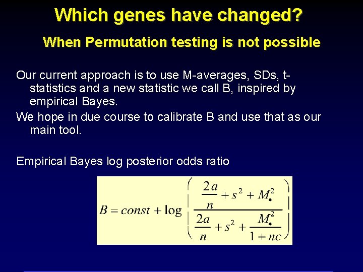
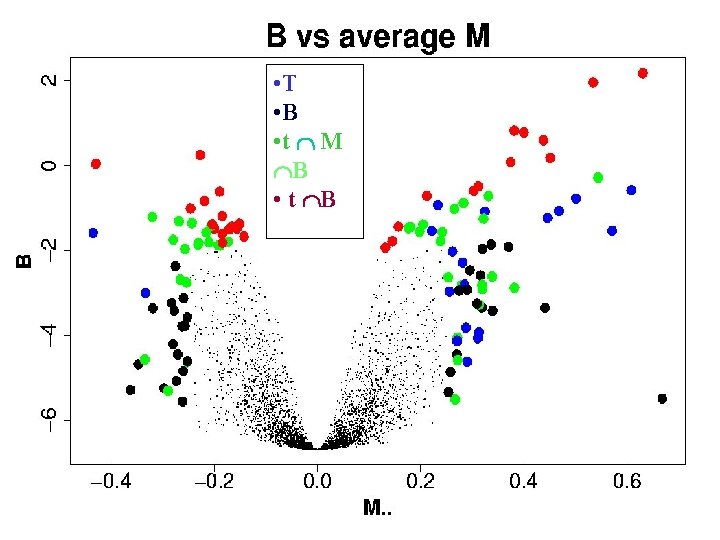
Which genes have changed? When Permutation testing is not possible Our current approach is to use M-averages, SDs, tstatistics and a new statistic we call B, inspired by empirical Bayes. We hope in due course to calibrate B and use that as our main tool. Empirical Bayes log posterior odds ratio


Remarks for multiarrays experiments • Microarray experiments typically have thousands of genes, but only few (1 -10) replicates for each gene. • Averages can be driven by outliers. • Ts can be driven by tiny variances. • B = LOR will, we hope – use information from all the genes – combine the best of M. and T – avoid the problems of M. and T

Some web sites: Technical reports, talks, software etc. http: //www. stat. berkeley. edu/users/terry/zarray/Html/ Especially: Dudoit et al: “Statistical methods for …” Yee Hwa Yang et al. “Normalization for c. DNA Microarray Data” Statistical software R “GNU’s S” http: //lib. stat. cmu. edu/R/CRAN/ Packages within R environment: -- Spot http: //www. cmis. csiro. au/iap/spot. htm -- SMA (statistics for microarray analysis) http: //www. stat. berkeley. edu/users/terry/zarray/Software /smacode. html