Control Charts Why Use Them By Marcy Bolek
Control Charts Why Use Them? By: Marcy Bolek – Alloway
Really, Control Charts? ! !! !! G N I R 5 O B 4 CHARTS 3 2 1 0 Category 1 Category 2 Series 1 Category 3 Column 1 Category 4 Column 2

Not for me, right?
Electronic Code of Federal Regulations
40 CFR 136. 7 https: //www. ecfr. gov/ • Title 40 • Part 136. 7 – Quality Assurance and Quality Control • C(1) – “Incorporate the following twelve quality control elements, where applicable, into the laboratory's documented standard operating procedure (SOP) for performing compliance analyses when using an approved part 136 method when the method lacks such QA/QC procedures. ” • “ One or more of the twelve QC elements may not apply to a given method and may be omitted if a written rationale is provided indicating why the element(s) is/are inappropriate for a specific method. ” • C(1)(viii) – Control Charts or other trend analysis
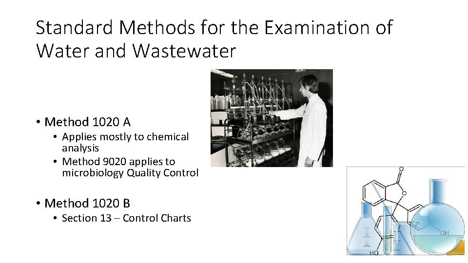
Standard Methods for the Examination of Water and Wastewater • Method 1020 A • Applies mostly to chemical analysis • Method 9020 applies to microbiology Quality Control • Method 1020 B • Section 13 – Control Charts
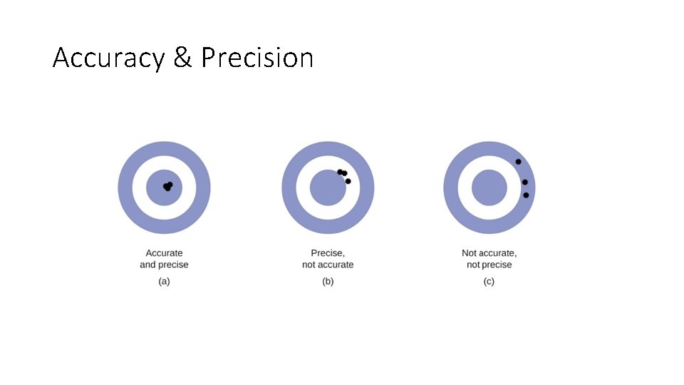
Accuracy & Precision
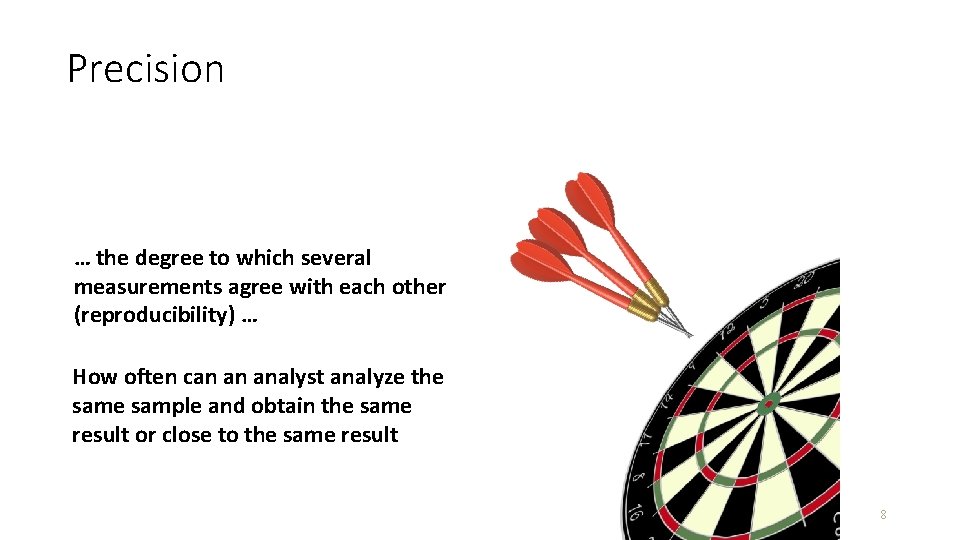
Precision … the degree to which several measurements agree with each other (reproducibility) … How often can an analyst analyze the sample and obtain the same result or close to the same result 8
Precision & Range Control Charts • Perform identical analysis on two portions of the sample (duplicate) • Perform identical analysis on two portions of the sample that are spiked (matrix spike/matrix spike duplicate) • 20 or more data points used to generate chart
Evaluation of Precision • Calculate the range (R): R = │Value 1 – Value 2│ _ • Calculate the Average Range (R): _ R = (ΣR) / n
Evaluation of Precision • Range Charts are used to evaluate precision • Range Charts typically plot • Upper Warning Level (UWL) • Upper Control Limit (UCL) • Average Range of data set (mean) • Confidence Limits 95% Confidence Limit 99% Confidence Limit
Precision & Range Control Charts • Calculate range of duplicate determinations in data set • Calculate average range • Calculate UWL • Calculate UCL
Precision & Range Control Charts UCL Difference UWL Mean range Sample Number
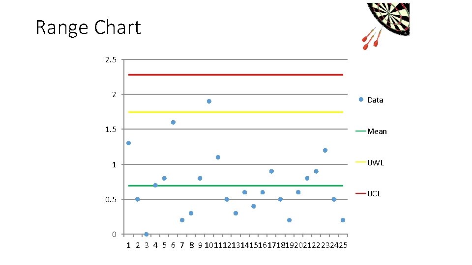
Range Chart 2. 5 2 Data 1. 5 Mean UWL 1 UCL 0. 5 0 1 2 3 4 5 6 7 8 9 10111213141516171819202122232425
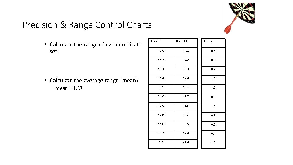
Precision & Range Control Charts • Calculate the range of each duplicate set • Calculate the average range (mean) mean = 1. 37 Result 1 Result 2 Range 10. 6 11. 2 0. 6 14. 7 13. 9 0. 8 10. 1 11. 0 0. 9 15. 4 17. 9 2. 5 18. 3 15. 1 3. 2 21. 9 18. 7 3. 2 19. 9 18. 8 1. 1 12. 5 11. 7 0. 8 14. 6 0. 2 18. 7 19. 4 0. 7 23. 3 24. 4 1. 1
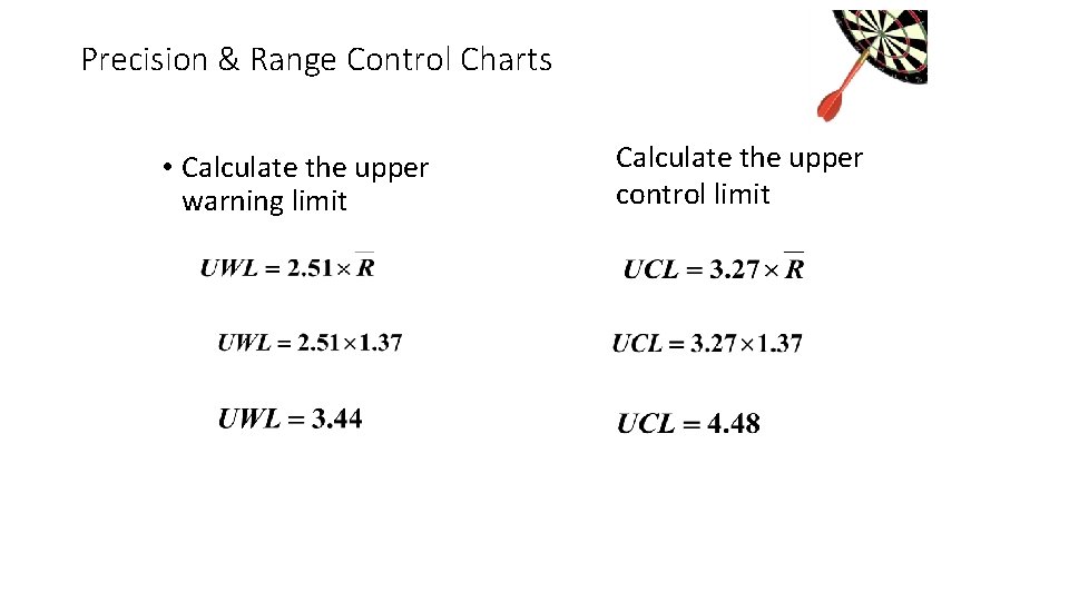
Precision & Range Control Charts • Calculate the upper warning limit Calculate the upper control limit
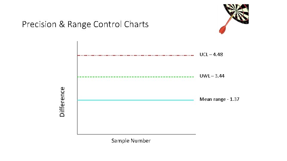
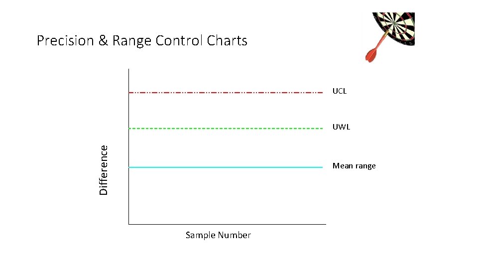
Precision & Range Control Charts UCL – 4. 48 Difference UWL – 3. 44 Mean range - 1. 37 Sample Number
Evaluation of Precision • If there is a wide variety in amounts of analyte, classify precision data into levels • For example: • Low – 1 to 10 mg/L • High – 100 mg/L • Develop a separate chart for each level
Precision • Relative Percent Difference (RPD) RPD = Difference * 100 Average • Precision of High Level Duplicate • Precision of Low Level Duplicate
Accuracy … the degree to which the measurement approaches the “true value”… 20
Evaluation of Accuracy • Analyze sample containing known concentration of analyte • QC sample run at method specified frequency • 20 data points used to make chart
Accuracy & Means Control Charts • Analyze sample containing known concentration of analyte • • • Can be QC standard Initial Calibration Verification Continuing Calibration Verification Laboratory Control Standard Laboratory Fortified Blank • Matrix spike results are charted using means control chart • 20 data points used to make chart
Accuracy & Means Control Charts • Confidence Limits • Range within which we can state the probability that the true value lies within this range • 68% confidence limit: mean ± 1 SD • 95% confidence limit: mean ± 2 SD • 99% confidence limit: mean ± 3 SD
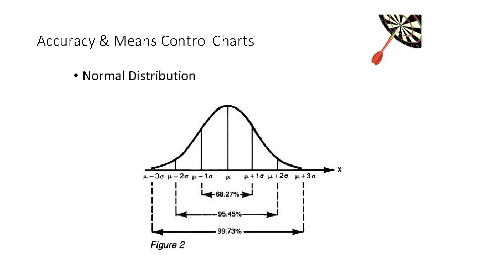
Accuracy & Means Control Charts • Normal Distribution
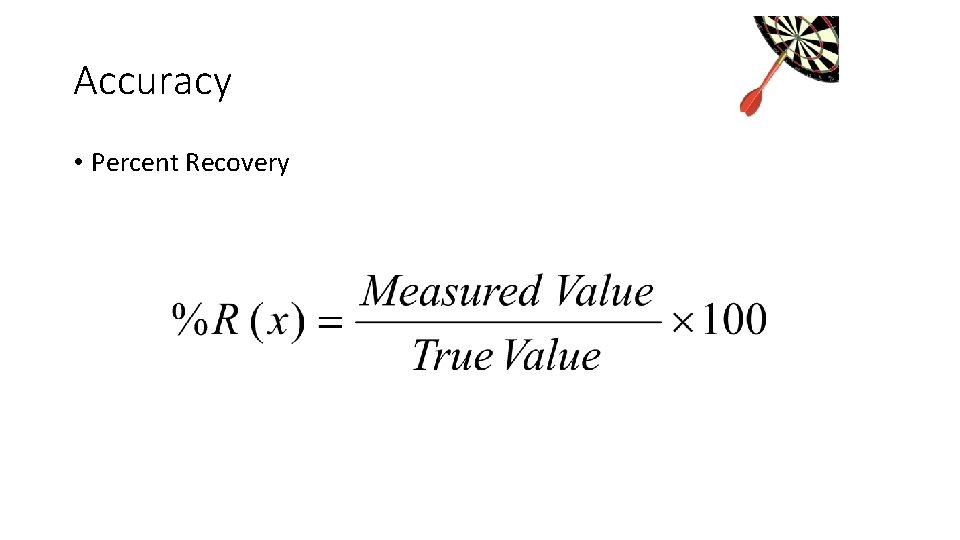
Accuracy • Percent Recovery
Accuracy & Means Control Charts • Calculate the mean • Average of the data set • Calculate the standard deviation • Use sample standard deviation
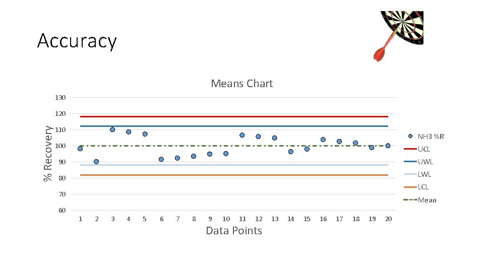
Accuracy Means Chart 130 % Recovery 120 110 NH 3 %R 100 UCL 90 UWL 80 LWL LCL 70 Mean 60 1 2 3 4 5 6 7 8 9 10 11 12 Data Points 13 14 15 16 17 18 19 20
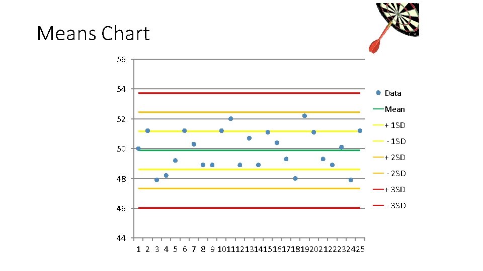
Means Chart 56 54 Data Mean 52 + 1 SD - 1 SD 50 + 2 SD - 2 SD 48 + 3 SD - 3 SD 46 44 1 2 3 4 5 6 7 8 9 10111213141516171819202122232425
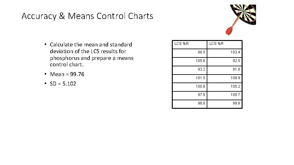
Accuracy & Means Control Charts • Calculate the mean and standard deviation of the LCS results for phosphorus and prepare a means control chart. • Mean = 99. 76 • SD = 5. 102 LCS %R 98. 5 103. 4 105. 6 92. 5 93. 2 91. 8 101. 5 108. 9 100. 8 105. 2 97. 9 100. 7 96. 8 99. 8
Accuracy & Means Control Charts • Calculate the UWL = mean + (2 x SD) = 99. 76 + (2 x 5. 102) = 99. 76 +10. 204 = 109. 96 • Calculate the LWL = mean – (2 x SD) = 99. 76 – (2 x 5. 102) = 99. 76 – (10. 204) = 89. 56
Accuracy & Means Control Charts • Calculate the UCL = mean + (3 x SD) = 99. 76 + (3 x 5. 102) = 99. 76+ 15. 306 = 115. 07 • Calculate the LCL = mean – (3 x SD) = 99. 76 – (3 x 5. 102) = 99. 76 – (15. 306) = 84. 45
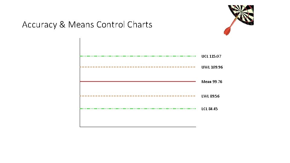
Accuracy & Means Control Charts UCL 115. 07 UWL 109. 96 Mean 99. 76 LWL 89. 56 LCL 84. 45
Control Charts • Importance of Control Chart • point out problems as they occur • Detect trends which can lead to out-of-control conditions • documentation that analysis was in control at a specified time • Indication of improving performance when limits are narrowed
Control Charts • Trends • 5 to 7 consecutive points with an increasing or decreasing slope • Requires corrective action • Corrective action must be documented
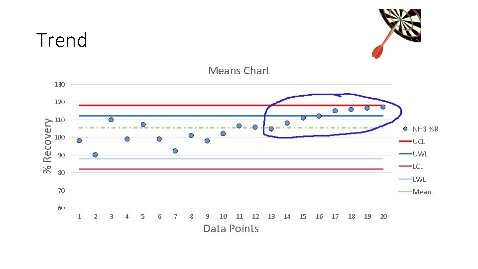
Trend Means Chart 130 % Recovery 120 110 NH 3 %R 100 UCL UWL 90 LCL 80 LWL 70 Mean 60 1 2 3 4 5 6 7 8 9 10 11 12 Data Points 13 14 15 16 17 18 19 20
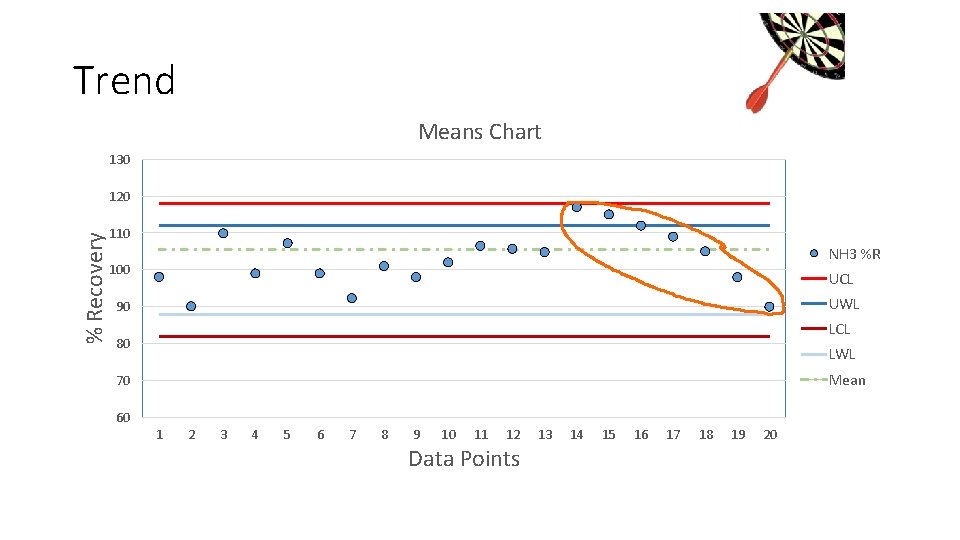
Trend Means Chart 130 % Recovery 120 110 NH 3 %R 100 UCL UWL 90 LCL 80 LWL Mean 70 60 1 2 3 4 5 6 7 8 9 10 11 12 Data Points 13 14 15 16 17 18 19 20
Control Charts • Shifts • 5 to 7 consecutive points above or below the mean • Requires corrective action • Corrective action must be documented
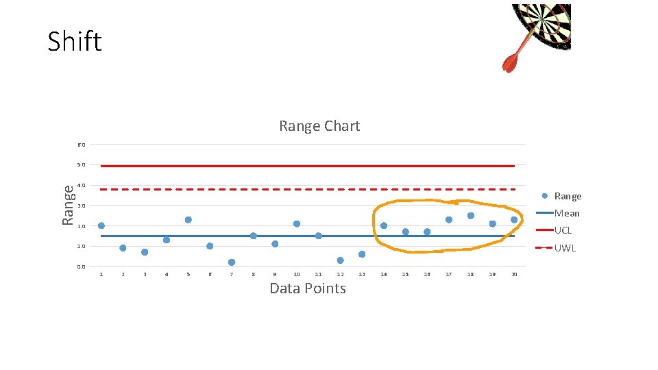
Shift Range Chart 6. 0 Range 5. 0 4. 0 Range 3. 0 Mean 2. 0 UCL 1. 0 UWL 0. 0 1 2 3 4 5 6 7 8 9 10 11 12 Data Points 13 14 15 16 17 18 19 20
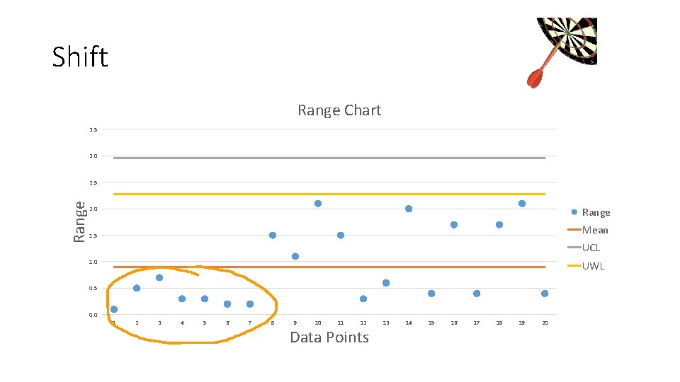
Shift Range Chart 3. 5 3. 0 Range 2. 5 2. 0 Range Mean 1. 5 UCL 1. 0 UWL 0. 5 0. 0 1 2 3 4 5 6 7 8 9 10 11 12 Data Points 13 14 15 16 17 18 19 20
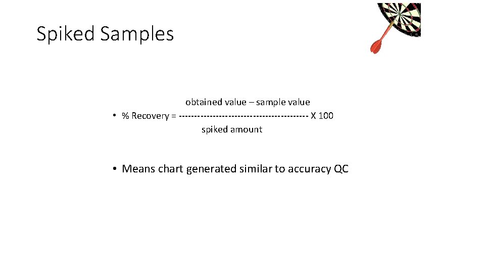
Spiked Samples obtained value – sample value • % Recovery = --------------------- X 100 spiked amount • Means chart generated similar to accuracy QC
Spiked Samples • Problems encountered with sample spikes: • High standard deviations caused by two measurements • Mixing problems, especially with two-phase samples
- Slides: 41