Contents page analysis 1 The background is plain

Contents page analysis - 1 The background is plain leaving many blank spaces, however the enlarged letter “V” boosts the colour and fills what would be a blank space. Even though it is half hidden is still shows that this contents page is from VIBE magazine which creates an identity for the magazine and I particularly like this feature. This contents Page has been edited into greyscale, the only bright colour being red. As this is the only bright colour featured on the contents Page, you are instantly drawn to it, s it’s a heart it has connotations of love which suggests that the magazine contains details of Kayne love life. “CONTENTS” has been positioned in a unique stylised way which is effective as the abstract format of the title emphasizes that VIBE magazine has a distinctive and unique theme throughout which brands the magazines identity. I like the way “contents” has been aid out therefore I shall replicate this feature into my own piece. The clothing that Kayne is wearing is representative within the R&B and POP genre, therefore this casual yet dressing look is fashionable to todays society which appeals to the magazines target audience. It also suggests that the magazines secondary purpose is fashion, celebrities and culture. The layout of the page makes it easy for the reader to understand as it only provides them with the essential information they need to be directed to the page they want to read about.

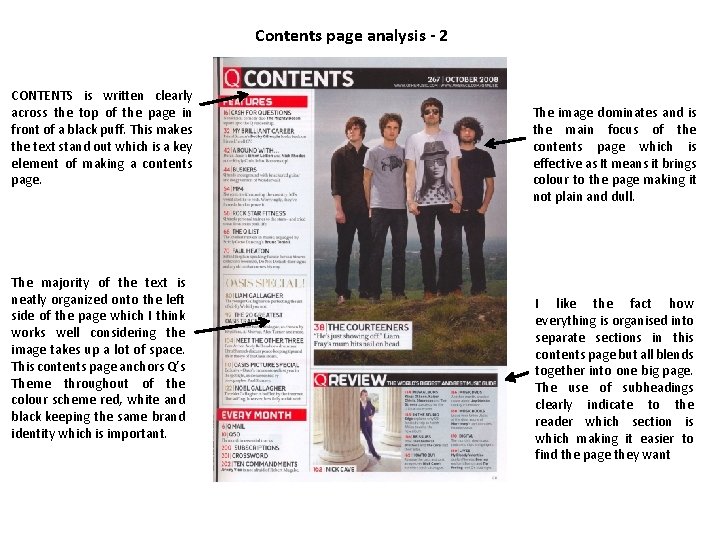
Contents page analysis - 2 CONTENTS is written clearly across the top of the page in front of a black puff. This makes the text stand out which is a key element of making a contents page. The majority of the text is neatly organized onto the left side of the page which I think works well considering the image takes up a lot of space. This contents page anchors Q’s Theme throughout of the colour scheme red, white and black keeping the same brand identity which is important. The image dominates and is the main focus of the contents page which is effective as It means it brings colour to the page making it not plain and dull. I like the fact how everything is organised into separate sections in this contents page but all blends together into one big page. The use of subheadings clearly indicate to the reader which section is which making it easier to find the page they want
- Slides: 2