Contents Chapter 1 Understanding the Desktop Publishing Process
Contents
Chapter 1 Understanding the Desktop Publishing Process Quick Links to Slide Contents Ø Ø Ø Ø Ø Defining Desktop Publishing Initiating the Desktop Publishing Process Designing the Document Creating Focus Creating Balance Creating Proportion Creating Contrast CHECKPOINT 1 Creating Directional Flow © Paradigm Publishing, Inc. Ø Ø Ø Ø 2 Establishing Consistency Evaluating Consistency Using Color Using Word 2013 in Desktop Publishing Using Online Resources Using the Windows 8 Snipping Tool CHECKPOINT 2 Desktop Publishing Terms and Definitions Contents

Defining Desktop Publishing In the mid-1980 s, the introduction of the laser printer and the inkjet printer, with their ability to produce high-quality documents in black and white as well as in color, led to the growing popularity of desktop publishing software. Ø The phrase desktop publishing, coined by Aldus Corporation president Paul Brainard in 1984, means that publishing can literally take place at your desk. Ø For simpler desktop publishing projects, Microsoft Word is a good choice; for more complex documents, high-end desktop publishing software may be more appropriate. Ø © Paradigm Publishing, Inc. 3 Contents
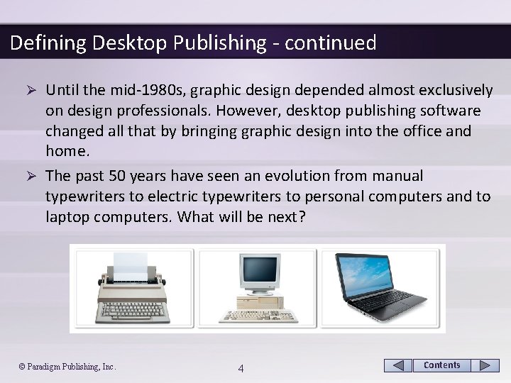
Defining Desktop Publishing - continued Until the mid-1980 s, graphic design depended almost exclusively on design professionals. However, desktop publishing software changed all that by bringing graphic design into the office and home. Ø The past 50 years have seen an evolution from manual typewriters to electric typewriters to personal computers and to laptop computers. What will be next? Ø © Paradigm Publishing, Inc. 4 Contents
Defining Desktop Publishing - continued In traditional publishing, several people may have been involved in completing a publication project, which naturally involved greater costs and time compared with today’s desktop publishing. Ø Using desktop publishing software, one person may be able to perform all of the tasks necessary to complete a project, which greatly reduces the costs of publishing documents. Ø The two approaches, however, do have a great deal in common. Ø Both approaches involve planning the project, organizing content, analyzing the layout and design, arranging design elements, typesetting, printing, and distributing the project. Ø © Paradigm Publishing, Inc. 5 Contents
Defining Desktop Publishing - continued Using the results-oriented interface of the programs in the Microsoft Office 2013 suite, you will find it easier to create, collaborate, manage, review, edit, customize, print, and publish professional-looking publications. Ø The availability of Open. Type fonts in Office 2013 also promotes cross-platform sharing between Apple computers and PCs. Ø Shared document technology, the Internet, and email provide opportunities for you to collaborate with others outside your home and office, even as you travel. Ø © Paradigm Publishing, Inc. 6 Contents
Initiating the Desktop Publishing Process The process of creating a publication begins with two steps— planning the publication and creating the content. Ø During the planning process, the desktop publisher must decide on the purpose of the publication and identify the intended audience. Ø © Paradigm Publishing, Inc. 7 Contents
Initiating the Desktop Publishing Process - continued Planning the Publication Ø Initial planning is one of the most important steps in the desktop publishing process. During this stage, consider the following: § Clearly identify the purpose of your communication. § Assess your target audience. § Determine in what form your intended audience will be exposed to your message. § Decide what you want your readers to do after reading your message. § Determine the budget for the entire project. § Collect examples of effective designs. © Paradigm Publishing, Inc. 8 Contents
Initiating the Desktop Publishing Process - continued Creating the Content Ø The most important goal in desktop publishing is to communicate the message. Ø To determine your message, identify your purpose and start organizing your material. Ø Clear and organized content combined with an attractive layout and design create an effective message. © Paradigm Publishing, Inc. 9 Contents
Designing the Document Ø As in the planning stage, consider the purpose of the document, the target audience, and the method of distribution. In addition, think about the following factors: § What feeling does the document elicit? § What is the most important information, and how can it be emphasized so that the reader can easily identify the purpose of the document? § What different types of information are presented, and how can these elements be distinguished, yet kept internally consistent? § How much space is available? © Paradigm Publishing, Inc. 10 Contents

Designing the Document - continued Ø An important first step in planning your design and layout is to prepare a thumbnail sketch, which is also known as thinking on paper. © Paradigm Publishing, Inc. 11 Contents

Designing the Document - continued Ø A good designer continually asks questions, pays attention to details, and makes thoughtful decisions. A © Paradigm Publishing, Inc. B 12 Contents

Designing the Document - continued To create a visually appealing publication, start with the same classic design concepts used by professional designers. Ø These concepts include: Ø § § § § focus balance proportion contrast directional flow consistency color © Paradigm Publishing, Inc. 13 Contents
Creating Focus The focus, or focal point, on a page is an element that draws the reader’s attention. Ø Two basic design elements used to create focus in a document are: § text created in larger, bolder, contrasting typefaces § graphic elements, such as lines, clip art images, photographs, illustrations, watermarks, and logos Ø © Paradigm Publishing, Inc. 14 Contents
Creating Focus - continued Creating Focus with Text Ø Changing the weight, size, style, or letter spacing of text, as well as applying text effects, color, rotation, shapes, or drop caps, can effectively draw the reader’s attention. Ø Grouping blocks of similar text, using a consistent alignment, and providing ample white space helps to create focus using text. White space is areas where no text or graphics are located. Ø Use white space to emphasize the main message and give the reader’s eyes a break. Consider using the 1/3 – 2/3 rule, which says that at least one-third of your page should consist of white space if the remaining two-thirds contains text and other design elements. © Paradigm Publishing, Inc. 15 Contents
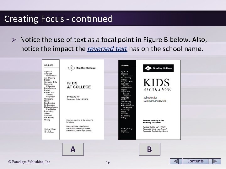
Creating Focus - continued Ø Notice the use of text as a focal point in Figure B below. Also, notice the impact the reversed text has on the school name. A © Paradigm Publishing, Inc. B 16 Contents
Creating Focus - continued Creating Focus with Titles, Headlines, and Subheadings Ø When creating titles and headlines, consider the following points: § State your title or headline using precise language. § Select easy-to-read typefaces. Legibility is of utmost importance. Readers must be able to clearly read the individual letters in the title or headline. § Size your title or headline in proportion to its importance relative to the surrounding text. § To improve readability, or the ease with which the reader’s eyes move throughout your text, keep the line length of your headline fairly short, set it in a larger point size, and include enough white space around it. © Paradigm Publishing, Inc. 17 Contents
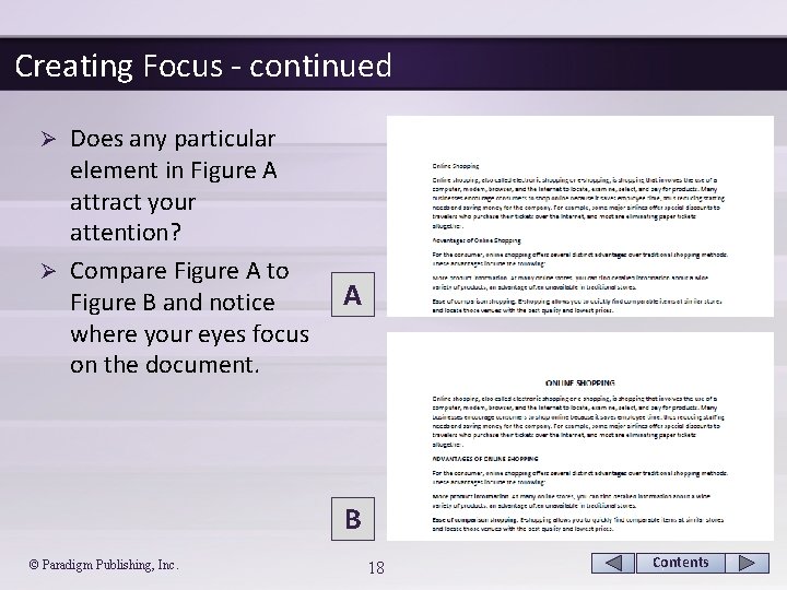
Creating Focus - continued Does any particular element in Figure A attract your attention? Ø Compare Figure A to Figure B and notice where your eyes focus on the document. Ø A B © Paradigm Publishing, Inc. 18 Contents
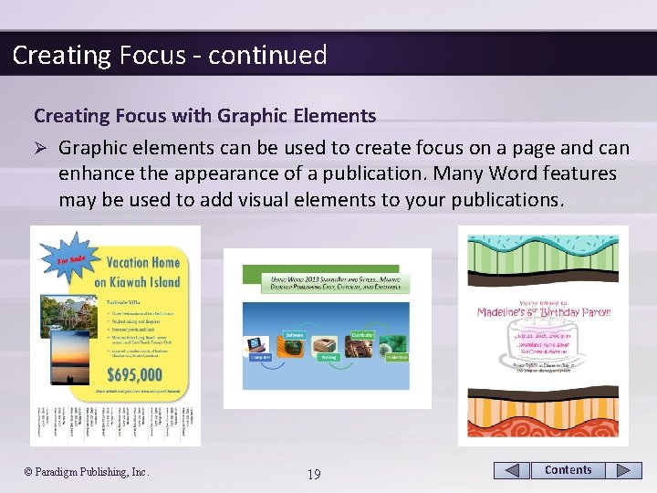
Creating Focus - continued Creating Focus with Graphic Elements Ø Graphic elements can be used to create focus on a page and can enhance the appearance of a publication. Many Word features may be used to add visual elements to your publications. © Paradigm Publishing, Inc. 19 Contents
Creating Focus - continued Creating Focus with Graphic Elements Ø When considering a graphic element as a focal point, remember the following points: § Legibility is just as important with graphic elements as it is with titles and subheads. § Communicate rather than decorate. § Less is best; keep it simple. § Crop an image if necessary to increase impact. § Position the graphic to face the text. © Paradigm Publishing, Inc. 20 Contents
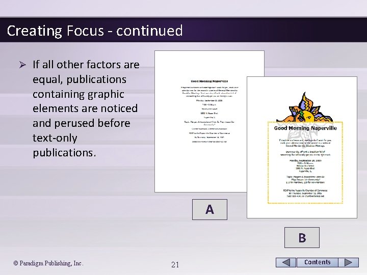
Creating Focus - continued Ø If all other factors are equal, publications containing graphic elements are noticed and perused before text-only publications. A B © Paradigm Publishing, Inc. 21 Contents
Creating Balance Attain balance by equally distributing the visual weight of various elements, such as blocks of text, graphic images, headings, lines, and white space on the page. Ø Balance is either symmetrical or asymmetrical. Ø © Paradigm Publishing, Inc. 22 Contents
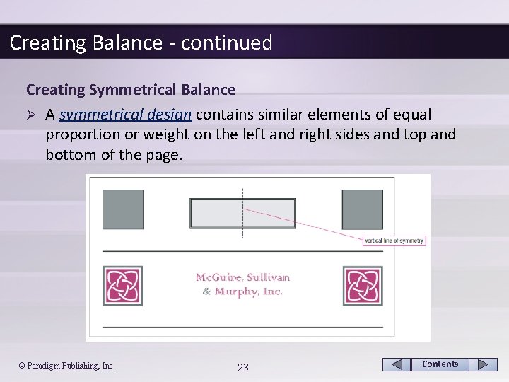
Creating Balance - continued Creating Symmetrical Balance Ø A symmetrical design contains similar elements of equal proportion or weight on the left and right sides and top and bottom of the page. © Paradigm Publishing, Inc. 23 Contents
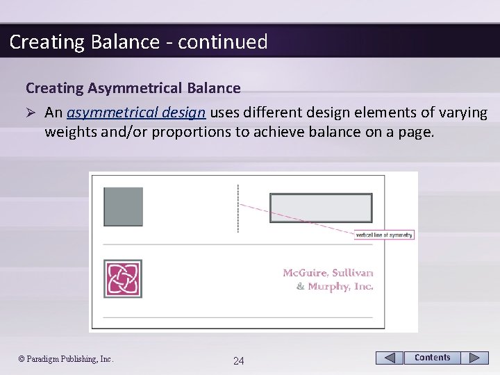
Creating Balance - continued Creating Asymmetrical Balance Ø An asymmetrical design uses different design elements of varying weights and/or proportions to achieve balance on a page. © Paradigm Publishing, Inc. 24 Contents
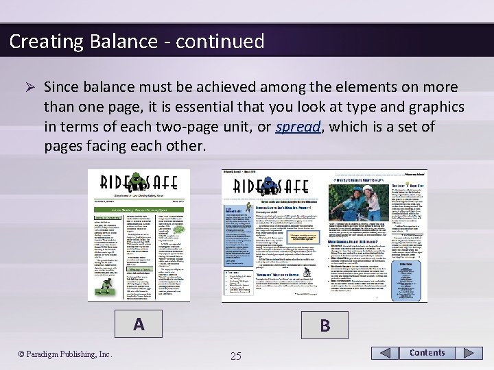
Creating Balance - continued Ø Since balance must be achieved among the elements on more than one page, it is essential that you look at type and graphics in terms of each two-page unit, or spread, which is a set of pages facing each other. A © Paradigm Publishing, Inc. B 25 Contents
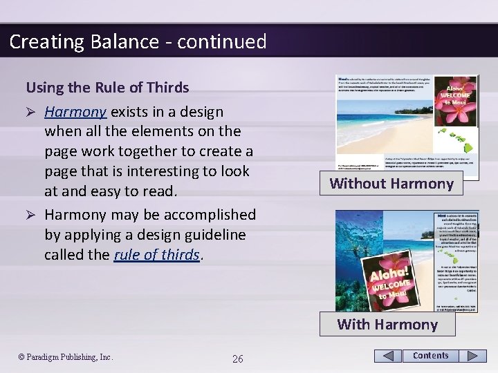
Creating Balance - continued Using the Rule of Thirds Ø Harmony exists in a design when all the elements on the page work together to create a page that is interesting to look at and easy to read. Ø Harmony may be accomplished by applying a design guideline called the rule of thirds. Without Harmony With Harmony © Paradigm Publishing, Inc. 26 Contents
Creating Proportion Readers tend to view larger elements as more important. Ø Readers also are more likely to read a page where all of the elements are in proportion to one another. Ø When incorporating the concept of proportion into your documents, consider the following points: Ø § Size design elements, whether text or graphics, according to their relative importance to the message. § Strive for variety. Try not to make all design elements the same size. § Text, graphics, and other design elements should take up two-thirds of the document and at least one-third of the document should be left for white space. © Paradigm Publishing, Inc. 27 Contents
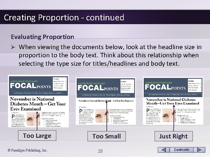
Creating Proportion - continued Evaluating Proportion Ø When viewing the documents below, look at the headline size in proportion to the body text. Think about this relationship when selecting the type size for titles/headlines and body text. Too Large © Paradigm Publishing, Inc. Too Small 28 Just Right Contents
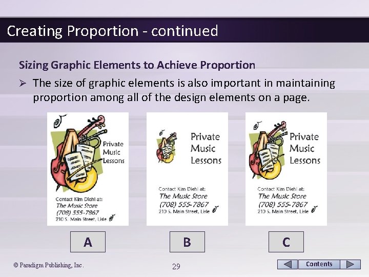
Creating Proportion - continued Sizing Graphic Elements to Achieve Proportion Ø The size of graphic elements is also important in maintaining proportion among all of the design elements on a page. A © Paradigm Publishing, Inc. B 29 C Contents
Creating Proportion - continued Using White Space Ø White space must also be considered when evaluating proportion in a document. Ø Keep the following pointers in mind: § Narrow margins can make lines too long to read easily. § Too much white space between columns makes the line length look choppy. § Too little space between columns makes the text squished and harder to read. § Excess white space between lines of text creates gaps that look out of proportion to the type size. § Too little white space between lines of text reduces legibility. © Paradigm Publishing, Inc. 30 Contents
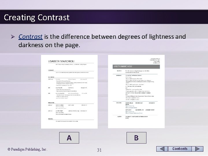
Creating Contrast Ø Contrast is the difference between degrees of lightness and darkness on the page. A © Paradigm Publishing, Inc. B 31 Contents
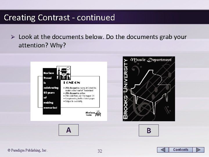
Creating Contrast - continued Ø Look at the documents below. Do the documents grab your attention? Why? A © Paradigm Publishing, Inc. B 32 Contents
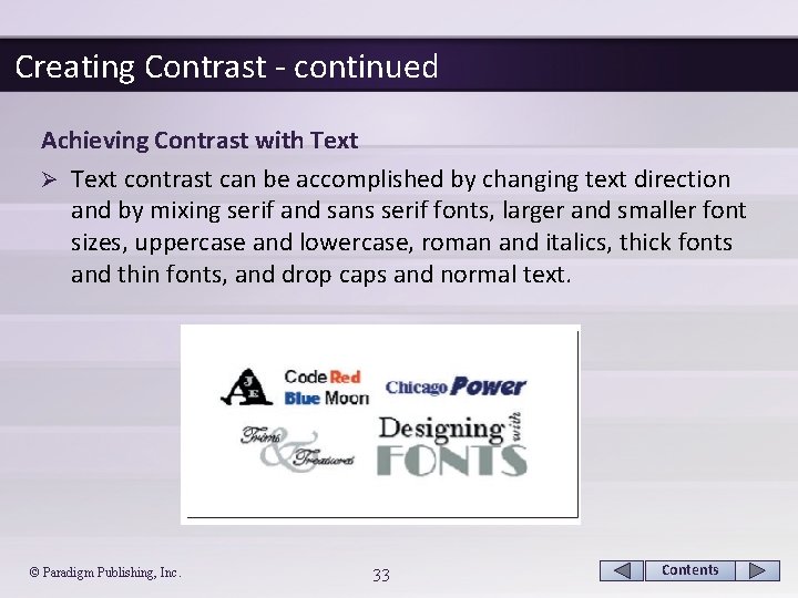
Creating Contrast - continued Achieving Contrast with Text Ø Text contrast can be accomplished by changing text direction and by mixing serif and sans serif fonts, larger and smaller font sizes, uppercase and lowercase, roman and italics, thick fonts and thin fonts, and drop caps and normal text. © Paradigm Publishing, Inc. 33 Contents
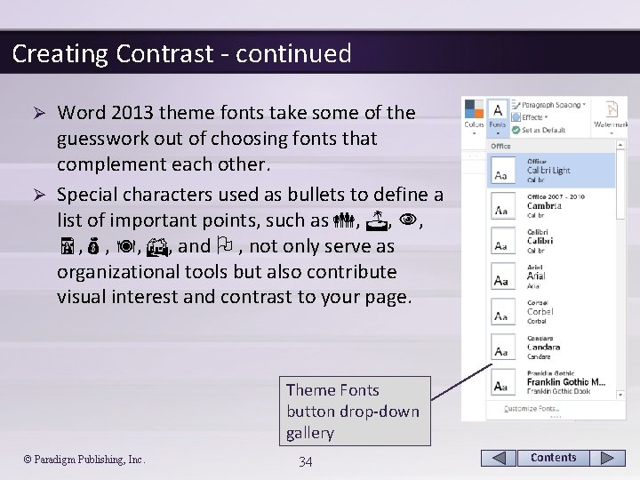
Creating Contrast - continued Word 2013 theme fonts take some of the guesswork out of choosing fonts that complement each other. Ø Special characters used as bullets to define a list of important points, such as , , , and , not only serve as organizational tools but also contribute visual interest and contrast to your page. Ø Theme Fonts button drop-down gallery © Paradigm Publishing, Inc. 34 Contents
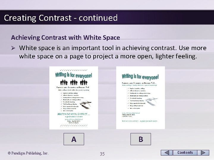
Creating Contrast - continued Achieving Contrast with White Space Ø White space is an important tool in achieving contrast. Use more white space on a page to project a more open, lighter feeling. A © Paradigm Publishing, Inc. B 35 Contents
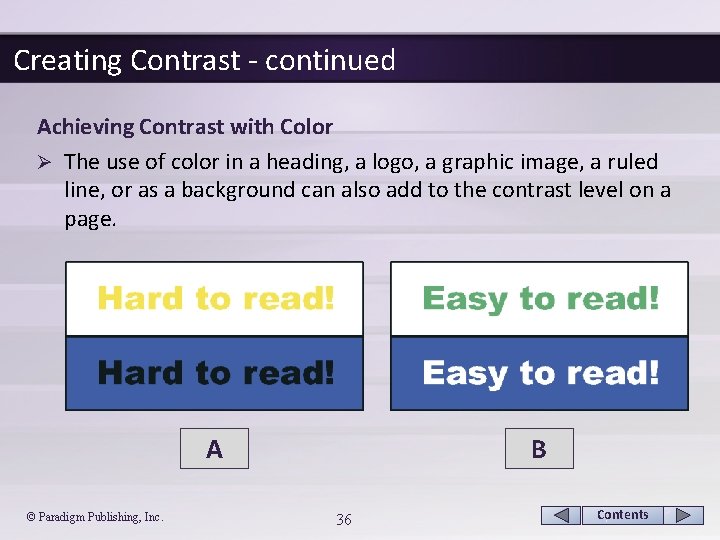
Creating Contrast - continued Achieving Contrast with Color Ø The use of color in a heading, a logo, a graphic image, a ruled line, or as a background can also add to the contrast level on a page. A © Paradigm Publishing, Inc. B 36 Contents
CHECKPOINT 1 1) The most important goal in desktop publishing is to do this. a. provide proportion b. add color c. communicate the message d. create contrast Answer Next Question 2) Applying this design principle means including an element that draws the reader’s attention. a. contrast b. focus c. proportion d. balance Answer Next Question © Paradigm Publishing, Inc. 37 3) Attain this by equally distributing the visual weight of various elements. a. contrast b. balance c. focus Answer d. proportion Next Question 4) This is the difference between degrees of lightness and darkness on the page. a. contrast b. balance c. focus d. proportion Answer Next Slide Contents
Creating Directional Flow Establish smooth directional flow in a document by organizing and positioning elements so that the reader’s eyes scan through the text and find the words or images you wish to emphasize. Ø When establishing the directional flow of your document: Ø § Organize your information into groups of closely related items and then rank the groups in order of importance. § Decide how to emphasize the most important information. § Place related items close to each other on the page. § Use left or right alignment to establish a stronger visual connection between all of the elements on your page. § Position elements so that the reader is drawn into the document and then directed through the document. © Paradigm Publishing, Inc. 38 Contents
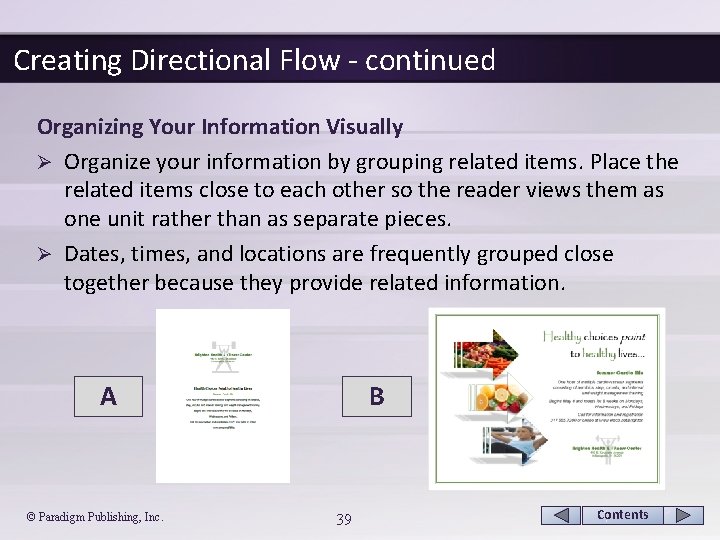
Creating Directional Flow - continued Organizing Your Information Visually Ø Organize your information by grouping related items. Place the related items close to each other so the reader views them as one unit rather than as separate pieces. Ø Dates, times, and locations are frequently grouped close together because they provide related information. A © Paradigm Publishing, Inc. B 39 Contents
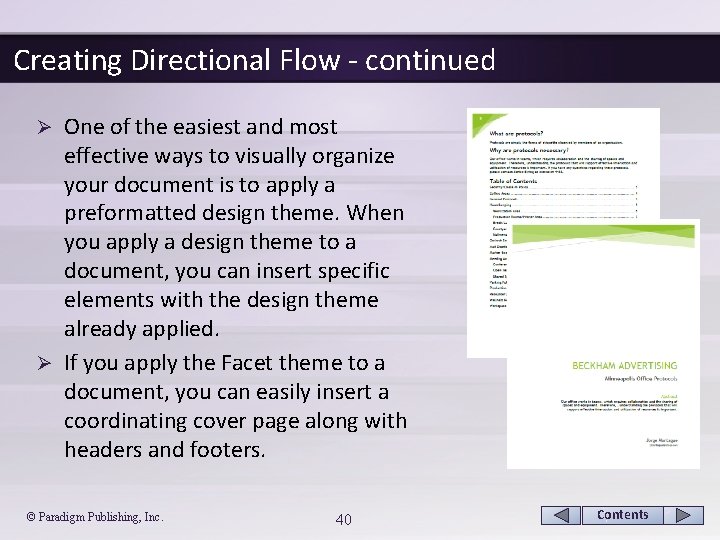
Creating Directional Flow - continued One of the easiest and most effective ways to visually organize your document is to apply a preformatted design theme. When you apply a design theme to a document, you can insert specific elements with the design theme already applied. Ø If you apply the Facet theme to a document, you can easily insert a coordinating cover page along with headers and footers. Ø © Paradigm Publishing, Inc. 40 Contents
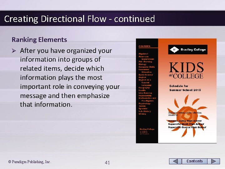
Creating Directional Flow - continued Ranking Elements Ø After you have organized your information into groups of related items, decide which information plays the most important role in conveying your message and then emphasize that information. © Paradigm Publishing, Inc. 41 Contents
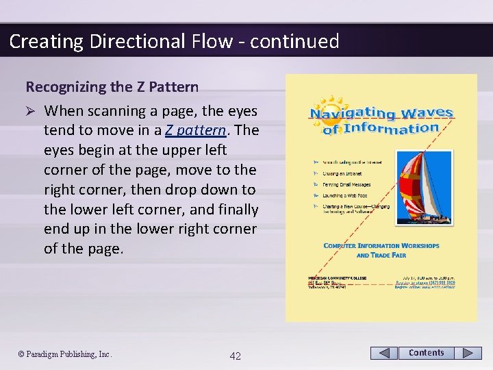
Creating Directional Flow - continued Recognizing the Z Pattern Ø When scanning a page, the eyes tend to move in a Z pattern. The eyes begin at the upper left corner of the page, move to the right corner, then drop down to the lower left corner, and finally end up in the lower right corner of the page. © Paradigm Publishing, Inc. 42 Contents
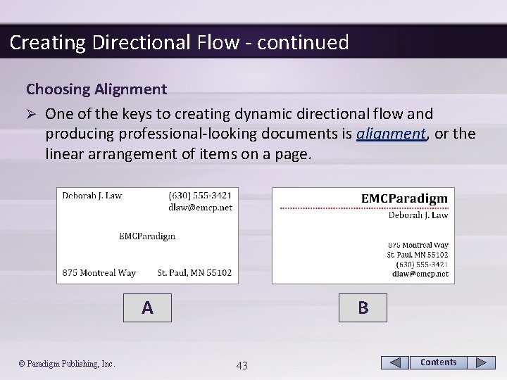
Creating Directional Flow - continued Choosing Alignment Ø One of the keys to creating dynamic directional flow and producing professional-looking documents is alignment, or the linear arrangement of items on a page. A © Paradigm Publishing, Inc. B 43 Contents
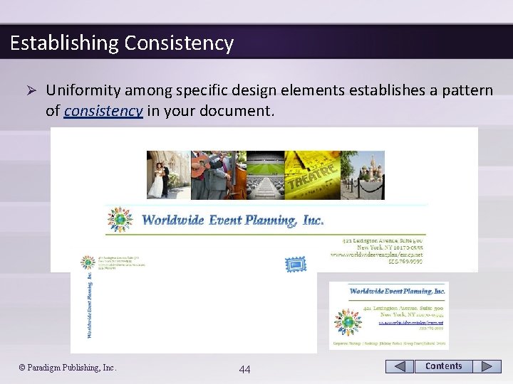
Establishing Consistency Ø Uniformity among specific design elements establishes a pattern of consistency in your document. © Paradigm Publishing, Inc. 44 Contents
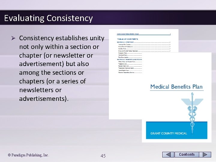
Evaluating Consistency Ø Consistency establishes unity not only within a section or chapter (or newsletter or advertisement) but also among the sections or chapters (or a series of newsletters or advertisements). © Paradigm Publishing, Inc. 45 Contents
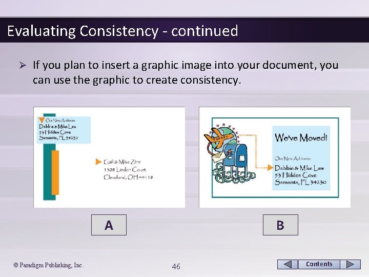
Evaluating Consistency - continued Ø If you plan to insert a graphic image into your document, you can use the graphic to create consistency. A © Paradigm Publishing, Inc. B 46 Contents
Evaluating Consistency - continued Applying Styles for Consistency within a Document Ø One way to ensure consistent formatting throughout a document is to apply styles. Ø Word 2013 provides a gallery of professionally designed styles for titles, headings, subheadings, and body text, among others. Ø These styles include preselected combinations of fonts, font sizes, colors, and spacing. © Paradigm Publishing, Inc. 47 Contents
Evaluating Consistency - continued Applying Themes for Consistency among Documents Ø Just as styles reinforce consistency within a document, themes help to promote consistency among different files created in Word, Excel, Access, and/or Power. Point. Ø Because the same themes are available in each of the programs in the Office 2013 suite, you can quickly and easily format a group of related documents to give them a cohesive and professional look. Ø Each theme contains a set of formatting choices that includes theme colors, theme fonts (including heading and body text fonts), and theme effects (including lines and fill effects). © Paradigm Publishing, Inc. 48 Contents
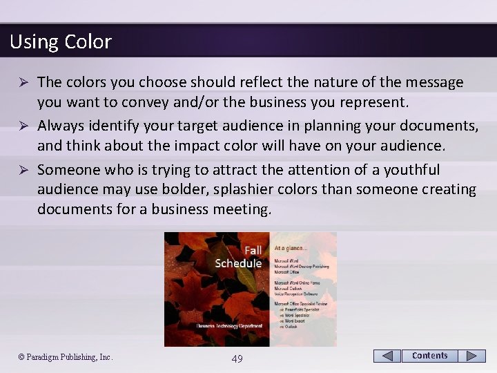
Using Color The colors you choose should reflect the nature of the message you want to convey and/or the business you represent. Ø Always identify your target audience in planning your documents, and think about the impact color will have on your audience. Ø Someone who is trying to attract the attention of a youthful audience may use bolder, splashier colors than someone creating documents for a business meeting. Ø © Paradigm Publishing, Inc. 49 Contents
Using Color - continued Applying Guidelines for Using Color Ø The following are a few guidelines to follow when using color in documents: § § § Use color sparingly—less is best! Use color to identify a consistently recurring element. Do not let color overpower content. Remember the importance of contrast. Avoid changing all text to one color, such as red. Use light colors for shaded backgrounds or watermarks. © Paradigm Publishing, Inc. 50 Contents
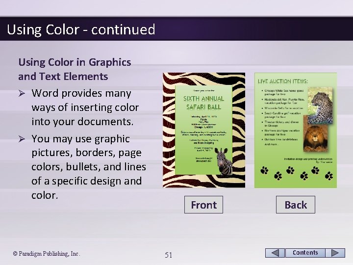
Using Color - continued Using Color in Graphics and Text Elements Ø Word provides many ways of inserting color into your documents. Ø You may use graphic pictures, borders, page colors, bullets, and lines of a specific design and color. © Paradigm Publishing, Inc. Front 51 Back Contents
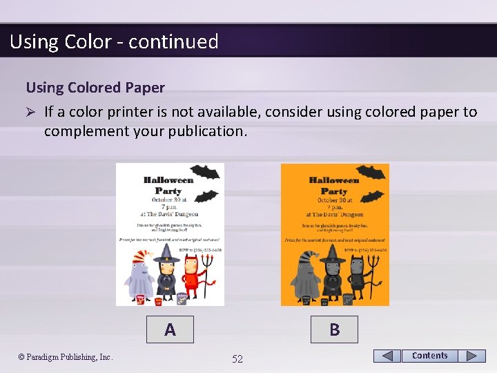
Using Color - continued Using Colored Paper Ø If a color printer is not available, consider using colored paper to complement your publication. A © Paradigm Publishing, Inc. B 52 Contents
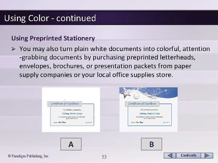
Using Color - continued Using Preprinted Stationery Ø You may also turn plain white documents into colorful, attention -grabbing documents by purchasing preprinted letterheads, envelopes, brochures, or presentation packets from paper supply companies or your local office supplies store. A © Paradigm Publishing, Inc. B 53 Contents
Using Color - continued Printing Options Ø Even though laser printers have become more affordable, color laser printers (and laser printer cartridges) remain rather expensive. Ø A less expensive, but still good, alternative is the inkjet color printer. An inkjet printer uses color ink cartridges to produce color. Ø Improve the resolution of the printed document by using specially designed inkjet paper. © Paradigm Publishing, Inc. 54 Contents
Using Word 2013 in Desktop Publishing Microsoft Word 2013 is a visual word processing program that provides an efficient means of editing and manipulating text and graphics to produce professional-looking documents. Ø Word is linear in nature, which means that every character, picture, and object is part of a line of text. Ø Word also contains many features and options that allow you to change linear objects to floating objects that can be moved easily around the document screen. Ø © Paradigm Publishing, Inc. 55 Contents
Using Online Resources The Internet can provide you with a wealth of information on desktop publishing as well as resources such as templates and images that can be downloaded from websites. Ø Search engines that provide image results include Google, Bing, and Yahoo. Ø Be sure that you read the copyright information associated with each collection. Ø Many images are free to use privately, but permission may be needed if the images are used for profit-making endeavors. Ø © Paradigm Publishing, Inc. 56 Contents
Using Online Resources - continued Using Office. com Templates Ø If you have previously used Microsoft Word 2013, you may be familiar with the hundreds of Office templates that are available through Office. com. Ø You may initiate a search to find a template and then doubleclick the template thumbnail to open a document based on the template. Ø You can tailor the document based on the template to your exact needs. Many of the templates reinforce integration of the Office programs by using a common theme. © Paradigm Publishing, Inc. 57 Contents
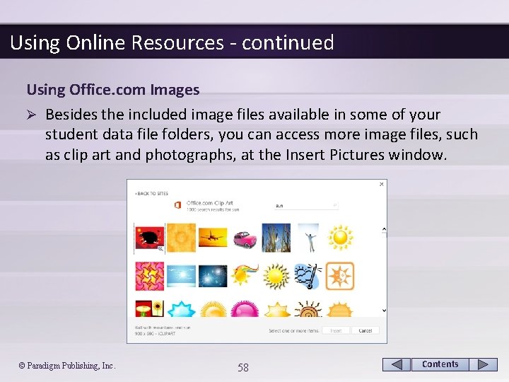
Using Online Resources - continued Using Office. com Images Ø Besides the included image files available in some of your student data file folders, you can access more image files, such as clip art and photographs, at the Insert Pictures window. © Paradigm Publishing, Inc. 58 Contents
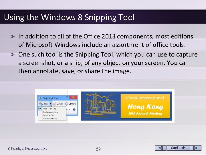
Using the Windows 8 Snipping Tool In addition to all of the Office 2013 components, most editions of Microsoft Windows include an assortment of office tools. Ø One such tool is the Snipping Tool, which you can use to capture a screenshot, or a snip, of any object on your screen. You can then annotate, save, or share the image. Ø © Paradigm Publishing, Inc. 59 Contents
CHECKPOINT 2 1) When scanning a page, the eyes tend to move in this pattern. a. B b. N c. W d. Z Answer Next Question 2) One of the keys to creating dynamic directional flow is this. a. alignment b. color c. consistency d. graphics © Paradigm Publishing, Inc. 3) Uniformity among specific design elements establishes a pattern of this. a. consistency b. directional flow c. color Answer d. alignment Next Question 4) Improve this by using specially designed inkjet paper. a. resolution b. consistency c. directional flow d. alignment Answer Next Question Next Slide 60 Contents
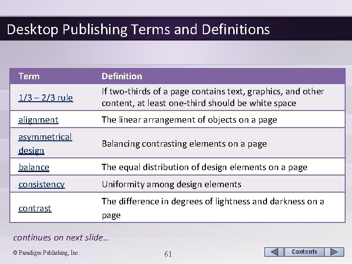
Desktop Publishing Terms and Definitions Term Definition 1/3 – 2/3 rule If two-thirds of a page contains text, graphics, and other content, at least one-third should be white space alignment The linear arrangement of objects on a page asymmetrical design Balancing contrasting elements on a page balance The equal distribution of design elements on a page consistency Uniformity among design elements contrast The difference in degrees of lightness and darkness on a page continues on next slide… © Paradigm Publishing, Inc. 61 Contents
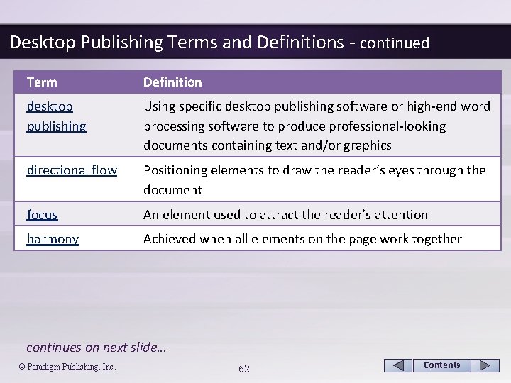
Desktop Publishing Terms and Definitions - continued Term Definition desktop publishing Using specific desktop publishing software or high-end word processing software to produce professional-looking documents containing text and/or graphics directional flow Positioning elements to draw the reader’s eyes through the document focus An element used to attract the reader’s attention harmony Achieved when all elements on the page work together continues on next slide… © Paradigm Publishing, Inc. 62 Contents
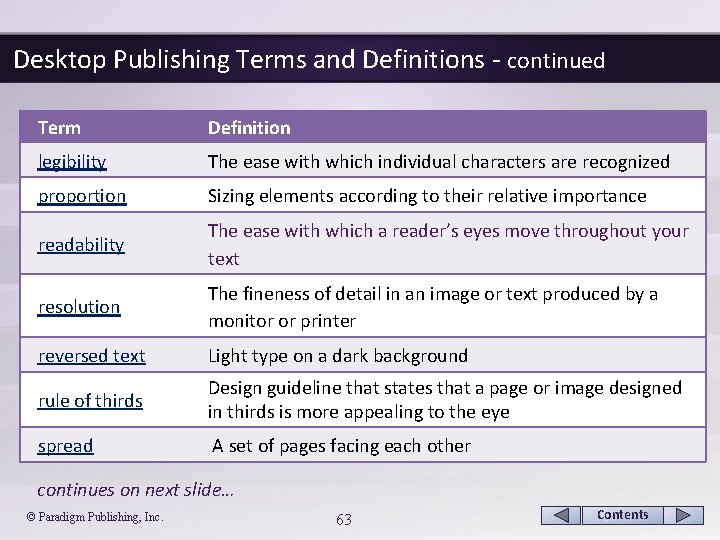
Desktop Publishing Terms and Definitions - continued Term Definition legibility The ease with which individual characters are recognized proportion Sizing elements according to their relative importance readability The ease with which a reader’s eyes move throughout your text resolution The fineness of detail in an image or text produced by a monitor or printer reversed text Light type on a dark background rule of thirds Design guideline that states that a page or image designed in thirds is more appealing to the eye spread A set of pages facing each other continues on next slide… © Paradigm Publishing, Inc. 63 Contents
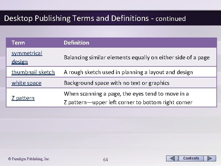
Desktop Publishing Terms and Definitions - continued Term Definition symmetrical design Balancing similar elements equally on either side of a page thumbnail sketch A rough sketch used in planning a layout and design white space Background space with no text or graphics Z pattern When scanning a page, the eyes tend to move in a Z pattern—upper left corner to bottom right corner © Paradigm Publishing, Inc. 64 Contents
- Slides: 64