COMPSCI 111 111 G An introduction to practical
- Slides: 29

COMPSCI 111 / 111 G An introduction to practical computing Presentation Design 27/12/2021 1

Content • Power. Point should be used to support your presentation, not replace it • Spend more time on content than presentation – – – Think about the topic Think about your audience Organize the material Focus on the main points Limit the material on each slide 27/12/2021 Power. Point 02 2

Slide Structure – Good • Use maximum 1 -2 slides per minute of your presentation – If the presentation is for 10 minutes you should probably not have more than 15 slides and definitely not more than 20 • Write in note form, not in complete sentences • Include 4 -5 points per slide • Avoid wordiness: use key words and phrases only • Do not read your points verbatim to the audience 27/12/2021 Power. Point 02 3

Slide Structure - Bad • This page contains far too many words for a presentation slide. It is not written in note form, making it difficult both for your audience to read and for you to present each individual point clearly. Although there are exactly the same number of points on this slide as were on the previous slide, it looks much more complicated. In short, this will make your audience spend much too much time trying to read this paragraph instead of listening to you explain the important points to them. What is even worse it may encourage you to read the text out loud to you audience. A very poor thing to do. 27/12/2021 Power. Point 02 4

Slide Structure • Show one point at a time: – Will help audience concentrate on what you are saying – Will prevent audience from reading ahead – Will help you keep your presentation focused • Potential problems – Limits the audience – Can be annoying – You can’t see what’s next 27/12/2021 Power. Point 02 5

Animation • Be consistent with the animation that you use • Don’t Overuse Animation • Distracts people from the content 27/12/2021 Power. Point 02 6

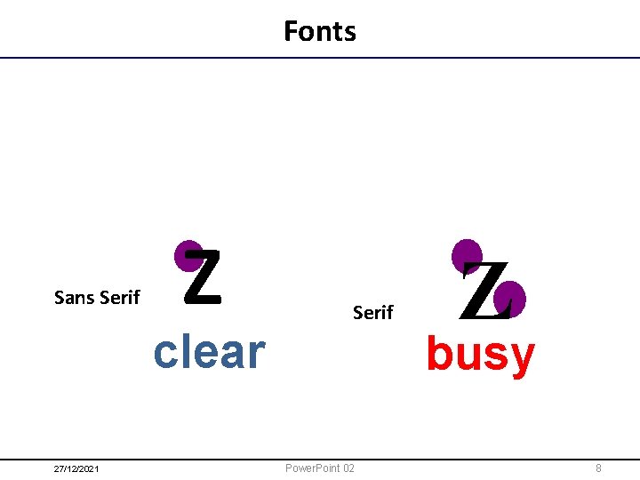
Fonts - Good • Size – Use at least an 18 -point font – Use different size fonts for main points and secondary points • Typeface – Maximum of 2 typefaces – Sans Serif is best – Easier to read on screen 27/12/2021 Power. Point 02 7

Fonts Sans Serif Z Serif clear 27/12/2021 Z busy Power. Point 02 8

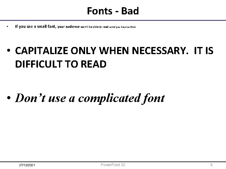
Fonts - Bad • If you use a small font, your audience won’t be able to read what you have written • CAPITALIZE ONLY WHEN NECESSARY. IT IS DIFFICULT TO READ • Don’t use a complicated font 27/12/2021 Power. Point 02 9

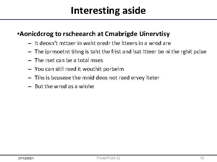
Interesting aside • Aonicdcrog to rscheearch at Cmabrigde Uinervtisy – – – 27/12/2021 It deosn't mttaer in waht oredr the ltteers in a wrod are The iprmoetnt tihng is taht the frist and lsat ltteer be ni the rghit pclae The rset can be a total mses You can sitll raed it wouthit porbelm Tihs is bcuseae the mnid deos not raed ervey lteter But the wrod as a wlohe Power. Point 02 10

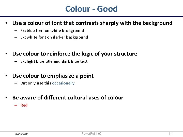
Colour - Good • Use a colour of font that contrasts sharply with the background – Ex: blue font on white background – Ex: white font on darker background • Use colour to reinforce the logic of your structure – Ex: light blue title and dark blue text • Use colour to emphasize a point – But only use this occasionally • Be aware of different cultural uses of colour – Red 27/12/2021 Power. Point 02 11

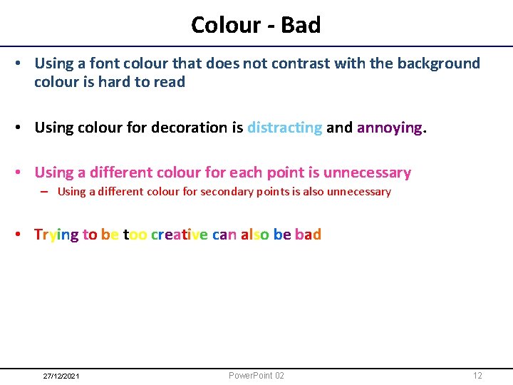
Colour - Bad • Using a font colour that does not contrast with the background colour is hard to read • Using colour for decoration is distracting and annoying. • Using a different colour for each point is unnecessary – Using a different colour for secondary points is also unnecessary • Trying to be too creative can also be bad 27/12/2021 Power. Point 02 12

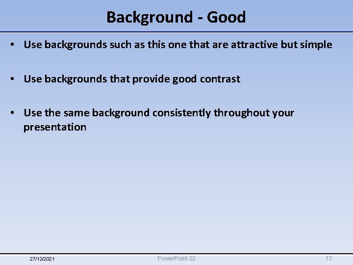
Background - Good • Use backgrounds such as this one that are attractive but simple • Use backgrounds that provide good contrast • Use the same background consistently throughout your presentation 27/12/2021 Power. Point 02 13

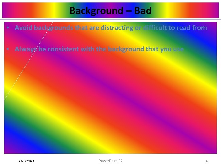
Background – Bad • Avoid backgrounds that are distracting or difficult to read from • Always be consistent with the background that you use 27/12/2021 Power. Point 02 14

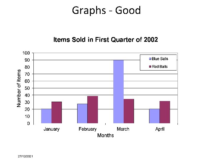
Graphs - Good • Use graphs rather than just charts and words – Data in graphs is easier to comprehend & retain than is raw data – Trends are easier to visualize in graph form • Always title your graphs • Keeping charts as simple as possible while still displaying the desired information. This makes them easier to read. • Highlight key data points to make charts easier for audiences to understand. • Clearly label the axes in the graph. • Avoid 3 D graphs if possible, since they are hard to read. 27/12/2021 Power. Point 02 15

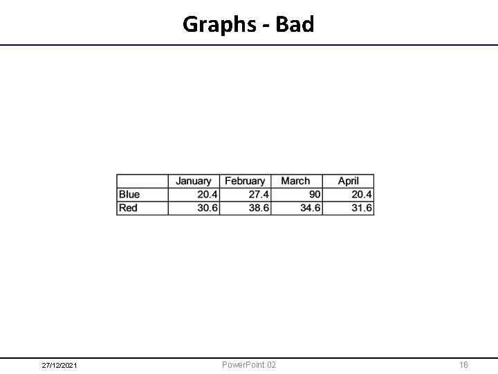
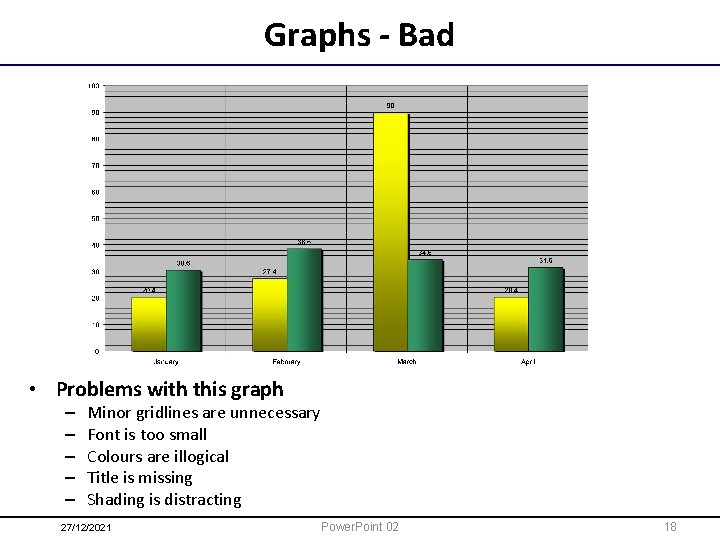
Graphs - Bad 27/12/2021 Power. Point 02 16

Graphs - Good 27/12/2021

Graphs - Bad • Problems with this graph – – – Minor gridlines are unnecessary Font is too small Colours are illogical Title is missing Shading is distracting 27/12/2021 Power. Point 02 18

Spelling and Grammar • Proof your slides for: – speling mistakes – the use of of repeated words – grammatical errors you might have made • If English is not your first language, please have someone else check your presentation! 27/12/2021 Power. Point 02 19

Conclusion • Use an effective and strong closing – Your audience is likely to remember your last words • Use a conclusion slide to: – Summarize the main points of your presentation – Suggest future avenues of research – Or points of contact 27/12/2021 Power. Point 02 20

Questions? ? • End your presentation with a simple question slide to: – Invite your audience to ask questions – Provide a visual aid during question period – Avoid ending a presentation abruptly ? 27/12/2021 Power. Point 02 21

Web Page vs Web Site • A web page is a single page viewable using web browser – Should be visually appealing, informative • A web site is a set of web pages – – Same theme Consistent design Easy to navigate Three click-rule 27/12/2021 Power. Point 02 22

Navigation • Users have trouble navigating in many web sites – Navigation should be easy – Navigation bar on the left is common – Navigation bar on the right is more ergonomic • Each page should – Tell the user what the page is about – Clearly identify how to get to other pages (Obvious links) • Familiarity Use layout and design that people are familiar with 27/12/2021 Power. Point 02 23

Links • Don’t make the user guess where the links are – All links should be clearly identified • Underlining – Do not underline any normal text. • Remember that links are different colour to normal text – Check the appearance of links on your background • Name of the link should indicate where it links to – Don’t use “Click here” 27/12/2021 Power. Point 02 24

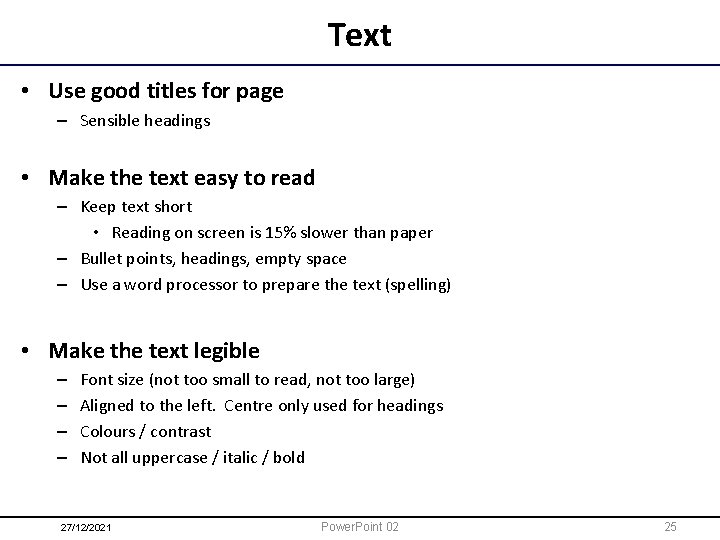
Text • Use good titles for page – Sensible headings • Make the text easy to read – Keep text short • Reading on screen is 15% slower than paper – Bullet points, headings, empty space – Use a word processor to prepare the text (spelling) • Make the text legible – – Font size (not too small to read, not too large) Aligned to the left. Centre only used for headings Colours / contrast Not all uppercase / italic / bold 27/12/2021 Power. Point 02 25

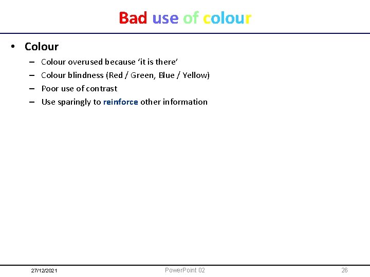
Bad use of colour • Colour – – Colour overused because ‘it is there’ Colour blindness (Red / Green, Blue / Yellow) Poor use of contrast Use sparingly to reinforce other information 27/12/2021 Power. Point 02 26

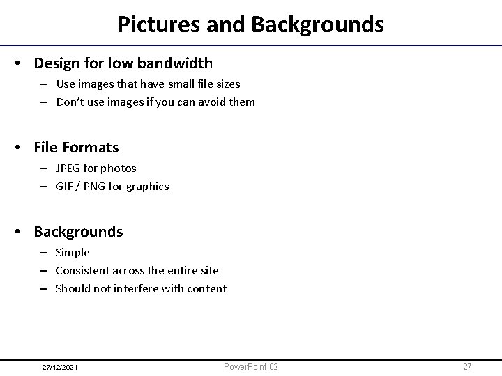
Pictures and Backgrounds • Design for low bandwidth – Use images that have small file sizes – Don’t use images if you can avoid them • File Formats – JPEG for photos – GIF / PNG for graphics • Backgrounds – Simple – Consistent across the entire site – Should not interfere with content 27/12/2021 Power. Point 02 27

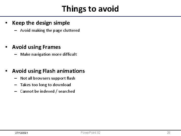
Things to avoid • Keep the design simple – Avoid making the page cluttered • Avoid using Frames – Make navigation more difficult • Avoid using Flash animations – Not all browsers support flash – Takes too long to download – Cannot be indexed / searched 27/12/2021 Power. Point 02 28

References • Power. Point – http: //www. shkaminski. com/Classes/Handouts/powerpoint. htm • Web Design – http: //en. wikibooks. org/wiki/Web_Design – http: //www. webstyleguide. com/ • Good and bad features – http: //www. ratz. com/featuresbad. html – http: //www. ratz. com/featuresgood. html 27/12/2021 Power. Point 02 29