Comparing Data Displays in Dot Plots Warm Up
- Slides: 14

Comparing Data Displays in Dot Plots

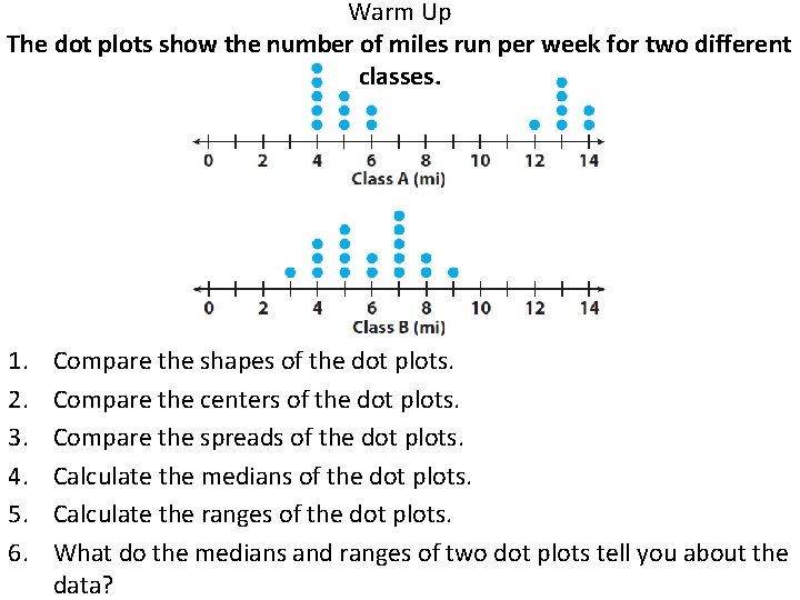
Warm Up The dot plots show the number of miles run per week for two different classes. 1. 2. 3. 4. 5. 6. Compare the shapes of the dot plots. Compare the centers of the dot plots. Compare the spreads of the dot plots. Calculate the medians of the dot plots. Calculate the ranges of the dot plots. What do the medians and ranges of two dot plots tell you about the data?

• Dot plots can be used to analyze a data set, especially with respect to its center and spread. • The visual characteristics of dot plots, such as center, spread, and shape can be compared. • The shape, center, and spread of two dot plots can be compared numerically by calculating values related to center and spread. • The shape of the dot plot is used to visualize whether the values in the data set are evenly distributed or grouped on one side. • The mean, median, and range of the data help describe the spread of the data.

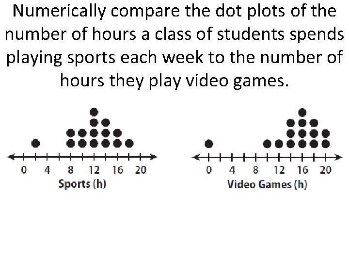
Numerically compare the dot plots of the number of hours a class of students spends playing sports each week to the number of hours they play video games.

How do you compare two sets of data displayed in dot plots? You can compare the shapes, the centers, and the spread of the dots in the two plots. You can also compare the median and the range of the dot plots numerically.

Why is the spread a useful way to compare dot plots? The spread can tell you which data set has more variability.

Why is the center a useful way to compare dot plots? The center can compare the most common piece of data for each data set.

The median of a data set is one of the measures of central tendency. The others are the mean and mode. Here are some guidelines for choosing which measure to use to describe a data set. Mean: The mean is the sum of the data values divided by the number of values. It is useful for describing data that are close in value and data that are normally distributed. The mean is not useful if the data contains outliers, which can skew the mean to the right or left of the center. Median: The median is the middle value of the data when it is in numerical order. It is easy to calculate and is useful for describing a data set that is not normally distributed or that has outliers. Mode: The mode is the data value that occurs most often. It is useful for describing a data set when the data clusters around certain values. It is the only measure of the three that can be used to describe non-numerical, categorical data.

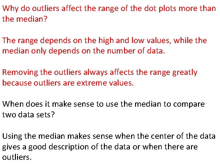
Visually compare the dot plots of the scores for 25 science tests to the scores for 25 math tests.

Why do outliers affect the range of the dot plots more than the median? The range depends on the high and low values, while the median only depends on the number of data. Removing the outliers always affects the range greatly because outliers are extreme values. When does it make sense to use the median to compare two data sets? Using the median makes sense when the center of the data gives a good description of the data or when there are outliers.

In what ways can you compare data displayed in a pair of dot plots? You can compare the shapes, centers, and spread of the dot plots. You can also calculate the means and ranges of the dot plots and compare them.

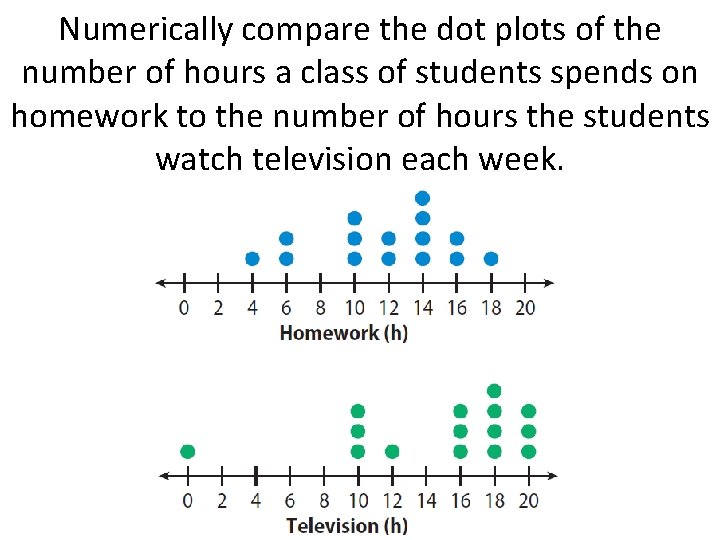
Numerically compare the dot plots of the number of hours a class of students spends on homework to the number of hours the students watch television each week.

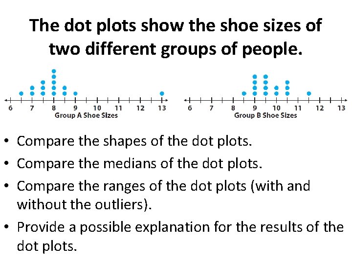
The dot plots show the shoe sizes of two different groups of people. • Compare the shapes of the dot plots. • Compare the medians of the dot plots. • Compare the ranges of the dot plots (with and without the outliers). • Provide a possible explanation for the results of the dot plots.

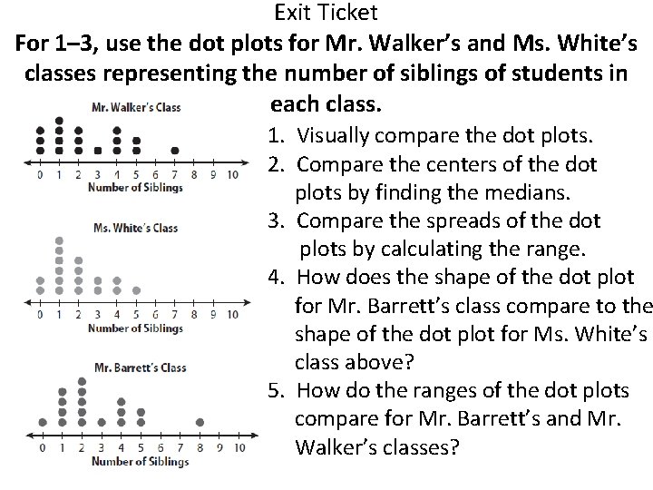
Exit Ticket For 1– 3, use the dot plots for Mr. Walker’s and Ms. White’s classes representing the number of siblings of students in each class. 1. Visually compare the dot plots. 2. Compare the centers of the dot plots by finding the medians. 3. Compare the spreads of the dot plots by calculating the range. 4. How does the shape of the dot plot for Mr. Barrett’s class compare to the shape of the dot plot for Ms. White’s class above? 5. How do the ranges of the dot plots compare for Mr. Barrett’s and Mr. Walker’s classes?