Comparing Data Displays in Box Plots Warm Up
Comparing Data Displays in Box Plots
Warm Up

• Box plots show five key values to represent a set of data: the least and greatest values, the lower and upper quartiles, and the median. • Two box plots can be compared numerically according to their centers, or medians, and their spreads, or variability. • Range and interquartile range are measures of spread. • Box plots with similar variability should have similar boxes and whiskers. Box plots with less overlap of the median and interquartile range also can be compared.

• You can compare two sets of data displayed in box plots by comparing the shapes, the centers, and the spreads of the box plots. • While the median is displayed in a box plot, the mean and mode are not. Also, you cannot tell how many values there are in a data set by looking at its box plot. • The shape of the box plot is used to visualize whether the data values are evenly distributed or grouped on one side of the median. Evenly distributed data are modeled by a box plot whose quartiles (the two whiskers and the two parts of the box) are all about the same length.

• Box plots model five key values that can be used to visually and numerically compare data sets. • Box plots with similar key values indicate similar variability in the data sets, while box plots with very different key values indicate more variability in the data sets. • The interquartile range is used to compare the spread of the data in the box plots by computing and comparing them. The wider the box, the greater the spread of the data around the median. • The measures of variability in the data in box plots are compared through the sizes of the boxes and the lengths of the corresponding whiskers.

• The actual data values other than the maximum, minimum, and quartiles, cannot be compared for two box plots as they can for dot plots. • Outliers affect the range of box plots but not the interquartile range because the range depends on the high and low values, while the interquartile range only depends on the upper and lower quartiles of the data. • The range is the difference between the highest and lowest values, while the interquartile range is the difference between the upper and lower quartiles. You often use the interquartile range because it shows how widely the data are spread around the median.
• To determine the variability of a box plot find the spread of the box plot by computing its range and interquartile range. If there is little spread, then the data have less variability. If there is a great spread, then they have more variability. • To compare data modeled by a pair of box plots, you compare the shapes, centers, and spreads of the box plots. • The quartiles are single values. The first quartile is the median of the lower half of the data, the second quartile is the median of all the data (or the middle half of the data), and the third quartile is the median of the upper half of the data. Each quartile represents one quarter of the data.

• Two box plots have the same median and equally long whiskers. If one box plot has a longer box than the other box plot, this tells us that the box plot with the longer box has more variability in the middle 50% of the values. • In mathematics, central tendency is the tendency of data values to cluster around some central value. A measure of variability like the range tells you very little, but the interquartile range tells you how closely the middle half of the data cluster around the median.
What can you learn about a data set from a box plot? How is this information different from a dot plot? You can identify the minimum and maximum values and the range of the data. You can identify the quartiles, including the lower and upper quartiles and the median, as well as the interquartile range. Together, these values help you to recognize the center of the data, both the median and the middle 50%. It helps you to recognize how spread out the data are overall and how spread out the middle 50% of the values are around the median. A dot plot contains all the data values, which a box plot does not.

The box plots show the distribution of the days spent along the California coast by two different groups of visitors. Compare the shapes, the centers, and the spreads of the plots.

The box plots show the distribution of days spent at a national park by two different groups of visitors. • Compare the shapes of the box plots. • Compare the centers of the box plots. • Compare the spreads of the box plots.
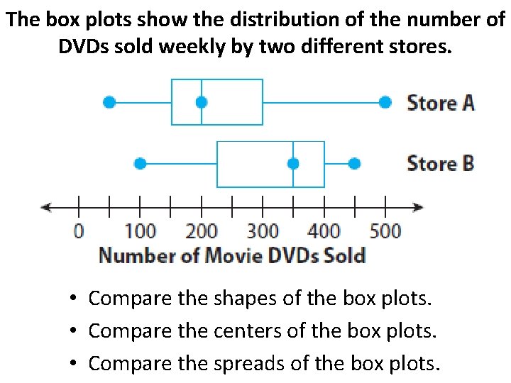
The box plots show the distribution of the number of DVDs sold weekly by two different stores. • Compare the shapes of the box plots. • Compare the centers of the box plots. • Compare the spreads of the box plots.

Use the box plots to compare the costs of leasing cars in two different cities. • In which city could you spend the least amount of money to lease a car? The greatest? • Which city has a higher median price? How much higher is it? • In which city is it more likely to choose a car at random that leases for less than $450? Why? • What do the box plots tell you about the costs of leasing cars in those two cities?
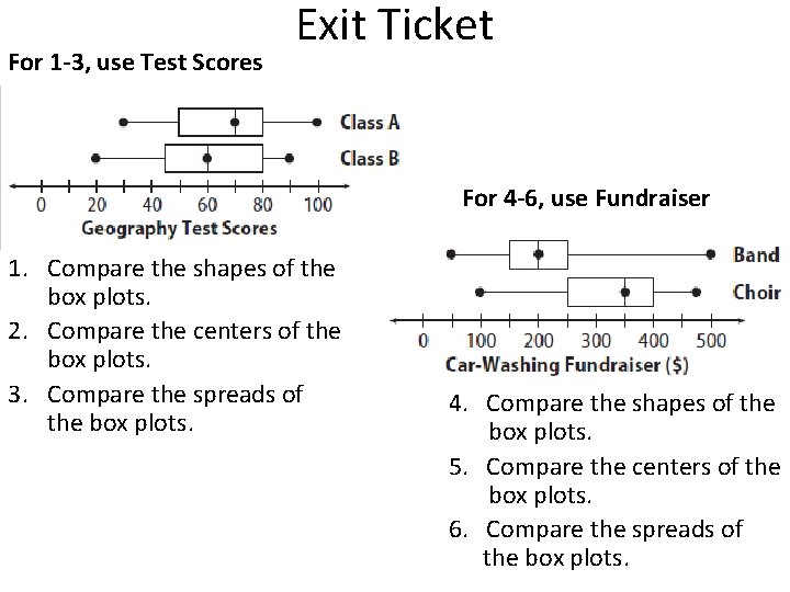
For 1 -3, use Test Scores Exit Ticket For 4 -6, use Fundraiser 1. Compare the shapes of the box plots. 2. Compare the centers of the box plots. 3. Compare the spreads of the box plots. 4. Compare the shapes of the box plots. 5. Compare the centers of the box plots. 6. Compare the spreads of the box plots.
- Slides: 14