Compare the Market Meerkat advert Name Compare the
- Slides: 3

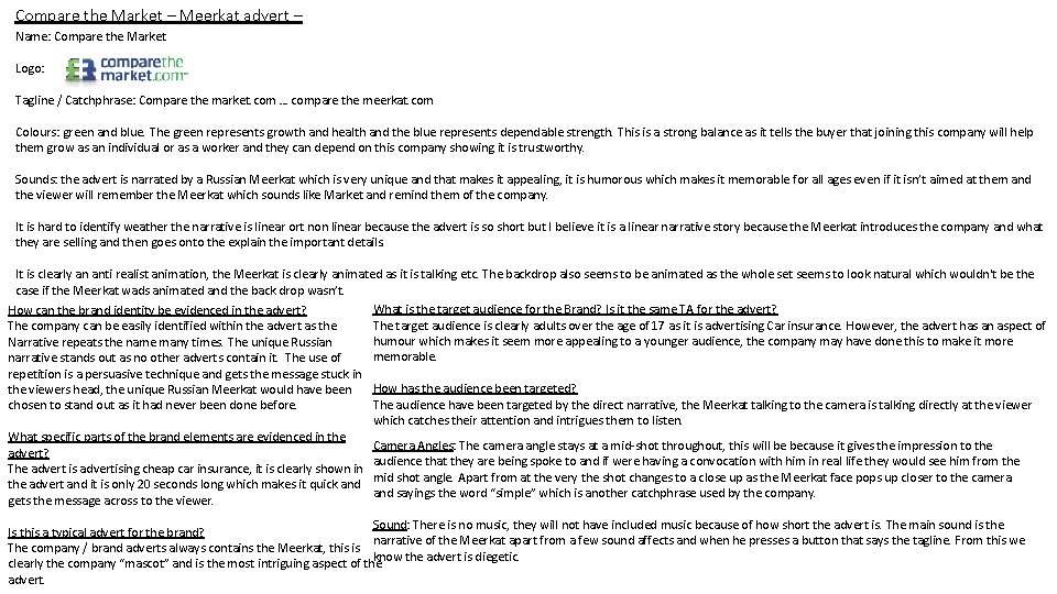
Compare the Market – Meerkat advert – Name: Compare the Market Logo: Tagline / Catchphrase: Compare the market. com … compare the meerkat. com Colours: green and blue. The green represents growth and health and the blue represents dependable strength. This is a strong balance as it tells the buyer that joining this company will help them grow as an individual or as a worker and they can depend on this company showing it is trustworthy. Sounds: the advert is narrated by a Russian Meerkat which is very unique and that makes it appealing, it is humorous which makes it memorable for all ages even if it isn’t aimed at them and the viewer will remember the Meerkat which sounds like Market and remind them of the company. It is hard to identify weather the narrative is linear ort non linear because the advert is so short but I believe it is a linear narrative story because the Meerkat introduces the company and what they are selling and then goes onto the explain the important details. It is clearly an anti realist animation, the Meerkat is clearly animated as it is talking etc. The backdrop also seems to be animated as the whole set seems to look natural which wouldn't be the case if the Meerkat wads animated and the back drop wasn’t. What is the target audience for the Brand? Is it the same TA for the advert? How can the brand identity be evidenced in the advert? The target audience is clearly adults over the age of 17 as it is advertising Car insurance. However, the advert has an aspect of The company can be easily identified within the advert as the humour which makes it seem more appealing to a younger audience, the company may have done this to make it more Narrative repeats the name many times. The unique Russian memorable. narrative stands out as no other adverts contain it. The use of repetition is a persuasive technique and gets the message stuck in How has the audience been targeted? the viewers head, the unique Russian Meerkat would have been The audience have been targeted by the direct narrative, the Meerkat talking to the camera is talking directly at the viewer chosen to stand out as it had never been done before. which catches their attention and intrigues them to listen. What specific parts of the brand elements are evidenced in the Camera Angles: The camera angle stays at a mid-shot throughout, this will be because it gives the impression to the advert? audience that they are being spoke to and if were having a convocation with him in real life they would see him from the The advert is advertising cheap car insurance, it is clearly shown in mid shot angle. Apart from at the very the shot changes to a close up as the Meerkat face pops up closer to the camera the advert and it is only 20 seconds long which makes it quick and sayings the word “simple” which is another catchphrase used by the company. gets the message across to the viewer. Sound: There is no music, they will not have included music because of how short the advert is. The main sound is the Is this a typical advert for the brand? narrative of the Meerkat apart from a few sound affects and when he presses a button that says the tagline. From this we The company / brand adverts always contains the Meerkat, this is know the advert is diegetic. clearly the company “mascot” and is the most intriguing aspect of the advert.

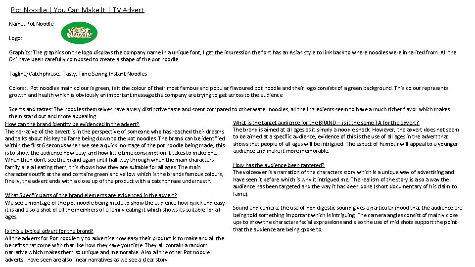
Pot Noodle | You Can Make It | TV Advert Name: Pot Noodle Logo: Graphics: The graphics on the logo displays the company name in a unique font, I get the impression the font has an Asian style to link back to where noodles were inherited from. All the Os‘ have been carefully composed to create a shape of the pot noodle. Tagline/Catchphrase: Tasty, Time Saving Instant Noodles Colors: . Pot noodles main colour is green, is it the colour of their most famous and popular flavoured pot noodle and their logo consists of a green background. This colour represents growth and health which is obviously an important message the company are trying to get across to the audience. Scents and tastes: The noodles themselves have a very distinctive taste and scent compared to other water noodles, all the ingredients seem to have a much richer flavor which makes them stand out and more appealing. What is the target audience for the BRAND – is it the same TA for the advert? How can the brand identity be evidenced in the advert? The narrative of the advert is in the perspective of someone who has reached their dreams The brand is aimed at all ages as it simply a noodle snack. However, the advert does not seem and talks about his key to fame being down to the pot noodles. The brand can be identified to be aimed at a specific audience, evidence of this is the use of all ages in the advert that within the first 6 seconds when we see a quick montage of the pot noodle being made, this shows that people of all ages will be intrigued. The aspect of humour will appeal to a younger audience and make it more memorable. is to show the audience how easy and how little time consumption it takes to make one. When then don’t see the brand again until half way through when the main characters family are all eating them, this shows how they are suitable for all ages. The main characters outfit at the end contains green and yellow which is the brands famous colours, finally, the advert ends with a close up of the product with a catchphrase underneath. What Specific parts of the brand elements are evidenced in the advert? We see a montage of the pot noodle being made to show the audience how quick and easy it is and also a shot of all the members of a family eating it which shows its suitable for all ages. Is this a typical advert for the brand? All the adverts for Pot noodle try to advertise how easy their product is to make and all the benefits that come with that like how they save you time. They all contain a random narrative which makes them so unique and memorable. Also all the other Pot noodle adverts I have seen are also linear narratives as we see a clear story. How has the audience been targeted? The voiceover is a narration of the characters story which is a unique way of advertising and I have seen it before which is why it intrigued me. The realism of the story is also a way the audience has been targeted and the way it has been done (short documentary of his claim to fame). Sound and camera: the use of non digestic sound gives a particular mood that the audience are being told something important which is intriguing. The camera angles consist of mainly close ups to show the characters facial expressions and also the use of mid shots support the point that the audience are being spoke to.

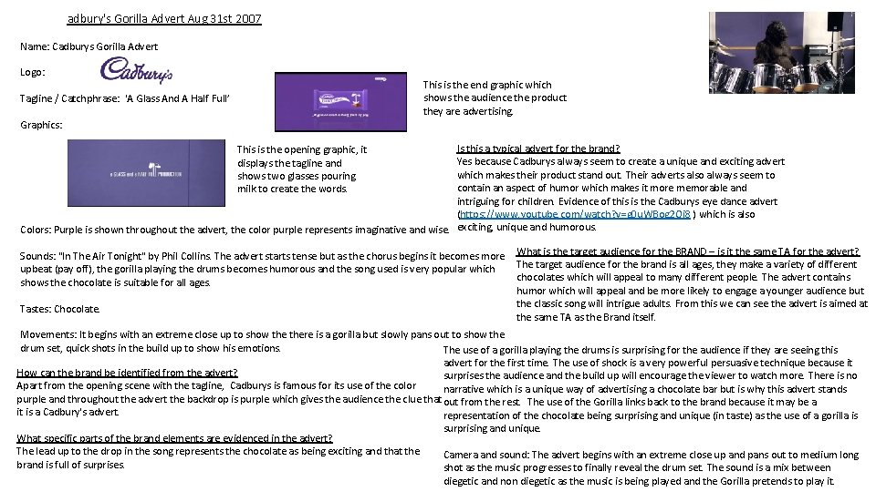
adbury's Gorilla Advert Aug 31 st 2007 Name: Cadburys Gorilla Advert Logo: This is the end graphic which shows the audience the product they are advertising. Tagline / Catchphrase: 'A Glass And A Half Full’ Graphics: Is this a typical advert for the brand? Yes because Cadburys always seem to create a unique and exciting advert which makes their product stand out. Their adverts also always seem to contain an aspect of humor which makes it more memorable and intriguing for children. Evidence of this is the Cadburys eye dance advert (https: //www. youtube. com/watch? v=g 0 u. WBog 2 Oi 8 ) which is also Colors: Purple is shown throughout the advert, the color purple represents imaginative and wise. exciting, unique and humorous. This is the opening graphic, it displays the tagline and shows two glasses pouring milk to create the words. Sounds: "In The Air Tonight" by Phil Collins. The advert starts tense but as the chorus begins it becomes more upbeat (pay off), the gorilla playing the drums becomes humorous and the song used is very popular which shows the chocolate is suitable for all ages. Tastes: Chocolate. What is the target audience for the BRAND – is it the same TA for the advert? The target audience for the brand is all ages, they make a variety of different chocolates which will appeal to many different people. The advert contains humor which will appeal and be more likely to engage a younger audience but the classic song will intrigue adults. From this we can see the advert is aimed at the same TA as the Brand itself. Movements: It begins with an extreme close up to show there is a gorilla but slowly pans out to show the drum set, quick shots in the build up to show his emotions. The use of a gorilla playing the drums is surprising for the audience if they are seeing this advert for the first time. The use of shock is a very powerful persuasive technique because it How can the brand be identified from the advert? surprises the audience and the build up will encourage the viewer to watch more. There is no Apart from the opening scene with the tagline, Cadburys is famous for its use of the color narrative which is a unique way of advertising a chocolate bar but is why this advert stands purple and throughout the advert the backdrop is purple which gives the audience the clue that out from the rest. The use of the Gorilla links back to the brand because it may be a it is a Cadbury's advert. representation of the chocolate being surprising and unique (in taste) as the use of a gorilla is surprising and unique. What specific parts of the brand elements are evidenced in the advert? The lead up to the drop in the song represents the chocolate as being exciting and that the Camera and sound: The advert begins with an extreme close up and pans out to medium long brand is full of surprises. shot as the music progresses to finally reveal the drum set. The sound is a mix between diegetic and non diegetic as the music is being played and the Gorilla pretends to play it.