Communicating with maps Today well talk about how

Communicating with maps • Today we’ll talk about how to represent data • The formal components of a map • General map aesthetics • You’ll get to critique some maps Bad map! Please note that portions of the material in this lecture come from Maribeth Price, author of your text.

Types of data Categorical data-geology Other examples? Quantities data-precipitation Other examples?

Map Types • Single symbol maps • Unique values maps • Quantities maps – Graduated color – Graduated symbol – Dot density • Chart maps • Multiple attribute maps Choose map type in Layer Properties

Single symbol maps

Unique Values Map

Types of unique values Many values-State names Use to show different features Few values— State subregion Use to show patterns For our campus, how might you color buildings?

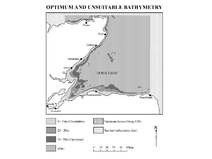
Quantities maps

Types of Quantities Maps

Multiple attribute maps State subregion and population

How would you do habitat edge? Normalizing data • By percent of total – Shows percentage of total • By another field – Example: population/area gives population density

Ways to classify data • Choose number of classes • Variety of different classification methods – – – Jenks Natural Breaks Equal Interval Defined Interval Quantile Standard Deviation Manual (set your own) • Same data may appear differently

Jenks Natural Breaks Class breaks • Exploits natural gaps in the data • Good for unevenly distributed data • Default method

Equal Interval Specify number of classes Divides into equally spaced classes

Defined interval User chooses the class size Data determines number of classes

Classifying data Set manual breaks

Designing a Map • • What are the objectives of the map? Which layers should be included? Plan the layout Choose colors and symbols

Consider Map Objectives • Determine how the map will be viewed and under what circumstances it will be viewed (On paper? In a report? Poster? Projected on a screen? Displayed on a webpage? ) Affects choice of map scale, font size, level of detail, choice of colors • Conveying information versus alerting viewers to risk • Are there privacy issues?

Choosing Map Layers • Present the most important layers with largest clearest symbols • For less important layers, use smaller symbols, smaller font, muted colors

Planning the Layout • Balance and alignment – overall layout looks balanced (no large blank areas), map elements are a good size relative to one another not clustered in one area • Emphasize the importance of the map – it should occupy the majority of the space • All maps should include the basics: title, legend, indication of north, and scale (may also include graphics, pictures, neatlines, graticules), your name/agency

Symbol psychology Where is there less rain? Which towns have more people? Where is the water? What’s there? Where’s the danger?

Choosing symbols Which one looks more aesthetic? Which one is easier to understand? Which one shows the roads better?
")
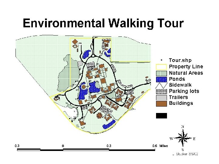
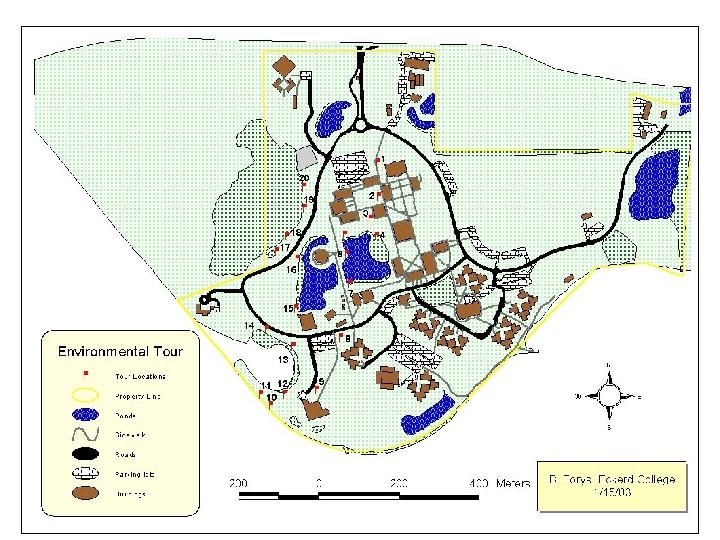
Making a map: Required Components a. Actual spatial map (we’ll talk about this later) b. Title. Occasionally just a title on your legend will suffice. c. Legend. Format can vary. d. Compass or North Arrow bar (or south, depends on Hemisphere) e. Scale bar (in even units – 100 m, not 121 m). Think about audience and scale when using measurement system (e. g. , metric vs. English units, feet vs. miles). f. your name, date (in some cases your company or agency)

The map page Paper size? Landscape or Portrait? Data frames Size and position? Map scale? Margins Grid for aligning features Layout view

Legends: Pay attention to details! Crowded Unclear name Abbreviations Poor formatting Much better!!!

Adding a scale bar

Adding north arrow

Pictures

Neatlines

Using a template
")
Design Basics a. Size/ Arrangement b. Color / Symbols c. Format (neatlines, etc)

Size: Planning the layout Better design Poor design

Choosing symbols • Natural earth tones usually look better than strident colors • Use pastels for most of map; use bold colors sparingly for emphasis • Take advantage of the psychological aspects of different colors and symbols • Mimic phenomena, such as using blue to represent water • Make ramps easy to understand • Apply emphasis with color, size, and thickness

Color: Improving a world map More pastels Natural colors Use ramp to indicate increasing population Emphasize the important information

B&W maps • Special principles apply to maps that are black/white or will be copied or faxed. – Best to design in B&W rather than assuming it will copy all right – Use no more than 5 gray levels – Use different patterns instead of colors – B&W maps may not be able to show as much – Color balance rules still apply—use mostly light patterns; emphasize small regions with dark ones

Map optimized for color printing Map optimized for B&W printing
- Slides: 40