Common Core Math 1 Statistics WELCOME Common Core


- Slides: 26

Common Core Math 1 Statistics WELCOME!!!

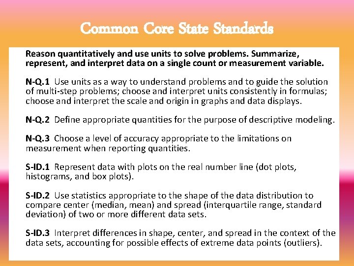
Common Core State Standards Reason quantitatively and use units to solve problems. Summarize, represent, and interpret data on a single count or measurement variable. N-Q. 1 Use units as a way to understand problems and to guide the solution of multi-step problems; choose and interpret units consistently in formulas; choose and interpret the scale and origin in graphs and data displays. N-Q. 2 Define appropriate quantities for the purpose of descriptive modeling. N-Q. 3 Choose a level of accuracy appropriate to the limitations on measurement when reporting quantities. S-ID. 1 Represent data with plots on the real number line (dot plots, histograms, and box plots). S-ID. 2 Use statistics appropriate to the shape of the data distribution to compare center (median, mean) and spread (interquartile range, standard deviation) of two or more different data sets. S-ID. 3 Interpret differences in shape, center, and spread in the context of the data sets, accounting for possible effects of extreme data points (outliers).

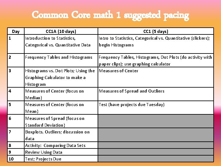
Common Core math 1 suggested pacing Day 1 CC 1 A (10 days) Introduction to Statistics, Categorical vs. Quantitative Data 2 Frequency Tables and Histograms 3 4 5 6 7 8 9 10 CC 1 (5 days) Intro to Statistics, Categorical vs. Quantitative (clickers); begin Histograms Frequency Tables, Histograms, Dot Plots (do activity with paper clips); use graphing calculator Histograms vs. Dot Plots; Using the Measures of Center Graphing Calculator to make a Histogram Measures of Center (focus on Measures of Spread and Outliers Median) Measures of Center (focus on Test (have projects due Tuesday) Mean) Measures of Spread (focus on Standard Deviation) Boxplots. Outliers; discussion on data Activity: Comparing Data Sets Review Using Data Test; Projects Due

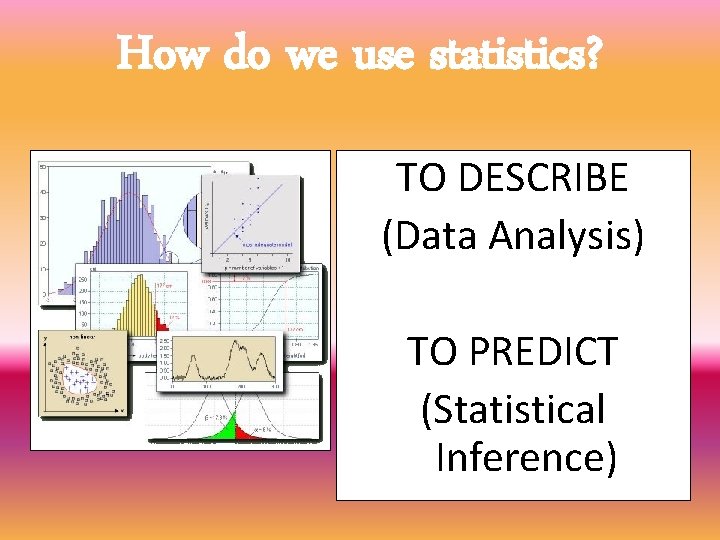
How do we use statistics? TO DESCRIBE (Data Analysis) TO PREDICT (Statistical Inference)

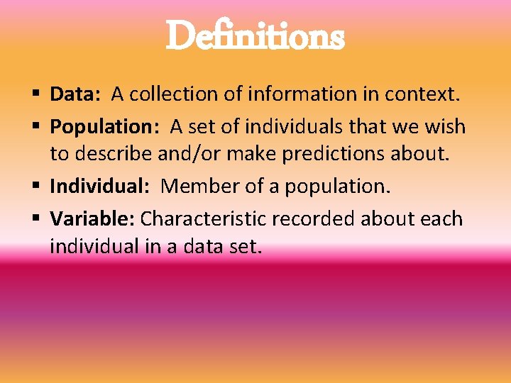
Definitions § Data: A collection of information in context. § Population: A set of individuals that we wish to describe and/or make predictions about. § Individual: Member of a population. § Variable: Characteristic recorded about each individual in a data set.

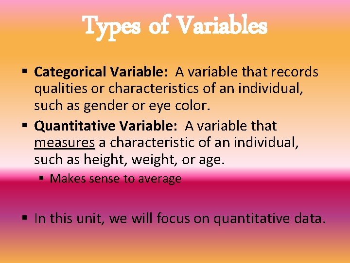
Types of Variables § Categorical Variable: A variable that records qualities or characteristics of an individual, such as gender or eye color. § Quantitative Variable: A variable that measures a characteristic of an individual, such as height, weight, or age. § Makes sense to average § In this unit, we will focus on quantitative data.

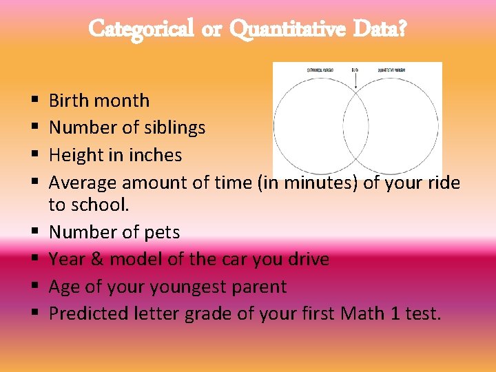
Categorical or Quantitative Data? § § § § Birth month Number of siblings Height in inches Average amount of time (in minutes) of your ride to school. Number of pets Year & model of the car you drive Age of your youngest parent Predicted letter grade of your first Math 1 test.

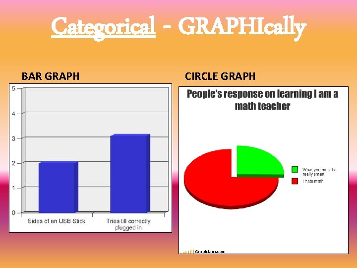
Categorical - GRAPHIcally BAR GRAPH CIRCLE GRAPH

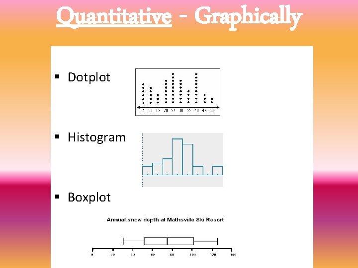
Quantitative - Graphically § Dotplot § Histogram § Boxplot

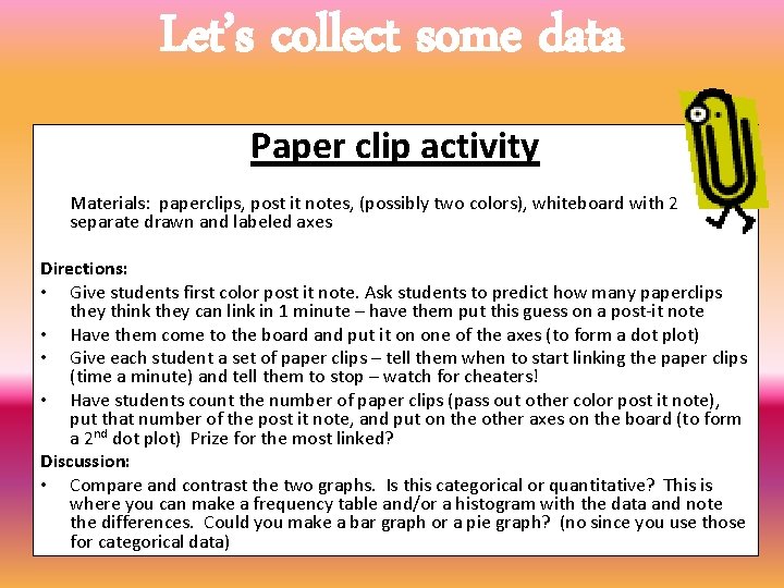
Let’s collect some data Paper clip activity Materials: paperclips, post it notes, (possibly two colors), whiteboard with 2 separate drawn and labeled axes Directions: • Give students first color post it note. Ask students to predict how many paperclips they think they can link in 1 minute – have them put this guess on a post-it note • Have them come to the board and put it on one of the axes (to form a dot plot) • Give each student a set of paper clips – tell them when to start linking the paper clips (time a minute) and tell them to stop – watch for cheaters! • Have students count the number of paper clips (pass out other color post it note), put that number of the post it note, and put on the other axes on the board (to form a 2 nd dot plot) Prize for the most linked? Discussion: • Compare and contrast the two graphs. Is this categorical or quantitative? This is where you can make a frequency table and/or a histogram with the data and note the differences. Could you make a bar graph or a pie graph? (no since you use those for categorical data)

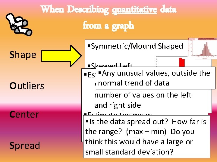
When Describing quantitative data from a graph Shape Outliers Center Spread §Symmetric/Mound Shaped §Skewed Left §Any unusual values, outside the §Estimate thelow median (extreme values) trend of data §normal The middle value, same §Skewed Right number ofhigh values (extreme values)on the left and right side §Uniform §Estimate the mean §Is§the spread point” out? How Thedata “balancing or far is theaverage range? (max – min) Do you think this would have a large or small standard deviation?

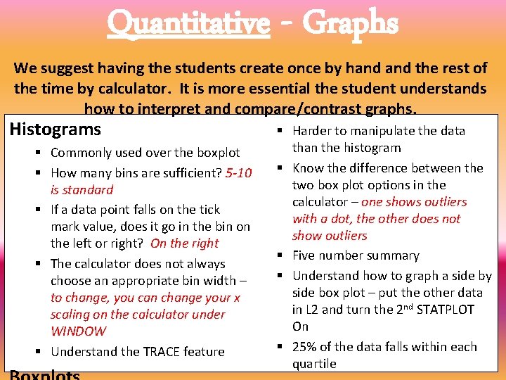
Quantitative - Graphs We suggest having the students create once by hand the rest of the time by calculator. It is more essential the student understands how to interpret and compare/contrast graphs. Histograms § Commonly used over the boxplot § How many bins are sufficient? 5 -10 is standard § If a data point falls on the tick mark value, does it go in the bin on the left or right? On the right § The calculator does not always choose an appropriate bin width – to change, you can change your x scaling on the calculator under WINDOW § Understand the TRACE feature § Harder to manipulate the data than the histogram § Know the difference between the two box plot options in the calculator – one shows outliers with a dot, the other does not show outliers § Five number summary § Understand how to graph a side by side box plot – put the other data in L 2 and turn the 2 nd STATPLOT On § 25% of the data falls within each quartile

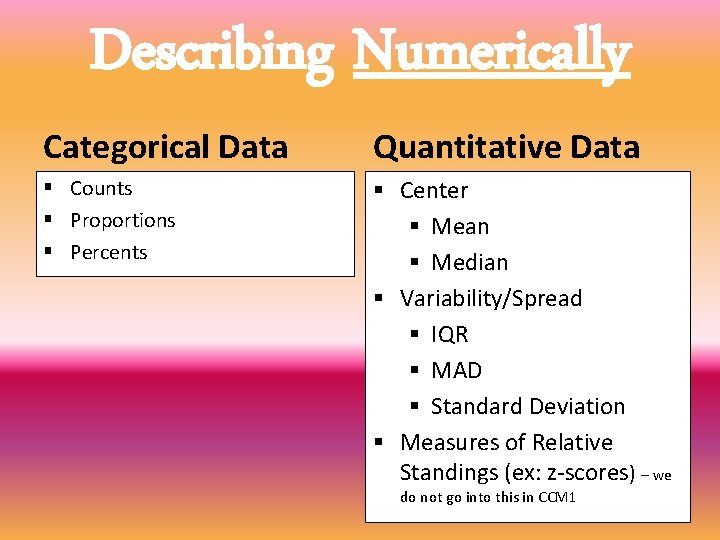
Describing Numerically Categorical Data Quantitative Data § Counts § Proportions § Percents § Center § Mean § Median § Variability/Spread § IQR § MAD § Standard Deviation § Measures of Relative Standings (ex: z-scores) – we do not go into this in CCM 1

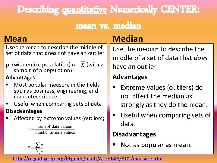
Describing quantitative Numerically CENTER: mean vs. median Mean Use the mean to describe the middle of set of data that does not have an outlier μ (with entire population) or (with a sample of a population) Advantages § Most popular measure in the fields such as business, engineering, and computer science. § Useful when comparing sets of data Disadvantages § Affected by extreme values (outliers) Median Use the median to describe the middle of a set of data that does have an outlier Advantages § Extreme values (outliers) do not affect the median as strongly as they do the mean. § Useful when comparing sets of data. Disadvantages § Not as popular as mean. http: //regentsprep. org/REgents/math/ALGEBRA/AD 2/measure. htm

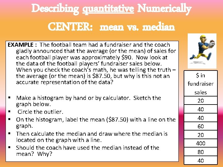
Describing quantitative Numerically CENTER: mean vs. median EXAMPLE : The football team had a fundraiser and the coach gladly announced that the average (or the mean) of sales for each football player was approximately $90. Now look at the data of the football players’ fundraiser sales below. When you check the coach’s math, he was telling the truth – the average (or the mean) is $87. 50, but why is this not an accurate representation of the data? § Make a histogram by hand or by calculator. Sketch the graph below. § Circle the outlier. § On the histogram, label the mean ($87. 50) with a line on the graph. § Then calculate the median and draw where the median is located on the graph with a line. § Should the coach have used the median instead of the mean? Why? $ in fundraiser sales 20 40 40 60 20 400 80 40

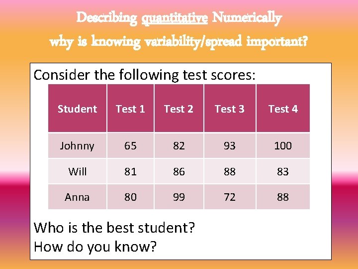
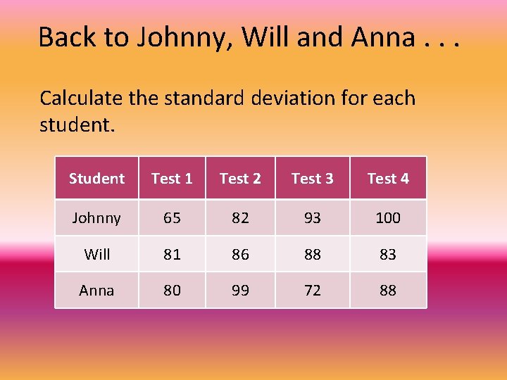
Describing quantitative Numerically why is knowing variability/spread important? Consider the following test scores: Student Test 1 Test 2 Test 3 Test 4 Johnny 65 82 93 100 Will 81 86 88 83 Anna 80 99 72 88 Who is the best student? How do you know?

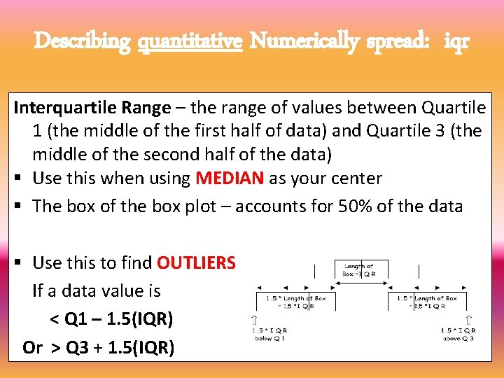
Describing quantitative Numerically spread: iqr Interquartile Range – the range of values between Quartile 1 (the middle of the first half of data) and Quartile 3 (the middle of the second half of the data) § Use this when using MEDIAN as your center § The box of the box plot – accounts for 50% of the data § Use this to find OUTLIERS: If a data value is < Q 1 – 1. 5(IQR) Or > Q 3 + 1. 5(IQR)

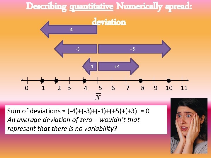
Describing quantitative Numerically spread: deviation -4 -3 +5 -1 0 1 2 3 4 +3 5 6 7 8 Sum of deviations = (-4)+(-3)+(-1)+(+5)+(+3) = 0 An average deviation of zero – wouldn’t that represent that there is no variability? 9 10 11

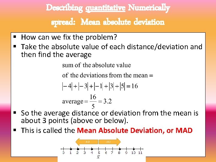
Describing quantitative Numerically spread: Mean absolute deviation § How can we fix the problem? § Take the absolute value of each distance/deviation and then find the average § So the average distance or deviation from the mean is about 3 points (above or below). § This is called the Mean Absolute Deviation, or MAD

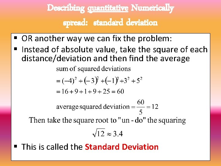
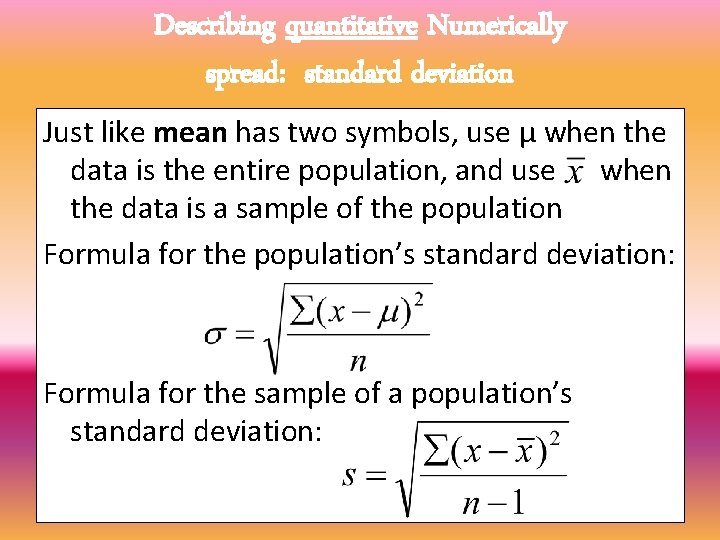
Describing quantitative Numerically spread: standard deviation § OR another way we can fix the problem: § Instead of absolute value, take the square of each distance/deviation and then find the average § This is called the Standard Deviation


Describing quantitative Numerically spread: standard deviation Just like mean has two symbols, use μ when the data is the entire population, and use when the data is a sample of the population Formula for the population’s standard deviation: Formula for the sample of a population’s standard deviation:

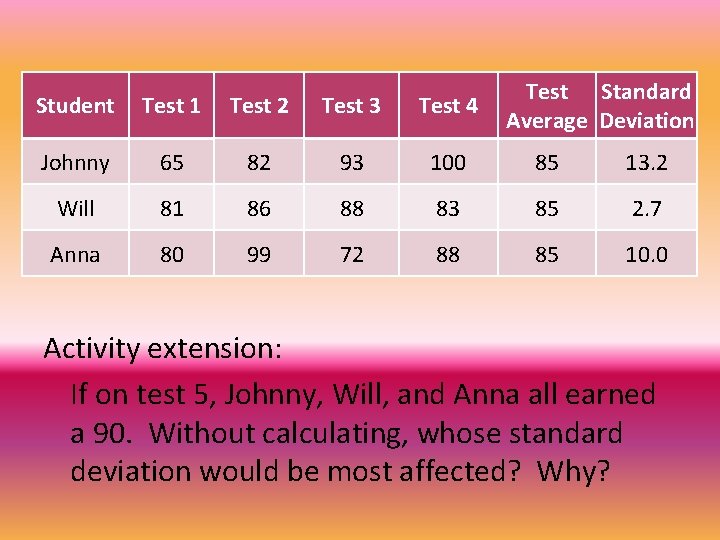
Back to Johnny, Will and Anna. . . Calculate the standard deviation for each student. Student Test 1 Test 2 Test 3 Test 4 Johnny 65 82 93 100 Will 81 86 88 83 Anna 80 99 72 88

Test Standard Average Deviation Student Test 1 Test 2 Test 3 Test 4 Johnny 65 82 93 100 85 13. 2 Will 81 86 88 83 85 2. 7 Anna 80 99 72 88 85 10. 0 Activity extension: If on test 5, Johnny, Will, and Anna all earned a 90. Without calculating, whose standard deviation would be most affected? Why?

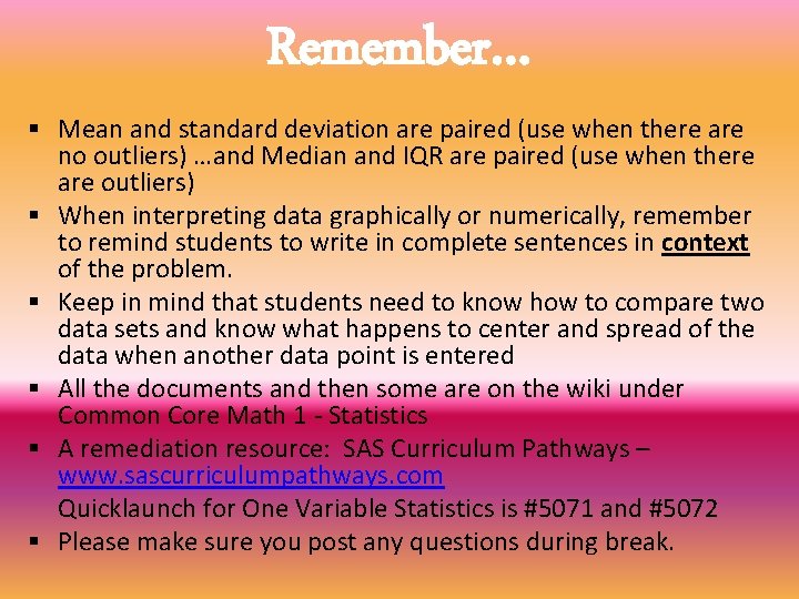
Remember… § Mean and standard deviation are paired (use when there are no outliers) …and Median and IQR are paired (use when there are outliers) § When interpreting data graphically or numerically, remember to remind students to write in complete sentences in context of the problem. § Keep in mind that students need to know how to compare two data sets and know what happens to center and spread of the data when another data point is entered § All the documents and then some are on the wiki under Common Core Math 1 - Statistics § A remediation resource: SAS Curriculum Pathways – www. sascurriculumpathways. com Quicklaunch for One Variable Statistics is #5071 and #5072 § Please make sure you post any questions during break.

PROJECT IDEAS § At your table, discuss what would be a great summative assessment in the form of a project for this unit. § Write down a few ideas on chart paper. § When finished, put up on the board. § When you get back from break, do a gallery walk to see the different project ideas.