Combining Two Datasets into a Single Map Animation
Combining Two Datasets into a Single Map Animation Salla Multimäki 1, Antti Mäkilä 2, Paula Ahonen-Rainio 1 1) Department of Real Estate, Planning and Geoinformatics 2) Department of Computer Science MMEA WP 1 Result Seminar Vaisala 23. 9. 2015

Motivation: Why to combine two different datasets into the same visualization? Visual analysis • Is there spatial correlation between two phenomena? • Instant • Lagged • Finding anomalies • Are there areas where two phenomena do not match as expected? Model evaluation • How good is the correlation between model of the phenomenon and actual obseravtions?
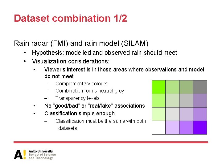
Dataset combination 1/2 Rain radar (FMI) and rain model (SILAM) • Hypothesis: modelled and observed rain should meet • Visualization considerations: • Viewer’s interest is in those areas where observations and model do not meet – – – • • Complementary colours Combination forms neutral grey Transparency levels No ”good/bad” or ”real/fake” associations Classification simple enough – Classification must be the same with both datasets

Dataset combination 1/2 http: //ankka. github. io/p sychicnemesis/examples/9 a. html

Dataset combination 2/2 Birch pollen concentration (SILAM) and relative air humidity (SILAM) • Hypothesis: high air humidity ( > 70%) should remove high pollen concentrations ( > 50 grains / m 3) Bartková-Ščevková, J. "The influence of temperature, relative humidity and rainfall on the occurrence of pollen allergens (Betula, Poaceae, Ambrosia artemisiifolia) in the atmosphere of Bratislava (Slovakia). " International Journal of Biometeorology 48. 1 (2003): 1 -5. • Visualization considerations: • Two colours which together forms third, easily separable colour • Natural associations: yellow pollen, blue water • No classification, only binary values because of the hypothesis

Dataset combination 2/2
Validation of the results • Coming up in September: focus group interviews – three separate groups of 4 -6 participants: students, GIS professionals and meteorology professionals • The focus groups are evaluating: – Used colours and their suitability for the task – Classification – Background map • Analysis of e. g. following things: – Colour combinations – Effect of geometrical complexity of the datasets – Other suggestions?
Some preliminary results from the first focus group interview (GIS professionals) Rain model and observations • Was easier to interpret because of the logical movement of the areas • Neutral grey is easily missed or mixed with other light values (or sea) • Green areas of the model were experienced too dominant because of their geometry – Suggestion: show dappled radar images on the top of the more solid model, no transparency – Suggestion: show only outlines of model areas
Some preliminary results from the first focus group interview (GIS professionals) Pollen and air humidity • The geometry and behaviour of the datasets have a great effect • Blue was seen as a sea area • Green was seen as a third, separate phenomenon – Suggestion: show only the areas where the datasets overlap (because that is what should not happen according to the previous research!) • The task of the user was not as clear as with the other example
Publication of the results • Euro. Carto 2015: 1 st ICA European Symposium on Cartography 10. -12. 11. 2015 Vienna, Austria • Selected papers are intended to be published in the International Journal of Cartography and in a book of the series Lecture Notes on Geoinformation and Cartography by Springer.
- Slides: 10