Colour Theory Colour Wheel By Sir Isaac Newton
Colour Theory
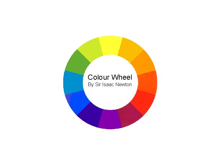
Colour Wheel By Sir Isaac Newton
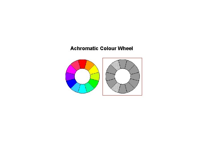
Achromatic Colour Wheel
Additive Colour (RGB) refers to the requirement to add primary colours to create white (physical light). To create all the spectral hues, we must mix the additive primary colours of red, green and blue. Digital media uses additive colour (ie. computers and tv).
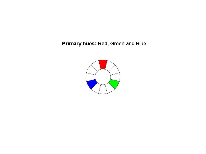
Primary hues: Red, Green and Blue
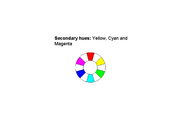
Secondary hues: Yellow, Cyan and Magenta
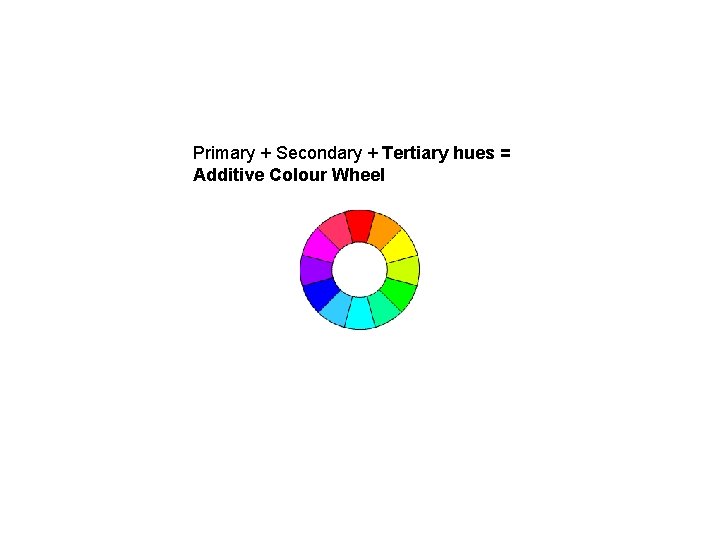
Primary + Secondary + Tertiary hues = Additive Colour Wheel
Subtractive Colour (CMYK) refers to the requirement to subtract primary colours to create white (reflective light). To create all the spectral hues, we must mix different colour pigments and dyes together. Analog media uses subtractive colour (ie. paintings, newspapers).
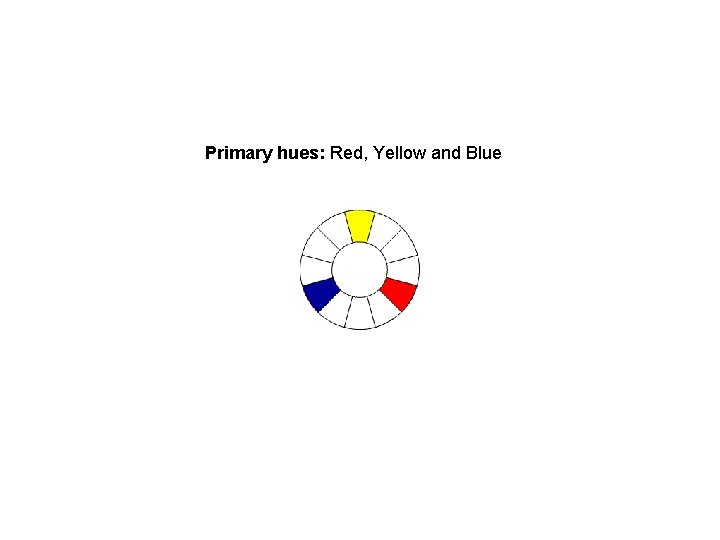
Primary hues: Red, Yellow and Blue
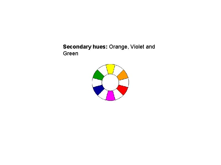
Secondary hues: Orange, Violet and Green
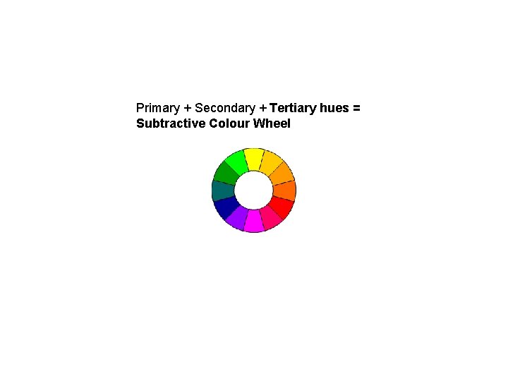
Primary + Secondary + Tertiary hues = Subtractive Colour Wheel
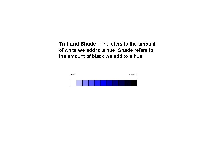
Tint and Shade: Tint refers to the amount of white we add to a hue. Shade refers to the amount of black we add to a hue
Colour Harmonies: different sets of colour combinations that work well together. Complementary Triadic Analogous Monochromatic
Monochromatic Harmonies refer to variations on one hue. Variation is created using saturation and brightness.
Analogous Harmonies are based on the combination of several hues located adjacent to each other on the colour wheel.
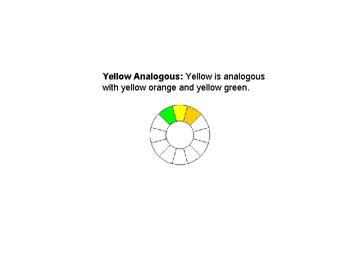
Yellow Analogous: Yellow is analogous with yellow orange and yellow green.
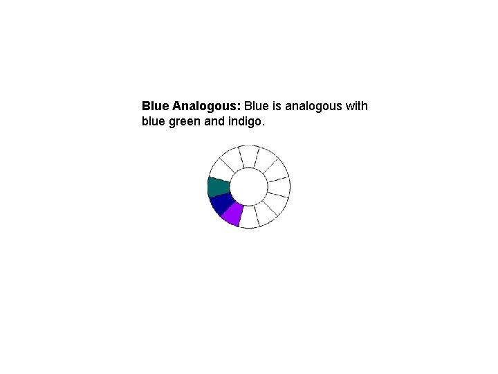
Blue Analogous: Blue is analogous with blue green and indigo.
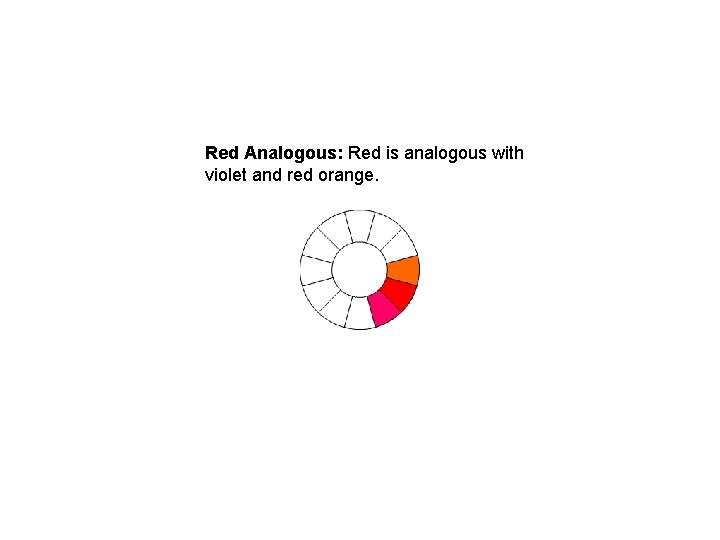
Red Analogous: Red is analogous with violet and red orange.
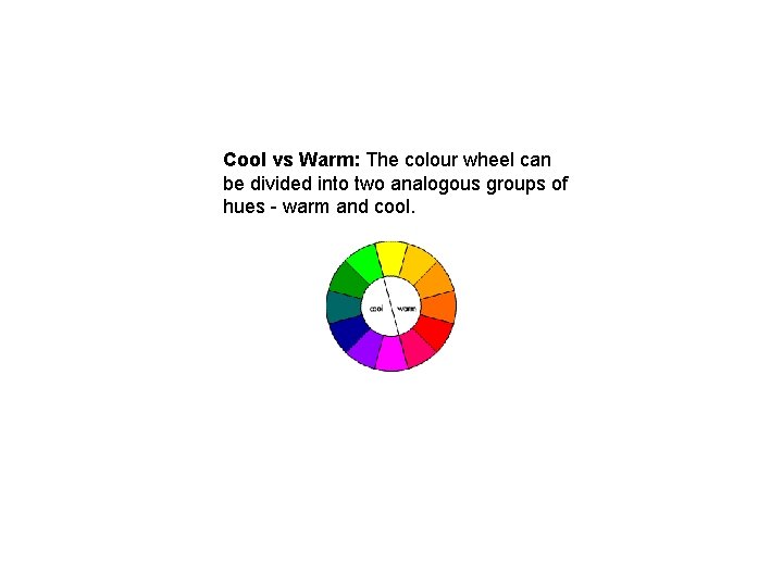
Cool vs Warm: The colour wheel can be divided into two analogous groups of hues - warm and cool.
Complementary Harmonies are created using colours that are directly opposite each other on the colour wheel.
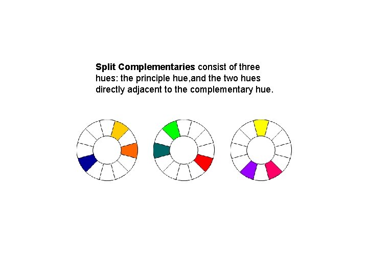
Split Complementaries consist of three hues: the principle hue, and the two hues directly adjacent to the complementary hue.
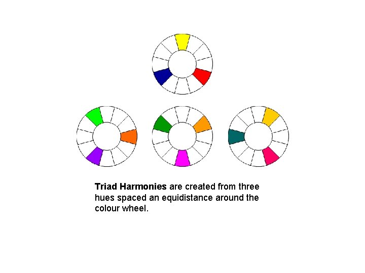
Triad Harmonies are created from three hues spaced an equidistance around the colour wheel.
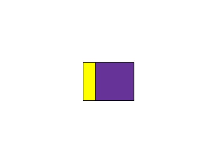
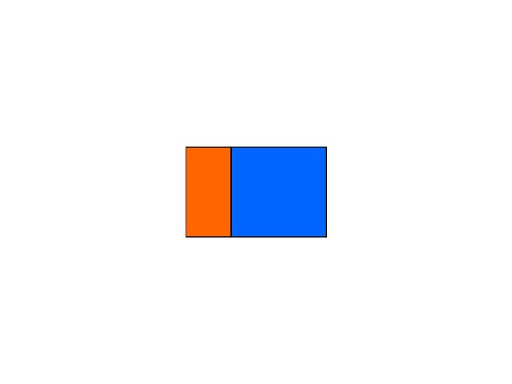
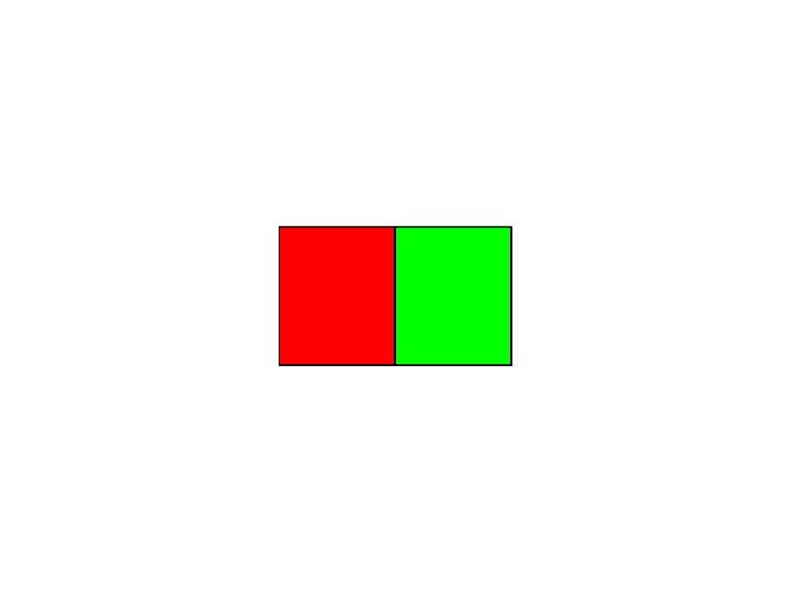
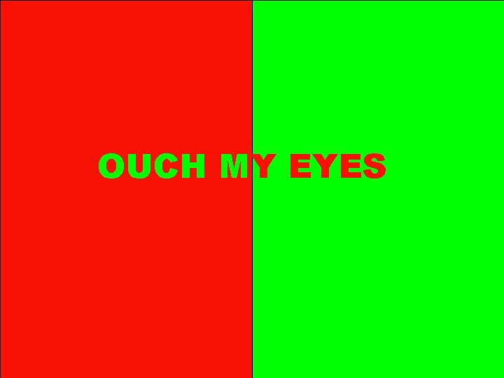
OUCH MY EYES
Some good sites dealing with colour: Claudia Cortes’ Color in Motion Poynter’s Institute’s Color Contrast and Dimension in News Design Adobe’s Kuler Application http: //kuler. adobe. com/ Colour Lovers http: //www. colourlovers. com/
“Building Blocks” essential to good graphic design: § Shape and Form § Spatial Awareness (layout and grid systems) § Typography: understanding what type is and how to work with it § Dynamics, Emphasis and Contrast § Using Colour as a powerful tool rather than just decoration e. g. emotive: to arouse intense feelings in viewer
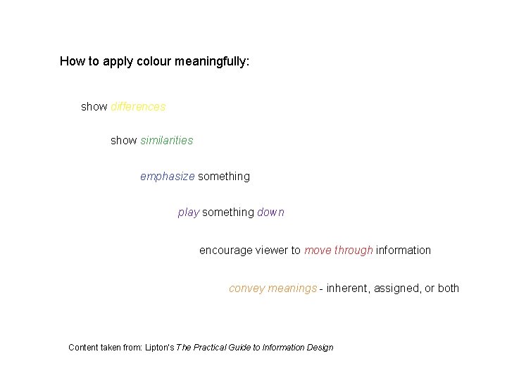
How to apply colour meaningfully: show differences show similarities emphasize something play something down encourage viewer to move through information convey meanings - inherent, assigned, or both Content taken from: Lipton’s The Practical Guide to Information Design

fin
- Slides: 30