Colour Theory 2 A Design Photography n Primary


- Slides: 15
Colour Theory 2 A Design Photography
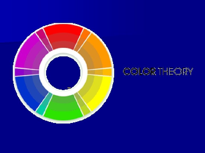
n Primary Colours: Red, Yellow, Blue.
n Secondary Colours: Orange, Green, Purple. These 3 colours are what you get when you mix the primary colours together. n YELLOW + RED = ORANGE RED + BLUE=VIOLET/PURPLE BLUE + YELLOW = GREEN
n Tertiary Colours: These are those "in-between" colours like Yellow-Green and Red-Violet. They're made by mixing one primary colour and one secondary colour together. YELLOW + ORANGE = YELLOW-ORANGE RED + ORANGE = RED-ORANGE RED + VIOLET / PURPLE = RED-PURPLE BLUE + VIOLET / PURPLE = BLUE-PURPLE BLUE + GREEN = BLUE-GREEN YELLOW + GREEN = YELLOW-GREEN
n Complementary Colours: Red and Green, Blue and Orange, Purple and Yellow. These are the colours directly across from each other on the colours wheel.
n Analogous Colours: Red and Orange, Blue and Green, etc. These are colours right next to each other on the colours wheel. They usually match extremely well, but they also create almost no contrast.
n. A Monochromatic Color Scheme is created by taking one Hue and repeating it in various Tints, Shades and Tones.
n Complementary Colours are any two Hues positioned exactly opposite each other on the Basic Colour Wheel.
n. A Near Complementary Colour Scheme is a twocolour palette and is very similar to a Basic Complementary Colour Scheme.
n. A Triad Colour combine every fourth colour on the Basic Colour Wheel. and Violet.
n Rectangular Tetrad on your Colour Wheel means juggling 4 colours. Simply put you're choosing a rectangle of 4 colours on the basic colour wheel.
n There are plenty of other names and titles that refer to different aspects of color, but this is where it starts getting complex. If you want to know more about color, read on. Warm Colors: Colors such as red, yellow, and orange. These colors evoke warmth because they remind us of things like the sun or fire. Cool Colors: Colors like blue, green, and purple (violet). These colors evoke a cool feeling because they remind us of things like water or grass. Neutral Colors: Gray, Brown. These aren't on most color wheels, but they're considered neutral because they don't contrast with much of anything. They're dull and uneventful.
n Value: Usually refers to the amount of black in a color. The more black a colour has, the darker its value. Brightness: Refers to the amount of white in a color. The more white a colour has, the brighter it is. Saturation: Refers to the amount of a color used. When a color is at full saturation, it is extremely vibrant. When a color is "desaturated, " a large amount of color has been removed. Desaturated colours tend to be close to being neutral because there is so much gray in them.
For Colour Meanings n Click here n http: //www. color-wheel-artist. com/colormeanings. html