Colour GOP Week 3 Artist research assignment Check



- Slides: 21

Colour GOP Week 3

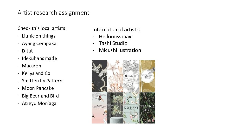
Artist research assignment Check this local artists: - Liunic on things - Ayang Cempaka - Ditut - Idekuhandmade - Macaroni - Kellys and Co - Smitten by Pattern - Moon Pancake - Big Bear and Bird - Atreyu Moniaga International artists: - Hellomissmay - Tashi Studio - Micushillustration

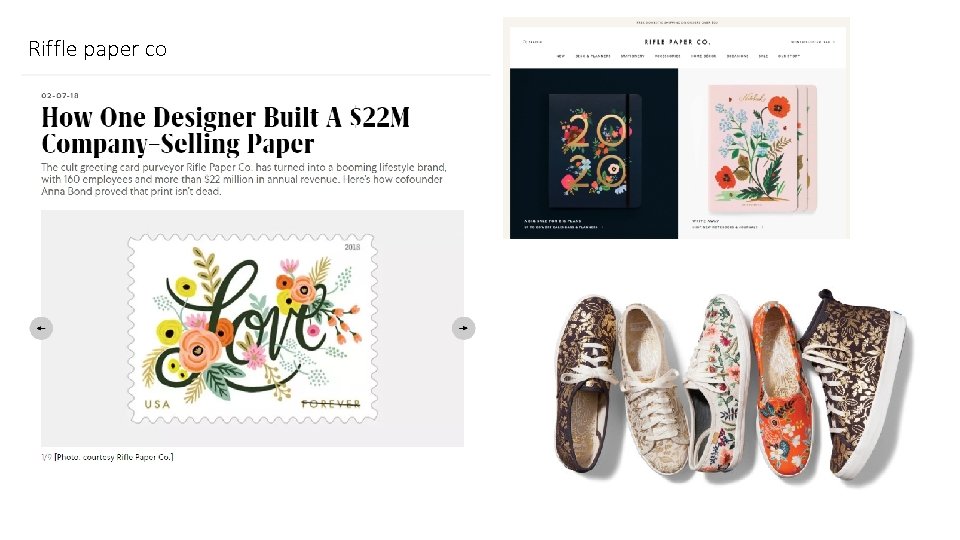
Riffle paper co

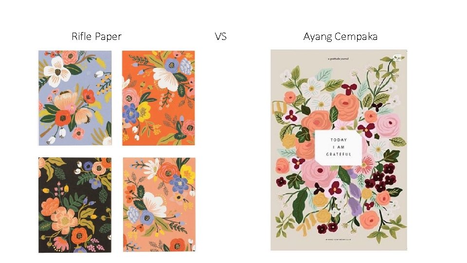
Rifle Paper VS Ayang Cempaka

Hal baru apa yang kalian dapatkan setelah melakukan riset? (Segi desain, bisnis, dll)

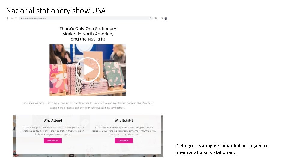
National stationery show USA Sebagai seorang desainer kalian juga bisa membuat bisnis stationery.

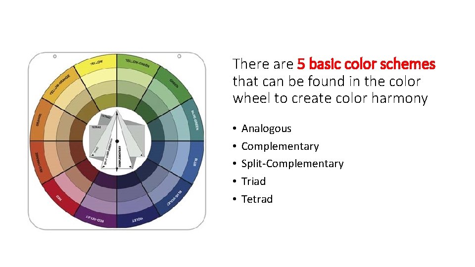
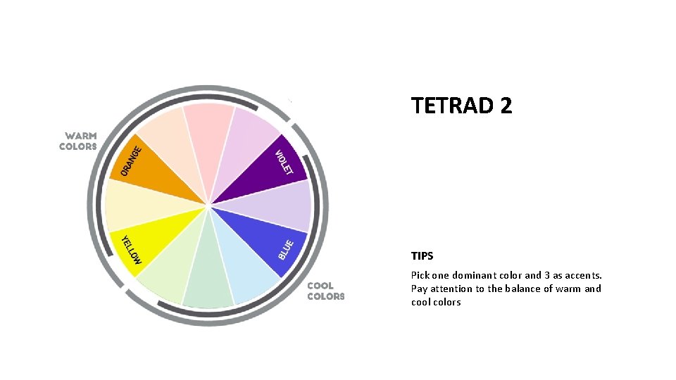
There are 5 basic color schemes that can be found in the color wheel to create color harmony • • • Analogous Complementary Split-Complementary Triad Tetrad

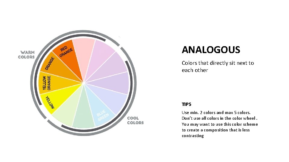
ANALOGOUS Colors that directly sit next to each other TIPS Use min. 2 colors and max 5 colors. Don’t use all colors in the color wheel. You may want to use this color scheme to create a composition that is less contrasting

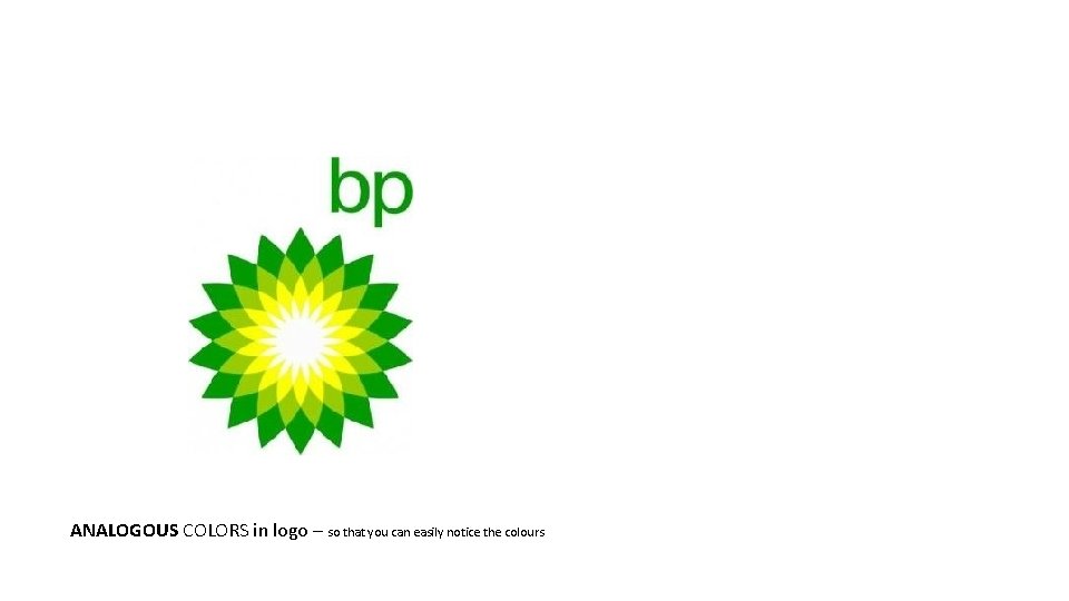
ANALOGOUS COLORS in logo – so that you can easily notice the colours

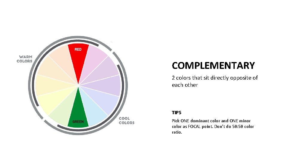
COMPLEMENTARY 2 colors that sit directly opposite of each other TIPS Pick ONE dominant color and ONE minor color as FOCAL point. Don’t do 50: 50 color ratio.

COMPLEMENTARY COLORS in logo

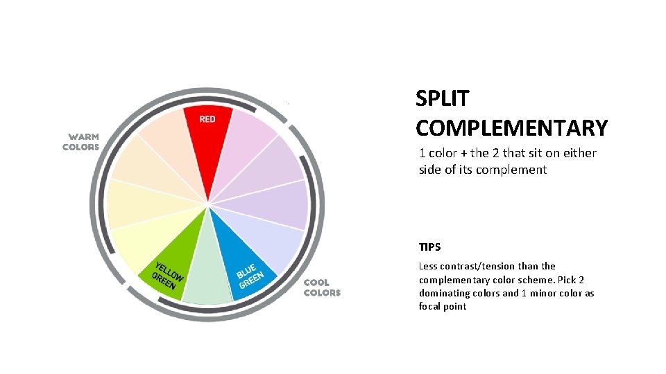
SPLIT COMPLEMENTARY 1 color + the 2 that sit on either side of its complement TIPS Less contrast/tension than the complementary color scheme. Pick 2 dominating colors and 1 minor color as focal point

SPLIT-COMPLEMENTARY COLORS in logo

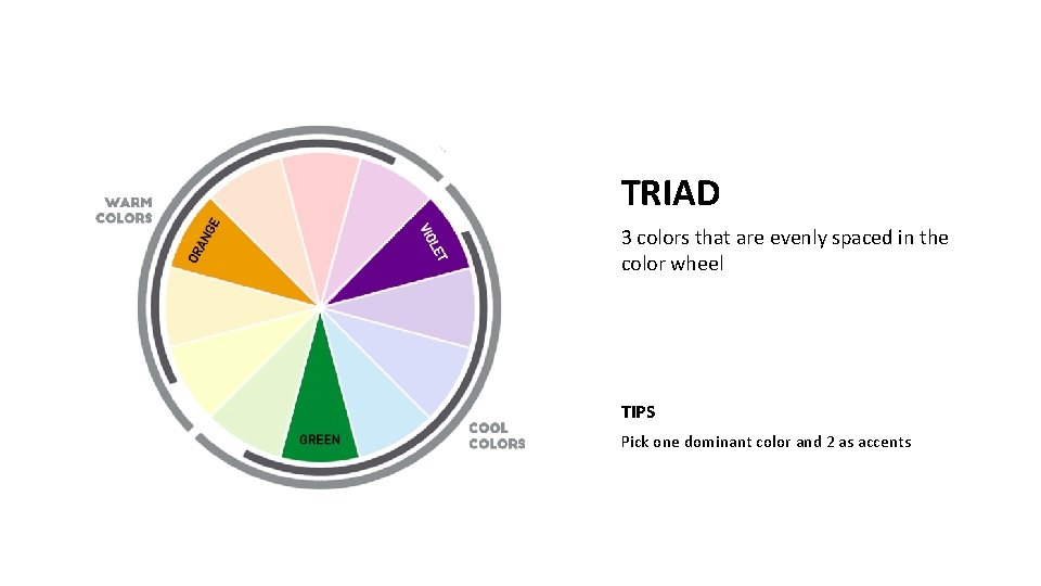
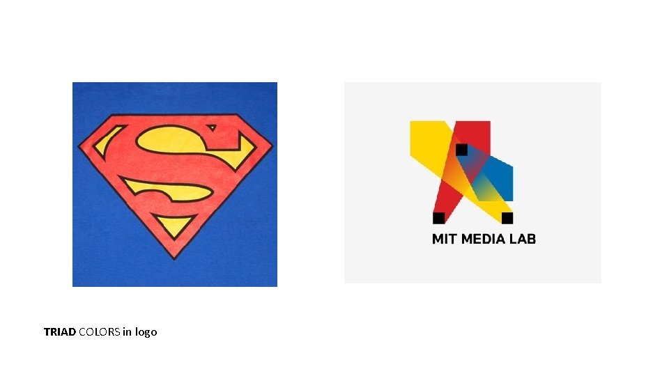
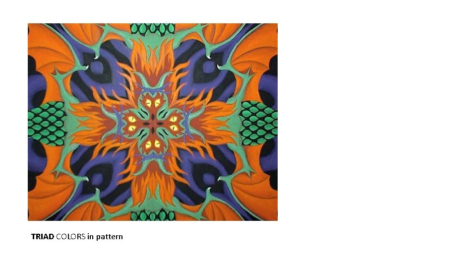
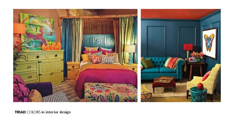
TRIAD 3 colors that are evenly spaced in the color wheel TIPS Pick one dominant color and 2 as accents

TRIAD COLORS in logo

TRIAD COLORS in pattern

TRIAD COLORS in interior design

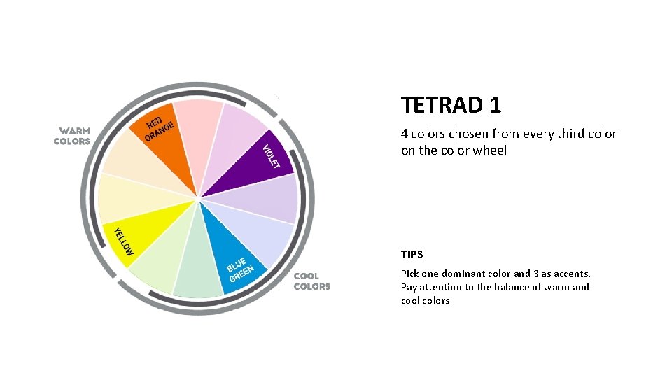
TETRAD 1 4 colors chosen from every third color on the color wheel TIPS Pick one dominant color and 3 as accents. Pay attention to the balance of warm and cool colors

TETRAD 2 TIPS Pick one dominant color and 3 as accents. Pay attention to the balance of warm and cool colors

TETRAD COLORS in logo

In-Class Work Color your poster using: 1. Tetrad or triad color palette 2. Three-four colors combination inspired by your chosen artists’ artwork (use their color palette but limit it into maximum 4 colors) Purpose of this exercise is to create color balance and evoke certain moods by using limited amount of colors.