Colour and Perception Psy L Tarja Peromaa tarja
- Slides: 40

Colour and Perception Psy. L Tarja Peromaa (tarja. peromaa@helsinki. fi) Department of Psychology and Logopedics, University of Helsinki 29. 10. 2019

Contents • The basics of colour perception • About color psychology • Colour preferences • Physiological responses to colour • Physiological responses to light: Non-visual effects • Colour and emotions • Case: Baker-Miller Pink

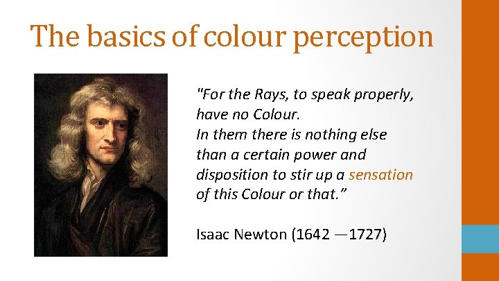
The basics of colour perception "For the Rays, to speak properly, have no Colour. In them there is nothing else than a certain power and disposition to stir up a sensation of this Colour or that. ” Isaac Newton (1642 — 1727)

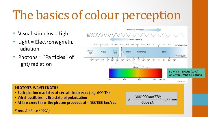
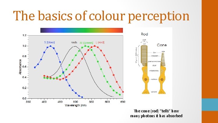
The basics of colour perception • Visual stimulus = Light • Light = Electromagnetic radiation • Photons = ”Particles” of light/radiation 5 G = 3. 5— 30 GHz (10^9) 4 G = 700— 2600 MHz (10^6) PHOTON'S WAVELENGTH? • Each photon oscillates at certain frequency (e. g. 600 THz) • What oscillates, is the state of polarization • At the same time, the photon proceeds at ≈ 300'000 km/sec From: Rodieck (1998)

The basics of colour perception The cone (rod) ”tells” how many photons it has absorbed

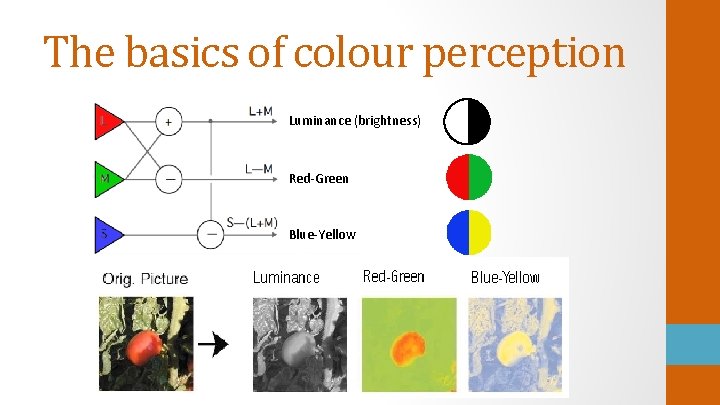
The basics of colour perception Luminance (brightness) Red-Green Blue-Yellow

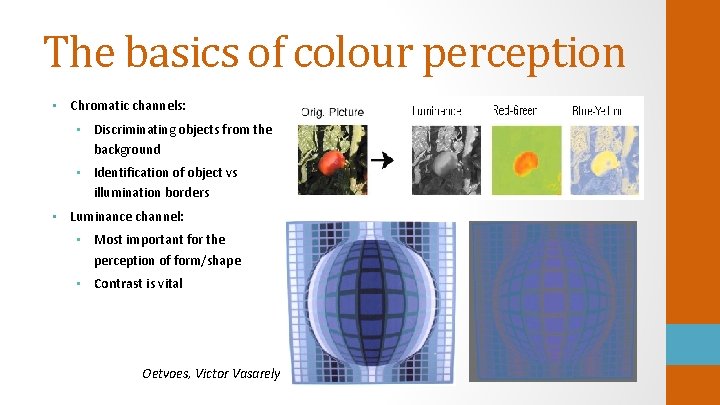
The basics of colour perception • Chromatic channels: • Discriminating objects from the background • Identification of object vs illumination borders • Luminance channel: • Most important for the perception of form/shape • Contrast is vital Oetvoes, Victor Vasarely

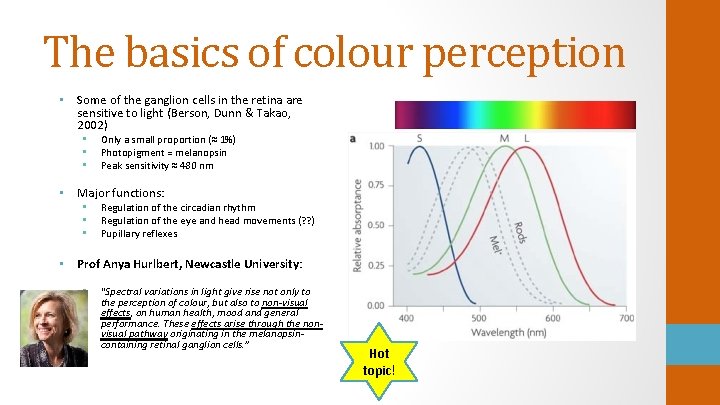
The basics of colour perception • Some of the ganglion cells in the retina are sensitive to light (Berson, Dunn & Takao, 2002) • • • Only a small proportion (≈ 1%) Photopigment = melanopsin Peak sensitivity ≈ 480 nm • Major functions: • • • Regulation of the circadian rhythm Regulation of the eye and head movements (? ? ) Pupillary reflexes • Prof Anya Hurlbert, Newcastle University: • “Spectral variations in light give rise not only to the perception of colour, but also to non-visual effects, on human health, mood and general performance. These effects arise through the nonvisual pathway originating in the melanopsincontaining retinal ganglion cells. ” Hot topic!

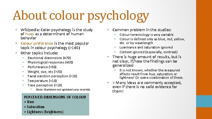
About colour psychology • Wikipedia: Color psychology is the study of hues as a determinant of human behavior • Colour preference is the most popular topic in colour psychology (>160) • Other topics include: • • Emotional dimensions (≈70) Physiological responses (≈60) Performance (<50) Weight, size, etc (>20) Facial emotion perception (>10) Temperature (<10) Time perception (<10) • Note: Numbers not updated very recently PERCEIVED DIMENSIONS OF COLOUR • Hue • Saturation • Lightness (brightness) • Common problem in the studies: • Colour terminology is very variable • Colour is defined only as blue, red, yellow, etc. or by wavelength • Luminance and saturation ignored • Context ignored (especially, contrast) • There is huge amount of results, but is not clear, if/how the findings can be generalized • It is not known, whether the measured effects result from hue, saturation or lightness! Or some combination of these. • > Many ideas are commonly accepted, even if there is no solid evidence for them!

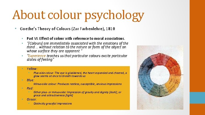
About colour psychology • Goethe’s Theory of Colours (Zur Farbenlehre), 1810 • Part VI. Effect of colour with reference to moral associations. • ”[Colours] are immediately associated with the emotions of the mind … without relation to the nature or form of the object on whose surface they are apparent ” • ”Experience teaches us that particular colours excite particular states of feeling” • Yellow: • Plus-side colour: The eye is gladdened, the heart expanded and cheered, a glow seems at once to breath towards us • Blue: • • Red: • Minus-side colour: Produces restless, susceptible, anxious impressions Either plus- or minus-side: Impression of gravity and dignity [dark]; or grace and attractiveness [light] • Green: • Distinctly graceful impressions

Colour preferences • Development: from infants to geriatric populations (ongoing interest) • Cultural aspects: e. g. Inuits, Negroes, Mexican, Filipino, Japanese, Chinese etc. (from 1920 s) • Gender (from 1960 s) • Personality characteristics: extro/introverts, stimulation seeking etc. (from 1940 s) • Psychiatric groups: insane, schizophrenics, depressed etc. (from 1930 s) • Misc: educational background, personal values, marital prediction, sexual orientation, criminals, alcohol and drug addicts, … • ”Out-of-person” factors • • • Only a few studies Preference as a function of temperature (1966); background and illumination (1970 s) Seasonal variations (2017) • Large amount of studies (> 160), starting from 1890 s • • ≈ 20 studies with more than 100 citations ≈ 20 studies with 50— 100 citations • Very variable methodology • Excellent review: Hurlbert, A. , & Ling, Y. (2012). Understanding colour perception and preference. In: Colour design: Theories and applications, pp. 129— 157. Ed. J. Best. Cambridge: Woodhead Publishing.

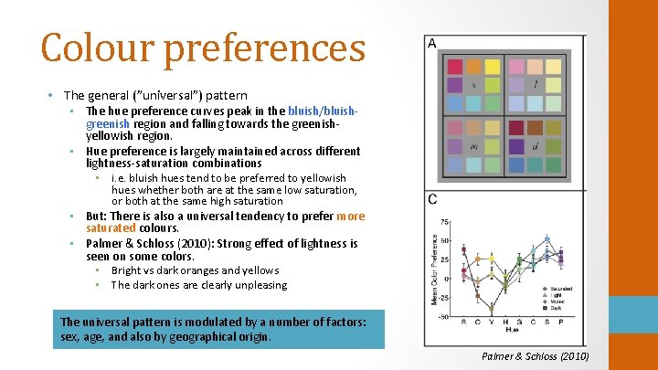
Colour preferences • The general (”universal”) pattern • The hue preference curves peak in the bluish/bluishgreenish region and falling towards the greenishyellowish region. • Hue preference is largely maintained across different lightness-saturation combinations • i. e. bluish hues tend to be preferred to yellowish hues whether both are at the same low saturation, or both at the same high saturation • But: There is also a universal tendency to prefer more saturated colours. • Palmer & Schloss (2010): Strong effect of lightness is seen on some colors. • Bright vs dark oranges and yellows • The dark ones are clearly unpleasing The universal pattern is modulated by a number of factors: sex, age, and also by geographical origin. Palmer & Schloss (2010)

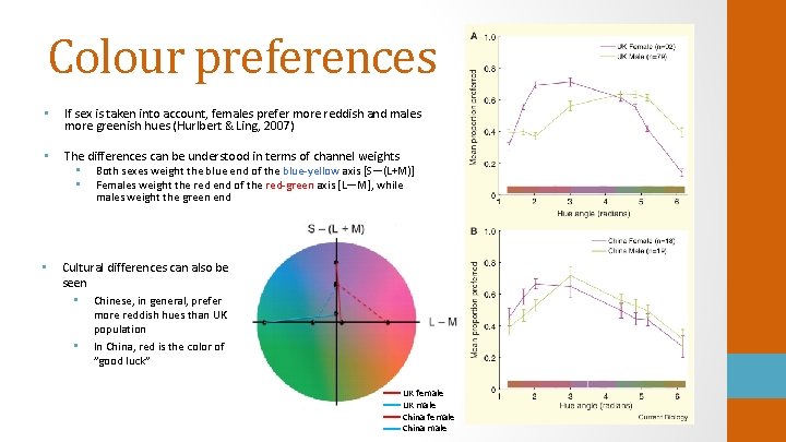
Colour preferences • If sex is taken into account, females prefer more reddish and males more greenish hues (Hurlbert & Ling, 2007) • The differences can be understood in terms of channel weights • Both sexes weight the blue end of the blue-yellow axis [S—(L+M)] • Females weight the red end of the red-green axis [L—M], while males weight the green end • Cultural differences can also be seen • Chinese, in general, prefer • more reddish hues than UK population In China, red is the color of ”good luck” UK female UK male China female China male

Colour preferences • ”It has become increasingly clear that development and ageing influence colour preference, in a way not entirely explained by changes in colour vision, linguistic ability, or other cognitive factors” (Hurlbert & Ling, 2007) • The difference in the colour preferences between the sexes is smallest in infants — and in the elderly population • Possible contributing factors include: • Sex hormones • Natural exposure to the environment • Feedback from the social environment (may strengthen the tendencies) • Ecological valence theory (Palmer & Schloss, 2010) • Individual colour preferences may arise from emotional responses to specific objects experienced during an individual's lifetime • Palmer & Schloss (2010) compared average individual colour preferences with the average individual preferences for objects associated with the same colours, in a local population, and found a close correspondence • Learning!

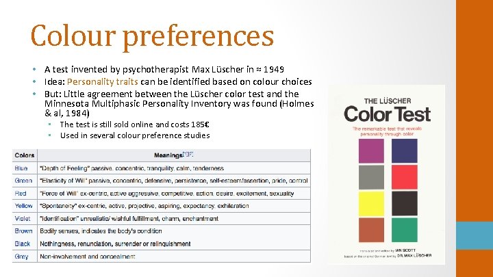
Colour preferences • A test invented by psychotherapist Max Lüscher in ≈ 1949 • Idea: Personality traits can be identified based on colour choices • But: Little agreement between the Lüscher color test and the Minnesota Multiphasic Personality Inventory was found (Holmes & al, 1984) • The test is still sold online and costs 185€ • Used in several colour preference studies

Physiological responses to colour • I found 57 articles on physiological responses, 12 of which were reviews of the topic (21%) • First study already in 1887; increasing interest from 1990 s • Very generally: Red is often said to be activating and blue is thought to be relaxing • Recent review-articles: • Elliot, A. J. & Maier, M. A. (2014). Color psychology: Effects of perceiving color on psychological functioning in humans. Annual Review of Psychology, 65, 95— 120. • Elliott, A. E. (2019). A historically based review of empirical work on color and psychological functioning: content, methods, and recommendations for future research. Review of General Psychology, 23(2), 177 — 200.

Physiological responses to colour • Autonomic nervous system consists of two parts • Peripheral, largely involuntary • Sympathetic nervous system • • Stress-related; fight-flight-or-freeze response Signs of activation: • Pupil dilation • Faster heart rate • Dilating blood vessels in sceletal muscles, • constricting blood vessels in the skin, gastrointestinal organs etc Sweating • Parasympathetic nervous system • • Relates to resting Signs of activation: • Pupil constriction • Diminished and more variable heart rate • Sexual arousal • Dilating blood vessels in the • gastrointestinal organs Salivation • What has been measured? • • Electrodermal activity of the skin Blood pressure Pulse & heart rate variability Breathing • But: For pupil responses to colour, there is separate literature • Constriction observed (more for red-green than blue-yellow stimuli, melanopsin contribution) • Also EEG, f. MRI, f. NIRS

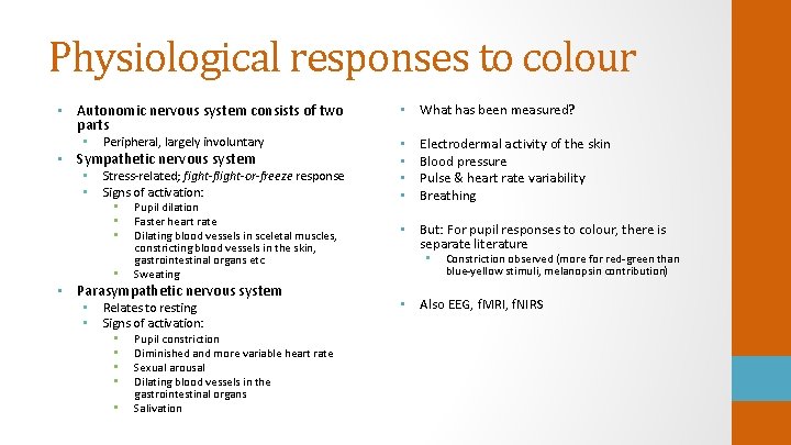
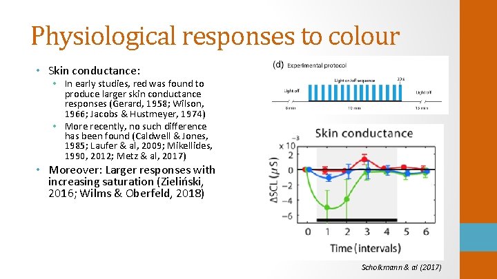
Physiological responses to colour • Skin conductance: • In early studies, red was found to produce larger skin conductance responses (Gerard, 1958; Wilson, 1966; Jacobs & Hustmeyer, 1974) • More recently, no such difference has been found (Caldwell & Jones, 1985; Laufer & al, 2009; Mikellides, 1990, 2012; Metz & al, 2017) • Moreover: Larger responses with increasing saturation (Zieliński, 2016; Wilms & Oberfeld, 2018) Scholkmann & al (2017)

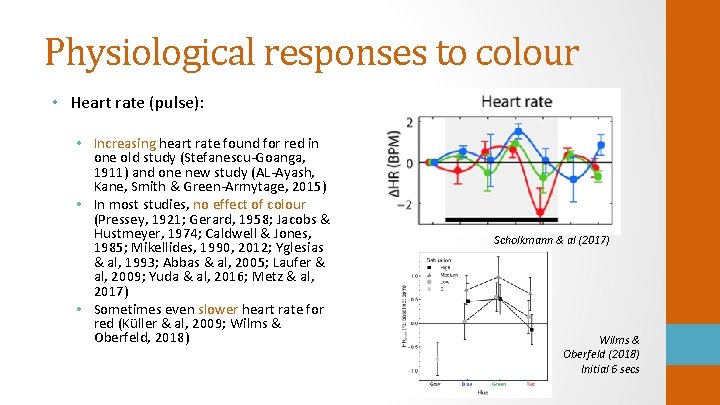
Physiological responses to colour • Heart rate (pulse): • Increasing heart rate found for red in one old study (Stefanescu-Goanga, 1911) and one new study (AL-Ayash, Kane, Smith & Green-Armytage, 2015) • In most studies, no effect of colour (Pressey, 1921; Gerard, 1958; Jacobs & Hustmeyer, 1974; Caldwell & Jones, 1985; Mikellides, 1990, 2012; Yglesias & al, 1993; Abbas & al, 2005; Laufer & al, 2009; Yuda & al, 2016; Metz & al, 2017) • Sometimes even slower heart rate for red (Küller & al, 2009; Wilms & Oberfeld, 2018) Scholkmann & al (2017) Wilms & Oberfeld (2018) Initial 6 secs

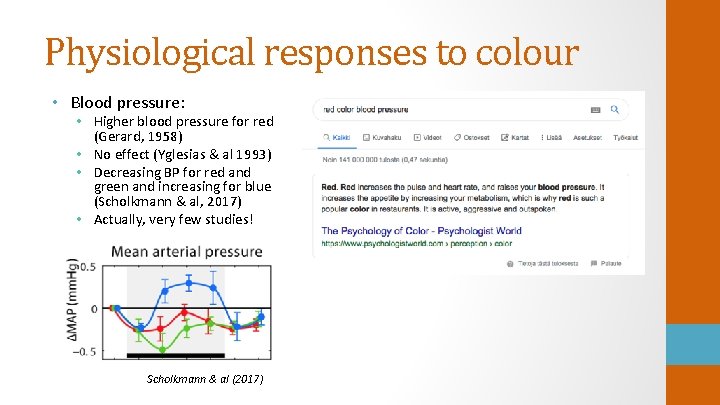
Physiological responses to colour • Blood pressure: • Higher blood pressure for red (Gerard, 1958) • No effect (Yglesias & al 1993) • Decreasing BP for red and green and increasing for blue (Scholkmann & al, 2017) • Actually, very few studies! Scholkmann & al (2017)

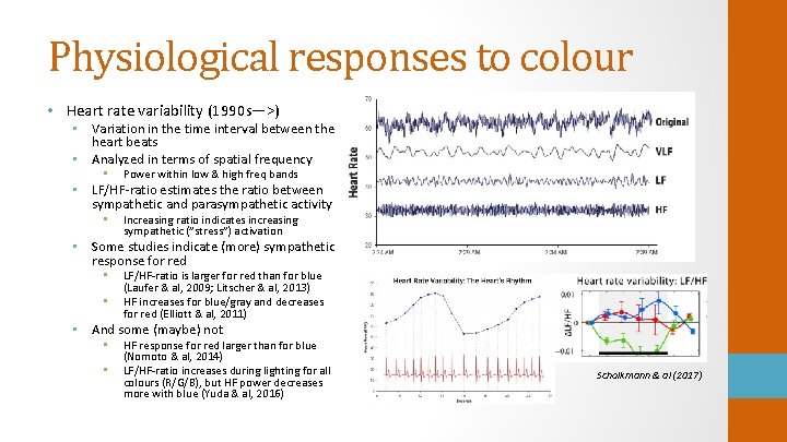
Physiological responses to colour • Heart rate variability (1990 s—>) • Variation in the time interval between the heart beats • Analyzed in terms of spatial frequency • Power within low & high freq bands • LF/HF-ratio estimates the ratio between sympathetic and parasympathetic activity • Increasing ratio indicates increasing sympathetic (”stress”) activation • Some studies indicate (more) sympathetic response for red • • LF/HF-ratio is larger for red than for blue (Laufer & al, 2009; Litscher & al, 2013) HF increases for blue/gray and decreases for red (Elliott & al, 2011) • And some (maybe) not • • HF response for red larger than for blue (Nomoto & al, 2014) LF/HF-ratio increases during lighting for all colours (R/G/B), but HF power decreases more with blue (Yuda & al, 2016) Scholkmann & al (2017)

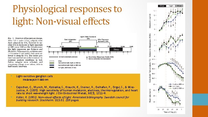
Physiological responses to light: Non-visual effects • Light-sensitive ganglion cells • Melanopsin ≈ 480 nm • Cajochen, C. , Munch, M. , Kobialka, S. , Krauchi, K. , Steiner, R. , Oelhafen, P. , Orgul, S. , & Wirz. Justice, A. (2005). High sensitivity of human melatonin, alertness, thermoregulation, and heart rate to short wavelength light. J Clin Endocrinol Metab, 90(3), 1311– 6. Küller, R. (1981). Non-visual effects of light. Annotated bibliography. Swedish council for building research: Stockholm. D 15: 81. 239 pages. •

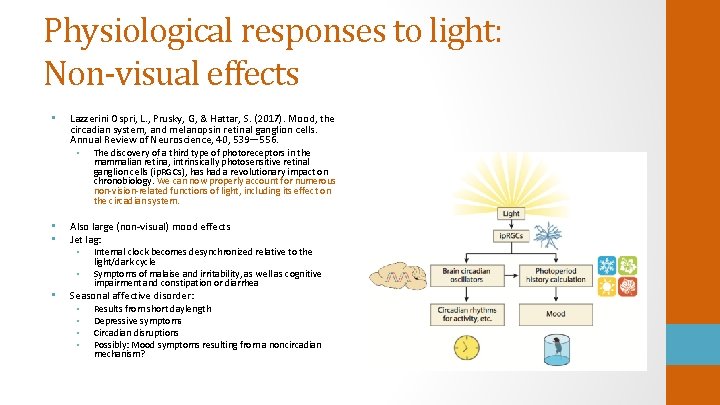
Physiological responses to light: Non-visual effects • Lazzerini Ospri, L. , Prusky, G, & Hattar, S. (2017). Mood, the circadian system, and melanopsin retinal ganglion cells. Annual Review of Neuroscience, 40, 539— 556. • The discovery of a third type of photoreceptors in the mammalian retina, intrinsically photosensitive retinal ganglion cells (ip. RGCs), has had a revolutionary impact on chronobiology. We can now properly account for numerous non-vision-related functions of light, including its effect on the circadian system. • • Also large (non-visual) mood effects Jet lag: • Internal clock becomes desynchronized relative to the • • light/dark cycle Symptoms of malaise and irritability, as well as cognitive impairment and constipation or diarrhea Seasonal affective disorder: • Results from short daylength • Depressive symptoms • Circadian disruptions • Possibly: Mood symptoms resulting from a noncircadian mechanism?

Colour and emotions Hurlbert & Ling, 2012: ”There is strong evidence, though, that the ability to form emotional associations to colour, whether on an ontogenetic or evolutionary time scale, is deeply embedded in human nature. ” • Stimuli • Small/large paper patches • • • Coloured mood questionnaires Projected light patch Patch on CRT Colored walls (one or more) Concept of colour only • Stimulus duration from 5 secs to days • Definition of colour • • Spectral colours Munsell colour NCS colours CIELab definition (2000—>) • Not well defined at all Lots of variability!

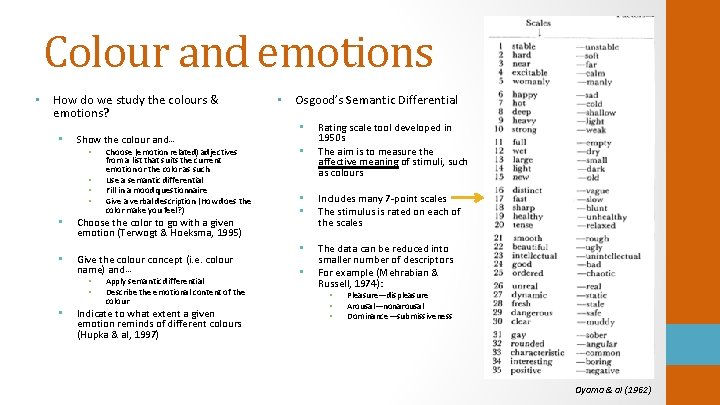
Colour and emotions • How do we study the colours & emotions? • Show the colour and… • • Choose (emotion related) adjectives from a list that suits the current emotion or the color as such Use a semantic differential Fill in a mood questionnaire Give a verbal description (How does the color make you feel? ) • Choose the color to go with a given emotion (Terwogt & Hoeksma, 1995) • Give the colour concept (i. e. colour name) and… • • • Apply semantic differential Describe the emotional content of the colour Indicate to what extent a given emotion reminds of different colours (Hupka & al, 1997) • Osgood’s Semantic Differential • • Rating scale tool developed in 1950 s The aim is to measure the affective meaning of stimuli, such as colours • • Includes many 7 -point scales The stimulus is rated on each of the scales • The data can be reduced into smaller number of descriptors For example (Mehrabian & Russell, 1974): • • Pleasure—displeasure Arousal—nonarousal Dominance—submissiveness Oyama & al (1962)

Colour and emotions • Most widely cited (over 1000 refs) paper in the field is Valdez & Mehrabian (1994): Effects of Color on Emotions • ”Thus, despite the substantial body of experimental work in this area, results have failed to provide a thorough and general characterization of relationships between color and affect” • Early reports showed that • Red and yellow colours were associated with higher anxiety scores than blue and green (Jacobs & Suess, 1975). • Red colour was associated with words exciting and stimulating, whereas blue was associated with secure/comfortable and tender/soothing (Wexner, 1954). • Colour chips were rated using a semantic differential. Showiness factor correlated positively with saturation and brightness. Furthermore, calmness correlated negatively with brightness (Wright & Rainwater, 1962). • Semantic differential and Pleasure-Arousal-Dominance (PAD) Emotion Model applied • General low-level cognitive-affective factors • For example: [+P—A+D] ≈ comfortable, leisurely, relaxed, satisfied, unperturbed

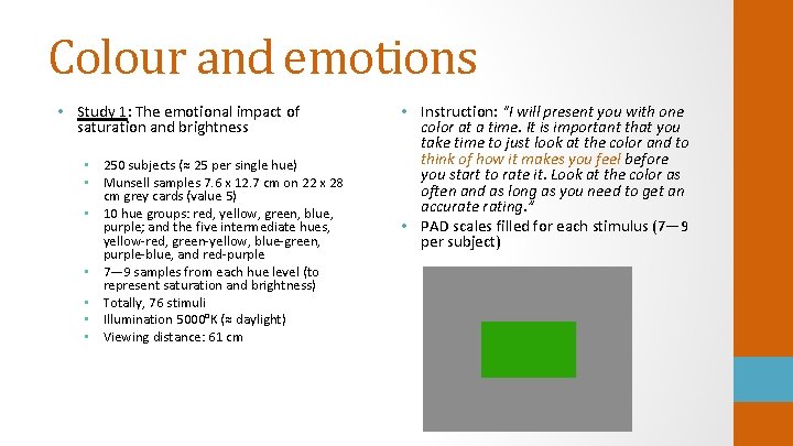
Colour and emotions • Study 1: The emotional impact of saturation and brightness • 250 subjects (≈ 25 per single hue) • Munsell samples 7. 6 x 12. 7 cm on 22 x 28 cm grey cards (value 5) • 10 hue groups: red, yellow, green, blue, purple; and the five intermediate hues, yellow-red, green-yellow, blue-green, purple-blue, and red-purple • 7— 9 samples from each hue level (to represent saturation and brightness) • Totally, 76 stimuli • Illumination 5000°K (≈ daylight) • Viewing distance: 61 cm • Instruction: "I will present you with one color at a time. It is important that you take time to just look at the color and to think of how it makes you feel before you start to rate it. Look at the color as often and as long as you need to get an accurate rating. ” • PAD scales filled for each stimulus (7— 9 per subject)

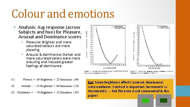
Colour and emotions • Analysis: Avg response (across Subjects and hue) for Pleasure, Arousal and Dominance scores • Pleasure: Brighter and more saturated colours are more pleasing • Arousal & dominance: Darker and more saturated colors were more arousing and induced greater feelings of dominance But: Some brightness effects (arousal, dominance) were nonlinear. Contrast is important (increments vs decrements) — but the issue is not commented in the paper!

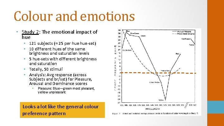
Colour and emotions • Study 2: The emotional impact of hue • 121 subjects (≈ 25 per hue-set) • 10 different hues of the same brightness and saturation levels • 5 hue-sets with different brightness and saturation • Totally, 50 stimuli • Analysis: Avg response (across Subjects and br/sat) for Pleasure, Arousal and Dominance scores • Pleasure: Blue—green most pleasant, yellow unpleasant Looks a lot like the general colour preference pattern

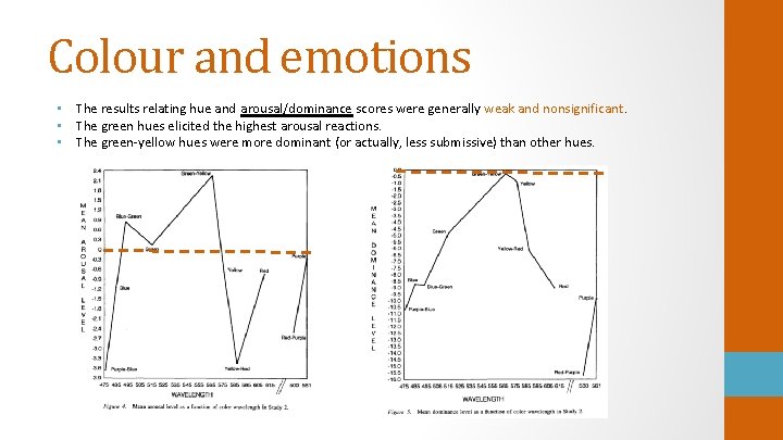
Colour and emotions • The results relating hue and arousal/dominance scores were generally weak and nonsignificant. • The green hues elicited the highest arousal reactions. • The green-yellow hues were more dominant (or actually, less submissive) than other hues.

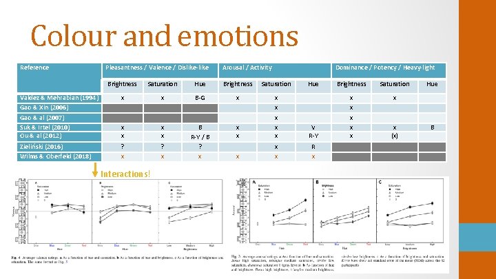
Colour and emotions Reference Pleasantness / Valence / Dislike-like Arousal / Activity Dominance / Potency / Heavy-light Brightness Saturation Hue Brightness Saturation Valdez & Mehrabian (1994) Gao & Xin (2006) Gao & al (2007) Suk & Irtel (2010) Ou & al (2012) x x B-G x x x Zieliński (2016) Wilms & Oberfeld (2018) ? x B R-Y / B ? x Interactions! Hue Brightness Saturation V R-Y x x x x R x x (x) Hue B

Colour and emotions • Semantic differentials indicate (very roughly) that. . . • Blue is pleasing • Saturated is arousing • Dark is dominating • But what does this mean in terms of emotions? • —> Look at the basic emotion—colour linkage • Sorry — not much more clear there, either • For example Sadness: Correlates with blue (Clarke & Costal, 2008), red (Terwogt & Hoeksma, 1995), green (Terwogt & Hoeksma, 1995), purple, gray and black (Oberascher & Gallmetzer, 2003) • Angriness is somewhat more consistent: In several studies it correlates with red (Terwogt & Hoeksma, 1995; Hupka & al, 1997; Oberascher & Gallmetzer, 2003; Clarke & Costal, 2008) and black (Hupka & al, 1997; Oberascher & Gallmetzer, 2003) And so on…….

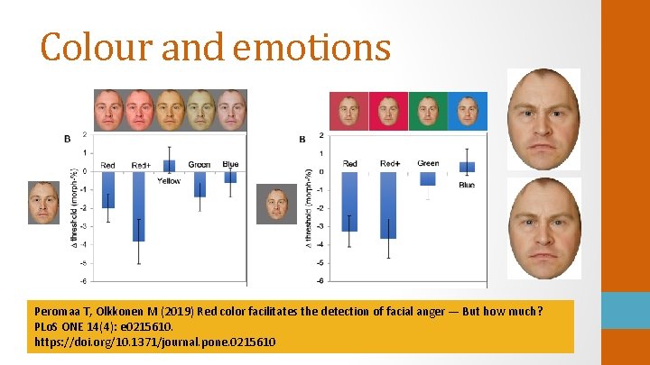
Colour and emotions Peromaa T, Olkkonen M (2019) Red color facilitates the detection of facial anger — But how much? PLo. S ONE 14(4): e 0215610. https: //doi. org/10. 1371/journal. pone. 0215610

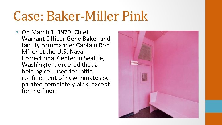
Case: Baker-Miller Pink • On March 1, 1979, Chief Warrant Officer Gene Baker and facility commander Captain Ron Miller at the U. S. Naval Correctional Center in Seattle, Washington, ordered that a holding cell used for initial confinement of new inmates be painted completely pink, except for the floor.

Case: Baker-Miller Pink • Background (Schauss, 1979): In 1978, Glen Wylie of Santa Ana, California, showed John N. Ott, noted photo-biologist, a Kinesoid experiment utilizing the colors pink and blue. If a two foot by three foot piece of bright pink construction paper is placed in front of a subject's eyes, the response is a significant loss of muscular strength. • AIBMR Life Sciences Alexander Schauss (1979) reports his own experiment with 153 subjects. • • Schauss was influenced by John Ott who believed that physical strength is influenced by electromagnetic properties of visual stimuli. Using the Kinesoid method, only two subjects failed to demonstrate a loss of strength to the pink color. Also, experiments with 38 subjects using an adjustable dynamometer show similar results. All 38 subjects exhibited losses of strength, when exposed to the pink color, ranging from 6 to 23 percent. • After experimenting with hundreds of shades of pink, I finally identified a shade of pink, I labelled P-618, that seemingly had a maximal effect on reducing hyperexcitability (Schauss, 1985). • Note that this is not an actual research paper. The above mentioned is everything we know of the experiment. s. RGB: 255, 145, 175

Case: Baker-Miller Pink • Because of the demonstrated loss of muscular power after the exposure to the pink colour, Schauss suggested that a pink holding cell might be useful as a time-out room for acting out confinees • —> Applied in the U. S. Naval Correctional Center in Seattle • ”After 223 days of continuous use as a temporary holding facility for new confinees, the results have been impressive. A memorandum to the Bureau of Naval Personnel, Law Enforcement and Corrections Division, Washington, D. C, written 156 days after use of the pink holding cell stated: Since initiation of this procedure on March 1, 1979, there have been no incidents of erratic or hostile behavior during the initial phase of confinement. ” • Schauss (1979): The use of pink color in reducing aggression and causing muscular relaxation is humane and involves no medication or physical force. … It is similarly effective with the color-blind. In repeated experiments with adolescents and adults, the non-drug anesthetic effect occurs, on the average in 2. 7 seconds. I would suggest the use of pink color in any situation where sudden or uncontrollable aggression is likely. No data!

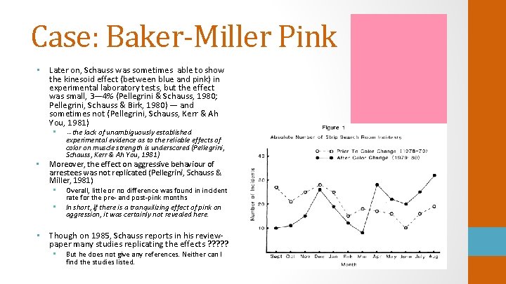
Case: Baker-Miller Pink • Later on, Schauss was sometimes able to show the kinesoid effect (between blue and pink) in experimental laboratory tests, but the effect was small, 3— 4% (Pellegrini & Schauss, 1980; Pellegrini, Schauss & Birk, 1980) — and sometimes not (Pellegrini, Schauss, Kerr & Ah You, 1981) • • … the lack of unambiguously established experimental evidence as to the reliable effects of color on muscle strength is underscored (Pellegrini, Schauss, Kerr & Ah You, 1981) Moreover, the effect on aggressive behaviour of arrestees was not replicated (Pellegrini, Schauss & Miller, 1981) • Overall, little or no difference was found in incident • rate for the pre- and post-pink months In short, if there is a tranquilizing effect of pink on aggression, it was certainly not revealed here. • Though on 1985, Schauss reports in his reviewpaper many studies replicating the effects ? ? ? • But he does not give any references. Neither can I find the studies listed.

Case: Baker-Miller Pink • Later studies found no effects of pink… • on the grip strength (Profusek & Rainey, 1987; Gilliam & Unruh, 1988; Gilliam, 1991) • on the aggressive behaviour of the inmates (Genschow, Noll, Wänke & Gersbach, 2015)

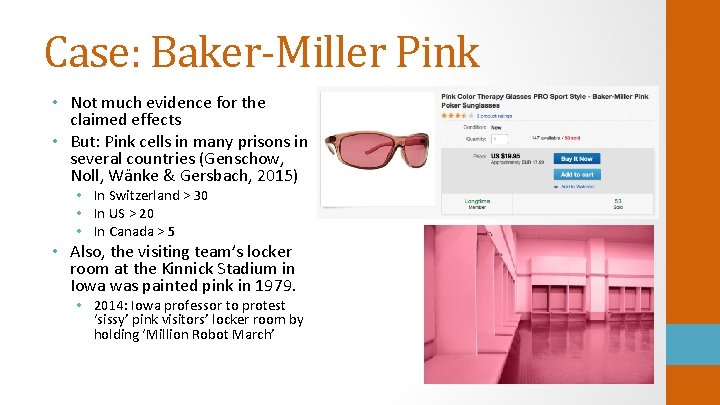
Case: Baker-Miller Pink • Not much evidence for the claimed effects • But: Pink cells in many prisons in several countries (Genschow, Noll, Wänke & Gersbach, 2015) • In Switzerland > 30 • In US > 20 • In Canada > 5 • Also, the visiting team’s locker room at the Kinnick Stadium in Iowa was painted pink in 1979. • 2014: Iowa professor to protest ‘sissy’ pink visitors’ locker room by holding ‘Million Robot March’

To conclude • Color psychology is a field of study, where the quality of research varies a lot • Lots of incorrect information available in the Internet • Little consistent results so far • Partly results of highly variable parameters of the studies, also • More (and better controlled) research is needed!