COLOR You will need to take notes What


- Slides: 45
COLOR ! You will need to take notes!
What is Color? How do we see it? As illustrated in the diagram below, light goes from the source (the sun) to the object (the apple), and finally to the detector (the eye and brain). 1. All the "invisible" colors of sunlight shine on the apple. 2. The surface of a red apple absorbs all the colored light rays, except for those corresponding to red, and reflects this color to the human eye. 3. The eye receives the reflected red light and sends a message to the brain. When light hits an object’s surface, the color of the object is reflected back to our eyes . http: //www. colormatters. com/color-and-vision/how-the-eye-sees-color
Color Wheel 1. Primary Colors 2. Secondary Colors 3. Tertiary Colors
Color Wheel 1. Primary Colors * Colors that cannot be made from mixing other colors. * Colors that can be mixed to make other colors. 2. Secondary Colors 3. Tertiary Colors
Color Wheel 1. Primary Colors * Colors that cannot be made from mixing other colors. * Colors that can be mixed to make other colors. 2. Secondary Colors * Colors made by mixing 2 (1+1) Primary colors. 3. Tertiary Colors
Color Wheel 1. Primary Colors * Colors that cannot be made from mixing other colors. * Colors that can be mixed to make other colors. 2. Secondary Colors * Colors made by mixing 2 (1+1) Primary colors. 3. Tertiary Colors * Colors made by mixing a Primary and Secondary (1+2) colors.
Color Wheel 1. Primary Colors 2. Secondary Colors 3. Tertiary Colors
Color Wheel 1. Primary Colors * Red * Yellow * Blue 2. Secondary Colors 3. Tertiary Colors
Color Wheel 1. Primary Colors * Red * Yellow * Blue 2. Secondary Colors * Orange * Green * Purple 3. Tertiary Colors
Color Wheel 1. Primary Colors * Red * Yellow * Blue 2. Secondary Colors * Orange * Green * Purple 3. Tertiary Colors * Red-Orange * Yellow-Green * Blue-Violet * Red-Violet blue -violet blu e P T
What about Black and White? • In Paint… – Black = a mixture of all colors or pigments – White = absence of color or pigment • In Light… – Black = absence of color – White = all colors combined create white light
Sketchbook Mini-Project #1 • Create your own Color wheel! – Be creative with your design! – Make sure to place colors in the correct order! – Label colors by name and as Primary, Secondary, and Tertiary.
Sketchbook Mini-Project #1 • Create your own Color wheel! – Be creative with your design! – Make sure to place colors in the correct order! – Label colors by name and as Primary, Secondary, and Tertiary.
Sketchbook Mini-Project #1 • Create your own Color wheel! – Be creative with your design! – Make sure to place colors in the correct order! • Remember ROYGBIV ! – Label colors by name and as Primary, Secondary, and Tertiary.
What is “color” ? • Color has 3 properties… – Hue – Intensity – Value
Hue • The attribute of a color by virtue of which it is discernible as red, green, etc. ,
Intensity • is the purity or saturation of a color. • The strength of a color, especially the degree to which it lacks its complementary color.
Value • the relative lightness or darkness of a color
Sketchbook Mini-Project #2 • Create 1 color Intensity Scale! o Choose 2 complementary colors (color pencil or crayon). o Start with one color on each end, and gradually mix the colors until they are mixed 50/50 in the middle! (Minimum 3 -5 squares. ) • Create 1 color Value Scale! o Choose a color for each scale, and place it in the middle of 3 -5 squares. o To the left of the middle square, gradually add white. o To the right of the middle square, gradually add black. o The square to the far left should be almost white, the square to the far right should be almost black.
Color Temperature • Warm Colors • Cool Colors
Color Temperature • Warm Colors – Red • red-violet • red-orange – Orange • yellow-orange – Yellow • yellow-green • Cool Colors – Blue • blue-green • blue-violet – Violet
Sketchbook Mini-Project #3 • Create a Warm/Cool Color Grid Design! – Draw a grid on a page in your sketchbook. – Draw another picture or design overlapping the grid. – Begin coloring in each square - when the squares overlap the other object or design, change the temperature of your color!
Check Yourself … q Mini-Project #1: Color Wheel • 12 colors, labeled by color and category (P, S, T) q Mini-Project #2 a: Color Intensity Scale • Using Complementary Colors q Mini-Project #2 b: Color Value Scale • Light to Dark of 1 Color q Mini-Project #3: Warm/Cool Color Grid • Grid with overlapping image/shape, color temperature changes with overlap
Color Schemes • a planned combination of colors. – Monochromatic – Analagous – Complementary – Split-Complementary – Triadic
Monochromatic • Mono-: One + Chroma: Color • One Color, Black, White • tints and shades (Values) of one color only (except for guitar)
Analogous • colors that are adjacent to each other on the color wheel
Complementary • pairs of colors that are of “opposite” hue
Split-Complementary • A color scheme that includes a main color and the two colors on each side of its complementary (opposite) color on the color wheel. • These are the colors that are one hue and two equally spaced from its complement.
Triadic • A color scheme in which 3 colors of equal distance apart on the color wheel are used (e. g. , red, blue, and yellow OR purple, green, and orange).
Sketchbook Mini-Project #4 • Same Picture 5 Ways! – Draw a simple picture in 5 boxes on a page in your sketchbook. – Label each picture with a color scheme • Monochromatic • Analogous • Triadic • Complementary • Split-Complementary – Color each picture according to each color scheme.
Check Yourself … q Mini-Project #1: Color Wheel • 12 colors, labeled by color and category (P, S, T) q Mini-Project #2 a: Color Intensity Scale • Using Complementary Colors q Mini-Project #2 b: Color Value Scale • Light to Dark of 1 Color q Mini-Project #3: Warm/Cool Color Grid • Grid with overlapping image/shape, color temperature changes with overlap q Mini-Project #4: Color Schemes • 1 picture 5 ways – Monochromatic, Analogous, Triadic, Complementary, Split-Complementary
Color Psychology
“Seeing RED” • Red is the color of fire and blood, so it is associated with energy, war, danger, strength, power, determination as well as passion, desire, and love. • Red is a very emotionally intense color. It enhances human metabolism, increases respiration rate, and raises blood pressure. It has very high visibility, which is why stop signs, stoplights, and fire equipment are usually painted red. In heraldry, red is used to indicate courage. It is a color found in many national flags. • Red brings text and images to the foreground. Use it as an accent color to stimulate people to make quick decisions; it is a perfect color for 'Buy Now' or 'Click Here' buttons on Internet banners and websites. Red is widely used to indicate danger (high voltage signs, traffic lights). This color is also commonly associated with energy, so you can use it when promoting energy drinks, games, cars, items related to sports and high physical activity. http: //www. color-wheel-pro. com/color-meaning. html
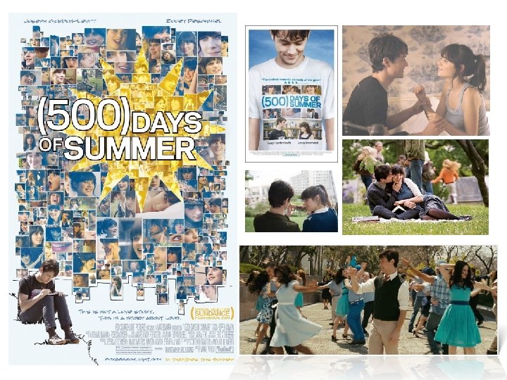
movies with RED themes
“Feeling BLUE? ” • • • Blue is the color of the sky and sea. It is often associated with depth and stability. It symbolizes trust, loyalty, wisdom, confidence, intelligence, faith, truth, and heaven. Blue is considered beneficial to the mind and body. It slows human metabolism and produces a calming effect. Blue is strongly associated with tranquility and calmness. In heraldry, blue is used to symbolize piety and sincerity. You can use blue to promote products and services related to cleanliness (water purification filters, cleaning liquids, vodka), air and sky (airlines, airports, air conditioners), water and sea (sea voyages, mineral water). As opposed to emotionally warm colors like red, orange, and yellow; blue is linked to consciousness and intellect. Use blue to suggest precision when promoting high-tech products. Blue is a masculine color; according to studies, it is highly accepted among males. Dark blue is associated with depth, expertise, and stability; it is a preferred color for corporate America. Avoid using blue when promoting food and cooking, because blue suppresses appetite. When used together with warm colors like yellow or red, blue can create high-impact, vibrant designs; for example, blue-yellow-red is a perfect color scheme for a superhero. http: //www. color-wheel-pro. com/color-meaning. html
“and it was all YELLOW” • • • Yellow is the color of sunshine. It's associated with joy, happiness, intellect, and energy. Yellow produces a warming effect, arouses cheerfulness, stimulates mental activity, and generates muscle energy. Yellow is often associated with food. Bright, pure yellow is an attention getter, which is the reason taxicabs are painted this color. When overused, yellow may have a disturbing effect; it is known that babies cry more in yellow rooms. Yellow is seen before other colors when placed against black; this combination is often used to issue a warning. In heraldry, yellow indicates honor and loyalty. Later the meaning of yellow was connected with cowardice. Use yellow to evoke pleasant, cheerful feelings. You can choose yellow to promote children's products and items related to leisure. Yellow is very effective for attracting attention, so use it to highlight the most important elements of your design. Men usually perceive yellow as a very lighthearted, 'childish' color, so it is not recommended to use yellow when selling prestigious, expensive products to men – nobody will buy a yellow business suit or a yellow Mercedes. Yellow is an unstable and spontaneous color, so avoid using yellow if you want to suggest stability and safety. Light yellow tends to disappear into white, so it usually needs a dark color to highlight it. Shades of yellow are visually unappealing because they loose cheerfulness and become dingy. http: //www. color-wheel-pro. com/color-meaning. html
“MORE” by Mark Osborne
“ORANGE you glad? ” • • • Orange combines the energy of red and the happiness of yellow. It is associated with joy, sunshine, and the tropics. Orange represents enthusiasm, fascination, happiness, creativity, determination, attraction, success, encouragement, and stimulation. To the human eye, orange is a very hot color, so it gives the sensation of heat. Nevertheless, orange is not as aggressive as red. Orange increases oxygen supply to the brain, produces an invigorating effect, and stimulates mental activity. It is highly accepted among young people. As a citrus color, orange is associated with healthy food and stimulates appetite. Orange is the color of fall and harvest. In heraldry, orange is symbolic of strength and endurance. Orange has very high visibility, so you can use it to catch attention and highlight the most important elements of your design. Orange is very effective for promoting food products and toys. http: //www. color-wheel-pro. com/color-meaning. html
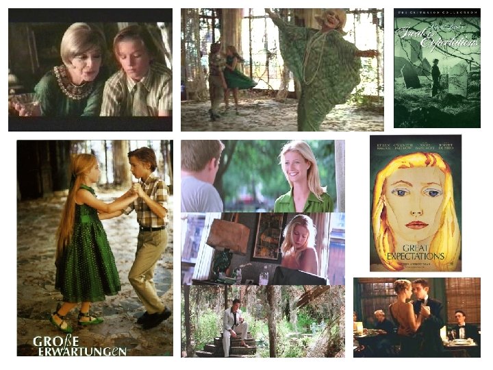
“Going GREEN” • Green is the color of nature. It symbolizes growth, harmony, freshness, and fertility. Green has strong emotional correspondence with safety. Dark green is also commonly associated with money. • Green has great healing power. It is the most restful color for the human eye; it can improve vision. Green suggests stability and endurance. Sometimes green denotes lack of experience; for example, a 'greenhorn' is a novice. In heraldry, green indicates growth and hope. Green, as opposed to red, means safety; it is the color of free passage in road traffic. • Use green to indicate safety when advertising drugs and medical products. Green is directly related to nature, so you can use it to promote 'green' products. Dull, darker green is commonly associated with money, the financial world, banking, and Wall Street. http: //www. color-wheel-pro. com/color-meaning. html
“The Color PURPLE” • Purple combines the stability of blue and the energy of red. Purple is associated with royalty. It symbolizes power, nobility, luxury, and ambition. It conveys wealth and extravagance. Purple is associated with wisdom, dignity, independence, creativity, mystery, and magic. • According to surveys, almost 75 percent of pre-adolescent children prefer purple to all other colors. Purple is a very rare color in nature; some people consider it to be artificial. • Light purple is a good choice for a feminine design. You can use bright purple when promoting children's products. http: //www. color-wheel-pro. com/color-meaning. html
BLACK Black is associated with power, elegance, formality, death, evil, and mystery. Black is a mysterious color associated with fear and the unknown (black holes). It usually has a negative connotation (blacklist, black humor, 'black death'). Black denotes strength and authority; it is considered to be a very formal, elegant, and prestigious color (black tie, black Mercedes). In heraldry, black is the symbol of grief. Black gives the feeling of perspective and depth, but a black background diminishes readability. A black suit or dress can make you look thinner. When designing for a gallery of art or photography, you can use a black or gray background to make the other colors stand out. Black contrasts well with bright colors. Combined with red or orange – other very powerful colors – black gives a very aggressive color scheme. WHITE White is associated with light, goodness, innocence, and purity. It is considered to be the color of perfection. White means safety, purity, and cleanliness. As opposed to black, white usually has a positive connotation. White can represent a successful beginning. In heraldry, white depicts faith and purity. In advertising, white is associated with coolness and cleanliness because it's the color of snow. You can use white to suggest simplicity in high-tech products. White is an appropriate color for charitable organizations; angels are usually imagined wearing white clothes. White is associated with hospitals, doctors, and sterility, so you can use white to suggest safety when promoting medical products. White is often associated with low weight, low-fat food, and dairy products. http: //www. color-wheel-pro. com/color-meaning. html
Sketchbook Mini-Project #5 • Create a personal logo in your sketchbook. • Think about color – use it symbolically to convey a message about yourself.
Check Yourself … q Mini-Project #1: Color Wheel • 12 colors, labeled by color and category (P, S, T) q Mini-Project #2 a: Color Intensity Scale • Using Complementary Colors q Mini-Project #2 b: Color Value Scale • Light to Dark of 1 Color q Mini-Project #3: Warm/Cool Color Grid • Grid with overlapping image/shape, color temperature changes with overlap q Mini-Project #4: Color Schemes • 1 picture 5 ways – Monochromatic, Analogous, Triadic, Complementary, Split-Complementary q Mini-Project #5: Personal Logo w/ Symbolic Color