Color Theory Color Color is all around us




- Slides: 65

Color Theory

Color • Color is all around us. • Artists use color to help convey a mood, feeling, thought or idea. • Colors can be grouped into primary, secondary and intermediate colors.

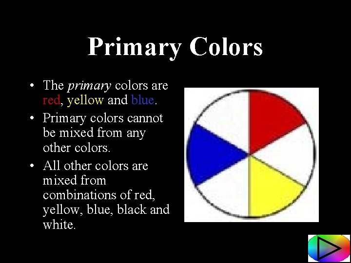
Primary Colors • The primary colors are red, yellow and blue. • Primary colors cannot be mixed from any other colors. • All other colors are mixed from combinations of red, yellow, blue, black and white.

Quiz Time! Which of the following statements is NOT true: A. Red, yellow and blue are primary colors. B. You must have the primary colors to make all other colors. C. Primary colors can be mixed using other colors.

Oops! Remember… • The primary colors are red, yellow and blue. • Primary colors cannot be mixed from any other colors. • All other colors are mixed from combinations of red, yellow, blue, black and white.

Let’s Review • The primary colors are red, yellow and blue. • Primary colors cannot be mixed from any other colors. • All other colors are mixed from combinations of red, yellow, blue, black and white.

You’re right! Primary colors CANNOT be mixed from any other colors!

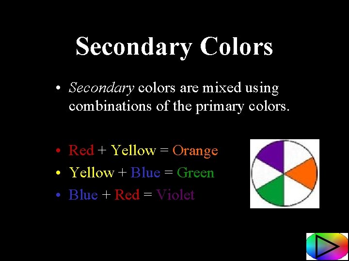
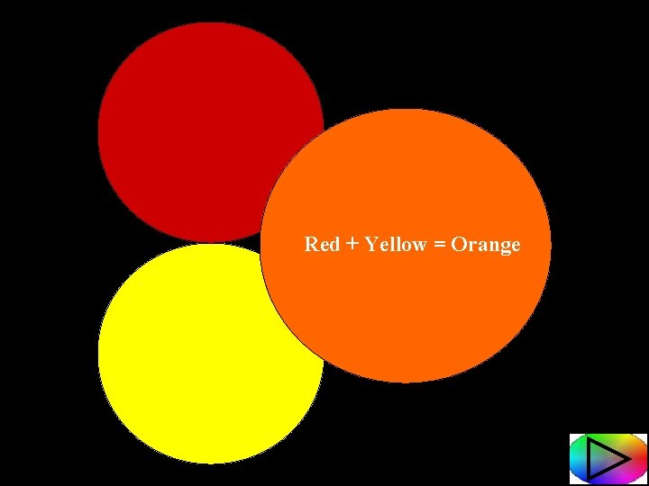
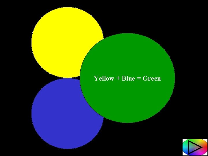
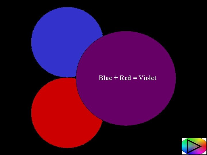
Secondary Colors • Secondary colors are mixed using combinations of the primary colors. • Red + Yellow = Orange • Yellow + Blue = Green • Blue + Red = Violet

Red + Yellow = Orange

Yellow + Blue = Green

Blue + Red = Violet

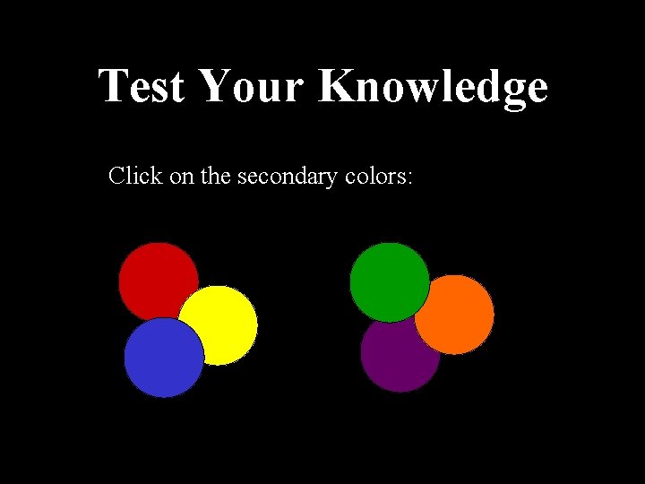
Test Your Knowledge Click on the secondary colors:

Oh no!!! Remember… PRIMARY COLORS: Red, Yellow and Blue SECONDARY COLORS: Orange, Green and Violet

Yes, Orange, Green and Violet are the Secondary Colors!

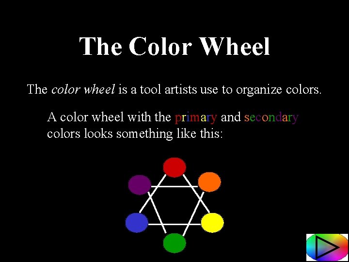
The Color Wheel The color wheel is a tool artists use to organize colors. A color wheel with the primary and secondary colors looks something like this:

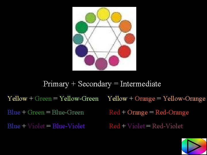
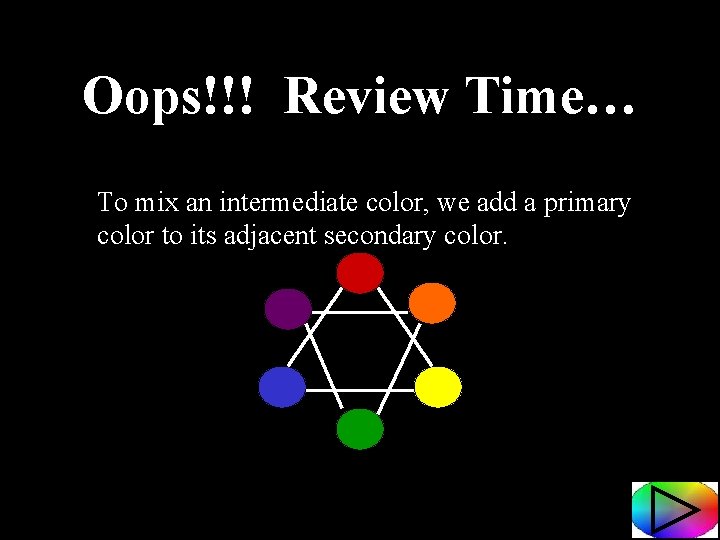
Intermediate Colors • Intermediate colors are mixed using a primary color and the secondary color right next to it (adjacent to it). • For example, to make blue-green, we mix equal parts of blue and green. • These colors are then placed between the combined primary and secondary colors on the color wheel.

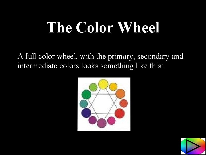
The Color Wheel A full color wheel, with the primary, secondary and intermediate colors looks something like this:

Primary + Secondary = Intermediate Yellow + Green = Yellow-Green Yellow + Orange = Yellow-Orange Blue + Green = Blue-Green Red + Orange = Red-Orange Blue + Violet = Blue-Violet Red + Violet = Red-Violet

Quiz Time! Which of the following colors would you mix with blue to make an intermediate color? Yellow Orange Green

Let’s Review… To make an intermediate color, we mix a primary color and a secondary color next to it.

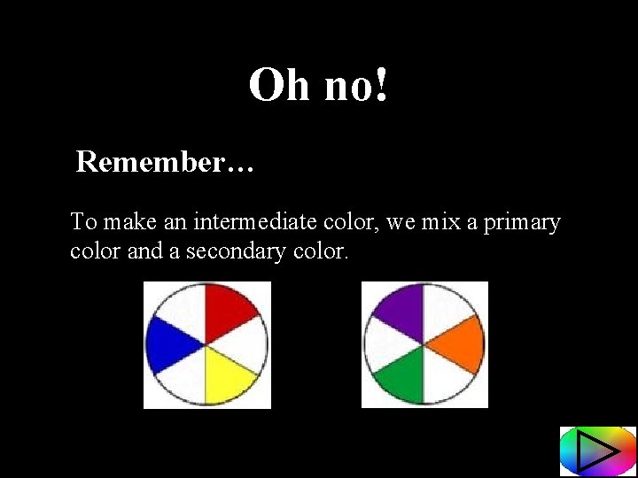
Oh no! Remember… To make an intermediate color, we mix a primary color and a secondary color.

When we mix the primary color, blue, with the secondary color, green, we make the intermediate color, blue-green.

Another Quiz Q For You! Which of the following colors would you mix with orange to make an intermediate color? Green Red Blue

Oops!!! Review Time… To mix an intermediate color, we add a primary color to its adjacent secondary color.

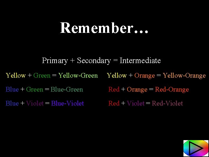
Remember… Primary + Secondary = Intermediate Yellow + Green = Yellow-Green Yellow + Orange = Yellow-Orange Blue + Green = Blue-Green Red + Orange = Red-Orange Blue + Violet = Blue-Violet Red + Violet = Red-Violet

Yes! Red and Orange make Red-Orange!

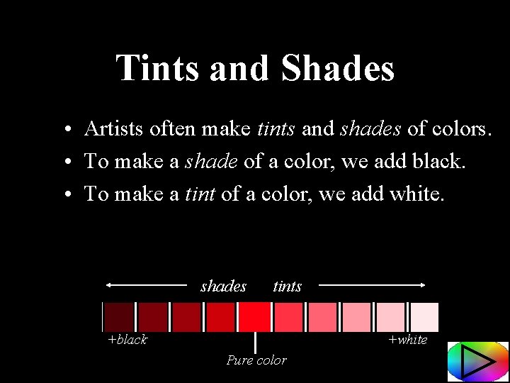
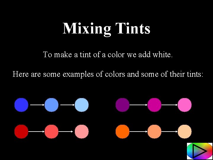
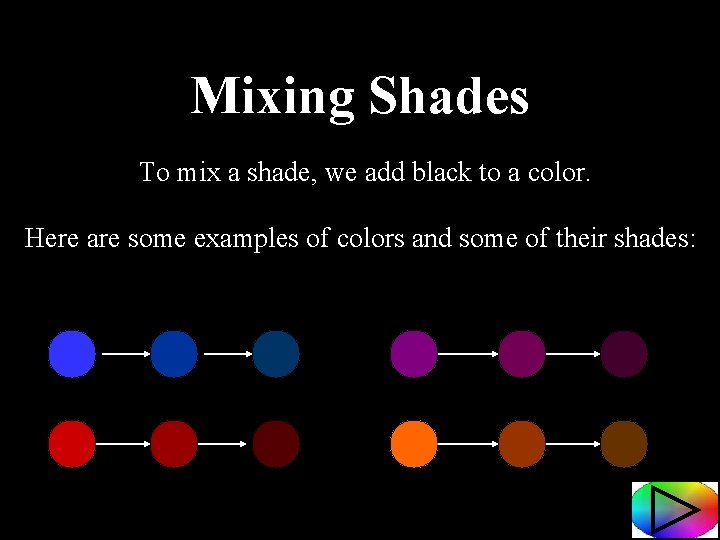
Tints and Shades • Artists often make tints and shades of colors. • To make a shade of a color, we add black. • To make a tint of a color, we add white. shades tints +black +white Pure color

Mixing Tints To make a tint of a color we add white. Here are some examples of colors and some of their tints:

Mixing Shades To mix a shade, we add black to a color. Here are some examples of colors and some of their shades:

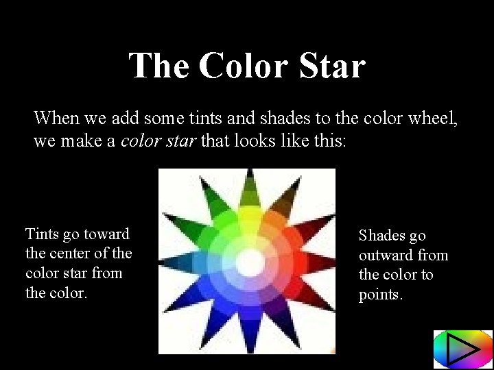
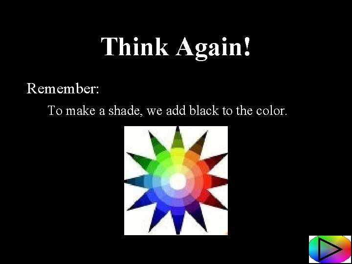
The Color Star When we add some tints and shades to the color wheel, we make a color star that looks like this: Tints go toward the center of the color star from the color. Shades go outward from the color to points.

Quiz Time! To make a tint of a color, we add black. True False

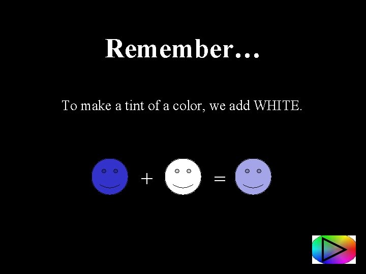
Remember… To make a tint of a color, we add WHITE. + =

Yes! To make a tint of a color, we add white!

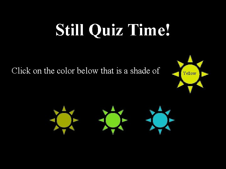
Still Quiz Time! Click on the color below that is a shade of Yellow

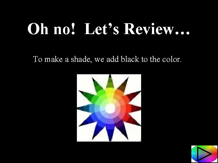
Oh no! Let’s Review… To make a shade, we add black to the color.

Think Again! Remember: To make a shade, we add black to the color.

When we mix shades of a color, we add black.

So What Do Artists Do With All of This Info? • Artists use the color wheel as a guide to help them choose colors to use in their artworks. • The color wheel can help us see various color schemes. • Artists often use one color scheme as the base palette for a painting.

Color Schemes Some color schemes artist use are: Monochromatic Complementary Analogous Warm Colors Cool Colors

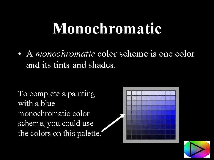
Monochromatic • A monochromatic color scheme is one color and its tints and shades. To complete a painting with a blue monochromatic color scheme, you could use the colors on this palette.

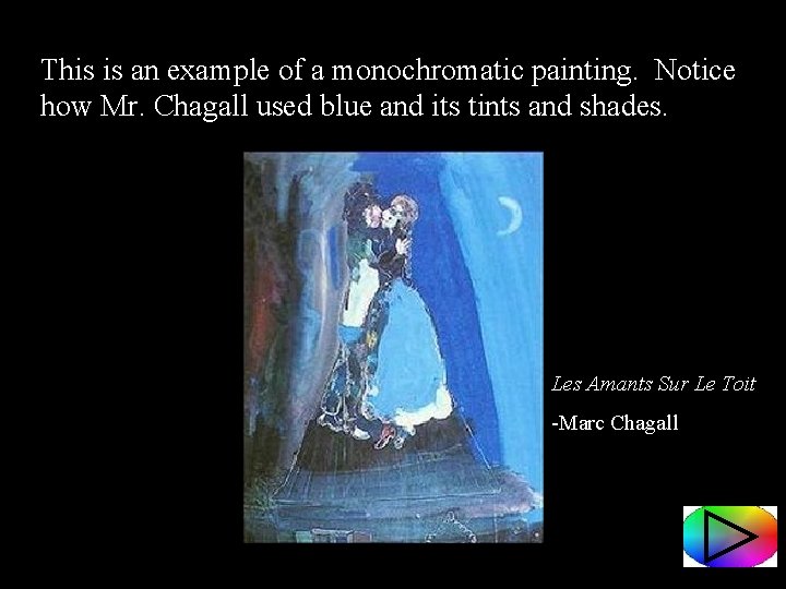
This is an example of a monochromatic painting. Notice how Mr. Chagall used blue and its tints and shades. Les Amants Sur Le Toit -Marc Chagall

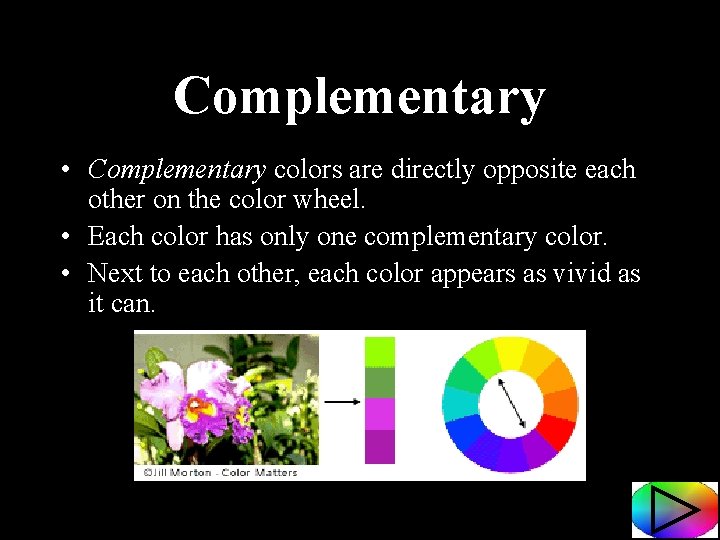
Complementary • Complementary colors are directly opposite each other on the color wheel. • Each color has only one complementary color. • Next to each other, each color appears as vivid as it can.

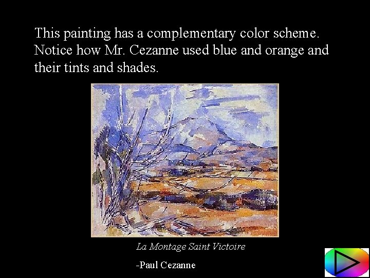
This painting has a complementary color scheme. Notice how Mr. Cezanne used blue and orange and their tints and shades. La Montage Saint Victoire -Paul Cezanne

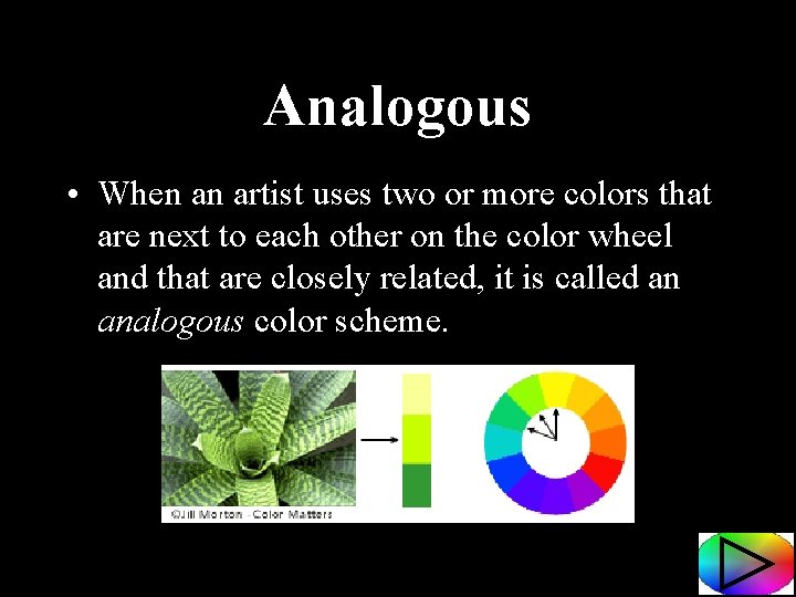
Analogous • When an artist uses two or more colors that are next to each other on the color wheel and that are closely related, it is called an analogous color scheme.

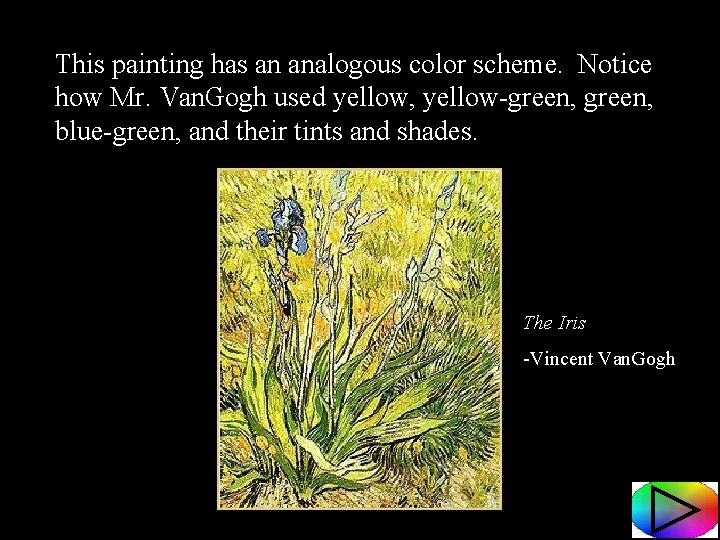
This painting has an analogous color scheme. Notice how Mr. Van. Gogh used yellow, yellow-green, blue-green, and their tints and shades. The Iris -Vincent Van. Gogh

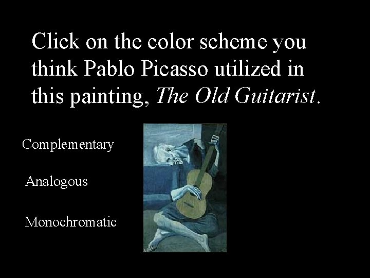
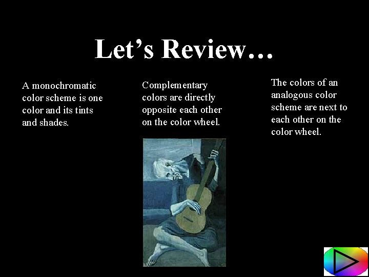
Click on the color scheme you think Pablo Picasso utilized in this painting, The Old Guitarist. Complementary Analogous Monochromatic

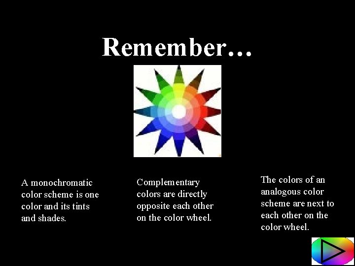
Remember… A monochromatic color scheme is one color and its tints and shades. Complementary colors are directly opposite each other on the color wheel. The colors of an analogous color scheme are next to each other on the color wheel.

Let’s Review… A monochromatic color scheme is one color and its tints and shades. Complementary colors are directly opposite each other on the color wheel. The colors of an analogous color scheme are next to each other on the color wheel.

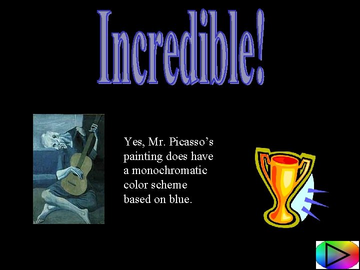
Yes, Mr. Picasso’s painting does have a monochromatic color scheme based on blue.

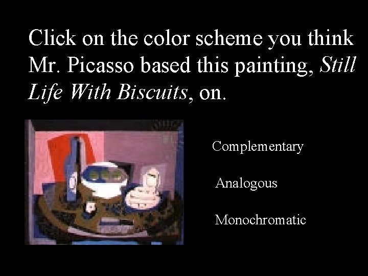
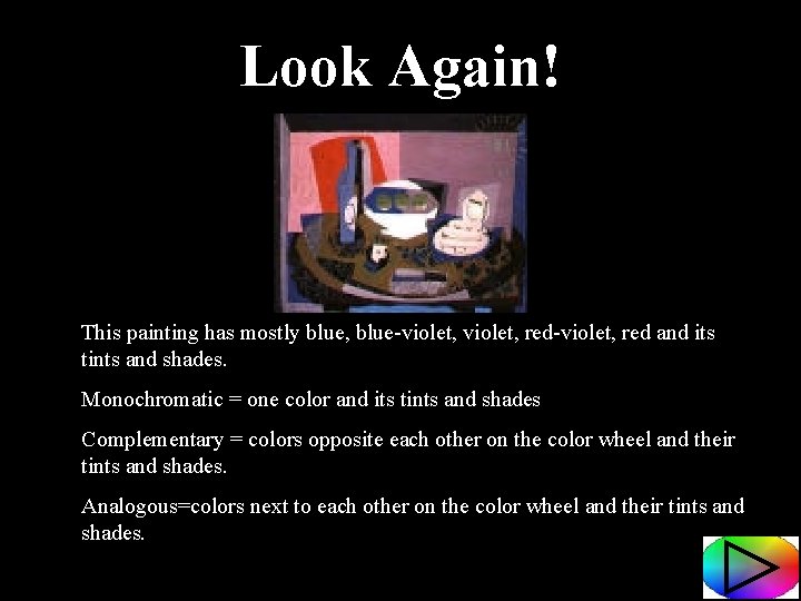
Click on the color scheme you think Mr. Picasso based this painting, Still Life With Biscuits, on. Complementary Analogous Monochromatic

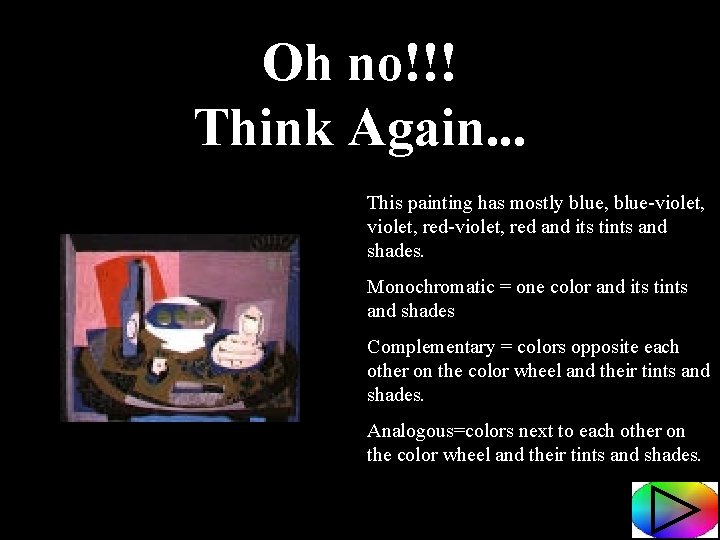
Oh no!!! Think Again. . . This painting has mostly blue, blue-violet, red-violet, red and its tints and shades. Monochromatic = one color and its tints and shades Complementary = colors opposite each other on the color wheel and their tints and shades. Analogous=colors next to each other on the color wheel and their tints and shades.

Look Again! This painting has mostly blue, blue-violet, red-violet, red and its tints and shades. Monochromatic = one color and its tints and shades Complementary = colors opposite each other on the color wheel and their tints and shades. Analogous=colors next to each other on the color wheel and their tints and shades.

Yes! This is an analogous color scheme.

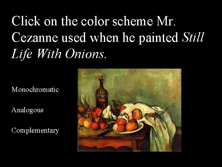
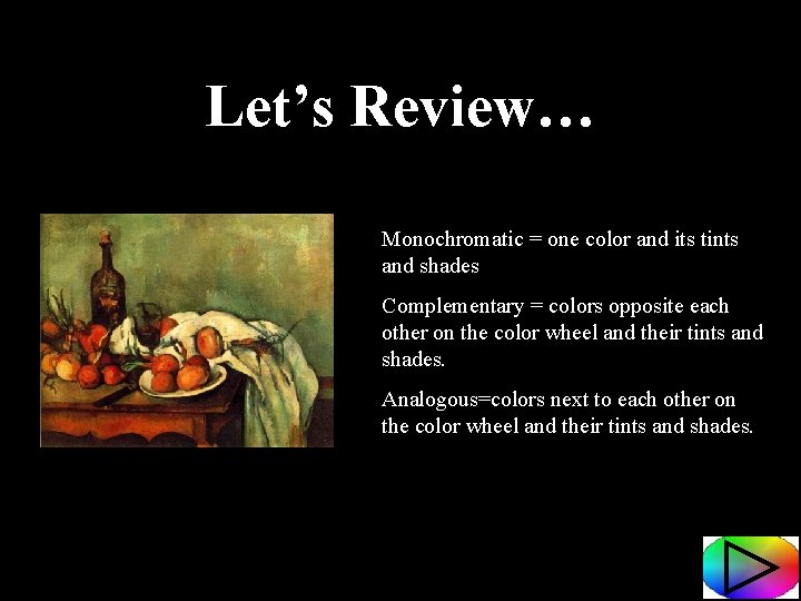
Click on the color scheme Mr. Cezanne used when he painted Still Life With Onions. Monochromatic Analogous Complementary

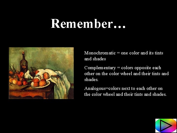
Remember… Monochromatic = one color and its tints and shades Complementary = colors opposite each other on the color wheel and their tints and shades. Analogous=colors next to each other on the color wheel and their tints and shades.

Let’s Review… Monochromatic = one color and its tints and shades Complementary = colors opposite each other on the color wheel and their tints and shades. Analogous=colors next to each other on the color wheel and their tints and shades.

Yes! Mr. Cezanne used the complementary color pair red and green in his painting!

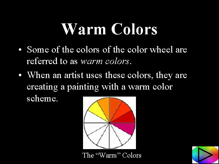
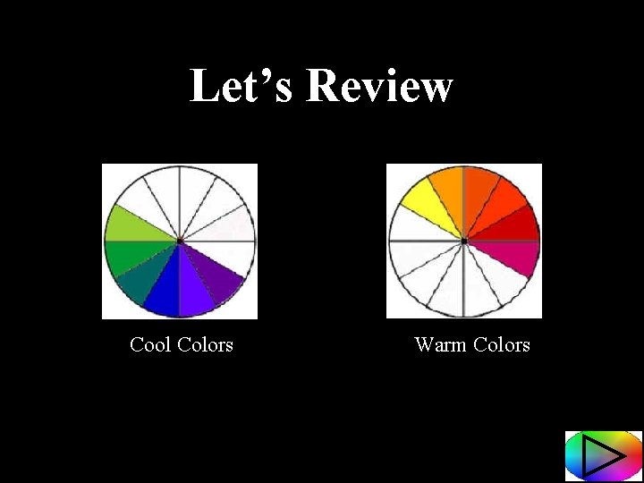
Warm Colors • Some of the colors of the color wheel are referred to as warm colors. • When an artist uses these colors, they are creating a painting with a warm color scheme. The “Warm” Colors

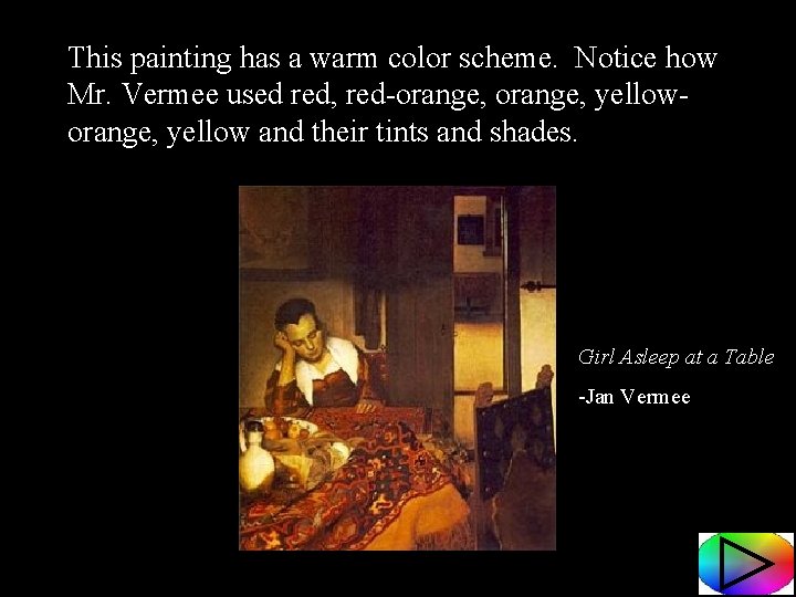
This painting has a warm color scheme. Notice how Mr. Vermee used red, red-orange, yelloworange, yellow and their tints and shades. Girl Asleep at a Table -Jan Vermee

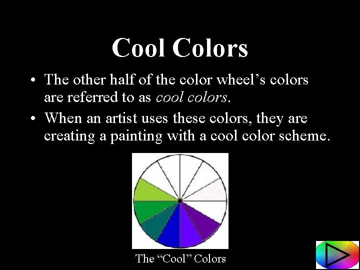
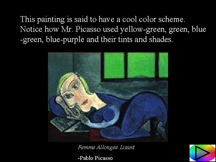
Cool Colors • The other half of the color wheel’s colors are referred to as cool colors. • When an artist uses these colors, they are creating a painting with a cool color scheme. The “Cool” Colors

This painting is said to have a cool color scheme. Notice how Mr. Picasso used yellow-green, blue-purple and their tints and shades. Femme Allongee Lisant -Pablo Picasso

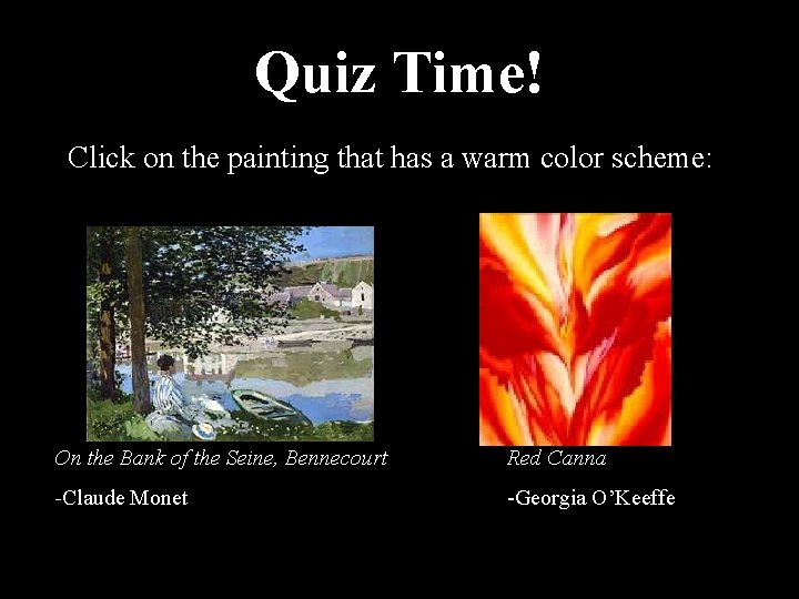
Quiz Time! Click on the painting that has a warm color scheme: On the Bank of the Seine, Bennecourt Red Canna -Claude Monet -Georgia O’Keeffe

Let’s Review Cool Colors Warm Colors

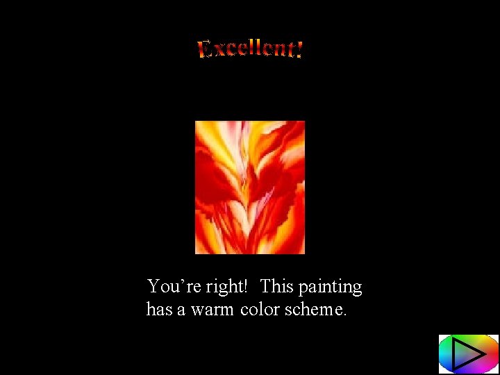
You’re right! This painting has a warm color scheme.

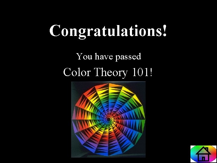
Congratulations! You have passed Color Theory 101!