Color Theory adapted from thevirtualinstructor com What is
- Slides: 13

Color Theory adapted from thevirtualinstructor. com

What is Color Theory? �Color is the element of art that refers to reflected light. Color theory is defined as a theory because it cannot be proved. Theories are generally accepted, despite the fact that they cannot be proven. �If color theory is simplified, it can be broken down into 3 parts- The color wheel, color value, and color schemes. Each part of color theory builds on the previous.

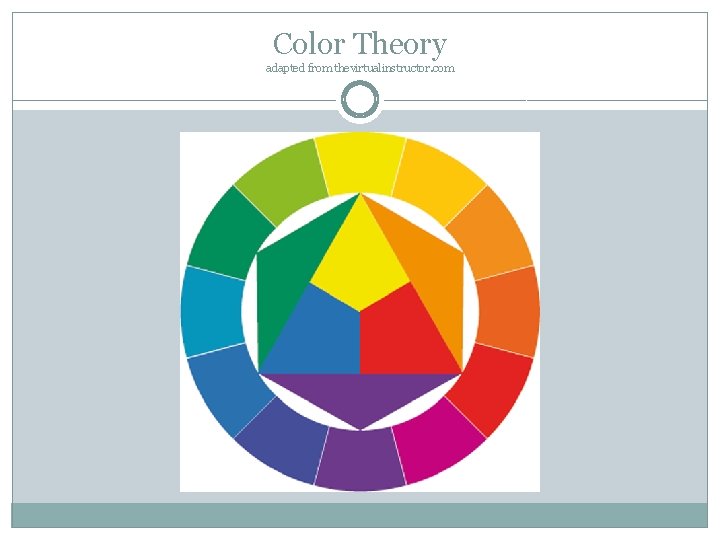
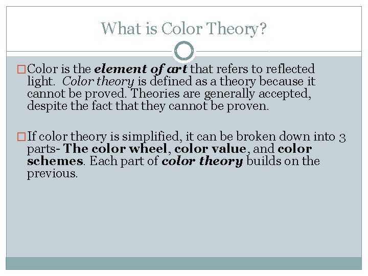
The Color Wheel � The color wheel was developed by Sir Isaac Newton by taking the color spectrum and bending it into a circle � If you follow around the color wheel, you will find the same order of the color spectrum- red, orange, yellow, green, blue, indigo(blueviolet), and violet. � Some remember it by the acronym ROYGBIV.

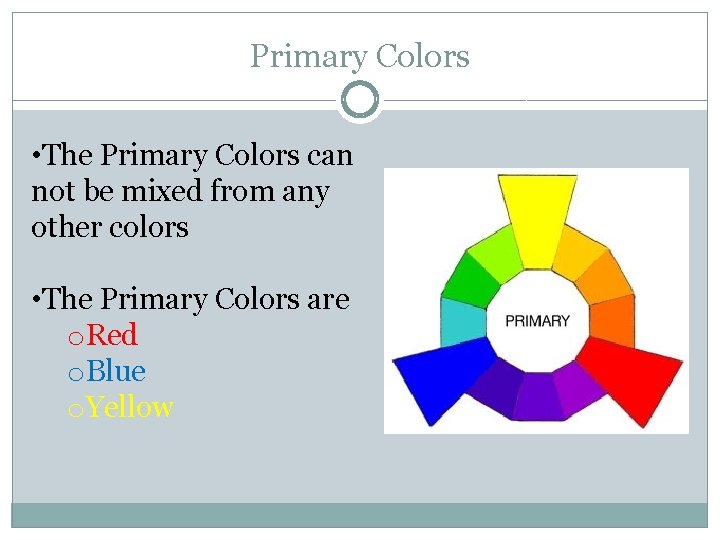
Primary Colors • The Primary Colors can not be mixed from any other colors • The Primary Colors are o. Red o. Blue o. Yellow

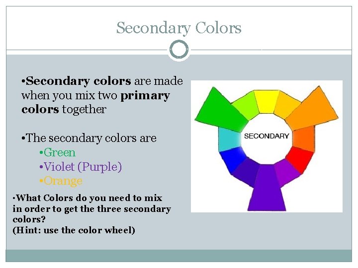
Secondary Colors • Secondary colors are made when you mix two primary colors together • The secondary colors are • Green • Violet (Purple) • Orange • What Colors do you need to mix in order to get the three secondary colors? (Hint: use the color wheel)

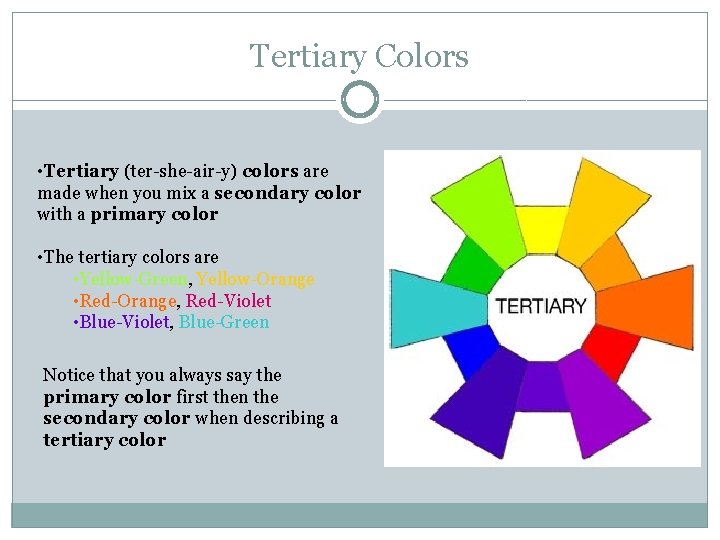
Tertiary Colors • Tertiary (ter-she-air-y) colors are made when you mix a secondary color with a primary color • The tertiary colors are • Yellow-Green, Yellow-Orange • Red-Orange, Red-Violet • Blue-Violet, Blue-Green Notice that you always say the primary color first then the secondary color when describing a tertiary color

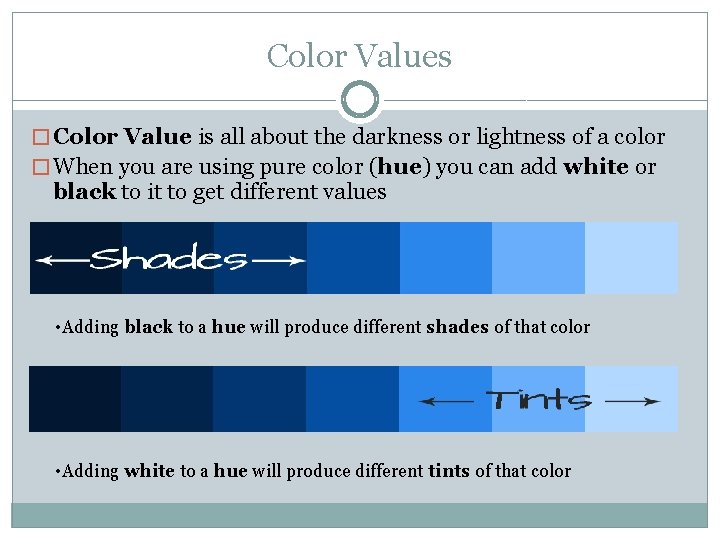
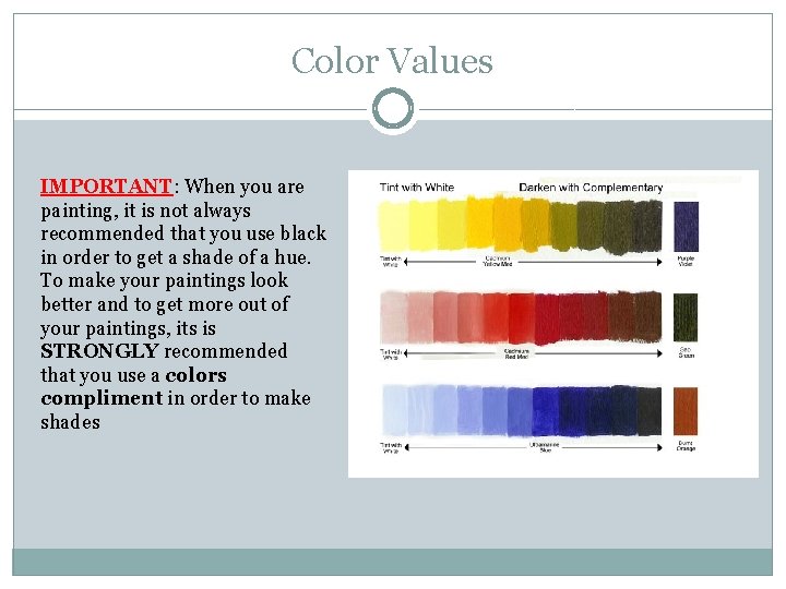
Color Values � Color Value is all about the darkness or lightness of a color � When you are using pure color (hue) you can add white or black to it to get different values • Adding black to a hue will produce different shades of that color • Adding white to a hue will produce different tints of that color

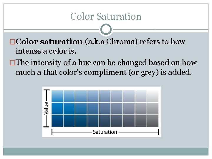
Color Saturation �Color saturation (a. k. a Chroma) refers to how intense a color is. �The intensity of a hue can be changed based on how much a that color’s compliment (or grey) is added.

Color Values IMPORTANT: When you are painting, it is not always recommended that you use black in order to get a shade of a hue. To make your paintings look better and to get more out of your paintings, its is STRONGLY recommended that you use a colors compliment in order to make shades

Color Schemes �Color Schemes: Let's watch a quick video on color schemes and what we just learned about the color wheel • How would you achieve the result of making your audience uncomfortable looking at your painting? What examples can you give? • Can you think of some examples of color schemes that give a certain mood? What examples can you think of and what mood do the give?

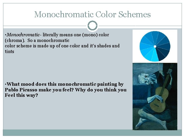
Monochromatic Color Schemes • Monochromatic- literally means one (mono) color (chroma). So a monochromatic color scheme is made up of one color and it’s shades and tints • What mood does this monochromatic painting by Pablo Picasso make you feel? Why do you think you Feel this way?

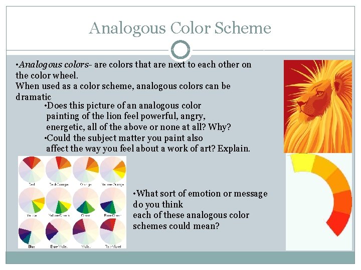
Analogous Color Scheme • Analogous colors- are colors that are next to each other on the color wheel. When used as a color scheme, analogous colors can be dramatic • Does this picture of an analogous color painting of the lion feel powerful, angry, energetic, all of the above or none at all? Why? • Could the subject matter you paint also affect the way you feel about a work of art? Explain. • What sort of emotion or message do you think each of these analogous color schemes could mean?

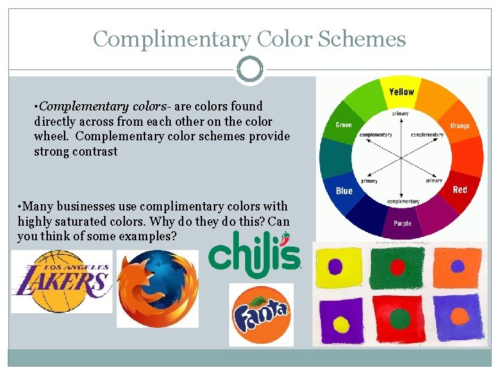
Complimentary Color Schemes • Complementary colors- are colors found directly across from each other on the color wheel. Complementary color schemes provide strong contrast • Many businesses use complimentary colors with highly saturated colors. Why do they do this? Can you think of some examples?