COLOR Picasso Guernica 1937 Paul Czanne Still Life


")


- Slides: 53
COLOR
Picasso, Guernica, 1937
Paul Cézanne, Still Life with Green Melon, 1902 -06 BW
Paul Cézanne, Still Life with Green Melon, 1902 -06 CO
Monochromatic - using only one color
Mark Tansey, The Bricoleur’s Daughter, 1987
Gunther Gerzso Southern
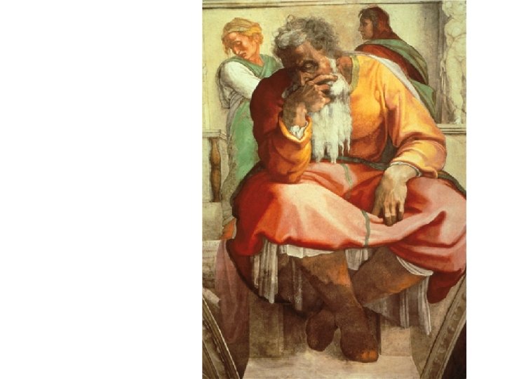
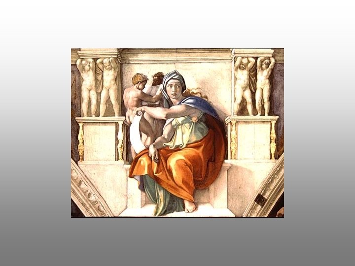
Michaelangelo Sistene Chapel detail (medallion)
Monochromatic medallion
Barnett Newman, Yellow Painting, 1949
Gunther Gerzso Opposite
Mark Rothko, untitled, 1968
Church, Frederic Edwin Rainy Season in the Tropics 1866, Oil on canvas, 56 1/4 x 84 3/16 in. The Fine Arts Museums of San Francisco
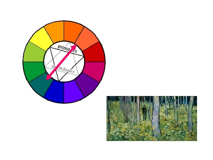
COLOR WHEEL HUE
informal definitions HUE – a particular gradation of color; a spectral color (a color from the spectrum) Color – many definitions! A broader term, including all hues, non-spectral colors and maybe even white & black
PRIMARY & secondary RED PURPLE BLUE GREEN YELLOW ORANGE
Robert Delaunay, Circular Forms, c. 1912
Gunther Gerzso Personaje
Complementary Colors § opposites on the color wheel § unsettling, hard to look at - note: NOT COMPLIMENTARY
Complementary colors Analagous colors Barnett Newman, Dionysius, 1944, 67 x 49 in.
Analagous colors Matisse, Seated Riffian, 1912 -13 Complementary colors
Monet, Impression: Sunrise, 1872
Analogous Colors • neighbors on the color wheel
Van Gogh, Sunflowers, 1888
TINT – adding white to a hue, or a hue to white VALUE SHADE – adding black to a hue or vice versa
a very aware use of contrasts of complementary & analogous colors AND shades and tints Robert Delaunay, Circular Forms, c. 1912
SATURATION – brilliance or depth of color Franz Marc, Fighting Forms
LUMINENCE
Monet, Impression: Sunrise, 1872
Monet, Impression: Sunrise, 1872
Ellsworth Kelly Red, Yellow, Blue I, 1963 a/c, 3 joined panels, 90" x 90" overall
Ellsworth Kelly Red, Yellow, Blue I, 1963 a/c, 3 joined panels, 90" x 90" overall
Raphael, Madonna dell Granduca, c. 1505 33 x 22 in
Raphael, Madonna dell Granduca, c. 1505 33 x 22 in
Triadic Color Schemes NOT JUST ANY 3 COLORS
Raphael, School of Athens, 1511
Ellsworth Kelly Red, Yellow, Blue I, 1963 a/c, 3 joined panels, 90" x 90" overall
Raphael, Madonna dell Granduca, c. 1505 33 x 22 in
PRIMARY & secondary RED PURPLE BLUE GREEN YELLOW ORANGE
Also note countershading
COLOR CONCLUSION • Color can be an important part of an artwork’s impact – notice it! • Color can be optimized & analyzed for greatest effect • Timbre in music is considered to be analogous to color in painting; some kinds of harmony and scales are also considered to be analogous to color in painting. They are DIFFERENT – try not to confuse them.
“Colors are barbaric, unstable, suggest life, cannot be completely controlled and should be concealed. ” Ad Reinhardt, 1957
The thing in painting is to find a way to get color down, to float it without bogging the picture down in Surrealism, Cubism, or systems of structure. . . In the best color painting, structure is nowhere evident, or nowhere self-revealing. Kenneth Noland, quoted in the New York Times, August 25 1968