COLOR IN FASHION LEARNING TARGETS Describe the impact

COLOR IN FASHION

LEARNING TARGETS • Describe the impact of color on clothing choices. • Identify primary, secondary, and intermediate colors on the color wheel. • Describe color schemes that work well together. • Choose colors that are flattering on you.

DO YOU KNOW? • The human eye sees as many as 6 -7 million colors! • No wonder why color has such an impact!

WHAT IS COLOR? Ø Light is the source of all color Ø All objects contain pigments, or substances that absorb some light rays and reflect others Ø When light strikes an object, you see only the colors that reflect, or bounce back, to your eyes Ø Color is seen by the eye but interpreted by the brain

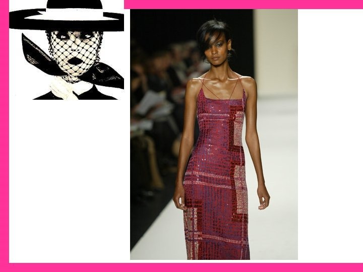
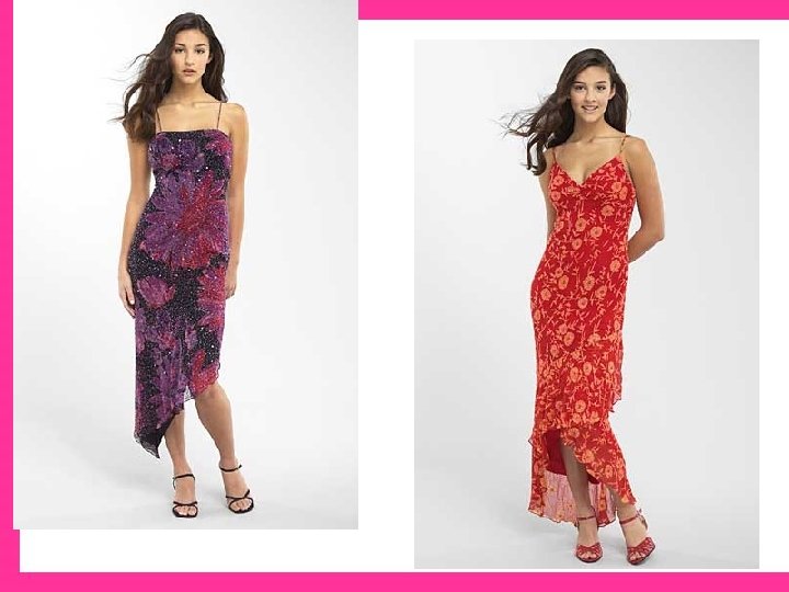
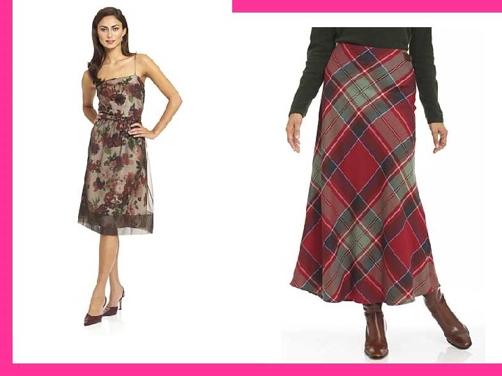
WHAT DOES COLOR HAVE TO DO WITH FASHION? Ø Color is often the first thing you notice about the clothing in a store display Ø Color can help you choose clothing that helps you look your best Ø Color can help draw attention to or away from certain areas of your body Ø Color can create illusions in height and size

LANGUAGE OF COLOR Ø Hue: the name given to a specific color. Ø Primary Colors: red, yellow, and blue. Ø Secondary Colors: combining equal amounts of two primary colors (blue + yellow = green). Ø Intermediate Color: A primary color combined with a secondary color (blue-green). Ø Warm Colors: colors associated with the sun (red, orange, & yellow). Ø Cool Colors: colors that capture the essence of the ocean (blues, violets, & greens).

THE IMPACT OF COLOR Ø Color as Symbols Ø Red, Yellow, and Green at a stoplight Ø Holidays Ø Ceremonies & Celebrations Ø Groups & Countries Ø In Language (green with envy) Ø Colors and Temperature Ø Associations with nature (green as grass) Ø Warm & Cool Colors Ø Why wear white in hot weather?

THE IMPACT OF COLOR Ø Colors and Movement Ø Warm colors advance or move toward you Ø Warm colors are used to attract attention Ø Colors and Mood Ø Cool colors have a subduing effect Ø Cool colors give a sense of calm and relaxation Ø Warm colors express excitement and encourage you to be cheerful

THE COLOR WHEEL ØA system that places colors around a circle. ØPositions on the wheel show the colors relate to each other.

COLOR VARIATIONS Ø Most colors you see appear lighter, darker, or softer than the hues on the color wheel. Ø Value is the lightness or darkness of a color. Ø Tint: a color that is lightened by adding white. Ø Shade: a color darkened by the addition of black. Ø Intensity is the brightness or dullness of a color. Ø High-intensity: emerald green & ruby red Ø Low-intensity: khaki green & dusty rose

NEUTRAL COLORS Ø Not on the color wheel Ø Not true colors because they do not contain pigment Ø Used to change the value and intensity of a color Ø Black, white, gray, and beiges

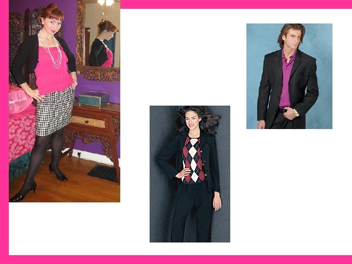
COLOR SCHEMES Ø A plan for using a color or a combination of colors to put together an outfit. Monochromatic Analogous Complementary Split Complementary Triadic Accented Neutral

MONOCHROMATIC • Mono means “one” Chromatic refers to color. • Uses the values and intensities of one color. • Ex: baby blue shirt, blue jeans, and navy blue socks.

ANALOGOUS • Uses two or more colors that are next to each other on the color wheel. • Ex: Yellow, Yellow-Orange, and Orange. • Colors blend better when they are close in value and intensity.

COMPLEMENTARY • Combines colors that are direct opposites on the color wheel. • Ex: Red & green, blue & orange, yellow & violet. • When complements of equal intensity are used together, a bold color scheme results. • A softer effect can be obtained by using different values and intensities (ex: pink and forest green). • Use one of the complementary colors as an accent (ex: yellow blouse with violet trim).

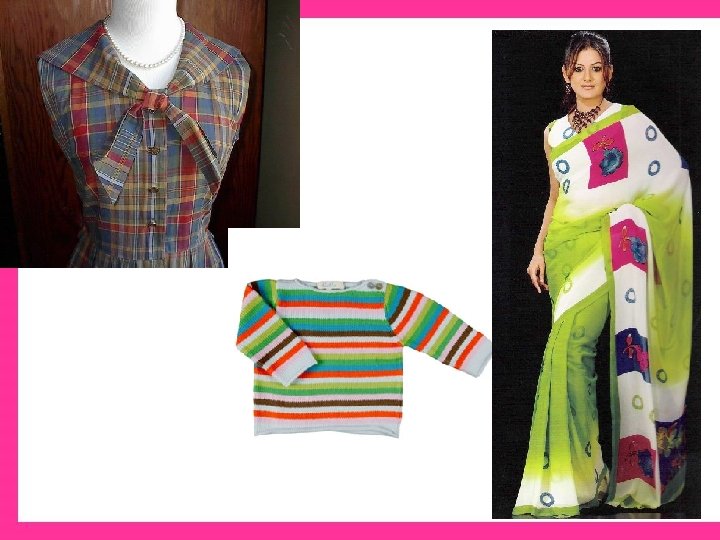
SPLITCOMPLEMENTARY • One color used with the two colors on each side of its direct complement. • More common and easier to wear than a complementary color scheme. • Often found in a plaid or print fabric. • Ex: blue-and-green plaid pant accented with a stripe of red-orange.

TRIADIC • Three colors equally spaced on the color wheel. • Ex: Red, yellow, & blue. • Bold if high-intensity colors are used. • Would be easier to wear with softer, muted colors.
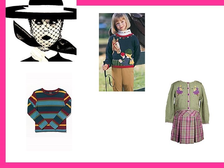

ACCENTED NEUTRAL • A small amount of one color matched with white, black, grays, or browns. • Since neutrals have no hue, they combine well with any color. • Accent colors draw the eye and brighten up the neutral color. • Often used to create a focal point, or point of interest. • Ex: A gray suit accented with a yellow tie.
- Slides: 24