Color Harmonies pleasing combination of colors based on

Color Harmonies: pleasing combination of colors based on their respective positions on color wheel.

Complementary The high contrast of complementary colors **Makes each color look brighter and more intense


Split Complementary

Analogous Pleasing to the eye. Choose one color to dominate, a second to support. The third color is used (along with black, white or gray) as an accent.

Analogous

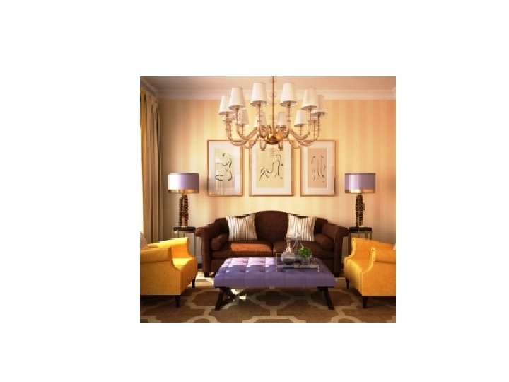
Monochromatic • Same color in varying intensities. • Creates a calm, relaxing environment. • Sophisticated.
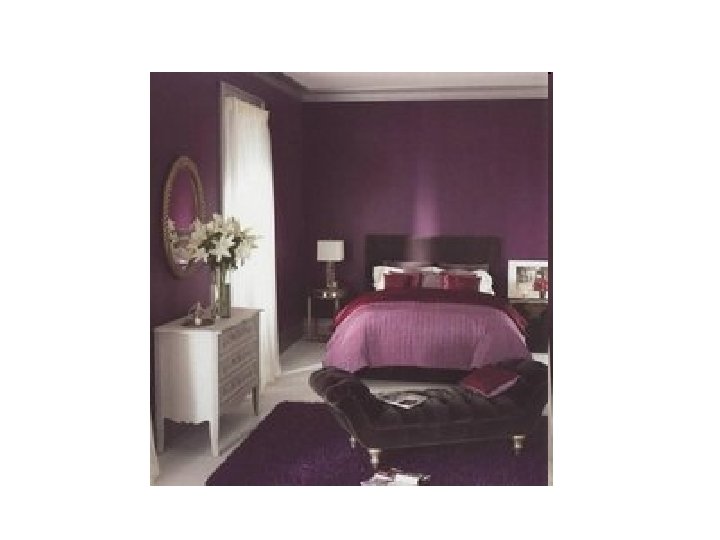

Monochromatic

Accented Neutral • Neutralsblack, gray, white, tan, brown, taupe used to intensify one color.

Accented neutral

Triadic

Triadic—using Primary colors

Color. adobe. com • https: //color. adobe. com/create/colorwheel/? base=2&rule=Triad&selected=2&name=My%20 Color%20 Theme&mo de=rgb&rgbvalues=0. 7, 0. 48419206120134484, 0. 13969462389374113, 0. 199 5637484196302, 1, 0. 4969031734046899, 1, 0. 6531868160474426, 0. 0995637 4841963023, 0. 5052997556816701, 0. 15965099873570418, 0. 393814378 56902457, 0. 034694623893741124, 0. 7&swatch. Order=0, 1, 2, 3, 4 • Select your color and color scheme to see results.

**Choose colors that are appropriate for feel of design. Vertical Lines: Complementary • Diagonal Lines: Triadic Horizontal Lines: Monochromatic • Curved Lines: Analogous
- Slides: 16