COLOR Color is the element of art that


 color model, the primary colors are red,")
 are created by mixing")


- Slides: 42
COLOR ! Color is the element of art that is produced when light, striking an object, is reflected back to the eye.
THREE PROPERTIES OF COLOR Hue: The name given to a color (red, blue, etc. )
THREE PROPERTIES OF COLOR Intensity: The strength and vividness of a color
THREE PROPERTIES OF COLOR Value: The lightness or darkness of a color
ADDITIVE COLOR WHEEL Primary Red, Green, Blue Secondary Cyan, Yellow, Magenta * Televisions * Computer monitors
SUBTRACTIVE COLOR WHEEL Primary Cyan, Magenta, Yellow Secondary Red, Blue, Green * Printing * Photographs
THE COLOR WHEEL 12 Stage Color Wheel
PRIMARY COLORS In the RYB (or subtractive) color model, the primary colors are red, yellow and blue. Red Yellow Blue
SECONDARY COLORS The three secondary colors (orange, green and violet) are created by mixing two primary colors. Orange Green Violet
INTERMEDIATE/TERTIARY COLORS Another six intermediate or tertiary colors are created by mixing primary and secondary colors. Red-Orange Red-Violet Yellow-Green Yellow-Orange Blue-Green Blue-Violet
WARM AND COOL COLORS Warm Colors are associated with warm things such as sunshine or fire. They are vivid and energetic, and tend to advance in space. Cool Colors are associated with cool things such as ice, snow, water and grass. They give an impression of calm, and create a soothing impression.
TINTS, SHADES AND TONES Terms are often used incorrectly, although they describe fairly simple color concepts. Tints If a color is made lighter by adding white, the result is called a tint.
Shades If black is added, the darker version is called a shade.
Tones If the complement is added, the result is a tone.
MONOCHROMATIC COLORS Monochromatic color scheme means “One Color”. It is a color scheme that uses only one hue and all the values (tints and shades) of that hue.
COMPLEMENTARY COLORS These are colors that are opposite each other on the Color Wheel Red and green Yellow and violet Blue and orange
ANALOGOUS COLORS Analogous colors are colors that side by side on the Color Wheel and have a common hue.
SPLIT COMPLEMENTARY COLORS Split Complementary color scheme is a combination of one hue plus the hues on each side of it’s complement.
TRIADIC COLORS A triadic color scheme uses colors that are evenly spaced around the color wheel.
Triadic color schemes tend to be quite vibrant, even if you use pale or unsaturated versions of your hues. To use a triadic harmony successfully, the colors should be carefully balanced - let one color dominate and use the two others for accent.
COLOR You should have 8 definitions… now is time to add color. 1. 2. 3. 4. 5. 6. 7. 8. COLOR: definition & color wheel Primary, Secondary, Tertiary, Warm & Cool Tints, Shades, Tones Monochromatic Complementary Split-Complementary Analogous Triadic
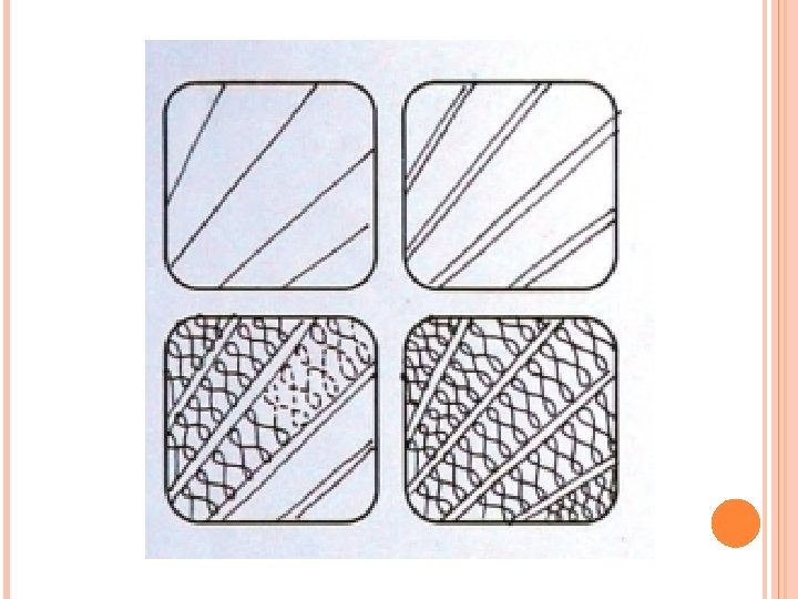
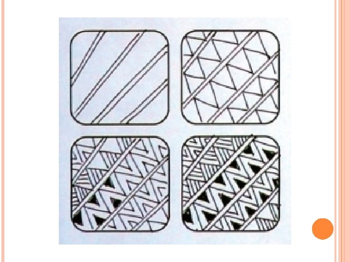
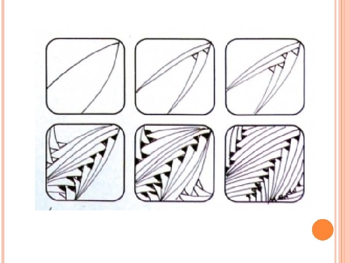
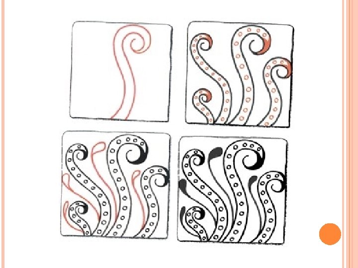
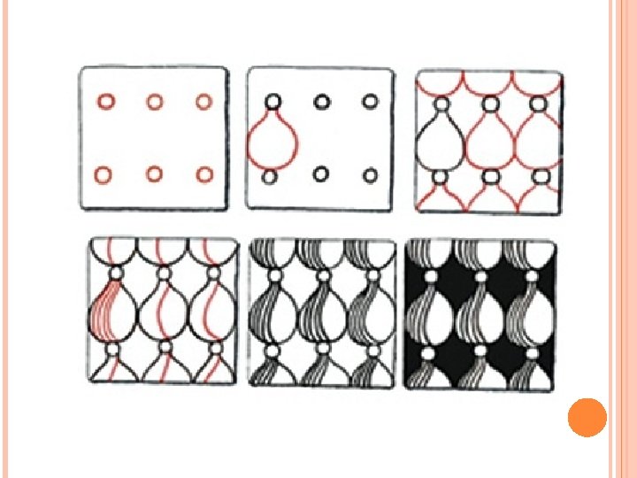
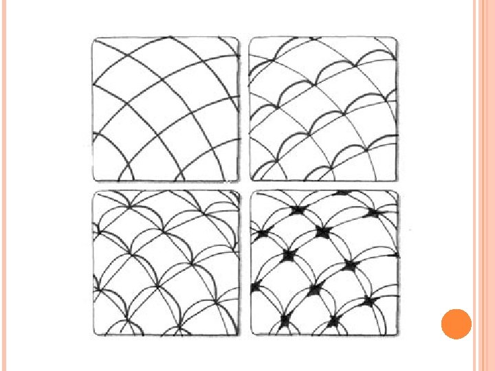
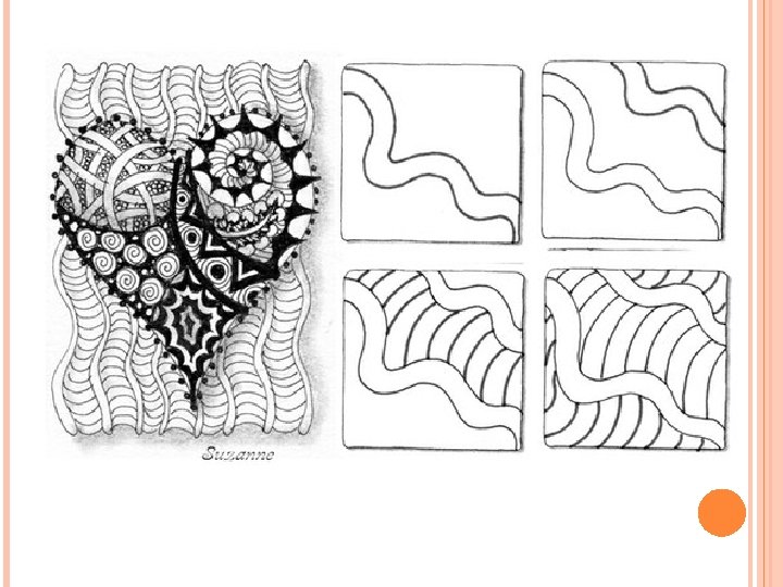
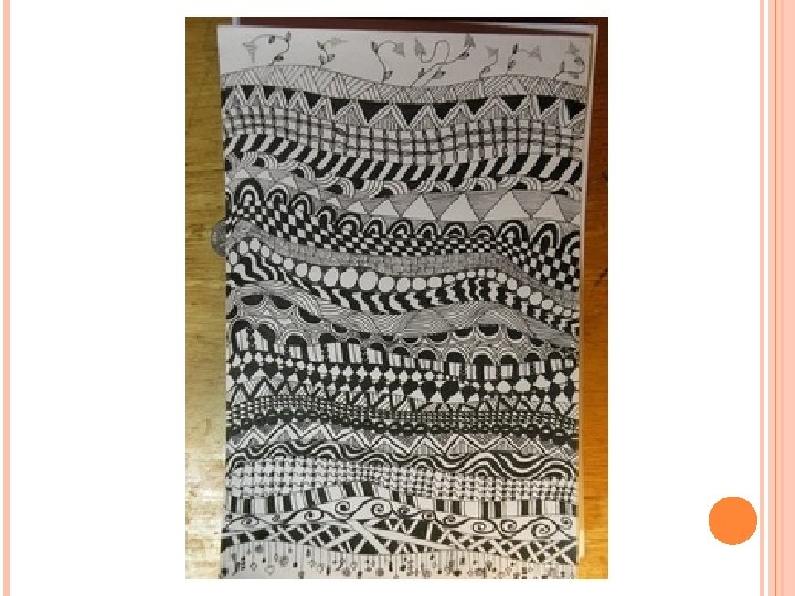
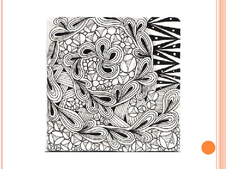
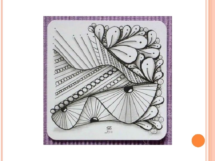
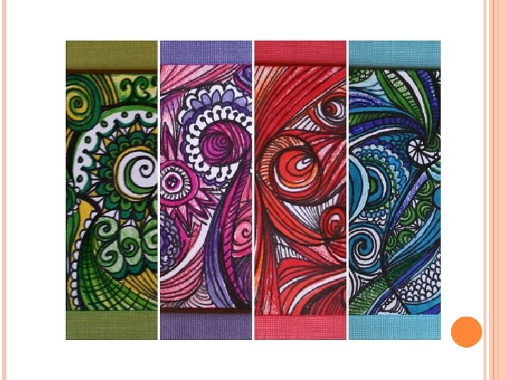
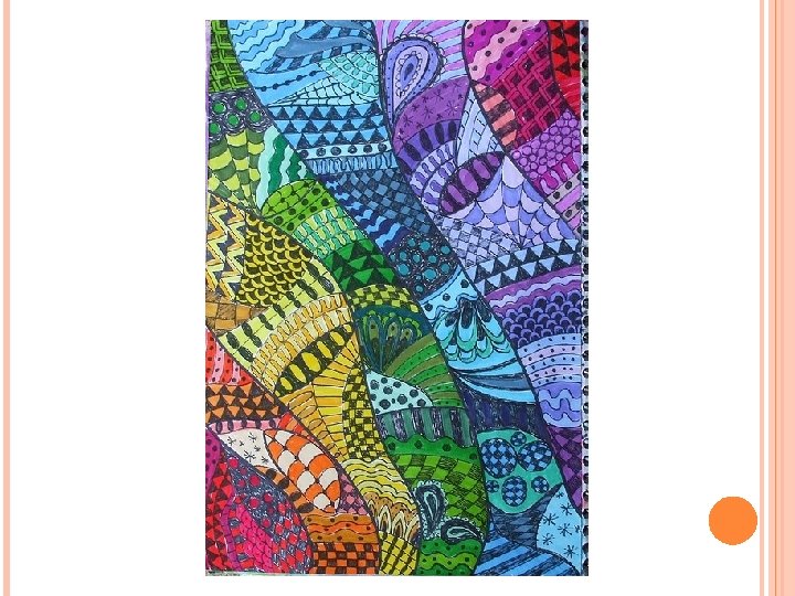
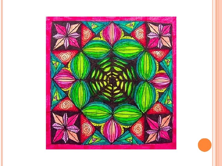
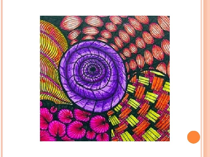
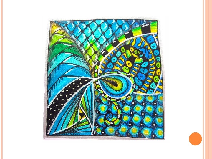
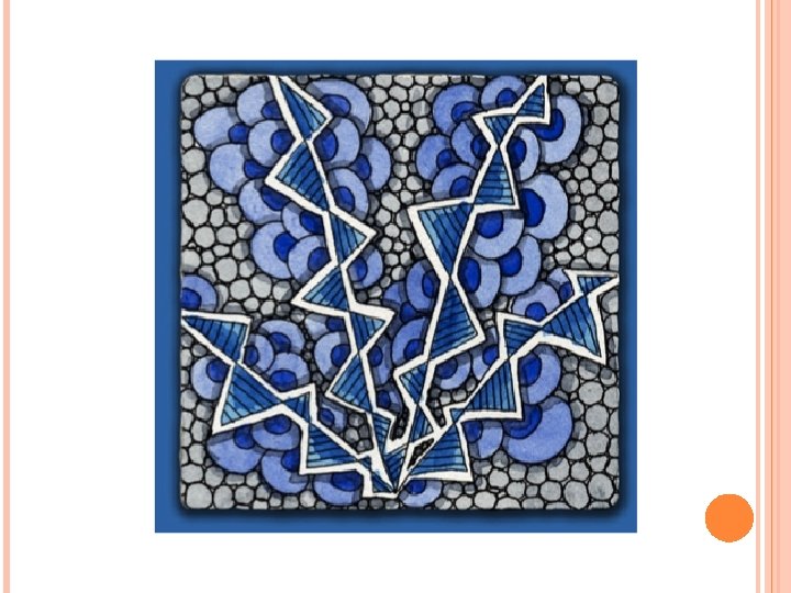
ZENTANGLE COLORS What is a Zentangle? o o o Miniature pieces of unplanned, abstract art created in a very structured method from a series of repetitive patterns on a square paper tile. The process is a form of “artistic meditation” as one becomes completely engrossed in making each pattern, deliberately focusing on “one stroke at a time”. The creativity options and pattern combinations are boundless. And anyone can do it successfully!
ZENTANGLE HOW TO Create a Border o Using a pencil, draw a border around the square of paper, about a ¼” from the edge as shown. o Do it freehand let it be 'rough'.
ZENTANGLE HOW TO Draw a ‘String’ o Draw a light random line within the border o Can be anything but keep it simple. o Aim to create areas in which to doodle. o Experiment until you get something you are happy with.
ZENTANGLE HOW TO Fill Your Zentangle o Begin to fill the shapes made by your string. o While doing this you s can listen to some music. o These simple patterns you are creating are called 'tangles'.
ZENTANGLE HOW TO Keep going. Don't worry about patterns, as you do more, the next pattern seems to suggest itself. o You can work up to the border, however, you don't have to – leaving white space can work well too. o